Murray defines additive formulations, or “multimedia” in contemporary terms, a medium which use and application is highly dependent on the nature of the derived mediums. For instance, she gives the example of the “photo-play”, what we call “film” now. During the initial stages of development, film was merely seen as a combination of photo and play, limiting the creative scope of film. Murray describes, the only way in which a medium can progress from an additive form to that of an expressive one is through bold exploration and exploitation from the creator’s part, respecting the medium as one of its own. As such, whether a technology is additive or expressive depends partly on how the technology is applied and the number of bold attempts made by creators since the introduction of the technology. Using Murray’s definitions of the two terms, it is possible to attempt to deduce whether Virtual Reality, one of the many new emerging technologies defining the Fourth Industrial Revolution, is at a stage of being an additive or expressive form. VR combines extends the visual experience one can encounter through a flat screen. Its primary focus is to give users a sense of being in another “reality”. The current application of VR is wide, ranging from military use, entertainment, education, etc. However, it is not yet a complete immersive experience as there still exists physical gadgets – mostly those that require the user to have a heavy head set or carry a remote etc. There has been cave systems (uses projections on walls for immersive experience) to eliminate the need for headsets, but it is still limiting due to the two dimensional nature of the projection. As such, despite the advancements that have been made, there have yet to be a definite technology created specially dedicated to VR. Hence, I personally believe VR is still at a stage of being an additive form – heavily reliant on simulated false reality through pre-existing forms of media.
Category: Spring 2020
Reading Response1: Hamlet on the Holodeck, Chapter 3
Where do you think VR falls in terms of being an additive or an expressive form (or somewhere in between)?
Virtual Reality as a simulated experience seems like the sum of a body sensor and various existed mediums; however, instead of reckoning it as an additive form, we can hardly deny its expressive essence that differs it from other older traditions. VR is more than one plus one equals two, firstly because of the innovative form of 3D visuals. Even though 3D visuals can also be found in 3D films, only with the VR equipment can we have different perspectives when we move around our head or change position. The more you can explore by moving around, the more spacious the VR world feels. Since it also enables 360 degree presentation, it can more easily create an immersive sense, which adds to the possibility of the created world being more imaginative and unrealistic. Besides, rather than only using fingers to trigger some feedback in the case of computer, VR can receive a set of movements of human body which can be designed creatively. As VR tries to build a world around us, it can set rules directly to us instead of the character we control on the screen and thus the restriction and effect on the person’s behavior can also be a new sort of feedback we can get. Moreover, due to the illusion that VR can bring sometimes, the moment when we exit VR can cause a lot of human emotions as we wake up from a dream, which is also very special of VR but different form other mediums. In short, the expressive attribute of VR lies in the way the inside VR world can be explored, the way the interaction between human’s body and the environment happens, the way the person can act in a world that may have completely different rules and perspectives, the way to exit and the way human’s senses can be allured.
Response: Hamlet on the Holodeck, Ch. 3
I found it interesting to consider VR as a conceptual descendant of sorts to ELIZA and other archaic technologies that were not as visually intensive. Although one might not immediately see the nontrivial similarities between a chatbot and an audiovisual framework, both technologies are designed to fool the end user’s perception of reality. In ELIZA’s case, this meant fooling the user into believing ELIZA was human; in the case of VR, this means fooling the user into believing that the virtual world that they are seeing and hearing is real. What made ELIZA so impressive was the fact that despite its eery humanity, its implementation was quite small and simple — even current graphing calculators are able to run the full implementation flawlessly. In a way, this was yet another proof that the human senses are easily fooled.
Likewise, VR headsets are portable and compact; although they are still rather computationally intensive, they can run reasonably well on most consumer-grade computers. Without prior exposure to VR headsets, one might not expect these glorified goggles to already simulate reality so well — and yet they do. In fact, there exist many videos online of people who, while watching a VR roller-coaster ride, have toppled over due to the disorienting incongruence between their “real” and “virtual” spatial perception. Thus, it might not be so far-fetched to call VR an ELIZA for the modern age.
Reading Response: Hamlet on the Holodeck, Chapter 3
I think that it is most interesting to think about how VR will utilize the encyclopedic properties of digital environments to create engaging experiences. All of the knowledge present on the internet and networked devices can be explored in a setting that allows complete immersion for users, but how can virtual reality present this information through near full-sensory immersion? I believe that apart from adhering to physical and spatial properties of the real world, virtual reality experiences will have the difficulty of enhancing our experience of movement within the experience. I believe the challenge will be: how can the most engaging aspects of viewing and navigating the world around us be combined with innovative ways of movement and sensory stimulation in virtual reality to enhance the user’s experience? I believe VR will force developers and designers to alter the current state of “encyclopedic knowledge,” which I believe is at the present limited to video, photos and text on the internet, and how new and old knowledge will be transformed into appealing experiences in VR.
I believe that Murray’s description of Sid Meier’s Civilization as a game that can inhibit our ability to interpret the underpinnings of alternate realities through the experience’s seeming encyclopedic knowledge will remain more or less true in virtual reality. In fact, I personally believe that in its present state, virtual reality may inhibit users’ ability to “ask why things work the way they do” because of the physical constraints that VR poses with its wonky headsets and controllers. The mere fact that I can explore the whole database of the rules and backstory of Civilization in mere seconds and with moving my mouse by a few inches is extremely efficient compared to the required physical, full-body movements in virtual reality. Therefore, I believe VR designers will need to consider how experiences can allow full, conscious participation of users while remaining engaging and requiring minimal mental and physical exertion to question and understand the environment around them.
Reading Response 1: Hamlet on the Holodeck Ch. 3
There are so many things happening around us and each encounter and action all entail complex intricacies and details. When reading the chapter, I realized that I’ve never really took the time to analyze and break down some of the technological advancements we see and use everyday. The chapter documents numerous advancements and the ingenuity that goes behind each of them. I loved the example of Zork and how it was similar to the game Dungeons and Dragons. Prior to reading this, I would’ve just described Zork as something that is cool and fun, and I would not have analyzed the game and understood its concept. Whether or not a technology was additive or expressive or whether or not something falls under a digital environment are concepts and questions I have yet to ponder.
In regards to this, VR fulfills the property of a digital environment being spatial. VR perfectly embodies this property in that it’s an entirely new world or reality. One is able to fully immerse himself/herself in a different space and navigate across the environment. One also has agency in this world and is able to have various experiences. In the example of Zork, the book tells a story of a character walking into a dungeon that “someone is sealing shut behind you.” This experience could be further amplified in a virtual reality where one’s senses can fully immerse in the situation. There is a power of navigation that exists in virtual reality.
Galaxyze: the final documentation
For our group project, Shenuka and I worked on Galaxyze, an open-ended VR environment that allows the following interaction/engagement:
- user controls the stars in the night sky by rearranging pebbles on a beach.
- user is able to impact on a cosmic level with a trivial action.
The goal for this project is to let the user become a creator in a fictional world that is also quite relatable, in the sense that it’s a deserted island surrounded by the sea (much like Saadiyat bubble). The user can draw patterns in the sky with trails and constellations, feeling powerful but also isolated by their limited mobility in the world.
This idea first arose from a chapter from Italo Calvino’s Invisible Cities and we wanted to explore the “stuff of story” – about makes a story, the lack of a narrative and he open-endedness of it.
The environment consists of the following, based on the idea that the user must feel small in the vastness of the cosmos above and the ocean below.
- Island: Terrain tool
- Pebbles/ Water: Unity Asset Packs
- Stars: Spheres with glowing material
- Sky: Night sky skybox
- Trails: Particle systems set to fade with time
The scripts we wrote are the following:
- Mapping the position of the stones (x and z values) to the positions of the stars.
- Detecting when all the stones have been thrown in order to play the ending animation.
- Switching from the ambient music to the ending music.
Looking back, our project came out differently from how we imagined it in the first place. We were able to complete this project thanks to multiple player testing, experiments, and feedback from peers and Sarah.
Here’s a footage of Craig testing it out at the IM Show exhibition (mute sound, a little noisy):
Some challenges we faced were mainly in writing the scripts because it was the first time for both of us to use C#. However, after ample research, late-night experiments, crazy amount of logs, tests, and help from friends, we were able to solve them all!
If we had more time, I think we could work more on the environment and making it feel more alive. This could involve adding:
- splashing noises and wave sounds
- dolphins jumping out of the water from afar
- more stars in the sky
- shooting stars here and there
- different types of assets to pick up – not just pebbles, but also shells and other broken/abandoned remnants that we find on the beach these days. I think this could add more to the backstory and give more contextual evidence as to where they are
Documentation-Let it out!
Inspired by my first project of creating a meditative space and the second project of observing users hijacking the intended goals of my project to throw trash as far as they could, I wanted to create a stress relief room that would explore users’ destructive tendencies in VR and also challenge myself to depart from the normally slow, poetic experiences I design. I had seen several videos of “Rage Rooms” where the players just started smashing plates and breaking computers. All for the price of $45/hour (or along those lines). The existence of such rooms seemed terribly wasteful and also inaccessible to the everyday person who could not afford to shell out so much money in the name of self-care. I also knew that I wanted to create a project that had a compelling need to be done using the medium of VR. Thus, I began thinking of interactions I could create in this room. I began with smashing plates, hitting a punching bag, and burning things in a fire.To create a sense of story, I thought of dividing one wall into three partitions-one for each interaction. As each interaction was done, one part of that single wall would fall onto the ground, revealing an open forest sky. The room itself was going to be a typical living room with a couch and TV and a shelf of china plates. I decided though that I wanted to have a more peaceful environment to promote stress relief, but I also didn’t want it to be soothing because I wanted players to feel motivated to break things apart. Thus, I was inspired by Japanese training dojos, I created an environment in the same spirit…meditative but still conducive to action-oriented interactions.
The interaction of smashing plates turned out to be very satisfying. Once I fixed performance issues of instantiating so many objects at once, I made the plates the focal piece of my experience by placing them in the center of the room near the player. I placed them on wooden tables to match with the ambience of the room, but if I’m being honest, I would have liked to design my own tables had I more time as I was pretty dissatisfied with the aesthetic of the tables in the asset store.
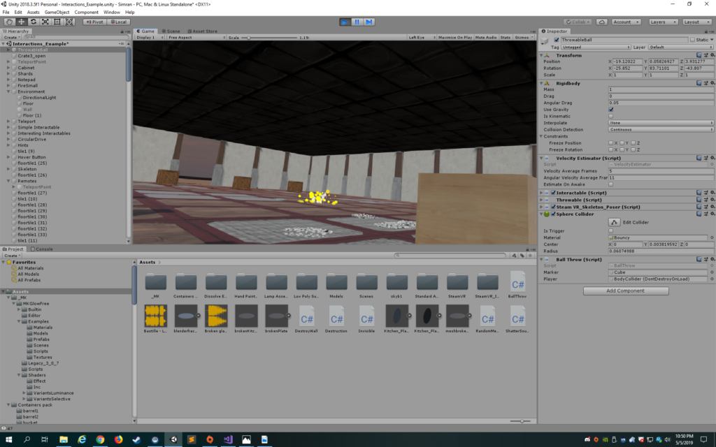
I had a fire in the middle of the room and when one threw a notebook in the fire, the notebook would dissolve. This was pretty dissatisfying and the fire looked weird, so I scrapped this almost immediately. An interaction that I felt sad destroying was the ball throwing. I really liked how if the player threw the ball in the box, a white line appeared, marking the site of a successful throw. I thought players would be excited to get the ball in from further away, but in comparison to the plate smashing, less satisfaction was derived from the ball interaction. Furthermore, the ball was just annoying to get inside the box and its bounciness differed too much from the rhythm of the plate smashing, so I had to scrap it, though I felt a bit sad doing so.
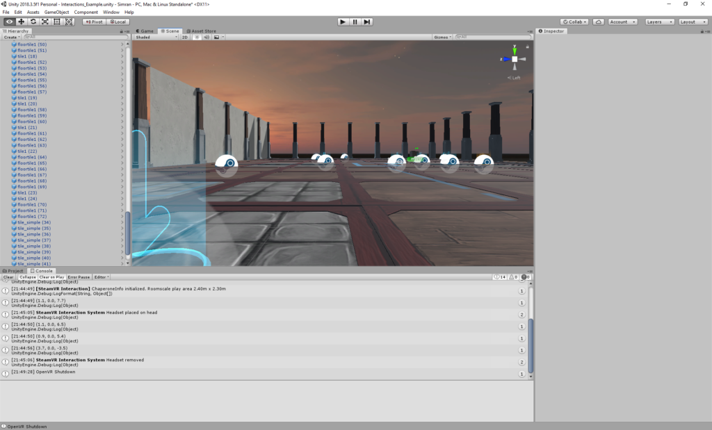
I began with a sunset skybox that was slightly dark with stars in the sky. I intended it to be spiritual, but playtesting revealed that it was really just spooky. I loved the aesthetic of it, but did believe I needed to have a more relieving feeling outside the room. I ended up creating an open sky so that there would be a more openness juxtaposed with the constraints of the room.
I found a cool hatchet in the asset store, so I decided to incorporate it into the experience. I thought it would be fun for the player to smash printers with it and break the printer into pieces. However, the breaking of the printers was into awkward clumps that I couldn’t seem to adjust no matter what in Blender. Thus, I decided to just destroy the printers and have an explosion, which I hoped would create a satisfying feeling.
Having a hatchet though added a specific affordance to the piece. In having access to a hatchet, the player would expect to be able to smash more things beyond the printer. Thus, I added the ability to destroy the walls…instead of having a partition for each interaction, I just split the walls evenly separated by columns. I tried to change the texture to crack the wall everytime it was hit with the ax to give it a stronger depth of experience and make the user feel more powerful, but it looked quite horrible as the crack was not at the site of collision. Thus, the wall was destroyed with each hit.
With the destroying of the walls, the sky looked quite open and I wanted to add something that contrasted with the interior of the room. Something that felt playful and nostalgic. I began with bubbles, but they felt too light. Clouds looked too bad. Then, I settled on balloons and ended up having bubbles blow out each time the balloon was popped just because I really like bubbles (I originally had a laser gun). I decided to replace the laser gun which felt too light with a bow and arrow because I remember how powerful I felt using the bow and arrow in the VR Maze experience during our class trip.
However, having balloons when the walls were opened up really contrasted with the remaining floor in the room and I also wanted to convey a sense of resolution to the player. I ended up switching the floor to white and removing the roof, creating a colorful marquis at the end and adding bright white particles that danced to the floor and changing the music. The combination of all this with the balloons conveyed a sense of nostalgic playfulness and magic.
I tried to make the logic of the space clear through the placement of objects. I tried to make the plates the first things the player saw so that they used their hands to pick them up and throw them. On the right, the hatchet was placed on a table, but the printers were on the floor so that the player knew not to try to pick them up. The longbows were placed on the ends of the room, one on each side so that the player could use them to pop the balloons.
In terms of music, the main background clip was an instrumental of Do I Wanna Know by Arctic Monkeys because it is quite pumped up and energetic but not overly intrusive. Listening to it makes me feel ready for anything. For the ending song, I chose a specific piano cover of Kygo’s Firestone because the song conveys a sense of happiness with a tinge of melancholia and is light in tone to contrast with the heaviness of the first song. I also tried to provide feedback to the user through sound. The shattering of the plates was accompanied by a glass shattering sound that I think contributed to the satisfaction of that interaction. Hitting the hatchet produced a thud sound. Popping the balloons also had a satisfying popping sound. Smashing the printers also produced an explosion sound, but to be honest, I wish I had used a shorter sound as the one I used was a bit too unnaturally long of an explosion for that specific collision.
Reflecting on the overall experience, I am proud of what I accomplished as a one person team. I really wanted to challenge myself to become more comfortable with Unity script, so I wanted to create interactions that didn’t necessarily rely on the SteamVR interactions (though I love the Throwable script. Makes life so much easier). I had a lot more scripting than my last project and feel quite comfortable now. I also really enjoyed hearing the positive user feedback at the showcase-no one noticed the bugs surprisingly. It was nice to hear a couple of people expressing how it was a stress relieving experience despite me not mentioning my objectives to them. Overall, I have a tendency to go off on tangents, which is great when trying new things creatively that improve your project or take it in a new direction, but it’s not so great when you divert too much off course that you end up breaking something. I broke my project so much I don’t know which branch is the real one. I also realized that because I don’t necessarily have clear objectives of what I want to accomplish, but rather just see what happens through the process, there’s never a finished state…there’s always more you can do.
There is definitely a lot of room for improvement. For one, I’d fix the buggy walls: the walls that just would not register a collision and break. I’d polish the design of the interior in terms of the objects in the room. I’d make the explosions smaller and closer to the site of collision. I’d improve the aesthetic of the instructions. I’d add the restart button. I’d fix the particles so they only started coming down during the ending.
Project 3 Documentation
Windows XPerience
By Junior Garcia and Juhee Noh
Development Blog: https://alternaterealities.nyuadim.com/2019/05/19/project-3-development-blog-2/
- Project Description: describe the space, the “storyness” it conveys, and the inter-relation between modes of interaction and the logic of the world.
As a kid, I was always fascinated by computers. How could they achieve tasks that are so inherently complex in a matter of seconds and with seamlessly little effort? Now that I am studying Computer Science, I know that every single computer-based task takes hours of algorithm design and coding implementation that breaks down the difficulty for the end-users. As such, I wanted to convey the difficulty of a computer-based task as simple as submitting an assignment through Gmail by taking full advantages of the features lent by Virtual Reality through the Unity Game Engine. In addition, I wanted to explore the idea of space, and how space is defined in a medium as nascent as Virtual Reality where the artists have a full range of control of the experience they want their audience to feel, see, listen, and fully engage in. As such, me and my partner Juhee decided to bring back a vintage piece of technology in Virtual Reality: the Windows XP computer. We want the users to feel enthralled by the space inside of a Windows XP computer, to enjoy the iconic green mountains laying against the beautiful blue sky. This scenery will be juxtaposed by the clock-ticking task of submitting an assignment via email. The user has to enter the computer, physically juggle through a bunch of documents that come from the folder icon to look for the assignment, enter google chrome, and submit the assignment. However, the former task is not as easy as expected as the internet connection is lost and our player must face the jumping dinosaur from Google Chrome. To submit the assignment, the user must kill the dinosaur with giant cactus. This allows for the mailbox to appear, where the user can submit the assignment and win the game.
Our project is a combination of a linear-storyline game with the abstractive storytelling of an iconic space. We hope that combining both elements will provide users with an experience that is both sensory satisfying and competitively fulfilling.
Originally, the theme we chose for this project is “close the door”. However, after implementing the project, we believe the scope of our theme expanded. The theme is touched upon when the internet connection is lost and the user is stuck in the Chrome environment with the dinosaur, with no escape other than to garner the courage to fight the dinosaur or succumb to their inevitable death. However, given the exploratory nature of our ideation process, the user can interpret the storyline the way they best see fit. Is the door really being closed after entering inside a computer or are we opening the door to a world where humans can live in a digital environment? Is the dinosaur a friend or a foe, acting out of spite towards an intruder or merely following the strings of ones and zeros that tell it to jump on top of every obstacle that lies in front of it? These are the questions we hope our users take with them, and we expect that our projects leave users with more questions than answers.
2. Process and Implementation: discuss how you built the space and design choices you or your group made. What did the brainstorming process involve? How did you go about defining the logic of this world? What were the steps to implementing the user’s role? Share images or sketches of visual inspiration or reference, including the storyboard/layout.
Idea Development:
Initially, our team was just excited to play with the idea of entering inside the Windows XP Environment. However, given the limitless provided by this idea, we relied heavily on several playtest sessions and feedback from different individuals in order to narrow the scope of our project to the point where it was playable, achievable, and entertaining enough.
Prototype for feedback generation:
Our initial prototype we relied for user-feedback and playtesting was composed of two scenes. One scene was just a monitor and that was interactable and the second scene was just a green terrain with three computer icons.
We partook in a total of 4 playtest sessions and one idea-critique session with our Professor Sarah Fay Krom. After the playtest sessions, we decided to use the task of submitting the assignment in order to give the users some form of direction in this highly exploitable world. The storyline after the playtest sessions was the following:
However, after talking with Sarah, we fixed several logical mishaps that were affecting our storyline. The first one was that the Google chrome Dinosaur signified lack of connection and it didn’t make senses that the user would get stuck in the internet after loosing against the dinosaur. The second one was that initially we wanted to kill the dinosaur with the assignment itself. Sarah recommended that we instead kill the dinosaur with the cactus as this is what happens in the real-life version of the game. We incorporated this two pieces of feedback into our ultimate version of our storyline:
Storyline
- User is in a room, the user clicks on computer
- The user is inside the Windows XP computer
- The user must get the assignment from the folder file
- The user must go to google chrome to submit the assignment
- The user is inside google chrome. The dinosaur approaches the user and attempts to jump on him/her. The user must grab the cactus to hit the dinosaur three times and kill it.
- If the user gets attacked by the dinosaur three times, then he is sent back to the initial room scene. Go back to step 1
- If the user attacks the dinosaur three times with the dinosaur, then the dinosaur disappears. Go to step 6
- Gmail icon appears and the user must put the assignment in the icon. Game ends
Technical Implementation
Scene Design:
All three scenes were placed in the world and the transform.position of the player was changed in order to bypass the issues provided by the Scene Manager in Unity. The initial scene was the monitor was located in was designed with the early 2000s look in order to match the old-look of the monitor. The 2nd scene was designed to emulate the Windows XP background, with mountains created by modifying the height of the terrain and the skybox changed with one found in the asset store that we believed best resembled the cloudiness and blueness of the Windows XP background. The third scene was a combination of a combat studio and the style of Google Chrome’s design. .We wanted to give the world an appearance similar to that of a combat studio because the user would be confronted, 1v1, with the dinosaur. As such, we went with a confined box environment, which creates the solitary, depredatory aura that we want the user to feel. We also decorated the box with Google Chrome’s iconic green, yellow, red and blue colours on the sides of the cube, with one side being the google chrome icon itself in order to let the user know where they are at all times. The entirety of the project was accompanied by the Windows XP startup music in order to fully encapsulate the user with the illusion of being trapped in a Windows XP computer.
Scripts
- Destroy Monitor: This script is attached to monitor in initial scene to ensure it is destroyed after the player is moved to the next scene.
- Mailbox Script: Script attached to the mailbox that ensures the game is restarted after the user wins the game by submitting the assignment to the mailbox
- Follow Target: Controls the behaviour of the dinosaur and ensures that the dinosaur follows the user by using the Vector3.Movetowards function. A force is added to the rigid body to simulate the jumping. And counters (namely “lives” and “hits”) are used to know the times the dinosaur is being hit.
Important code design in this script;
- Vector3.Movetoward: This function simplified my code immensely. It boils down a lot of the code that I did before to make the dinosaur follow the target as it literally makes the object follow the object with an incremental change in position after every frame and it also changes the rotation of the object so that it looks at the target.
- Rigidbody.addforce: Before, I was trying to literally hardcode the position the dinosaur had to be when it jumped, which seemed unnatural as the dinosaur would disappear and then appear somewhere in the air and then fall down. By setting the ForceMode to Impulse and determining the position in space you want the dinosaur to be after the jump, this line of code creates a natural jump of the object to the desired height.
- Quaternion. Euler: Something that was happening after the force was added to the rigidbody was that the dinosaur would move amongst its own axis in space. In order to stop this, I froze the rotation of the Game object using the quaternion.euler function in the Update function so that it remains in place within its own axis after every jump.
- Lives and hit counter: The lives and hit counters are an essential variable in the dinosaur that determines a lot of functionalities in my project. Whenever the number of hits is equal to the number of lives assigned to the dinosaur in the inspector, the mailbox appears. The mailbox then detects a collision between itself and the assignment to determine the win condition. This can be further appreciated in the mailbox script I attached to the mailbox.
- Coroutine and Delay function: I also learned about coroutines and implemented them in the script as well. I used them to cause a delay between every jump as the jumps were happening very frequently frame after frame. I also added the coroutine on the collision detection so that the number of hits between the dinosaur and the player was reduced as a lot of collisions were happening frame after frame too.
- Foldercoll: Script that instantiates papers and the assignment when the folder icon touches the ground.
- Sceneswap 2_1,scenesawp 2, and sceneswap: Changes the transform.position of the user whenever the user throws the monitor (scene 1 to scene 2) , the user puts the assignments in chrome(from scene 2 to scene 3). In scene swap 2 and 2_1, 2 detects a collision between assignment and chrome icon and sets the assignment collide boolean to true, which is then referenced be Sceneswap 2_1 to change the transform of the user to the next scene.
- Dino attack; Script that keeps track of the number of times the dinosaur attacks the player. If the lives are exhausted, the user loose and the game is restarted.
- Reflection/Evaluation: This should discuss your expectations and goals in the context of the what you felt was achieved with the finished piece.
All in all, the project succeeded in raising questions on the possibilities allowed by VR by allowing us, the designers of this world, to exploit the untethered territory of vintage technology by bringing it to life. We believe that this project was able to achieve its goal from an ideological perspective as it proved to spark questions and positive comments on every user we player tested it with. Indeed, most users started questioning the reason why they had to fight with the dinosaur. Others saw the dinosaur as an immediate threat as evidenced by their screams after they first had the majestic creature in sight. Others would just spend a couple of seconds enjoying the scenery of the Windows XP background. This was really fulfilling as we wanted each user to have a different experience when playing our game under the same assigned task of submitting the assignment and fighting the dinosaur. However, there are some technical bugs that need to be fixed:
- In chrome world, the assignment goes far away
In the hastiness of fighting the dinosaur with the cactus, some players would throw the assignment far away and wouldn’t be able to catch it after beating the dinosaur so they could win the game. Maybe adding teleportation would have solved this problem, in order to give the user more freedom of movement. Also, teleportation would have made the final fight scene against the dinosaur more exciting as the user could escape the dinosaur and fight it at the same time. This problem could have also been solved by adding box colliders to prevent the assignment from going beyond reach.
- The initial scene is too big
Scaling our scene was a big issue. When we made the scenes, they were done at a very small size, which also affected the gravity of our objects. Resizing all of the game objects to an appropriate Unity-unit size would have made the experience more enjoyable.
- Make a more robust, complete UI system
Definitely, the UI we implemented in our project wasn’t as complete as it could have been as we still needed to vocally guide users through our game despite the fact that we added the UI canvas with the instructions. Maybe incorporating audio feedback in every scene would have helped the users know what to do at every step in a more succinct manner.
In retrospect, this project was a nice way of culminating a semester long endeavor of exploring the possibilities brought forth by Virtual Reality and it empowered me to be an artist,designer, technological philosopher, and software engineer all at once.
theWardrobe. Documentation
Project Description:describe the space, the “storyness” it conveys, and the inter-relation between modes of interaction and the logic of the world.
The prompt that I decided to extend on was “close the door”, and the reason for choosing it was the idea of having doors as portals. When creating my projects “storyness”, I always kept the passing through the door as the middle, as a way to go from the beginning to the end.
THE STORY
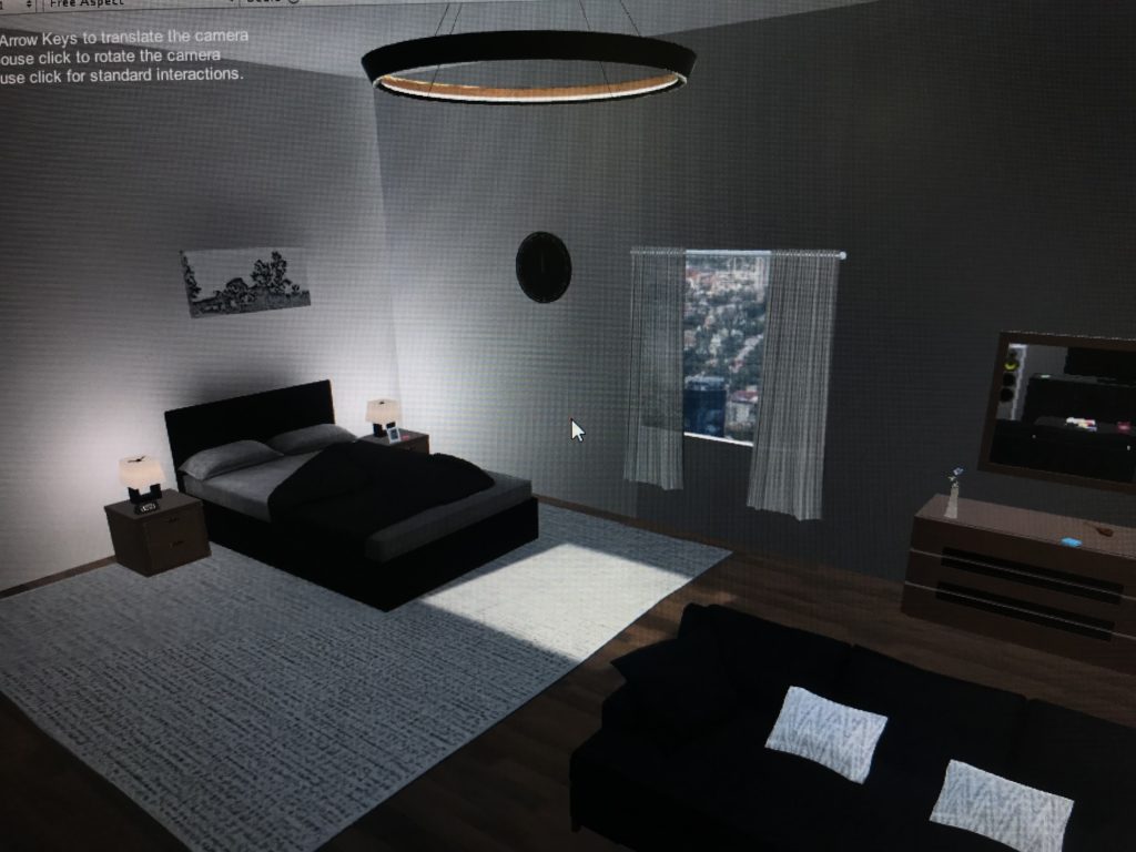
- You wake up in a room with no knowledge of who or what you are.
- Clues around the room written on post-its, posters, books assist (or remind) you of what you should do.
- Going through the wardrobe using the key, you get teleported to your spaceship, now taking your natural form (an extraterrestrial).
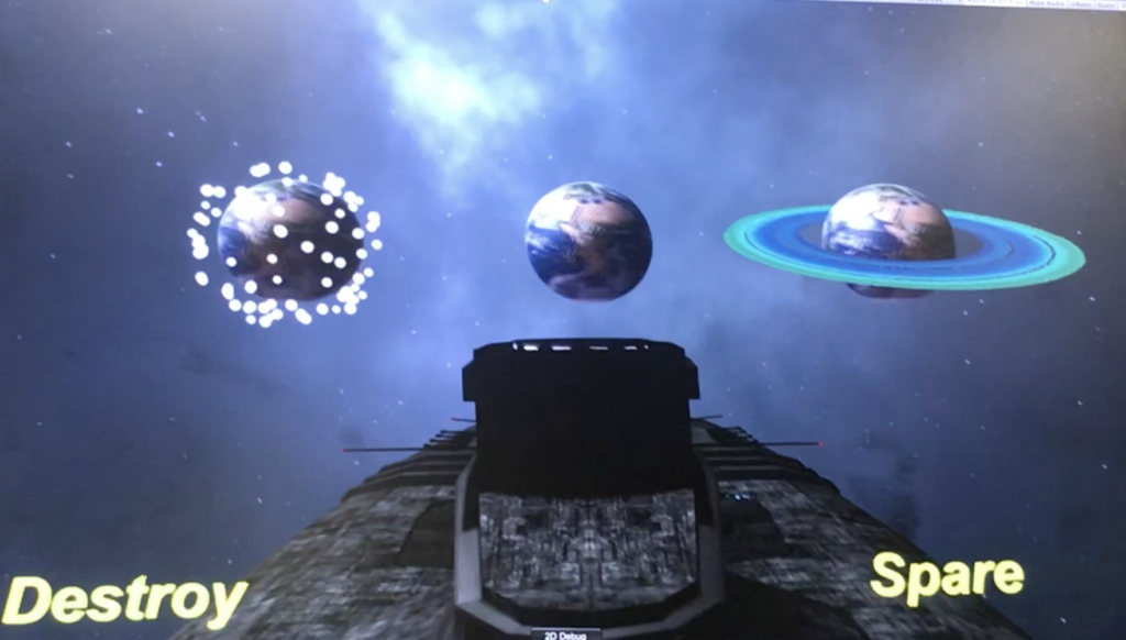
- You are presented with a choice of what you should do to the Earth you have left behind, Destroy or Spare.
- After choosing, a button appears and you move on to your next mission elsewhere.
Process and Implementation:discuss how you built the space and design choices you or your group made. What did the brainstorming process involve? How did you go about defining the logic of this world? What were the steps to implementing the user’s role? Share images or sketches of visual inspiration or reference, including the storyboard/layout.
I had a hard time choosing where the ending will be, I knew I wanted to start in an ordinary mundane room. And I wanted it to end in a location that would juxtapose that, but at the same time have the player be able to interact there as well. Because when I was play testing in the beginning, when the user would reach the second part their reactions would be “oh thats it?”, as if the clues in the room, the key, the leading up to the hidden door, all that climax was to something that did not satisfy. So deciding to make the location in Outer Space, with a busy, colorful, noisy environment achieved what I hoped to. And including even simple choices made the user feel like they had a mission, they accomplished something.
My projects inspiration mainly came from two ideas;
- Doors as portals; Narnia, Monsters Inc., Howls Moving Castle
- By this video I saw about how escape rooms are incorporated into a VR environment
Reflection/Evaluation:This should discuss your expectations and goals in the context of the what you felt was achieved with the finished piece.
This project was a great learning experience for me. In my two other projects, I didn’t really expose myself much to scripts and code writing. That made the beginning quite hard for me, but I was determined to use my resources to make what I had in my mind into the project space I have now.
I would often get carried away in the process, wanting to add more and more. Restricting myself from doing too much but at the same time letting myself be able to include what I saw as needed or fitting was important.
I’ve always had a special fondness for games that required the user to pay attention to the details to receive the “full experience”. I wanted to implement that ideology into my game; thus having every item in the room tailored specifically to bring more “story” to the story. I really enjoyed that part, creating details and seeing how different users catch up on different things.
Walkthrough
https://drive.google.com/file/d/1ON0vu3VS2NtIqVaRGOR7UMPtmfEMcjNo/view?usp=sharing
The IM Show footage
https://drive.google.com/drive/folders/1vkDYMsGLx4VgVP2DLWwTON-UWsPOWIyH?usp=sharing
I was debating before whether to put the hint on the UI canvas “Use the post its as clues” or not. I figured that since they stand out and are scattered around the room, they would act as the singular item that is constant. But I noticed I tended to tell users that post its are clues to use. Another thing was the issue with door #1, which required the pushing of a button. The issue was that when you’d press the button, the animation and sound would take a second, and that would prompt the user to press the button again. That makes the door open and then close. I noticed other users that would try the key at the first door, ignoring the button. So maybe if I put a label on top of the button to make it more obvious and to have the animation/sound start immediately it would fix that issue.
Project #3. Detoxification documentation.
Detoxification.
Goal of game:
The goal of the game is to gather ingredients on the list (which is generated randomly) and put the items into the cauldron to cure yourself from poison.
Was the goal met? Yes it was. The list is generated randomly each time the scene is started. 5 items of 34 are picked from the list using random number as an index to that list array. The game changes its state to won as soon as the items in the cauldron match the items in the winning list (with up to 5 mistakes possible).

Space description:
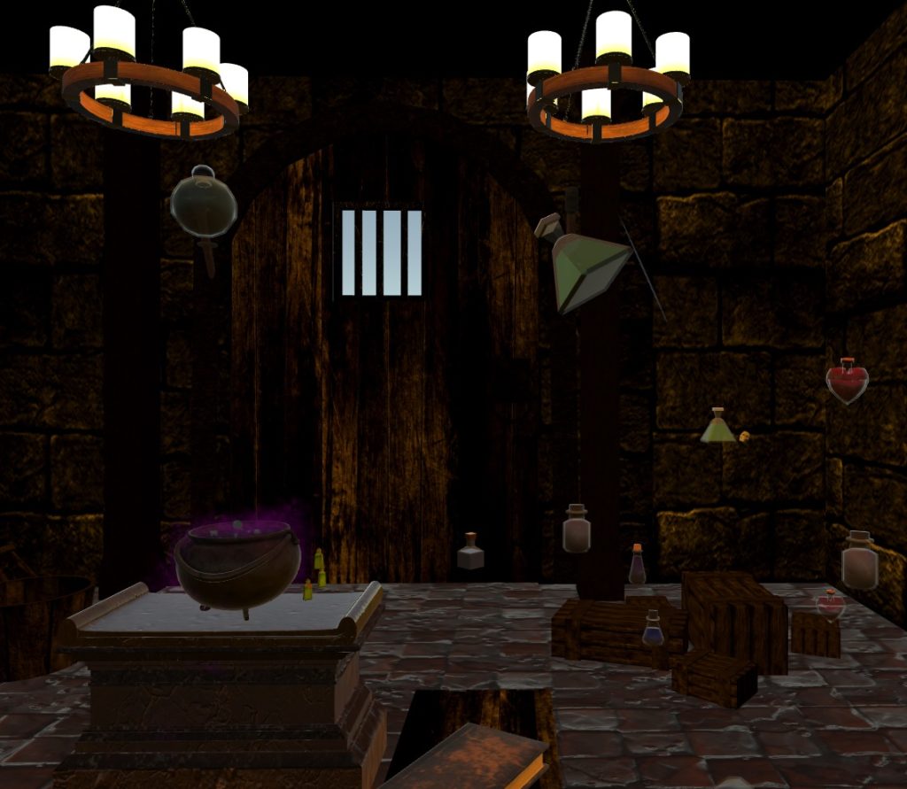
The space was a dungeon looking area, with random objects flying around like potions, skulls, books, cat statues and etc. In the middle of the room there was a sarcophagus with a cauldron on it.
Light:
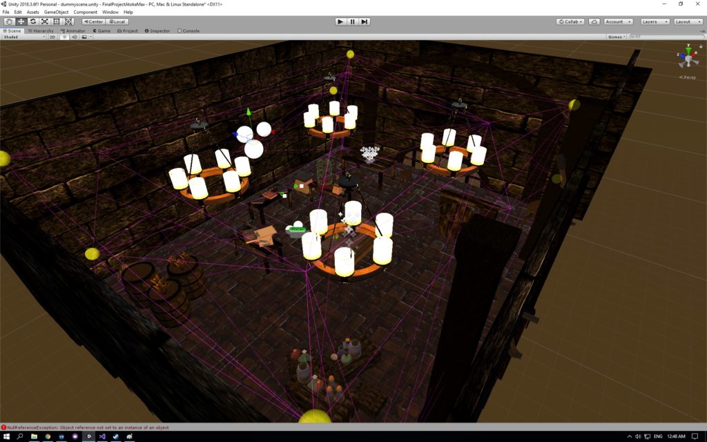
Light emission was used as the main source of light. None of the direct light sources was used. The emissive texture was placed on the chandeliers and the light probes were scattered around the room for the non-static objects to receive lights.
Process and implementation:
Since our topic was poison, we came up with the idea to make the user be poisoned and make him do an antidote. The initial expectations matched the result and we are extremely happy with that. It can be imagined like an escape room where the user has to meet the goals to escape.
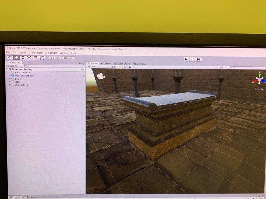
We started of with just placing a cauldron and and a sarcophagus in the middle of the room and tried writing the scripts.
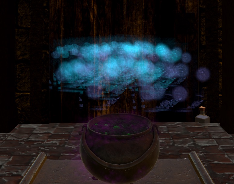
Then we added a collider inside of the cauldron to destroy the objects when they are collided.
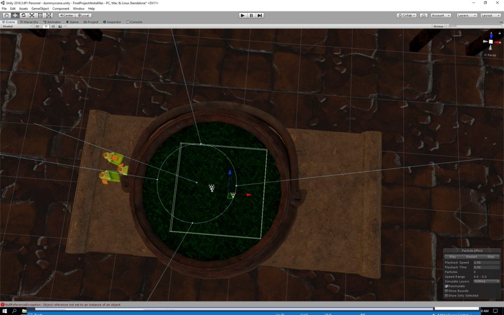
Afterwards we added the particle system to play on the collision with that object)destroyer collider

Then we added the list of object and made it randomize
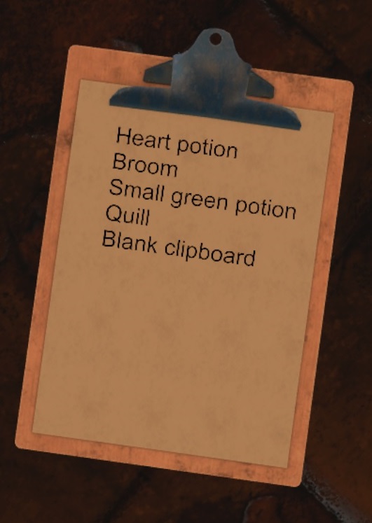
Later on we added the winning list and made sure the it is randomized each time and printed on the clipboard. We also made a list that keeps track of objects that are being put in the cauldron and the winning condition became true as soon as the winning list matched the items in the cauldron. Also sounds were added. The main sound was the ticking clock sound which made the user feel more pressured.

Reflection/Evaluation:
The goal of the game was to make the user to gather ingredients on the list (which is generated randomly) and put the items into the cauldron to cure yourself from poison. As can be seen above, the goal is met and the user feels pressured due to the ticking sound. As soon as the user meets the goal, it makes him/her feel free and continue, alive or dead it depends on how the game goes (: