Project 1 Documentation

1. Project Description

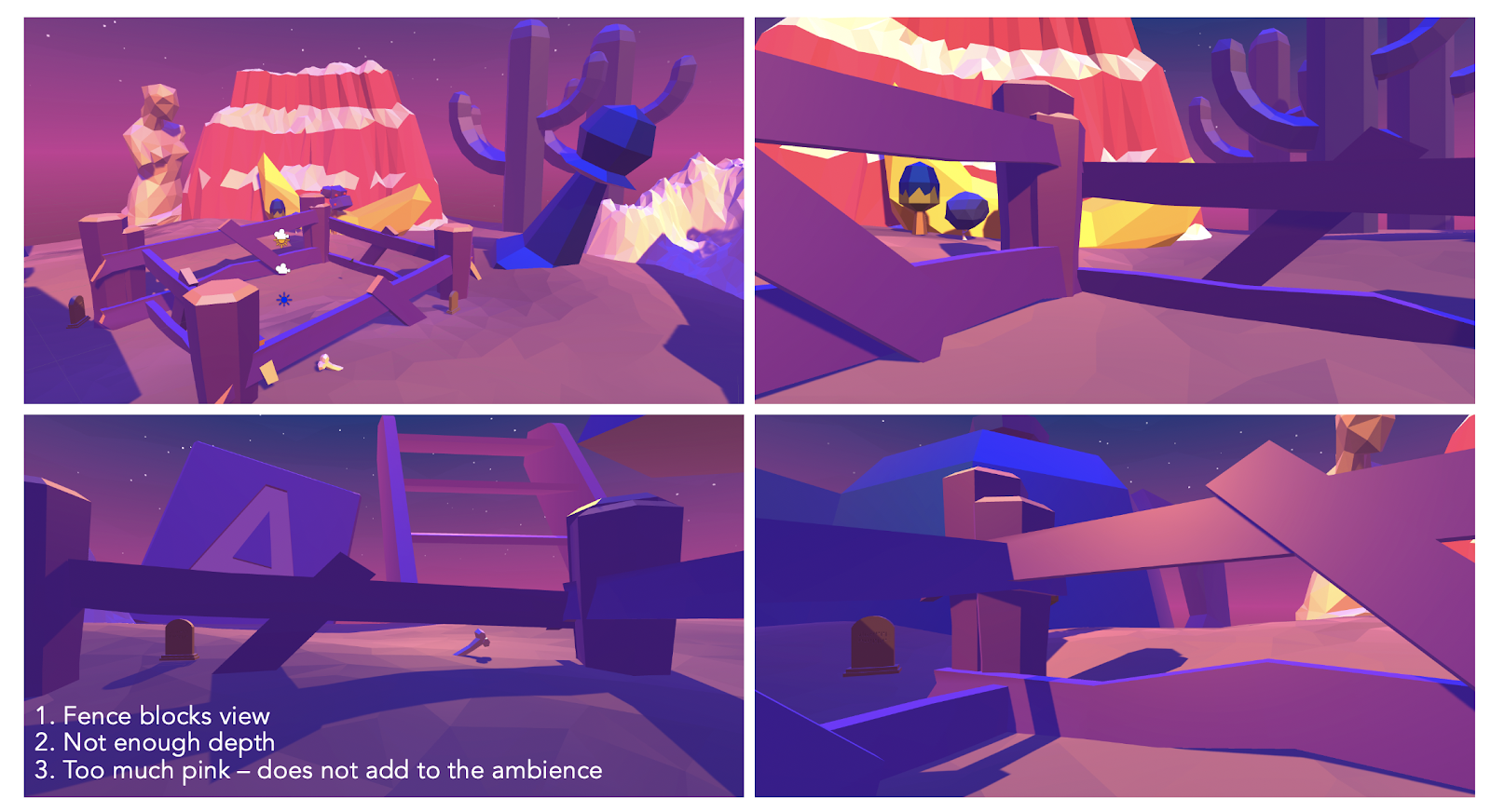
When I started brainstorming ideas about the environment I would create for Project 1, I realized that I wanted to make something realistic-looking but with a hint of enhancement. I had recently watched the movie “Once Upon a Time in Hollywood” and was very amazed with its scenography. The scenes were beautifully set and very atmospheric, and I decided that I would like to recreate a scene inspired by the movie. A vision that I had in mind from the very beginning was a late 1960s Hollywood street with palm trees surrounding the street from both sides, retro cars on the road, some diners and motels on the sides and an endless desert in the background during a beautiful pink-toned sunset. The identity that I was striving for is dreamy, tranquil and deserted. In the finished project the camera’s point of view is in the middle of a street that stretches far into the desert. Palm trees densely surround the street from both sides. There are no cars or buildings, thus enhancing the deserted mood of my environment. Emphasis is put on the sunset, its lighting and colors.

*

2. Process and Implementation

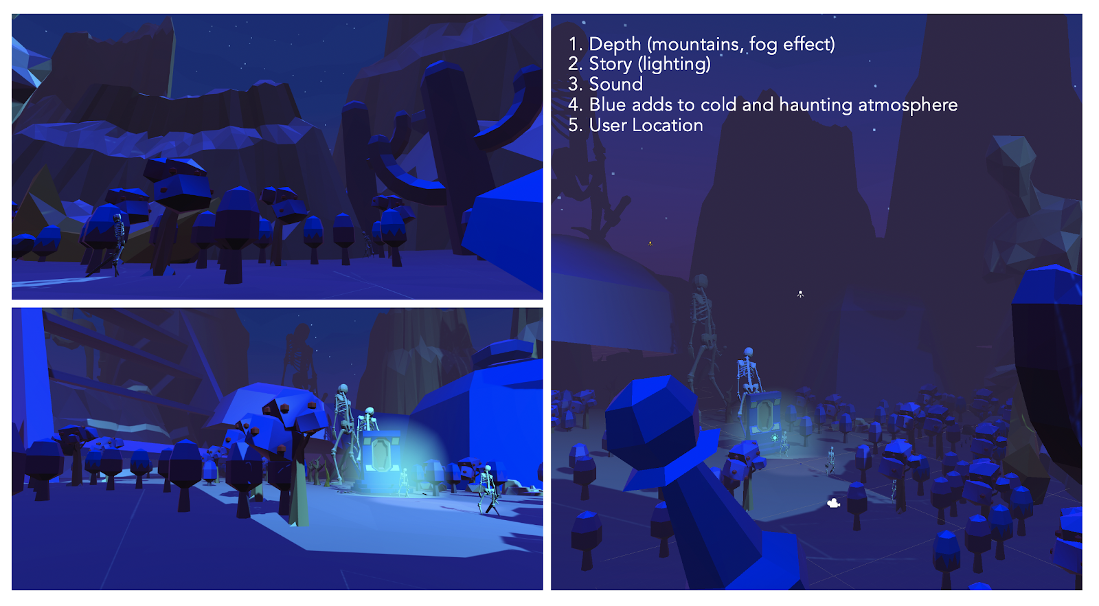
The process of creating this project started with looking for suitable assets for my environment. The road was an integral part of my scene, therefore I spent some time looking for the most realistic-looking road asset. Instead of having a ready-made road I found an asset that allows to draw a road on a terrain, thus being able to change its width and curvature. After struggling for a bit with making this asset work, I eventually tried out many different shapes of the road to see which one encompassed the feel of my identity the most. I placed the camera in the middle of the road to maximize the view on the surroundings. I created a vast desert on the sides of the road by using the terrain tool in Unity and applying a sand texture to it. I then placed palm trees alongside the road, alternating different types of trees to make them look more natural. The trickiest part of the project was creating the lighting and colors of a sunset. This was the part where I wanted to go for a more unrealistic feel and have very bright sunset colors that look more enhanced than during a real-life sunset. I found a skybox which I liked conceptually (the angle of the setting sun and the clouds), however, I wasn’t convinced with the colors and I wanted to change them. After meeting with Sarah, I learned that I could change the coloring of the skybox in Photoshop, thus I experimented quite a lot with the color palette that I wanted the sunset sky to have. I especially emphasized the pink and the purple colors. After changing the colors of the skybox I also experimented with the environmental lighting in the scene and added two directional lights. One of them is placed closer to the end of the road that is nearer to the sun and that directional light is a yellowish white color. I chose that color because during a sunset there is sometimes a ray of the last sunlight peeking through the clouds and illuminating the ground. I wanted to recreate that feeling by placing a directional light and illuminating the road for one last bit, as well as casting a shadow on the road coming from the palm trees. The other directional light acts from the opposite side of the road and is a darker color – a pink. This light emphasizes the pink ambience of the scene and makes the other side of the sunset look a bit darker. The environmental lighting is also pink to emphasize the pink feeling coming from the atmospheric clouds.

*

I think that playing with the colors and enhancing them made my world into an alternate world, as it was the only more unrealistic aspect. I wanted to create an environment where one could feel like they can escape to a dreamy sunset and experience colors that they haven’t seen in the real world. Also, the road is eerily empty which only happens in very remote areas. I think this also adds a layer to my alternate reality because usually there is more traffic on roads, therefore my world suggests a more deserted feeling.

*

The composition of the areas in view was carefully chosen to represent a real-life scene of a road that is situated in the middle of a desert with palm trees on the side. I wanted the user to feel like there is really nothing else in the scene except for the road and the desert on the sides. However, the colors of the sunset are captivating enough to make the user not feel scared but rather calm and peaceful.

moodboard that I created for inspiration
storyboard of my envisioned environment
the road asset & terrain with applied and texture
palm tree assets
the interactor’s point of view towards the setting sun
the opposite side of the road which is in more shadows
left side view – vast palm trees and vast desert
top view
right side view

3. Reflection/Evaluation

I think that the implementation reflects my intended identity, and when being in my environment I feel similarly as what I had imagined while brainstorming ideas in the beginning. What helps my environment to achieve the identity goal is that my environment is located in the middle of the desert with no other living beings or objects around, therefore creating a deserted feeling. The colors of the setting sun hopefully cause the user to feel a tranquil and dreamy feeling and I associate these colors and clouds with something peaceful and safe. Compared to the initial storyboards of my environment, the end result is quite similar, however, not completely the same, as I didn’t include some of the envisioned assets like retro cars and buildings. At first, I had imagined the scene to be filled with more objects, but I was also thinking a lot in terms of the mood and feeling that one would feel while being in my environment. I wanted the mood to be mainly created and emphasized by the sunset, the desert, the road and the palm trees, thus I think that I managed to achieve the mood I was aiming for in my end result.

*

Lastly, the medium that we worked in was advantageous because Unity allowed to easily manipulate objects in the scene – change their position, change their size, change their color, etc. Therefore, many different versions of the same thing could be created to see which one fits and looks the best. However, in my case, the end result was a build for the computer screen, therefore, it didn’t feel quite realistic when looking at it because there was a notable separation between the environment and the person interacting with it. I would like to also build my project for either Google Cardboard or a VR headset to see whether the environment feels more capturing in that medium.

Project 1 Documentation

Project Description

1.1 – Inspiration and Direction

The environment which I tried to create for this assignment was centered around the theme of disproportionate objects. Primarily inspired by the works of the Russian surrealist, Vitaly Urzhumov, I wanted to create a landscape composed of objects that were either bigger or smaller than their average size. Through the abnormal sizes of the objects, I wanted to initially provoke a sense of confusion for the user. However, as seen in Urzhumov’s works, although the sizes are not normal, he makes sure to maintain balance in all other aspects of the work such as the side-objects (the tree in the first work, the man and cloud in the second, the mountains in the third), the lighting, the landscape, etc. He does this to set the emphasis on the few objects that are out of proportion. If he were to make everything disproportionate, there would be no focal point and the world will not be visually appealing to the eye of the viewer. I was inspired by these particular aspects of Urzhumov’s work.

1.2 – Environment and Identity

Environment: 

Surreal Landscape consisting of Disproportionate Everyday Objects

Identity: 

The identity of the user is a person who stumbles across this landscape. To achieve this, I made sure to avoid making the user the obvious center of the terrain. The user was placed under a shaded area, behind a few trees. The main scene of the space is the portal and skeletons, illuminated with green light. This ensures that the user does not feel like the world was created for them – rather, they have coincidentally stumbled across an already existing scene. 

1.3 – Design Goals

For this project, I had a couple of design goals I wanted to achieve:


1. Limited Use of Color: 

I wanted to limit the user of color I used for the scene. As the style I was going for was more surrealist – less realism – I also wanted to express this through the choice of colors. I was inspired by an ios game which I played a couple of years back, called Monument Valley. I wanted to adapt the same approach where there are only two to three colors – very bright but pastel. Limiting the colors leads to a more creative adaptation of the different range of tints and tones of the color. I also wanted the main directional light to be an unconventional color which dominates the scene and walls of the objects.


2. Light / Shadow: 

Inspired by the talk on the development of Kentucky Route Zero, I learnt how light and shadow can provide various functions. Particularly, their ability to create a focal point without the user of sound or words, seemed to be such a subtle way to naturally bring attention of the user and communicate what objects were of higher significance, and vice versa. I wanted to make use of this functionality in my project.


3. Depth: 

Looking at various indie games during the brainstorming stage, I learnt that depth – created through layering of objects, fog, lighting – was an essential feature of making a space seem believable. I wanted to make sure to implement depth in my landscape so the user could not sense where the end of the terrain was. 


4. Objects Proportion:

Inspired by Urzhumov’s works, I wanted to make sure to magnify some objects, while keeping the other objects in normal proportion to reinforce the effect and not overwhelm the user. 


5. Consistency in Object Style

To make a scene appear consistent and believable, I thought it was very important to keep the styles of the objects consistent as well. As I needed to use many objects, I decided to stick with low-poly resource packs to increase my options.

Process and Implementation

2.1 – First Build

For the first build, although the Howl’s Moving Castle idea was scrapped, I still wanted to incorporate the aspect of two main spaces – internal (where the player will be located in) and an external space. Although surrounded by a foreign and surreal environment, I want to recreate a sense of coziness through enclosing the user within an internal space. Having these ideas in mind, I started working on my unity file. I decided to go with a cold shade of pink (#CC00FF) and ultramarine (#3300FF). These colors were chosen through playing around with the color options of the directional light on unity.

As seen in the previous surrealist art pieces, I took prefabs of ordinary objects – those small enough to be held with a person’s hand – and blew them out of proportion. I placed these objects within the terrain, through burying their roots, giving a sense of an abandoned landscape. Although I increased the size of most objects, I made the sizes of the trees and hills realistic to emphasize and highlight the absurd proportions of the other objects.

To construct an internal space, I used the fence prefab object and surrounded the 360 camera with it, giving an illusion of being protected. I also placed grave stones and skeletons right outside the parameters of the fence to give the fence significance and to provide a sense of fear towards the outer environment.

2.2 – First Build Limitations

Some primary limitations of build 1 that were taken into consideration when constructing build 2:

  1. Fence: The size of the fence was very big to make the user seem smaller. However, it blocked a significant portion of the background. The effect was not worth the blocking and creation of internal space. 
  2. Not Enough Depth: Due to the lack of objects in the background and fog, it is very obvious where the terrain ends.
  3. Too much pink: Although pink was pleasing to see aesthetically, it seemed like it did not serve any purpose other than the visual appeal. I wanted to maximize the potential of using colors for emotional effect as well.

2.3 – Second Build

Changes that have been made since build 1. These are the main changes:

  1. Depth (mountains, fog effect):

One limitation from the first build was the lack of depth. Due to this, it was very obvious that objects only existed within the parameters surrounding the user. To solve this issue, I added a fog effect, to make the background blend in a more subtle manner. I also layered more objects and filled with empty spaces with objects to remove the filling of emptiness. The overall size of the terrain was also increased to provide more space for objects in the background.

2. Story (lighting)

One aspect lacking was a story. I had a clear image of the world, but no clear narrative for the user and their identity. An idea of the story came to me during the development process. I got feedback that the bones mentioned in the previous build were not easily identifiable as bones. 

Hence, I downloaded a resource pack of a skeleton to replace the bone. While playing with the skeleton, I was also trying to make an escape portal from this alternate world. Combining these two aspects, instead of an escape portal for the user, I decided to give the portal a function – one where if objects go through it, it magnifies (giving more narrative and reason behind the disproportionate world).

3. User Location

Initially, the player was located in the middle of the terrain – again, this made it seem like the world was built for the user which I did not like. Instead of the user, I placed the portal and the skeletons in the middle of the terrain, darkened the overall lighting of the scene, and placed a luminous green light around the scene to bring attention to it and indicate that this was the focal point.

The user was relocated to the side, under the shadows and behind some trees, to make it seem like they were hiding under the shadows witnessing a haunting scene. Through this relocation, they no longer became the focal point of the world. Rather, a spectator who stumbled across this world.

4. Sound

I added the sound of an empty room (which actually has a sound) and placed it under the camera rig. I also added portal sound effects and placed it on the portal to add to the atmosphere.

5. Blue adds to cold and haunting atmosphere

The previous build was very pink. I liked the visuals of it, and enjoyed playing around with different tones and tints of pink, but it did not really add to the atmosphere I was intended to create. Hence, I changed the color to a colder one – blue, to give it a haunting atmosphere. This suited the new narrative more.

There are many more little changes made since the previous builds but the ones above are the most significant.


Reflection and Evaluation 

Do you feel the implementation reflects the identity you intended? In what way?

The most important aspect of the work, which was making the objects disproportionate, was followed and achieved, it seems like that aspect of the identity was clearly reflected in the world I created. Also, the change which I have made in between the two builds – particularly the color change from pink to a colder blue – seemed to aid in achieving the effect of being lost in an unknown world. Changing the user location from center to the side, under the shade, seemed to have contributed significantly in achieving this identity and effect. Hence, I think many of the changes made for build 2 were essential in creating a more accurate depiction of the identity I intended.

How did the end result compare to what you envisioned?

The main components – such as the magnified everyday objects – seemed to align with my original vision. But, the implementation of a storyline – the skeletons and the portal – were ideas which came during the development process through playing around with the prefabs. After the implementation however, it seems like that became almost the focal point and a very significant part of the scene which provides context and a potential reason for the way the world is. This seems to increase the user presence in the scene. 

How would you evaluate the medium for being able to render this kind of environment?

Working on this project made me realize the lack of limitations in using VR as a medium of implementing my vision. As it gives the developer to customize a 360 view of a scene, it is very similar to the way in which we view the real world. The act of looking around alone is a significant part of what makes VR an immersive and powerful tool for creating a place. Due to the 3 dimensional nature of the space, compared to 2D space, it seemed to have many more possibilities. Especially since my project dealt with size, more specifically the alteration of it, the extra z-axis contributed significantly in providing a larger surface to place and move around objects. The specific incorporation of sound into objects was another key component to increasing presence to the scene. Even in a very quiet room, there is always sound at low frequency. It is rare to come across a completely noiseless scene. For my scene, I incorporated the sound of an empty room, and a portal sound to add to the atmosphere. Even with the lack of movement and interaction, except looking around the 360 degree view, it seemed, there were enough properties – lighting, proportion, colors, depth, etc – to create a presence. Through this project, I learnt that it is not necessarily the complexity that matters as much as perfecting these fundamental properties in constructing a place – something to keep in mind moving forward with future projects. I also realized through the process of having more than one build, the importance of having enough time and flexibility to alter ideas in between builds as these changes in development process are equally important and significant. Many of the changes and additions I made in between builds have become an integral part of the scene – the portal, skeleton, color change, etc. This taught me alot about the nature of the development process and to always give myself more time than planned to work on the project to allow these changes. 

Link to Final Build: https://drive.google.com/open?id=1970tL91_xtHvKijMk0bQVuJPqfQTTcDQ

Documentation – Project 1: Psychedelia

Project Description

Entitled “Psychedelia,” my first project is a 3D environment built with Unity. The viewer can look around the environment by moving around the mouse. Drawing a lot of inspiration from psychedelic art, I intended the environment to evoke a psychedelic, surreal, dark, dizzy, and even suffocating feel.

Demo of “Psychedelia”

What the viewer will first see is the television right in front of them starting to play a music video upside-down. Then they should realize that they are located on a round, isolated platform that sits in the middle of an extremely dim room filled with dark pink liquid. As they start to look around the platform, they will notice the checkerboard-patterned dance floor, a palm tree lighted up with funny colors, and a green armchair. Farther surroundings include some cars, trees, an airplane, and a huge disco ball drowned in water. In the darkened background there are some mountains and walls covered by a glitchy image.

Process and Implementation

For this project, there are a few things I specifically worked on to realize the identity of psychedelia, which I will address in different parts of this section:

  • Colors/patterns
  • Lighting/shadows
  • Themed elements

The first thing I did to bring my imagination of psychedelia to life is making a storyboard to present the basic idea of the environment I wanted to create, as shown below.

I used black and white striped patterns to emphasize the dizziness they bring. The colors, on the other hand, are all bright ones and clash with each other so that they evoke a surrealistic feel.

Then I started to implement things in Unity. Above is what the enviroment first looked like. I changed the disco dance floor into a checkerboard because the former didn’t look good as expected, while the latter is about equivalent to a black and white striped pattern. I also found a water asset online that automatically generates waves and turned it pink.

I soon realized that even after I deleted the directional light existing by default, the light given out by the sky box kept the whole scene lighted up, which hindered the darkness I was going for. Therefore, I built walls and ceiling to make it an enclosed space, but within the walls it was still quite bright. By playing with directional light, I found out that rather than deleting it, adjusting its angle helps change the brightness of the environment, and a 188° directional light gave me just the right amount of brightness to design my own lighting.

Coming back to the focal point of the environment, lighting upon the island consists of six spot lights. Two of them are main ones that cast red and blue light respectively on either side of the island, creating a contrast that the viewer can notice instantly as they change angles. The other four spot lights surround the palm tree and cast the shadows of its leaves all over the island and the surface of water.

As a result, the palm tree is illuminated with a bunch of different colors.

After that I began working on the surroundings. I thought carefully about what to add to the scene to help with the psychedelic identity, and finally settled on two sets of objects (themed elements): one would appear more realistic, while the other would enhance the surrealistic aspect. Together they would distort the viewer’s perception of how realistic this reality is.

“Realistic” elements

The realistic set of objects includes some trees, cars, and an airplane, which are elements with a sense of everyday life. These objects not only added layers to the scene, so that it looks deeper from the viewer’s point of view, but also complemented the lighting. Under lighting of different colors, the trees contribute to darkening the atmosphere.

“Surrealistic” elements

The surrealistic set of objects, on the other hand, includes the striped pattern on the walls, the psychedelic-style mountains, two disco balls, as well as the island itself. Disco ball presents a sense of clubbing/intoxication/hallucination and is reflective like mirrors, which would add to the lighting structure of the environment. Meanwhile, the palm tree encourages the viewer to look up, to not only see the disco ball overhead but also explore outside of the horizontal view.

Moreover, in this part I kind of “cheated” by inserting videos to achieve the dizziness I wanted. Besides the music video played on the television, there are videos of a glitchy screen playing on the walls and the mountains. Even on the checkerboard dance floor, I added a video of disco lights revolving slowly to accompany the rhythm that the water movement produced.

The video played on the television is a music video of the song “‘Cause I’m a Man” by Tame Impala. The video has been a great inspiration for this project, and therefore I paid homage by integrating it into the project itself, which acted as great background music at the same time.

Everything combined looks like this:

Reflection/Evaluation

In fact, psychedelia as the identity for an alternate reality is already interesting, because psychedelia itself refers to the experience of altered consciousness. Personally, I am satisfied with how the project turned out to reflect my initial idea of psychedelia, especially how the distinction between presence and immersion is also somewhat reflected here. The colors, patterns, lighting, and surroundings of the environment are all part of creating the immersion, while the television is a means of presenting presence to the viewer. Since looking around is the only interaction allowed here, there is not much that can be done to promote the sense of participation; nonetheless, stopping to watch the television becomes something that the viewer can do, besides looking around, in the alternate reality.

From another perspective, I am content with how the final product embodies psychedelia both visually and musically, sometimes blurring the line between the two. Psychedelia itself can refer to a genre of music – the music I used in this project falls within that category. More importantly, during presentation in class, Vince pointed out the “rhythm” within the environment created by the water movement. Together with the revolving disco lights and glitchy videos, they act as a visual presentation of the music. And don’t forget that while the viewer is looking around the environment, they themselves are also revolving with it. They become a part of their very own psychedelic experience.

Project 1 “Wonderland Syndrome” – Documentation

Project Description

In this project, I decided to recreate a cartoon scene from my favorite childhood movie “Alice in Wonderland”. With the hope to alternate reality into a more cartoon-alike world, I wanted to focus on the specific scene when Alice meets the Cheshire Cat. This scene would be similar to the one in this Youtube video. In this one, the Cheshire Cat is the symbol of mystery and magic while Alice’s experience, in my opinion, would be described as confused, lost, and uncertain. Those are also the main identity I chose as the main guide during the development of the project. Please find the APK and Project File of the project here.

Final sketch of the project

Even though the final result of the project slightly diverged from what I intended to create, it still reflects the identity that I want to bring into the whole scene. The scene is a long path in a forest where two sides of the path are completely opposite. One side is full of trees and bright fireflies, which reflects a positive sense (1), while, on the other side, it is full of darkness, dead trees scattered along the path and a few tombs lit up by the mysterious blue light (2). By doing so, I hope the users would experience complete opposition when turning around and see the scenes. While feeling triggered to explore the scary side, they would be conflicting when deciding whether they should choose the safer side.

Process and Implementation

I worked on the project for a whole week. Since I never had any prior experience in IM and Unity, it took me quite a lot of time to understand how Unity works and how to use basic Unity functions and to find assets for the project. Since the Cheshire Cat asset was too difficult to find or recreate, I decided to remove the cat while aiming to keep the identity as previously mentioned.

I started by laying out the path. Since I could not find any asset that has the right shape I wanted for the path, I decided to create the path manually by putting the cubes of decreasing size towards two ends of the path. The decrease in the size of the path also reflects the depth, which implies the continuity of the path beyond the scope of my scene. 

First layout of the path

After finishing the path, I put a few mountains in the scene and trees for side (1). Though the process was repetitive, I changed the space among the trees and rotated the trees so they look different to each other and reflect a sense of forests where trees are never equally spaced. After that, I added fireflies of different sizes and different distances from the viewing point. For these fireflies, I chose a strong yellow-green color for them to create a sense of liveliness and brightness. 

On the other side (2), I went for a completely opposite layout. At first, I only added the dead trees are scattered with a darker color towards the horizon. I also added two colorful posts to explicitly indicate the border between two concepts. However, after finishing laying out the trees, I felt that it was empty and did not reflect the identity I wanted to create. The posts were too much of unnecessity while I could implicitly demonstrate the opposition by the contrast among the objects themselves. Therefore, I decided to remove the posts, added mountains far away and a few more tombs lit up by the mysterious blue color.

On the road where it was too flat, I added a few rocks to imply a sense of obstacle. With the attempt to make the user feel even more lonely in such a remote place, I added the sound of wind into the project. I believe that this addition will make the experience even more real for the users and enhance the immersion in the cartoon scene.

Side (1) of the path which reflects the sense of brightness and safety
Side (2) of the path which reflects the sense of mystery and fear
More of the bright side
Towards the darker side

Finally, I worked on the lighting of the objects and the directional light. In the beginning, the lighting was too bright that it did not fit with the night setting in the scene. Hence, I changed it to a much darker lighting to fit with the situation and did not realize that it was too dark. This is the biggest issue in my project as I did not realize that the lighting of my own laptop screen could affect how I fixed the light, thus changing the lighting from what I actually thought I set for the scene. Although I discovered the problem at the very end after presenting my project, I want to learn properly how the lighting works in this case and the proper way to set the lighting in the future. The lighting for the moon and the fireflies works well in the scene. The emission effect and the shadow effect of the trees create the immersion for the scene and make it more of a 3D space.

The lighting was too bright in the beginning that it did not fit with the night setting

Reflection/Evaluation

I hope that for the user experience, my project evokes a sense of confusion, conflict, and a bit of mystery while alternating the reality into a cartoon scene of “Alice in Wonderland.” The project is a great learning experience for me with great help and feedback from Professor Sarah Krom throughout the whole development process. It, though not close to the original scene I wanted, reflects the identity I hope to create. I also come to learn that small details such as shadow can bring such a huge difference in the make user experience more real. I wish I could have added a few more movements in the scene to make it more immersive, such as the movement of the fireflies. I have not seen my project on an Android phone with Google cardboard and look forward to the experience and learning the differences on PC and on Android.

Project 1: Lost in Cyber City

Description

Walking in a modern metropolis, do you find yourself “lost” in the big city sometimes? On one hand, one can literally get lost among the streets downtown since the buildings and street furniture are often similar and constructed in a unified pattern. On the other hand, at least for me, once in a while I would get struck by a sense of loneliness when wandering in the street and having no clue about where to go. I think this feeling of getting lost is partially invoked by the imposing buildings around us. They are so tall and magnificent that their very existence blocks our view of the sky and our imagination about the rest of the world. Therefore, in this project I choose to build a grandiose environment and try to convey the feeling of getting lost around the buildings.

For this project, I intend to imitate the streets of the big city while constructing it in a cyberpunk style. Cyberpunk strikes me as “high tech, low life” and the existence of every single human being is trivial compared with advanced technology and hyper-urbanized landscape. It resonates with the identity that I want to achieve. From my point of view, reminding people of how small they are in this virtual space is one important factor for the sense of “grandiose” identity. Thus, I use the architecture of cyberpunk skyscrapers as a critical feature of my environment.

Overall view of the whole environment

Process and Implementation

  • Views of Audience

The most important view in my environment is the view of a street and the skyscraper one can see at the end of the street. The street is very narrow and the buildings are close to each other to make it overwhelming for the audience. The ascending height of the buildings is leading one’s view to gradually look upwards. If the audience is equipped with a VR device, he/she will have to look up very hard to see the top of the skyscraper.

Whole view the street and the skyscraper from the bottom

As for other views when the audience turns around, I think it would be boring to see similar street scenes. After all, I want to keep some imagination about the outside world. Therefore, I make it possible for the audience to look further beyond the city by placing the camera at the top of a lower house. From this view (View A), the audience would realize that the city is isolated in the middle of the sea. I intend to blur the division between land and sea and thus block the audience’s view of the land boundary with several houses.

View A is set to be the first view of the audience when the environment is launched and there are no tall buildings in this scene. I design it this way so that when the audience explores the whole environment, there is a contrast between the first impression and the actual vibe. In View A, one has a wide view of the mountains in the distance and even the skyline. However, in View B, one could hardly see the sky and sunset but only see the buildings at a very close distance. In View C, the last glimmer of twilight disappears and the audience could only see the imposing skyscrapers.


View A: The first view of audience when app is launched
View B: View of the street and the tallest skyscraper from camera
View C: Looking upwards to see the top of skyscrapers
Top view (circled is the position of the camera)
  • Lighting Settings

For the skybox of my environment, each of the two below has its merits. They both have a dark color theme (the sunset skybox is mainly dark with twilight around skyline). I like the dark theme a lot because the skyscrapers seem to extend endlessly to the further sky against the dark background. With the cloudy night skybox, the sea seems more realistic since the water (as a 3D object) blends in with the background. However, eventually I choose the sunset skybox because of the contrast effect mentioned above.


For the environment reflections, they usually come with skybox packages. But the skybox that I choose doesn’t include reflection, so I try to choose a suitable one from another package. At last, I choose Reflection 3 as it matches best with the skybox with a cool tone. The dark reflection on the glass creates a feeling that there are more tall buildings on the opposite side (although actually there are no tall buildings on that side).


Feedback and Reflection

In general, to highlight the grandiose architecture, I focus on the contrast between a) depths of views; b) heights of buildings; c) color themes of different altitudes. According to several user tests, I get the feedback that the contrast between the first view and other views with tall building works well. Initially, I want the mountains to be further from the audience so that the contrast between depths of view could be stronger. However, it seems that Unity only renders scenes and objects in a limited scope. I tried to add fogs in the distance to increase the depth of the view but I couldn’t get volumetric fogs working.

The skyscrapers are grandiose and imposing enough to achieve the identity that I intended. The color theme of the skybox and the environment also contributes to the lonely, lost feeling. But the twilight of the skybox seems a bit too bright. Sarah suggests that I edit it in software like Photoshop since it has nothing to do with the light source in the environment. Moreover, to strengthen the lost feeling, I think I could add some fog effect to the whole environment. Raindrops on the road is one of my attempts to create a cool and humid vibe but I think there are other lighting settings to help create that feeling as well.

Project 1 – Documentation

For my first project I decided to create an environment that is isolated from everything, so the identity I was going for was something desolate. The inspiration for my project was loosely based upon my trip to Ethiopia, where my friends and I went stargazing. That was the first time I saw so many stars in my life, unfortunately I couldn’t capture that moment, since the quality of the photo was very bad, and after reading the description of the first project, I decided to make something similar, so people could experience the feeling I had on that day. In one hand the place that we went to for stargazing was very beautiful, however on the other side, it was very scary, since it was at night and very far from the city.

Image 1: inspiration
Image 2: inspiration

“You can find yourself in the middle of nowhere – or in the middle of nowhere you can find yourself” – This phrase seems to capture the sentiment of so many people. After reading this phrase I came to the idea of making “in the middle of nowhere” place with a lot of stars and mountains.

If we take closer look at the first part of the phrase, “You can find yourself in the middle of nowhere”, we may feel like we are in a place that is very far from the usual landmarks, surrounding may feel empty, abandoned and desolate. And the second part of the phrase, “Or in the middle of nowhere you can find yourself”, we may feel something totally different. When you find yourself in an empty and desolate place, you have the opportunity of experiencing new insights about yourself and who you are, with an option of retreating yourself.

Being in this new place “in the middle of nowhere” seems like traveling to a different place. The contrast between you, your life and the environment I have created, gives you opportunities to make new changes, insights, perspectives and awareness’s. The shift between space and timing that occurs when you enter a new place, actually allows you to jump to a new vision of yourself. 

My project is about a person who is trapped in his own world and everyday he gets sucked deeper and deeper into it. The further he is in, the more he feels alone. No people, no animals, nothing, only him and the sound of inner function of his body as he is becoming lost in the middle of nowhere. The main components of my project are stars, that I downloaded from assets store and the sound that I have mixed, using different inner body sounds in LogicPro software. Also, the other important thing to mention is that, I added post process layer, and was playing around with bloom, depth of field and chromatic aberration effects. The post process layer applied full-screen effects to a camera which completely changed the vibe of the environment, luckily in a good way. 

Throughout the project I have experimented with a variety of things. At the beginning, I started with making a terrain and adding palm trees and rivers, however, after getting feedbacks from friends I decided to get rid of them, and just leave the mountains and stars.

Image 3
Image 4
Image 5
Image 6

From various photos you can observe that the place is completely full of mountains and stars that the reflection you can see everywhere. The first thing that the viewer sees is very dark and huge mountains and then when he turns left or right, he could see all the beautiness I have created and at the same time would have the feeling of being isolated from everyone and everything. The most challenging part was building a terrain and finding a perfect spot to locate the camera, in order for the viewer to be able to experience the vibe that I was going for, looking from one dark side that the only thing the viewer sees are mountains and then moving around and observing the environment. 

Image 7: First view
Image 8: Left side view
Image 9: back view from center
Image 10: entire view

During test sessions, it was interesting to observe how for some people the environment felt like a meditation place, with all the bright colors, where they could just go and focus on their selves, where no one else is there, only you, your thoughts and the sound of your inner body parts. However, for other people, the environment felt as a scary place, in which they would just go crazy, since they are alone, in the middle of nowhere. 

Looking back, I definitely feel that the implementation fits perfectly the identity I was going for, it evokes the sense of isolated place, no people, no animals, only you and inner function sound of your body. Though in my initial idea I had palm trees and river, I am actually happy that I got rid of them, and made the place with stars, mountains and sound. Overall, I am very proud of the environment I have created in such a short period of time. Most importantly, I feel that I successfully made a vibe of the “desolate” place that I have been working on. 

How Would a Response in VR Seem Intelligent

In Krueger’s Responsive Environments paper, he argued that in order for an interactive medium to respond intelligently, “it must know as much as possible about what the participant is doing”. It is important for the computing machine to obtain as much multi-sensory information about users inputs as possible to use its algorithmic process to produce a corresponding response. The way in which the medium responds also reflects its intelligence, be it to the users’ position, velocity, or a change of shape.

Expanding that concept into VR environments, I believe that collecting users inputs in great resolution and accuracy is imperative to intelligent responses. Users inputs here can be headset position, rotation, velocity, and acceleration. They can also be from the controllers (all the data mentioned above, plus click detection, drag detection…). For more premium VR headset that employs spatial tracking, users’ position inside and outside of the environment can be utilized.

One potential possibility that promise to be a game changer is the ability to track users’ eyes, which opens infinitely many doors for novel interaction and responses as this mimics how we visually perceive in real life. One example for an intelligent response with regards to eyes tracking is foveated rendering. Foveated rendering uses algorithmic processing to render areas where the user is looking at at a higher resolution than the periphery (which will be blurrier), which produces a more realistic VR environment while saving bandwidth, thus achieving a faster response time. As users move their eyes around, the focal area changes accordingly in a timely manner, thus an intelligent response.

Project 1 Documentation

Golden, Silver or Wood?

Project Description

Once upon a time, a man had a tree branch which looked common but was left by his mother. One day he accidentally lost the tree branch in water and found himself somehow trapped on a little island. Then he came across a water god who found three tree branches for him, among which one is golden, one is silver and another one is ordinary. And it was the time for him to make a choice.

I made this story as the background for my alternate world and it was adapted from a traditional myth. The identity I want to show is mysterious fantasy with uncertainty. It should raise the curiosity, look explorable but feel abnormal at some point. I would say it’s not a fancy and harmless fairy tale, but somewhere that can have potential dangers or unknown results.

Process and Implementation

I firstly created the terrain and built the water surface with online assets. But to increase the immersive feeling, I also tried to fill up the space above. So I made the 3D model of a group of clouds in Rhino and then imported them into Unity. I decided to apply water material to them as well. In this case, the floating clouds can also be viewed as bubbles, which can indicate the unrealistic and alternate part of the environment. And it also raised the question that whether it is on a piece of real land or in an underwater world.

Besides the model of clouds, I also made this human face model to represent the water god role in my alternate world. It is in low poly and I still applied the water material to match his identity. Since it would be boring if it’s simply static, I modified the material and changed parameters to separate parts of his face, which makes him more dynamic and vivid as a floatable and abstract god figure. I made this face super big compared with other elements, so that he can be emphasized in the whole scene and it also indicates the god power is beyond imagination. Moreover, the face doesn’t look benign and I did this on purpose to make the whole thing less harmless.

Clouds model
3D Model built in Rhino
Unity Project Screenshot

To create a spacious view with spatiality, I tried to make the plants relatively small than the landscape and also played around the field view of the camera a lot. However with a larger field view, there will be more easily distorted view at the corner when rotating the camera. So I changed back the camera view to normal. One more detail about the plants is the contradiction between the two islands, where one is full of withered plants while the other is more vividly growing. It’s one more setting I made aimed to make the world feel tricky and abnormal.

the withered side
the vivid side

For the three tree branches, I picked the tree branch model and applied three different materials. I also added emission to make themselves glow a little bit. To further highlight them, I made three glowing water spheres to wrap them. To decide the position of these three spheres took me a while. Initially I placed them in front of the god in a row, but I found it would cover part of the god face and look disconnected in the scene. So I then placed them surrounding the camera in three directions. In this case, when the camera rotates, there can always be one of them as a main object in the field view. I believe can add to mystery and raise some curiosity.

Golden
Silver
Wood
Initial Arrangement — a row
Final Arrangement — a triangle

As for the skybox, I meant to make the surroundings dark with the only strong light behind the god face. And the light look extremely strong when the user faces the god directly. And it functions similarly as the exaggerated size of god face. Also I manipulated the directional light mainly to make the environment dark but some building details still visible.

Lastly, since my water is very dynamically floating, so I think adding some audio can help strengthen the immersive feeling. So there’s also some peaceful water floating sound in the background.

Unity Project Screenshot
water with real-time reflection

Reflection

The final result is very close to my initial assumption, since when I look around, the mixed feelings include the desire to explore, the hesitation to break the current peace, the slight fear to face the water god directly and the joy to enjoy the appealing fantasy. I don’t have much curiosity because I know what’s going on here, but from user experience testing, people will always be curious for the first time. I think these feelings can match the identity I set because fantasy brings delight and joy while uncertainty brings fear and suspect. However, since I have a lot of real-time reflection in my project and it takes time to render, when I open the file on PC, it would be awkward to turn around because the views change slowly. But I assume the reader on Android phone with Google Cardboard can be much better and smoother. 

Reaction: Response As A Medium

Response acts as a medium to create a predictable and consistent relationship between humans and computers. Krueger suggests that this interaction is, in itself, a new medium of art, comprised of input data received through sensors, cameras, etc., rules designed by the artist which process this information, and an output reflecting these rules and the input. The many steps required to design and implement this relationship are what Krueger views as the medium, as artists in the field are forced to think about how people will engage with the piece. For Krueger, response as a medium is not focused on the output, or visual and auditory responses from the computer, he even argues that this might distract from the relationship between human and computer. He argues that it is rather this relationship which is the primary component of this medium.

The reason why this is a medium in itself is because of its ability to make viewers participating actors in pieces of art. Furthermore, the artist maintains some distance from the piece, providing the rules, systems and creative vision for its operation, but potentially “relinquishing total control” as the piece is experienced and used by people. This contrasts with previous mediums of art, as viewers become users, using their body to influence the piece, and artists are unable to assert their creative vision as strongly as they once did. 

Final Documentation: A Walk In The Forest

Project Folder

Project Description

A Walk in the Forest is an immersive, 360 experience created in Unity. The experience takes the user into a temperate forest on a cloudy day at sundown. The project is stationary, allowing the user to look around from a position at the bank of a lake, with two bodies of land connected by a wooden bridge across the lake. The experience also utilizes sound to make the environment more immersive, with sounds of light wind, water lapping against the shore and noises of birds and insects. A Walk in the Forest is an attempt to make a realistic forest environment in Unity, using the terrain tool and various assets to provide great detail to the user’s surroundings. 

Brainstorming 

The inspiration behind this project was the city that I grew up in, Baguio City, in the Philippines. The city is located nearly a mile above sea level and is characterized by its tall pines and cool weather. My affinity to forests served as the primary inspiration for this project. Another inspiration for the project came from my experiences in Europe during J-Term, walking in forested areas and parks in Germany. This served s inspiration for this project because I had not experienced a proper winter climate prior to this, and found the empty winter forests beautiful. 

Image result for baguio city pine forest
Pine trees in Baguio City

I have always appreciated how forests have made me feel, and I often found it relaxing to walk in the forest when I need to relax or reflect. Because of this, I was inspired to push myself to create a VR experience that was as close to a real-life experience as possible. I wanted the environment to be relaxing but also have a certain distance from the user, as if the forest had its own indifferent aura, with its ebbs and flows not being impacted by the viewer. I have always found this indifference of nature relaxing, as the environment would remain the same regardless of my current mood and thoughts. I have also always enjoyed being around rivers and lakes, with their constant movement and rhythm being similar to the indifference of nature I wrote about above.

I started off by creating a map of an aerial view of what I thought this could look like. I decided to add the bridge to make this environment more approachable, and later a bench placed close to the camera. These decisions were made in a deliberate attempt to make the environment more approachable, as if a part of a longer walk taken by the user in this experience. Below are also two sketches of that I thought the views would look like.

Process

With Sarah’s advice, I started familiarizing myself with the terrain tool to create the landscape. This was fairly easy to do, but the difficult part was making the terrain look realistic. I was not sure what paint textures to use to make it realistic, and was unsure about what combinations of dirt, gravel and grass would allow me to do this. The other issue was the trees I would use. I was able to find an asset pack that allowed me to edit trees and their number of branches, leaves, etc. but I found it difficult to achieve the effect of the barren, leafless forest I envisioned because the trees started to all look very similar to one another. I decided to change the trees to tall conifers instead. I also decided to place the camera at the bank of the river, and a trail leading uphill from where it is. This was deliberate to make it seem like the user had walked down the path to where they are standing by the bank of the river.

I used many assets apart from the trees, using rocks, tree stumps and fallen trees and a bench to make the environment as realistic as possible. I created the bridge through wooden planks using cube game objects.

Lastly, I wanted to make the scene slightly dim, to accomplish the effect of it taking place on a cloudy day. I used post processing to add ambient occlusion and color filters, which did allow me to accomplish the effect of a darker, cloudy day. I also used a particle system to add some light fog, and also found a skybox for a setting sun on a cloudy day.

I wanted to build the project to my Android phone for viewing in the Google Cardboard, but unfortunately, the scene was split in half when it would play on my phone. After trying to change the orientation in the build settings, nothing would change the split in the screen.

View split in the Google Cardboard

Screenshots from the scene:

Final Reflections:

Overall, I am happy with the project but I am still bothered by me wishing I could make the scene look more like a forest in real-life. For the following projects I want to look into how I can accomplish more realistic graphics using all the tools in Unity. I still have no idea what I will do for these projects but I realized how powerful Unity is and how much more I can do to the environments to make them truly immersive and engaging.

I really enjoyed this project because it made me think about how I arrange objects in scenes with purpose to contribute to an engaging experience. Although I still have a lot to learn, thinking about why I would place things in a location deeper than what my intuition would tell me was a challenge and a valuable experience.