Documentation [Cursed]

Documentation

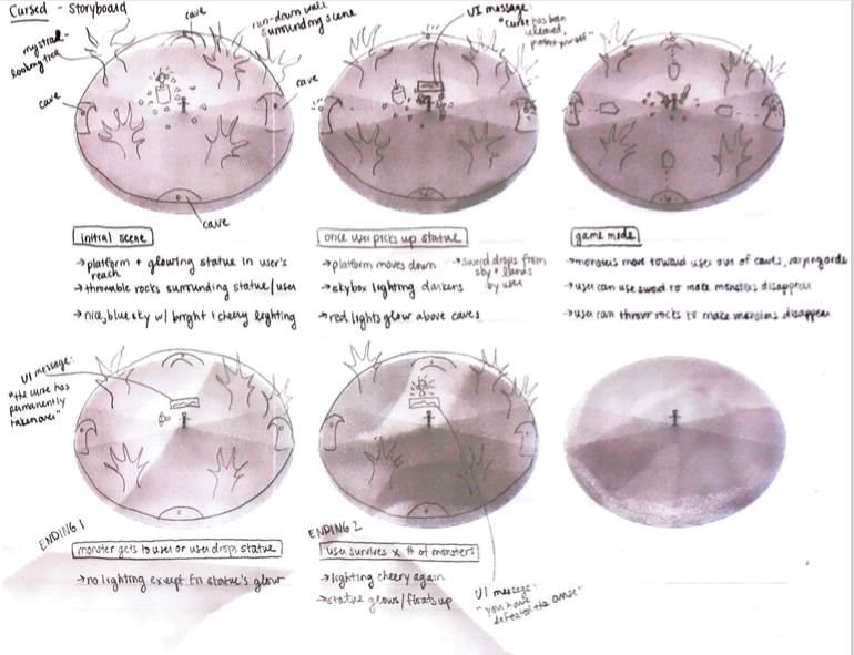
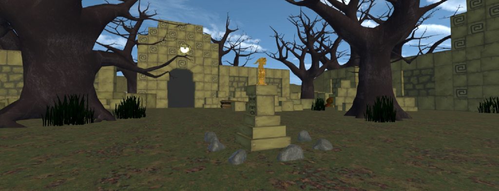
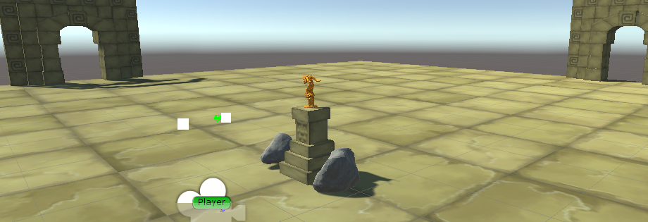
The initial scene where the player is placed does not give any direct instruction but suggests a certain behavior (fig.1). There is a statue on a podium that seems very attractive to pick up but there is no voice or direction to actually do so. This lets the player have full control of when do initiate the game; a voice with instruction, background music, sword dropping, and monster spawning all only start once the player has decided to pick up the statue. This design makes the player feel like they are the origin of the story to come because all the chain of action only started with their own action. Once the player has picked up the statue they are told to protect the curse within from those that want to release it. By giving the player an explanation of what they have just done, it gives them a goal for the story ahead as well as a better understanding of what is to come. The rest of the virtually reality experience, including the logic of the world and the interactions the player is capable of, then continues to play wholly off the premise of protecting the statue.
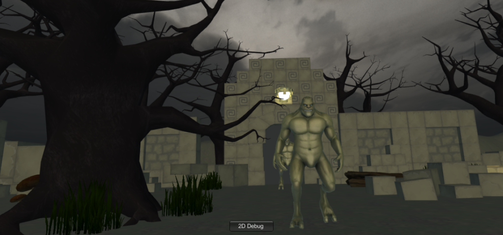
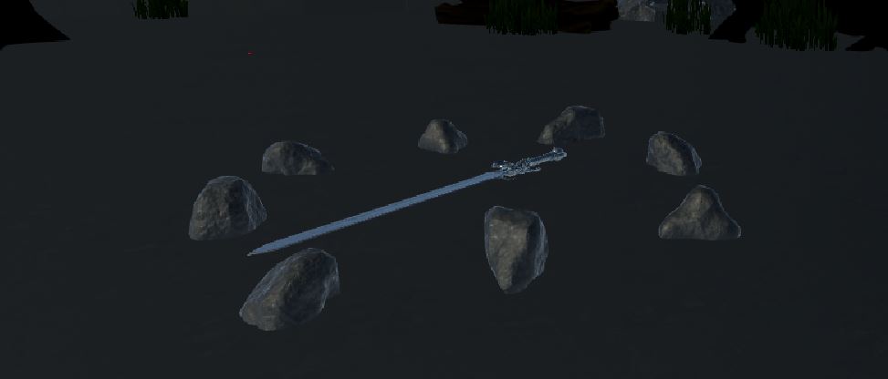
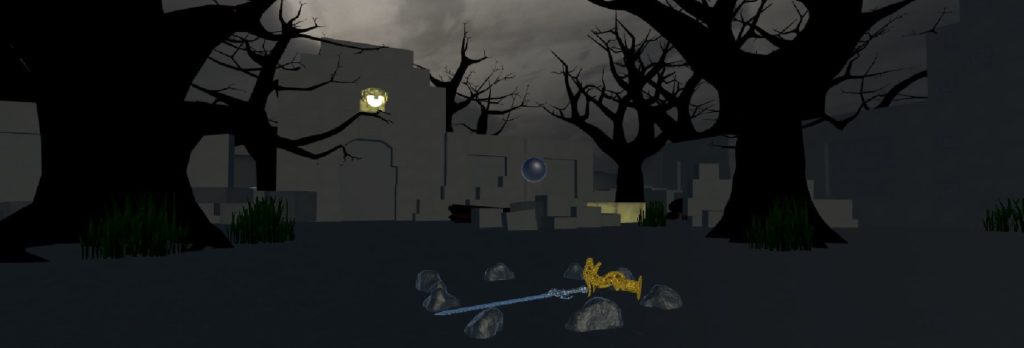
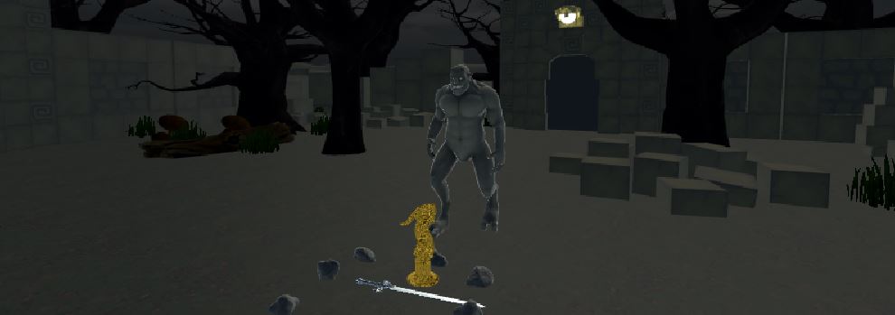
The spawning of monsters as well as the dropping of the sword from the sky make sense in the world because it is a situation in which the player can protect the statue from those that want the curse released. If the player drops the statue the logic also agrees because the statue was broken when I touched the floor. The player has the opportunity to either defeat monsters that appear using long range stone throws or short range sword swings (fig.2). If the player is capable of protecting the statue from enough monsters, by killing enough, then the curse is cured and the statue disappears from the player’s hand and the surroundings become bright and peacefulness is restored. On the other hand, if the player fails to protect the statue, the surroundings become dark and grim and the player is given a possibility to go back into the past and retry in protecting the statue by grabbing a mystical orb. Giving a change in scenery along with two possibly endings to the narratives convinces the player that their actions had a consequence on the world and they either succeeded in curing their mistake or failed in protecting the world.
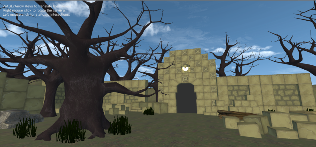
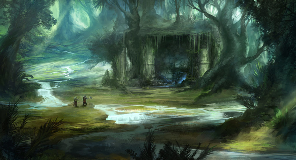
Since we knew that our game was going to be fundamentally based on the spawning of monsters randomly from four directions, in order to use the VR world to its fullest, I started the development of the game by making a rough design of the area. I placed the player in the middle of the world and placed from gates out of which the monsters were going to spawn (fig.3). Once I had the monsters spawning and moving to the player correctly I then added in the remaining features. The next part to come were the method to destroy the monsters, meaning the sword and stones, then came the logic of the world. The logic meant the detection of winning and losing conditions as well as respawning of weapons or deaths of monsters. The environment was built in independently of the logic because they didn’t necessarily interact with the logic directly. We knew that the environment and game mechanics were going to follow the foundations of games and scenes we had previously seen so we had a good framework for our development. The environment was largely based on the idea of Indiana Jones and the classic old ruins and temple scenes seen in movies and games (fig.4) while the game mechanics were mostly based on simple hack-and-slash games (fig.5).
We wanted to make sure the player felt a sense of urgency for the actions that they made so we implemented several features that enforced such emotions. Surrounding the player with monsters from all sides and having them spawn at random imposed panic and stress. Changes in scene, which only occurred with a certain action taking place, occurred alongside a change in sound and lighting which also imposed awareness on the player (fig.6). Making the player realize that their actions actually have an effect on their surroundings both made the player feel more immersed and responsible for what they have done. A successful game in my opinion is one in which a player feels like they have done something, thus having truly experienced something, after they are done. Our collection of features and plotlines were all created with the goal of giving the player a purpose and reason for something they have done and have to do.
With the goal of giving of giving the player a new experience, possibly fundamentally based on panic and fear for an action they have caused, a successful result should be obvious. We expected players to be a bit frightful when playing the game and to want to continue until they have won. This meant that when they played the game we wanted them to be making certain actions displaying panic or fear, such as backing away, screaming, constantly looking around, crouching or determination. Not only was there a desire to impose emotions but we also wanted the final piece that was reflective of an obvious narrative, this meant having a beginning, middle, and end. Our final project did indeed succeed in both of these aspect, players would scream and be afraid of monsters and would also know if they lost of won. Another unexpected result that occurred sometimes with players was that they would continuously attempt new ways of winning, whether this meant switching the hand the statue was in or relying solely on stones or a sword, if they lost often. This result showed that players were indeed determined to win and since they were human, and intelligently wanted to adapt, they would try and find the best method to win. All in all, our final product has replay value and makes players feel like they have gone through an experience, which is fundamentally all we wanted and that means a successful project (fig.7).
Project #3 Documentation

Project Description

MemoryBox is an immersive experience for people to explore the love story buried in one’s memory. The aim is for users to interact with objects in the environment, and form their own understanding of the story based on how they interpret the hint they get from the scene. The experience was set inside someone’s memory, and user, upon they entered the scene, would have the choice of deciding whether they want to hear the female version or the male version of the story. After they make the choice, they enter an empty wedding scene inside the memory, and there are multiple daily objects and a cardboard box on the red carpet. Users will be instructed to pick up the objects, and put them into the box in pairs. There are five pairs of objects, the voiceovers triggered by which, when organized in order, make up a whole story, and one single object, which is supposed to be the “leftover” and the end of the story. However, the order in which user puts objects into the box does not matter, because we wanted to provide the users with freedom to interpret the story and blend in their own imagination. When all the objects are put into the box, the box will disappear, indicating that this story is erased from the memory.

Process and Implementation

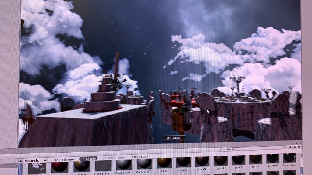
The tasks were divided into two parts: environment and interaction. Initially I made a prototype to test out whether the pairing of the objects we chose make sense to the user. However, we failed to find prefabs for some of the objects we wanted, such as passport and flight ticket, and we had to modify the storyline a bit based on what kind of prefabs we were able to find. After having all the objects placed in our environment, we felt like rather than situating the scene in an abstract environment, a more realistic scene will make the interactions more intuitive for the user, so we decided to use the wedding scene as our environment. For the skybox, we used a skybox for a city at first. Then during the play testing, people said they were distracted by the skybox a bit and were really focusing on the details. Thus we decided to change the skybox to a more abstract one, which could at the same time strengthen the dreaminess of our scene.

our scene with skybox of city view
our scene with skybox of nebula

My main task was to make the objects in our scene interactable, and to trigger different effects. By adding the interactable script and the throwable script to each object, and checking collision between the paired objects, I could attach the story pieces accordingly. When positioning the objects, I made sure that everything is placed within the play area, so that user can definitely reach the objects by walking around, which makes the experience of cleaning up and pairing up objects more real. Then during the play testing, we found that players might want to through objects away, and by doing so, they will never be able to get them back. To address that problem, I added a box that is the same size of the play area and made it transparent. Then by making the box collider as “isTrigger”, I checked whether the object stayed within the box. If not, I will reset the position of the object to its original position.

Then when Vivian and I was testing the game, we thought it is weird that the game does not have an ending scene. We initially thought about adding an animation of the box closing, when every object are put into the box and paired up. However, since the prefab we found for the cardboard box cannot be animated, we decided to make the box disappear, and have some visual effects when all the story pieces had been played. And for the first scene, as we planned, I set up a menu that allows user to choose which side of the story they want to hear about, and there’s also an instruction on the menu. The instruction was made “unclear” by purpose, so the user kind of know there task is to pair up objects, but do not know what they will see and what will actually happen in the scene.

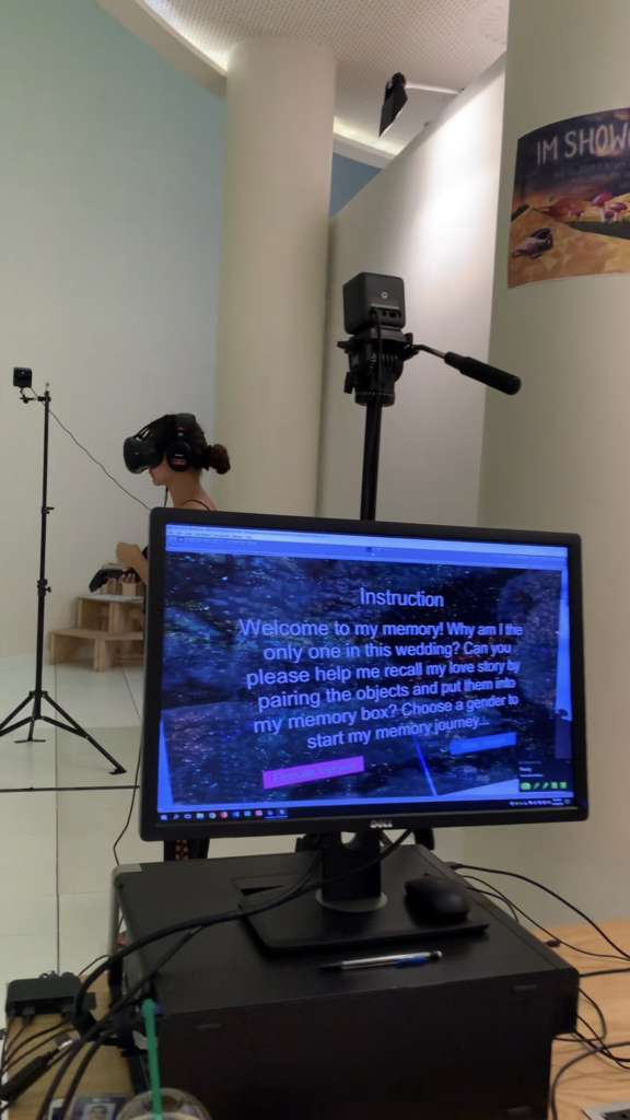
Here’s some videos of people playing with our project during the IM showcase.

Reflection/Evaluation

Two main takeaways from this project:

  • Details matter. Most of the issues I had during the process were due to my ignorance of details. For example, in order to make an object to be movable, the box says “static” should be unchecked.
  • User do not always read the instructions. Even if we did more that three rounds of user testing and made adjustments to our project based on the feedback, our project was still kind of “hacked” during the showcase. This is true for all the IM projects I have made in the past: users can always interact with your project in an unexpected way. User testing is really really important.

I liked the idea of our project, but I hope if we have chance in the future, we can turn it into something more than an interactable love story. I always believed that VR can be an effective tool to assist with the treatment of mental health problems. If we can dig deeper into the story, we might be able to come up with a project that helps people who suffer to recover from their breakup.

Project 3 Documentation – Cursed

Project: Cursed

Partner: Nico

Project Description

Cursed creates narrative through a game-like approach. The user starts off placed in a strange place: they are surrounded by ruins in a forest, though it is still a bright and sunny day.

In front of them is a golden dragon statue sitting on a podium, like it is waiting to be picked up. But when the user picks it up, the podium suddenly goes down, everything becomes darker and spookier, and a voice evilly laughs and says “the curse has been released…now you must protect the statue or risk releasing the curse forever.” A sword then drops down from the sky in front of the user, and monsters randomly come out one at a time from one of the four gates surrounding the user.

From here, there are several different possibilities. The “winning” possibility is that the user either uses the sword, stones, or a combination of both to kill forty monsters, all without dropping the statue. When this happens, it becomes bright and sunny again, peaceful bird chirps can be heard, and the voice says “congratulations…the curse has been contained, and peace will be restored.” However, there are two ways the user can “lose.” The first is if a monster touches the statue, and the second is if the user drops the statue on the ground. When this happens, the lighting becomes darker and the voice evilly laughs and says “you have failed to protect the statue…the curse has taken over.” The user can then restart the game by grabbing a floating sphere that appears in front of them, and try again. There is also a cheat to the game – if the user throws the statue into one of the ruins that looks sort of like a well upon restarting the game, they don’t have to worry about holding onto the statue or losing if a monster catches up to them, allowing them to win by destroying forty monsters with ease.

Process and Implementation

This project was largely inspired by an Indiana Jones-type adventure game – we wanted to create a narrative through a game.

Environment-wise, we were inspired by fantasy-like forests, both mystical and slightly spooky at the same time.

In terms of execution, Nico did most of the coding while I did most of the environment and sound design. For the environment, I created a border of ruins to give an arena-like feeling once the game starts. The other idea behind the ruins is that they would spark a slight curiosity in the user, inspiring additional narrative: why are the ruins there? What is this strange place they are in? On the outside of the walls, there are sections of raised terrain so that everything doesn’t seem so flat, as well as trees. Within the walls, there are more trees, rocks, logs, mushrooms, and grass to fill the space. Nico created a layer to place all of these objects in so that they wouldn’t disrupt the monsters’ path.

Another part of the environment design was changing the skybox and lighting to help set the mood within the “cursed” narrative. Before the user picks up the statue, it is a bright and sunny day. When the user picks up the statue, it turns dark and gloomy. When the user wins and the curse has been contained, it becomes bright and sunny again. For these changes, I used code to change the skybox material as well as the ambient intensity.

For the sound design, there are three major components: the voice instructions, the background music, and the sound effects. I ended up combining a few sounds together in Audacity in order to get the desired sound for the voice instructions and some of the sound effects. The purpose of the voice instructions are to help with the narrative – I think that if they weren’t there, it would be a little confusing for the user to know what to do or what is going on. This was also something we learned throughout our play-testing and feedback sessions. The background music was also selected to help put the user in a certain mood – there is scary, ominous music playing while the curse has taken over, and peaceful ambient bird chirps playing after the user wins. As for the sound effects, such as the monsters being destroyed or the podium moving down, they are there to create cohesiveness and to enhance the interactive experience, giving the user auditory feedback for their actions.

Reflection and Evaluation

Overall, I’m really happy with how Cursed turned out. I think we successfully created an experience in which the user experiences an adventure-like game within a narrative, taking them through emotions from curiosity to panic to determination, and if they win, triumph and relief. If we were to expand on this project, however, I would like to focus more on the experiences the user has before and after the game component. Perhaps there could be more they can interact with before they happen to pick up the statue, since the user doesn’t really have anything to do besides maybe look around for a couple seconds and then pick up the statue. There are also many unanswered questions – why exactly is the user in this place? Where is this place? Why do the monsters want the statue? Who does the statue belong to? If we were to work on this project more, these would be the questions I would want to focus on answering.

Project #1 Documentation

Project Description

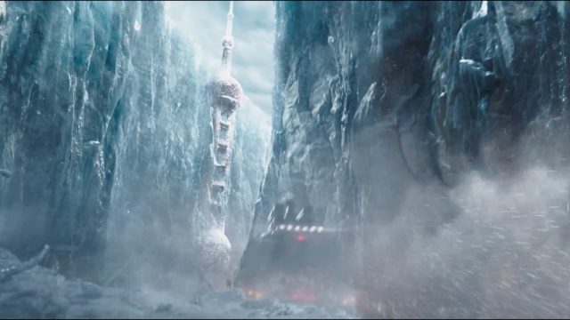
I was inspired by the Chinese Sci-fi movie called The Wandering Earth. The whole story was based in 2075, where the Sun is gradually dying out. The people of Earth are trying to build giant thrusters to move the planet out of orbit and sail to a new star system.

For my first project, I decided to create an apocalyptic scene, which raises people’s awareness of the environmental impact of our actions: if we keep polluting our nature, we will end up entering apocalypse without any uncontrollable factors (say, the sun dying out). However, rather than a recreation of what’s currently happening on the planet, a preview of the future which human beings might witness within the next century should serve as a more effective warning to trigger concerns about our environment. I decided to set the scene at an abandoned park, a place that’s full of sweet memories. The contrast will be thought-provoking.

Process and Implementation

After deciding the theme of the project, I started to search for sets of skybox materials online that resembles the scene in The Wandering Earth – abandoned city covered in snow. At first, I used “abandoned city” as the key word, because I thought I could always change the color tone and brightness of the image. So I found the following material and modified it a bit.

Original skybox material, from http://www.custommapmakers.org/skyboxes.php
Modified Skybox Material

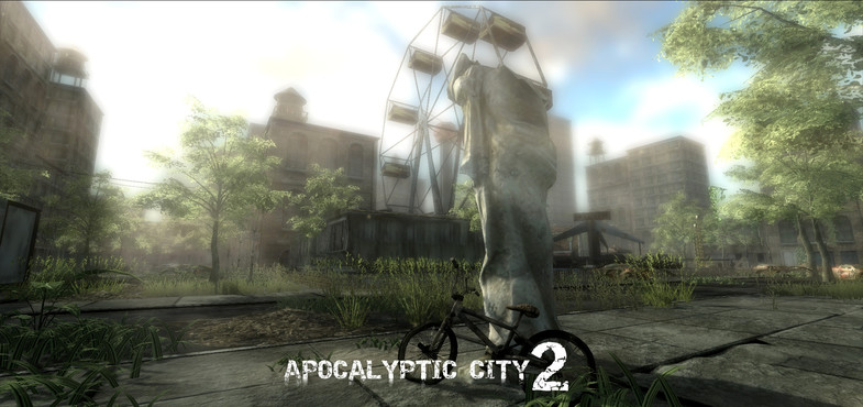
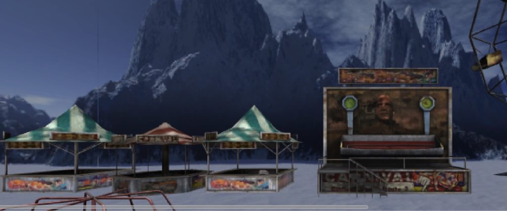
Then I looked for pre-fabs online that could make up an abandoned park, and I found the package: “Apocalyptic City 2”, which has assets for a video game of zombies, and after adding the assets to my scene with the background of an abandoned city, it looked just like a city invaded by zombies, which differed from my original idea. All the assets somewhat blended in with the background, so that you couldn’t really tell which are the objects I added. Plus, I failed to change the color tone of the image to a level that resembles the snowed city, so I decided to change the skybox material to snow, and the conflict between the color of the assets and the color of the background worked out quite well.


New Skybox Material

As entering the play mode, I found that my skybox looked like a box: there are edges between each side. It was because I didn’t change the “Wrap Mode” of the image from “Repeat” to “Clamp”.

Also when I planned out the layout of the assets, I didn’t take into consideration the angle of the camera: in fact, I thought I should be able to see everything because its in 3D. However, because of the height of the camera and the scale of the assets, some assets might be blocked by something behind it so that I couldn’t really see it. After testing in the play mode for several times, I moved objects around so that everything can be view clearly.

At last, I added a background music to my scene, which sounded to me had a mixed feeling of sadness & creepiness, and happiness from the past.

Reflection/Evaluation

This is the first 3D project I have ever made using Unity, and I realized how hard it is to work with 3D objects since you have to consider all three dimensions of the object to ensure its visibility. The layout of the scene was also harder than laying out things on flat space (say, webpage). It will be helpful if I could planned out the scene in real life: using blocks and boxes to represent the objects, and see how it looks in the space. Also, I used a lot of prefabs for my project, and realized how powerful they are: they made the whole process much easier. I am more than willing to learn how to build pre-fab from scratch.

Another take-away from this project is the importance of background music. At first, the scene didn’t seem to be arousing for me. I thought it was because I was so familiar with the scene. However, after adding the background music, I actually felt like I’m part of the environment, and I guess the purpose of raising people’s awareness of our environment should be achieved by really engaging people into the scene emotionally.