Project 1 “Wonderland Syndrome” – Documentation

Project Description

In this project, I decided to recreate a cartoon scene from my favorite childhood movie “Alice in Wonderland”. With the hope to alternate reality into a more cartoon-alike world, I wanted to focus on the specific scene when Alice meets the Cheshire Cat. This scene would be similar to the one in this Youtube video. In this one, the Cheshire Cat is the symbol of mystery and magic while Alice’s experience, in my opinion, would be described as confused, lost, and uncertain. Those are also the main identity I chose as the main guide during the development of the project. Please find the APK and Project File of the project here.

Final sketch of the project

Even though the final result of the project slightly diverged from what I intended to create, it still reflects the identity that I want to bring into the whole scene. The scene is a long path in a forest where two sides of the path are completely opposite. One side is full of trees and bright fireflies, which reflects a positive sense (1), while, on the other side, it is full of darkness, dead trees scattered along the path and a few tombs lit up by the mysterious blue light (2). By doing so, I hope the users would experience complete opposition when turning around and see the scenes. While feeling triggered to explore the scary side, they would be conflicting when deciding whether they should choose the safer side.

Process and Implementation

I worked on the project for a whole week. Since I never had any prior experience in IM and Unity, it took me quite a lot of time to understand how Unity works and how to use basic Unity functions and to find assets for the project. Since the Cheshire Cat asset was too difficult to find or recreate, I decided to remove the cat while aiming to keep the identity as previously mentioned.

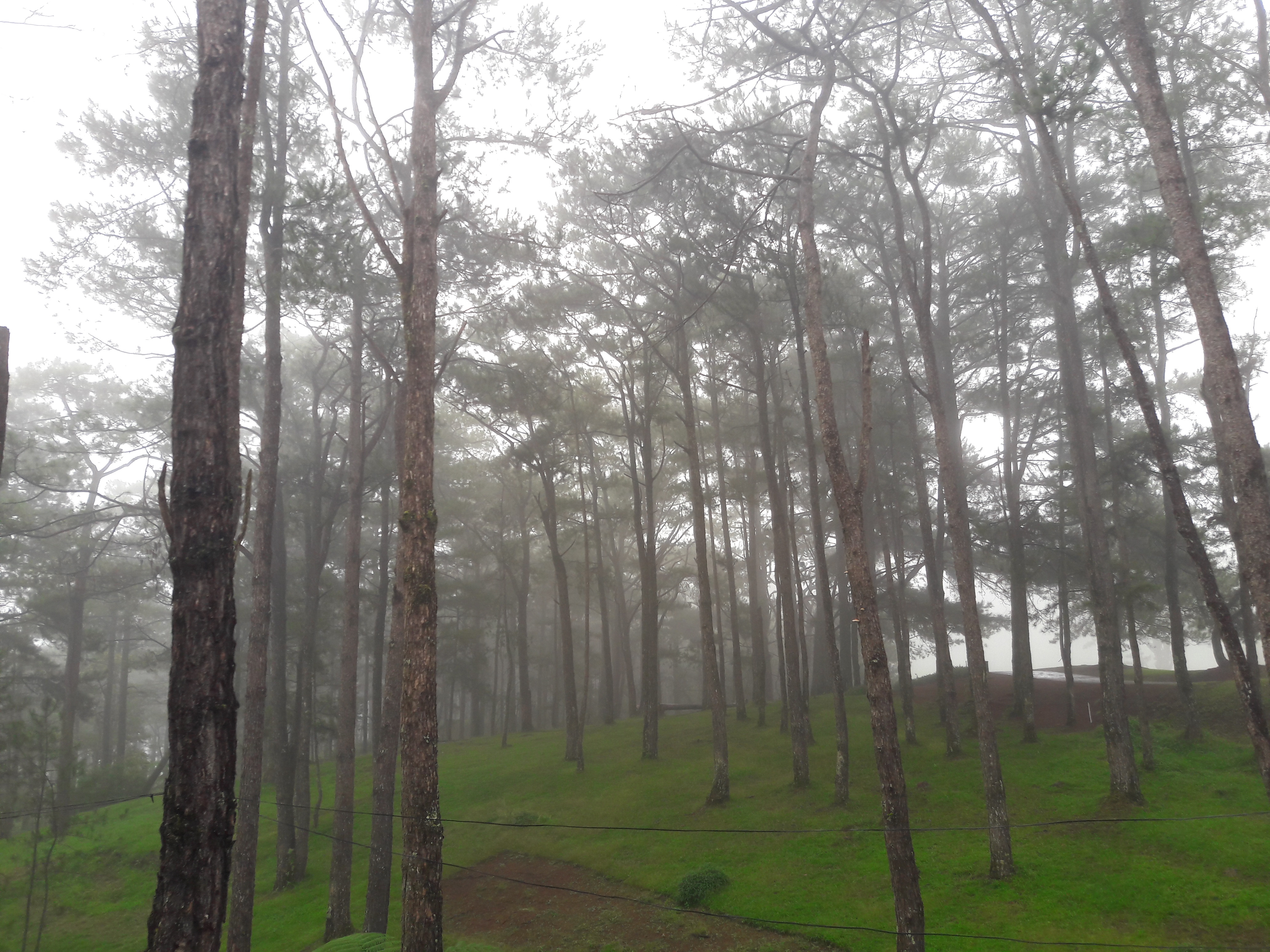
I started by laying out the path. Since I could not find any asset that has the right shape I wanted for the path, I decided to create the path manually by putting the cubes of decreasing size towards two ends of the path. The decrease in the size of the path also reflects the depth, which implies the continuity of the path beyond the scope of my scene. 

First layout of the path

After finishing the path, I put a few mountains in the scene and trees for side (1). Though the process was repetitive, I changed the space among the trees and rotated the trees so they look different to each other and reflect a sense of forests where trees are never equally spaced. After that, I added fireflies of different sizes and different distances from the viewing point. For these fireflies, I chose a strong yellow-green color for them to create a sense of liveliness and brightness. 

On the other side (2), I went for a completely opposite layout. At first, I only added the dead trees are scattered with a darker color towards the horizon. I also added two colorful posts to explicitly indicate the border between two concepts. However, after finishing laying out the trees, I felt that it was empty and did not reflect the identity I wanted to create. The posts were too much of unnecessity while I could implicitly demonstrate the opposition by the contrast among the objects themselves. Therefore, I decided to remove the posts, added mountains far away and a few more tombs lit up by the mysterious blue color.

On the road where it was too flat, I added a few rocks to imply a sense of obstacle. With the attempt to make the user feel even more lonely in such a remote place, I added the sound of wind into the project. I believe that this addition will make the experience even more real for the users and enhance the immersion in the cartoon scene.

Side (1) of the path which reflects the sense of brightness and safety
Side (2) of the path which reflects the sense of mystery and fear
More of the bright side
Towards the darker side

Finally, I worked on the lighting of the objects and the directional light. In the beginning, the lighting was too bright that it did not fit with the night setting in the scene. Hence, I changed it to a much darker lighting to fit with the situation and did not realize that it was too dark. This is the biggest issue in my project as I did not realize that the lighting of my own laptop screen could affect how I fixed the light, thus changing the lighting from what I actually thought I set for the scene. Although I discovered the problem at the very end after presenting my project, I want to learn properly how the lighting works in this case and the proper way to set the lighting in the future. The lighting for the moon and the fireflies works well in the scene. The emission effect and the shadow effect of the trees create the immersion for the scene and make it more of a 3D space.

The lighting was too bright in the beginning that it did not fit with the night setting

Reflection/Evaluation

I hope that for the user experience, my project evokes a sense of confusion, conflict, and a bit of mystery while alternating the reality into a cartoon scene of “Alice in Wonderland.” The project is a great learning experience for me with great help and feedback from Professor Sarah Krom throughout the whole development process. It, though not close to the original scene I wanted, reflects the identity I hope to create. I also come to learn that small details such as shadow can bring such a huge difference in the make user experience more real. I wish I could have added a few more movements in the scene to make it more immersive, such as the movement of the fireflies. I have not seen my project on an Android phone with Google cardboard and look forward to the experience and learning the differences on PC and on Android.

Project 1: Lost in Cyber City

Description

Walking in a modern metropolis, do you find yourself “lost” in the big city sometimes? On one hand, one can literally get lost among the streets downtown since the buildings and street furniture are often similar and constructed in a unified pattern. On the other hand, at least for me, once in a while I would get struck by a sense of loneliness when wandering in the street and having no clue about where to go. I think this feeling of getting lost is partially invoked by the imposing buildings around us. They are so tall and magnificent that their very existence blocks our view of the sky and our imagination about the rest of the world. Therefore, in this project I choose to build a grandiose environment and try to convey the feeling of getting lost around the buildings.

For this project, I intend to imitate the streets of the big city while constructing it in a cyberpunk style. Cyberpunk strikes me as “high tech, low life” and the existence of every single human being is trivial compared with advanced technology and hyper-urbanized landscape. It resonates with the identity that I want to achieve. From my point of view, reminding people of how small they are in this virtual space is one important factor for the sense of “grandiose” identity. Thus, I use the architecture of cyberpunk skyscrapers as a critical feature of my environment.

Overall view of the whole environment

Process and Implementation

  • Views of Audience

The most important view in my environment is the view of a street and the skyscraper one can see at the end of the street. The street is very narrow and the buildings are close to each other to make it overwhelming for the audience. The ascending height of the buildings is leading one’s view to gradually look upwards. If the audience is equipped with a VR device, he/she will have to look up very hard to see the top of the skyscraper.

Whole view the street and the skyscraper from the bottom

As for other views when the audience turns around, I think it would be boring to see similar street scenes. After all, I want to keep some imagination about the outside world. Therefore, I make it possible for the audience to look further beyond the city by placing the camera at the top of a lower house. From this view (View A), the audience would realize that the city is isolated in the middle of the sea. I intend to blur the division between land and sea and thus block the audience’s view of the land boundary with several houses.

View A is set to be the first view of the audience when the environment is launched and there are no tall buildings in this scene. I design it this way so that when the audience explores the whole environment, there is a contrast between the first impression and the actual vibe. In View A, one has a wide view of the mountains in the distance and even the skyline. However, in View B, one could hardly see the sky and sunset but only see the buildings at a very close distance. In View C, the last glimmer of twilight disappears and the audience could only see the imposing skyscrapers.


View A: The first view of audience when app is launched
View B: View of the street and the tallest skyscraper from camera
View C: Looking upwards to see the top of skyscrapers
Top view (circled is the position of the camera)
  • Lighting Settings

For the skybox of my environment, each of the two below has its merits. They both have a dark color theme (the sunset skybox is mainly dark with twilight around skyline). I like the dark theme a lot because the skyscrapers seem to extend endlessly to the further sky against the dark background. With the cloudy night skybox, the sea seems more realistic since the water (as a 3D object) blends in with the background. However, eventually I choose the sunset skybox because of the contrast effect mentioned above.


For the environment reflections, they usually come with skybox packages. But the skybox that I choose doesn’t include reflection, so I try to choose a suitable one from another package. At last, I choose Reflection 3 as it matches best with the skybox with a cool tone. The dark reflection on the glass creates a feeling that there are more tall buildings on the opposite side (although actually there are no tall buildings on that side).


Feedback and Reflection

In general, to highlight the grandiose architecture, I focus on the contrast between a) depths of views; b) heights of buildings; c) color themes of different altitudes. According to several user tests, I get the feedback that the contrast between the first view and other views with tall building works well. Initially, I want the mountains to be further from the audience so that the contrast between depths of view could be stronger. However, it seems that Unity only renders scenes and objects in a limited scope. I tried to add fogs in the distance to increase the depth of the view but I couldn’t get volumetric fogs working.

The skyscrapers are grandiose and imposing enough to achieve the identity that I intended. The color theme of the skybox and the environment also contributes to the lonely, lost feeling. But the twilight of the skybox seems a bit too bright. Sarah suggests that I edit it in software like Photoshop since it has nothing to do with the light source in the environment. Moreover, to strengthen the lost feeling, I think I could add some fog effect to the whole environment. Raindrops on the road is one of my attempts to create a cool and humid vibe but I think there are other lighting settings to help create that feeling as well.

Project 1 – Documentation

For my first project I decided to create an environment that is isolated from everything, so the identity I was going for was something desolate. The inspiration for my project was loosely based upon my trip to Ethiopia, where my friends and I went stargazing. That was the first time I saw so many stars in my life, unfortunately I couldn’t capture that moment, since the quality of the photo was very bad, and after reading the description of the first project, I decided to make something similar, so people could experience the feeling I had on that day. In one hand the place that we went to for stargazing was very beautiful, however on the other side, it was very scary, since it was at night and very far from the city.

Image 1: inspiration
Image 2: inspiration

“You can find yourself in the middle of nowhere – or in the middle of nowhere you can find yourself” – This phrase seems to capture the sentiment of so many people. After reading this phrase I came to the idea of making “in the middle of nowhere” place with a lot of stars and mountains.

If we take closer look at the first part of the phrase, “You can find yourself in the middle of nowhere”, we may feel like we are in a place that is very far from the usual landmarks, surrounding may feel empty, abandoned and desolate. And the second part of the phrase, “Or in the middle of nowhere you can find yourself”, we may feel something totally different. When you find yourself in an empty and desolate place, you have the opportunity of experiencing new insights about yourself and who you are, with an option of retreating yourself.

Being in this new place “in the middle of nowhere” seems like traveling to a different place. The contrast between you, your life and the environment I have created, gives you opportunities to make new changes, insights, perspectives and awareness’s. The shift between space and timing that occurs when you enter a new place, actually allows you to jump to a new vision of yourself. 

My project is about a person who is trapped in his own world and everyday he gets sucked deeper and deeper into it. The further he is in, the more he feels alone. No people, no animals, nothing, only him and the sound of inner function of his body as he is becoming lost in the middle of nowhere. The main components of my project are stars, that I downloaded from assets store and the sound that I have mixed, using different inner body sounds in LogicPro software. Also, the other important thing to mention is that, I added post process layer, and was playing around with bloom, depth of field and chromatic aberration effects. The post process layer applied full-screen effects to a camera which completely changed the vibe of the environment, luckily in a good way. 

Throughout the project I have experimented with a variety of things. At the beginning, I started with making a terrain and adding palm trees and rivers, however, after getting feedbacks from friends I decided to get rid of them, and just leave the mountains and stars.

Image 3
Image 4
Image 5
Image 6

From various photos you can observe that the place is completely full of mountains and stars that the reflection you can see everywhere. The first thing that the viewer sees is very dark and huge mountains and then when he turns left or right, he could see all the beautiness I have created and at the same time would have the feeling of being isolated from everyone and everything. The most challenging part was building a terrain and finding a perfect spot to locate the camera, in order for the viewer to be able to experience the vibe that I was going for, looking from one dark side that the only thing the viewer sees are mountains and then moving around and observing the environment. 

Image 7: First view
Image 8: Left side view
Image 9: back view from center
Image 10: entire view

During test sessions, it was interesting to observe how for some people the environment felt like a meditation place, with all the bright colors, where they could just go and focus on their selves, where no one else is there, only you, your thoughts and the sound of your inner body parts. However, for other people, the environment felt as a scary place, in which they would just go crazy, since they are alone, in the middle of nowhere. 

Looking back, I definitely feel that the implementation fits perfectly the identity I was going for, it evokes the sense of isolated place, no people, no animals, only you and inner function sound of your body. Though in my initial idea I had palm trees and river, I am actually happy that I got rid of them, and made the place with stars, mountains and sound. Overall, I am very proud of the environment I have created in such a short period of time. Most importantly, I feel that I successfully made a vibe of the “desolate” place that I have been working on. 

Project 1 Documentation

Golden, Silver or Wood?

Project Description

Once upon a time, a man had a tree branch which looked common but was left by his mother. One day he accidentally lost the tree branch in water and found himself somehow trapped on a little island. Then he came across a water god who found three tree branches for him, among which one is golden, one is silver and another one is ordinary. And it was the time for him to make a choice.

I made this story as the background for my alternate world and it was adapted from a traditional myth. The identity I want to show is mysterious fantasy with uncertainty. It should raise the curiosity, look explorable but feel abnormal at some point. I would say it’s not a fancy and harmless fairy tale, but somewhere that can have potential dangers or unknown results.

Process and Implementation

I firstly created the terrain and built the water surface with online assets. But to increase the immersive feeling, I also tried to fill up the space above. So I made the 3D model of a group of clouds in Rhino and then imported them into Unity. I decided to apply water material to them as well. In this case, the floating clouds can also be viewed as bubbles, which can indicate the unrealistic and alternate part of the environment. And it also raised the question that whether it is on a piece of real land or in an underwater world.

Besides the model of clouds, I also made this human face model to represent the water god role in my alternate world. It is in low poly and I still applied the water material to match his identity. Since it would be boring if it’s simply static, I modified the material and changed parameters to separate parts of his face, which makes him more dynamic and vivid as a floatable and abstract god figure. I made this face super big compared with other elements, so that he can be emphasized in the whole scene and it also indicates the god power is beyond imagination. Moreover, the face doesn’t look benign and I did this on purpose to make the whole thing less harmless.

Clouds model
3D Model built in Rhino
Unity Project Screenshot

To create a spacious view with spatiality, I tried to make the plants relatively small than the landscape and also played around the field view of the camera a lot. However with a larger field view, there will be more easily distorted view at the corner when rotating the camera. So I changed back the camera view to normal. One more detail about the plants is the contradiction between the two islands, where one is full of withered plants while the other is more vividly growing. It’s one more setting I made aimed to make the world feel tricky and abnormal.

the withered side
the vivid side

For the three tree branches, I picked the tree branch model and applied three different materials. I also added emission to make themselves glow a little bit. To further highlight them, I made three glowing water spheres to wrap them. To decide the position of these three spheres took me a while. Initially I placed them in front of the god in a row, but I found it would cover part of the god face and look disconnected in the scene. So I then placed them surrounding the camera in three directions. In this case, when the camera rotates, there can always be one of them as a main object in the field view. I believe can add to mystery and raise some curiosity.

Golden
Silver
Wood
Initial Arrangement — a row
Final Arrangement — a triangle

As for the skybox, I meant to make the surroundings dark with the only strong light behind the god face. And the light look extremely strong when the user faces the god directly. And it functions similarly as the exaggerated size of god face. Also I manipulated the directional light mainly to make the environment dark but some building details still visible.

Lastly, since my water is very dynamically floating, so I think adding some audio can help strengthen the immersive feeling. So there’s also some peaceful water floating sound in the background.

Unity Project Screenshot
water with real-time reflection

Reflection

The final result is very close to my initial assumption, since when I look around, the mixed feelings include the desire to explore, the hesitation to break the current peace, the slight fear to face the water god directly and the joy to enjoy the appealing fantasy. I don’t have much curiosity because I know what’s going on here, but from user experience testing, people will always be curious for the first time. I think these feelings can match the identity I set because fantasy brings delight and joy while uncertainty brings fear and suspect. However, since I have a lot of real-time reflection in my project and it takes time to render, when I open the file on PC, it would be awkward to turn around because the views change slowly. But I assume the reader on Android phone with Google Cardboard can be much better and smoother. 

Final Documentation: A Walk In The Forest

Project Folder

Project Description

A Walk in the Forest is an immersive, 360 experience created in Unity. The experience takes the user into a temperate forest on a cloudy day at sundown. The project is stationary, allowing the user to look around from a position at the bank of a lake, with two bodies of land connected by a wooden bridge across the lake. The experience also utilizes sound to make the environment more immersive, with sounds of light wind, water lapping against the shore and noises of birds and insects. A Walk in the Forest is an attempt to make a realistic forest environment in Unity, using the terrain tool and various assets to provide great detail to the user’s surroundings. 

Brainstorming 

The inspiration behind this project was the city that I grew up in, Baguio City, in the Philippines. The city is located nearly a mile above sea level and is characterized by its tall pines and cool weather. My affinity to forests served as the primary inspiration for this project. Another inspiration for the project came from my experiences in Europe during J-Term, walking in forested areas and parks in Germany. This served s inspiration for this project because I had not experienced a proper winter climate prior to this, and found the empty winter forests beautiful. 

Image result for baguio city pine forest
Pine trees in Baguio City

I have always appreciated how forests have made me feel, and I often found it relaxing to walk in the forest when I need to relax or reflect. Because of this, I was inspired to push myself to create a VR experience that was as close to a real-life experience as possible. I wanted the environment to be relaxing but also have a certain distance from the user, as if the forest had its own indifferent aura, with its ebbs and flows not being impacted by the viewer. I have always found this indifference of nature relaxing, as the environment would remain the same regardless of my current mood and thoughts. I have also always enjoyed being around rivers and lakes, with their constant movement and rhythm being similar to the indifference of nature I wrote about above.

I started off by creating a map of an aerial view of what I thought this could look like. I decided to add the bridge to make this environment more approachable, and later a bench placed close to the camera. These decisions were made in a deliberate attempt to make the environment more approachable, as if a part of a longer walk taken by the user in this experience. Below are also two sketches of that I thought the views would look like.

Process

With Sarah’s advice, I started familiarizing myself with the terrain tool to create the landscape. This was fairly easy to do, but the difficult part was making the terrain look realistic. I was not sure what paint textures to use to make it realistic, and was unsure about what combinations of dirt, gravel and grass would allow me to do this. The other issue was the trees I would use. I was able to find an asset pack that allowed me to edit trees and their number of branches, leaves, etc. but I found it difficult to achieve the effect of the barren, leafless forest I envisioned because the trees started to all look very similar to one another. I decided to change the trees to tall conifers instead. I also decided to place the camera at the bank of the river, and a trail leading uphill from where it is. This was deliberate to make it seem like the user had walked down the path to where they are standing by the bank of the river.

I used many assets apart from the trees, using rocks, tree stumps and fallen trees and a bench to make the environment as realistic as possible. I created the bridge through wooden planks using cube game objects.

Lastly, I wanted to make the scene slightly dim, to accomplish the effect of it taking place on a cloudy day. I used post processing to add ambient occlusion and color filters, which did allow me to accomplish the effect of a darker, cloudy day. I also used a particle system to add some light fog, and also found a skybox for a setting sun on a cloudy day.

I wanted to build the project to my Android phone for viewing in the Google Cardboard, but unfortunately, the scene was split in half when it would play on my phone. After trying to change the orientation in the build settings, nothing would change the split in the screen.

View split in the Google Cardboard

Screenshots from the scene:

Final Reflections:

Overall, I am happy with the project but I am still bothered by me wishing I could make the scene look more like a forest in real-life. For the following projects I want to look into how I can accomplish more realistic graphics using all the tools in Unity. I still have no idea what I will do for these projects but I realized how powerful Unity is and how much more I can do to the environments to make them truly immersive and engaging.

I really enjoyed this project because it made me think about how I arrange objects in scenes with purpose to contribute to an engaging experience. Although I still have a lot to learn, thinking about why I would place things in a location deeper than what my intuition would tell me was a challenge and a valuable experience.

Project 1: Crystal Cave // Documentation

Project Folder APK

Description
Crystal Cave is a 360° experience created for the Google Cardboard that immerses users into a small cave containing glowing crystals. To guide my design, I strove to create a cave that would have a serene and peaceful identity. To create the calm experience I was aiming for, I focused on making this environment one that did not look like a generic cave, and decided to include various mysterious, glowing crystals to do so. As such, the experience is designed in a way where the user finds themselves standing on a rock in the middle of a pond, looking at the mouth of the cave and the mountains outside or looking around inside the cave, eventually “discovering” a large assortment of glowing crystals at the end of the cave. 

Process and Implementation
To achieve the peaceful identity I was striving for, I first looked for references and sources of inspiration that had this mood/atmosphere. I first came across The Long Dark and was instantly captivated by the vast, yet tranquil environment it portrayed. Using this videogame as a main source of inspiration, I created two moodboards. The first moodboard contained a lot of images of large, mountainous and snowy environments. After deciding that this would perhaps look a bit too generic and not quite alternate, I created the second moodboard, which contained an assortment of ice caverns with streams of water and crystals, and which lined up better with the serene atmosphere I wanted to create.

The Long Dark has a really captivating atmosphere that I wanted to somehow represent in my project
First moodboard, focused on a vast space with mountains and snow
Final moodboard, showing cool colors, crystals, and glowing materials

Now that I had an initial idea of the general visuals, I created the following storyboard/sketches. As seen in the composition below, I decided to place the user in between the mouth of the cave (which would show a glimpse of the world outside) and the end of the cave (which contained a series of elevated rocks with large, glowing crystals).

Storyboard and sketches

In this initial stage, I was only certain about the composition at both ends of the cave, and not in the other surrounding walls. Once I started working in Unity, I started with these two parts, and decided to design the remaining viewpoints as I developed the project.

Once I started working in Unity, I deliberately created a place that naturally guided the user’s attention through the careful placement of rocks, stalagmites, and crystals, and through the deliberate use of lighting (both from the crystals lighting other parts of the cave and from the moonlight coming from outside). For instance, as shown in the still below, the rocks in the pond along with the rocks at the end of the cave naturally guide the user’s attention upwards towards the largest crystal atop the rocks.

Looking down, the rocks lead the user’s attention upwards…
…revealing this assortment of rocks and crystals

The biggest aspect that created the peaceful and alternate “feel” of the environment was definitely the crystals. Their cool teal color and their emissive glow was key in producing a serene atmosphere. Their lighting also afforded me with a lot of possibility regarding which aspects of the cave would be darker, and which ones would be less obscured. This then really guided me throughout the process of designing parts of the cave that would otherwise just have been empty. This can be shown in the following screenshot, where the crystal’s glow is used to suggest at the surrounding stalagmites. In this manner, the cave loses its potential of being scary, as certain areas are not entirely obscure. In a way, it could be said that the crystals themselves emit peace.

The crystal here was key in suggesting the presence of other surrounding rocks, while contributing to the peaceful ambiance
The rocks at the left were also used for the purpose of lighting up a portion of the darker side of the cave

Reflection/Evaluation
Overall, I feel that the project implementation does reflect the serene identity I was striving for. As mentioned previously, the emissiveness and glow of the crystals inside the cave were key in creating a soft and peaceful atmosphere, and in making the cave feel more like a place rather than just an empty cave. Their placement as objects that directly countered the darkness of the cave contributed to producing an environment that would have otherwise been hostile. Looking back at my moodboard and initial sketches, I feel that this final outcome gives justice to the environment I envisioned, which I am really happy about. Regarding the medium, building for Google Cardboard versus building for the PC really gave different results. In the Cardboard, the whole environment looked much brighter in general, and the lighting lost its soft edges and quality. However, it still maintained itself as a serene environment, which is what I was striving for. Using low-poly visuals in Unity also contributed to the calmness of the environment, as the lack of hyper-realistic visuals created enough of a visual separation between the real world and this alternate crystal cavern.

Final Project Screenshots

Project 1 Documentation | Our Small Existence

Description

Despite the fact that the world is ever-increasingly connected, I feel increasingly lonely and small amidst all the chaotic events taking place all over the globe. The imminence of global warming, of global wars, of global inequalities… threatens to put an end to our civilization, to wipe away the existence of everything on the small rock we called Earth. Not everyone is yet to realize that our existence is so small that it does not even outlast a blink of an eye compared to the scope of the universe, of space and time. Does everything that happens here on Earth matter?

Adopting this rather bleak outlook on our existence on Earth, I created an alternative reality experience in which the last human being stands on the surface of the moon, looking back to an explosion-stricken Earth, surrounded by nothing but lunar’s deserted terrains and relics of human’s lunar exploration. Throughout the experience, I wanted to emphasize the smallness and the emptiness that one feels when presented in such an environment, and that maybe it can make an influence on how we see our fragile existence on Earth.

A snippet of the immersive experience

Process and Implementation

This is the first sketch I drew for the scene.

Regarding the design aesthetics of the environment, I chose to stay as faithful as possible to people’s perception of the moon through realistic rendering of its surface and terrain albeit with a surreal element of an explosion-stricken Earth. By combining the two ends of realistic-ness, I hope to create an experience that is almost real, but not quite, something that has the possibility to happen in our current understanding of reality, perhaps in the far, dark future.

It was clear from early on that the “front” of the scene (where the viewers can see the Earth) will be mostly flat, dotted with some relics of previous lunar exploration (a lander and a flag). The terrain transitions to a more rocky, mountainous region that wraps around the viewer’s position towards the “back” of the scene, raising higher and almost touching the sun on the sky, which heightens the insignificant existence of the viewer even more.

The lunar terrain was built with the Terrain tool in Unity by using a normal map of the moon as well as the tool’s multiple terrain brushes. Cement was used for the material of the moon surface, and it suited perfectly.

An overview of the terrain. The viewer is situated in the middle (the flat land)

In the front view, lunar exploration’s relics (a lander and a flag) can be seen. If the enormous distance between the Earth and the moon creates a spatial separation between the person and the rest of the human race, these space relics added a second layer of human separation to the piece: temporal separation. The only other times when there were other people sharing such an abandoned place and such an isolated feeling was back in the 60s-70s during the Apollo program. The person is lonely, both in space and in time.

Compared to the first sketch, there were some changes to the scene. First of all, the position of the sun was pushed to the “back” of the scene so that it could illuminate the “front”. If it had been at the “front”, it would have cast shadows on the flag and lander, making them impossible to be seen clearly.

Due to a lack of atmosphere and thus a lack of ambient light scattering, the sky is black and anything facing away from the sun is unlit (the mountain range in this case). Therefore, I moved the sun to be in the “back” to light up the front objects.

Also, I originally envisioned the Earth to be slowly disintegrating into pieces, instead of smaller explosions on the surface as in the final product. Such slowly disintegrating Earth would have a stronger impact on the physicality of the scene by providing viewers with a nearly-frozen capture of the Earth in its most vulnerable form. By not showing the direct cause that makes Earth disintegrate, I hoped to ignite a sense of mysteriousness and unsettling.

Image result for earth disintegrate

However, after toying around with the Dissolve shader, I realized that I had to switch every other object’s shader to Lightweight Pipeline as well, and when doing that, a lot of them did not retain the original materials. That’s why I ended up using the particle systems to create smaller explosions on the surface of the Earth in hope of achieving the same effect of showing the viewers how small and fragile our existence on Earth is and that maybe we should embrace and appreciate it more.

The explosions made with particle systems

Reflection and Evaluation

Overall, I am moderately satisfied with the environment albeit a failure to produce a more enticing/dramatic disintegrating Earth. Also, while there was a failure to produce a sky filled with stars and asteroids flying around (the procedural sun skybox did not allow me to add another 6-sided skybox filled with stars), I think it would not have added much to the experience as a whole. The fact that the sky is desolate, except for the ever-present Sun and the dying Earth, amplifies the emptiness of the environment.

The drastic disparity between the expanse deserted environment on the moon and the tiny size of the Earth, and everything that belongs to it, highlights how insignificant our existence is, not only for the lone person stands on the moon, but also for our entire human race. Such size disparity is nicely represented with the help of virtual reality where viewers are not limited to a flat and fixed 2D view but a free 360-degree experience.

Project 1 Documentation | Finding Solitude

This experience emerged from the idea of solitude. Considering both
Gabriel García Márquez’ One Hundred Years of Solitude and the way spaces between places can have placeness led me to understand solitude as a place marked by chosen, intentional loneliness. Such placed space becomes apparent in games like The Long Dark, where the vastness and the spectral presence of humans in their artifacts turns what would otherwise be in-between space into a place of “the forest” or “the ghost town”  or “the wild.

screenshot from The Long Dark

Because of the practical limitations of having to rely upon visual cues for immersion, I focused on filling the space with objects that would suggest a long-term occupant whose grasp on physical reality has been eroded by solitude. In response to this erosion, the occupant tries to remind themselves of reality by manipulating it physically, but their mind starts to slip. Finding Solitude situates the user inside of a stone cave, with a campfire, woodpile, sleeping mat and various stone and wooden animal sculptures, along with the tools to make them, scattered about the cave. The smoke rises from the campfire and spreads across the ceiling. A waterfall rises across the entrance to the cave, flowing backward and obscuring a view of a frozen lake and several mountains.


Initially I thought of creating an empty cave, but after some research, I realized that An empty cave may feel lonely, but the time and effort implied by filling it with artifacts of activity-the statues, the figurines, the tools, the wood stack, the campfire, and the sleeping mat-would  turn that loneliness into solitude. Someone, the user, has been there, expending their time and effort. The repetitiveness of the statues and the size of the wood stack imply the obsessiveness of this expenditure, suggesting the futility of effort which yields nothing for anyone outside of the cave, anyone aside from the user. While these serve as indicators of the way a mind in solitude starts to shift, the upside-down waterfall confirms that the user’s experiential reality of the world has collided with their physical reality. They are hallucinating. Logically, if the user entered the cave, they should be able to exit, but the waterfall covers there only exit and creates cognitive friction with such causal inferences. The user is made to believe that they cannot leave when, in fact, they can. In this way, all of these elements combine to create a sense of being present inside a mind filled with solitude, a reality which is neither the physical reality nor the experiential mind, but somewhere in between.

The initial view is almost banal, with a campfire, a wood stack, and a cave entrance covered by a waterfall. I wanted something to be slightly off about this view, so I inverted the flow of the waterfall. The placement of the campfire allows for the smoke cue discussed later, but it also makes sense practically. The fire’s smoke should mostly exit the cave and the light should ward off dangerous creatures. Hence, its placement implies the foresight of one who has been in the wilderness long enough to understand these functions, as well as the nature of the wilderness outside.

The initial view is almost banal, with a campfire, a wood stack, and a cave entrance covered by a waterfall. I wanted something to be slightly off about this view, so I inverted the flow of the waterfall. The placement of the campfire allows for the smoke cue discussed later, but it also makes sense practically. The fire’s smoke should mostly exit the cave and the light should ward off dangerous creatures. Hence, its placement implies the foresight of one who has been in the wilderness long enough to understand these functions, as well as the nature of the wilderness outside.

If the user turns left, the wood stack comes into view with an axe leaned up against it. The stack has an unreasonably large amount of wood, but does not necessarily suggest anything strange aside from the amount of time  the individual has been there. It also implies, along with the unevenness of the walls and ceiling, that the cave exists within a larger natural context with plenty of available firewood, such as a hilly or mountainous forest. When the user turns completely to the left, a wolf head statue comes into view, and they are drawn to the back wall.

Similarly, if the user turns to the right, they start to see the statues, which guide them to turn all the way around to see the wall of various animal carvings 

Tools lying on the floor near the statues bring the user’s view down, a movement that will guide them to the figurines and the sleeping mat if they turn left initially or toward the back wall if they turn right. The sleeping mat also implies the number of people who live in the cave: one.

A final, subtler cue to look at the statues  comes from the smoke, which radiates toward the back of the cave. Both the waterfall and the smoke are constituted by large particles rather than lines. This both fit better with the style and helped make the two feel more like objects in the space by exaggerating their movement to compensate for the lack of sound and taste that often indicate the presence of such translucent substances.

Overall, I felt this experience did succeed in implying solitude, but there are many improvements that could be made. In terms immersion, sounds of the waterfall and the campfire would help. In the initial design, I also wanted the statues to growl when the user was not looking at them to add a bit more tension to the scene. The smoothness of the floor and the way the smoke blocks just disappear like bubbles popping also brings users out of the experience. Finally, using animal models designed for low-poly rather than adding a stone texture to models designed for life-like textures would improve the consistency of the aesthetic. 

Overall, I felt this experience did succeed in implying solitude, but there are many improvements that could be made. In terms immersion, sounds of the waterfall and the campfire would help. In the initial design, I also wanted the statues to growl when the user was not looking at them to add a bit more tension to the scene. The smoothness of the floor and the way the smoke blocks just disappear like bubbles popping also brings users out of the experience. Finally, using animal models designed for low-poly rather than adding a stone texture to models designed for life-like textures would improve the consistency of the aesthetic. 

Aside from these improvements, however, I am satisfied with the work. Rarely does an idea manifest as I initially intended it to because I have to bring out a concept without the ability to construct the world it exists in. With this project, however, the result was nearly the same as the initial inspiration, with the only limit being my skills with the technology. While that limitation did force me to cut many of the initial interactions I had planned, it also humbled me, making me appreciate the consideration and thoughtfulness that must go into creating a static environment. In particular, the medium allowed me to create exactly what I wanted, so I had to think much harder about the why, something that is often lost or modified when I fabricate tangible projects.

Documentation for Project 1: Synthwave

Source can be found here.

APK can be found here.

For Project 1, I decided to create a retrofuturistic environment inspired by the music/art genres of synthwave and vaporwave. By synthesizing and expanding on ideas, elements, and emotions expressed in existing synthwave media, I sought to create a minimalist, nostalgic space where the viewer could escape from “real” reality. Ideally, this space would be constructed in a way that steered the viewer away from questioning elements of the surroundings and towards simply accepting the “random” nature of the surroundings for what they were. To achieve this, I needed perfection in both design and implementation of the synthwave space.

Throughout the design/implementation process, I experimented a variety of things. I initially started with a static environment with only sun, sky, mountains, and a grid, but decided that this environment was too boring. To make the experience a bit more dynamic, I made a script that would scroll the grid texture to create the illusion of forward movement. This also had an unintended but welcome effect of making the terrain seem much more expanded than it really was. Since music is a defining characteristic of vaporwave and synthwave, I added a statue behind the camera that served as both an audio source situated in the 3D space as well as a point of interest for the viewer to look behind. In complement with the music, I added planets orbiting around the sun, then made the sun and planets vibrate along with the high and low frequencies of the music. Finally, I added shaders, lighting, and post-processing (bloom and chromatic aberration) to truly bring out neon and glossy elements.

Overall, I am quite proud of the end result. Despite having little experience in Unity, I managed to learn Unity’s C# framework, basic shader programming, as well as some useful quirks and intricacies that I hope to exploit in my next projects. The visual simplicity of the environment made it quite suitable for mobile devices, and I experienced little to no issue play-testing my environment. Most importantly, I feel that I successfully brought to life my unique interpretation of a synthwave world that I could get lost in.

Primary view.
Closer look at the statue.
Development angle which shows how the scene is constructed.

Documentation for Project 1

For my first project, I attempted to create an environment that was peaceful and calm. The inspiration for my project was loosely based upon the game Human: Fall Flat. In the game, there was always a sense of serenity, and this was something I hoped to recreate. Additionally, when traversing through levels, your character would fall from the sky while surrounded by clouds. I wanted to incorporate clouds in my project. I was particularly drawn to one of the levels that had a medieval feel. I also loved the low-poly objects and I utilized low-poly assets to create my project.

The image I associate with serenity and calmness is one that is filled with greenery and nature. I also thought that having clouds surrounding your character adds to this calmness and presents a heaven-like feel. I wanted to create some sort of isolated island in the middle of the sky where one would be able to just relax and indulge himself/herself in the scenery and tranquility. To do so, I situated the camera so that the first thing you would see would be trees, the sky, clouds, and a grass field (Figure 1). On the sides, one can observe a mountain on the right and a house on the left. The reason behind is that I wanted to curate a sense curiosity so that the user would turn around and try to explore the terrain (Figure 2 and Figure 3).

Figure 1: First view
Figure 2: Left side view from centre
Figure 3: Right side view from centre

In my project, I also wanted to incorporate a medieval feel to it. I originally intended to create castles in my project, but I felt like it disrupted this calmness that I tried to create. Instead, I utilized other objects that one would associate with medieval times. The first was the well in the centre of the screen in Figure 1. On the right side in Figure 1, there is also a church while the left side has a building with a water wheel. Lastly, there is a washroom directly behind the user that reminded me of the medieval times and also the movie Shrek (Figure 4).

Figure 4: Back view from centre

Across the various photos, one can observe that there are numerous clouds. In this project, to create a close proximity between the user and the clouds. This can be seen in Figure 2 where the cloud casts a shadow over the water. I also wanted the clouds to be everywhere to create a sense of living in the sky. In the project, the user is not situated directly in the centre of the space. From Figure 4, one can tell that he/she is close to the edge of the land. I wanted create the illusion that the user is suspended in the sky and that he/she could fall off. In Figure 5-7, one can observe that the user is surrounded by clouds everywhere.

Figure 5: Right bottom view
Figure 6: Left bottom view
Figure 7: View from bottom to top in centre

This world is an alternate world due to the fact that one is situated in the middle of the sky. The objects are also low-poly and the buildings are outdated in today’s world. There is also not a living object other than plants/trees in sight.

Looking back, I definitely feel that my implementation fits the identity that I picked. It evokes a sense of calmness through the trees, clouds, and grass. The idea that one is situated in the sky is also something that aids in the identity that I’m trying to create. However, there is a discrepancy between the clouds from the skybox and the clouds that I utilized to surround the land. This somewhat breaks the sense of immersion. Although my initial idea had more buildings and castles, I felt that I still achieved the identity I was aiming for. I also felt that Unity was great in rendering this type of environment. The asset store also had numerous assets that fit with the identity that I was trying to create.