The environment of the space is a confined elliptical structured town composed of houses surrounding a central body of water, directly inspired by Keizersgracht in Amsterdam. The environment choice was taken with careful consideration, leading to a long ideation / brainstorming process. The setting of Amsterdam was chosen due to its capability to encompass our, more abstract, theme of reflection while providing more substance that helped us push the story forward.
The confined structure of the town acted as narrative guidance, leading us to question – why the town was confined in the first place? What existed beyond the town? Are the villagers aware of such an outside? – all of which inspired us to create a corrupted town in which the core tension underlying it stems from lack of awareness of the external world.
Process and Implementation
There is a way in for merchants, but no way out for villagers. The exit is only accessible to those in power, to sustain the deception. The reason for such deception is the queen’s greed for power and control. She assigns the villagers to dig for ‘stones’, the top valuable of the town, in exchange for residency in the town. These stones are sold externally for personal gain.
Such corruption, sustained by deception, exists in the town but not overtly visible. The environment in which the user spawns in is constructed to feel like a jolly utopia. This has been done, on surface level, through the use of warm lighting from the sun which brings out the diverse colors of the scene and uplifting background music playing under town ambient sound. The optimistic monologues and body language of the NPCS, accessible when the user moves close and clicks, develops the environment further through the provision of contextual information. When interacting with the NPCs, the user is a character (merchant from external town) with no-impact. Their presence is acknowledged – NPC faces the user when they start to speak – but must simply listens with no option to respond. These monologues primarily serve to develop the characters of the individual NPCs while simultaneously hinting the tension which underlies the town.
The mode in which the user can gain more insight into this tension is through the reflection. The reflection on the water, central to the town, has the unique property of not permitting deception and lies through, allowing only truth through the reflected scene of the town. This idea was inspired by how we perceive colors. A color of an object is the wavelength reflected from it, every other color is absorbed by the object. In the constructed environment, the reflection has a choice in what it reflects and absorbs and it refuses to passively absorb the lies of the real world.
The user can access the reflected scene through a shining orb which becomes accessible, on the dock, after interacting with the King. Once close enough, the user can click the object which teleports them to the reflected scene. The reflected scene portrays a contrasting mood. The light is dimmed to construct a night environment and the music changes to a more haunting one, layered with the sound of night (crickets, water, wind, etc). This visual and auditory contrast is a clear indicator of scene change, which prompts the user to anticipate a contrast of some sort. This motivates the user to move and explore to fill their knowledge on this change.
In contrast to the first scene, the user is given more guidance in approaching the story. In the first scene, the nature of interacting with the NPCs was non-sequential. The individual characters themselves provided structure of the monologues. However, in the reflected scene, the user changes to a ghost with no-impact. The identity shifts from a merchant to a non-physical being that eavesdrops on the dialogues and interactions between the NPCs. In this scene, the story is organized through scenes, the sequence of which is significant. Spot light is used to guide the user towards the active scene of current order (also why the scene takes place at night). The highlighted scene is also the only interact-able one. The scenes are also constructed spatially to reduce unnecessary movement. The circular path of the pedestrian street allows for the implementation of a linear story without it being too noticeable.
The switching of the spotlight denotes the start and end of a scene, similar to how it is used in theatre. While under the spotlight, the NPCs perform their dialogues and actions and the user watches. The nature of the dialogues in this scene is more honest and real. The persona presented by the NPCs in the real scene is brutally contrasted to explicitly communicate the contrast between the façade that people desire to portray vs. their true selves. One’s ability to deceive seems to be a requirement as social beings. The intention behind deception is highly subjective. Some choose to deceive for personal gain (queen), some for self-deception (the happy depressed peasant), some for comfort of others, etc. One’s choice to not reveal their true selves, emotions, state, at certain moments seemed like an interesting phenomenon, reflective of the real world, to explore in a fictional space.
After the user finishes progressing through the dialogues, two NPCs are dead. After the last scene, the orb reappears on the dock which transports the user to scene 3 when clicked. Scene 3, on surface, is almost identical to the first one. A change, which the user can realize if attentive enough, is the disappearance of the two NPCs. Regardless, the town seems unaffected and unchanged, with each NPC carrying on their usual routine of sustaining their jolly façade. The user can choose to roam around scene 3 as long as they want. The option to interact with the NPCs is removed, however. The feeling provoked from roaming in the space would feel different from the first encounter of the space. Now aware of the truth which lies underneath, the user can recognize the deception.
More specific details on the development process / story development / sketches is all in the development journal.
As such, the story is constructed around the central aim of bringing light to a phenomenon which occurs in the real world – deception. To communicate such an abstract concept in a tangible form, we had to design a space – composed of characters, speech, animation, environment, sound which all follow a central story. Also, the fictional aspects – the reflection, characters – all played a significant role in constructing a space capable of expressing such concept.
This project taught me a lot on how to develop a theme, through story, in a VR setting. More specifically, it made me recognize the limitless number of approaches the creator can take when attempting to convey a story in VR. Space being the main medium of VR, we had to reconstruct the way in which we told the story. It was not limited to purely text (ex. books), sound (ex. songs, podcasts), visuals (ex. movie), etc. It was an integration of all these components, which made it flexible but also very challenging. As such, I found that we drew a lot of inspiration from many forms of media and combined them. For example, the scenes and spotlight in the reflected scene was inspired from theater. The interaction with NPCS was inspired by the approach taken by many open world games.
The final game, I think, achieved most of the goals intended for this project. The reason for feeling so has to do largely through constantly changing and adapting in the creation process. We made a lot of changes along the way to adapt to the VR interface, but made sure these changes did not take away the core message of the story.
Underwater Apocalypse is a virtual reality project designed and created by Luize, Nhi and myself. Within the world of this project, the user is able to see and experience how the plastics generated from humans’ everyday activities can severely impact the ocean and the life of marine creatures. We played with the concept of apocalypse and linked it to the consequence of our very own behaviors that are causing great damage to the natural environment.
The environment consists of two scenes: a living room scene, which embodies the typical modern lifestyle, and an underwater scene, which showcases the beauty of nature, as well as how human activities could destroy it. The storyness of the project lies in the emotional journey that the user will go through witnessing changes happen in the ocean and the connection between the two scenes.
Living room scene
Upon entering the environment, the user will find themselves in the room scene, which is simply furnished with a couch, a television, a coffee table and some wall decorations. Obviously inharmonic are some food items scattered around on the table and on the floor, including a few bags of chips and some cans and bottles, which the user is able to pick up and throw around. The television is also clickable, and when clicked on, it will play a video that introduces how awfully plastic products are threatening the ocean life. When the video ends, the coral decoration next to the television lights up and invites the user into the second scene.
In the underwater scene, the user can see various marine creatures including all kinds of fish, starfish, jellyfish, sharks, corals, and underwater plants. Right in front of the user is a path formed by a type of big-leaf plant, encouraging their active exploration. The further along the path they go, the more they will be able to see of the delicate beauty of the underwater world. However, as they are moving forward, plastic gargabe starts to appear from right behind them, while the scene darkens gradually. In no time the user will hardly find any fish within visible distance, but an increasing amount of plastic gargabe floating around. By the time they reach the end of the path, the entire scene has already become a mess.
Underwater scene
At the end of the path, the user will find a light-up coral, which is the same as the one next to the television in the living room. Once they click on the coral, they will be teleported back to the living room scene. The structure of the storyline appears as a cycle that the user cannot break out of, conveying a deeper message that until we actually start to do things differently in our daily life, the damage we are doing to nature is inevitable.
Process and Implementation
The function of the room scene is a vital factor that makes a great difference to the user experience, which has evolved a lot throughout the building of the project. The room scene serves as the starting point of the environment, as well as the story, presenting to the user a very important first impression. It matters whether it feels sci-fi-like, or everyday life-like. At the beginning, we wanted to go for a high-tech, The Matrix-ish feel in the design of the room scene, as shown below in the first two images. In that case, the room scene would be nothing but an introduction to the theme of the project.
Initial version of room scene, later ditched
But after we decided to turn it into a familiar living room setting that feels casual, cozy and homely, I realize that it was able to bring context to the user experience. It somehow indicates to the user some characteristics of the character that they are taking on in the story – one who lives a typical modern life, not so different from the user themselves. Maybe s/he is fond of puffed food like chips, drinks coffee every day, and has breakfast with milk, hence all the food. The character is made more easily relatable this way.
Regarding the room scene, we also had discussions about the video played on the television. Some feedback raised our concern that the user might not want to stay still and watch the entire video, yet the video is of great significance as an explicit introduction to the theme of our project and a smooth transition between the two scenes. So we decided to trim the video in length and have the lighting in the room go down while it plays, so that it was more likely to grasp the user’s attention and make them notice the visual cue of the coral when it ends.
The original design of the ocean scene included a past scene, a present scene and a future scene (1920, 2020, 2120) that would all have a different setting reflecting the corresponding time period, which was complex and required a lot of effort. To make our life easier, we significantly trimmed it down to one scene only. Somehow I seemed to find the one-scene design even better for the project, because rather than pushing the user to go from one scene to another, we got to then directly present the change to them in one scene. It had the potential to be more dramatic and more immersive, and moreover, we could then link the change to the character and produce the sense of agency, while the scene-to-scene walk might just feel like a visit to the museum.
The sense of agency, as I expected, should come from the garbage generating effect. An important detail that links up the two scenes, is that the garbage items that appear in the underwater scene are the same items seen in the living room scene, which should lead to the user’s realization that as the main character of the story, they are bringing waste to a beautiful natural environment. Besides, the gargabe doesn’t appear until about 20 seconds into the underwater scene, so that the user has their time to first appreciate its beauty, and then witness the gradual yet noticeable change of atmosphere.
The garbage generating, fish swimming away, and environmental light going down effects are all timed events that begin at a certain frame, and it took me quite a few tests to find the right timing for them to happen. How fast the plastics are generated, and how fast the light intensity changes were carefully calculated so that the two effects aligned in time. I also felt it was important to design the scene in a specific way that would encourage the user to behave as we intended, and consequently see the complete process of the environmental change; the way I handled this was by creating a path that they should intuitively follow along, and setting a proper walking speed for the character.
What’s worth pointing out is that, while I was laying out the corals and plants, I needed to make sure it looked good from the perspective of the character, so I had to use a temporary WASD movable character to walk the path and see how it looked. However, the mesh collider didn’t work as intended for the terrain. In order to fix that, I placed a bunch of cubes beneath the ocean floor to fit its shape and simulate the collider. Later when we switched the operation from keyboard to mouse, because Nhi’s character movement script used a different mechanism, we no longer needed those cubes and took them out. Still, they were crucial to the building process.
In terms of the aesthetics of the scene, I depended greatly on the assets we purchased and tried to make the most of what we had. I didn’t manage to find a convenient way to lay out such a large scene, and because the ocean floor wasn’t flat, I couldn’t just be lazy and copy and paste the assets, so I put every single object in place by hand, which was quite a struggle.
The sunken ship was borrowed from the original idea for the underwater scene, and it served well as the visually centric object in the scene. It not only helps to broaden the view in the vertical direction, but its gigantic size also puts weight onto one side of the scene, so that the user can look at it for reference of their own position in the scene and it doesn’t feel generic all over the place.
The lighting plays a vital part in the aesthetics, too. Corals are static objects, so I put point lights of different colors beside them to indicate their vibrancy. The dimming of these lights are also timed to hint at their decay due to the appearance of plastics. At the end of the path there is a spotlight lighting up the area near the ship, so that even after the scene darkens, the user is still able to find their way out of the mess.
Reflection/Evaluation
Given that the main goal for this project is to achieve storyness, I have expected our project to present that to the user manifestly. A dilemma that I found our group stuck in, was that it seemed to me there lies a conflict between storyness and agency. In a traditional sense, storyness comes from a plot, multiple characters with distinct personalities, and dramatic conflicts between characters; the feeling of agency, on the other hand, comes from the user being able to impact what happens. This leads back to the question we have been discussing for a while: at what position do we place the user, a ghost with impact, or a character with impact? How does the artist make the user feel like they have impact on a pre-designed story?
At least within the scope of this project, my answer is, we go for an adapted version of storyness, where the user should not only feel like they are able to impact what happens in the environment, they should also feel that their impact actually matters; we should put the user in a plot we designed but let them think they are actively pushing the story forward. We design consequences for user behavior. We are kind of caught up in the concept of “user being able to do whatever they want,” but we forget that there is still a lot of logic in what they would want, and that it could be designed as well.
Personally, I might be a little over ambitious, but I don’t want our project to feel like an interactive storytelling project, where the user does stuff as instructed and watches the story unfold; nor should it feel like an empty canvas where the user is free to draw whatever they want, because the complete freedom would mean absolutely nothing to the presentation of storyness. It should feel organically in the middle of the two models. I wanted the user to feel like they could do whatever they want in the environment, but by designing the scene in a specific way, I tell them what they want. Specifically for this project, the plastic spawning effect should be the major source of agency. It is where agency meets storyness. The interesting thing is, the fact that at first the user is not aware of the plastics they bring to the ocean is in accordance with our intention to highlight the lack of consciousness when we are producing plastic waste. Rather than an interaction that the user carries out, it is more an unavoidable property of the character – everyone who consumes plastic products inevitably produces non-degradable waste.
That said, I did regret a little bit about how the plastic spawning looked in the final version, because somehow the character moving mechanism interfered with the plastic spawning script. When I was working on the plastics myself, it felt more ovious that the plastics were generated by the character; in the final version, it somehow looked like they came out of nowhere. That to some extent affected how the user would understand the project. Nonetheless, I think it was clever that we depended our project on the common knowledge a lot of people share on environmental protection. That made it a lot easier to create the emotional connection with the user.
In a nutshell, I really enjoyed the process of us attempting to find the sense of storyness we wanted and fit it into an environment with only two scenes. It was very different from actually writing a story: it wasn’t about a fascinating plot or distinctive characters; instead, it was about how to manipulate the user’s feelings and emotions by leading them into doing what we intended and designing consequences for their behavior. We had no more than five minutes to intrigue the user and convey our message. In order to do that, we created intense dramatic effects, and those were the essence of the agency and storyness in our project. I also loved how we contextualized and interpreted the theme of apocalypse as a consequence of lack of consciousness about environmental protection.
Project Description:The boisterous sound of cicadas in the summer, two kitsune statues on either side of a road leading to a pagoda, a series of gray gravestones surrounded by overbearing bamboos… these are the first things that users find themselves spectating once they enter Paths of Perception. This experience, originally designed and intended for the Google Cardboard yet executed for the Mac and PC, places players in the verge of reality and fantasy as they are faced with the danger of getting possessed by a nogitsune (a wild fox found in Japanese folklore known to trick and even possess humans). To avoid losing complete sight of reality, users have one last chance: to correctly identify three objects that have changed in their surroundings between the time they first found themselves in the cemetery and when they enter the spirit world.
Since users in Paths of Perception are given no mobility apart from the possibility of rotating 360° around the same spot, the design of this environment was carefully done to make the most of only one main point of view: looking outwards. As such, everything is placed in a loose circle surrounding the user, indicating that they somehow are the main focus of the experience. The “storyness” of this space then comes from a change in this environment. What at first seems mundane and everyday suddenly turns eerie and even mysterious, as the sky turns dark with shades of red, a slightly purple tint encompasses the environment, and two nine-tailed foxes run towards the user. The experience’s story is then driven further through the use of text: prompting users to point and click at their objects of choice as well as providing another alternative by supplying riddles hinting at the correct objects.
Good ending
Bad ending
Process and Implementation
Brainstorming and Game Logic
One of the largest parts of the process of bringing this project to life was actually the idea and plot development. Initially, Neyva and I used the key words of “escape room” and “wonderland” as starting points to try to design a story that was driven by having an objective (like escaping from an escape room) and also presenting mystical qualities to it. Since at the beginning we were designing the experience for the Google Cardboard, we also wanted to constrain ourselves by having a small and very detailed environment that would only require users to look around to get a sense of the narrative. We eventually reached the idea of drawing inspiration from Japanese folklore, particularly that surrounding the kitsune, fox spirits known to be benevolent or malevolent depending on their type, and also known to have intelligence and be able to shapeshift. Reading further, we realized there were various types of kitsune, and we decided that we wanted to form a narrative surrounding the possibility of making a choice between two of these foxes, with no knowledge of which one was the bad or the good fox. After weeks of user testing and reconsidering our idea in relation to what the user’s actions would be, we eventually landed on our final concept: where users start the experience by being possessed by the nogitsune (bad fox), yet are given the possibility of breaking the curse by selecting the three correct objects that changed in their surroundings. To keep our original concept of having the user choose between the two foxes in front of them, we decided that these foxes would also present the user with a riddle hinting at the objects that supposedly changed. The good fox would hint at the three correct items, while the bad fox would contain one incorrect one. With no clue of which fox is which, users are invited to take a gamble and choose which one’s advice to follow.
Implementation
Environment
The environment’s design was an aspect that took a lot of trial and error to get just right. Originally, as shown in our initial storyboard, we intended for the user to be in the middle of a road passing through the surrounding cemetery. The two foxes would then come towards the user from either side of the road, with the visual distinction between the two of them serving as indication of the difference in choice that they represent (one intending to help the user, the other intending to deceive).
Our initial storyboard, showing how key this road was in the design originally
Considering this layout with a main road crossing through the cemetery, Neyva and I unconsciously created a larger space than we initially envisioned, causing a lot of the items to only be able to be seen from afar. It was until after we did our first user testing session in class and asked people to find 2 quite obvious changes in our environment that we realized how the environment we had created was not conducive for our type of experience. A lot of users mentioned the desire to walk around and explore further, getting close to the items they could only look from afar from their one vantage point. The amount and variety of objects we had also contributed to making users feel overwhelmed rather than guided, which was a significant reason why we decided to reconsider our layout design to make it more small and personal, ultimately contributing to our story as well. As such, we decided to create a sort of square or small circular opening where users could see everything from their location and height. Having this more intimate setting then allowed us to be more careful with our object placement. We decided to decrease the variety of items and be more selective. Gray gravestones would surround the user yet serving as a clear background, while distinctive and even colorful items would clearly serve as the foreground and as clear focal points. Having only one road also served to give context by indicating the path where the user potentially came from, while also providing closure regarding its purpose once the foxes use it to run towards the user.
A lot of the items felt/seemed very far awayToo much clutter also made it hard to pay attention to the different details in the environmentAt first users just arbitrarily started looking at this side of the roadTop view of our new scene design: all the objects are placed in relation to the user’s location in the centerThe foreground and background items are now easily distinguishable
2. Interaction
With our new environment design, we addressed one of the main modes of interaction of the Google Cardboard: looking around. We decided to take advantage of the second mode of interaction, that of using the pointer by using it as a means for users to choose the items they wanted to select, as well as “submitting” their items by lighting the candle in front of the foxes. To make this pointing and clicking intuitive, we decided to change the color of the selectable items. Once selected, their material color also changes permanently to suggest that the choice has been recorded, unless clicked again (causing it to deselect and go back to its original color). Having more than 3 selectable objects, and having these be very recognizable items such as the red lamps, and a detailed lantern also serve as a way to encourage the user to try to decipher the riddle, as no two items look the same. In a way, by presenting the riddles, our game provides two different experiences: one where users try their best to remember how the environment was originally or take wild guesses, or one where users could instead take their time to decipher the riddles and muse about which of the foxes’ advice to follow. Having users light up the candle at the end of the sequence also has various purposes. First, it serves as a clear and easy way for the program to know when to analyze the items that were selected and trigger the appropriate ending. Second, and most importantly, it works as our way of directing the user’s gaze back towards the foxes. Originally, once users made their last choice they would stay facing towards the graves and the cemetery, missing the foxes’ movement at the end according to their right or wrong choices. By having the additional step of lighting the candle, they are now naturally facing the direction where the action will happen, finally having closure on the triggered outcome.
Hovering over an object changed its color, showing it’s selectable Clicking over it changed its hue to blue, indicating it’s selected.
In terms of the logic to make all of this possible, I did spend a lot of time figuring out how everything would happen properly. I learned how to use coroutines in Unity to properly time and set delays between different events. This was key for showing and disappearing text, as well as for triggering the fade out transition effect. Doing the small changes in the environment such as rotating the foxes, changing the fence to a new one, and changing the material of the small gate were actually surprisingly simple. In order to properly check which items the user clicked on and determine whether they are correct or not, I wrote a script that added or deleted objects into a “selected items” array accordingly. Once the 3 choices were made, the program then searched whether the correct items were “contained” into the array, and triggered the final scene. Finally, figuring out how to switch between the fox animations was also a small hurdle I had to overcome, particularly since our bought prefab’s animations were read-only, so I had to find a workaround. Regardless of these challenges, piecing all of these elements together to create our functioning game was a great learning experience.
Reflection
Overall, even though it was quite a long, and at times frustrating process, I am really happy and proud with how our project turned out. As mentioned previously, Neyva and I originally wanted to make an intimate experience that made the most out of a small environment that drove our story forward. Considering the final result of Paths of Perception, I feel that we were definitely able to fulfill our own expectations, as we continuously user tested outside our class sessions with our roommates and adapted our project accordingly. The final choices we made regarding the environment’s layout, the tone of the text and the riddles, and even the final placement of various objects were done with confidence because of this. Since the very beginning, Neyva and I were very clear about creating a project whose concept we were passionate about, and whose scope was realistic given our time, skills, all the while considering the fact that we were only two people in a group. In the end, we were able to keep these in mind while ultimately creating an experience that successfully conveys our story and intended mood.
In Calvino’s Invisible Cities, the city of Octavia is described as follows:
Now I will tell how Octavia, the spider-web city, is made. There is a precipice between two steep mountains: the city is over the void, bound to the two crests with ropes and chains and catwalks.
Illustration of the city of Octavia
In our final project, we are inspired by this fascinating city with its special and elegant structure. When envisioning the city of Octavia as our fictional space, we find it crucial to interpret the life of inhabitants of Octavia carefully so that it’s consistent with the uniqueness of Octavia. Therefore, our project is about the city of Octavia, and its people.
It is described in Invisible Cities that the life of Octavia’s inhabitants is less uncertain than in other cities. They know the net will last only so long. In our project, Fall of Octavia, the player will experience the last day of Octavia when the net finally couldn’t last anymore and the whole city starts to collapse. As is shown in the intro of Fall of Octavia, the player is given basic information about this city and his/her role — one of the inhabitants of Octavia. One objective is implied that the player should find his/her daughter and escape the city from the only way out — a wooden bridge leading to one of the mountains. On his way, the player will witness the gradual collapse of the city, and also the reactions of other inhabitants. After the player reaches the safe place across the bridge, the whole city will be falling to its doom in the abyss.
Our project is designed and implemented for Google Cardboard. Therefore, the forms of interactions are limited to looking around and clicking. Other than clicking to walk around, we use gazing as a subtle way of interacting with the inhabitants. When this kind of interaction is triggered, the inhabitants will change their posture.
Process and Implementation
During the whole brainstorming process of our project, we made some major changes to our story. In the original version of the story, the fall of Octavia is caused by a giant spider, who is destroying the “spider-web” city for some reason. The player has to escape to the mountain and cut the rope of the bridge and stop the spider from climbing over. After presenting our idea of the story, we got the feedback that the incentive of cutting the rope seems unreasonable. We realize that we were focusing too much on the interaction instead of the story itself. Therefore, we come to this version of the story by focusing on the experience of our player and the construction of an immersive environment.
Scene Design
Overall View of Octavia
The city of Octavia consists of the main city and some “floating islands” connected to it. We choose to use a medieval style for the city since we are using elements like ropes and chains, which seem more suitable with a relatively primitive style. From the opening scene, we try to convey to the player that the city has been in chaos. We use the particle system for fog around the whole city and many houses are on fire with heavy smoke.
Houses on fire with smoke
Another important event that we focus on is part of the building in depredation. After falling apart, the big block is separated into many small bricks, each of which is a rigidbody.
Nonplayable Characters and Animations
Nonplayable characters, which are inhabitants of Octavia, play an important role in our project. They are created by 3D-modeling in Adobe Fuse and clothing asset is attached to the character. Later on, animations in the Mixamo library are applied to them.
One crucial decision that we make for interactions with the characters is whether to include conversations or not. We think about if it’s necessary to use conversations as the form of interaction. We realize that different animations on the characters have been enough to tell the story and conversations might bring about too much information for the player to capture and take in. However, we think it’s still important to implement some interactions between the player and the characters. Therefore, we apply gazing as interaction in a subtle way. To be more specific, if the player is in a certain close distance and keeps looking at the character, the interaction is triggered and they will change their posture. In this way, we hope the player is more participant as a character within this world and the story (without script) is told without a word.
The woman in fear when the player is in distance
The woman prays on the knee when the player walks up and looks at her
Movement and Audio
For the movement of the player, the interaction is to walk by clicking on the path with reticle. Only the walkable surface is interactable and by using NavMesh system, a path is automatically chosen from the current position to the clicked spot.
Audio is another significant element in our project. First, we use the sound effect of wind over the whole scene. It reinforces the player’s feeling that Octavia is hung up high between the mountains. With the houses falling into the abyss, the atmosphere of tense is created. In addition, we apply ambisonic audio to the characters. There are people crying, screaming for help, and mumbling in panic. We hope to makes it more immersive for the player by expressing the fear and pressure of characters.
Evaluation and Reflection
In our project, “storyness” is mainly achieved in the form of environmental storytelling. Our story is all about the fall of Octavia, and the only explicit goal is to escape the city from the bridge. In fact, the introduction of the objective of finding the player’s daughter is our strategy to guide the player to explore the space and look at the characters carefully. I think we’ve realized environmental storytelling since we always keep it in mind in the design of every aspect of our project.
There’s no doubt that the environment itself shows the process of its destruction. The player will see houses burning at the opening scene. Events of houses falling and breaking into pieces are triggered along the player’s way towards the bridge. The fog and wind effect over the whole scene (around the player all the time) creates the intense feeling that Octavia is in a terrible state.
Environmental storytelling is also implemented by shaping the other characters. We hope that the story of Octavia is also told when the player witnesses the inhabitants reacting in different ways to its fall. Recall that “suspended over the abyss, the life of Octavia’s inhabitants is less uncertain than in other cities. They know the net will last only so long” (Calvino), there must be some people reacting differently from us when our hometown is doomed to be destroyed. Therefore, other than people fleeing in fear and getting injured, there are also people seeming calm and staying in the city. Maybe they are praying for Octavia to survive, or accepting the fate of the city and themselves. Maybe they are trying to capture the last moment of Octavia…… It’s open for the player to interpret.
The story of our final project takes place in two different locations which connect to each other by a common thread present in both locations – plastic waste. With our project we aim to represent the theme of apocalypse and how both conscious and unconscious actions and habits of human beings lead to ocean pollution. The player first finds themselves in a living room in a multi-story apartment building, which is our first scene. The living room is small, representing what living in the city often looks like. There are plastic containers such as bottles, food packages, etc. lying around on the surfaces in the room. When looking around the room, the user notices a reticle which changes size when hovering over the plastic packages, thus indicating that it is possible to interact with them. By clicking on the packages, the player is able to pick them up, move them around by changing the position of their mouse and finally drop them by releasing the mouse press. After moving around the room, the user notices a television. When the television is clicked, a short video about plastic pollution in oceans starts playing. Once the video is over, the lights of the room go dark and a coral figure standing next to the television lights up and emits particles, thus indicating that the player should click on the coral next.
Clicking on the coral brings the user to the second scene which is an underwater ocean scene. At first it seems lively, filled with sea creatures swimming around and colorful corals. The user is able to move around by following a looped path guided by a trail of seaweeds. The beginning of the path is marked by a sunken ship on the right from the player to act as a reference point to where the path started. As the player slowly moves around the ocean, the atmosphere changes drastically – the overall lighting becomes darker, fewer sea creatures swim around and plastic packages that were present in the first scene start leaving a trail behind the user and floating around the ocean. At first the plastic waste appears slowly but towards the end of the looped path, increasingly more packages start surrounding the user. By the time that the player finishes walking on the path and gets back to the sunken ship, the ocean has changed dramatically and all of its pristine cleanliness and liveliness has disappeared. There is now a coral in the place where the user started the underwater journey which is the same coral as in the first scene in the living room. By clicking it the user goes back to the first scene and finds themselves in the same room with the same plastic containers to reflect back on the experience and think about different choices that could have been made.
The story is a journey of reflections about the role of human actions and habits in polluting our oceans. The story touches the user no matter what actions are taken in the first scene, because even if the user does not interact with the plastic packages, the deeper meaning of the story is that they can still eventually end up in the ocean because of reasons such as wind blowing the plastics from landfills into the water or industrial leakage. Therefore, the player is encouraged to think that even if they do not directly pollute the oceans themselves, it is possible that their consumption patterns can still affect how the ocean is contaminated with plastic waste. Thus, we wanted to make sure that all the interactions in the scenes are connected to the story, such as picking up and dropping the plastic packages acting as a metaphor for both conscious and unconscious human actions and the logic of the world being a loop where the user eventually finds themselves back in the first scene to reflect about their own experiences and relationship to sustainable living and recycling.
*
Process and Implementation
When we first met up to brainstorm our idea, we discussed themes such as recreating a city from Invisible Cities or creating a version of Escape Room where the protagonist wakes up from amnesia and finds themselves in a prison cell. However, we all felt that these approaches lacked “storyness” or it was hard to convey the story to the player so that it feels relatable. We then came up with an idea for the apocalypse theme and we instantly felt the most attached to it. We thought that it is a topic that inevitably concerns everyone, no matter whether the player is actively environmentally conscious or not. We actually felt passionate about transmitting the message to people who might not be as environmentally conscious with the hope that we might encourage them to take some tangible actions towards the cause in the future.
initial storyboard 1;9
initial storyboard 2
initial storyboard 3
initial storyboard 4
initial storyboard 5
initial storyboard 6
initial storyboard 7
initial storyboard 8
Thus, when designing and building the space, we always kept in mind the psychological effect of our project on the user and whether it might encourage them to become more environmentally friendly. Thus, for the first scene we wanted to recreate a relatable living space – a small room in a city environment where more and more people end up living as a result of urbanization. We added numerous objects such as furniture and decorations to represent how easy it is to accumulate different objects consisting of different materials in your living space. The plastic containers represent the waste that accumulates from our consumption habits such as buying groceries or other commodities in plastic packaging. We were very cautious about the positioning of the plastic objects in the room. Although they are untidily scattered around the room, seemingly indicating a messy person living there, we wanted the plastic waste to act more as a metaphor which represents the role of plastics in our life in general. In regard to the television, we thought that acts as an inviting cue for the user to want to interact with, however, the coral which needs to be clicked to travel to the next scene acts as a bridge between the two scenes, tying their themes together.
*
In the underwater scene, we wanted for it to have a realistic and mesmerizing look, in order for the user to fully relate to the actions happening in the ocean. We added several sea creatures, such as fish, sharks, jellyfish, corals, etc. to build up the ocean’s fauna and make it look full of life. There are also many seaweeds and other plants that grow in the ocean to enhance the mesmerizing look of the ocean. At first, the ocean also looks full of life. However, as the user walks around the ocean, over time the living creatures disappear, the overall atmosphere changes to a darker and duller place and slowly plastic waste starts floating around the user. When the user completes the loop when walking on the path, the ocean has completely changed and looks nothing like in the beginning. By this we wanted to emphasize the effect of time and how oceans can change over time because of human actions that lead to pollution. After feedback that we got from playtesting, we were keen on adding the coral figure in the ocean scene as well, which would allow the user to go back to the first scene and reflect on the experience. This connected loop was important for the logic of our world to make sure that the user goes through a full circle and can rethink their decisions regarding environmental issues in the future.
*
The user’s role in the story is character with impact. The user is able to interact with different objects in the first scene such as plastic packages, television, and coral. Although there are fewer interactions in the second scene, the user still leaves a trail of plastics behind towards the end of the path that the user is walking on. The trail of plastics and plastics floating around the ocean are also directly connected to the plastic amount witnessed in the first scene.
*
A video of the experience is available here:
Reflection/Evaluation
Our initial expectations were to build a more elaborate project with far more scenes to better convey the passing of time in the ocean. However, the restrictions of creating the project like it is made for the Google Cardboard also limited the possibilities and amount of interactions that we could include. Overall, it was however a good decision to reduce the number of scenes, as it was still possible to convey the same story with fewer scenes from our side and leave more room for interpretation to the user which was ultimately our goal with this project.
*
If we had more time we would have liked to improve the ocean scene by adding more interactivity to the fish, for example, the fish swimming away once the user approaches them. However, the primary goal was to make the fish more around the ocean and we were still satisfied with the effect that the moving sea creatures had on the initial atmosphere of our ocean. Our favorite part was the change in the ocean over time where it becomes darker, less inhabited and slowly filled up with plastic waste, as we hope it conveyed a strong message to the user.
For the second project I worked with Yeji and Will. The inspiration for this project was loosely on the book we read, Invisible Cities by Calvino. We decided to create an impression of one of the cities from Calvino’s book, Valdrada. Calvino mentions that “the traveler…sees two cities: one erect above the lake and the other reflected upside down”. He describes it as not comparable, twin cities. We then started brainstorming different scenarios that could give the Valdrada city feeling. We began to exchange various ideas and ended up constructing a city that includes two cities that were affected by a large scale event. The first city is just an ordinary one and the second one is reflected version of the first one. The characters are very happy in the non-reflected version of the city, while characters are very stressed in the reflected one, and their responses show the darker facets of humanity. For the environment we decided to choose Amsterdam as the inspiration.
Each of us voted for different topics at the beginning and after brainstorming together we narrowed to two; Apocalypse and Invisible Cities. Apocalypse – the user would be in an dystopian world where they would be taken to a flashback where they would want to alter the timeline and restore the piece of the universe they interacted with. We wanted to go with the apocalypse theme from the beginning, however after brainstorming further and having class feedback we have decided to go with Invisible Cities theme.
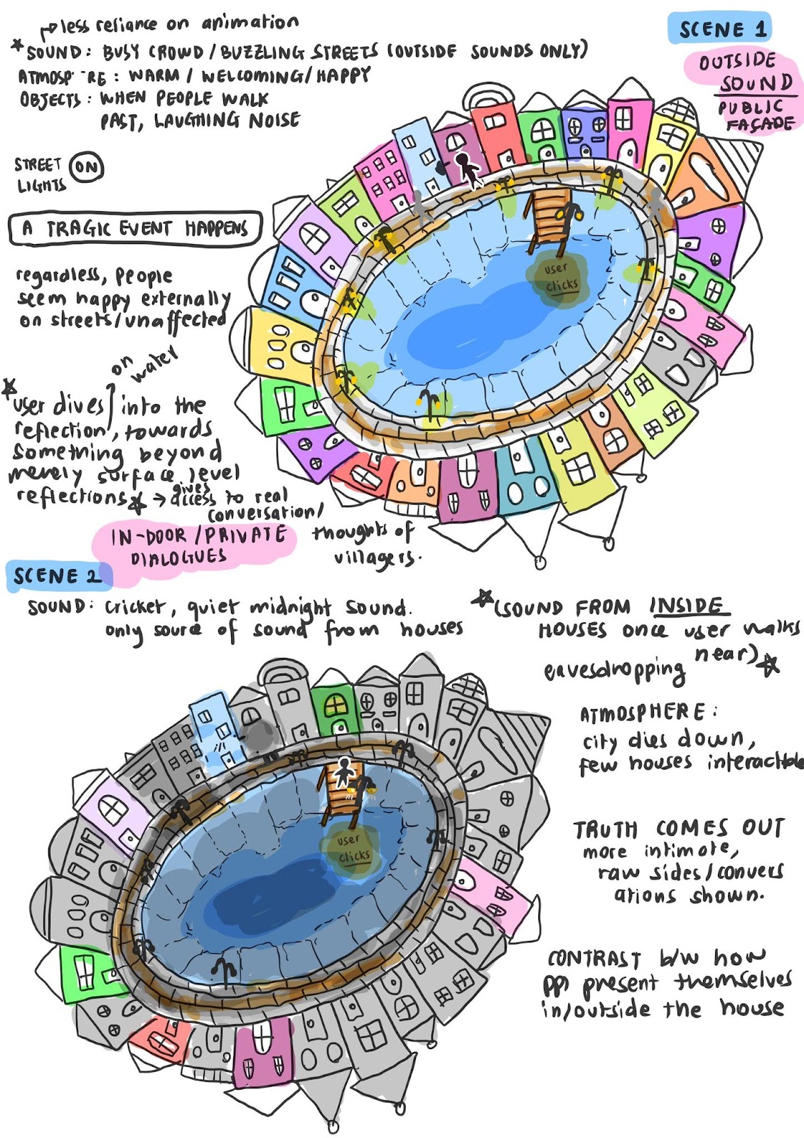
Invisible cities – There are two cities, usual one which we called “initial city” and the reflected version which we called “reflection city”. The user starts in the initial city – pinkish buildings, cheerful atmosphere with people walking around. The user can walk around and explore the place while interacting with characters. When the user walks to the bridge, light appears on top of the bridge to attract his attention. When the user reaches it, they find out they can click on it and after clicking the environment unexpectedly changes. The user finds himself in a reflection city – building positions flipped, very dark sky and people wandering around in despair. As the user approaches individuals he can hear all the negativity which people were ignoring in the initial city.
After having an idea, we sketched paper prototypes:
user walking to the pier initial view (next to pier)empty city view (next to pier)user walking away from pier
We decided to divide the workload between us:
We shared some ideas for the story and then Yeji took charge of the story development.
Will worked on building the dialogue system.
Then I started constructing the environment, based on the sketches. We have chosen to use the low-poly style assets. The most difficult and time consuming part was putting buildings together, particularly the “reflection city”, since I had to flip the buildings and decorations so it would look like the reflected version of the initial city. At the beginning I thought of just copying them all together and rotating the x position – 180 degrees and y position – 90 degrees, however, it didn’t work for some buildings, so I had to put everything one by one. Another problem that occurred during working on this project, was to make water look real. Though a lot of challenges occur I really enjoyed working on it.
The only action that the user does is walking around the city and talking with people. We wanted the user to start by just looking around the city and then walking and interacting with characters. The interaction form is a monologue system where NPCs say a few lines to the user, however, the user is not able to respond. The user could just go and interact with the characters. In the initial city the order of the interaction doesn’t matter since monologues are organized by character, however, in the reflection city, the dialogues are organized one by one in a sequential order. Moreover, as the user looks at the specific scene , light turns on and highlights the specific scene to make it easier for the user to understand and follow up on the story.
Although there have been some challenges that have emerged throughout working on the project, I am extremely pleased with the overall work we have done in such a challenging situation. The end product came very close to what we first foresaw for our projects, it feels very natural however, at the same time unusual and surprising especially when the transition to the second scene takes place.
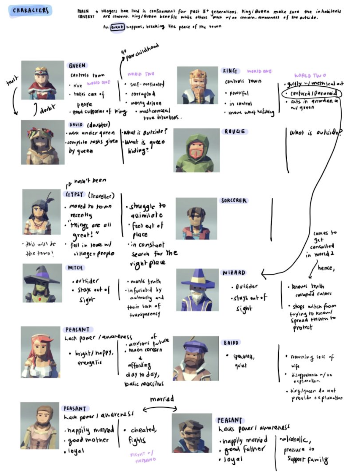
The user finds themselves inside of a small, rectangular town. Pink buildings encircle a clear blue lake, with no visible exit from the road which follows its edge. In the lake, the reflection of the town can be seen. Nearer to the player, a bridge stretches across the lake, and on the opposite end of the lake, a pier stretches into it. People are scattered about the town, walking around, sitting, or standing, going about their lives. Approaching and speaking with the residents reveals the simple society and economy of the town. Its everyday people are generally distrustful of difference and find their purpose in diving and digging for stones to give to the rulers in exchange for property rights. After talking with the king about stones, a mysterious light appears at the end of the pier.
Upon interacting with the light, most light disappears. A subtle mirroring of building positions suggest this is not the same place, though the same people are scattered about. Faint lights illuminate the road, and a bright spotlight falls on the most cheerful peasant from the first town. Approaching and interacting with the residents, the user finds that they residents no longer recognize the player. Instead, as the user moves from scene to scene, the underlying emotional and political complexities of the town unveil themselves. An overly cheerful peasant lives with depression. A busy wife cheats on her yearning husband. Virtuous rulers exploit the labor of the people for valuables without proper compensation or explanation of their worth. An angry witch sees all but does nothing, for the wizard keeps everyone under illusion. A charismatic and responsible king submits to the dutiful queen’s insistence on greed despite his guilty conscience, as well as the waning powers and reasoned council of his trusted wizard A loyal servant to the queen kills a merchant who refuses to explain how they arrived in the town, driven mad by her suspicions of the rulers.
Process
This project was created in
collaboration with Yeji and Ganjina.
At the beginning of the process, we had each voted for different topics, so we brainstormed different compelling narratives and environments for each topic. We narrowed down that list to two. The first fell into the apocalypse theme. The user would find themselves in an apocalyptic environment. When they interacted with the environment, they would be sent into a memory, during which they could choose to alter the timeline and repair the piece of the environment with which they had interacted. The second idea involved expanding upon the city of Valdrada from Invisible Cities. According to Calvino, this city was “built. . . on the shores of a lake, with houses all verandas one above the other,” such that “the traveler . . . sees two cities: one erect above the lake, and the other reflected, upside down” (Calvino 45). Calvino goes on to describe it as “twin cities” that “are not equal,” for “every face and gesture is answered, from the mirror, by a face and gesture inverted, point by point” (45-46). In this way, they “live for each other . . . but there is no love between them” (46). Feedback from the class was inconclusive, so we expanded both ideas a bit more, searching for compelling stories, interactions, and environments which might take place.
Yeji’s color-coded apocalypse
group brainstorm
short list of ideas
At our next meeting, we felt more
compelled by the ideas we had created from Valdrada and from reflection as a
guiding concept. Two ideas prevailed, one out of my creative process and one
out of Yeji’s.
My idea put the user on a tropical-island
environment. Guided by the question, “What would it be like to be a child in a city
where everyone knows their reflections are a different, mirror world?” the
narrative followed the relationship between two people throughout their lives.
In one world, they would become best friends. In the reflection, they would
become mortal enemies. Moreover, in each scene, the two worlds would interact
through the reflections, and the adults would anticipate these interactions and
respond to them nonchalantly. For instance, if one of the main characters
tackled the other through wall in the enemy world, then that hole in the wall
would exist in both worlds. In both worlds, the parents would fix the wall
without much comment.
environment sketch
environment sketch
adult enemies and friends
youth enemies and friends
Yeji’s idea emerged from the environment
of Amsterdam and revolved around the question, “What would be reflected?” This idea
focused more on a commentary on how people tend to hide their true thoughts and
feelings in order to get along, yet suppressing these feelings can lead
to outbursts when one feels safe or reckless enough to let them out. In this narrative,
the story would emerge from the user interacting with the characters to
understand some big event that connected everyone in the city. The user
would start in a bright city where people glossed over this big event to go
about their daily lives and would transition to the second city through an environmental
interaction. In the second city, the environment would be darker to match the
darker responses to the big event, responses which disrupted the functioning of
the city. The user would also encounter these responses as a voyeur rather than
a participant, indicating the private, and perhaps truer nature of them.
Yeji’s idea – initial presentation
The clarity of the interaction and
story, as well as the feasibility given the remote working environment
ultimately pushed us to develop upon Yeji’s idea. In my idea, the primary
interaction would be the user’s choice of how to experience the story, and the
story would be delivered via scenes which occurred around the user as a ghost. Given
the need to deliver two world narratives in parallel, our best solution was an environmentally
embedded panel present at the start of each scene, where the user would choose good
or evil. They would then be brought into the scene to watch it. In
Yeji’a idea, the primary interactions would be with the characters and with a
single transition into the reflection. The user’s agency and participation
would also be manipulated to convey story rather than held constant to make
room for it. Furthermore, my idea would rely upon complex and compelling
animations across many different scenes while Yeji’s would still be compelling with
simpler animations and fewer scenes. Hence, across the board, Yeji’s idea
seemed more conceptually appealing, explorative of the capabilities of VR, and
feasible to execute.
One problem still remained: how would we voice the characters? Voiceovers did not make sense without proper voice actors because of the number of characters we were using. After a bit of deliberation, we decided to go with a text-based dialogue system, similar to those of 2D text-based adventure games, like the early Pokémon games.
Pokémon screenshot
With this general outline for the experience, we sketched out the environment as the user would experience it for the paper prototyping session
Feedback from this session solidified
an already-developing idea to use the dialogue and interactions with characters
to guide the user to the scene-transition interaction. Another option was to start
the user right by the pier, but our desire to have the story emerge from the
characters suggested a focus on encouraging exploration rather than completion
in the first scene. This session also pushed us to move away form having the
private scenes occur inside of the houses. We realized that the narrative would
still be clear, and we could instead constrain the user’s agency in order to
achieve the feeling of privacy. With a relatively clear idea of the world, an
outline for a story, we divided up the creative work. Yeji would focus on the
story, figuring out the overarching big event and scripting dialogue. Ganjina
would start to build the environment based upon our sketches. I would start
figuring out how to achieve a functioning dialogue system in virtual reality.
An extensive outline of the design
process for the dialogue system is available in my development journal, but I
will summarize and expand upon some points here.
To start off, we wanted the system to feel comfortable in VR. The system would also be the object which would carry our story to the user, so it had exist at the intersection of user and environment. As a result, we decided to deliver the system via a HUD panel rather than multiple panels attached to each NPC. Mike Alger’s recommendations on comfortable relative locations for workspace UI were used to determine the dimensions of the panel, its distances from the main camera, its relative angle, and its curvature. Limitations of the assets we were working with meant it could not curve around the optimal spherical shape, but only around a cylindrical shape.
panel based on sphere
panel based on cylinder
The remainder of the visual design
choices occurred on an as-needed basis as more parts of the project were
integrated and tested with play testers in a series of demoes that can be found
in my development journal.
Visual design choices:
The dialogue itself is curved along
the same curve as the panel’s edges.
A next button and stop button
indicate when there is more text to scroll through and when there is less text
to scroll through.
The text is black when it is bright
and white when it is dark to optimize viewing.
The user’s reticle is a bright blue that
does not blend in with the colors in any of the scenes. It expands into a
polygon instead of a circle to match the low-poly aesthetic.
The reticle expands when an
interaction is possible because this was clearer than a simple color change
that might make the reticle disappear into the background.
The translucent blue of the panel provides
enough contrast without disrupting the visual environment.
The panel disappears when deactivated.
Initially, it changed form translucent to opaque, but feedback from play
testers suggested this was too disruptive the visual experience.
In addition to the visual design of the panel, we also had to develop functions which did not detract from the experience and were doable with the restrictions of the Google Cardboard. Hence, everything requires one-click or click-and-hold. Clicks under specific conditions create specific responses from the environment. These conditions were set to be as intuitive as possible. Finally, these conditions were determined and coded in a master script called dialogueManager. The script is around 500 to 600 lines, so posting it here would not be conducive to understanding it. Many of the functional design choices emerged from a gradual process of integrating the dialogueManger script with the pacing of the dialogue and the animations of each scene.
Functional design choices:
When the dialogue panel is active,
it must be deactivated before another dialogue can be opened. This is reinforced
by changing nothing if the user clicks on another NPC when the dialogue for one
NPC is active.
The dialogue panel can be reset and
deactivated by clicking on anything which is not the panel or another NPC.
Hence, the user can close out any dialogue at any point in the dialogue. This
adds to their agency as an explorer of the narrative.
Clicking on the panel scrolls
through the dialogue and ends the dialogue when there is no more of it. The brevity
of our dialogue meant that scrolling backwards through the dialogue was unnecessary.
Scrolling backwards would not have made sense in the night scene either, when
the user is witnessing rather than conversing.
In the second scene, the user cannot
click through the dialogue until certain animations have played. This occurs
during the cheating scene, with its delayed arrival of the peasant husband. The
reticle still indicates a potential interaction, however, to indicate that the
user will be able to move forward in the dialogue.
Before the
environment and dialogue were completely flushed out, I also worked on the
mechanics of the interaction between the user and the NPCs, since these
determined much of the dialogue system’s functionality. We did not want to have
any interactions triggered from an unintuitive distance, so I had to develop in-range
detection systems for the NPCs. For reasons described in my development journal,
I used a pseudo-cyclindrical, box collider, trigger method to detect when the player
was close enough to interact and set the GoogleVR reticle to detect objects
from a similar distance.
box colliders to fake a cylinder collider underneath the panel
During this time, I also figured out
a simple script to have the NPC look at the player upon interaction. This
script became more complicated later, when we had to have two NPCs stop their
pacing, turn toward the player, and then return to their pacing routine when
the dialogue interaction was completed.
npcLookAtPlayer
Finally, I also figured out the auto-walking
mechanics so that the user could move by clicking and holding.
autoWalk
As the dialogue and then the
environment were completed, our focus shifted to animating the characters in
the space. We used a back-and-forth workflow, and during my part I integrated the
dialogue system into the animations.
Dialogue System & Animation
Design:
Day Scene:
NPCs will turn toward the user when in the user interacts with them. This acknowledges the user as a participant and gives them the agency of control over the start of the interaction, a feature of public encounters between people.
NPCs return to their original positions or routines when the interaction ends. This maintains a sense of immersion, or that the user is in a place which exists independently of them.
The user can continue to interact with NPCs until they desire to move on to the next scene. This encourages exploration and understanding of the different characters and reinforces the user’s role.
Night Scene:
NPCs do not turn toward the player when the user interacts. This implies that the user is a voyeur, and that the NPCs are not necessarily aware of their presence.
Each dialogue-animation set is relative to the scene playing out rather than the NPC activated. This further reinforces the idea that the user is a witness of an otherwise private interaction.
The user cannot interact with NPCs whenever they want, but must do so in the prescribed, indicated order. This ensure that the story unfolds progressively, such that the pieces build on each other and organize the bits provided in the day scene.
With the exception of the arrival of the peasant husband allowing progression in the dialogue, the dialogue activates the animations of the characters. This was accomplished through edits to dialogueManager.
In the cases of the death animations, animation is both a condition and an effect. The deathTrigger script checks if the attacker of the NPC to which it is attached is attacking and then plays the death animation of the attached NPC.
deathTrigger
I also figured out how to do a root motion pacing animation cycle that could be interrupted. This allowed us to add some motion into the otherwise static environment of the day scene, giving more of a feeling of lively town and further distributing the interactions around the space. The pacing script attaches to an object with two box collider triggers. These are placed at the limits of the NPCs pacing area. It detects them and changes their animations on trigger.
pacingLimits
With the animations worked out, the
last components were the sound design, the scene change interaction, and the lighting
for the second scene.
Since the order of scene encounter matters in the night scene, there needed to be an indication of which scene could be interacted with beyond the reticle changing. Due to the dark environment of the night scene that helped establish the mood of a darker narrative, we decided to use theater-esque lighting to indicate which characters the user should go and interact with. The sceneLightsManager script was developed, and it either checks the animation or the state of the dialogue for a given scene, or both, on an as-needed basis. Hence, as the user completes each scene, they are visually guided to the next one they can interact with.
sceneLightsManagerall spot lights on in night scene
The visual cue for the scene change
had to be coherent with the visual cues we used elsewhere. Hence, we used an
orb of light as a button. This was visually coherent with our use of light in
the second scene and our use of single-click interactions. A similar
distance-sensing method to the NPCs was used to ensure the user could only interact
once they were within a relatively intuitive distance. Finally, the scene
change only appears in certain conditions.
In the day scene, it appears once
the user has spoken with the king, and the king has encouraged the user to go acquire
stones. When combined with the dialogue of the rogue and the swimming man in
the water, it seemed coherent with the story that the king’s dialogue would
push the user to try and find stones, and that going to the edge of the pier
might allow them to do so.
day scene orb
In the night scene, the orb only
appears once the user finishes the last scene. This fits with the intention to require
the user to witness all of the truth of the town before being able to return to
its daytime. Using the same orb in the same position suggests that it will do
the same thing it did before, teleport the user to a new scene.
night scene orb
As for the sound design, these were
done mostly by Ganjina and Yeji. I helped integrate them into the animations of
the night scene using similar methods from when I ordered the specific pieces
of dialogue and animations.
Finally, we had to think about the ending.
We were choosing between a fade-to-black or a return to the day scene. In the
case of the return to day scene, we would remove the murdered. We also were
choosing between maintaining the interactions with the characters or eliminating
them, disabling the dialogue system completely. Returning the day scene without
allowing interaction seemed to be the strongest indicator that the user’s role
had fundamentally changed as a result of what they had witnessed. They now
occupied the voice in all of the characters heads which caused the suspicion
and conflict, so it made more sense that the town would no longer want to speak
to the user.
Reflection
Overall, this piece was successful
in delivering the story we wanted. It conveys the commentary on the political
and emotional undercurrents of our public interactions. It embeds the story
within the characters distributed throughout the environment. The affordances
of the interactions with the dialogue system and the scene-change are clear,
and their conditions support the delivery and pacing of the story. Furthermore,
the experience takes advantage of the unique ability of VR to manipulate the
agency and participation of the user, and this manipulation helps convey the meaning
of the story.
However, the experience is not
perfect. Sometimes the NPCs do not turn toward the user. Sometimes the dialogue
panel is triggered by pointing at the pseudo-cylindrical colliders on the
ground. There is some asymmetrical pacing in the delivery of the cheating scene
due to the dependencies between the animations and dialogue pieces. However,
these bugs have been reduced as much as possible and rebutted against by the
logic of the system and the story. As a result, they do not detract
significantly from the overall delivery of the piece.
Space & Storyness: Our project is the combination of the experiences of our daily life in a small apartment and the underwater experience. This alternate reality is created with our hope to connect our daily life actions and their negative impact on the ocean, embracing the message of the inter-relation between human daily activities and nature. Through the perspective of being in a normal life that every user is used to, the user’s interactions with the food objects, such as plastic bottles and bags of chips, serve as the representation of our excessive plastic use daily. We may consciously or unconsciously use plastic in our life because of its durability, strength, and low cost that make plastic the material of choice for products. The message of ocean pollution is conveyed in the video of 20 seconds that the user will watch before diving in the next underwater scene. Without any special equipment, the user enters the underwater world, diving in its beauty before this world gets completely destroyed. Using the plastic objects that are frequently used in our daily life to contaminate the underwater world that the user explores, we hope to emphasize the negative impact our daily life activities can put on the ocean, and nature in general.
Storyboard for the project: Our initial storyboard consists of 9 scenes with the first scene describing our daily life and the next 8 scenes describing the underwater experience throughout 3 centuries. However, we reduced the number of scenes to two main scenes described above.
Playtest video:
An alternate realities experience designed for Google Cardboard, with the experience of exploring the interrelation of both worlds – our daily life and the underwater world.
PROCESS / IMPLEMENTATION
Project idea development: Our final choice of theme diverged from our initial idea for the project. At first, we decided to pursue the combination of two themes, namely “interpretation of a city” and “escape room”, as the descriptions of different invisible cities and our current social distancing situation amid Covid-19 pandemic served as inspiration for project ideas.
Olivia
Esmeralda
Fedora
However, as our team also put our main focus on creating a meaningful message for the users and a sense of storyness in our project, through lengthened discussion, we had come to a final choice of theme, “apocalypse”, which is different from what we started out with. In specific, we hope to portray to the users how our actions in daily life, whether conscious or unconscious, significantly contribute to ocean pollution.
The role of the users in the experience is the character with impact. In the first scene, the users are able to interact with the food objects, TV, and switch scene using the coral. In the second scene, the users, although mostly observing the underwater world, leave the trace of plastics wherever they go, and can switch back to the previous world through the coral at the end of the path of their exploration.
The final story of the project: With our unconscious consumption of plastic every day, we use different food objects, such as plastic bottles and bags of chips, serving as a first main interaction. We designed the first scene with various hints towards the next underwater scene, using corals of different types and colors. After the users interact with the food objects through grabbing and releasing them, they can also interact with the TV where a video of 20 seconds showing the current alarming ocean pollution. After watching the video, the coral on the shelf next to the TV would light up, inviting the users for interaction, which is for switching to the next scene. In the underwater space, it first starts out with a beautiful and lively scene. The users can walk around, but there is a designated path indicated by the two lines of plants. The scene would change gradually: the environment becomes darker; the fish disappears gradually. Every time the users walk around, they will leave a trace of plastic behind them. These traces of plastic consists of food objects from the previous scene.
The role of the users in the experience is the character with impact. In the first scene, the users are able to interact with the food objects, TV, and switch scene using the coral. In the second scene, the users, although mostly observing the underwater world, leave the trace of plastics wherever they go, and can switch back to the previous world through the coral at the end of the path of their exploration.
Scene 1:
Plastic containers around the room. User can interact with them (grab/release)
Television with video about ocean plastic pollution
After watching, user can teleport to next scene
Scene 2:
User enters into a pristine underwater environment – beautiful, vibrant, lively in the beginning, encouraging the user want to explore more
Users follow a plant path
After a while, a trail of plastic starts appearing behind them and around in the ocean, fish disappearing, and the lighting darkening.
Scene 1
Scene 2
Implementation of the project: Our project consists of two main tasks, designing on the two main scenes and building interactions. I worked mainly on designing the first scene and writing scripts for the interactions in both scenes.
After the first playtest session in our class, we realized that our initial design for the first scene does not reflect a strong correlation with the second underwater world. The playtesters were confused when exploring the scene and did not expect that our project had a second scene. Hence, we decided to re-design the first scene, adding corals as the main decorations for the room.
Initial design
Initial design
Initial design
Final design
Final design
Final design
For building the interactions in the project, I wrote several scripts, and partially used the GoogleVR package for event triggers:
PlayerWalk: this script is attached to the player object in the first scene. Due to the fact that the only action available in Google Cardboard is clicking the button, the user would be moving by clicking the button every time at the speed of 1 (the speed is public, thus can be changed). The user would not be able to walk when grabbing a food object in hand.
PlayerWalkUnderwater: this script is attached to the player object in the second scene. In this scene, we set the y-direction constant and adjust the camera’s height so it creates a feeling as if the user is swimming underwater instead of walking on the seabed.
Food interaction: this script is attached to the player objet and the food objects, enabled the user to grab/release the object whenever the user points the reticle towards the food objects.
User grabs the food object
Food collision: this script is attached to the food object to detect collision with other objects in the room. However, as the user grabs the food object, its kinematic is set to true, thus ignoring collision. The fix for this problem is Edit -> Project Setting -> Physics -> Contact Pairs Mode set to Enable Kinematic Static Pairs. This will make sure that the collision is still detected when the object is grabbed in hand, thus releasing the object whenever it collides with other game objects in the room. This is still not yet perfect. When we playtested to see whether the script worked properly, the objects sometimes still went through objects.
CoralChangeScene: this script is attached to the coral, which serves as the switching point between two scenes. The coral object with this script is only enabled for event triggers after the user watches the video of ocean pollution.
Coral lights up, inviting the user for interaction (switching scene)
RayCasting: this script is attached to the player object. When the hit.distance from the user to the object in the room is smaller than 1.2f, the user would not be able to move through other objects, such as walls.
TriggerTV: this script is attached to player object, with the event trigger added to the TV object. This also only allows the coral for switching scene after the user finishes watching the video.
The video of 20s about ocean pollution
Cursorhide: this script is added to hide the cursor, leaving only the reticle pointer in the scene.
For scripts in underwater, including ChangeLightIntensity, DeletePlastic, MovingFish, MovingShark, SpawnPlastics, I fixed the frameCount to adjust the speed and amount of plastic generated and the time when the fish disappears and the light becomes darker.
We also thought of whether we should change anything in the first room when the user goes back. After the discussion, we all agreed that we decided to keep it the same. Although it is easy to realize how much plastic can be generated by one human being, it is extremely difficult to significantly reduce the use of plastics in our daily life due to its convenience and massive use in products. This is the representation of an infinite loop that can only be broken by the change in the awareness and behavior.
EVALUATION / REFLECTION
The project is an amazing team collaboration experience. As we work throughout each scene, we realized that there were a few problems that we underestimated when we first started. For example, the scope of our project in Google Cardboard limited our choice for interactions, hence when using the clicking button for both walking and grabbing/releasing the object, we need to reconsider when we should enable the walking for the user. Another problem we encountered during the project development was collision detection and interaction with food objects. With the great support from Professor Sarah Krom, we were able to fix the issues in the end.
In addition, the choice to reduce from 9 scenes to only 2 scenes turned out to be the right choice. Due to the time constraints, this simplification still represents the message we want to convey in our project.
Although we did not have time to add interactions with the fish and other plants in the underwater world, the final witness of plastic overwhelmingly occupying the ocean, in the end, is quite powerful for us when we playtested our project.
The Fall Of Octavia is a piece of interactive storytelling designed for the Google Cardboard. The project is based on the city of Octavia as described in the book Invisible Cities by Italo Calvino. The piece takes this depiction further and imagines the complete destruction of the city, providing the user with the task to move through the city and escape with their daughter before it collapses. The city is depicted as being constructed of wooden houses similar to medieval-style homes. It is described in the book as a “spider-web city,” with many floating islands connected by bridges and ropes. As a consequence of the city’s flimsy architecture, the precarious situation is viewed as a part of life in the city, as something that the inhabitants must face everyday. How does this constant threat of collapse and destruction impact the culture of the city? In what ways would its inhabitants react if the city were to collapse? How might these reactions to death differ from the reactions of inhabitants in other cities? The project depicts the gradual destruction of the city, the reactions of its inhabitants and brings the user into this dynamic environment.
Process/Implementation
We all agreed that we would either do our final project with either the theme of apocalypse or a city from Invisible Cities. Eventually we decided on depicting Octavia and imagining the city as an explorable virtual reality experience. We found the premise interesting because of the architecture of the city as well as the dangers that this architecture would pose to the preservation of the city. We were also inspired by a few depictions of the city that we found online:
At first our idea was putting a fantasy spin on the destruction of the city. The idea that it was a “spider-web city” by actually introducing a malevolent spider that attempts to destroy the city. In this case Octavia would have been constructed by a spider and built upon by human settlers who were unaware of the spider’s existence or believe it to have disappeared. Because we believed that there were many interesting things we could play around with in the destruction of the city’s islands we found this destruction of the city to be at odds with defeating the spider character. Furthermore, we were unconvinced that this would be a compelling experience because of the restrictions of the Cardboard and the difficulty in creating an engaging way to kill or repel the spider with just the one button.
Initial sketch of the spider scene
After some more brainstorming and also experiences with the Google Cardboard, we decided that it might be a better idea to focus on the environment rather than a story that might require a more complex interaction system. Two questions came to mind when we decided this: why should we care about exploring the city? How should the user navigate the city with the Google Cardboard? To address this we decided to make the city as one strip of planks with houses on the sides of the path. This was done to immerse the user in the scene, making it apparent that the city is hanging in the sky between two mountains. It was also done to encourage the user to travel along that path exclusively, motivating them to get from point A to point B naturally. Because we wanted the user to also pay attention to the surroundings and the city’s inhabitants we decided to make the motivation for the user finding their daughter through the collapsing city. We realize that this motivation may be a bit superficial, but because of the difficulties with the Cardboard and our desire to make the user focus on the inhabitants, we decided that this would be a good option, even though finding the daughter is an easy task. The user can decide whether or not they choose to save their daughter, with the decision having no impact on the ending of the story. The user is also given no time restrictions. These decisions were made to encourage the user to fully observe the environment while “encouraging” them to seek out their daughter for the sake of the story introduced during the introduction sequence.
Sketches of the scene design for the final idea
For our interactions we decided to just have one interaction which was clicking on the ground around you to move the camera in that direction. The other interaction was going close to the daughter which would enable her to follow you for the rest of the scene. This was done to allow the user to pause while walking to look around and observe the city. It also becomes obvious that one of the inhabitants is the daughter because she starts waving at the user when they come close.
My task was designing the city and creating animations for the city’s gradual destruction. Applying what I discussed before I created a strip of land that the user could walk on through the city and placed medieval houses on the sides of the path. I found a great script that broke apart gameobjects into smaller pieces through this YouTube tutorial which I found made the user’s situation in the city more dangerous. With this script I made some objects fall onto the strip and become destroyed at certain points in time while others are cued by the user’s movement into a certain position in the scene. I also added flames and smoke inside several houses and scripted objects and houses to fall from the city’s other islands into the abyss. I also added some post processing effects to the screen to make the appearance of the scene more aesthetically appealing. Fog was also added below the city to create the illusion of a deep abyss and to avoid creating additional terrain/gameobjects that might be heavy on rendering power (the scene was heavy enough as it was!).
I also worked on adding ambisonic sounds to the scene as well as the final destruction sequence that occurs at the end. Ambisonic sounds were added to the fires, to the daughter, to an inhabitant crying and to an inhabitant screaming. This was done in order to increase immersion as well as guide the user to investigate where these cries might be coming from and to pay attention to the reactions and expressions of the inhabitants. The final destruction sequence was triggered as the user stands on the mountain slope and loud rumbling noises can be heard as the city falls into the abyss.
Reflection
Overall, I was satisfied with the project and my contribution to it. With this project I really felt like I understood how scripting worked compared to other projects, especially communication between different scripts. I did grow frustrated with how difficult it was to create a complete environment that was beautiful and responsive to the user’s actions and movement throughout the scene. Even though I felt like I did a solid job, I felt like a few of the animations looked a bit out of place with the environment. I think that the ideation part of this was where our group struggled the most as we put a lot of thought into how this whole experience would be designed for the Cardboard while also creating an engaging and immersive scene. Our biggest question was: what would we do with the one button? Our answer to that was to allow for the user to move around the scene with little limitations by reserving the button for movement up and down the city and over the bridge. I am not completely sure about whether it was the best decision, but we had a difficult time figuring out what kind of compelling actions could be taken with the click of the button, especially in the context of feeling powerless in the face of imminent death.
The Fall of Octavia is an immersive experience in Unity that depicts the demise of the fictional city of Octavia. First described in the novel Invisible Cities (1972) by Italo Calvino, the city of Octavia is said to be hung across two steep mountains above an abyss by ropes, bridges, and chains. Due to such a precarious nature of the foundation of the city, it seems like the city’s inhabitants all know the city will come to an end, sooner or later.
Adopting the perspective of a mother’s journey to find her daughter in the falling city, the experience invites the player to a precarious situation where the player must navigate through. The experience, thus, is two-fold. Firstly, the main objective is to find the daughter among the inhabitants of the city. Secondly, through the task of traversing the city to find the daughter, the player immerses themselves in this strange world of Octavia, trying to make sense of the city, its geometry, its direction, its motion, and its people in action through environmental storytelling elements.
The experience is open-ended. There is no time limit. Even though parts of the city are destroyed over the course of the experience, the player is welcomed to explore the city at their own pace. However, once the player crosses over to the mountain, the rest of the city will fall, signalling its eventual demise happening right in front of the player’s eyes.
Process and Implementation
We started off with the ideation phrase. Having unanimously agreed that we did not want to create an escape room experience, we were left with recreating a city from Invisible Cities or an apocalypse. How about combining both of them: we were all impressed and intrigued by the city of Octavia, whose unique foundation puts it in a precarious situation that would lead to eventual destruction. Octavia’s unique geometry would also leave a lot of room for environmental storytelling elements.
Some illustrations of the city we found
Originally, we came up with an idea in which the main character (the player) had to save the day when the spider that laid the hanging foundation of the city had returned and threatened to destroy the city out of vengeance (for occupying its net). However, after pitching the idea to everyone, we realized that the incentive of the experience were not explored sufficiently and would be hard to do so. Would the goal be cutting the ropes that hold the city and thus destroying the entire city AND the spider along with it (which is the only viable way to fight against the enormous spider)? Wouldn’t that go against the idea of saving the city in the first place even though the effort would save the people who already made it to safety across the mountain? But then would we have to explain that the spider would now try to kill the people who already made it to safety instead of destroying the city itself?
Our very first sketch involving the spider
The idea turned out to be a rabbit hole. After much efforts into patching the idea together, we decided to come up with another incentive for the main player to traverse the city: a mother’s journey to find her daughter in a chaotic, gradually disintegrating city and get to the mountain before the entire city collapses. The task of finding the daughter would give the player an incentive to put active efforts into exploring the environment and take in as much as possible what it has to offer, as opposed to rushing to the finish line. We also narrowed down the main navigable route of the city to be a straight line (which is of course decorated by out-branching bridges and ropes which act as the backdrop for the city), with the reason being we did not envision this experience to be similar to an escape room where the player needs to take different paths to find something.
Our sketch for the refined idea
We also envisioned some sorts of interactions between the player and the NPCs to further detail the environmental storytelling elements. Instead of asking the player to carry out a traditionally proactive interaction (either by pressing a button or holding a gaze), we decided to take in the feedback from Sarah and let the NPCs unravel their animations when the player came close to them, i.e. them being in the player’s field of vision. Because looking is an active choice in a virtual reality space, the player sees the world and the story that the NPCs deliver through their emotions and the reactions to the presence of the player. For instance, a woman who can be seen praying from afar begins to cry and lash out of frustration at the player upon coming closer to her. Another example is an injured man who is trying to run away from the crippling city drops dead when reaching the player’s field of vision. The act of seeing the man drop dead is an active embodiment of the dying city itself: the player is surrounded by the process, not the just the aftermath, of the destruction. The act of seeing the man drop dead evokes more emotions than just seeing dead corpses lying around, which leads us to the finale: after making their way to safety, the player and the daughter will witness the eventual obliteration of the rest of the city, wrapping up the entire experience.
Early on, my main responsibly was to create Non-Playable Characters (NPCs) and their animations. A more detail account of the process can be found on my developmental journal but the process can essentially be summarized as:
Using Adobe Fuse for 3D character creation
Rigging in Mixamo to applying animation -> importing into Unity
Tweaking the materials properties so that the character look as good as intended in Unity
Creating Animator Controllers in Unity and scripting them so that they change animation clips when the player is in the vicinity
Creating a special script for the daughter so that she follows the player
This was where things got trickier. At first, it was a straight-forward process to rotate the daughter so that she always faced the the player before she was picked up; it was also easy to anchor her rotation and position to the player’s respective data when she started to follow the player (using transform.position and transform.rotation). While the player itself utilizes the NavMesh and thus cannot walk through walls or other objects, the daughter is caught in a weird position (no pun intended): she would knock over walls and other objects if she is set to be isKinematic or alternatively she would be knocked over upon collision with other objects set to isKinematic. Unfortunately, when both were set to isKinematic, she could walk through them as if the Collider was not applied. The goal was to have the daughter AND the player stop when either of them hit any obstacle, which proved to be difficult. It might involve passing information around different scripts (daughter and player) when collisions happened and moving the daughter using Rigidbody instead of transform.position. I had to settle with the current imperfect implementation as I had to move on to other components.
The opening scene
As some suggested adding an introduction to our experience, we decided to do a flyby over the city while narrating the situation in the beginning. The narrator briefly introduced Octavia and its unusual traits while setting identity for the player (mother/parent) and setting a goal to incentivize the player to traverse the city (find daughter and head to the mountain). Text narration was discussed at some points; however, we agreed it would be competing for player’s attention with the moving scene of the city below. The only text element in the entire experience is the title of the experience which is displayed when the narration finishes.
Reflection/Evaluation
Overall, I am happy of the what the project turned out (or not turned out) to be. During the ideation process, I would often feel overwhelmed because of the scale of the city. Thankfully, with the simplifications we made with regards to where the player can go and what the player can interact with, the experience still retains its most essential essences while we managed to strip down unnecessary elements.
That being said, however, if I were to nitpick, there would be still some aspects of the experience that can be improved upon given enough time. Having said before, I would love the daughter character not to walk through objects like a ghost. Also, having some more characters wouldn’t hurt, especially having some NPCs make it through the bridge to safety; for now, the player and the daughter are the only sole survivors of the city. While such a scenario in itself is not entirely impossible, it would be a bit more realistic to have other survivors in the mountain congregate to witness the demise of the city as well.