Development Journal – Final Project

12 April – Brainstorming + Story Board

For this project, Ben, Chris and I decided to go for the theme of escape room. We came up a few ideas when trying to narrow down what specific scenario we wanted to create. And finally we chose to make the protagonist sit on a wheelchair while moving around and seeking clues. We will let the user sit on a chair to simulate the experience on a wheelchair, which can also fit how Google cardboard work. The wheelchair not only gives the limitation in terms of movement in the game, it may also be a core part of our story. We are going to choose the story background in a theater/hospital/laboratory/retirement house because the wheelchair can be connected to these locations. And it will also relate to the protagonist’s experience or identity or gives him reason to take some action.

Storyboard by Ben

So far, we spent most of time deciding on the general direction and the mechanic of how the wheelchair will move. We also started to compose our story and design the process of escaping to make the whole thing cohesive and intriguing.

Mood Board by me
Another Storyboard by me

20 April – Paper Prototype

We discussed some story details and made this paper prototype for first testing. We only put the key objects on this simple hospital map to give the general idea. The character can move around on a wheelchair to explore this space. During the paper prototype testing, we’ve received some feedback about the navigation and the style. After the session we also reconsidered how we’re going to construct our story in a better way.

26 April – Scene Layout

We’ve figured out how to control the character. Basically the character will move forward by a long clicking and be able to interact with objects by a short click.

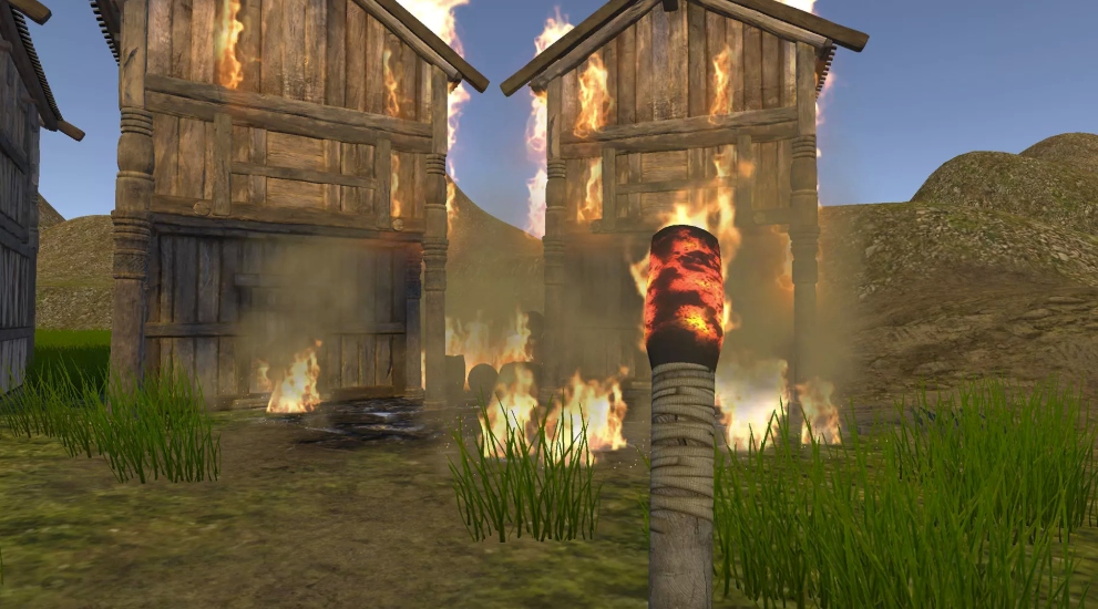
For the scene part, I started from building a basic hospital structure with a few sections. At first, our mood board chose some horror style, but later we found we all preferred more psychological horror and tried to go for a creepy clean style. As we were searching for assets, we didn’t find any that was very suitable. So we just chose a zombie hospital asset as it has a complete set of hospital stuff. But I don’t want to go for the exact same style as provided in its demo scene, so I tried to find a way to set the light in a sense that it look like psychological horror. And we all agreed on this change and these are what we have right now.

Layout

4 May – Play Testings

This week we did two play testings. In the first testing we had two separate builds: one on the movement and the other on the scene. But in the second testing we were able to combine the two parts and mostly tested on the space scope, speed choice as well as the general scene settings.

Here’re some points I gathered through the testing:

  • To provide the motivation to escape;
  • To limit the angle to look down;
  • To add more stuff / interactions;
  • To add some audio to wheelchair;
  • To add some glowing effect;
  • To implement object pickup animation;

There’re quite a few useful points and we were also inspired by some of them. By the end of the project, we only had the last point left due to time constraint.

6 May – Ending Scene

To make our story complete, we also decided to add an ending scene after the character managed to escape. Instead of the first perspective, this ending scene is a third perspective from a monitor screen.

When building this scene, the monitor screen is in fact a green filter on UI canvas and the red circle is made by two cylinders. One more detail is in the animation of the player that he will idle back and forth for a few frames before leaving. So it’s more natural to transit from the last scene. Later, this scene also included the audio of computer talking which can help with our illustration of the story idea.

Screenshot of the Ending Scene

9 May – Sound Effects + Story Reconstruction + Photos Editing

To create more immersive experience and give the character motivation to escape, we think adding audios can be a good way. Besides the basic wheelchair sound effect, there’re sounds only played once at the beginning, sounds within a range of area, and sounds that will be triggered if the user enters certain space. The combination of unknown footsteps and baby cries near the mortuary is meant to create some tension and indicate something undesired may happen. There’s also one moment when the sound of moving beds is left-panned to make the user feel something is on the left. But when he steps out of the trigger area, the sound will be cut off as if what he heard is only illusions.

The tricky settings in this part is that the spatial blend should be set as 1 and doppler factor as 0 to achieve the 3D sound effect. Also for the sound of wheelchair moving, it’s not natural to use Play/Stop to control. Instead I found adjusting the volume only can be a better solution.

Sound Effects Demo

For our background story, originally we set it as a world of selling happiness, and that’s why the clue photos are all laughs. However as we kept polishing up narrative details. We think replacing it as an AI/machine-dominated world can make more sense and be more consistent. So we started to guide our narration to that direction.

To match the style of body model, I also updated clue photos as follows:

Low-poly body model
Edited Photos
Original Photos

12 May – Interaction + Scenes Transition + Keypad GUI

As we separately did some portion of the project, we finally combined all of them which includes the wheelman animation, the door animation, keypad system, scenes transition and photo collection interface.

WheelMan Animation

Originally we had some texts and a flickering cursor on canvas in the ending scene, but it was not elegant enough, so we used a dissolve effect to do the transition between the two scenes.

Original Try with Text Animation

For the keypad system here, we also fixed every problem we met, like fixing the trigger state and placing it right in the center. Also, there’s a “?” at right bottom of the keypad by clicking which you can get an indication of “five-digit password” on screen. At first the user needs to click again after the door opens to enter the next ending scene, but it’s not that intuitive to make him click again. So we just use an “Invoke” function to make a delay after the door animation so that the scene transits more naturally.

Door Animation with transition to Ending Scene

For photo collection, when the user clicks the glowing album at very beginning, there will be four red rectangles appearing at left bottom to indicate there’re four photos in total. By clicking different objects, the user can collect photos one by one and get the clues.

Photo Collection Interface

We also met a weird camera shaking issue which we are still not sure about the reason. But we later solved it by simply fixing any rotation axis.

Project 3: Development Journal

For this final project, Neyva and I were inspired by the prompts of wonderland and escape room. For us, escape room loosely represented the existence of a motivation or objective for the player that would result in some sort of relief. Wonderland then served as inspiration for our setting, which led us to consider fantasy or supernatural elements for it. We eventually started discussing the possibility of obtaining inspiration for our experience from folklore – more specifically, Japanese Yōkai folklore, which deals with supernatural monsters, spirits, and demons. After researching different Yōkai, we came across the kitsune, or fox spirits with various abilities, such as being able to shape-shift into humans. According to Japanese folklore, kitsune could have up to 9 tails, with the highest number of tails representing the fox’ age, power, and intelligence.

There are also various types of kitsune. The two that are key figures in our game are the following:

  • Nogitsune: Nogitsune are wild foxes that do not serve as messengers for the gods. They are known to torment, trick, and even possess humans, sometimes using their shape-shifting powers to do so.
  • Zenko: Also known as benevolent foxes, the zenko are mostly associated with the deity of rice, Inari. These kitsune are white in color and are also known to be able to ward off evil, also at times serving as guardian spirits. They also help protect humans against nogitsune. 
A zenko kitsune with 9 tails
Wild kitsune, nogitsune

Given that representations of kitsune are usually found in shinto shrines in the form of statues, we decided to situate our game in a shinto shrine as well.

The Fushimi Inari shrine in Kyoto has many statues of Inari’s kitsune scattered throughout (please disregard the watermark)

In terms of our story, we decided that we would like it to be based off of the zenko and the nogitsune foxes. This is how the story/experience would pan out:

  • User finds themselves in the middle of a shrine/cemetery during sunset
  • As the sun sets, the environment starts looking more hostile/surreal (haze, colored skybox, creepy background sound)
  • Once the environment is fully “surreal”, two foxes appear in front of the user. Both have 9 tails and look similar. (one is an Inari fox, the other is a wild fox that has disguised its appearance)
  • The user is prompted to “make a choice” and pick one of the two foxes.
  • If the user chooses the Inari fox, the environment goes back to how it normally was (we are still considering different options on how to make this outcome more interesting/exciting)
  • If the user chooses the wild (bad) fox (which is disguised as a good kitsune), they stay trapped in the surreal space.

After pitching our project to the class, we received very helpful feedback from everyone. This is a summary of what we still need to consider as we work on the story/game:

  • Ending: does it end due to a user’s option? Or just naturally? Or does the user just take the Google Cardboard off ?
  • How do we hint at the choice that the user has to make? → we could possibly have the kitsunes be on different path and then the user chooses between them → does this mean that they move somewhere else after following the path? The user appears in another part of the shrine?
  • How do we create a satisfying ending for the good fox? (right now the “bad ending” seems more interesting)

04/29 Update

First, here’s our storyboard for our paper prototyping session. As can be seen, the user starts in the middle of a path. At each side of the path, the kitsune will appear.

Since our paper prototyping sessions, Neyva and I’ve been bouncing a lot of ideas back and forth as we continued to decide what would happen with our story. Following Sarah’s advice of establishing definitely what would happen in the story before focusing on the environment building, we considered a lot of options before finally deciding on a sequence that we think is technically possible and which also maintains the integrity of our original story. A first new idea that we had was inspired by a scene in the movie Ghost in the Shell: Innocence, where the protagonists are trapped inside an illusion that has them repeat the same experience/time 3 times until they realize they are trapped, successfully breaking the curse. It’s a really really interesting sequence, which can be seen here from minute 56 – 1:08 (shorter version from 1:02 – 1:08)

For our project, we similarly were thinking that now, instead of just having to make one choice between 2 foxes that either saves or dooms you, you start the experience by getting cursed by the bad kitsune. The curse is having the illusion of choice, of being able to escape by choosing one of the foxes. In reality, with each choice, the same experience repeats itself: the user finds themselves again in the same shrine and presented again with what seems like the same choice. Trapped, the only way the user is able to break the curse is to identify what is off in the environment (what has changed) and clicking on it instead of on the foxes. As we were fleshing out this idea, however, we questioned how hard it would be for users to catch onto the fact that they were stuck in this cycle, regardless of what fox they chose. We were concerned that instead, users would be confused and even bored about the experience if they thought that all there was to it was a cycle of choosing between foxes that seemingly didn’t make a difference. In light of this, we then started thinking about the possibility of telling the user to look closely at the environment, implying that their attention to detail will ultimately affect their experience. As such, following this line of thought, we finally developed how our experience will finally work:

  1. User appears in a shrine/cemetery at sunset.
  2. A text overlay states: “Look closely around you. Click when you’re ready.” the user has the option now to look around and pay attention to their surroundings, and decide when they are ready to continue
  3. Once the user clicks, the atmosphere changes eerie (the skybox turns dark, the lanterns become weird colors). 2 kitsune walk towards the user and sit at a distance from them. A new text overlay states: “Select the 3 changes”. An overlay on top of each fox contains a riddle/list of objects that they suggest the reader to pick. The good fox contains a list of the correct choices. The bad fox contains one wrong item. By having this overlay on top of the foxes, the user can at least have a hint of what they can select (or which fox’ advice they’d like to follow), if they are unable to track the changes.  
  4. Using their Raycast pointer, the user must now identify the 3 items/things that changed in the surrounding (this does not include the atmospheric change). Once they choose on an object, it will turn a highlight color to indicate that it has been selected.
  5. Once the 3 choices are made, the following could happen depending on whether the items are correctly selected or not:
  6. If they are properly selected: the bad fox walks away and the environment goes back to normal. Overlay states: “Good job! You made it.”
  7. If they are not properly selected: the bad fox walks towards you. Overlay states: “Wrong choice”. Everything goes black.

And an update on how the environment is starting to look like:


05/04 Update

Our playtesting session today was really helpful in giving us a better sense of how to hone down our interactions. These are additional notes we took during our playtesting session today:

  1. Give better indication at the beginning of paying attention to details. Mention some change.
  2. Possibly go back? Possibly do 3 rounds or something like that? –> perhaps this is not necessary if the text at the beginning is obvious
  3. Right now, second change looks like nighttime, change so it looks more surreal
  4. Sunset: take out shadows
  5. Have the text in front of you as soon as you go in. Experiment with overlay vs with set position

05/07 Update

After the second playtesting sessions, here are some additional notes that Neyva and I are considering to improve our project. Update, 5/13: after implementing the changes, I’m adding more descriptions on what we ended up doing.

  • Text resolution/canvas overlay: must be responsive to fit large resolution screens
  • Text overlay: in order to avoid people from clicking instantly and skipping the first part of the experience, we decided to implement a script that disables mouse clicking after 10 seconds. After these 10 seconds, a text will be shown prompting people to “click when you’re ready”. Furthermore, after clicking once, users are prompted, “are you sure?” so they reconsider this choice.
  • Scene change: we still need to make the new environment seem more surreal/ominous. This can be done by changing the skybox to make it have more unnatural colors and perhaps adding fog or another particle system. This is how the lighting looked like at first, when we wanted to have the user start at sunset:
This scene already looked a bit ominous with the pink ambience and the skybox

After realizing people would confuse the change of scene with just nighttime due to the fact that they were previously in a sunset setting, we decided to change it to being during the day. This would make the change of scene more prominent.

Changing the skybox to a sky blue and changing the rotation of the sunlight was key in giving the feel that the setting was during the day.

Layout: to avoid people from thinking that they can potentially move to other parts of the road throughout the experience, we have decided to change the layout of the shrine/cemetery. Instead of placing the user in what seems to be the middle of a road, the user will now be placed in the middle of a circular layout, with only one opening (which is where the foxes will come in from). By having everything directly surrounding them, the user would now be able to pay more attention to the details surrounding them. This is how the environment originally looked like:

Users would find themselves in the middle of this path, which unfortunately gave the sense that they could potentially move throughout the space
Having so many items laid out in this vast space was also very overwhelming for users, as they weren’t sure where their attention should be

Objects: following the previously mentioned layout, we decided to place more “flashy” and distinguishable objects in front of the user to emphasize how these are the ones that will potentially change, not the ones in the background.

Having items that were noticeably background or foreground was key in directing users’ attention
Having such a big lamp such as this one enabled it to stand out from the other simpler objects
  • Movement of foxes : how does their movement start? do they just appear? maybe every few seconds they switch between sitting & standing idle (to make them more realistic). In the end, we decided that both foxes appear running towards the user. Once they stop, the new instructions appear, suggesting that these are related to the foxes
  • The pointer: originally, we wanted the pointer to change when it hovered on a selectable object (we decided not to implement this in the end as we realized that the changing color of the hovered object material is enough indication for users to know they can select it)
  • The riddles: the riddles for us were key in giving more depth to the experience, as well as involving the foxes more into our narrative, as we had originally envisioned. In a way, even though users are not necessarily selecting foxes anymore as we had thought at the beginning, they can choose which fox to trust. Regarding the content and style of the riddles, we aimed at making them seem cryptic yet understandable after a few read-throughs, and we hope that players are able to take the time to try to decipher them.

Explanation of riddles:

Right (correct answer)

  • “In our likeness we stray from the path, one good one bad”: referring to the identical fox statues changing their facing direction
  • “Look for the red, that emerged from the stone. Both small and large, they will return you home”: referring to the small tori gate that turned from being stone gray to red, as well as the surrounding fence that completely changed from being stone to being red and made of wood
  • “Look for the red, that emerged from the stone

Left (‘incorrect answer)

  • “One light guides the path to where you came. It burns not”: referring to the candle (wrong choice)
  • “As the stone grows cold, a red outer edge is your first guide”: referring to the fence that became wooden and red
  • “Only one of us will save you, although both of us are key”: referring to the fox statues

Development Journal | Final Project

PROJECT MEMBER: Luize, Nhi, and Tiger

PROJECT THEME: Apocalypse/Escape Room

IDEA DEVELOPMENT:

In our first meeting (via Zoom), we decided a few elements that we want to explicitly convey in our projects before brainstorming: 4 final project theme ideas (Apocalypse, Escape room, Wonderland, Create an interpretation of a city from Invisible cities), a fictional space, interactions, events, and the sense of storyness.

In the beginning, we thought of recreating 3 cities from Invisible cities: FEDORA, OLIVIA, ESMERALDA. The theme would be escape room & Invisible cities interpretation: link to the current situation where everyone is trapped in their own space and try to escape the state of mind, connecting with other people through the Internet – a way of escaping the reality we are living in right now. Each city has different unique inhabitants, for example, OLIVIA has skeletons since it reflects the industrialization and the repetitiveness of the work people do every day, etc.


However, since our main focus of the project is the sense of storyness, we found that our approach of recreating the invisible cities did not reflect what we wanted. We brainstormed a new different idea of the escape room theme. The context would be: Protagonist (the user) is a prisoner, wakes up from amnesia, finds themselves in a dark small cell. There is a giant clock on the wall of the cell showing red digits and counting down from 1 hour. This, hopefully, triggers the anxiety and makes the user look for tools and try jailbreak. When the user successfully finds the door to escape, there would be different scenes waiting for them (representation of the past, present, and future of a person). In the final scene, the user can find the door to bring them back to reality. The whole message we want to present through this idea is that every moment in life is precious.
This is a better idea compared to the first, but we encountered one problem. Since each user will have their own experiences, there would be no generic way to layout the scenes that can evoke the feelings/emotions for the user to reflect on. Therefore, we decided to revise the idea into a more neutral setting, which is the undersea environment.


Final idea:

  • Beginning scene: neutral, white background – a television (off) -> user must interact (turn on/off) the TV to enter the undersea alternate reality world.
  • The same idea before but different scenes, different message: travel through time in the ocean to see how the environmental change reflects during each time period.
  • THEME: Apocalypse
  • The user would be under the sea, there would be a line (road) that indicates where the user should move to (sunken ship (1920), submarine (2020)) where they would find a button to enter the same scene 100 years later.
  • The scenes (3 scenes), in each time period, you still have a clock/sign somewhere to indicate the time (years, explicitly)
  • 1st scene (past, 1920): no plastic
  • 2nd scene (present, 2020): a lot of plastic but still can be saved
  • 3rd scene (future, 2120): a lot of plastic and no animals -> can’t be saved anymore. In this 3rd scene, the user will need to dig into the plastic in order to find the button and travel back to the current time (reality).
  • You go back to the present (the beginning scene) and take action to do something to save the environment.
  • Message: save the world before it’s too late.


Some clarifications/class feedback/adjustments:

1. The meaning of the TV in the first and last scene: The user needs to interact with the TV in order to move to the undersea scene. What we had in mind was that we could try showing different scenes of the ocean before the user actually experiences it. It’s similar to the fact that most people would just know about the undersea world through the screen but not by actually experiencing it.

2. Reduce the number of scenes to 4-5 scenes: Though it’s a lot of scenes, it would basically come down to these 3 ideas: first is the TV scene which is extremely simple, second is the outside undersea scene (appear three times with different levels of destruction) and third is the inside scene (sunken ship and submarine). In short, we only layout 3 main scenes and then replace a few things in each scene to demonstrate what we want.

3. The use of the button (click): not to have a literal button that triggers changes but something more subtle that blends in with the story – the nautilus

UPDATE April 17, 2020

Tiger and I finished the list of needed assets and created the first scene in our project. In this scene, we added a screen to the TV, which will be used to display the video later.

First room the user enters

UPDATE April 20, 2020

After the lecture and class discussion on Procedural Authorship, our team felt like in our project, the players would be in the role of “Ghost without impact” since they will only observe what happened throughout 300 years and do not have any real impact on the environment. Hence, we decided to create some interactions between the user and the environment and limit our scenes to only 2 main scenes:

  • The first scene: the users will enter an apartment (which is also their house in the game) where they see some snacks, water bottles, cups, and cans on the table and on the floor. They will get a chance to interact with the objects by grabbing and releasing them. They can also move by clicking the mouse (clicking the button in Google cardboard). The main point in the scene is when they turn on the TV and watch a video/a teaser of the experience they will experience next.
  • The second scene: the users enter the underwater scene of 100 years ago. When they explore and interact with the undersea animal, they will leave a trace of plastic behind them (can be the cans, water bottles, or those cups that they saw in the first scene). We also hope to make the scene gradually polluted (sea animals/plants gradually die) that also represents the 3 initial 3 scenes we had in mind (1920, 2020, 2120).

UPDATE April 26, 2020

We finished laying out two basic scenes.

In the first scene, I added objects for user interactions such as cans, chips, water bottles, coffee cups, and wrote scripts for PlayerGrab, PlayerWalk. I also wrote the SceneCtrl for switching scenes later. I also added event triggers for the objects so that when the users gaze at the objects, they can click the mouse/button in Google Cardboard to grab/release the objects.

UPDATE April 29, 2020

After the team check-in, we all agreed on the current design of the environments (of the room and of the underwater scenes) and finalized the interactions we are going to add in the underwater scene. Currently, the user is able to look around using ctrl + moving the mouse in the direction they want to see. They also are able to walk by clicking the mouse (the button clicking in Google Cardboard) in the two scenes.

  • The final interaction we are going to add in the white room is the user’s interaction with the TV. When the user looks at the TV, it is expected to change color from black to white. When the user clicks on the TV screen, it is going to show the below video, which is designed by our team member Luize.
  • In the underwater scene, every time the user walks around, they will leave a trace of plastic behind them. They can also interact with the sea creatures and animals, and there would not be any immediate effects. However, the scene would change gradually: the environment becomes darker; the fish disappears gradually, etc. The user might not notice this but over a period of time, the change would be significant enough for them to realize their negative impact on the ocean.

UPDATE May 05, 2020

After the first playtesting, we realized that the first scene was not well designed and thus prevented the user from interacting with the objects in the room. Since we wanted to create a setting that truly reflects the daily life in an apartment, we decided to recreate the scene. I was in charge of redesigning the scene and adding interactions in this scene, while Tiger and Luize focused on redesigning the second scene.

In this first scene, I added corals and sharks to hint the user towards something related to the underwater scene. When the user interacts with the objects (chips, coffee cup, milk bottle), they would be constrained on the vertical line, only moving up and down the objects. I limited the movement because I could not figure out the way to make it look natural when the user drops the object. Also, the user can click on the TV screen and the TV will show the video. After the video finishes, the coral on the TV shelf would be lit up, inviting the user to interact with the coral. When they click on the coral, it would lead them to the second scene.

In this underwater scene, after Tiger and Luize finished the design, I added the player walk movement in this scene to make it consistent with the movement in the previous scene.

UPDATE May 08, 2020

After the second playtesting, we realize that the constraint on the movement of the objects made the interaction meaningless. Professor Sarah Krom has been really supportive and helped us out with this problem (by adding a Rigidbody to the food object so we can take advantage of physics when dropping it). I am currently finishing the final touch on the interactions of these objects. I also added the script to hide cursor whenever the user enters the scene.

UPDATE May 11, 2020

The scripts for the food objects worked perfectly thanks to the help of Professor Sarah Krom. The user is able to grab the food objects and drops them anywhere they want. However, there was one problem I encountered when I was working on this part. As we grabbed the food object, its kinematic is set to true, thus ignoring collision. The fix for this problem is Edit -> Project Setting -> Physics -> Contact Pairs Mode set to Enable Kinematic Static Pairs. This will make sure that the collision is still detected when the object is grabbed in hand, thus releasing the object whenever it collides with other game objects in the room.


UPDATE May 12, 2020

While Tiger and I worked on the final touch, mostly for the second scene, for the project, Luize prepared the presentation. I replaced the FPS controller with the player object that can only move by clicking the mouse. Since the movement in the underwater is different from movement on the ground, we decided to keep the movement of the user near the seabed as if the user is swimming through the path.

We also adjusted the frameCount in the scripts to change the speed and the number of plastics, the change of light, and the disappearance of the fish in the ocean. We also adjust the switching scene script to enable to user to go back to the previous room, which is their daily life.

We also thought whether we should change anything in the first room when the user goes back. After discussion, we all agreed that we decided to keep it the same because without any change in behaviour, we cannot expect the change that easy in a person’s daily life. This is the representation of a infinite loop that can only be broken by the change in the awareness and behaviour. And though it is easy to realize how much plastic can be generated by one human being, it is challenging to replace the convenience of plastic in our daily life even though we realize the negative impact of it on the environment.

Development Journal: The Fall of Octavia

For this project, me, Vinh and Ellen aim to create a narrative experience based on the destruction of Octavia, one of the invisible cities. The reason why we want to depict Octavia in our experience, more specifically its destruction, is because it is described as a city in a precarious situation. This is because the city is suspended in the air between two mountains by ropes and chains.

Calvino writes: “Suspended over the abyss, the life of Octavia’s inhabitants is less uncertain than in other cities. They know the net will last only so long.

Manisha Dusila - BA (HONS) Computer Animation Arts, UCA Rochester ...
Depiction of Octavia

We narrowed the experience down to one inhabitant’s quest to escape the city on one of the ropes (that holds the city together) into the mountain. But first, the inhabitant must find his daughter in the city. This allows the user to experience our interpretation of the city and the realities of the inhabitants facing their city’s doom, incentivized by finding their loved one lost in the city’s streets.

We want the story to illustrate how the city’s dangerous location has shaped the culture of Octavia’s inhabitants. As of now we are leaning towards using the destruction of the city to show their grief of losing the city, and perhaps their lives, but we also thought about giving the city’s inhabitants a more fatalistic attitude towards the city’s destruction. As Calvino writes that this is something that the residents of the city are aware of, we thought it might be possible that the city’s inhabitants would not necessarily resist death and destruction but rather embrace it. This is still something we are considering and we want to portray the destruction of the city as something that causes different responses, just as any disaster would.

We thought a lot about how the user could move using the Google Cardboard. After exploring a few titles with the Cardboard and realizing that most of the interactions of this title did not involve movement to create a powerful experience, we are now leaning towards having a visual cue in front of the user in the direction in which they can walk. When the user hovers over this cue (an arrow, for example) this will bring the user forward. As a result, we currently see this as following one straight path, going through a street in the city until they eventually find their daughter, and then leaving the city on a footbridge to conclude the experience. We intend for the button on the Cardboard to be used for calling the daughter. The user can move along the prescribed trail and look around and press the button to call for their daughter.

Update 4/29:

We have started work on designing the scene of the experience. Vince has taken charge of character animation, Ellen with scripting interactions and movements with Cardboard and me with designing the environment and the destruction of the city.

The style we decided to follow was that of a medieval town. We have one big stretch that contains most of the city as well as other floating components that add to the environment of Octavia.

I have worked with a few destruction scripts I found online that allow objects to be destroyed into many pieces. I also have a game timer that allows me to script when each destruction animation occurs. The difficulty now lies in the exact effects that will happen when the city gradually becomes destroyed. Here are a few screenshots of the scene so far:

Update 5/9:

Over the weekend I worked on adding sounds to the scene. More specifically I worked on getting the sound to be ambisonic, the further the camera is from the game object that is the source of the sound, the more quiet the sound is. For now, we have it attached to the daughter as a prompt for the user to search for the cries that cut through the other environmental sounds (wind and fire). I also added a loud earthquake-like noise that plays as the user crosses the bridge into the mountain, as a prompt for the user to look back and see the destruction of Octavia. I also finished scripting the destruction of the city. To do this, I separated all the contents of the scene into eight different game objects. When the player would cross the bridge, this would trigger the placement of a rigid body on these game objects which would prompt their descent into the abyss.

Apart from the falling objects that are triggered based on the current time of the game, I also made some objects fall when the user gets into a certain distance of the object, making the city’s destruction more immersive and real.

We also worked on importing the Google Cardboard reticle functionality into the scene along with the ground that the user is supposed to walk along.

Final Project Development Journal: Wheelchairs?

May 10, 2020

It’s been awhile and there have been numerous updates for this project. We each worked on different things and there is still a lot to do. Keyin wrote the story in which the escape room would follow. She also illustrated some of the photos that are used as clues in the game and created the environment. Ben worked on character movement and the physics in the game.

As of now, this is what our escape room looks like.

Figure 1: Environment

The movement and physics are show in the links below:
(Movement) https://streamable.com/gs96wb?fbclid=IwAR2KHC1-RPg-UoJsrxnpihHjj8crV-yYtwkCyq2GxCcdt10PNLL4WC6ohIE
(Physics) https://streamable.com/1ae7el?fbclid=IwAR2dNoTDX2IRfwa5JZGAW4Jj6P7e9qWQGbA6AmRELT0Q3lU9LeQvJaFk-vg

One important thing that we wanted to implement was the view from the wheelchair. We are aiming to create something like this:

Figure 2: Wheelchair View

I primarily worked on animating the door and writing the scripts for it. As of now, I have only implemented something simple: if you press the spacebar, the door opens. This was a similar script to the tutorial that was shown in animation. I intend to complete the password script soon. However, I did encounter an issue with the door animation. When the door was sliding over, it would slide onto the wall. To resolve this, I removed the entire wall (one wall covered the entire side of the environment) and filled in planes separately. After doing so, I added another layer on top of where the door would slide over to cover it (kind of like a sandwich in which the sliding door slides between the two walls). An animation of the door is shown below:

Figure 3: Door Opening

We have also created an ending scene and I intend to write a script that connects the ending. The ending scene is shown below:

Figure 4: Ending Scene

April 10, 2020
For our final project, we (Ben, Keyin, and me) initially decided on the escape room/apocalypse prompt. However, Ben later on raised the suggestion of making an escape room based off of someone in a wheelchair. We all took a liking to this idea and started brainstorming for potential background stories. Keyin brought up the idea of the user trying to escape from an abandoned hospital or a retirement home. We are yet to fully decide on what our story should be about.

We spent the bulk of our time discussing the mechanism of how the wheelchair would work and what are the possible interactions with the Google Cardboard. We decided that when the user was moving, we wanted the user to be able to see part of the body and the hands/arms as he/she turns the wheels to move. The way to move would be to point the Google Cardboard in the direction you want to go and to press the button on the side. This would then allow the user to move as an animation of the user spinning the wheelchair is shown. In terms of interacting with the world, we thought that the two methods we had are a long click and a short click. We would designate one as the movement while the other would be the interaction with game objects.

Figure 1: Brainstorming and Wheelchair
Figure 2: Wheelchair Sample Scene
Figure 3: Abandoned Hospital 

Development Journal – Project 2: 3D Calculator

For this project, I teamed up with Ben, Keyin, and Yeji. Our first discussion led to quite a few different ideas (as shown at the left bottom corner of the picture below), among which we settled on one about a “3D calculator”.

Storyboard by Ben

The idea originated from our brainstorm of everyday activities, where Ben came up with coding and programming. He suggested we could alter the action of programming in an alternate reality by making it more intuitive and graphic. Instead of typing, the programmer can drag around cubes that represent different functions or values and put them in sequences to present algorithms. I liked the idea, but thought programming wasn’t “everyday” enough, so we later switched to the idea of calculating with a calculator, which is similar to programming in a mathematical and logical way.

Basically, the core idea here is to reimagine the interface of logically creative processes within a VR context, and we are only using calculator as an example to present it. In order for the user to feel “everyday” in the alternate reality, they will first find themselves in a very normal bedroom scene, where there is a calculator in front of them. Once they touch it, the scene switches to a sci-fi-ish enviornment where there are cubes floating in the air, which tempts the user to drag them around, combine them, or separate them.

3/16 Edit: I saved this as draft but forgot to post it on the due date

Development Journal: Interaction Project

For this interaction project, we initially had several outdoors-oriented ideas to work off of, including camping, gardening, and rock climbing. Eventually, however, after some consideration, we decided to go with a 3D block/cube-based calculator. In this environment, the user would be able to drag and snap blocks together to calculate results from the block’s contents. The idea was to focus not only on interactions between the user and the the block (e.g. dragging), but also on interactions between the blocks themselves. For example, if you were to drag blocks with 1, +, and 1 together, you would get a result of 2. We also decided to have some sort of teleportation/environment-switching mechanic in which a small calculator could be clicked to move from a “normal” office environment to the block-snapping environment.

Update 1

Video

Basic block snapping is functional, but has several glaring issues with collision.

Update 2

Video

Block creation and deletion has been implemented. Some of the collision issues have been solved, but other issues with raycasting and positioning decisions are now present.

Update 3

Video

Circuit-style interaction between blocks has been implemented. Most of the issues regarding collision, raycasting, and positioning have been solved.

Update 4

Video

Figured out and finalized interactions between player and blocks. Also added mechanics for adding different types of blocks as well as an output block.

Project 2: Development Journal

For Project 2, we decide to choose the interactions that seem to be the “everyday” routine for people. Initially, we set the scenario to be a regular morning. The interactions we come up with are getting out of bed, turning off the alarm, and drinking a cup of coffee made by the character. After talking to Sarah, we realize that waking up in bed and changing posture could be challenging to implement since we don’t have a delicate model for the character. Therefore, we change the setting and try to make the interactions different in how they are triggered by the controller. Eventually, the three interactions are:

  • Opening the door to the kitchen (with the trigger on the controller)
  • Turning on the light switch and adjusting brightness (with the touching pad)
  • Making coffee and drinking it (with buttons on the controller)

Here’s the whole-scene storyboard of our kitchen area. On the left side is a window from which dim light comes into the dark room. On the right side is the light and there will be a small glowing cue on it so that the player knows it’s interactable.


Update Mar.3rd

Ganjina and I started working on the environment setup and we choose to use a low-poly kitchen asset. We think it creates a homey feeling and some props come along with the animation, such as opening the microwave. However, they could only automatically play the animation. We will work further on modifying the animations and try to activate them with our desired interaction.


Update Mar.10th

Ganjina has finished setting up the kitchen scene and we like the space that is left for the player to walk around. The dining area looks warm and cozy. Hopefully, later we will only do some minor changes to the indoor decorations.


Update Mar.12th

Luize is working on adding rigid body to the GameObjects and adjusting indoor lighting. Chris gets the script for the light switch to work.

For the prop animation, unfortunately, I couldn’t get the animator working. Therefore, I decide to get rid off them and write scripts for the fridge and microwave. The principle is rotating the door along an axis when an interaction is activated.


Update Mar.14th

Luize has finished updating the kitchen and we like the wall color and lighting she chooses for the scene.


I have been working on the firework animation. Each firework emission has a sparkle as its Shader appearance. Each emission comes with it a trail and sub-emissions of small sparkles. Each burst at the end of a trail comes along with a bunch of delayed sub-emissions so that the bursts stay longer.


Update Mar.15th

I finished the firefly visual effect and manage to get the switch mechanism right. For the fireflies, their sizes change with a curve pattern depending on their lifetime. The curves are random but all come gradually to zero till one particle disappears. Noise is added to the flying trail so that it looks more realistic.


Development Journal – Project 2

3 Mar

For the interaction project, our group discussed several possibilities among which we finally chose the one with the idea of 3D cubes. The other ideas, for example, building an alternate backyard, can be fun as well, but we prefer to play around the flexibility of simple 3D shapes in a limited space and make things creative but also simpler and clearer.

The scene would start from an ordinary room and the participant is able to move around in a room scale. When the participant pick up a calculator or turn on the computer in the room, he will be transported to another alternate world in some way with only the calculator or the computer still in sight. The background will be different from the initial room view. Instead, there will be a lot of 3D cubes floating in the dark which represent the operands and operators or programming statements. The participant can use dragging and throwing to control these cubes and get the result of calculation or run some certain code. The result might be dropped from high in front of him. By reimagining the process of using a calculator and a computer in this 3D way, we would like to create a totally different experience which can be more involved and visualized.  And here is our story board written by Ben.

10 Mar

We started form the first realistic bedroom scene. We built the room scene from scratch including picking the proper material and importing furniture models with consistent style. Here we also added the Rigidbody and Collider to the chair so that the chair could be movable and interact with the participant.

After gathering things together, we started to design the light settings to create the feeling of warm and cozy. We made the whole environment relatively dark as the sunset and the light in the room is slight but warm. To highlight the calculator on the desk, we chose a lamp to project light right on the calculator. And the lamp itself was not lit at first, but we put a bulb in it by adding a sphere with emission to make it look natural. We put the staircase in the room to extend the space and create more layers in this scene.

The window is basically an empty object with a collider because we didn’t find proper glass material. Later we also added the curtains to make it more like a window. As for the skybox, we chose a sunset scene to match our whole warm atmosphere. And we adjusted the shadow to make the whole thing more coherent.

14 Mar

For the interaction of changing scenes, Tiger and I were firstly using SceneManeger as follows to shift between two different scenes. It required to build two scenes at the same time and we added a white dot in front of the camera as the cursor. But later since Ben and Yeji used OnMouseDown to play with the visibility in the same scene, we go with their solution considering it’s more convenient to match camera setting in the realistic world and alternate world.

previous code using SceneManager

When combining our work together, we decided the light effect on the calculator and made the two scenes more consistent in terms of the objects position and the way of interaction. We also spent time fixing the problems like lost materials and textures as well as some awkward movement of our character. Also, we thought more carefully about some design details and did a little user testing within our group to make the project more complete.

Project 2 Development Journal |Fire Planet

For Project #2, Will, Steven, and I brainstormed a variety of concepts that were properly balanced between actions that were everyday, yet alternate and different from what we already experience in real life. We considered different stories, settings (both in terms of time and space), and actions (squeezing, catching, grabbing, flicking, etc.) and ended up with this mind map:

The concept: In the end, after a long discussion on concepts that took advantage of VR as a medium, we decided on a concept where the user is a firefighter in a planet where a lot of random fires are part of the natural ecosystem. In an effort to make the ecosystem livable, humans have placed sprinklers around the planet. In our VR game’s scenario, the user finds themselves in between a large wall of fire and a city. Via a radio (that will be recorded and edited audio we create), the user will be instructed to use a fan they are holding to push back the fire in front of him in order to move an asteroid that has fallen on one of the sprinklers, then successfully stopping the fire from spreading into the city.

The city

The experience can be broken down as such:

  • User hears audio instructing him to complete his mission
  • User fans fire away from the sprinkler
  • Fire gets smaller/disappears as user’s fan collides against it
  • User walks towards the sprinkler with the asteroid on top
  • User uses free hand to push/move the rock away
  • User turns on the sprinkler
  • Audio congratulates user

For now, we’ve found various fire and particle system assets. We also found an asset that allows fire to propagate from a certain location, which could be useful for us in this case. Here are some samples of potential assets we could use:

Propagating Fire
Other example of Propagating Fire asset pack
Steam could be used in other areas where the sprinklers are putting out the fire
Magic particle system pack that could be useful if we want to go for a more surreal feel

March 11

Up until now, we divided our work as such:

  • Steven: work on the character mechanics (showing hands, triggering an animation whenever user clicks), start working on the environment
  • Will: figure out collision detection of the fire particle system to detect when it should be put out
  • Mari: render a projectile path that allows the user to aim, when user clicks, a water particle system will be shot out following the set projectile path

Two of these aspects: showing a hand animation whenever the user shoots, and rendering the projectile path of the projectile are key in enhancing this non-VR experience. If this project were for the HTC Vive, we wouldn’t have to show any of these, as the controllers would naturally be shown (so no pre-set animation would be required). With a simple motion such as throwing, the user also wouldn’t need a projectile path to estimate where the object would fall. As such, even though these two things might initially seem a bit inconsequential, they are actually key in providing a more enhanced and intuitive experience on the laptop.

For my part, I’ve been able to successfully render the predicted projectile path according to where the mouse is moved, showing an additional radius on the floor of where it will be hit, and also shooting an object on mouse click.
I followed this very useful tutorial that walked me through the whole process, including the scripting of the projectile path. Essentially, I created an empty “Path” object with a script that renders the path. I can fully customize the color, width, initial velocity of this line. I attached it to the Main Character and offset it from the center, simulating how the line will come out of the player’s hand. With a script called “Spawn on Button”, I can also choose what object will be thrown when the user clicks.

The line shows the projectile path, while the sphere shows the collision poing
The path also accounts for other collide-able objects
3rd person view of how these mechanics look

March 14
As of right now, the project is almost done – the environment is mostly built, and we have been able to combine all our different parts (listed above) into one. We play-tested with Carlos without giving him any context and it went mostly well – he brought up points on how we could improve the game play and add more urgency to what the user has to do. Some of the stuff he mentioned included trying to have more cohesion between what is being shot and the fire itself, adding a bit more background to the story so the urgency of the mission is communicated, and generally guiding the user more throughout the experience.

Due to the scale of the project, we won’t be able to implement all of the aspects we could potentially add. However, this feedback was still great in helping us make more conscious decisions and on directing us better in what we would like to include in the narration that would be played at the beginning of the experience. One of the changes we did make included the fact that previously we had changed the project to have the user save a tree that was the last of its species. Instead of having to fix any sprinklers, the user just had to put out the fires surrounding the large tree. After playtesting with Carlos, however, we decided to go back to our original concept of trying to extinguish the fires in order to fix the broken sprinkler. To make this more clear, we decided to find a more obvious and flashy sprinkler that would catch the user’s attention at the end. This is the model we ended up using:

Carlos testing our project!

Based on this feedback another decision we made was to add an indicator for the users about the location of the turret. In this way, they would not lose sight of the objective as they extinguished the flames:

The large turquoise cylinder would not get lost along the business of the flames, and also matches the look of the projectile path

Some more photos of how the environment currently looks like:

Shown: user’s hands, projectile path, far-away city with dome
The user finds themselves between the city and this fire wall (with water turrets stopping the fire from getting closer). The propagating flames will come in from the area where the turret is broken.
Closer look at the water sprinklers without the fire

March 15 
Today was entirely dedicated to doing the finishing touches on the project. This included:

  • Writing, recording, editing, and adding the narration into the project: Since the beginning of this process, we knew that we wanted a narration that would provide necessary context to successfully place the user into this new situation. Since our project was so story-heavy, we wanted to do this part properly, which is why we asked Carlos Páez to be our voice actor. I wrote a script that would properly contextualize players into being in the situation of a person with powers that is given this particular mission. I then added a radio-like filter and white noise to the audio so it would sound as if the person was talking on a radio-like device.
  • Adjusting the beginning and ending sequences: This ended up not taking as much time as we thought. We synced up the narrations for both parts. We also added an animation in the ending where as soon as the player enters the cylinder surrounding the turret, the turret becomes animated and starts shooting water. Simultaneously, the voice from the radio congratulates the player on completing the mission.
  • Doing final tweaks on the location of the player, the number of flames, etc. These changes we made based on doing two other playtests with people and finding small changes we could do to the project.