Google Cardboard VR Title Review

The Google Cardboard VR experience I chose to review is Invasion (and Asteroid), made by Baobab Studio, which specializes in providing users with immersive experience through its storytelling. Invasion is an animation about the story of a couple of aliens who want to conquer the earth, and upon their arrival they met two bunnies. Interestingly, the user is one of the bunnies (in fact I failed to realize that until I read through the description of the story)!
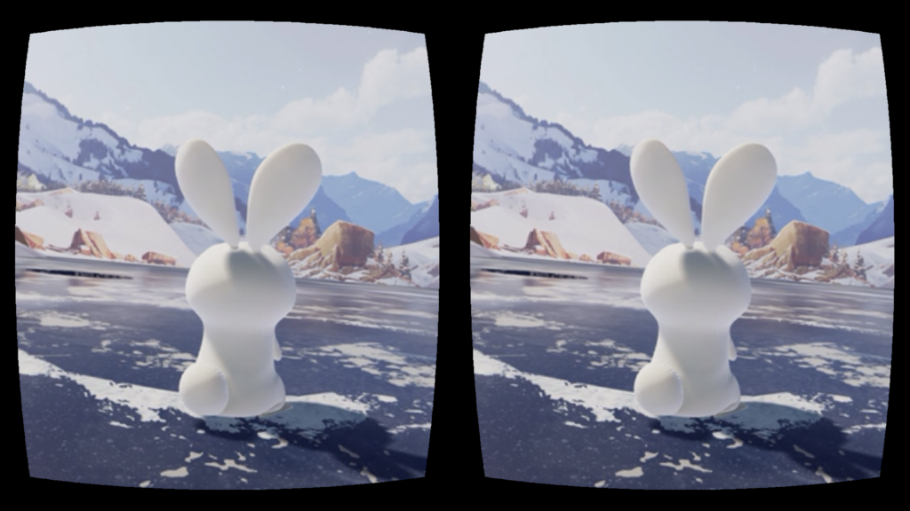
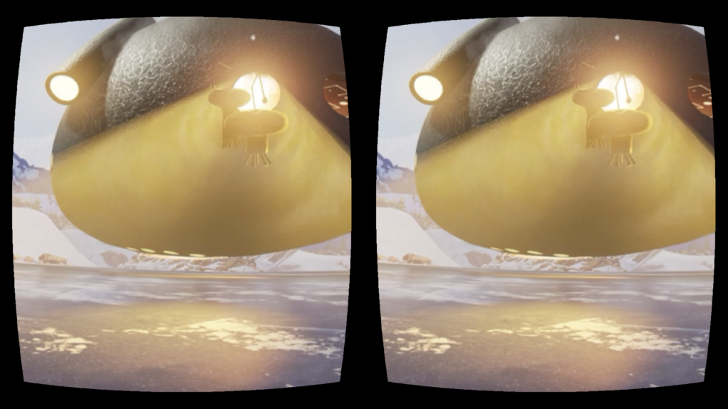
Like other VR animations, Invasion provides a panoramic scene, allowing the user to get a comprehensive sense of the setting and really feel involved in the story. The Baobab app allows the user to switch between the VR mode and the normal mode (the one that does not require a Google Cardboard but still shows the panoramic scene). I watched the animation twice using different modes, and really appreciated the immersive experience of the VR mode. In the normal mode, the whole experience is limited within the screen of your phone. Thus even if you can look around and explore the scene, you still feel the boundary between the story and the reality, while in the VR mode you become part of the story as if everything is happening around you.

On the other hand, the sound effect fosters the immersive experience. When using the Google Cardboard, the speaker of the phone is closer to your ears, and the 3D sound effect is more notable. When I watched the animations (Invasion and also Asteroid), my attention was directed by the sound effect: whenever I heard something behind me, I would look back and see what’s going on. In that sense, I consider the sound effect as an essential part of the environment. Also, the VR environment offers more freedom for the user: unlike films which directs user’s attention through specific camera angles, VR environment allows user to pick their own camera angle. If you are not interested in what’s going on with the main characters, you can just turn around and explore the scene by yourself.
An Interaction I Like: Black Mirror Bandersnatch (but more of a ramble in all honesty)

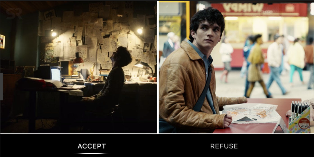
This was the first interactive film that I know of, designed to be streamed alone or in a small group of people; such an experience could not have the same effect watched in a theater in a big crowd as you wouldn’t feel complicit in the choices you made with the presence of other people. The film is reminiscent of a hypertext novel, in which your decisions fork various paths. There are evidently one trillion different ways your individual film experience can go.


There isn’t too much time in between making a decision that it becomes a typical movie, but it isn’t short enough that there is no room for storytelling through the medium of film. In other ways, the speed of interaction feels just right. There is also a progression to the interactions…with each subsequent decision being more high-stakes. The player is eased into the decisions, which coupled with having enough time for the arc of character development, creates more emotional investment into the outcome they receive. If they reach a dead end, the viewer can go back in time as the whole story is about multiple threads of time and whether one is more real than the other. However, the story becomes altered just as they do. Being able to go back to the last point before it all went wrong furthers emotional investment in the interaction as the viewer becomes struck with the desire to see many, if not all, possible endings–there are evidently five possible main endings for the film, so that is a good number that it is possible to see all five in about two hours, the average length of a feature film. Each decision that the viewer makes has only two possible immediate choices, making it relatively simple for the viewer comprehend what is required for them to interact. If the film was convoluted with the ability to make a decision from even three or four or eight choices, the viewer would probably get exasperated and stop watching or make a random decision reducing the emotional investment in the decisions made.


What I loved most was that the film was really about the appearance of interaction. Though the viewer was empowered to make decisions in the course of the film, they come to the conclusion that they only have the appearance of free will, a realization whose development parallels that of the protagonist. The protagonist similarly realizes that his decisions are being controlled by none other than the viewer. Perhaps, appearance of interaction is phrasing it wrong. Because it is certainly interaction given the media’s various reactions to the choice the viewer makes. Rather, it is that your interaction appears to have consequences but you soon realize the futility of making decisions. The film also raises the theme about whether it is only through insanity that one can realize their true creative potential. From the first decision of what cereal to eat versus one of the last decisions of whether to kill your father or not, Bandersnatch is an engaging interaction. It received much criticism from Black Mirror fans and others who declared that the endings weren’t personalized enough. That is probably well-warranted if you look at it from a critical lens as a film, but as a medium, it raised so many questions about how an interaction is designed to give you the appearance of free will…with other forms of media, the artist usually has an intended interaction for the viewer; there is a specificity to the interaction. It also makes the viewer wonder whether this will change the way that we watch on our screens and the dangers that may come from that in terms of what data is collected from us…when we interact with something, is our interaction a form of input? What could be gleaned by it? And by who?

VR Title Review: InMind


My first Google Cardboard experience was InMind, a VR experience designed to give the viewer an inside look at the brain. I selected this title because I was really excited to have a VR experience in the context of the human body, to have greater understanding into what our brains look like. What I found was something else entirely.


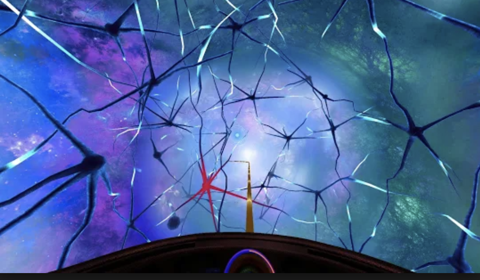
The experience began with an introduction in which the viewer is referred to as “Human.” The only other character in this experience was a robot narrator who speaks in a very patronizing manner to the viewer. The robot frames the narrative as “we are going to look into the brain of a patient who has depression” and the viewer is launched into what is evidently a game in which they must focus on the red neurons of the brain and turn them back to “normal” to “help” the patient. The ridiculous oversimplification of mental health aside, I do not feel that InMind achieves its goal of giving the viewer an immersive experience into the human brain.


First, the interaction is too slow. Feedback is given in the form of a circle becoming fully shaded when you concentrate on it. However, it takes too long for the circle to become full and thus, for the red neuron to change. It brought to mind what Chris Crawford says on interaction in his book “Interactive Storytelling,” that it must have speed. Furthermore, the interaction was slow in the sense that once you changed a few neurons, nothing seemed to happen. I grew bored. There seemed to be no progression in the narrative and when there finally was, it was merely a sentence or two from the robot who gave a feeble “keep going” message. Because there was such a focus on the red neurons, a pointless focus, I don’t think the viewer was necessarily observing the whole brain and all its synapses of activity. Sure, the environment was pretty, but it didn’t feel immersive. Perhaps that is because the game did not take full advantage of designing for VR since the rollercoaster through the brain only moved forward, not giving the viewer the chance to explore. Furthermore, I felt detached as a player. Perhaps, the game would have felt more immersive if there was more effort put into personalizing it. For instance, instead of being called “Human,” you could be called by your real name or a name you created.


Though the whole experience lasted only four minutes, it felt much longer. In this VR mind, I was bored out of my mind. The ending was just as dull as the progression: “congrats Human on not dying. Now download these other apps,” or something along those lines. I wouldn’t say that this was a waste of time though because it made me realize how important it is to have progression through a VR experience, a clear narrative if you will, and that there is attention given to how much feedback given to the viewer in this narrative and how fast the feedback takes.

VR app: InMind


Google Cardboard VR Experience Review

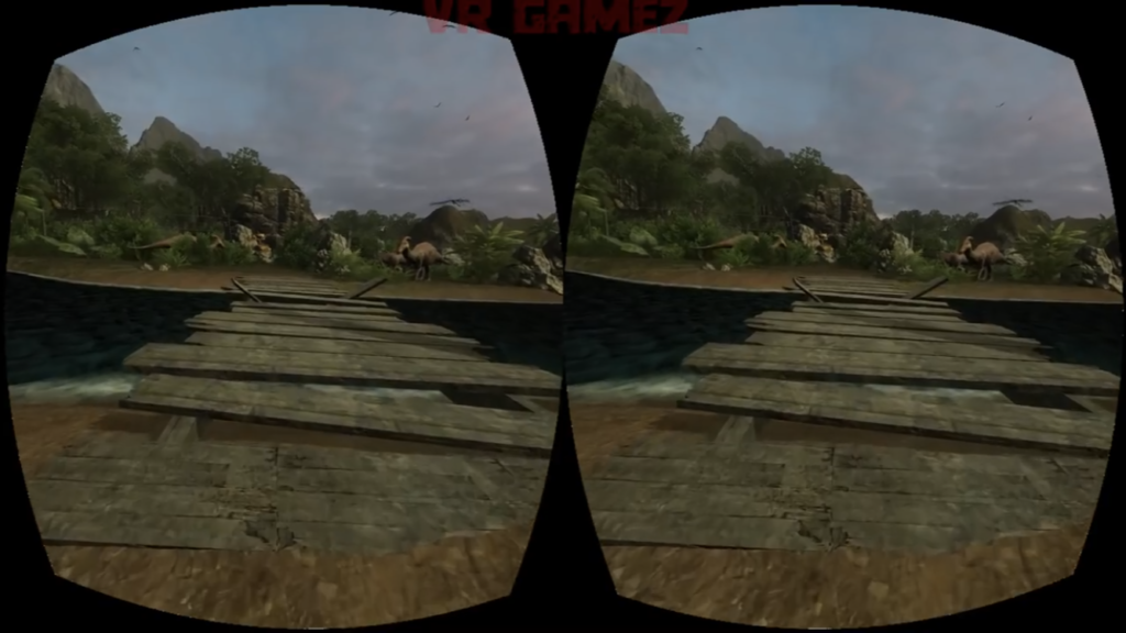
I chose to watch a 360 video featuring dinosaurs in a jungle in hopes of experiencing what it would be like to be in Jurassic Park.

One thing I noticed about the composition of the environment is the use of positive and negative space. I think it’s important that the view is not saturated with so many assets that the player/viewer does not know how to go about that place. There needs to be as much empty space for them to figure out how to navigate through the environment. But on this note, I think the design needs to be clear so that the player/viewer can regonize navigation points like roads. In other words, it should be obvious that there’s a road ahead so the player/viewer knows that they have to go forward (see picture #1).

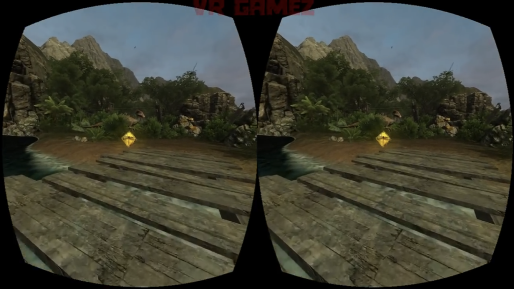
Some of these “navigation points” are clear in the game’s use of coins that are placed on the road before them. The coins appear out of nowhere, bright and glowing, prompting the player to approach it (see picture #2). When you go close enough, it disappears, suggesting that you’ve successfully acquired it.

picture #2: a glowing coin/diamond!

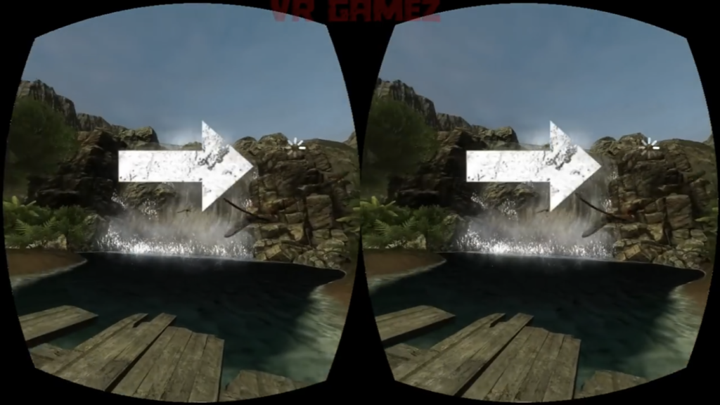
This specific game seems to also use arrows to direct the player (see picture #3). When the player is lost and looks around, arrows appear on the screen to guide the player. These are all different ways a VR environment tries to communicate information to the player.

Interaction and Title

Samsung be fearless fear of heights -City Scapes

As someone who used to be afraid of heights as a kid, I felt really connected to this application as it immerses the user in three different types of outdoor settings (elevator, skywalk, and a virtually created tower) with each setting having multiple difficulty levels in order to slowly ease you into the experience. Usually, I tend to see that most virtual reality applications are designed for entertainment purposes. However, I am, interested in learning more about VR experiences with impactful applications that can change someone’s life for the better, and Cityscapes does exactly this. In addition, the application has the possibility of pairing up with a Gear S2 to measure the heartbeat of the user in order to gauge the user’s progress.

In terms of communicating information and composing an attractive view, the app developers did an outstanding job in simulating a real-life environment that can actually make the user’s fear of heights be tested in a variety of ways. As such, I believe that a careful research was done in order to design the best environment possible, one that takes the user into this simulated world and lets them leave with less fear after hours of use.

After perusing through different VR titles, I realized that I want to create one that lets the user interact with non-human entities from our world. For my 1st project, I created a simulation of a camping site and I really enjoyed doing so. As such, I would like to continue delving into the idea of simulating human’s interaction with nature in order to bring awareness on the impact (oftentimes a negative one) that humans have with nature and extend the significance this interaction has for the user.

Interaction I like: Instagram Stories Stickers

Instagram engagement is no longer just likes and comments, it also includes engagement from your stories to build connections between you and your followers, to encourage your followers to chat and share their opinions and experiences with you and therefore to interact with your viewers to foster the loyalty/stickiness.


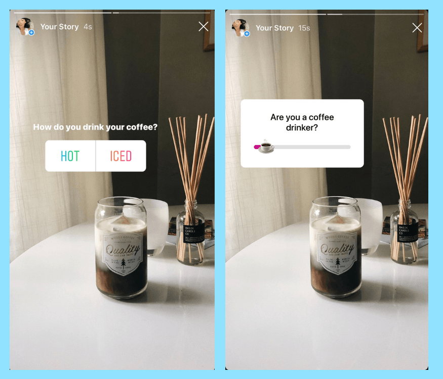
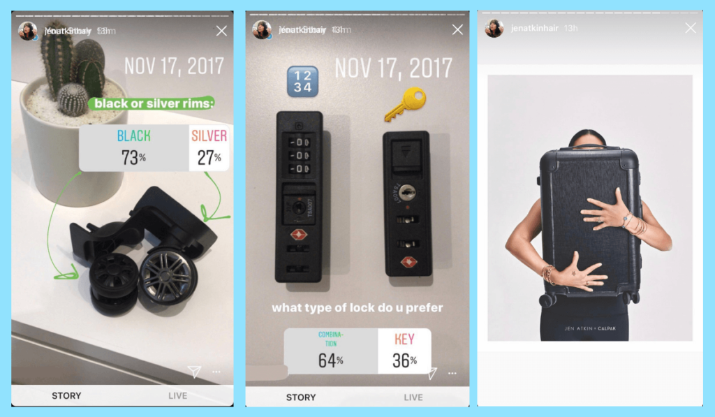
A simple interaction I like between two human beings is the way we comment/reply to each other on instagram stories via stories stickers like question/poll and vote stickers. They are easy to use, fast to get response, and the results of the interactions are clearly visualized to be seen.

Here are two examples that indicate how stories sticker increase the Instagram engagement/interaction:

The Question Sticker:

Nothing sparks conversation more than a good AMA (Ask Me Anything) on Instagram Stories. And while influencers have been known to use the question sticker to help their followers get to know them more. It’s also a great opportunity for your followers to get to know yourself or a specific brand better, or get more information about your products.

On the flipside, it’s a great place for you to ask your followers some questions. You could spark a conversation about your VR project inspiration, your next season’s color palette, or what product lines they’d like to see more of. It’s engagement, conversation, and customer feedback altogether and it’s designed to be user friendly for both instagrammer and followers. All you need to do is to drag the bar / comment your ideas at the spot.

Poll and Vote Stickers:

Ask people to vote can make you decision-making much more easier and give your followers a sense of they are participating in your choice making in your life and people are also curios about what other people’s choices are. All they need to do to join the decision making is by simply tap the answer and the portion of each choice will be shown after you make your own choice.

Blog: ARTECHOUSE Interaction

This past winter break, I visited Marpi’s New Nature exhibition at ARTECHOUSE DC, an art gallery that focuses on immersive interactive art pieces.

The part of this particular exhibit that I really liked was a room full of screens, each screen containing a “creature” you could interact with by waving your hand over a motion sensor. The sensor would track your hand, which you could see displayed on the screen with a small hand symbol, the movement of which would get different reactions out of the creature. These also all implemented AI, so the creatures adapted how they reacted to the interactions. Essentially, the way it was explained, the reactions we were getting from the creatures were not the same as say, the reactions the very first exhibition visitors received from the creatures. This video I took during my visit shows just one of the many creatures you could interact with:

I really liked this interaction for many reasons. First, I think the music, lighting, and graphics all complemented each other nicely. The music was very calming yet futuristic in a way, and kind of inspired curiosity. Second, the interaction was very easy to understand. The user’s hand makes a digital hand appear on the screen, which gets an immediate reaction from the creature – it is all very intuitive. Third, it was fun to play with all the creatures in different ways. They were each designed differently – this one just happened to have many balls that would bounce in different ways. I also really liked the use of AI because it made the creatures more “real,” in a sense. They learned, just like real living things do. There was one creature, however, whose sensor didn’t seem to be working properly so the digital hand wouldn’t move the way you wanted it to. However, looking back on it, this could have been on purpose.

Interaction I like: Chatbots

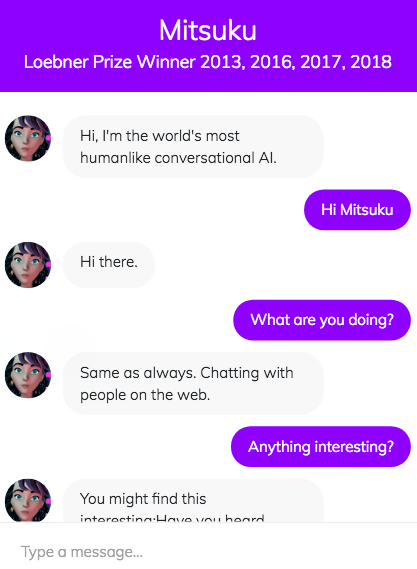
I thought chatbots were pretty old and outdated until I *met* Mitsuku last semester as part of another IM class. It was really interesting that this chatbot was in a human form. The homepage states that she’s a “four-time winner of the Loebner Prize turing test, so I gave her a try – or rather, a lot of tries because she actually turned out to be interesting!

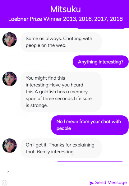
Mitsuku’s answers may not always be fitting, but she has a lot of different answers on stock. I find it interesting that this chatbot almost gives an impression of a real person, which makes the conversation more exciting and interesting, regardless of whether the whole content makes sense or not. It’s interesting because you wouldn’t expect such complicated, sophisticated answers from the computer that just isn’t human.

I read a paper a while back that talks about how believable these chatbots have become. Some people have actually started treating these chatbots as their real counselors because of certain traits that they possess. For example, chatbots often repeat some phrases of the sentence that you write, which is what counselors and psychologists often do to turn the conversation’s focus back to the patient/speaker. The preset algorithm makes these chatbots particularly successful in giving the impression that they possess human qualities. I find this human-machine interaction very fascinating and see a lot of potential in developing this field.

Screenshots from my conversation with Mitsuku

Development blog #1

I was thinking of making an enchanted forest virtual reality, but my data got deleted due to an unexpected computer reboot and I saw some of the presentations of projects in class. I was thinking on what virtual reality to create since there already was an enchanted forest, and I have came up with a lovely idea to make a beautiful sunset valley. Inspiration for this was a very well-known game “Legends of Zelda: Breath of the wild”. Here are some screenshots from the game:

So I have used some asset from the asset store to get the terrain modifier tool and used a preset terrain. I’ve added some textures and meshes to make it look like a forest valley in the mountain area, to make it look like in the game.

VR Title Review: Pearl

Here is a link to the film on YouTube.

Pearl Patrick Osborn’s Oscar nominated 360 view short film that tells the story of a young girl, her father, and their love of music, the two of them connected by a song. The viewer witnesses the story unfold across the years and seasons from the passenger seat of the car that the two protagonists travel around in.

The film begins as an older Pearl finds her father’s old car in a scrapyard, she plays a cassette recording of her father’s song, bringing back memories. The film is a montage of scenes spanning from the girl’s childhood to young adulthood, how her love for music, and the friends she makes it with, develops as she finally makes it in the music world. Yet it primarily revolves around her warm and sometimes rocky relationship with her father over time, around the symbols of the song and the car, the space that the film takes place in.

The style consists of simple, not too detailed, 3D models with cel shading that gives them an almost 2D effect. What really makes the style, however is the atmospheric lighting that creates different moods as well as different times and places. The constant changes in lighting signal the change of scene. There is always a focal point to the action in the scene which the film effectively guides the eye of the viewer to the right spot. One of the moments that works best is where the kids run out into the sea, lit up by the headlights of the car.

What I love most about the film is that it makes use of the idea of how a space can contain memories. The choice of car, a contained space that moves around, revealing the space outside is particularly interesting. The use of VR, instead of telling the story through curated shots, works to make the viewer feel like an outsider, given an intimate glimpse into the lives of these two people. It also gives the viewer an association of themselves with the space of the car, like they are seeing the story unfold from its perspective.

Though it makes a great 360 view video, it is difficult to watch through a headset. The scene transitions between scenes happen rapidly and the car constantly switches from moving to stationary, making it a slightly nauseating experience.