VR Minecart is one of those games you have downloaded on
your phone that you decide to play when you have nothing else to do. These games
usually have a very simple premise to them, they are incredibly simple, repetitive,
and addictive. The goal of the game is to collect gems and then use those gems
to upgrade your luck and life so that you can play each round with hopes of
collecting even more gems over a longer period of time. The rounds are quite
simple too, you are in a moving mine cart and you have 4 options of movements:
tilt right, left, stay center, or duck. There are blocks you have to avoid,
bombs coming at you, and gems of different gems scattered across. Naturally,
the longer you play the faster your mine cart goes, the more value the gems
have, and the easier it is to get hit and lose the round.
Your surroundings are all in sync with the idea of being in
a mine shaft that has to be abandoned quickly. You have saves and tunnels
surrounding you, the railroad is old and rusty, and the mine cart you are in also
seems to be running on its last wheels. The things that are flying at you make
sense too, you have bombs, boulders, pretty gems, and blocks with red crosses.
Keeping all the graphics in line with each other, at least in terms of theme,
make it so that the story is more believable. You are not incredibly immersed
but the constant theme at least makes the game more enjoyable by soothing any confusion
the player would have with the situation.
To add on to the effect, you can almost feel the mine carts movement. This effect is possibly through the constant shaking of the screen, almost as if you were truly on an old rackety mine cart. As you speed up the movement becomes worse and you start to become more stressed. The emotions present themselves in the necessity to act quickly in a scene filled with confusion. The good thing about such simple repetitive games, is that each round ends up giving you more thrill because you always end up progressing further and always want to maintain your highest score. The environment complimented well with goal of the game by providing simple obstacles and benefits that both scaled with time achieved per round.
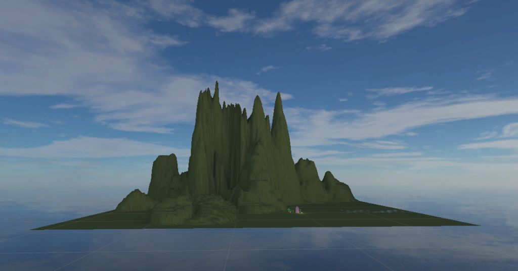
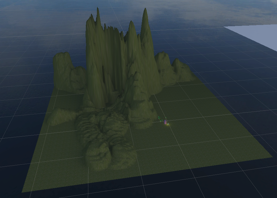
For my assignment, I’ve started creating some hills using the terrain function. I’m trying to build mountains that build up towards the center to create a grandiose atmosphere. I added a sky background to make it look almost like this place is floating in mid-air.
view from frontbird’s eye view
It took me some time and test runs to build this base as I was experimenting with different textures and different heights for the mountains.
Moving on, I’ll work on how to emphasize the ‘grandiose’ aspect more. I want to make this environment somewhat mystical and other-worldy, suggestive of some kind of mysterious forces within.
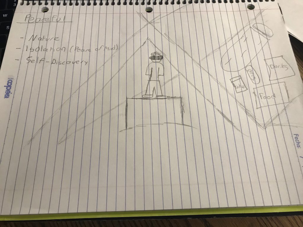
For my 1st attempt at creating an alternative reality experience, I want to create a peaceful environment. Ever since I was a kid, looking at a picture or listening to a song that emanated peace would make my day better and would make me forget of whatever I was stressed or worried about. I believe I can create a similar type of experience in this project, and I want to achieve such through an activity I am personally connected to: camping. I believe that nature has a way of making humans forget about worldly concerns as it provides perspective and makes us look at the bigger picture: why worry about the menial job-related, school-related, or anything-related thing that is worrying us when there is a bigger,captivating landscape we can draw our eyes to. The complexity of nature and how simply it can make me forget about my worries is a juxtaposition I want the users experience.
Sketch of Desired Environment
As seen in the picture, the user would be set in the middle of the tent. The user would be able to look outside and see the night stars and then look at the tent from the inside if they do a 180 degree turn. Inside the tent I would have a sleeping bag and some snacks(as seen in the picture, I am obsessed with doritos, coke and oreos as they are the staple cuisine of my camping trips). I also hope to play music in the background that emulates the sounds of nature (crickets chirping, sound of the wind, and the sound of the leaves being hit by the wind). However, given that I haven’t explored the extent to which I can use Unity in order to create such environment, the three main things I want to portray in my environment are: self-discovery, nature, and isolation. I am open to create an environment that does the aforementioned in a more technically feasible way, but I thought that the tent environment was a good starting point.
Blog Update February 18:
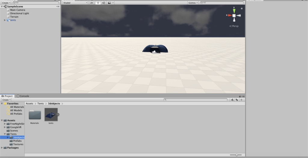
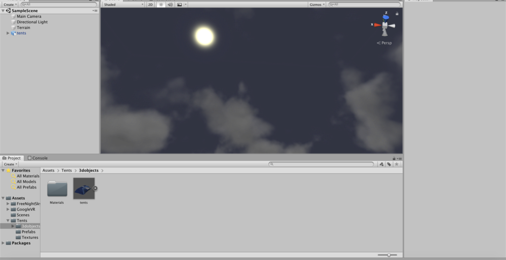
After experimenting in Unity, I was able to learn a little about changing the sky, working with the terrain asset, and importing the tent asset. I imported a sky asset that makes it looks like its night and it has a moon on it, which is something that took me a while to accomplish. I also learned about importing the terrain asset, but I am having problems editing it. I wanted to extrude the terrain so I can create mountains, but for some reason my laptop is unresponsive to this command. I am also having problems synchronising my laptop and the Google VR SDK for IOS, but I am hoping to fix this in the time coming.
Screenshot 1
Blog Update: February 20
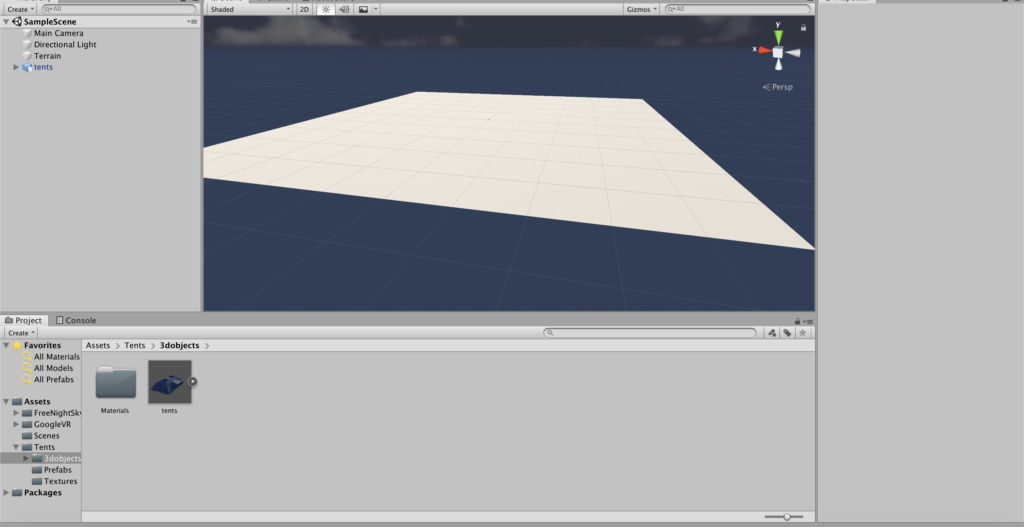
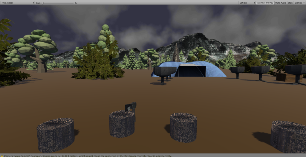
As I continued to play around with the terrain, I realized that for my purposes the terrain wasn’t necessary, and I could achieve a similar result using a terrain composed of a cube object. This proved to be extremely fruitful and easier to manipulate and play around with as I added new assets. After creating the terrain and setting the camp site in the middle, I decided to start adding trees around my campsite to create the illusion of nature. As I did this, patterns emerged, and I was able to create clusters of trees and duplicate them to populate the entire terrain faster. I then added extra elements to the campsite to make it more relatable and believable, like tree chunks located in a circular pattern with some axes stuck in them, torches, bushes, and rocks to surround the site.
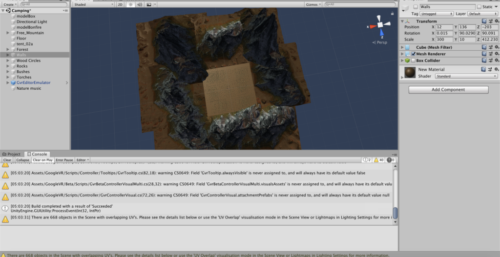
View of entire environment from aboveBox approach
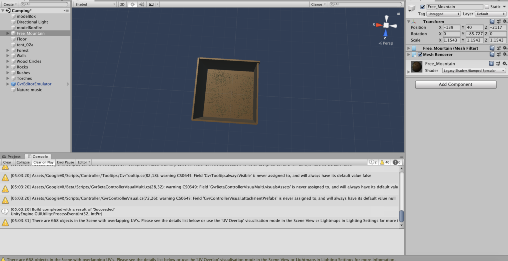
As a final step, I wanted to fill the viewer’s sight with something as you could steel see the blueprint of the Unity IDE far in the horizon. My original idea was to play with my initial concept a little by creating an enclosing environment surrounding my terrain in order to create a juxtaposition between the openness of the nature that is near you and the enslavement of the box that covers it. However, after realizing that the box surrounding the terrain dims the lighting in a way that prevents the user from seeing the nature and the campsite that surrounds him/her, I decided to populate the horizon with mountains. As a final touch, I added music to the environment to further cement the illusion of nature. The music is composed of a mixture of wind sounds, animal sounds, and dry leaves cracking, which I hope makes a better experience for the user.
User’s view
Another problem I encounter was to build and run the environment on my iPhone. Xcode couldn’t run the code and it was requiring some form of “provisional file” from my iPhone. As a result, I resorted in running the application on Android, and after installing the necessary software, I was able to make an apk file that can run on any android phone.
As a camper with over 10 years of experience, I can attest that this environment really makes me feel like I am back home in one of my usual camping outings, secluding myself from society and just letting the openness of nature enclose me, revitalize me, and inspire me. I am happy that I was able to create a peaceful environment through my campsite environment, and seeing the beauty of the final result definitely obliterated the copious amounts of stress I accumulated as I made this project.
For Project #1, I was thinking of re-creating a scene from the film Escape Room since it reminded me of my experience with my friend at the escape room, but I just realized that the idea was already taken by Yiran, so I changed my mind. Last semester for Mashups, I gathered the Air Quality data of my home city during the past 5 years and created an online simulation of how it feels going out on a specific day with a certain level of air pollution. Here is the link to my project: http://yg1262.nyuad.im/airqualitysimulation/simulation.html
My idea for Project #1 is to build upon the aforementioned project and make a game that teaches players how their life choices influence the Air Quality. The environment I will be creating is a crossroad of a city, and players can look around at see how the air quality is. Then by making several choices (such as whether taking cabs or walking to work), players can see how their choices affects the air quality on a larger scale.
After talking to Sarah, I realized that my understanding for our project one was not accurate. Instead of having the possibility to interact with the scene, we, as represented by the camera, will just be standing still at some point within the scene and looking around. Thus, rather than designing the interactive experience in my scene, I should just be focusing on the layout of the environment.
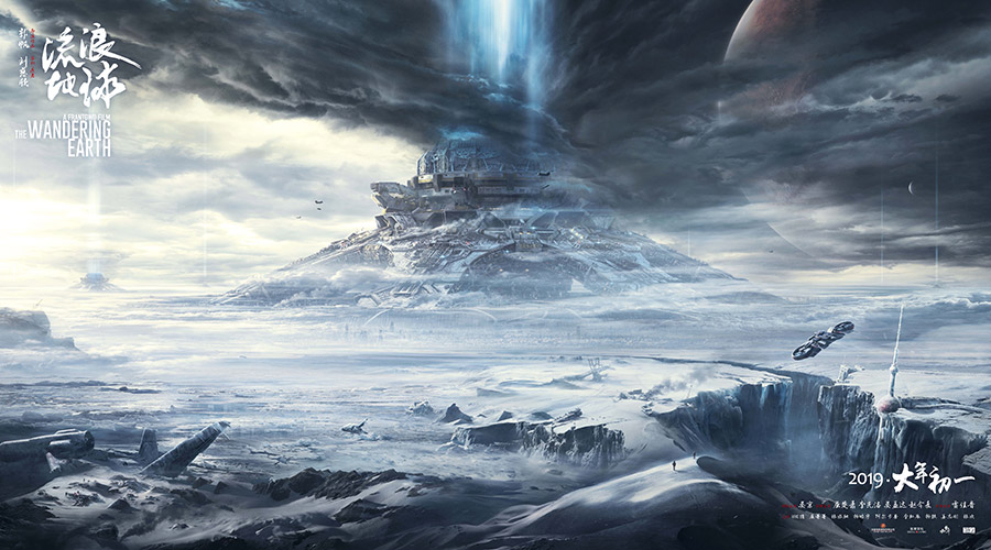
During this winter break, I watched a Chinese Sci-fi movie called The Wandering Earth. The scene looked like below. The whole story was based in 2075, where the Sun is gradually dying out. The people of Earth are trying to build giant thrusters to move the planet out of orbit and sail to a new star system. I was really impressed by this movie, not only because this is the first legit science fiction movie produced by China, but also because its theme which differs from most Sci-fi movie. I do not want to ruin it, so I will stop talking about the details.
So I decided to create a apocalyptic scene for my first project, which kind of connects with my original idea about air quality simulation: if we keep polluting our nature, we will end up entering apocalypse without any uncontrollable factors (say, the sun dying out). However, rather than a recreation of what’s currently happening on the planet, a preview of the future which human beings might witness within the next century should serve as a more effective warning to trigger concerns about our environment.
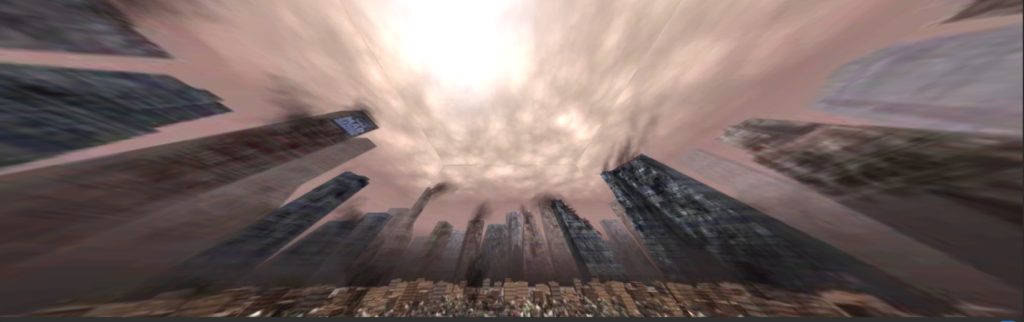
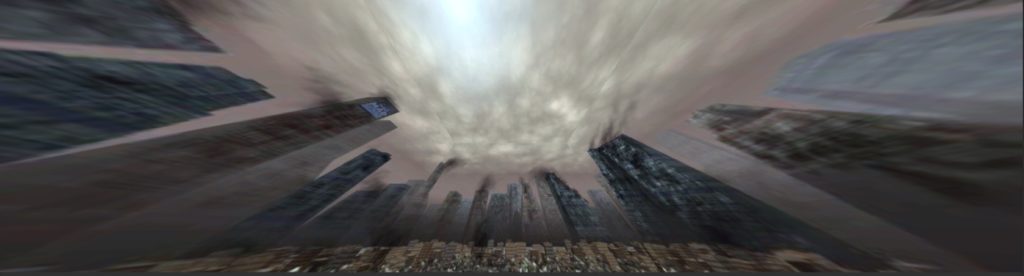
After deciding the theme of the project, I started to search for sets of skybox materials online that resembles the scene in The Wandering Earth – abandoned city covered in snow. At first, I used “abandoned city” as the key word, because I thought I could always change the color tone and brightness of the image. So I found the following material and modified it a bit.
Original skybox material, from http://www.custommapmakers.org/skyboxes.php
Then I started to think, what I should add to my environment. Where should the user be, when they entered the apocalypse?Or put it in an extremely pessimistic way, if I come to the end of the world, which place do I want to see before I die? A place that brought me happiness, for sure. A place that I usually went to. A place that could trigger my memories. Thus, I decided to put the user at the center of a community park. When I was a kid and before I entered middle school, I went out for a walk everyday with my mom after dinner. There is this community park we usually went to where I called “home”, because the first time I went there (when I was three or four I think), I was reluctant to leave and said to my mom the park is where my home is. Although we moved to a new community when I entered middle school, my mom and I still joked about that whenever we passed by the park.
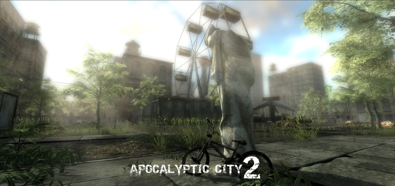
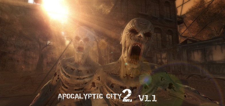
So, I started to look for pre-fabs online that could make up an abandoned park, and I found the package: “Apocalyptic City 2”.
As you can see, Apocalyptic City 2 has assets for a video game of zombies, and after adding the assets to my scene with the background of an abandoned city, it looked just like a city invaded by zombies, which differed from my original idea. All the assets somewhat blended in with the background, so that you couldn’t really tell which are the objects I added. Plus, I failed to change the color tone of the image to a level that resembles the snowed city, so I decided to change the skybox material to snow, and the conflict between the color of the assets and the color of the background worked out quite well.
As I entered play mode, I was disappointed to find that my skybox looked like a box: there are edges between each side. It was because I didn’t change the “Wrap Mode” of the image from “Repeat” to “Clamp”.
Also when I planned out the layout of the assets, I didn’t take into consideration the angle of the camera: in fact, I thought I should be able to see everything because its in 3D. However, because of the height of the camera and the scale of the assets, some assets might be blocked by something behind it so that I couldn’t really see it. After testing in the play mode for several times, I moved objects around so that everything can be view clearly.
At last, I added a background music to my scene, which sounded to me had a mixed feeling of sadness & creepiness, and happiness from the past.
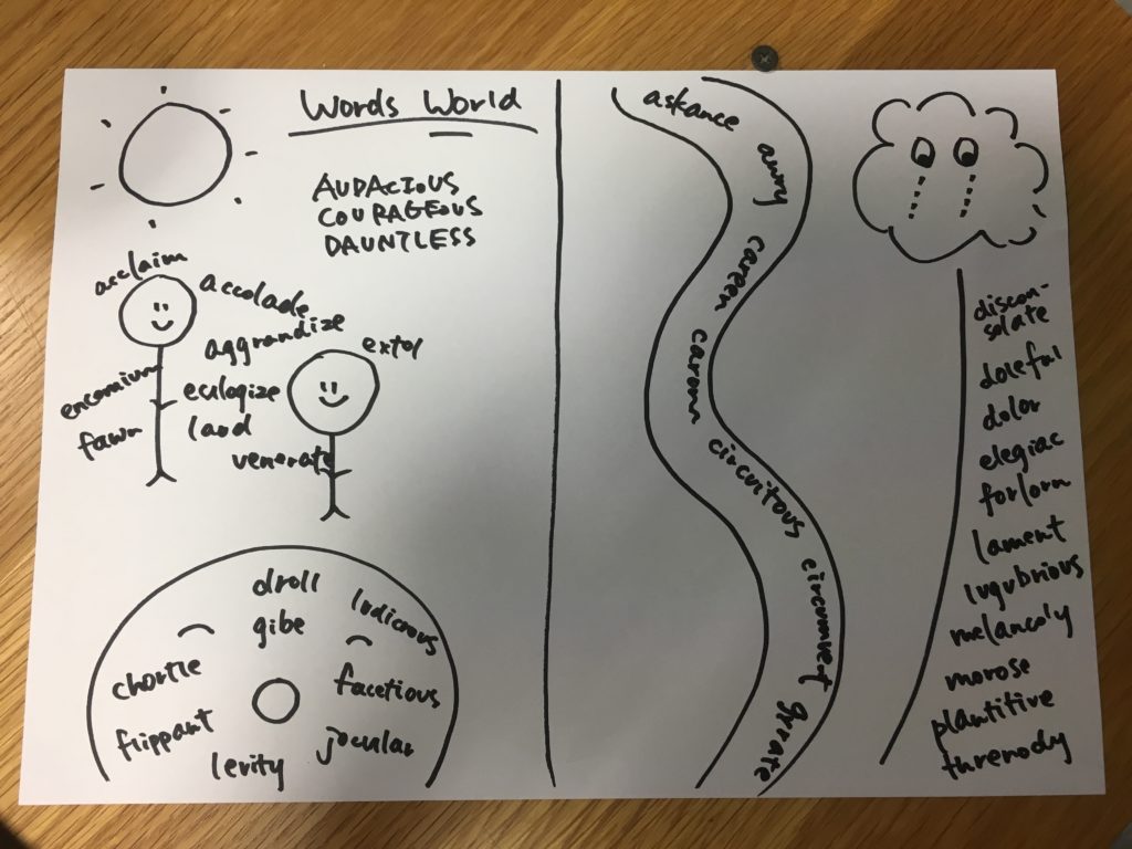
For my first project, I would like to create a “Word World,” which is an environment made up of words. I was recently reading a book, which talked about using various senses to memorize new vocabulary, facts, and information. For example, when trying to memorize a new word, let’s say, “table,” by visualizing the actual object and associate it with the word “table” allow the human brain to remember the word for a longer term.
I’ve always struggled in memorizing new vocabulary, whether that was SAT vocabulary or words in an unfamiliar language. Currently, I am trying to memorize new vocabulary for the GRE, and so I wanted to create this environment through the use of virtual worlds.
I got my idea from the following portion of the article, The Science of Memory: Top 10 Proven Techniques to Remember More and Learn Faster by Melanie Pinola:
5. Create a Memory Palace
“The number one technique that we top memory athletes use is still and will always be the memory palace. If someone were to learn one thing, it should be that.”- Nelson Dellis, four-time USA Memory Champion
The memory palace is a mnemonic device that’s as tried-and-true as it gets–and deserves a section of its own. Invented by orators in ancient Roman and Greek times, the memory palace (or mind palace or “method of loci”) technique is both effective and enjoyable to use, whether you’re trying to remember a speech you have to give, details of a case you’re working on (a la Sherlock Holmes), or your grocery list. In fact, four-time USA Memory Champion Nelson Dellis–who claims to have an average memory–says that “The number one technique that we top memory athletes use is still and will always be the memory palace. If someone were to learn one thing, it should be that.”
With the memory palace technique, you associate a location you’re familiar with–such as your apartment, the block you grew up on, or the route you take to work or school–with the items you’re trying to remember. It works because you’re visually pegging (or “placing”) representations of what you want to remember in places you already have strong memories of.
To use the memory palace technique:
Imagine yourself standing your memory palace. Your home is a great one to start with, even if it’s not a palace.
Mentally walk through this palace noticing distinctive features you can use to store things you want to remember. Each stop on that path is a “loci” you can peg the idea or object to. For example, your front door might be one loci, the table in your foyer a second loci, a lamp in your living room another. Commit those features to memory so when you think of your palace, the route and objects in it will be imprinted in your mind.
Associate what you need to remember with the loci in your palace. If you had a grocery list, for example, at the front door you could picture milk flooding over the door from the inside, like a waterfall of milk. Then you get to the foyer and the table is buckling under the weight of all the chocolate chip cookies stacked on it to the ceiling. And instead of a lightbulb in your living room lamp, you see fluorescent yellow bananas.
Here’s a video from 2016 World Memory Championship winner Alex Mullen describing in great detail how to “attach” words to objects and locations in with the memory palace technique. You’ll find yourself remembering these 20 words long after you watch the video:
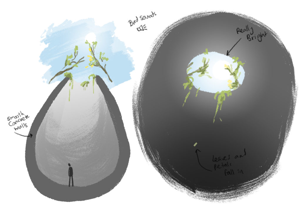
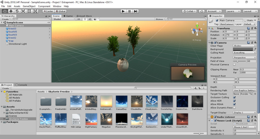
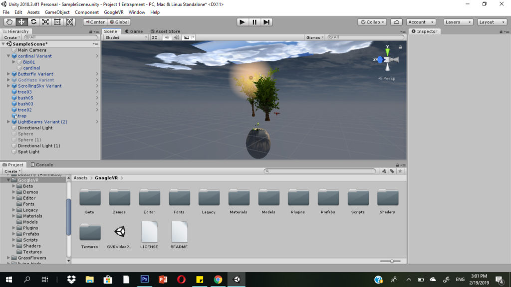
For my first project I wanted to create an environment where the experiencer would feel imprisoned. Instead of focusing on the prison itself I wanted to create the feeling of entrapment by creating the sense of a vibrant and flourishing world outside.
This is an alternate reality where the experience is held at arms length from the world. Able to see the briefest glimpses of light and life while unable to see them clearly or experience them completely.
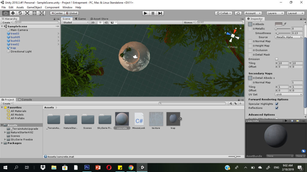
The prison itself resembles a cocoon or a nest with a smooth, curved surface. The walls are of smooth concrete and impossible to climb. The curved surface is also what makes it impossible to get out of like the inside of a pitcher plant.
Through an opening far overhead the experiencer can see a sliver of sky and some overhanging branches. Some vines spill over the edge and dust dances in the sunlight. Shadows of birds flitter across the opening. The experiencer can also hear creaking branches, twittering birds and rustling leaves, but muffled and in the distance.
Initial Concept Sketches
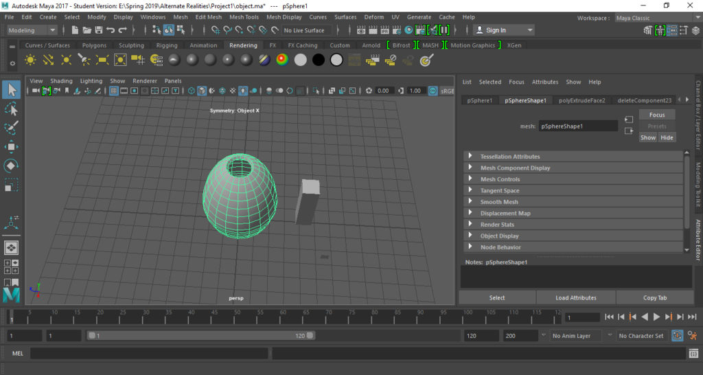
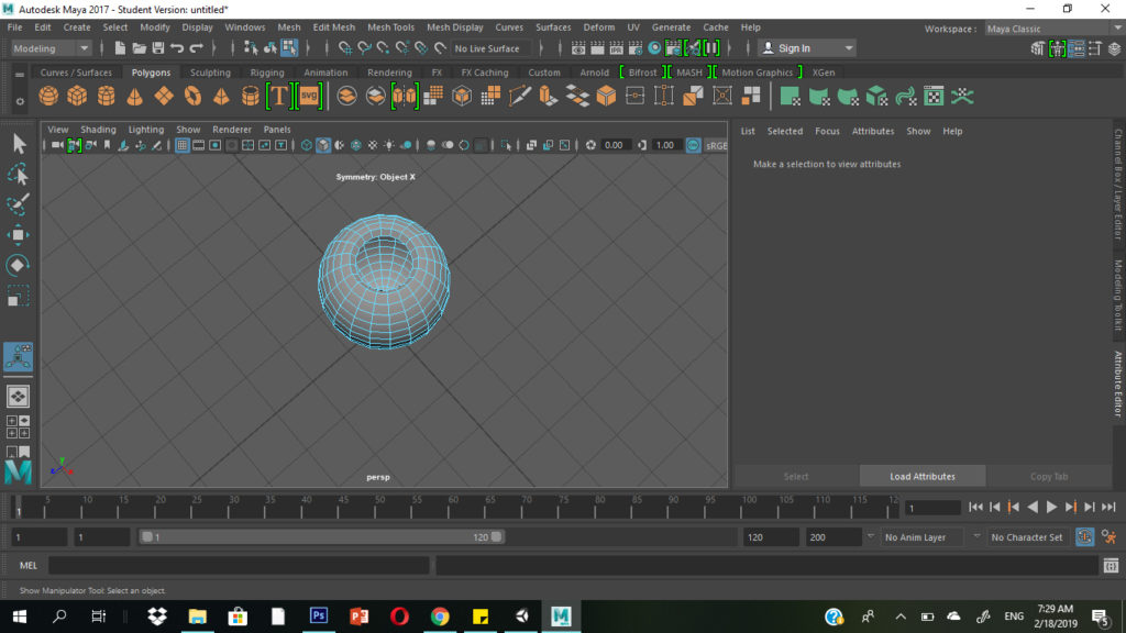
I built the main structure in Maya, a 3D modeling software I am familiar with. It took two tries to get it right. The first one I made looked strange when I imported it into unity and placed the camera inside it. I ended up going for a simple shape, taking a sphere, elongating it, deleting some surfaces and extruding the sides.
The First Try The Final Shape
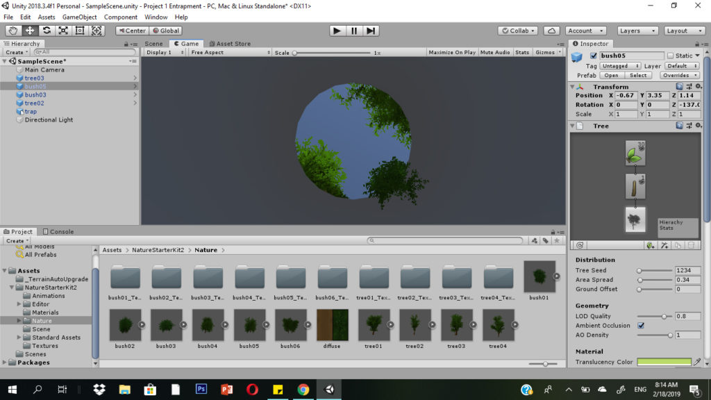
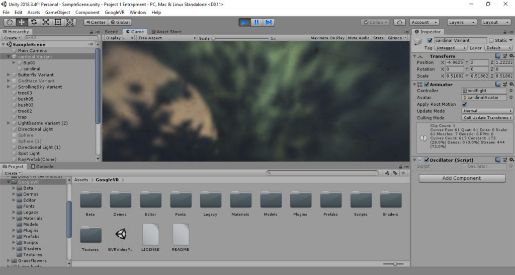
Importing the .fbx file of the object into Unity, I placed the camera inside it, facing upwards. I imported assets from the Nature Starter Kit 2 to play around with the vegetation.
I placed the vegetation based on how it would look from inside the trap. Looking at it from the outside is pretty strange since some of them are floating in mid air.
From InsideFrom the Outside
I found a free skybox seires from Avionix that had a wide variety of skies to choose from. I decided it was a little strange to have clouds that weren’t moving so I decided to go for one that just had a gradient and some lighting as if dawn was just breaking. Perhaps this could create the feeling that the user just woke up in this strange trap? I may hunt for some animated skyboxes as well, however.
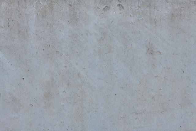
I added a concrete texture to the main object using an image I found.
Texture ImageMaterial for the Trap Object
The main components of the environment are ready! My next steps would be to experiment with lighting and perhaps add a sun object overhead. I would also like to add some sound and movement to the environment. It also remains to test the environment out with Google Cardboard.
Searching through the asset store, I managed to find a bunch more assets that I could use to make the environment more lively and make the contrast between the vibrant outside world and the dingy space inside more apparent.
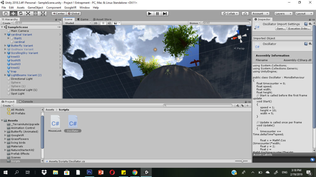
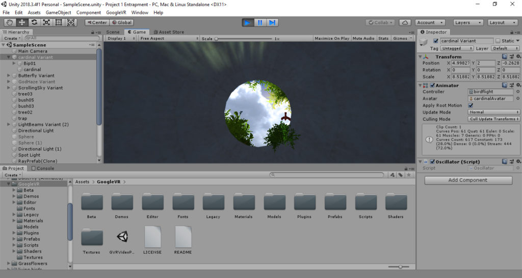
I found an animated prefab of a moving sky to create the feeling of the passing of time. I found another useful asset that took the form of animated beams of light that shine into the space from time to time. I introduced a little, animated butterfly, hovering in the bushes. I also introduced a little bird flying overhead. The bird was a little harder to add since the asset did not have an animation attached to it. I had to attach the animation to the model of the bird and create a script that would keep the bird looping in a circle. It appears over the mouth of the trap for the briefest of moments before it continues on it’s loop, allowing just the right amount of a delay before it appears again.
Outside View of all the Objects and Light SourcesLayers of Objects
Here is the script I used to make the bird fly around in a circle:
<!-- wp:paragraph -->
<p>using System.Collections;<br>
using System.Collections.Generic;<br>
using UnityEngine;</p>
<!-- /wp:paragraph -->

<!-- wp:paragraph -->
<p>public class Oscillator : MonoBehaviour<br>
{<br>
    float timecounter = 0;<br>
    float speed;<br>
    float width;<br>
    float height;<br>
    // Start is called before the first frame update<br>
    void Start()<br>
    {<br>
        speed = 1;<br>
        height = 10;<br>
        width = 5;<br>
    }</p>
<!-- /wp:paragraph -->

// Update is called once per frame
void Update()
{
    timecounter += Time.deltaTime*speed;

    float x = Mathf.Cos (timecounter)*width;
    float y = 2;
    float z = Mathf.Sin(timecounter)*height;

    transform.position = new Vector3(x, y, z);

}
}
Finally, I worked further on lighting, changing the skybox and adding other light sources. I wanted it to be sufficiently dark inside, in contrast to the brightness outside. The extra light sources I added cast interesting shadows through the leaves on the inside surface of the space.
The Final Lighting SituationThe Shadows on the Inside
Finally, I added some audio to have the sound of distant birds constantly playing in the space.
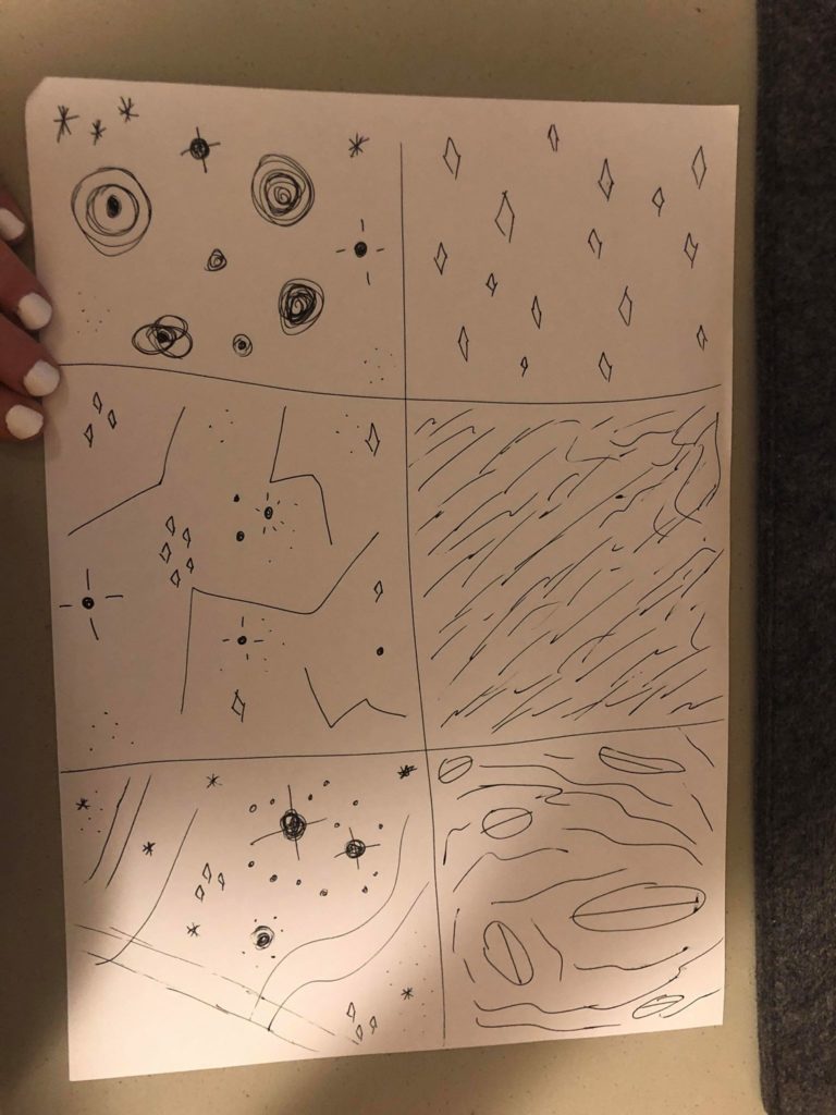
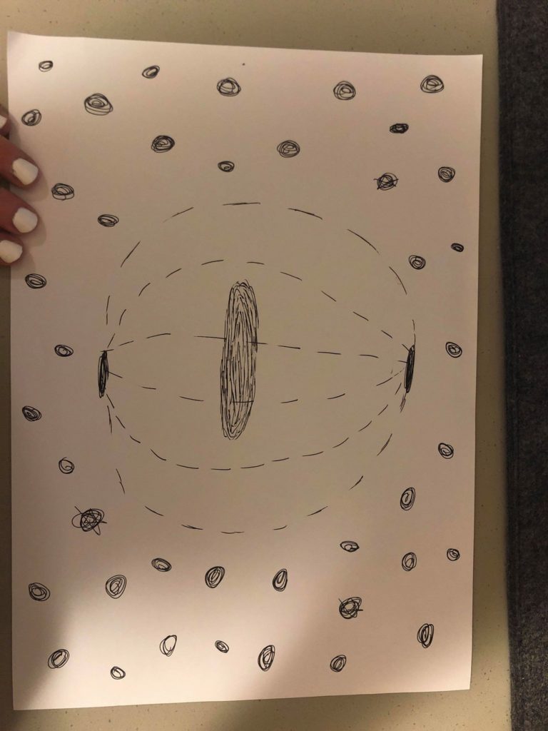
So for my project I want to do a very peaceful and calm space that is also pretty in an unusual way. My goal is to do a view of someone standing on a glowing disc in the middle of space, surrounded by stars and ‘space dust’. This would allow me to lean in to the idea of stylized stars to accommodate for my lack of experience with Unity. I also think experimenting with color paletes and different background music could give the space a lot of character. I found two TV shows to look at for inspiration. One is called Final Space, and I love it because Fred Armisen (<3) is one of the voice actors. And they have an alien space cat named Avocato, which I love animal puns so I’m obviously in love with this show’s cuteness. It’s about a prisoner in a spaceship who joins forces with a motley crew to save the universe from a weird evil green bean thing played by David Tennant weirdly enough. The other is one that my cousins love called Steven Universe. It’s about a group of rainbow aliens adventures in space and on Earth. I think the idea of looking out over space and ‘feeling small’ has been pretty socially engrained by tv and movies at this point in time. And because very few people have ever actually been to space, this setting will give me more creative control and allow for an acceptance of more imaginative design choices. It’s also such a weird scaling effect so I’m able to make very simple shapes for stars as an artistic choice versus as a limitation. I like the smudgy-halo effect that was in the Steven Universe stars and my main goal is to try and figure out how to incorporate that into Unity. I also love the big shots of Final Space, so I want to be able to make the user feel small in comparison.
Here are some sketches of what I would like my ‘space’ to look like. Get it? Because we did all those readings on spaces and I’m making it look like space???
Limitations: The biggest limitation on this project is that I’ve never used Unity before, so I need to create stars using very simple shapes. I also am using professional animation as my aspiration/inspiration, so I will need to temper my expectations. I would also like to learn how to make it look as if my stars are illuminated, give them halos, something like that. And since that will complicate things, I need to budget more time for a learning curve.
Colors: I would like to use soft pinks and purples, maybe some deep blues, white, a lot of blush colors.
Research: I looked up the art teams for both shows, perused their blogs, watched some interviews, etc.
Steven Universe:
Rebecca Sugar(creator) : official show blog: http://stevencrewniverse.tumblr.com/ Sugar’s Insta: https://www.instagram.com/rebeccasugar/ . Random blog about background art: su-aesthetic.tumblr.com
Jeff Liu(storyboard artist/composer): http://jeffliujeffliu.tumblr.com/
Joe Johnston(storyboard artist/supervising director): http://joethejohnston.tumblr.com/
Colin Howard(storyboard artist): http://colin-howard.tumblr.com/
Danny Hynes(lead designer): http://dannyhynes.tumblr.com/
Elle Michalka(Art Director for 44 episodes): http://ellemichalka.com/
Jasmin Lai(Art Director for 44 episodes): https://twitter.com/_jasminlai
Liz Artinian(Art Director for 28episodes): http://lizartinian.tumblr.com/
Ricky Cometa(Art Director for 18 episodes): http://www.rickycometa.com/
Kevin Dart(Art Director for 12 episodes): http://kevindart.tumblr.com/
Sue Mondt(pilot Art Director): http://suemondtportfolio.tumblr.com/
And looking all these people up, I was surprised at how much overlap there was. Apparently Rebecca Sugar originally worked on Adventure Time and brought people from that show to Steven Universe. And then several people from the Steven Universe crew left and started a new show called Craig of the Creek which is pretty cute. And the art director from the pilot worked on another show for the studio called We Bare Bears, which I then found out my favorite Youtube song writer(Louie Zong) also works on. Which leads me to another aspect of this show. My cousins are OBSESSED with the music videos for this show. So I also want to get background music that gels well with my environment as a sort of omage. I like how soft and fluffy this show is aesthetically. I’m going to embed a few music videos below whose colors, shapes, and sounds I liked after watching about a billion of them. I also found that this show has a MASSIVE adult following and has so much content about it online. There was a wikipedia blog entirely devoted to it, reminded me of the Hamlet on the Holodeck reading in that every single detail of this show is posted, discussed, and evenly hotly debated. There were also a lot of Youtube accounts with fan art and theories I found, some people obviously devote A LOT of time to this kind of stuff. Finding all the stuff people were so passionate about made me think a lot more about the backgrounds of this show and gave me a lot of stuff to comb through. I think because there’s such a high demand, the creators of the show have a lot of blogs and information out there about it, so starting to look into this show particularly was like stumbling across a treasure trove of Internet obsession almost.
(This is Estelle. Like, American Boy with Kanye Estelle, what. even. Cartoon Network.)
The colors for this video are so nice, and I like the bubbles.
The sky in this is gorgeous. I like the clouds/wispy thingies and the just white lines, maybe emulate the geometric aspect of this??
the flow of the background colors is just so nice and calming. And I like how this song is sweet and calm but also has a fast rhythm sorta
weirdly sexual for a kid’s cartoon, but go off I guess. Loved the lights and neon-y aspect of this. They just use so many basic shapes in the background shots that I didn’t notice until I started to look for how exactly they were making/designing this after reading the artist’s blogs and stuff.
the song and sky for this one are both super cute
so when the funky white alien and the mullet guy are in space is kind of how I want my audience to feel, just floating in space in a magical peaceful loving moment
Final Space:
So since I watch this show on Netflix, I can’t take screenshots of the scenes I especially like. But each episode starts with a view of Gary, the main character, floating through space as he slowly runs out of oxygen. Just seeing his tiny body in front of this huge backdrop of millions of stars is very calm and serious and doesn’t really fit with the overall tone of the show. It’s like things start out super dark and serious and beautiful and then turn crazy quirky goofy. I don’t want my view to be sad and death-y but I do want to try for a ‘wow’ factor of I’m so small in comparison to this massive universe.
Devin Roth(Art Director-who also worked on my favorite TV show of all time, Bob’s Burgers, and worked with some of the Steven Universe animators too, I’m getting the vibe that animation with Disney is a small world-pun intended): http://www.dvoart.com/
Alan Huynh(Backgrounds and Storyboards): http://www.alanink.com/final-space.html
Liza Epps(background design, also worked on Bob’s Burgers and Bojack Horseman, what is this industry????): http://lizaepps.tumblr.com/
Hedy Yudaw(Background Artist, also worked on Rick and Morty which can’t believe I didn’t think about for inspo): https://www.hedyudaw.com/final-space.html
Olan Rogers(Series Creator): apparently he’s a youtube star who posted the pilot in 2010, it didn’t really go anywhere until Conan O’Brien found it and got him a one season deal, which I think is a nice nod to the IM Internet new media culture we’ve been reading about https://twitter.com/OlanRogers?ref_src=twsrc%5Egoogle%7Ctwcamp%5Eserp%7Ctwgr%5Eauthor
Dan Brown: this guy worked on the original pilot with Olan Rogers, then came back and helped with the animation on the show, but I cannot find any blogs or accounts for him. There are two Dan Browns working in animation, but neither one listed this show in their portfolios so idk
Here is the trailer for the show!
This little dude is adorable and so weird and I love him
Gary floating through space. It does spoil the ending of the show so SPOILERS
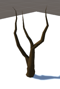
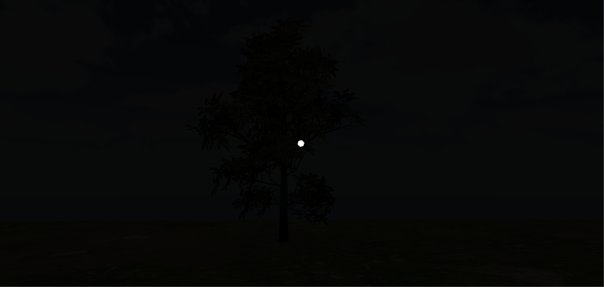
When I was playing around with Unity, I downloaded an additional asset package called Nature Starter Kit 2. With this asset, there is a feature that allows you to build trees, which I messed around with and ended up really liking the look of a barren tree:
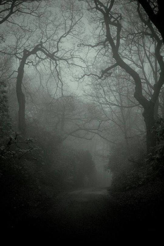
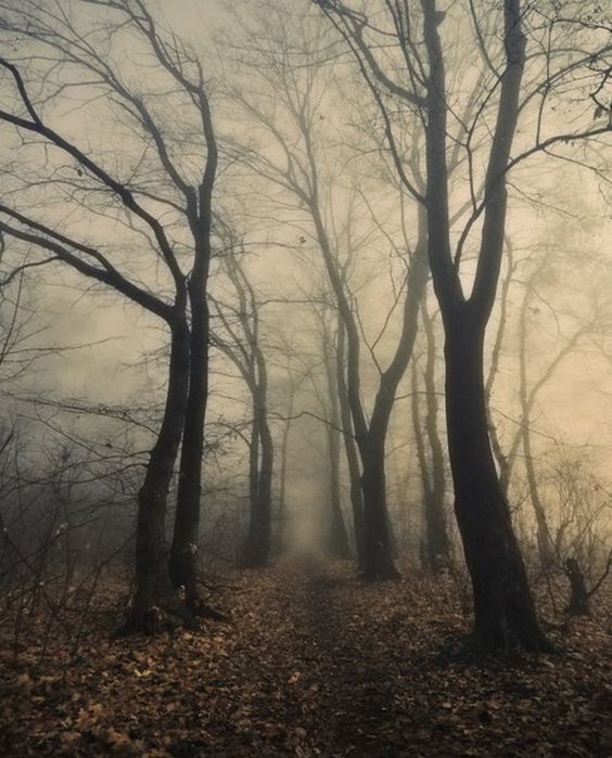
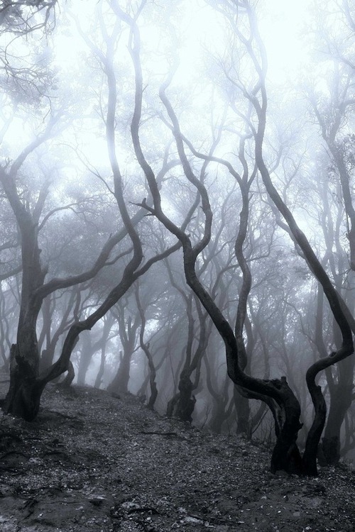
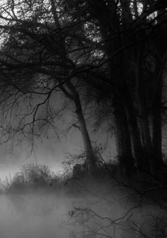
It has a sort of spooky feel, which got me thinking about creating some sort of forest that has a creepy yet mystical identity. I looked at the following photos (from Pinterest) for reference:
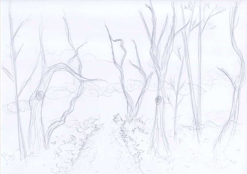
One thing that struck me about these photos was they were either black and white or dark in color. One aspect of (most of) our daily realities is color. In some of these forest photographs, the absence of color adds to the eerie mood in a way that color would potentially not. With this project, I would like to address this and create a spooky forest environment in which the absence of color would provide a lens in which the user is forced to see what would normally be brown and green as black and white. The following is a sketch of what the environment would potentially look like:
So far I’m thinking there will be a path along the forest as a divide so it won’t feel overcrowded (and could add to the spookiness because it’s like you’re forced to walk down a creepy path), with forest surrounding both sides of the path.
Feb 13
Today I created the file for my project and started to play around with the skybox and ground, as well as installed the Google VR components. I browsed the assets store for tree and nature-related packages, and ended up importing Free Rocks, StonyGroundPackage, Realistic Tree Pack Vol.1, and Nature Starter Kit 2. At the moment, my world looks like this:
For the skybox, I played around with the material from one of the package’s skyboxes, changing the tint and exposure to make it darker and less blue. I popped a tree in there from Realistic Tree Pack Vol. 1 as a reference for lighting as I messed around with the lighting. I ended up removing the directional light, but at the moment I feel like my world is too dark. Next steps would be to see if I can add some sort of moonlight in there. I’m also wondering if there’s a way to remove the color saturation from materials without having to tint them, since I do want to have a black and white world and the sky is still slightly blue…so this is something I need to look into as well.
Feb 16
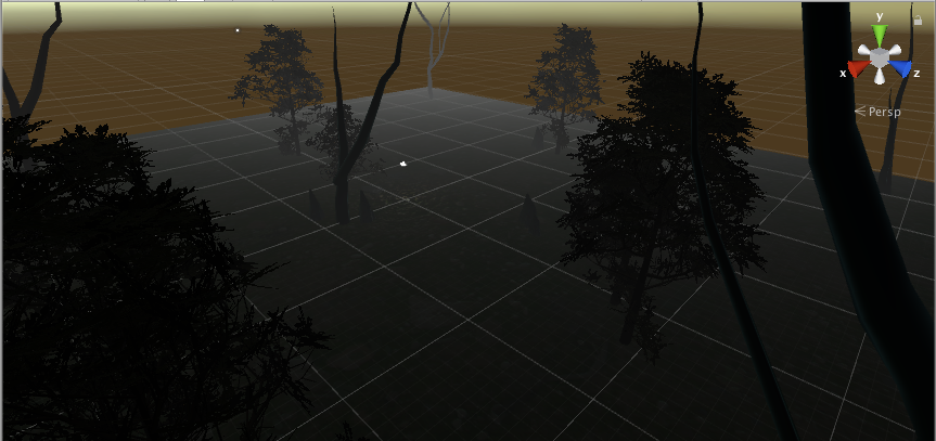
Today I worked on adding more elements into my world. I took my initial inspiration, the creepy effect of the build-your-own-tree function of Nature Starter Kit 2 to create some of my own trees. I did this because I couldn’t really find any prefab trees that had the same spooky effect. I also added more prefab trees, bushes, and rocks.
I also messed around with the lighting a little more – adding fog in the lighting settings seemed to make the ground a little lighter than before, sort of giving the illusion of moonlight. I’m still unsatisfied with the skybox itself so it’s back to the default skybox at the moment. Here is a progress pic of what I have so far:
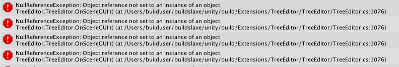
I’m a little nervous about the trees I made myself, because I keep getting this message in the console:
Definitely have to look into that.
Feb 18
Today Sarah helped me get rid of the dot in the game mode from the Google VR player, as well as clear my console (thanks, Sarah). Strangely, the console errors never reappeared so that was thankfully no longer a concern.
I also worked on the skybox, and got rid of the slightly blue tint. I realized I could just edit the png files of the separate panels that come with the skybox and decrease the saturation outside of Unity, and then upload them back in. I decided to do this with the sky that came from the asset WorldSkies:
I also did this with the ground material, and am now much more satisfied with the lighting of the environment, following the original idea of a black & white world. Now last steps would be to fill the world with more components to make the forest more dense.
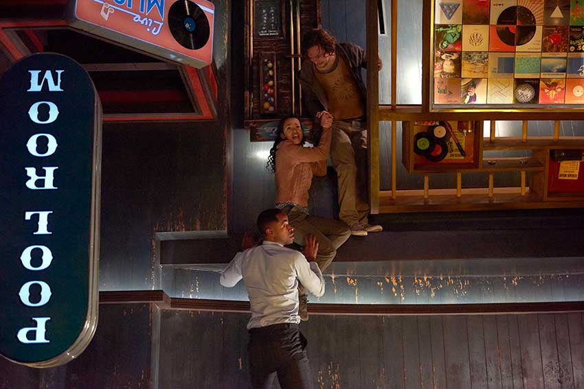
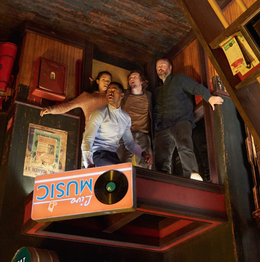
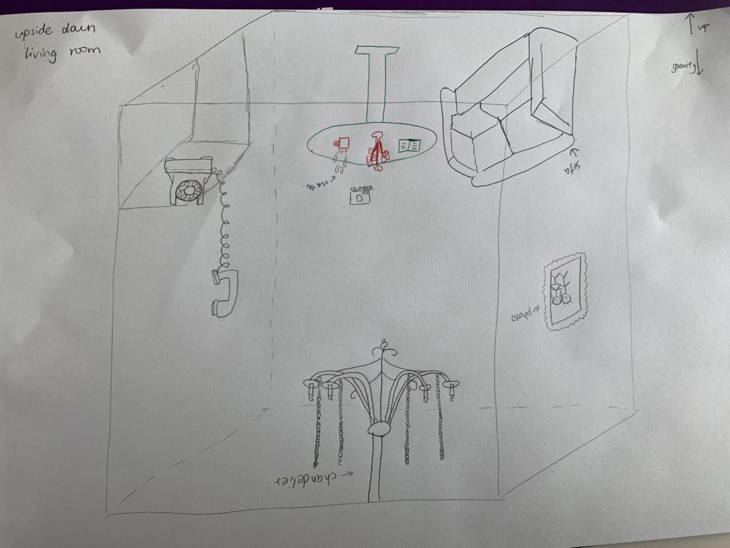
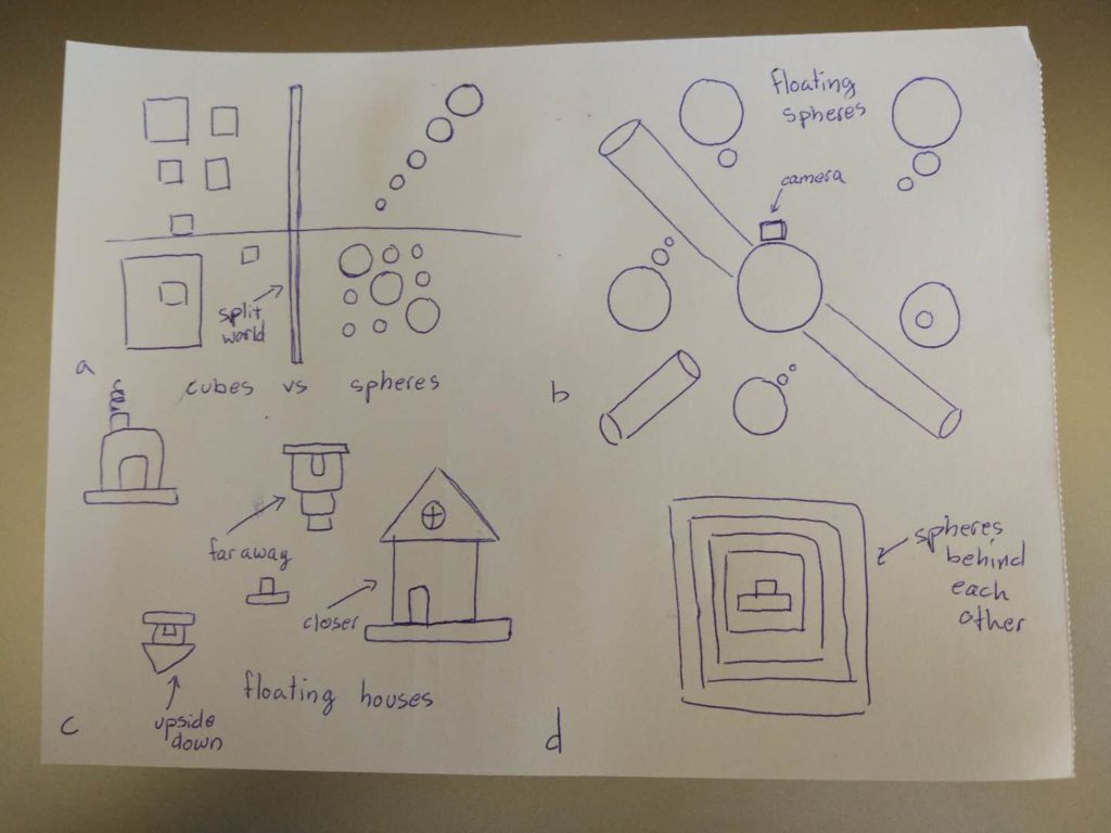
Inspiration: Recently I’ve seen a movie called “escape room” and one of the scene left a deep impression on me (movie scene shown as below) – an upside down pool room. It’s unique and gives audience huge visual impact because it challenges our common sense of how the layout of a pool room is supposed to be while maintaining the exact same objects that an ordinary pool room would have.
The aspect of reality that I would like to address is that the order in the real world has been taken for granted by us and viewing the exact same thing from two opposite perspectives can give audience a total different experience and knowledge of what’s existing around us. It’s also supposed to address the sense of space and gravity.
The identity in the alternate reality: disordered, upside down
Objects in the alternate reality: chandelier, sofa, table, flower, books, mug, telephone, wall paper
In order to make an environment that truly feels alternate I
believe there are certain aspects I have to choose from to incorporate. The
first would be disrupting one of the earthly laws of physics. This would mean
removing something that ultimately makes up our logic. If this would be removed
something wouldn’t feel right which would give this environment an alternate
world feeling; a world that is perhaps in another dimension with different
rules. Some of the interesting laws to remove would be gravity or size. Objects
should not be able to float in the air without movement or be too large for
example. Second, I could give the environment a history or something that
preludes to something that has happened in the place. This would make the
camera or user feel like this is another world because there is an alternate
history that has taken place. To do this would require some creative planning.
Finally, having objects that are new or uncommon in our own world. This would
contribute to the alternate world feel because it would feel discomforting due
to the unknown surrounds. These objects could be weird shapes or illogical
buildings.
Different Laws
Floating spheres
Large orthogonal cylinders
Upside-down houses
Floating platforms
History
Walking individuals
Houses or villages
Forests
A desolate world
Uncommon Objects
Spheres will holes cut out of them
Infinity stairs
Impossible shapes
Fences that are placed horizontally instead of
vertically
Feb 12
After thinking about specific identities I decided on a few
to choose from: trapped, impossible, quiet, and calm. I slowly realized, as I
was working in Unity, to make something seem like it was going on forever
required a lot of work. It was also very difficult because it required you to
try and not make things appear in patterns since those were easy to identify.
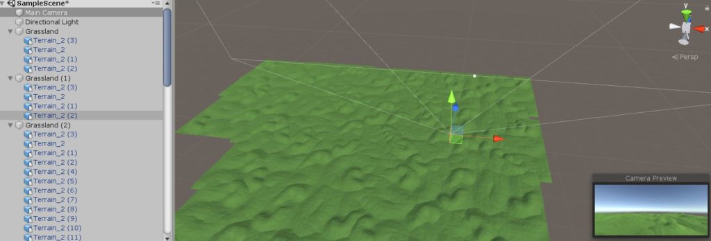
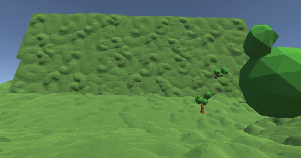
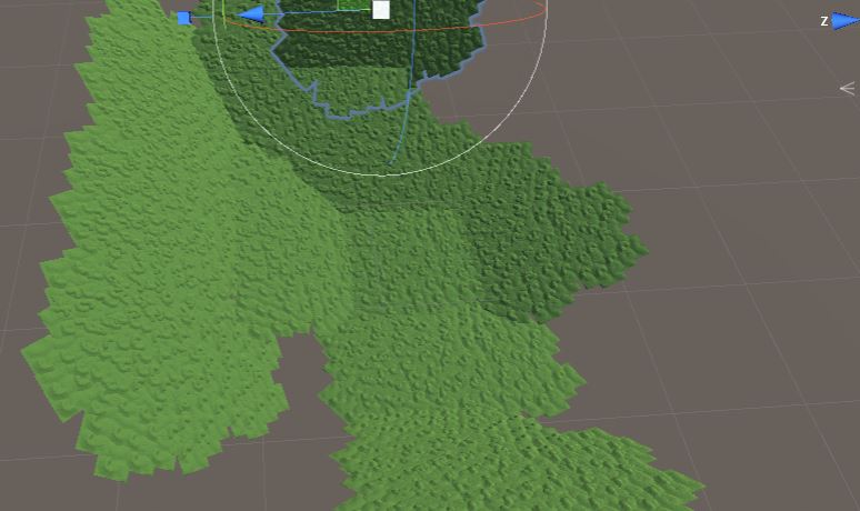
I worked heavily on the terrain of my world today. I took from a prefabricated forest terrain and tried to copy, paste, and rotate to expand it. My idea was to make a large grassland tile that could then be repeated into the infinity to make it look like a long calming plane. As I was working on doing this I started to play with rotation. I realized how interesting it would be if the walls of the world slowly started to curve upwards. Almost making it seem like a trapped location. Finally I ended with a work in progress version of an upwards slanting grassland world.
Feb 14
After working around with terrains and grounds I understood
that it wasn’t always so easy to put different pieces together without
something poking out and disrupting the fluid feel. Especially with the
grasslands that I wanted to make curving up and around the player because you
could obviously see the dents where two pieces are combining. Because of this I
decided on a new approach to make it seem like the land went on forever
(without actually needing to repeat forever).
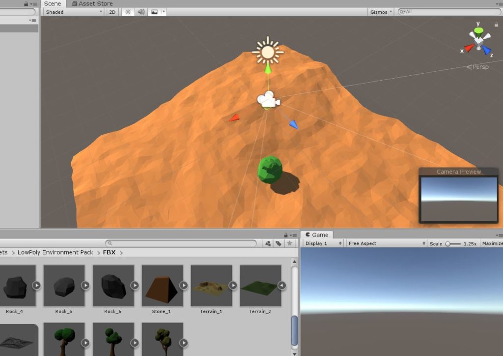
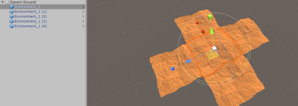
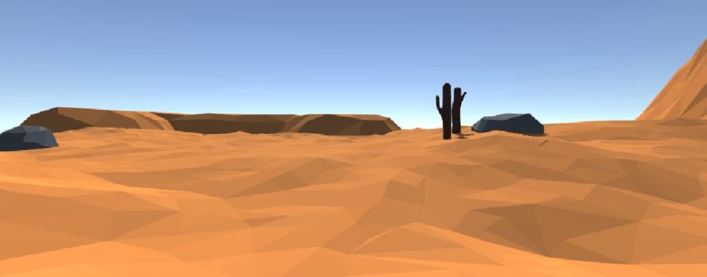
I restarted with the desert pieces instead of the grassland
pieces and I pieced together the same pieces 5 times to make a cross (with the
camera in the middle) (Pic 1). Because the enlarged desert had many hills which
repeated but all looked only slightly different, it was possible to hide the
edge of the world. Adding in a few mountains at different scaled sizes (and
rotated so that they didn’t look copy and pasted) also gave the impression of
depth (Pic 2). These two things together took away the need for a lot of labor
in piecing the ground pieces together.
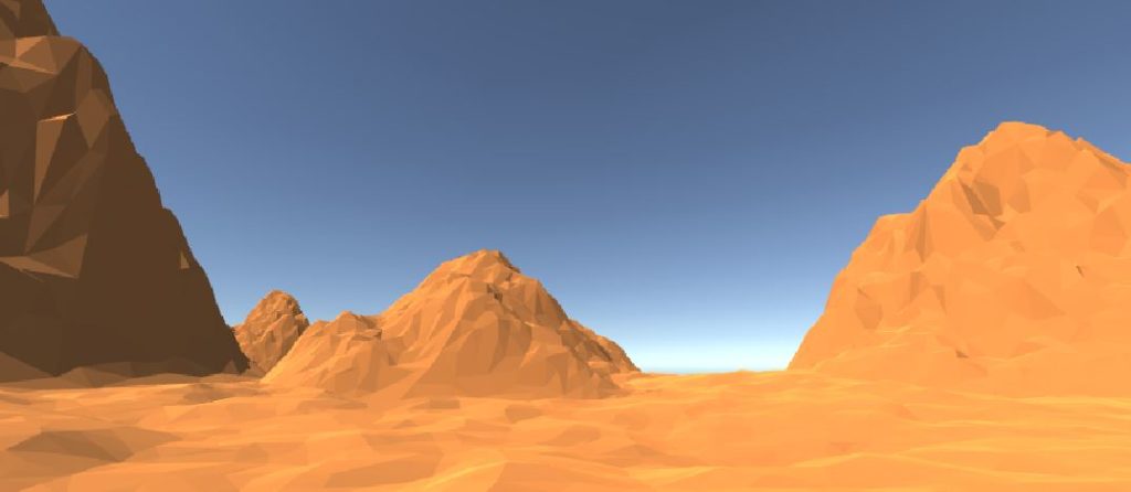
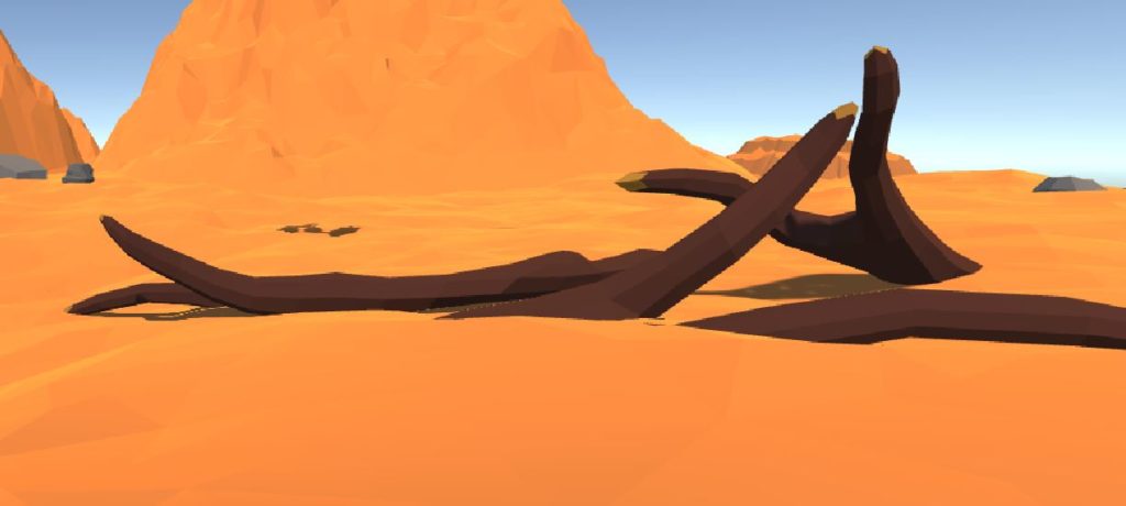
The dunes and mountains alone didn’t give enough of a story,
so I added in some stones and logs to make the environment seem more like a
desert (Pic 3). On top of that, I found a few different terrains that I could
add into the world to give even more background. These terrains had different
color sets that didn’t fit in though so I had to apply to material from the
dessert in order to make a clean fit (Pic 4).
Feb 15
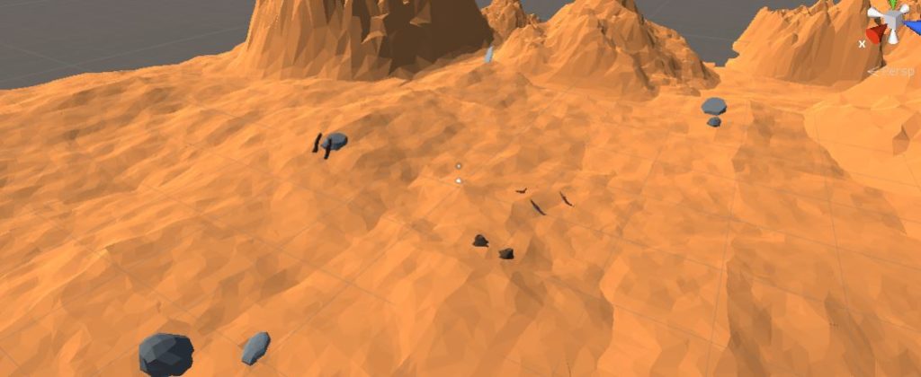
Now that I have a vaguely “normal” looking desert, it is
time to add “abnormal” things in. Since the desert had only non-living things
within, including the logs which all seem dead and dried up, the next step
would be to have something living. The goal was to involve these living objects
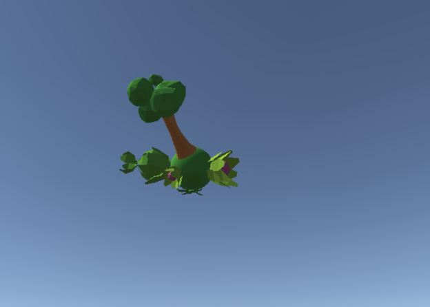
with either the identity “separated” or “impossible.” To do this I designed
floating spheres (very impossible) with vegetation and greenness all around
them (Pic 1). This seemed very abnormal because there were two colors that
deeply contrasted, the dry-desert-dead-orange and the alive-vegetation-green,
and two things that should not be found together. I designed 6 of these
different spheres and placed them all around the map in the sky. I made sure to
place different trees and plants on the spheres and also have them at different
sizes to once again mimic the depth in the map.
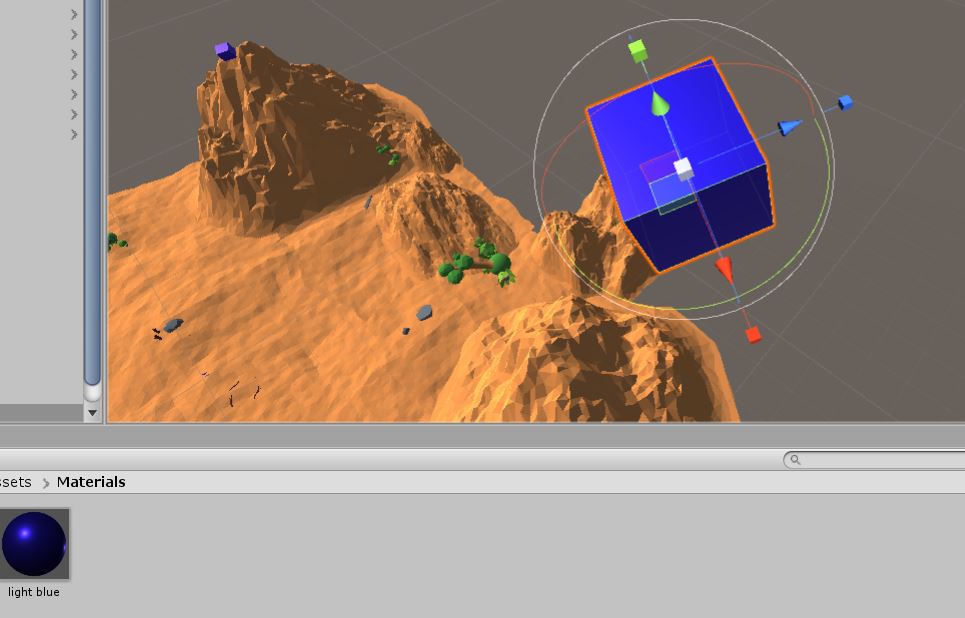
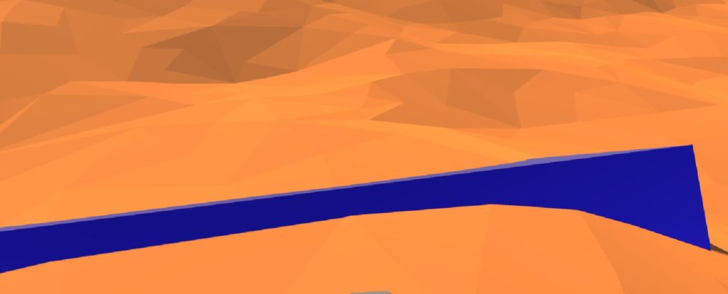
In order to further the impossibility, I decided to place
vaguely reflective cubes in the sky as well. I made on cube for each
tree-sphere. I made the cubes blue to mimic floating water which would make
sense, since each tree-sphere would probably need source of hydration (Pic 2).
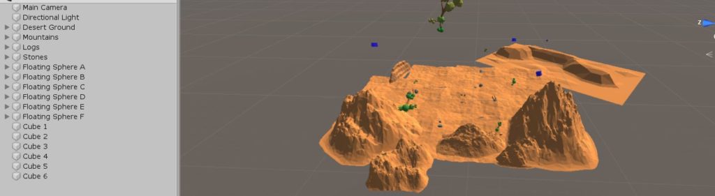
After placing five cubes around in the sky, once again keeping in mind the depth and height, I decided to embed one into the ground. This would be close to the player in order to formulate a story or mystery. “Why are there cubes floating in the sky?” and “why has one fallen down, is something going to happen to the trees?” where the questions I was trying to formulate. The final map that I ended up designing had a lot of pieces to it which made it quite an interesting landscape. It also kept some room for mystery, making the player wonder what exactly is going on (Pic 3).
Feb 18
Just final touches were made to give the area a bit more logic. The water block at the foot of the player was made gigantic in order to correlate well with the huge size of the cubes in the sky (Pic 1). Similarly, the logs in front of the player were also made gigantic in order to relate to the size of the spheres they were falling from (Pic 2). Finally some of the mountains were changed in size and some darker colors were given to the logs to give them more of the “dead” look.