Nerudia: the final documentation

Welcome to Nerudia, a mystical land of trees, mountains, and all things mother nature!

demo video

Nerudia at a glance

Projection Description:

Nerudia is a nature-filled land characterised by its tall hills, bountiful trees, plants and rocks. I’ve chosen “mystical” and “grandiose” as my main direction for the identity of Nerudia.

Process and Implementation:

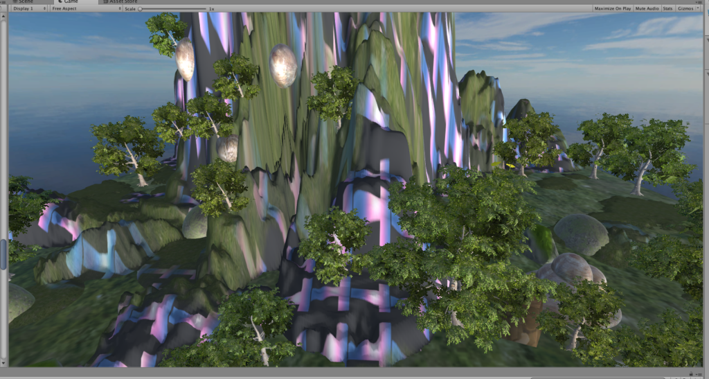
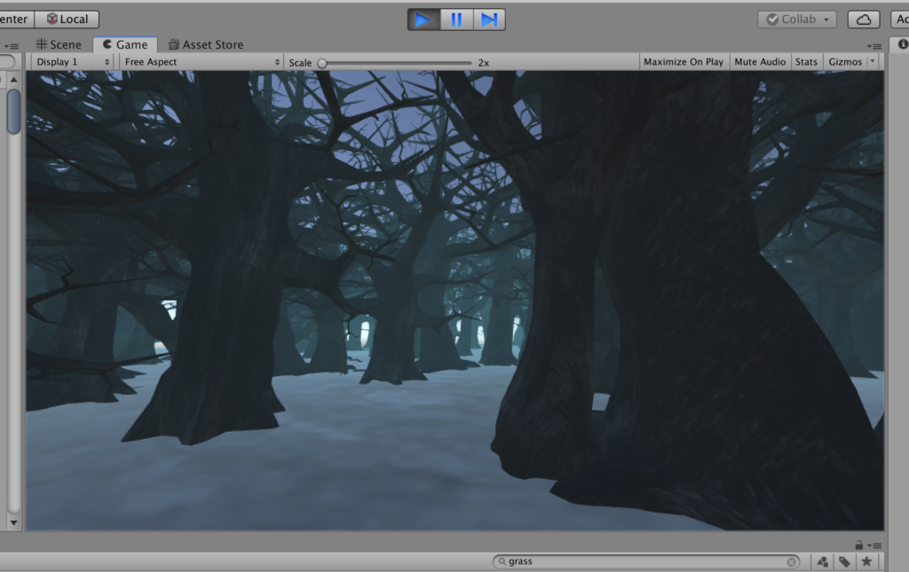
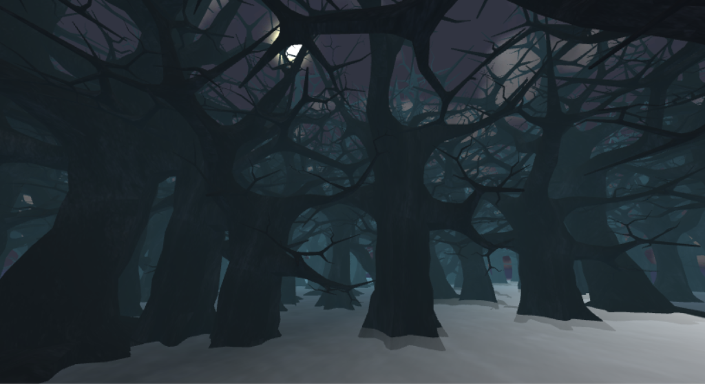
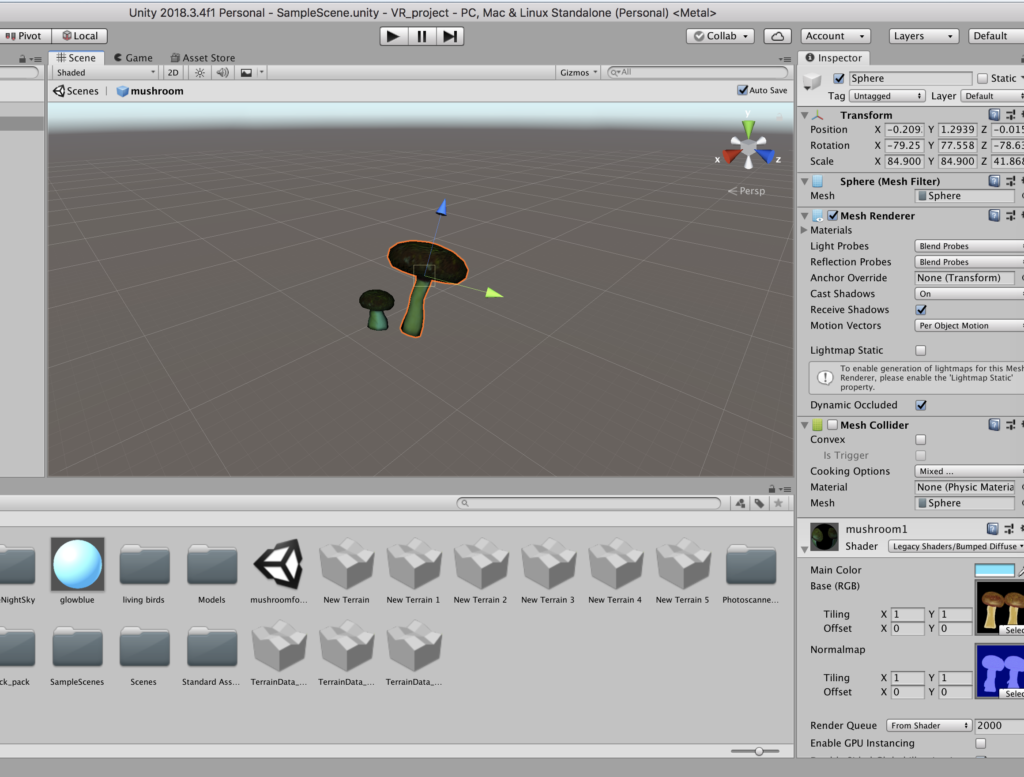
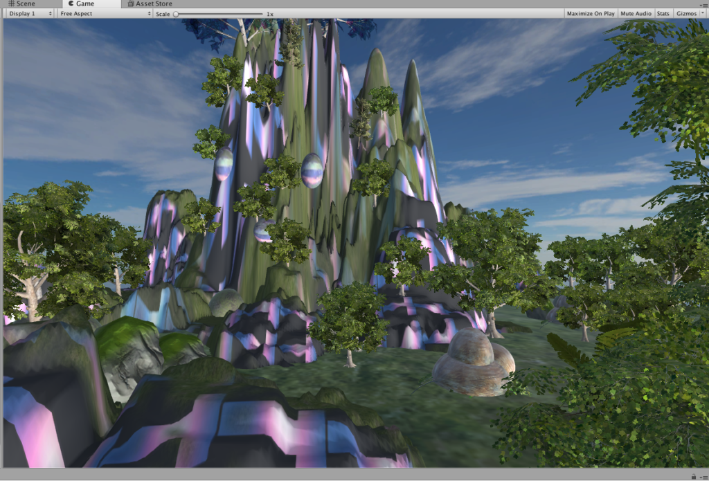
Knowing that I wanted to create a grandiose effect with tall mountains and hills, I started playing with the terrain feature to experiment with different heights for the ground. I initially built mountains and trees all around but after quickly realizing not all this will be visible from a single point where I put the player, I redesigned it so that the tall hills are on one side. I ensured the other side is more sparsely packed with trees and with shorter ones as well, so as to emphasize the tall hills more and create a contrast between the two. Building contrasting materials is a design strategy that I’ve repeatedly used for this project – emphasizing something and making it pop out more by creating others that are unlike it.

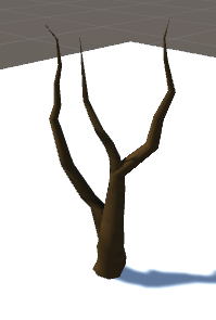
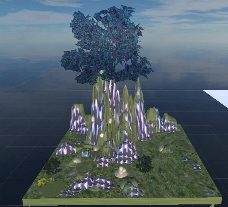
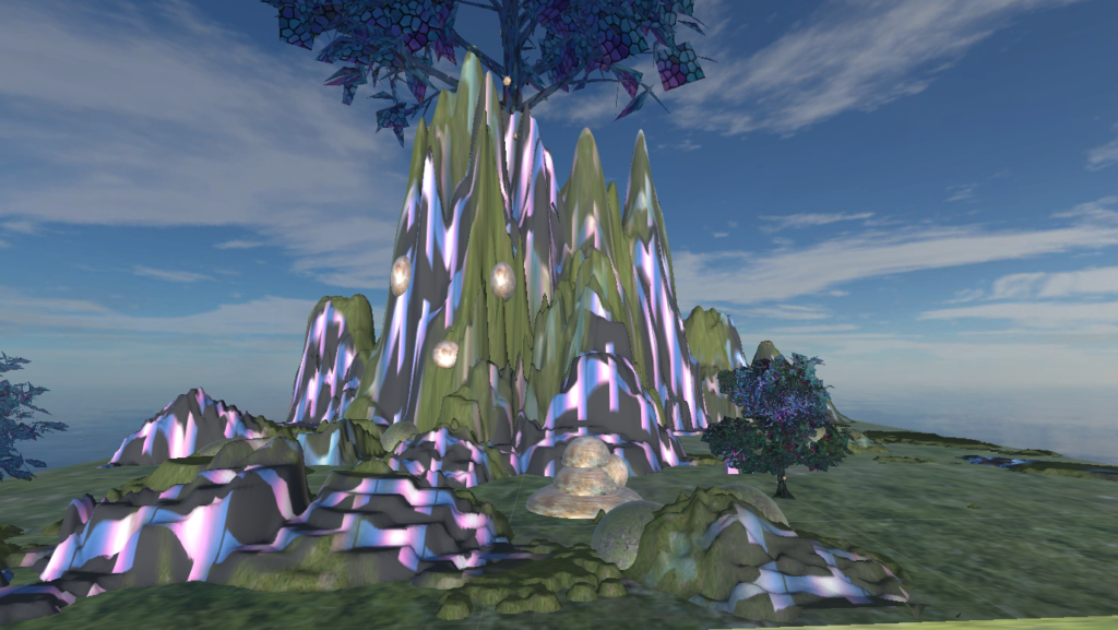
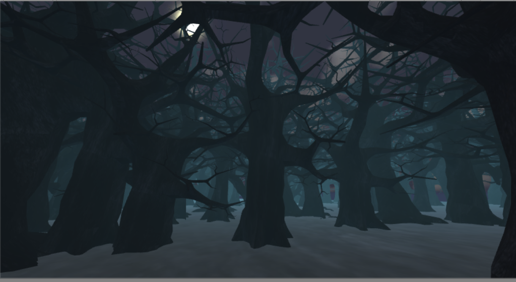
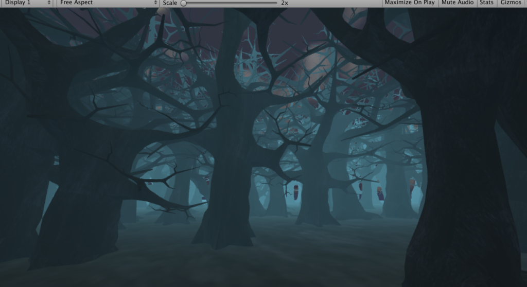
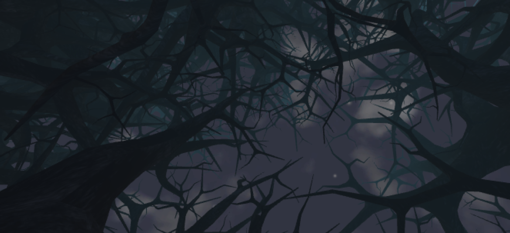
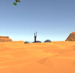
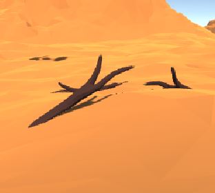
To add to the grandiose component, I decided to add a Mother Tree for Nerudia – an evident landmark that is symbolic of the place. So I placed a giant tree on top of the mountain, so the player can look up from the ground and really feel the power of its size and elevation. Again to make the Mother Tree stand out more, I made sure all the other plants and trees were properly colored green. I also added a Directional Light that lights the hills up from the bottom to brighten up the hills and Mother Tree more.

view of Mother Tree from below

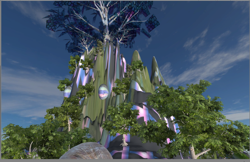
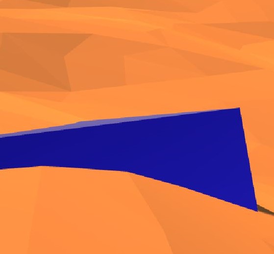
I also experimented with the color and texture of the mother tree leaves, and eventually went with a glass reflective material I found in the Asset Store. I also decided that color was key to tackling the “mystic” identity. To do this, I looked for various different textures that I could apply to the hills and mountains. I discovered a purple-blue-neon-colored stripes that added lava-like effect to the hills. I was careful not to overuse it and applied it only here and there to build up to the hills and the Mother Tree.

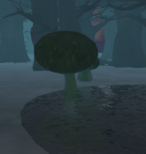
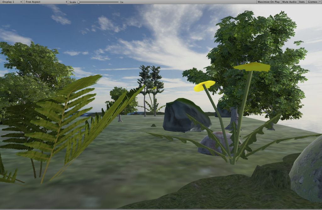
On the other side of the hills, I left the space less dense and only populated it with small plants so the player is not overwhelmed with too many materials around him/her. This relatively empty space was to create some breathing space for the land and the player. I also designed and made some stone-like structures to place around the ground. I also designed and made some stone-like structures to place around the ground.

Reflection/Evaluation:

I think Nerudia turned out quite well and I’m happy with its overall design and aesthetics. I’ve asked for feedback from my friends and they agreed that they felt the “grandiose and mystic” vibes from Nerudia. One friend even commented that she felt like “going on an adventure up the hills.” Designing a concept that suited the identity was central to my goals for this project so I was happy to hear that my friends agreed.

In the beginning, I was struggling with how to convey the “mystical” element because before adding the neon texture, it looked like a normal forest to me. Searching for an interesting texture really helped my concept and I think it played a big role in shaping the identity of Nerudia. Both the color scheme and the use of glass reflective material for the Mother Tree really defined the “alternative world” for me – something that we can identify as making sense but is different from the norm and what we expected. In other words, we would expect to see leaves on trees, but might not anticipate them being made of glass materials. Similiarly, we would expect to see mountains to be green in most cases, not some neon-colored stripes running down the hills.

Development Blog – Project 1

My project inspiration comes partially from a show called the man in the high castle, and partially from real life. The show is set in a world where the Axis powers won world war 2. There was a scene from the show set in Berlin, where a Nazi commander was addressing people in a massive auditorium building, and that scene really gave me a feeling of grandeur. I looked into that building, and it turns out that it is a building that the Nazis have really planned to build in the centre of Berlin once they won the war. It is called the Volkshalle.

Here are the depictions of the building in the show, and the plans for it from real life: 

The structure was supposed to be massive, at around 400m tall and with a diameter of the dome alone at 290m x 290m, intending to seat 150,000 people. I intend to simulate the feeling of standing on the podium.

I started with creating a cube as the building. However I quickly realized that the surfaces on the cube face only outwards, so you cannot display texture on the inside. So I decided to go with 6 planes instead. The dome and the stands, however, proved very difficult to replicate. so instead, I decided to recreate the feeling of the volkshalle rather than a direct re-build. I thought about what made https://www.youtube.com/watch?v=2akYIfxYbbE this scene so powerful. I determined that it was the scale of the building, the size of the crowd, the organized chants by the attendees, and the flags hung around.

I first created a simple but very large podium inside a massive hall. Then I added in some people using models from the asset store. However, a massive problem appeared. I needed a massive crowd, and the more people I added in, the more laggy the program got. It reached a point where even the macs in the classroom could not handle it, and would take 10 minutes to do even a simple operation. So I decided to use a rectangular prism instead of a model of a person to reduce the number of polygons Unity needs to render. This still caused some lag, however it was significantly less than with the people models, and I was able to create a larger crowd.

I then added in the flags. They are massive, with a logo on them. I did not want to use Nazi symbols, so I decided to go with the Abstergo logo instead, which is a very cult-like organization form the Assassin’s Creed games. The flags are just an image added onto a material, which is added onto planes.

I then added in audio. I decided to use the same chants used in the man in the high castle. I tried as much as I can to avoid Nazi symbols and phrases, however I could not find freely available audio that replicates the feeling I was going for more than that.

I wasn’t quite satisfied with the results, I needed to enhance the feeling of grandeur, so I added in statues. Next came what turned out to be one of the most unexpectedly time consuming tasks of this project, building the .apk and .app files. They took hours upon hours just to build. Nonetheless, here they are:

https://drive.google.com/drive/folders/1_7CXnfyNDD8YYHU6DY34HaKu92zkeUsy?usp=sharing

and a three-slide presentation about the project:

https://docs.google.com/presentation/d/1WhcUUHWOIPkWwEs96qrND2xbYrVSrcErzguMZYEdjr0/edit?usp=sharing

Project 1 Documentation

1. Project Description:​ 

Project demo: https://youtu.be/E0v61hVvWWA

I created an upside-down living room, in which the effect of gravity still works and can be seen. The aspect of reality that I would like to address is that the gravity and orderliness in the real world have been taken for granted by us and viewing the exact same thing from two opposite perspectives can give audience a total different experience and knowledge of what’s existing around us. It’s also supposed to emphasis the sense of space and gravity – how does the world looks like with gravity when everything is upside-down?

The identity in the alternate reality: gravity, disorder, upside down, broken

Sketch
Sketch
Final look
Final look


2. Process and Implementation:​ 

During the project developing process I encountered some difficulties in terms of technical issues, how to achieve the gravity effect I want, and how to decide the best place to put the camera so the viewer will get the most out of my project etc. In the following I’ll highlight what made me choose the objects to represent my chosen identity, the reason behind my camera positioning and some processes of how I solved some problems.

  • The chandelier with chains falling on the ground

In order to embody the effect of gravity in this upside-down world, where the “ceiling” becomes the “floor” in this case, I played around with the chandelier with chains – in the normal discipline when it’s hanging the chain will be straight, but in this case it should be on the ground, which is obvious enough to show the viewer that the gravity does exist in this environment. In order to do that, I downloaded a chandelier prefab and break down the iron hoop on the chain one by one and reorganized them to make it looks like “staying on the ground”, as shown below:

  • The water pumping out of pipes – partical effect

The initial idea was to add the upside-down mug and the water drop coming out of the cup, but taking into consideration of the realness and the time for animation partical, it seems not realistic if there is water endlessly keep falling out of a mug, but the water falling is another obvious way to indicate gravity, so I changed it into water pumping out of the old broken pipes, which also cater the “broken” theme.

water pumping out of pipe – view from camera
Partical effect

  • The telephone with microphone falling on the ground

This came from my initial daft, because the microphone on the ground indicated it fells down from somewhere, and it leaves imagination for viewers to think what happened before in this room.

  • Messy floor resulted from things falling down: plants, broken wooden boxes, telephone

The design of this scene indicates the things falling down because of the gravity, it caters the broken and messy nature of chaotic upside-down, also leaves space for viewers to image what happened before here.

  • Camera positioning and the mirror

It took me a lot of time to decide where to put the camera so the viewer will see most of my design of the room while feel comfortable viewing around. I tried to put it in the middle of the room first, but it takes effort to have a clear view of what is right below or above you. Then I figured the best way to have a comprehensive view of a room is to view the room from a side perspective instead of being in the middle of it. So I moved the camera to a corner of the wall. Surprisingly I happen to placed it under the water falling effect, so when I looked up I feel the water is about to falling on my face! That was such a real experience, so I decided to keep the camera that way so when the viewer look up there will be this kind of “immersive” feeling. However, doing this means I give up the sight to the the pipe, because the viewer is right under it. Then I added a mirror which can actually reflect, I put the mirror across to where the camera is, so the viewer can just look ahead into the mirror and she/he will know what’s going on above him/her and why there’s water falling down. The mirror helped me solve the problem of lack of sight so I decide to just keep the camera in the corner.

Mirror reflecting the view above the viewer
  • Adjust the scale of texture

This is a difficulty I overcame with the help of Sarah. When I was doing the design of the overall layout of the room, I put wall paper and wooden floor to make it look more like a living room, however, when I applied those textures to the materials, it’s been stretched so much that it didn’t look real at all (shown as below). But later I solved it by changing the tiling parameters.

stretched texture


3. Reflection/Evaluation:​ 

This project pretty much satisfied all the expectations I had before I started: in order to show the gravity effect and the sense of being upside-down, I made the partical water falling effect, I designed the chandelier with the chains falling on the ground, the upside-down photos on the wall etc. And during the process I added the mirror with actual reflection to tell the viewer what’s happening above you, since I placed the camera in a lower corner of a wall to make up the lack of light since it’s in a corner and achieve a better effect of immersion (viewer standing under the water fall and can see it falling down on you).

However the things I will consider to improve the project includes adding sounds effect, like the steel lander cover of the chandelier rolling on the ground, the sound of water pumping out of the pipe, and something hanging in the middle of the room and swing around to show the gravity etc. Overall I think I’m satisfied with this project and it achieved what I expected.

Project 1 Documentation

Project Description

Video demo:  https://youtu.be/eTXNGwPbcrs

Color is an inherent part of some of our daily lives. It can add vibrance or even different moods – a bright yellow can inspire happiness whereas a dark blue can inspire sadness. With this environment, I wanted to explore how the absence of color could affect a mood. I created a forest with a completely desaturated sky and ground, making its identity one that is eerie and spooky.


Process and Implementation

I was initially inspired by the idea of a spooky forest when playing around with the tree building function of Nature Starter Kit 2 since the branches of the trees could be warped in a way that were windy and pointy.

When browsing pictures of spooky forest images, I noticed that a lot of these images were in black and white as if to enhance the creepy effect, hence inspiring me to create a black and white forest to add on to the eerie effect.

In terms of what to put into the actual environment, a lot of my implementation had to do with what I came across in the assets store. I wanted my environment to look a little more realistic, so I kept this in mind when browsing various packages.

The trickiest part was definitely getting the lighting right. I removed the directional light and added fog in order to give the illusion of nighttime, choosing a night setting because night is inherently more spooky than day. However, my biggest struggle was with the skybox. I would try out different materials with different combinations of tint and exposure in order to try and remove the color, however there always seemed to be a slight tinge of color. I eventually realized that I could just edit the saturation out of png images of the panels using a simple photo-editing website (Pixlr), and then place these edited panels into a new skybox material. This finally completely desaturated the sky and gave the effect I was going for.

Reflection/Evaluation

Overall, I think the eerie effect was accomplished because of the absence of most color and the choice to make it nighttime. However, I do think it’s possible that someone could be in this world and feel at peace rather than spooked out, depending on what their feelings towards nighttime forests are. If I were to build upon this, I think I would try and add some animations or sounds in order to enhance the spooky effect. For example, it would be cool to have wind whistling so that the user could perhaps feel “chilled,” and have some leaves rustle in the wind.

Development Blog 03

I’ve been having issues positioning the camera – no matter how much I change its position, it goes back to default when I press play in Game View.

After much experimentation and going back and forth, I realized there were a few causes for this, including having more than one camera and the fact that the player’s position can be moved around – this is essentially what you see when you hit play, not the position of the camera.

So after setting the position, I’ve been moving things around to make sure everything is visible from this single point.

Development Blog 02

I’ve added a new texture in the shade of purple, blue and white that runs all over the hilly terrain. It creates a lava-like effect and makes the mountains pop out more, thus adding more to the mystic atmosphere.

I’ve also built in a big tree on the top of the hills, which almost looks like a “mother tree” to this place. The leaves are light-reflective and very different from the other trees in the place.

top view
front view

Things I need to keep in mind:

  • decide on the camera position and make sure the environment is fully visible from there (make sure nothing is hidden)
  • test run to see the VR space is working 360 degrees

Development Blog: Project 1

For the first project, I bounced around two ideas. The first was a beach environment abstracted such that when you moved around in a circle from your vantage point you would see a change in the beach as a result of human activity, a gradual transformation. The second idea was a mystical forest, inspired by the Forbidden Forest. Perhaps because I watched Harry Potter over the weekend, I leaned towards the latter.

The Forbidden Forest in Harry Potter 2

Though I do have a bit of experience with Unity, I don’t feel very comfortable with lighting, fog, or aerial perspective. Since these are critical to creating mood and a sense of place, I hoped to specifically work on these aspects while making this project.

So far I’ve found some assets I really like from Fantasy Forest and I am experimenting with the color of the fog as I think that could make it more of an alternate reality by giving it a tinge of magic. I struggled a lot with making the trees have the scale that I wanted, but I realized that that had more to do with the perspective of the camera than the size of the trees themselves.

I’ve been messing around with the density of trees I put into the scene and the fog. The difficult thing about the fog is that it requires a precise density…too small and the fog will be barely there but even if you increase it just a bit, your scene will become consumed by fog.


I think the scene could do with a tad more fog, but this is about the tone I hope to convey. The blueish tint of the fog gives off an aura of mystery. I really hate the ground currently. Nothing I do looks natural! I’ve tried adding rocks and different textures to the ground, but it doesn’t help the trees fit into the ambience. I think I shall experiment with terrain to see if adding more levels makes the forest look better.

Actually, adding a different lightbox helped a bit. But definitely gave it a dark forest vibe.

Here I just increased the fog density by .01 and the difference is staggering.

Experimenting with a moonray directional light:

I had envisioned having a pond with mushrooms and magical fauna surrounding it. I wanted the mushrooms to glow, so I tried to add an emission to a new material but these made the mushrooms neon blue and far too bright. Thus, I adjusted the prefab by giving the shader a blueish color to give it a slight glow.

I think I will try to make a meditation forest now. I have a lot of trouble sleeping at night, so usually I end up listening to music to block out all the darting thoughts. But, my imagination usually tends to run wild all the same, so I wonder if having something visual to focus on would help me concentrate or sleep.

I think I shall keep my skybox and fog as is as I hope to still convey a nighttime ambience to remind myself of sleep. But, I now need elements that signal peace and tranquility to balance the darkness and barrenness of the trees. I did try putting leaves on many trees, but it didn’t support the aesthetic I was aiming for.

I experimented with a few things: waves, swaying flowers, mist, flying birds, and flying orbs of light. I wanted to keep my environment as uncluttered as possible, so I only chose my two favorites: the orbs and the waves.

With the orbs, I had to play around with the particle system to get the aesthetic I desired. Specifically, I played around the the color, the spread of the system, the size, speed, and direction of the individual particle, as well as the emission (glow).

VR Experience Review

During the week I tried out the Google Earth VR online, where you can experience varies views from different locations in the world by using the mode “walking” or “flying”. When you are “walking” in the scene all you need is just a VR headset, while in order to experience “flying” you need an extra handle as well to navigate the directions.

Here are two brief clips showing how it looks on a PC:

Flying mode

Walking mode

Experience without equipment online

After experiencing the online Google Earth VR and looking at the videos of how it will work in a headset with a more immersive experience, I deepened my understanding of how the space works in terms of communications information that the way to communicate influence the user experience and the level of immersion. Take Google Earth for example, when the communication means is simply drag the mouse to rotate the 360 degree scene on a PC, it gives you less sense of reality since the user don’t see the instant reaction from the scene they are watching. While when the user is using a headset and maybe a handle to experience it, it feels more like reality since the user is asked to take less effort (no need to drag the mouse) and the scene will give you instant feedback and interactions as the user is moving the head around.

What’s more, beyond the communication means, the information included in the VR experience also matters. Wether the view is from the perspective from above (the god’s view), or it’s a fixed camera point in the middle of a 360 degree scene, the position from which the view starts really influence the level of immersion, or the level of how realistic it is. However, although the Google Earth VR in the flying mode gives you the perspective to see the world from above, it does provides you with the contextual background that you are in an aircraft, which makes more sense and smoothens the user experience.

VR Experience Review: VR Diving

I decided to try out an app called VR Diving where you can choose from a set of different underwater environments to experience either just on your phone or with Google Cardboard:

I chose the first one, Ocean Shark Shipwreck 360, to review. Here are a few screenshots of the experience, taken from the normal phone view rather than the Google Cardboard view for ease of viewing on the computer:

Ignore the quality setting – I set it to “high” later on but there wasn’t really any noticeable difference.

This 360 video showed different clips of sharks and fish swimming underwater. When you tilt your head down, you can either see coral or darker blue ocean water, and when you tilt your head up you can see the sun shining onto the surface of the water. While the videos appear to be taken from real life, the sound does not – there is a creepy sort of music along with sounds that sound like bubbles.

I’m a little confused as to what the purpose of this environment is. On one hand, it could be a cool way to represent what scuba diving is like. On the other hand, it could be meant to scare the user because of the music and, at one point, one of the sharks eats the camera. However, this experience was an odd mix of the two. It wasn’t quite like a realistic representation of scuba diving because of the strange sound effects and also because of the fact that every so often, the video would suddenly transition to a slightly different scene with an unnatural fade in/out effect. It also wasn’t quite scary, because the bubbly noises distracted from the scary music, and most of the sharks didn’t seem to mind the user.

It makes more sense for this to be aiming for a realistic representation of scuba diving, because the rest of the worlds you can pick fit along with this theme. In terms of how the view is composed, it is pretty effective, especially because it uses real footage and the slight haziness is similar to how it feels to wear goggles underwater. The editing done to the footage, like the transitions and sound effects, are the components that would need to be improved.

Documentation [The Hydrated Desert]

The location that I place the user in is a desert surrounded horizontally with objects representing a dry world but juxtaposed with objects, found in the sky, that complement the dehydrated environment. The identity used as a basis for the project was complementary, an adjective that explains how two parts can come together to “mutually supply each other’s lack.” The desert is composed of dunes, mountains, rocks, and logs, all familiar objects that one would expect to find in a desert. The sky on the other hand, is filled with floating spheres covered with vegetation and trees as well as floating blue cubes, representing the water that is supporting the mixed environment. Not only do the orange-red colors of the desert complement well with the blue-green colors in the sky, but the dehydrated world also complements with the hydrated world. The four core elements are all well presented as well. The earth and fire in the desert and the wind and water in the sky. In our reality, there is some impossibility in having organic spheres and cubes floating above a lifeless environment. This alternate reality on the other hand, has other laws governing physics; this permits a natural yin yang of elements to form.

Most of the prefabs I found were originally from a free asset pack. The terrain was skillfully pieced together with scaled desert tiles in order to give the user a perceived view of infinite dunes. Making sure that the user couldn’t see the edge of the tiles gave a more realistic feeling since deserts usually are quite large. In one corner a mountain range was set up with differently scaled mountains to give the perception of depth. Other rock monuments were also placed around the user to further reinforce the feeling of depth in a large desert. Finally, a collection of stones and logs were placed all around in different formats to gives the environment a bit more meaning. Before adding in the complementary objects in the sky, the desert looked essentially like one humans would be used to.

The feeling of being in an alternative world really started with the placement of floating objects. Everything originally looked “normal” but once the user started looking around and seeing things in the sky that were not the sun, then their perception changed. The objects in the sky were also populated by prefabs that were specifically rotated and scaled in such a way to give the user a new experience. Some of the floating spheres and cubes were placed far away and others nearby, once again to promote depth, but they were also designed to all be unique in order avoid pattern recognition. A few were also designed to have huge trees on small spheres in order to further inhibit the user’s original basis of logic. By altering the user’s perception of physics, this world that combined four elements in a harmonizing manner could come to exist. This coordination would not normally be found in our reality so it was necessary to convince the user that they were in a different reality.

In order to force the user to think a bit more, since that usually helps a player connect better with a new world, some small details were hidden in the environment. Some of the collection of logs and stones were gathered in a formation that promoted purpose, perhaps urging the user to develop a story. This is evident in the stones encircling a log, maybe supporting the hypothesis that some creatures lived here and camped, or a group of dead logs packed together next to a shadow, as if they fell from somewhere. These details asked the user to perhaps look into the sky and seek out the source of the logs or seek out the unknown creatures. After looking into the sky, maybe the user would even discover that there were only 5 water cubes in the sky but 6 floating spheres. The last cube was at the foot of the user, buried in the sand, perhaps for some unknown reason. My final goal was for the colors and objects on the ground and in the sky to complement each other in such a way that was usually impossible in our reality, all the while also giving the user a story to explore and formulate hypotheses about.


I believe I did develop a story and an environment that came together smoothly. Using prefabs from an asset package naturally limited my possibilities but I feel that I achieved with what tools I had. Naturally, there is always room for improvement, especially in a 3D world. Using low-poly objects made it easy to pay less attention to details. Ideally the objects used would have been a bit more realistic. This would have been more effective because there would have been more room for storytelling and connecting with the user’s experience. This would have required a much greater time commitment which was not available for this project. This would have been time consuming because the spheres would have to be carefully populated with even more well picked vegetation and the entire desert environment would have to be designed to better give the sense of sand and depth. Better representation of fire and wind would also be done by implementing wind drafts and scorch marks in the sand. I expected there to be more presence in this world but after designing it I understand where the fault is. There is no movement in the environment, giving the user the feeling that they are stuck in place. This could have possibly been achieved by rotating the sphere and cubes and implementing some sort of sandstorm. In general, the desired effect of this world on the user was achieved but not nearly to the extent that was originally anticipated.