Development Blog: Project 1

Feb 10

When I was playing around with Unity, I downloaded an additional asset package called Nature Starter Kit 2. With this asset, there is a feature that allows you to build trees, which I messed around with and ended up really liking the look of a barren tree:
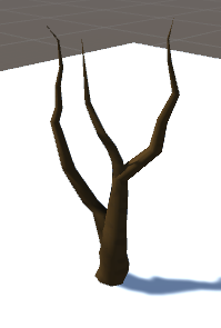
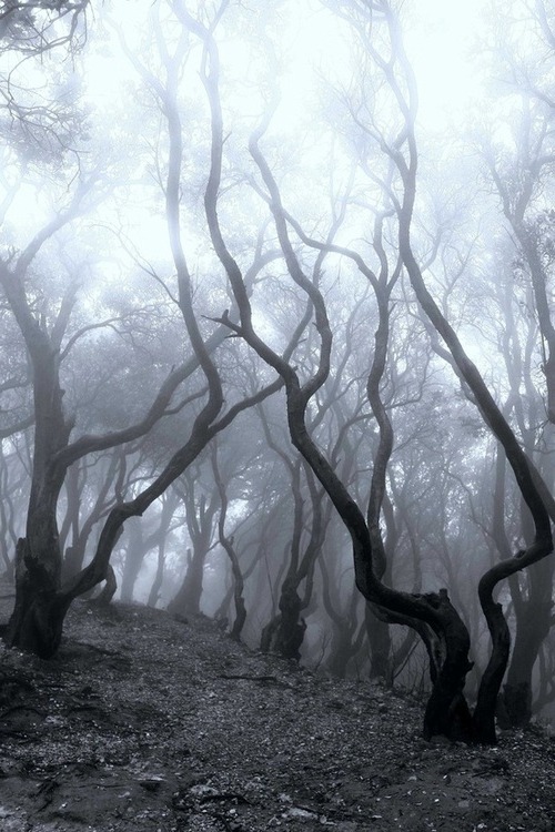
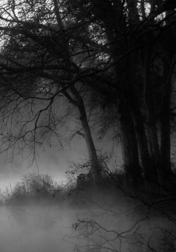
It has a sort of spooky feel, which got me thinking about creating some sort of forest that has a creepy yet mystical identity. I looked at the following photos (from Pinterest) for reference:
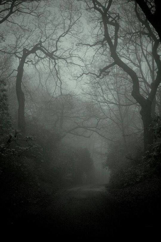
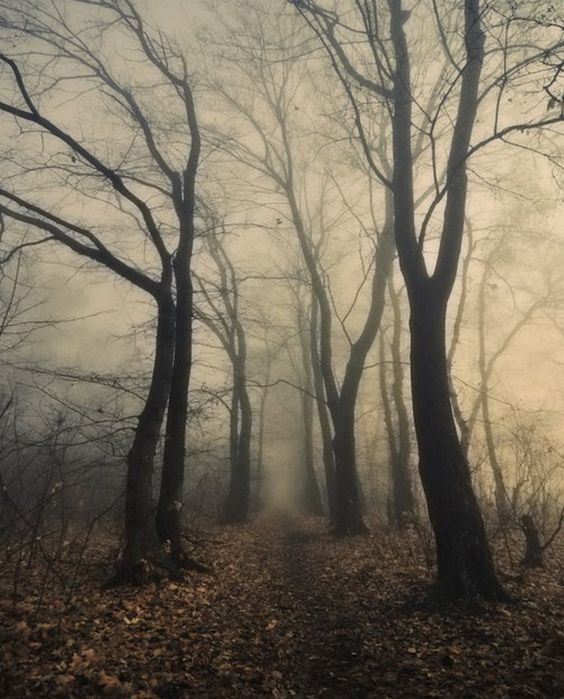
One thing that struck me about these photos was they were either black and white or dark in color. One aspect of (most of) our daily realities is color. In some of these forest photographs, the absence of color adds to the eerie mood in a way that color would potentially not. With this project, I would like to address this and create a spooky forest environment in which the absence of color would provide a lens in which the user is forced to see what would normally be brown and green as black and white. The following is a sketch of what the environment would potentially look like:
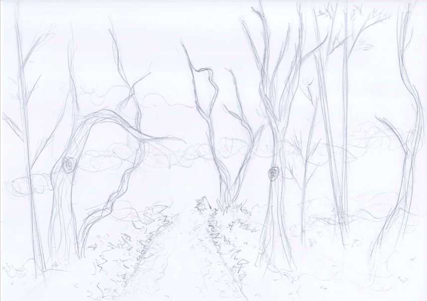
So far I’m thinking there will be a path along the forest as a divide so it won’t feel overcrowded (and could add to the spookiness because it’s like you’re forced to walk down a creepy path), with forest surrounding both sides of the path.

Feb 13

Today I created the file for my project and started to play around with the skybox and ground, as well as installed the Google VR components. I browsed the assets store for tree and nature-related packages, and ended up importing Free Rocks, StonyGroundPackage, Realistic Tree Pack Vol.1, and Nature Starter Kit 2. At the moment, my world looks like this:
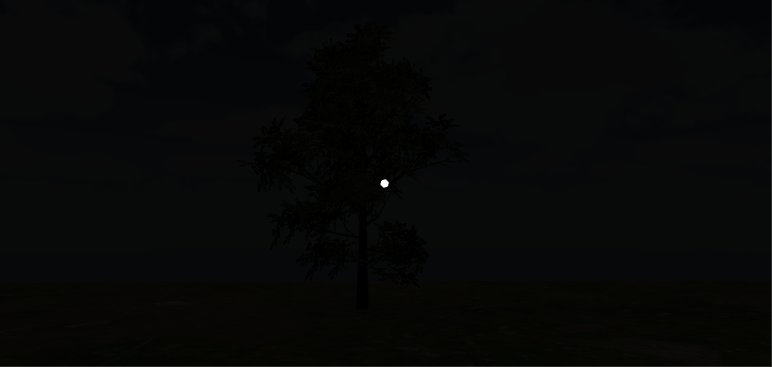
For the skybox, I played around with the material from one of the package’s skyboxes, changing the tint and exposure to make it darker and less blue. I popped a tree in there from Realistic Tree Pack Vol. 1 as a reference for lighting as I messed around with the lighting. I ended up removing the directional light, but at the moment I feel like my world is too dark. Next steps would be to see if I can add some sort of moonlight in there. I’m also wondering if there’s a way to remove the color saturation from materials without having to tint them, since I do want to have a black and white world and the sky is still slightly blue…so this is something I need to look into as well.

Feb 16

Today I worked on adding more elements into my world. I took my initial inspiration, the creepy effect of the build-your-own-tree function of Nature Starter Kit 2 to create some of my own trees. I did this because I couldn’t really find any prefab trees that had the same spooky effect. I also added more prefab trees, bushes, and rocks.

I also messed around with the lighting a little more – adding fog in the lighting settings seemed to make the ground a little lighter than before, sort of giving the illusion of moonlight. I’m still unsatisfied with the skybox itself so it’s back to the default skybox at the moment. Here is a progress pic of what I have so far:
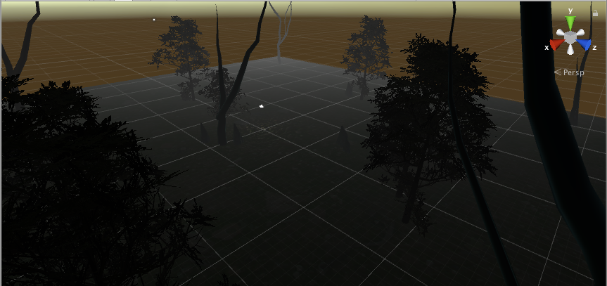
I’m a little nervous about the trees I made myself, because I keep getting this message in the console:

Definitely have to look into that.

Feb 18

Today Sarah helped me get rid of the dot in the game mode from the Google VR player, as well as clear my console (thanks, Sarah). Strangely, the console errors never reappeared so that was thankfully no longer a concern.

I also worked on the skybox, and got rid of the slightly blue tint. I realized I could just edit the png files of the separate panels that come with the skybox and decrease the saturation outside of Unity, and then upload them back in. I decided to do this with the sky that came from the asset WorldSkies:
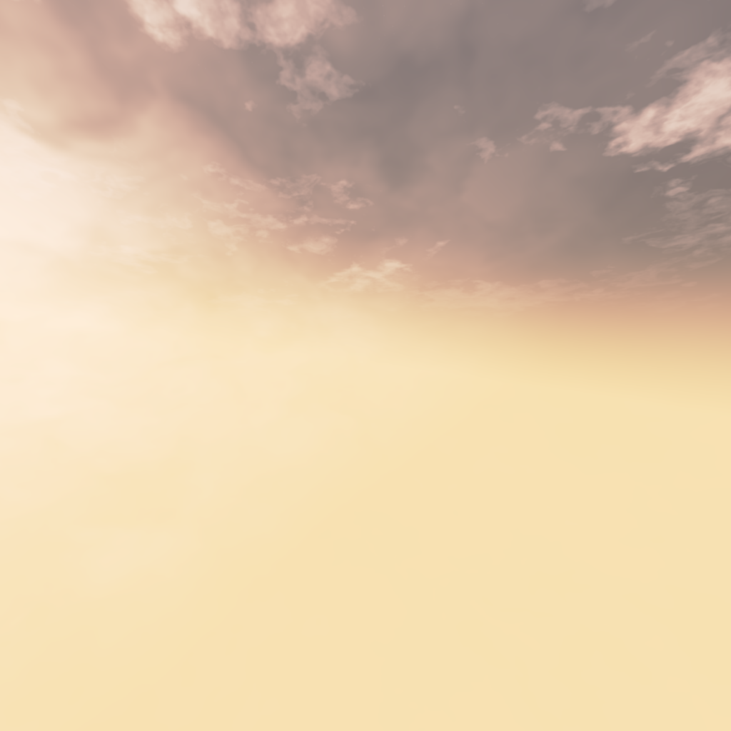
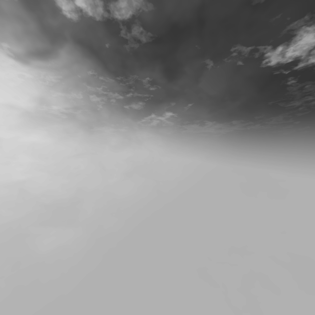
I also did this with the ground material, and am now much more satisfied with the lighting of the environment, following the original idea of a black & white world. Now last steps would be to fill the world with more components to make the forest more dense.
Project #1 Development Blog

Project idea: an upside down living room

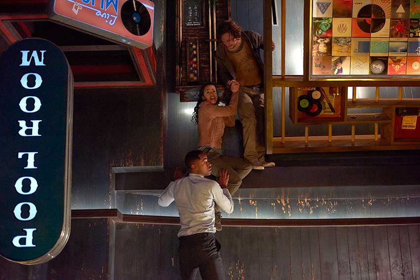
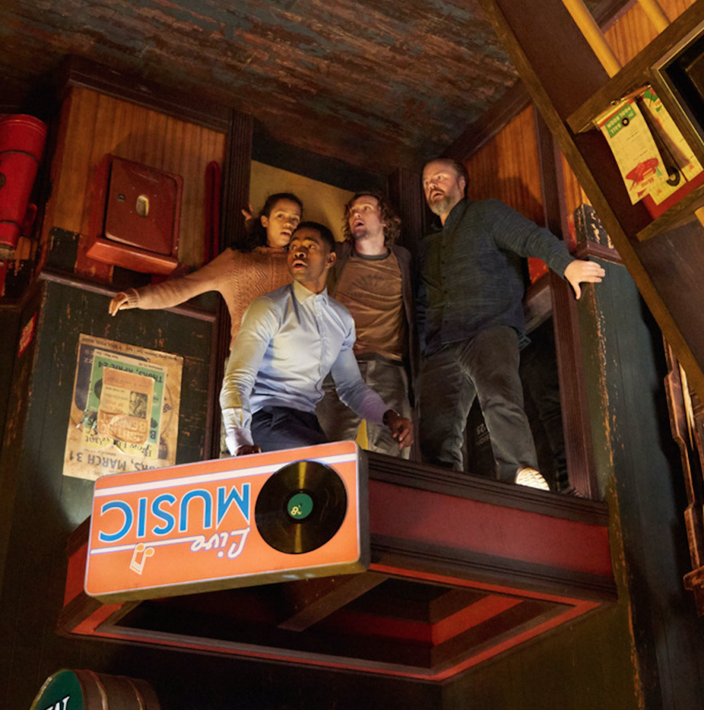
Inspiration: Recently I’ve seen a movie called “escape room” and one of the scene left a deep impression on me (movie scene shown as below) – an upside down pool room. It’s unique and gives audience huge visual impact because it challenges our common sense of how the layout of a pool room is supposed to be while maintaining the exact same objects that an ordinary pool room would have.

The aspect of reality that I would like to address is that the order in the real world has been taken for granted by us and viewing the exact same thing from two opposite perspectives can give audience a total different experience and knowledge of what’s existing around us. It’s also supposed to address the sense of space and gravity.

The identity in the alternate reality: disordered, upside down

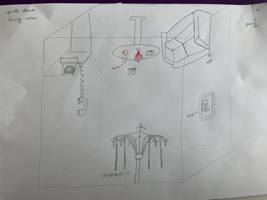
Objects in the alternate reality: chandelier, sofa, table, flower, books, mug, telephone, wall paper

Sketch:

Development Blog [The Hydrated Desert]

Feb 9

Brainstorm of ideas:

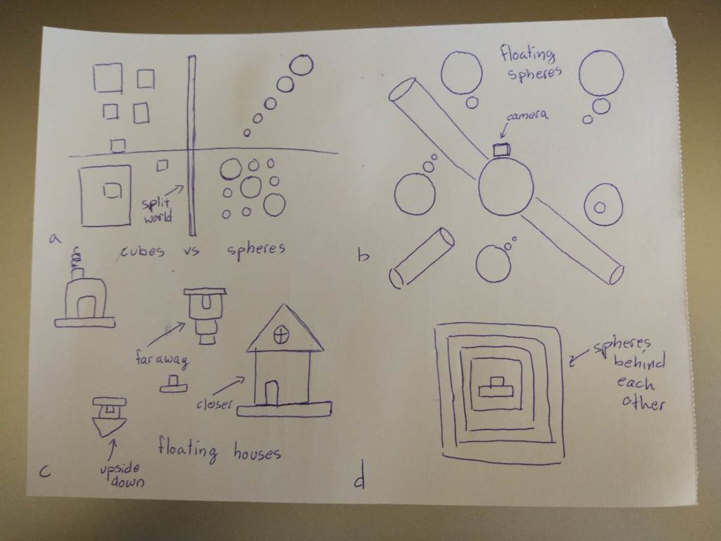
In order to make an environment that truly feels alternate I believe there are certain aspects I have to choose from to incorporate. The first would be disrupting one of the earthly laws of physics. This would mean removing something that ultimately makes up our logic. If this would be removed something wouldn’t feel right which would give this environment an alternate world feeling; a world that is perhaps in another dimension with different rules. Some of the interesting laws to remove would be gravity or size. Objects should not be able to float in the air without movement or be too large for example. Second, I could give the environment a history or something that preludes to something that has happened in the place. This would make the camera or user feel like this is another world because there is an alternate history that has taken place. To do this would require some creative planning. Finally, having objects that are new or uncommon in our own world. This would contribute to the alternate world feel because it would feel discomforting due to the unknown surrounds. These objects could be weird shapes or illogical buildings.

Different Laws

  • Floating spheres
  • Large orthogonal cylinders
  • Upside-down houses
  • Floating platforms

History

  • Walking individuals
  • Houses or villages
  • Forests
  • A desolate world

Uncommon Objects

  • Spheres will holes cut out of them
  • Infinity stairs
  • Impossible shapes
  • Fences that are placed horizontally instead of vertically

Feb 12

After thinking about specific identities I decided on a few to choose from: trapped, impossible, quiet, and calm. I slowly realized, as I was working in Unity, to make something seem like it was going on forever required a lot of work. It was also very difficult because it required you to try and not make things appear in patterns since those were easy to identify.

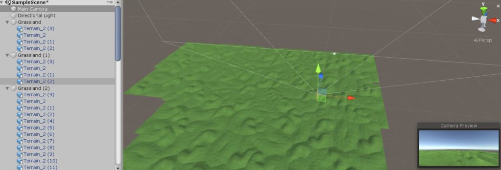
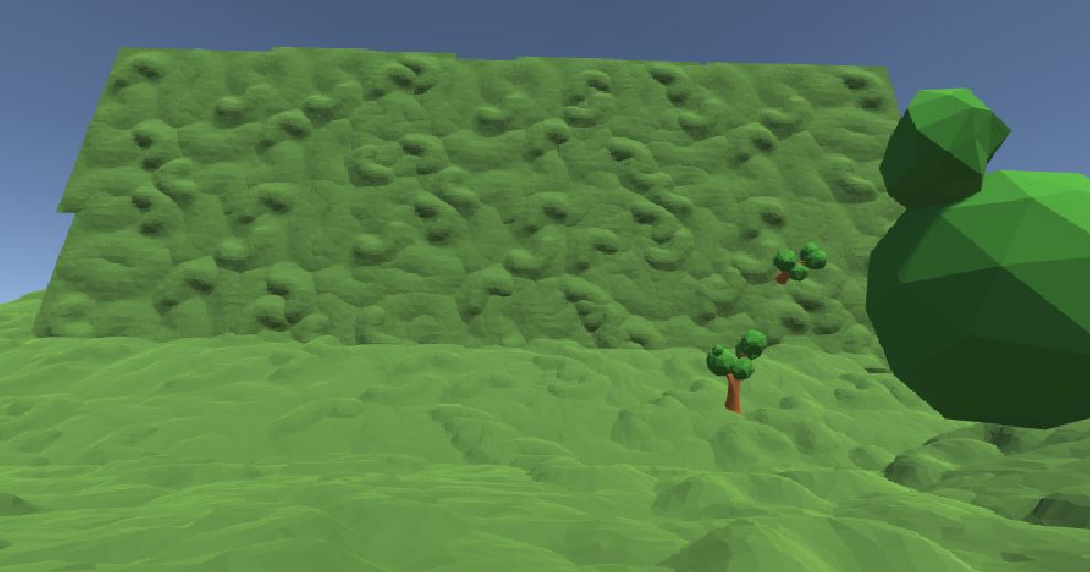
I worked heavily on the terrain of my world today. I took from a prefabricated forest terrain and tried to copy, paste, and rotate to expand it. My idea was to make a large grassland tile that could then be repeated into the infinity to make it look like a long calming plane. As I was working on doing this I started to play with rotation. I realized how interesting it would be if the walls of the world slowly started to curve upwards. Almost making it seem like a trapped location. Finally I ended with a work in progress version of an upwards slanting grassland world.


Feb 14

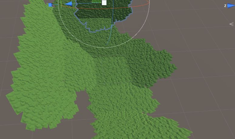
After working around with terrains and grounds I understood that it wasn’t always so easy to put different pieces together without something poking out and disrupting the fluid feel. Especially with the grasslands that I wanted to make curving up and around the player because you could obviously see the dents where two pieces are combining. Because of this I decided on a new approach to make it seem like the land went on forever (without actually needing to repeat forever).

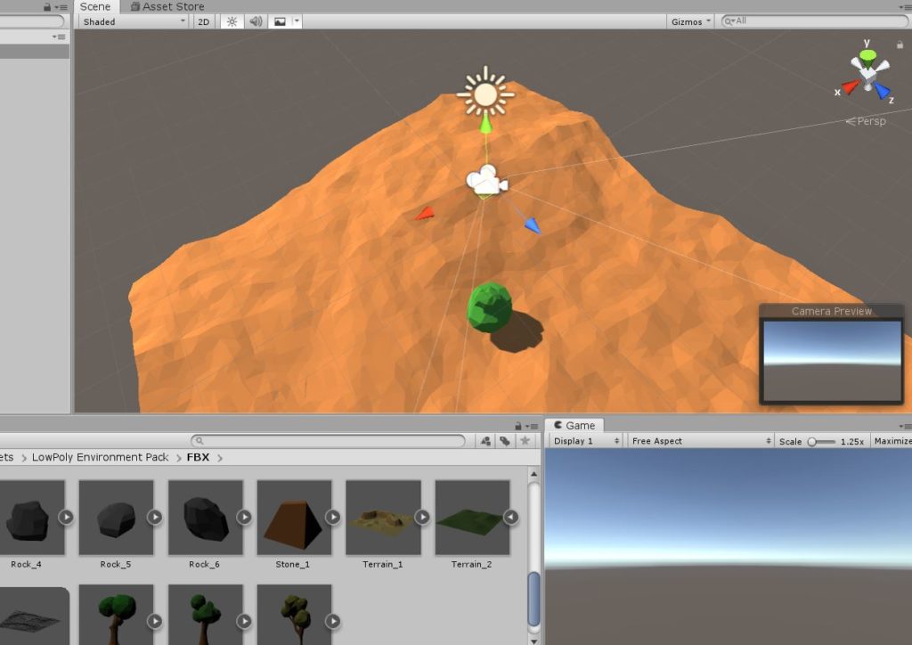
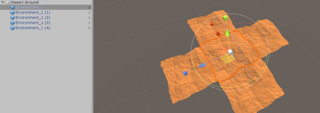
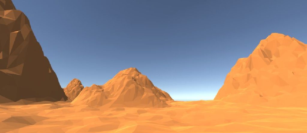
I restarted with the desert pieces instead of the grassland pieces and I pieced together the same pieces 5 times to make a cross (with the camera in the middle) (Pic 1). Because the enlarged desert had many hills which repeated but all looked only slightly different, it was possible to hide the edge of the world. Adding in a few mountains at different scaled sizes (and rotated so that they didn’t look copy and pasted) also gave the impression of depth (Pic 2). These two things together took away the need for a lot of labor in piecing the ground pieces together.

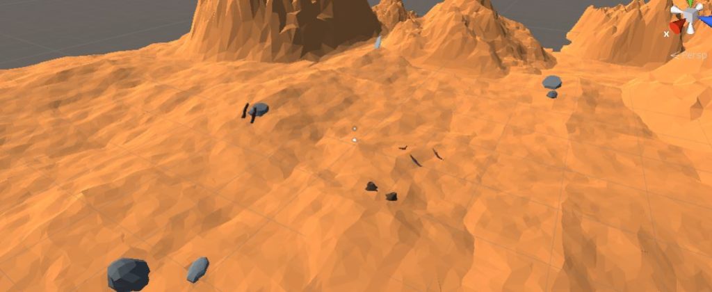
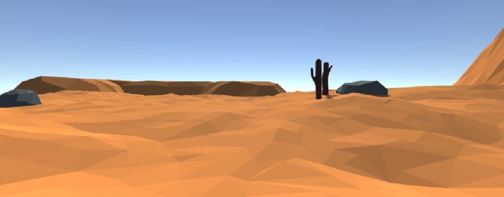
The dunes and mountains alone didn’t give enough of a story, so I added in some stones and logs to make the environment seem more like a desert (Pic 3). On top of that, I found a few different terrains that I could add into the world to give even more background. These terrains had different color sets that didn’t fit in though so I had to apply to material from the dessert in order to make a clean fit (Pic 4).


Feb 15

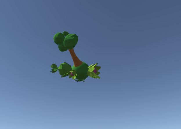
Now that I have a vaguely “normal” looking desert, it is time to add “abnormal” things in. Since the desert had only non-living things within, including the logs which all seem dead and dried up, the next step would be to have something living. The goal was to involve these living objects with either the identity “separated” or “impossible.” To do this I designed floating spheres (very impossible) with vegetation and greenness all around them (Pic 1). This seemed very abnormal because there were two colors that deeply contrasted, the dry-desert-dead-orange and the alive-vegetation-green, and two things that should not be found together. I designed 6 of these different spheres and placed them all around the map in the sky. I made sure to place different trees and plants on the spheres and also have them at different sizes to once again mimic the depth in the map.

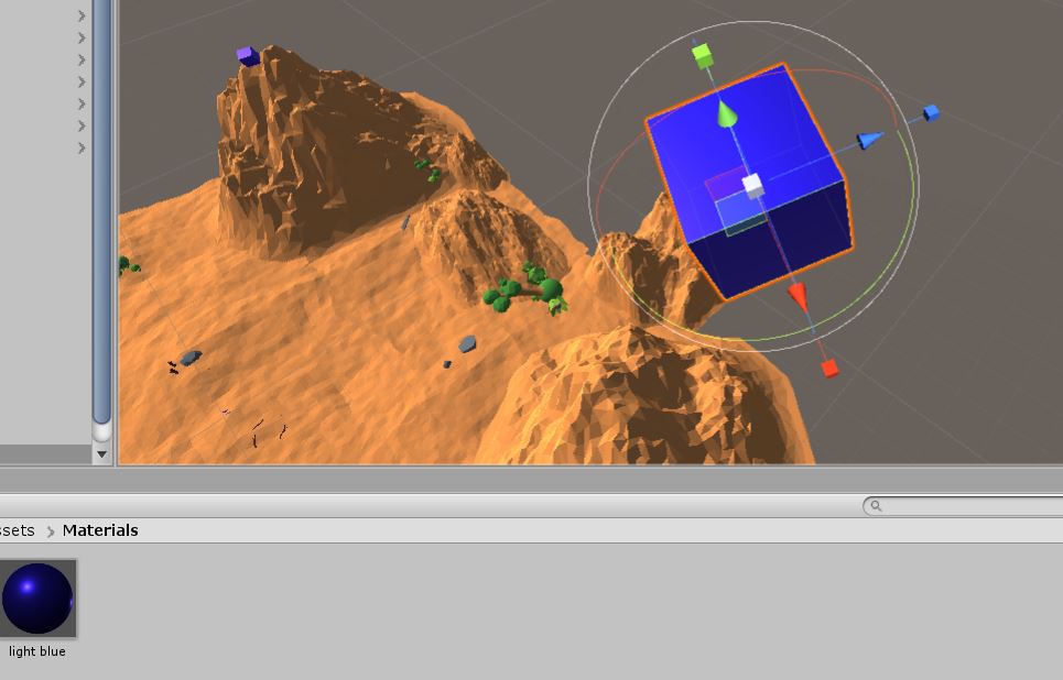
In order to further the impossibility, I decided to place vaguely reflective cubes in the sky as well. I made on cube for each tree-sphere. I made the cubes blue to mimic floating water which would make sense, since each tree-sphere would probably need source of hydration (Pic 2).

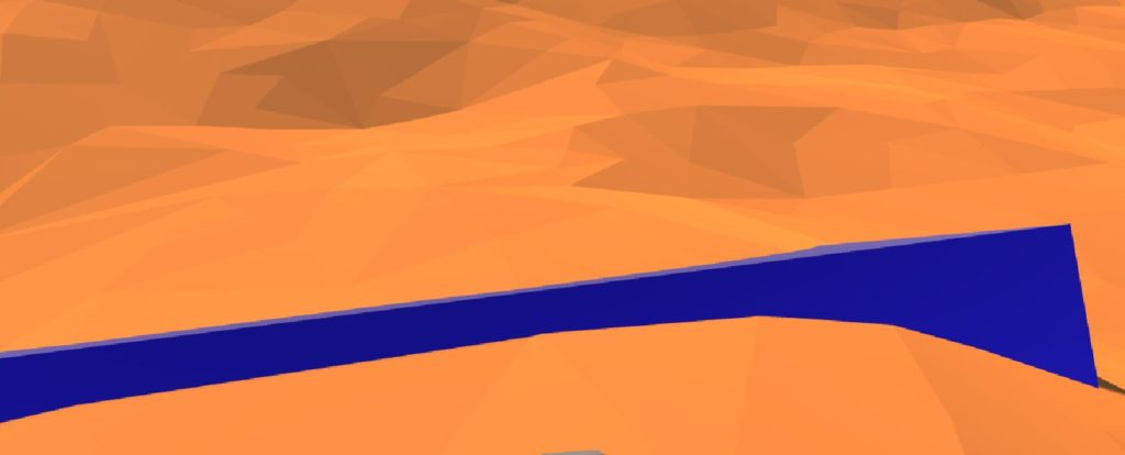
After placing five cubes around in the sky, once again keeping in mind the depth and height, I decided to embed one into the ground. This would be close to the player in order to formulate a story or mystery. “Why are there cubes floating in the sky?” and “why has one fallen down, is something going to happen to the trees?” where the questions I was trying to formulate. The final map that I ended up designing had a lot of pieces to it which made it quite an interesting landscape. It also kept some room for mystery, making the player wonder what exactly is going on (Pic 3).

Feb 18

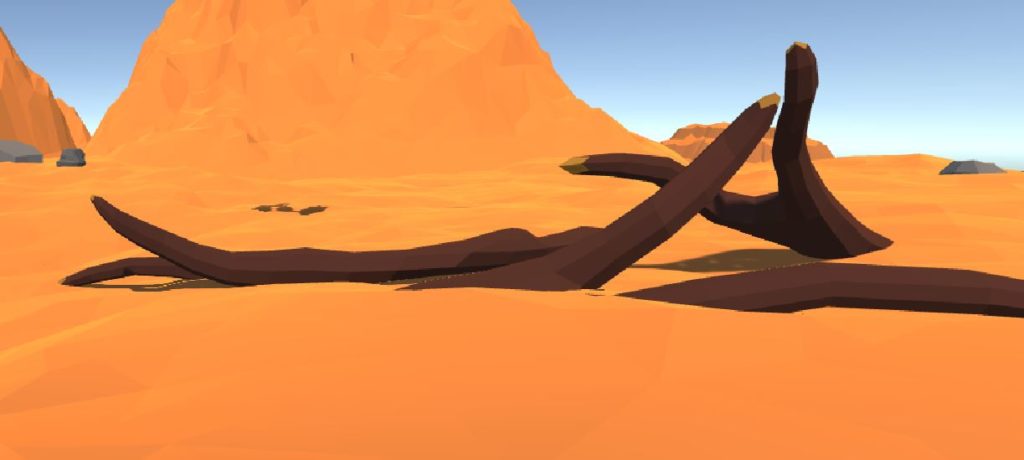
Just final touches were made to give the area a bit more logic. The water block at the foot of the player was made gigantic in order to correlate well with the huge size of the cubes in the sky (Pic 1). Similarly, the logs in front of the player were also made gigantic in order to relate to the size of the spheres they were falling from (Pic 2). Finally some of the mountains were changed in size and some darker colors were given to the logs to give them more of the “dead” look.