1. Project Description:
Project demo: https://youtu.be/E0v61hVvWWA
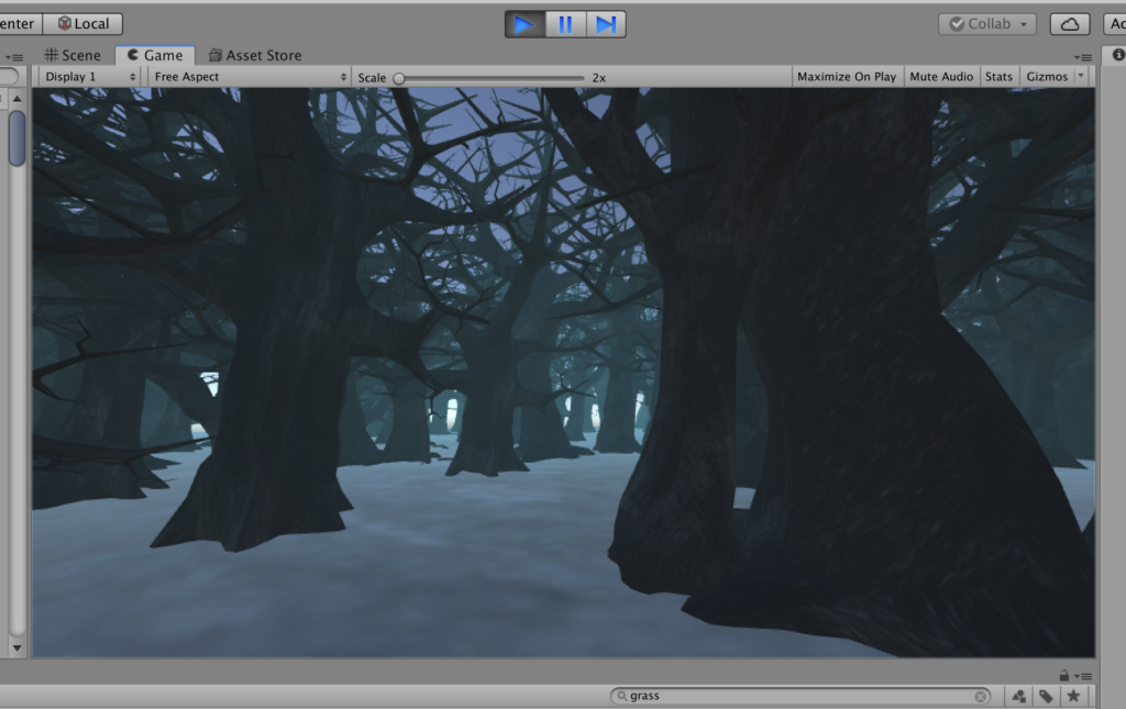
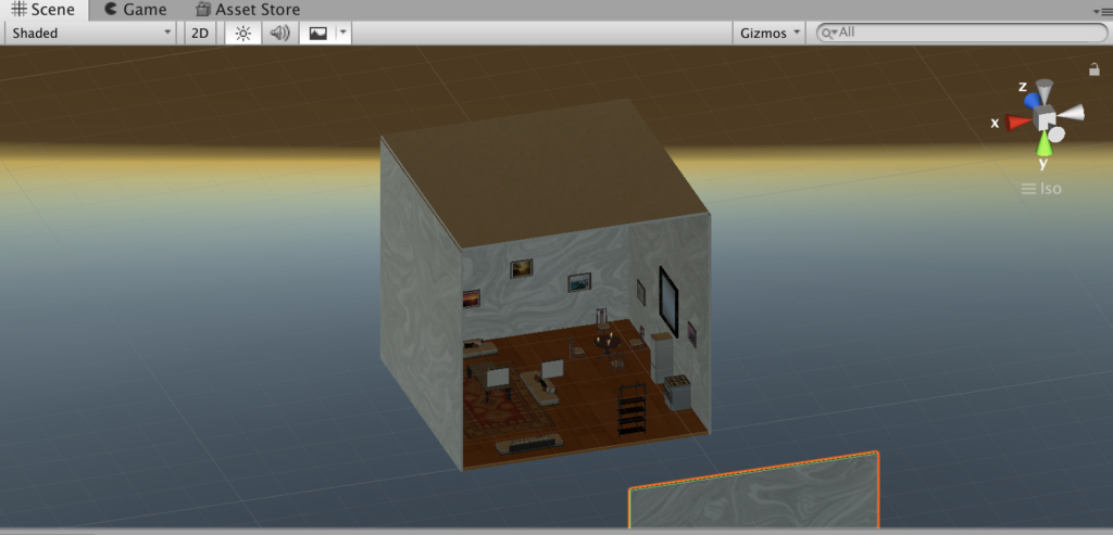
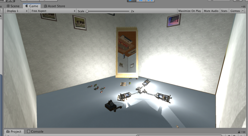
I created an upside-down living room, in which the effect of gravity still works and can be seen. The aspect of reality that I would like to address is that the gravity and orderliness in the real world have been taken for granted by us and viewing the exact same thing from two opposite perspectives can give audience a total different experience and knowledge of what’s existing around us. It’s also supposed to emphasis the sense of space and gravity – how does the world looks like with gravity when everything is upside-down?
The identity in the alternate reality: gravity, disorder, upside down, broken
2. Process and Implementation:
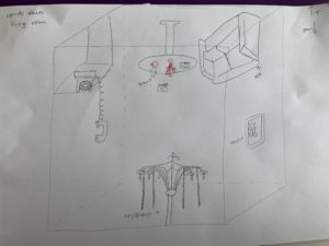
During the project developing process I encountered some difficulties in terms of technical issues, how to achieve the gravity effect I want, and how to decide the best place to put the camera so the viewer will get the most out of my project etc. In the following I’ll highlight what made me choose the objects to represent my chosen identity, the reason behind my camera positioning and some processes of how I solved some problems.
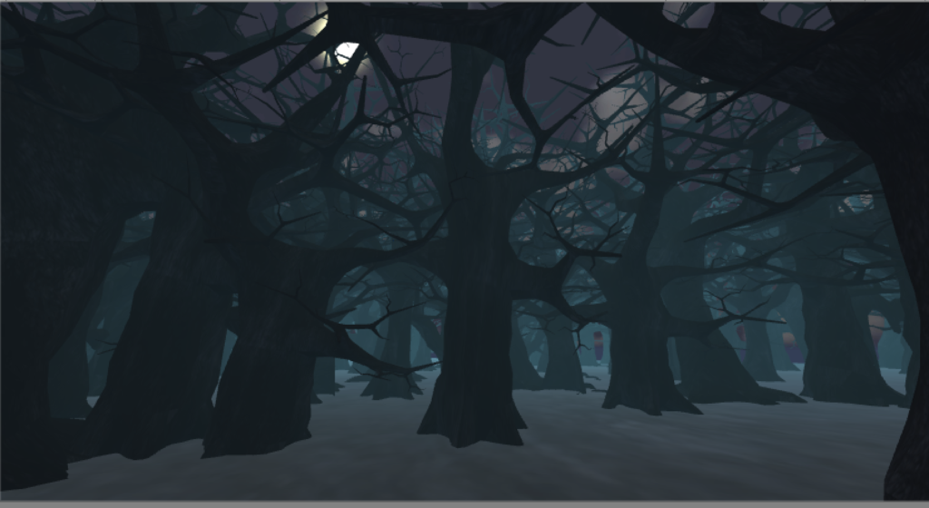
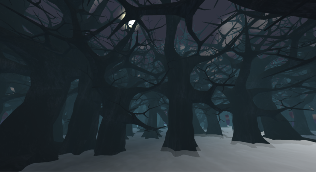
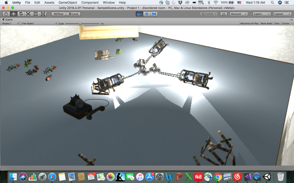
- The chandelier with chains falling on the ground
In order to embody the effect of gravity in this upside-down world, where the “ceiling” becomes the “floor” in this case, I played around with the chandelier with chains – in the normal discipline when it’s hanging the chain will be straight, but in this case it should be on the ground, which is obvious enough to show the viewer that the gravity does exist in this environment. In order to do that, I downloaded a chandelier prefab and break down the iron hoop on the chain one by one and reorganized them to make it looks like “staying on the ground”, as shown below:
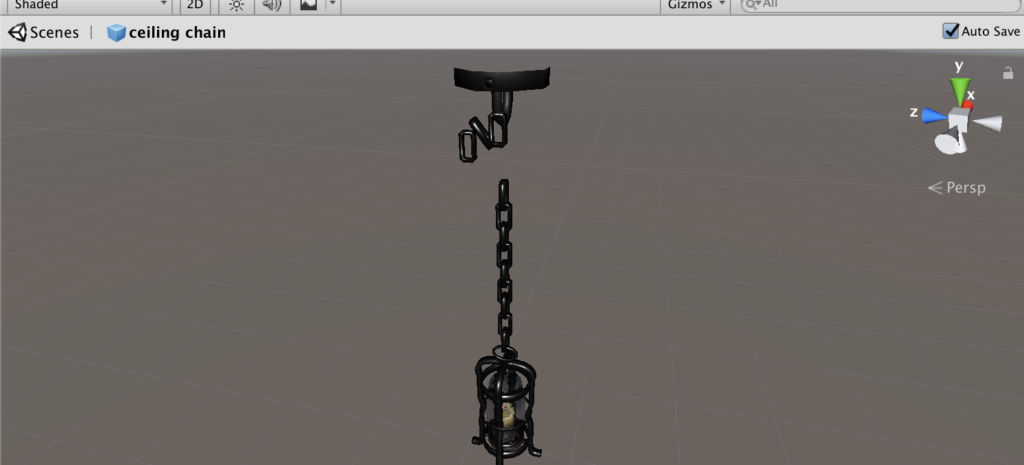
Break down the iron hoop and reorganize it 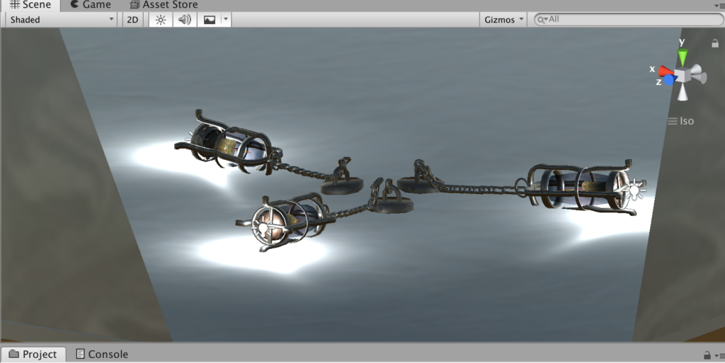
Final look of chandelier on the ground 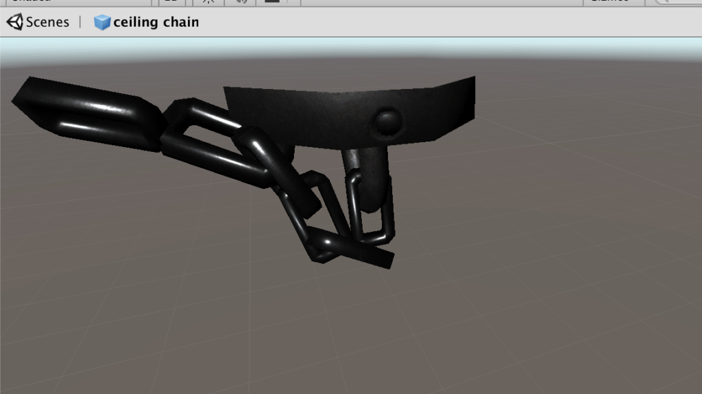
Break down the iron hoop and reorganize it 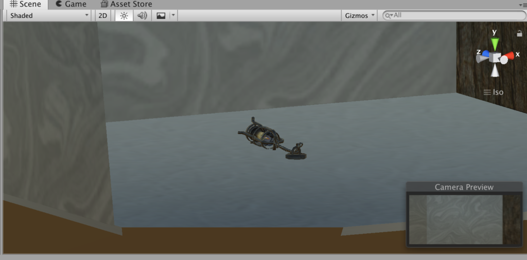
Finished single model 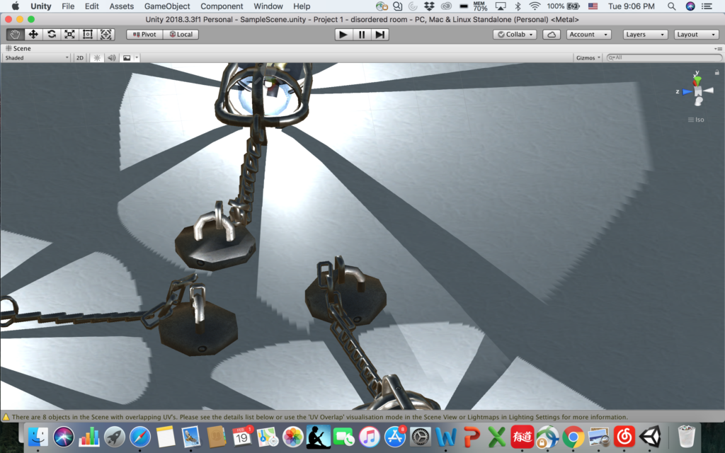
Final look of chandelier on the ground
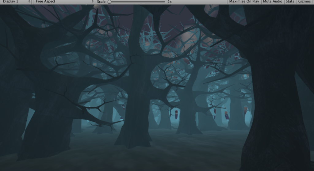
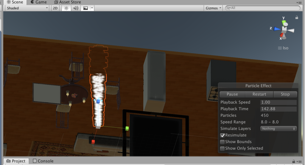
- The water pumping out of pipes – partical effect
The initial idea was to add the upside-down mug and the water drop coming out of the cup, but taking into consideration of the realness and the time for animation partical, it seems not realistic if there is water endlessly keep falling out of a mug, but the water falling is another obvious way to indicate gravity, so I changed it into water pumping out of the old broken pipes, which also cater the “broken” theme.
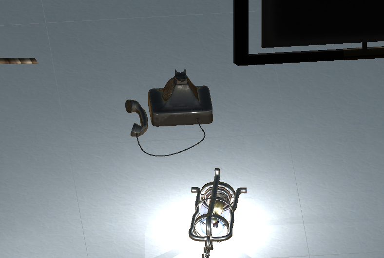
- The telephone with microphone falling on the ground
This came from my initial daft, because the microphone on the ground indicated it fells down from somewhere, and it leaves imagination for viewers to think what happened before in this room.
- Messy floor resulted from things falling down: plants, broken wooden boxes, telephone
The design of this scene indicates the things falling down because of the gravity, it caters the broken and messy nature of chaotic upside-down, also leaves space for viewers to image what happened before here.
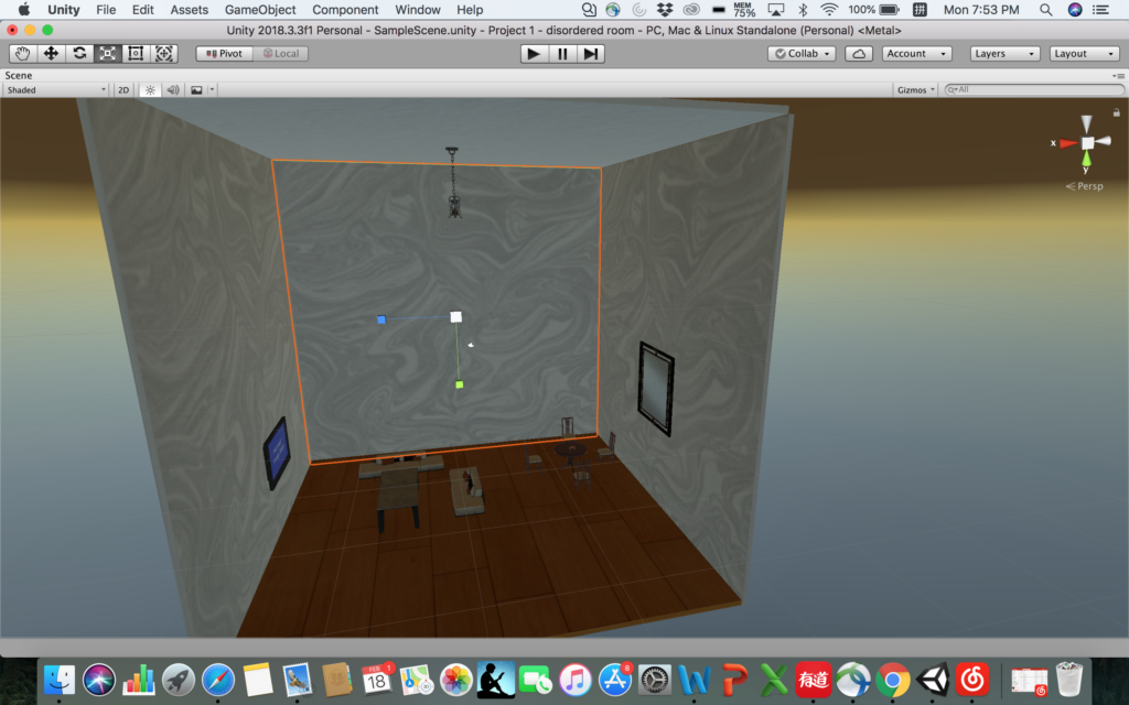
- Camera positioning and the mirror
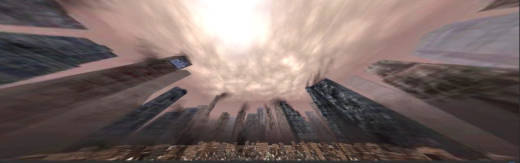
It took me a lot of time to decide where to put the camera so the viewer will see most of my design of the room while feel comfortable viewing around. I tried to put it in the middle of the room first, but it takes effort to have a clear view of what is right below or above you. Then I figured the best way to have a comprehensive view of a room is to view the room from a side perspective instead of being in the middle of it. So I moved the camera to a corner of the wall. Surprisingly I happen to placed it under the water falling effect, so when I looked up I feel the water is about to falling on my face! That was such a real experience, so I decided to keep the camera that way so when the viewer look up there will be this kind of “immersive” feeling. However, doing this means I give up the sight to the the pipe, because the viewer is right under it. Then I added a mirror which can actually reflect, I put the mirror across to where the camera is, so the viewer can just look ahead into the mirror and she/he will know what’s going on above him/her and why there’s water falling down. The mirror helped me solve the problem of lack of sight so I decide to just keep the camera in the corner.
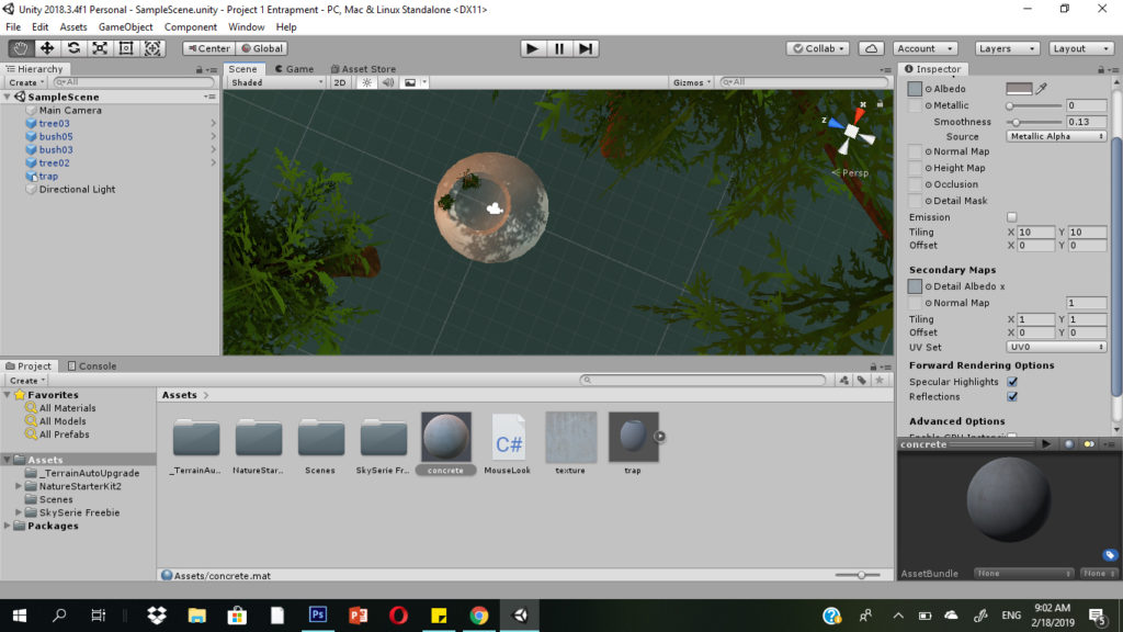
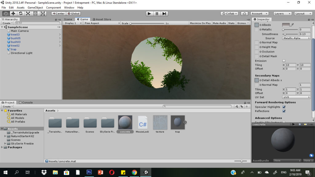
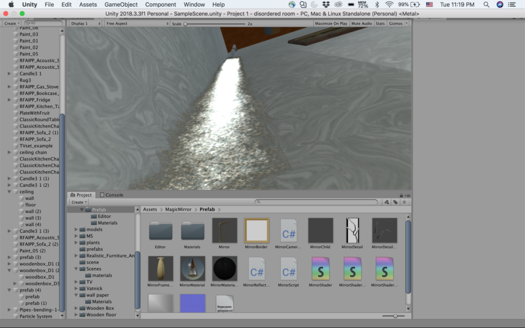
- Adjust the scale of texture
This is a difficulty I overcame with the help of Sarah. When I was doing the design of the overall layout of the room, I put wall paper and wooden floor to make it look more like a living room, however, when I applied those textures to the materials, it’s been stretched so much that it didn’t look real at all (shown as below). But later I solved it by changing the tiling parameters.
3. Reflection/Evaluation:
This project pretty much satisfied all the expectations I had before I started: in order to show the gravity effect and the sense of being upside-down, I made the partical water falling effect, I designed the chandelier with the chains falling on the ground, the upside-down photos on the wall etc. And during the process I added the mirror with actual reflection to tell the viewer what’s happening above you, since I placed the camera in a lower corner of a wall to make up the lack of light since it’s in a corner and achieve a better effect of immersion (viewer standing under the water fall and can see it falling down on you).
However the things I will consider to improve the project includes adding sounds effect, like the steel lander cover of the chandelier rolling on the ground, the sound of water pumping out of the pipe, and something hanging in the middle of the room and swing around to show the gravity etc. Overall I think I’m satisfied with this project and it achieved what I expected.