Development Blog: Let It Out!

I’ve had a few ideas for my final project. Here are some of the things I’ve been bouncing around:

  1. A tycoon style cake shop game where the player has certain goals to make per day. This is largely inspired by my love for these computer games like Diner Dash or Hot Dog Bush as purposeless as they might be ultimately. I have ultimately decided not to go in this direction as I would want to put a lot of effort into character development, into creating an alternate universe with meaning and I don’t have the tech capability in Maya yet. Additionally, the rhythm of the experience would be particularly important to me and I think I’d need at least two months of user testing to get that perfect balance of speed and seeing what movements/baking processes need to be simplified while still retaining the meaning of baking a cake.
  2. Some sort of inceptiony VR experience in which the viewer builds their own VR experience within the environment rather than needing access to software like Unity to create VR. They are then able to view what they built. It’s especially the part of wearing a headset while already wearing a headset that leaves me unsure of how to proceed.
  3. A sort of whack-a-mole in a beautiful, mountainous alternate reality where post it notes keep appearing as an interface not leaving until you’ve clicked them to convey the never ending to do list. But I want the viewer to have a way to break the cycle and I can’t really think of a creative way that makes the most of VR to do so.

After reaching a dead end in all my project thoughts, I decided to revisit my previous projects to understand my biggest takeaways from them and to see what input they could provide to my final project.

From my first project, I really liked the concept of using VR in meditation given what an immersive space it is. I have found myself using the world I created and playing a guided meditation in the background as I get easily distracted in the physical world. My second project made me realize how important user testing is, but also how users tend to gravitate towards the destructive: throwing things in the wrong places, teleporting into colliders, etc.

Can I confess? Despite all our readings and looking at cool VR projects, I still am not entirely sold on the necessity of VR. I understand its incredible applications for museums, medical training, marketing, etc. However, I get so irritated when I see a project that has been made for VR for the sole purpose of it being made in VR. In other words, I think a lot of VR out there doesn’t maximize the potential of VR and hasn’t been designed for VR. It’s simply a game from the physical world adapted for a VR headset. Thus, for my final project, I want to create something that has a clear advantage and purpose for being designed in VR. This, combined with my insights from my earlier class projects, have made me realize that I want to create a therapeutic project like my first that is in line with the theme of “Renewal.” However, I do want to try something that is different than a guided meditation that also explores the user’s destructive tendencies. Sometimes when you are in need for something cleansing, you don’t want to meditate-you want to break things! This also has the added benefit of being something that maximizes VR. First, many of us just want to shatter 30 plates, but very few of us can afford that or want to deal with the aftermath of cleaning our mess up. Second, this is an experience that would benefit from an immersive space like VR because one could look around the room for objects to break and has an immediacy that is conducive to the need for feedback when we have strong emotions.

One of the key interactions I want to have is shattering objects. I shall begin with the quintessential plate! I’ve watched a few youtube tutorials and it seems that I must adjust the mesh in Blender. Today, I spent a couple of hours just figuring out the horrendous Blender interface and I finally figured out how to fracture an object’s mesh. I got a simple plate fbx model from turbosquid and created a particle system for it. Using this particle system, I created fractured objects for the plate. So, thus, it is a total of 100 shards! I imported the model into Unity.
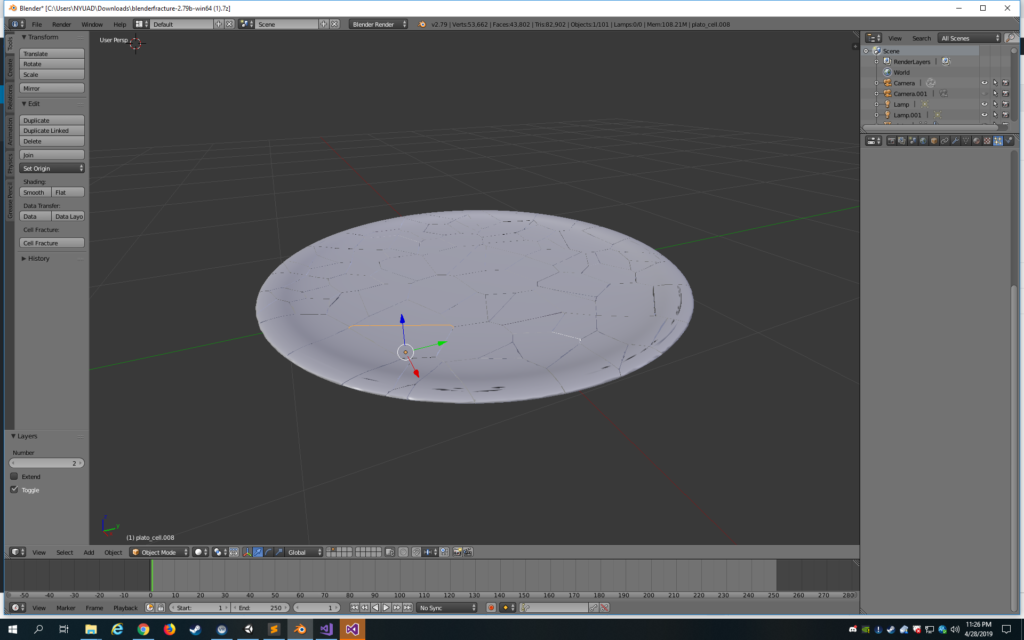
I’ve added the Throwable and Interactable SteamVR scripts to the parent object which I have made the unbroken plate. However, when the plate collides with something, it should shatter into the 100 shards.

  foreach (Rigidbody rigid in brokenObj.GetComponentsInChildren<Rigidbody>())
            rigid.AddExplosionForce(force, transform.position, radius);
    }

I hope to loop through each rigidbody that is a child of the parent plate (thus each shard) and use the Unity function AddExplosionForce as it seems to give the feel that I want to the shattering.

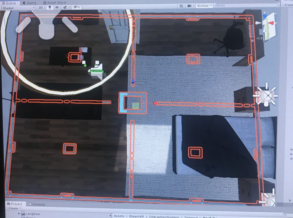
I’ve been working on this for nearly an hour with very little progress, so I think I’ll come back to the script when I’m in a fresher state of mind. For now, I have implemented the teleport system. This time, I’ve learned from past mistakes and I think I’ve coordinated the floor and space such that the teleport is more natural. I’m not sure if I will keep the teleport. When I sort of mentally mapped out where each interaction would be, it felt a bit tight so having a teleport system would give extra flexibility. I just added it because I’m not sure how much space I’ll need as the interactions evolve and also not sure what exactly our space will be in terms of dimensions at the IM showcase.

For the environment, I’m debating a few options. One, a retro looking living room. Two, an office space with cubicles, etc. Three, a dojo that is meditative but also fight-conducive.
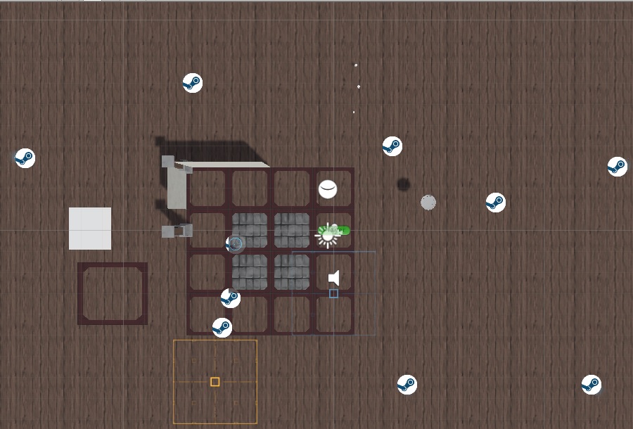
the dojo environment in progress

I debated changing my idea because I’m not sure if I can get the right rhythm needed for this experience. Perhaps destruction is not my forte. I kept daydreaming about making a VR experience that was underwater and having fish blow giant bubbles that the user could pop.

But, I shall keep going at this a bit longer.

For the shattering objects script, I’ve tried many different approaches. The difficulty lies in the way that my blender model is created and that specific object hierarchy. I tried to take the unbroken plate so that when it collides with the floor or wall, the unbroken plate layer is removed and so the shards remain. I wanted to add an explosion force, so I need to loop through all the shards and add a rigidbody and then use that rigidbody for the Unity method AddExplosionForce. If the shards are there from the beginning as they are part of the object, I shall have to keep them affixed to the unbroken layer. I played around with doing a Fixed Joint on them but it keeps shaking–think it has something to do with the box colliders. When I check OnTrigger, the shaking goes away at least.
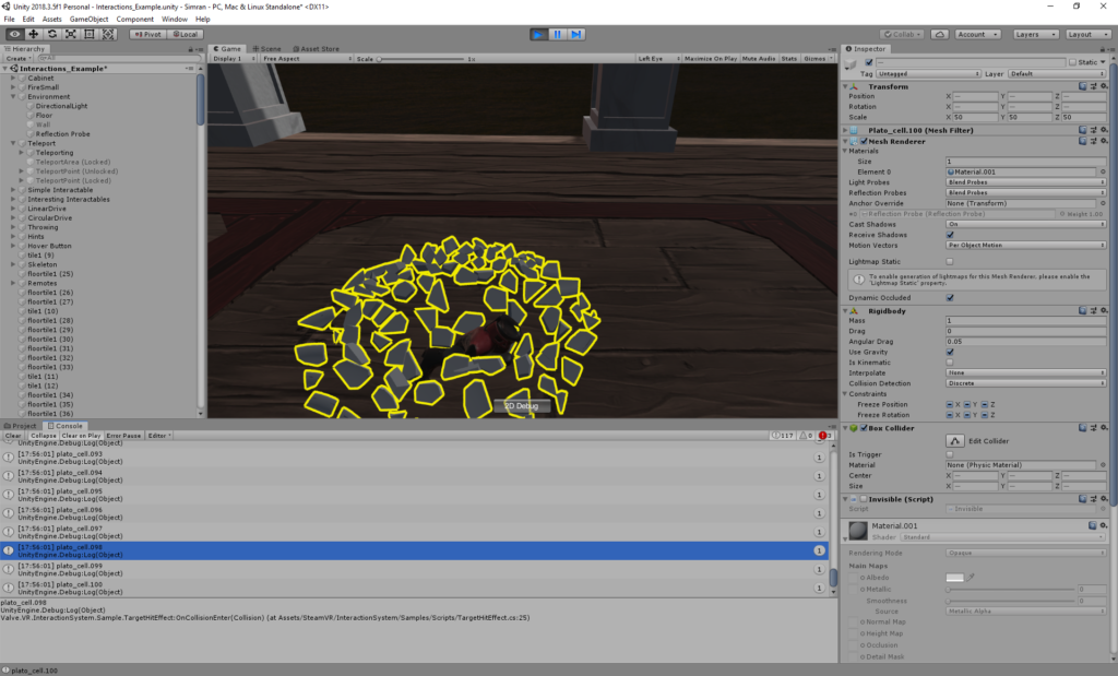
using Fixed Joints to keep the shards attached.

I think it will be better to unpack the object and separate the shards from the unbroken layer. When the unbroken layer collides with the wall or floor, the unbroken part will be destroyed and the shards will spawn.

This approach is working so far, but am having trouble with where the objects are spawning. At first, I did them at the transform.position of the unbroken object, but they would spawn under the ground. Next, I am respawning them at the initial contact point, but they float above the ground when I do this (I have frozen their y position because they initiate below the ground then).
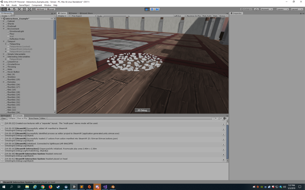
shards floating above ground! aaaaahhh

I’ve added a public offset variable and set it to -3 for now. But the shards just float aimlessly after removing the y constraint on each individual shard.
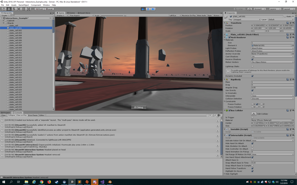
It’s kinda trippy though?

I’ve kept the offset and removed the y frozen constraints on the individual shards, but frozen the y on the parent object. This seems to be working for now.
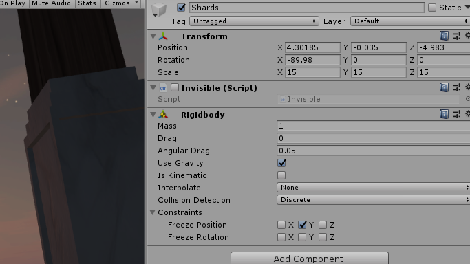
Freezing y position on parent object

Some initial bugs: if you throw the plate like a frisbee, the shards are spawned in an unnatural circle shape. If you don’t hit the plate hard enough, it doesn’t break, but I think that’s okay honestly. If the plate is thrown in such a way it collides twice, it will spawn the shards twice, but this is also no big deal as it’s just more fragments and it seems to be rare. Just the first bug is something to work on.
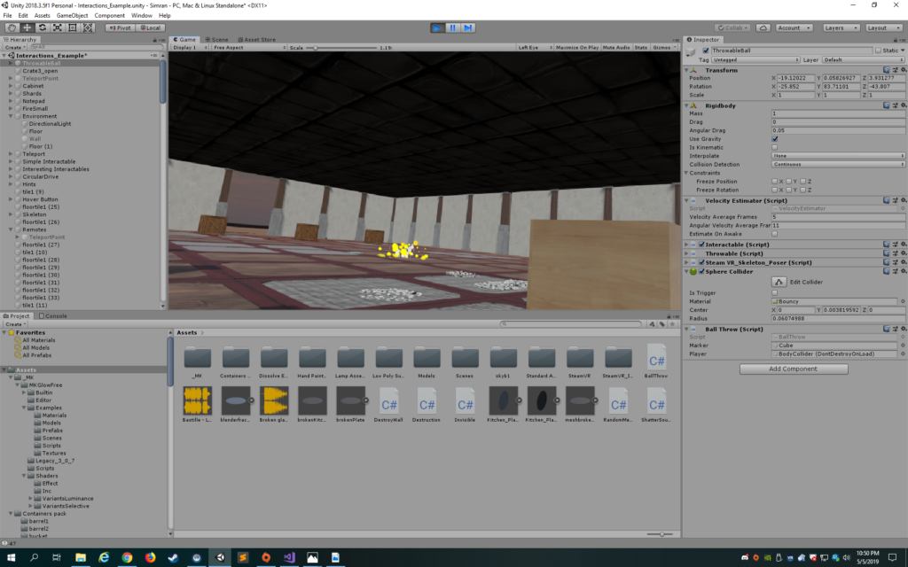
circular shards

To address this, I’ve changed the transform position of the individual shards so it looks more like a pile. But, when I throw it, many of the shards spawn under the floor so only a few shards are actually created visibly on the ground. I will table this for now and address this later as I want to create my other interactions.

I also want to add some sound in. Because I am destroying the object, I cannot add an Audio Source to the plate and expect to get the audio source component and play the clip. I played around with creating an empty game object, but I’m a bit too lazy to get everything to line up correctly. I chanced upon a Unity method called PlayAtSpot which essentially instantiates an Audio Source and destroys it after it plays the clip. I used the contact.point to instantiate the Audio Source. I am not sure how expensive it is to create and destroy an audio source every time.

 AudioSource.PlayClipAtPoint(shatterSound, contact.point);

I got a friend to test the plate shattering and they ended up throwing it at the ceiling which I hadn’t thought about. I added the collider tag so that it will also shatter if it hits the ceiling. The reason why I need collider tags is that it would otherwise start the script with any collision like the hand or the cabinet it starts on.

After seeing how much people enjoyed throwing objects around in the recycling project, I thought I’d create some bins for people to try to aim the balls into. If they hit the box, the ball disappears and a gray line appears where the player hit the ball from to see if they can get it further and further, like a game with themselves.
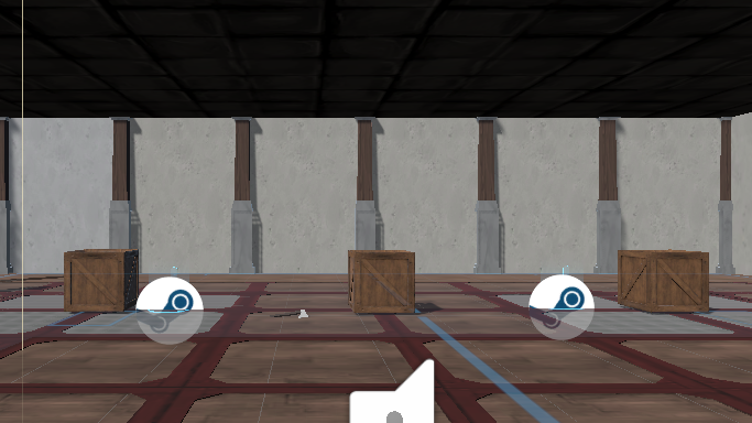
the three boxes

I found the boxes from a medieval containers pack. I added a bouncy physics material to the ball, but I find that it is too bouncy and it just goes on forever. I better add some friction and reduce the bounciness. For now, a dynamic friction of .3 and a bounciness of .9 is working well. For the interaction, I will add a script to the ball so that if it collides with a collision object with the tag “box”, the ball will disappear and a cube will appear where the player was. Okay, it’s a technically a cube object, but more of a white line. I wasn’t sure which object of the player prefab to reference for the transform.position, so ended up doing the bodycollider which seems okay for now.

I’m also having trouble with the inside walls, but think this has to do with the normals, so that Unity doesn’t waste resources rendering the inside of buildings. I ended up just flipping the walls that weren’t showing up.
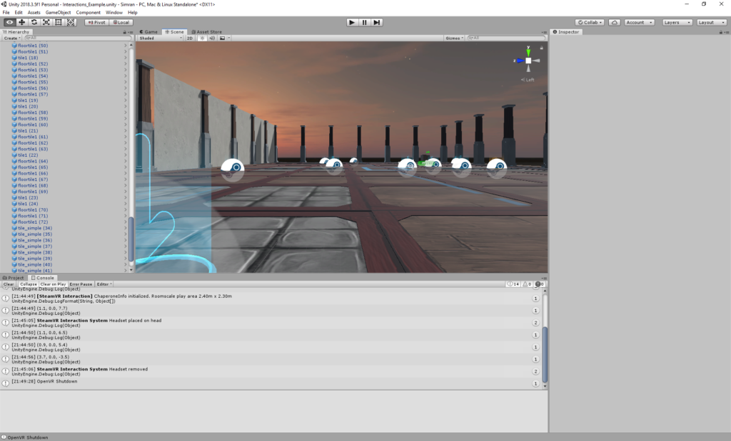
inside walls not appearing?

I added a hatchet so people can smash things! If you pick it up a certain way, it really does feel like you are holding a hammer. However, if you pick it up from another side, it feels very unnatural ofc. I suppose just like in real life, people will put it down and pick it up from another side that feels more natural and functional for the task they want to do. I wonder if there’s a way in unity though to only for a certain part to be picked up from. Perhaps I can see if the prefab can be broken up into the handle and blade part.

When I only have the throwable script on the body, the handle and blade separate. I will ask people in the class on Monday if they have any ideas.

I’m not sure what to do with the walls. I wanted to make them crack if you hit them with the hatchet, so tried playing around with the texture of the plaster to add cracks. But, I don’t think it will work out because the cracks need to appear from the point where it’s hit and I have no idea how I could do that. I’m debating whether they should glow or shake or some sort of feedback, so you hit it three to seven times before it falls.

Also debating what background sound to put in the room. I started watching videos of real “rage rooms” to get ideas and they seem terribly wasteful as people smash plates, etc.

My first thought was to do a song like the battle music in those superhero movies. Something energetic and pumped up, but not necessarily angry. Then, started thinking about Kanye West’s song Power. But, it might be too intense for the environment I have. Then, I considered a couple of Arctic Monkeys song instrumentals.

For now, I shall do the instrumental to the song Laughter Lines by Bastille. The choice of music has to be perfect! I asked a friend to try out the environment with this music and he liked it.

After the feedback from in-class playtesting, I realize I lack a sense of cohesion. Not that cohesion is a requirement for a sense of story, but I think it helps create a meaningful experience. I lack cohesion in the sense of the power involved in the various movements of the player and the feeling that I want to evoke in the reader. For instance, I have the player throwing a ball and it is bouncy and also very hard to get into the box. The player would likely be discouraged from continuing on with throwing the ball, which as we learned in Games and Play last summer, it is very important to keep your player motivated through small successes indicated by feedback. Additionally, the feel of the ball’s bounciness is light and playful which is too much of a juxtaposition with the smashing of the plates. I’m pretty satisfied with the plate smashing though I need to figure out how to not let the amount of new objects being instantiated (the plate fragments) affect the performance. Also, I got negative feedback on the music, so I shall switch to Arctic Monkeys again! I also got feedback that the outside was quite creepy.

After the playtesting session, I realize I need to ask myself: how do I want the player to feel during the experience? I think I was so obsessed with the idea of relieving stress that I didn’t really get into the specifics. I want the user to feel powerful, like they can achieve anything. I want there to be a sense of relief of course in terms of the satisfaction derived from the interactions. I also want the user to feel a sense of resolution at the end.

Getting at the core of this, I think I will remove the ball throwing. I’m not really sure what’s going on myself with it…there’s just too little incentive to enter that interaction. It is not an easy decision because I really like the concept of a line appearing at the player’s position if they successfully got the ball into the box.

I also will make the walls get destroyed each time the hatchet collides with the wall. Before, I had a count of 3, so the player had to hit it 3 times before it would collide, but that was rather annoying.

To replace the ball interaction, I want to break printers with the ax as well. I created 3 new meshes (each mesh a different level of destruction) for the printer in Blender for it to shatter. Each time the ax collides with the printer, it instantiates the mesh for the next level of destruction.

Trying this out, it’s not the cleanest instantiation and there’s not much satisfaction. I think I will just make the printers explode. Essentially, I am writing a script that will instantiate a particle prefab. I am having trouble with making the explosion occur at the exact site of collision so I created a ContactPoint object. I’ve also reduced the radius of the particle system so it’s a more contained explosion and added an explosion sound.

I can’t seem to get the walls to work correctly…some just won’t be destroyed. This seems to correlate with whether the body has also collided with the wall at some point. Thus, I’ve changed the function to be OnCollisionStay rather than OnCollisionEnter, so that it is checking for the right collider tag constantly. I’ve also checked and adjusted each box collider individually. This doesn’t seem to work either. I have decided to also add all the parts of the body, that is the Player prefab, as a tag ‘Player’ that is one of the tags checked during collision. This isn’t working either.

I’ve added a script to respawn the hatchet on the table if it falls below the y-position of the floor. Also, added fade in to the camera and the instruction UI.

During user testing, the sunset I had was deemed to be sort of spooky. I want to create an open sky and a forest outside.

It doesn’t exactly match the feel of the room. Though I am trying to create a clear difference, this is just too different. I also want something for the player to interact with outside the room but not go out of the room.

I began with bubbles, thinking the user could pop the bubbles with a raycast. The bubbles were too light. The raycast was awkward with the teleport and picking up objects. Then, I thought I should confine the raycast to a container object, like a laser gun, so that the raycast would be active only when that object is picked up. I found a tutorial called ‘Let’s Try Shooter’ on Unity that I used to start creating the laser gun system. But, I thought the laser gun had too light of a feeling.

I remember how powerful the feeling derived from the VR maze game was. The bow and arrow was a very satisfying interaction. I think for my game I will have the bow and arrow instead of the laser gun. I am just using the longbow from the SteamVR system.

Okay but what will people shoot with the bow and arrow? I liked the idea of having floating islands in the sky but not sure what interaction to create with the islands and I cannot find any suitable assets for the islands. I thought of creating a cloud system, but it doesn’t have the desired effect and is kind of messy looking. I started thinking of things that evoke nostalgia which is usually a sort of relieving feeling.

I started getting fixed on this vision of a carnival with a colorful marquis and balloons. I decided to go off on this tangent and started making a sea of colorful balloons in the open sky around the room. The bow and arrow would be used to pop the balloons, though I wonder whether balloons are heavy enough to make the user feel powerful.

I really like bubbles and find them so relieving, so I decided to still incorporate them into the experience. They’d come out of the balloon being popped. I really like the popping sound of the balloons.

I created alternate shaders to give the balloons different colors and a certain reflection when the light hits.

I started creating a marquis by scratch because I couldn’t find any suitable assets. I wanted to make ribbons that the player could wrap around the columns like a maypole. But, given the constraints of my knowledge of Blender and the time I have left, I am just going to make a marquis from rectangles.

It actually doesn’t look that bad. It’s very colorful but I want the user to look up at it. I think I’ll create a particle system of lights dancing down.

I can’t figure out how to get the music to change!!!! I picked this specific piano cover of Kygo’s Firestone song because it has a tingle of nostalgia and is generally positive sounding without being overly upbeat…a sort of perfect resolution song. I ended up creating the script to play the audio source and stop it. I used the PlayClipAtPoint to create a second audio source to play the new clip for the ending which is triggered by all the walls being destroyed.
Project #3 development blog. Atoka and Max.

Development blog #1. 15/04/2019.

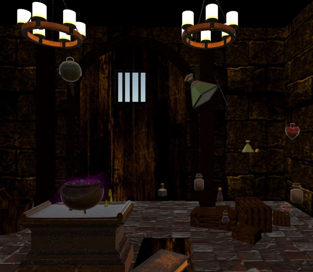
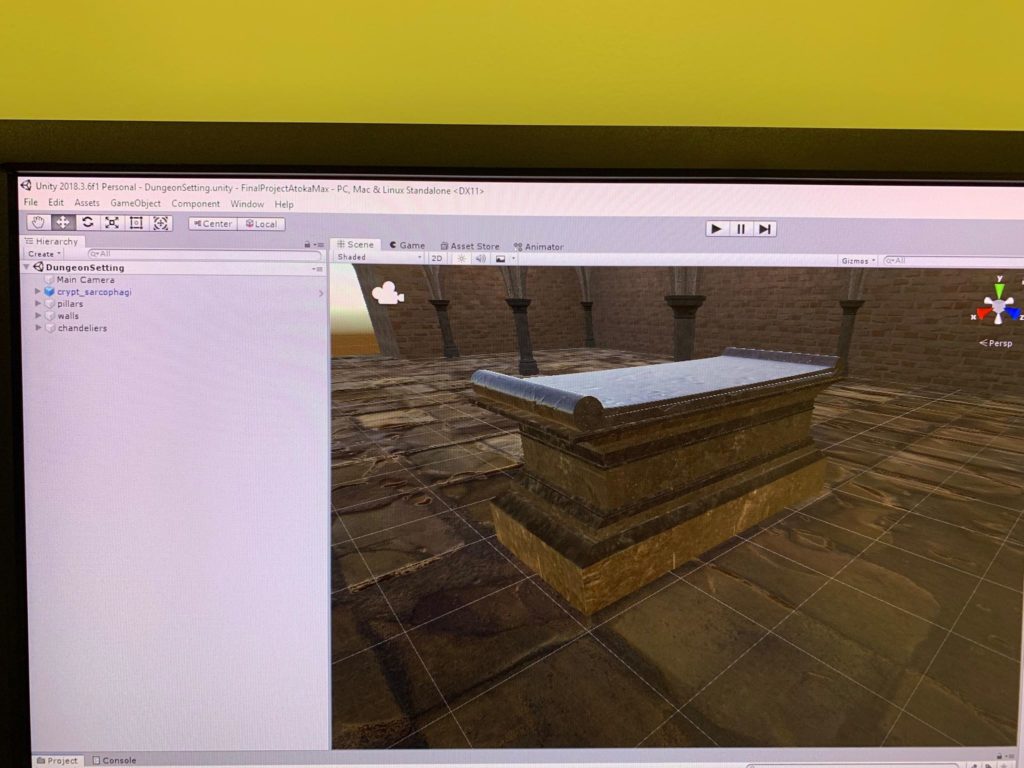
Atoka has been working on the environment leaving me to work with the scripts. The setup was that our project takes place in a dungeon crypt which looks something like this:

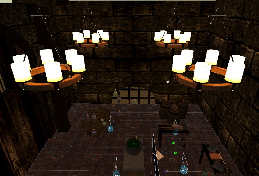
After dealing with the light settings and applying a more darker skybox (to make the crypt darker) I have encountered a small problem when I started testing the environment in the VR headset. Due to the fact that we have quite a couple of lights (18 light sources), the computer can’t handle it and simply crashes (blue screen). Our professor suggested us to use lightmapped textures to replace the light sources.

Development blog #2 5/5/2019

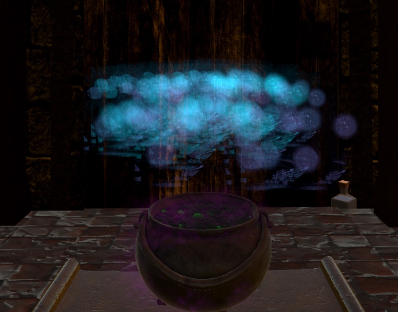
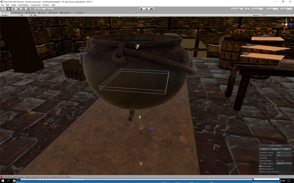
We have implemented most of the interactions including the cauldron and the feedback system of the cauldron. The cauldron has an invisible collider at its bottom. Anything that collides with it, gets destroyed and plays the particle system as can be seen in the picture below. User testing was also done to get feedback based on the user perspective rather than the creator perspective. Based on the user feedback we have added some teleportation points and and turned the gravity off since it was very easy. And now when the objects are released. I have started working on the scripts, started to create the script that will store the data in the cauldron, but failed miserably :/. Atoka in the meanwhile was finishing of the environment and doing the voice over (special thanks to Sebastian Caro and Ahmed Meshref) Also we have completed the lightmap using light emission textures
destroyer collider
Particle system
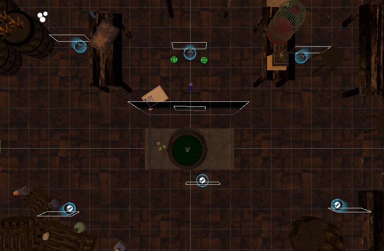
Teleportation points

Development blog #3 20/5/2019

The final scripts left to be done until the game is finished. In the past week we have completed the final scripts such as :
-winning list generation
-printing that list on the clipboard
-restarting the game
-game over/winning screen
-playing sounds whenever they are supposed to

Just some finishing moves and user testing and we got this:

User testing. Staring: Vivian.
Here are some screenshots of the final version:

Scripts used
Light textures

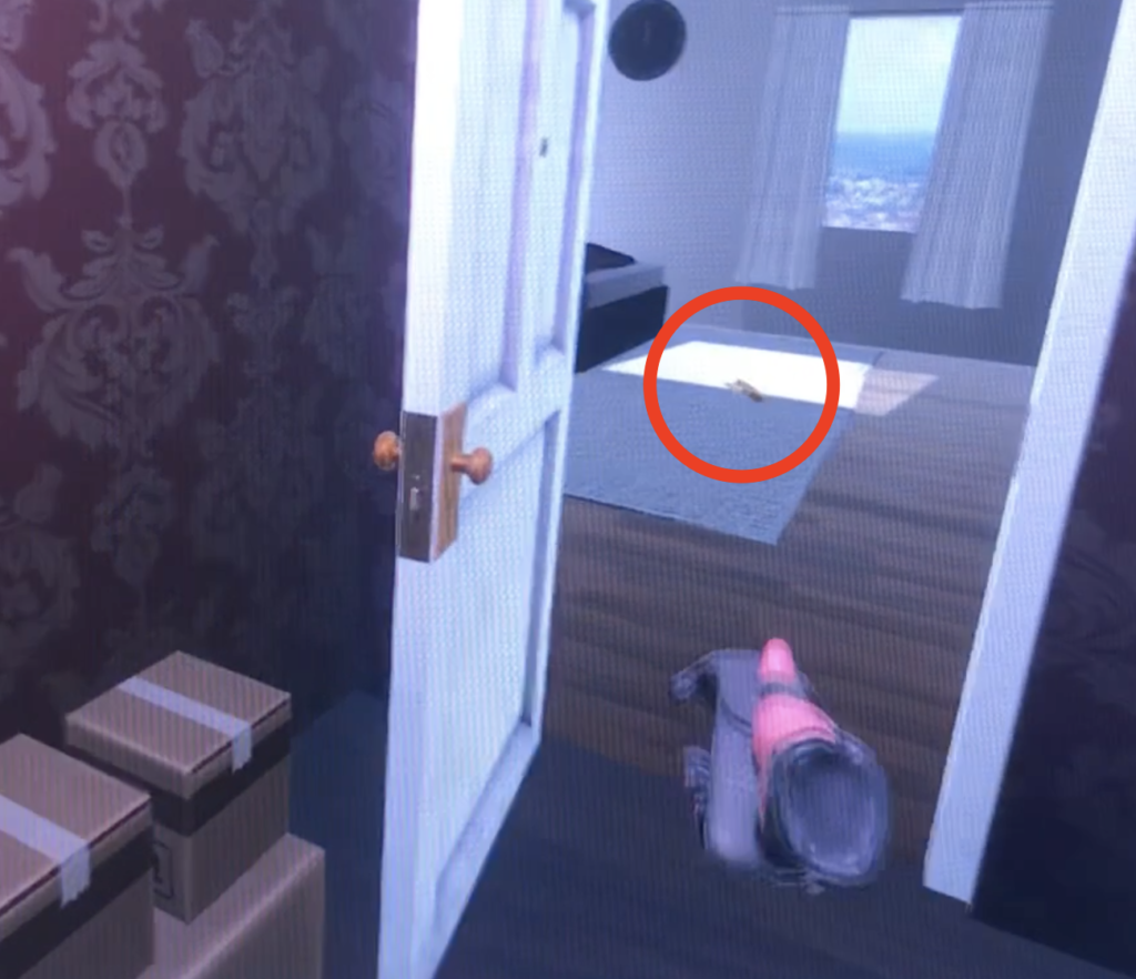
Development Blog – The Wardrobe

April 15

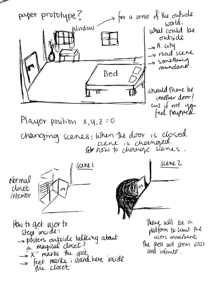
Thought Process about the idea

  1. Player is located a simple and plain room with a door
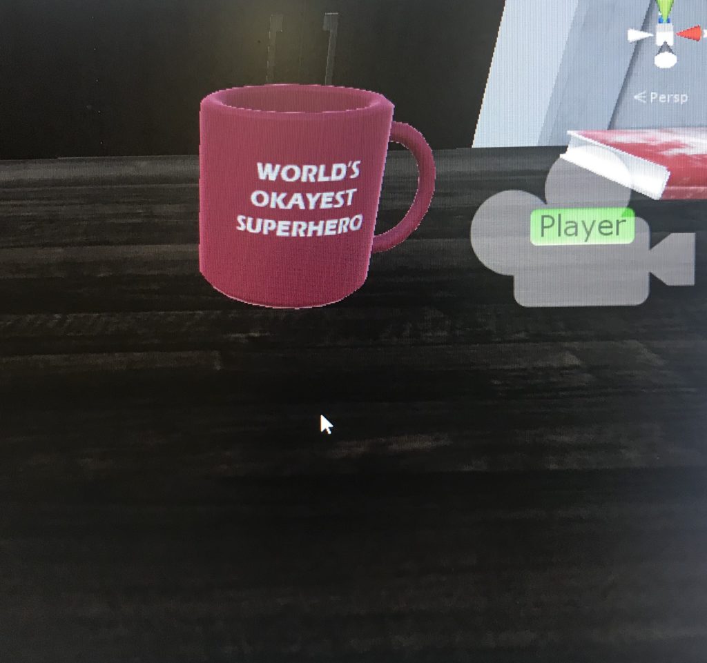
    • is there anything the player can interact with in the room? A mug on the side table, a pillow?
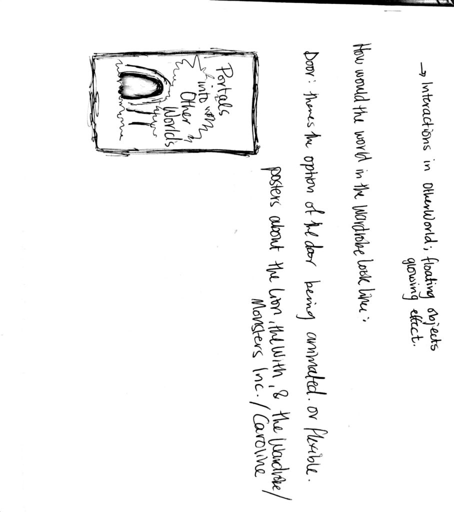
    • Hints in the room to what the closet holds? Poster on the wall about different worlds, closed doors
    • what will instigate the user to open the door
  2. Player opens the closet door and finds an ordinary closet
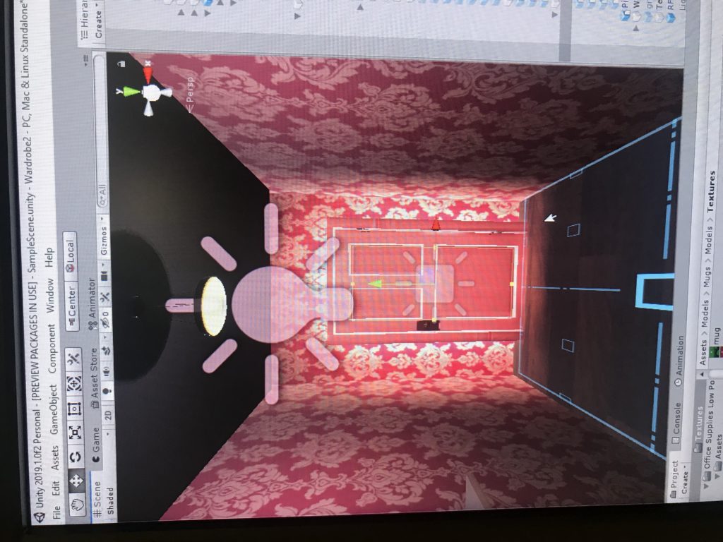
    • whats inside the closet? boxes, clothes, a light bulb hanging above?
  3. Player enters the closet and closes the door behind them. Its dark at first but
    • how would the player know to close the door while their inside
  4. After a few seconds of darkness, things start to appear, glowing and floating around them. The door is still visible to them, in the same place. Eerie music starts to play in the background
    • What interactions are they able to do inside
    • how would I limit their movement
    • switching scenes and knowing when the door is closed to initiate the other world to begin
  5. if player opens the door again, they are back where they started in the closet, in the room
    • how would I switch back to the original environment without it being too abruptly
    • maybe if the user is facing the door the effects stop, if they are facing any other side it begins

Actions in VR

  • interacting with the door;
    • how would you grab it
    • is there tilt
    • how to close
    • can you push it
  • switching scene 1;
    • detecting if the door is closed then playing scene
    • switching the scene
  • inside normal wardrobe;
    • carrying box
    • pushing box
  • the other world;
    • floating objects
    • glowing effect
    • able to push around those objects/grab/throw
  • switching scene 2;
    • knowing when the player is facing the door or close to it
    • calming the effects of this other world, fading to black
    • open the door and switching back to the room/closet scene

Inspiration

https://www.youtube.com/watch?v=GRyR71oHOb8&t=59s

Instructional Videos


Notes

April 17

Door Struggles

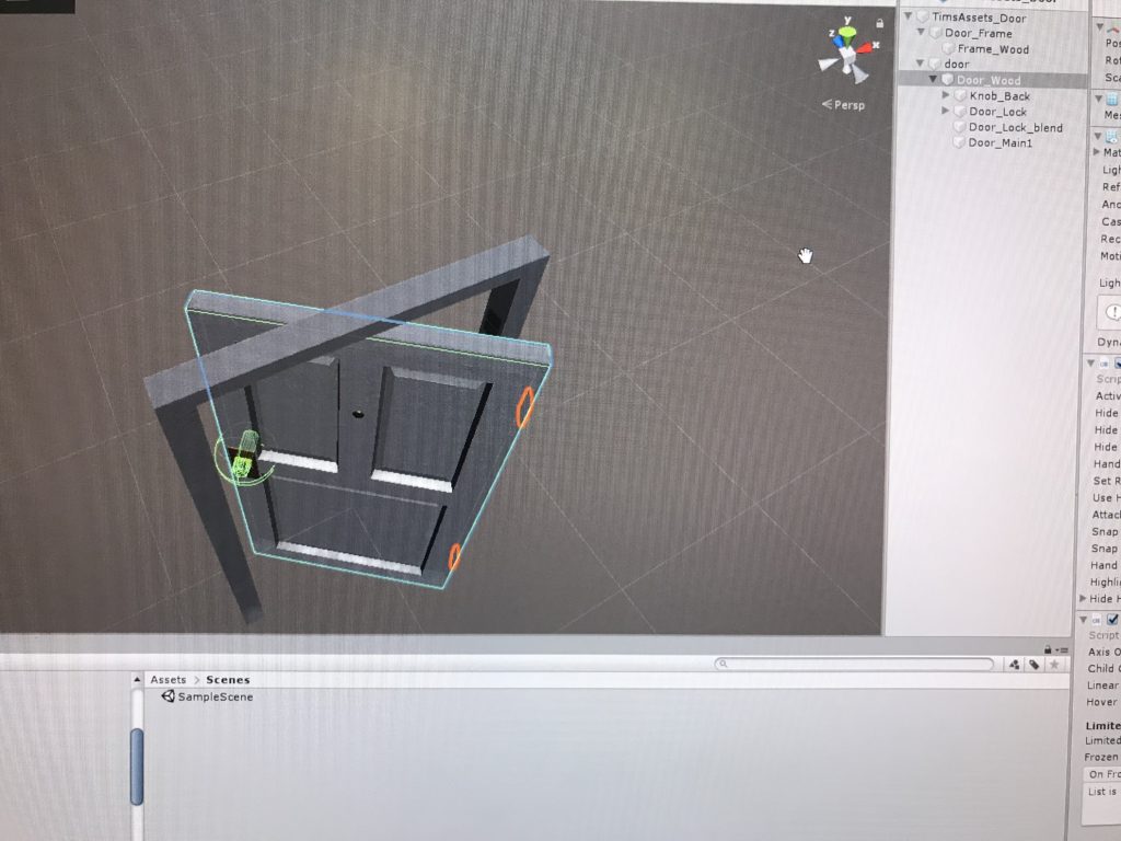
Creating a door that is interactive and immersive is the first thing I looked at, I want to make a door when you can physically turn the knob then push the door. I feel like having such a move will add more onto the users experience.

had to move the location where the door will rotate or it will end up like this
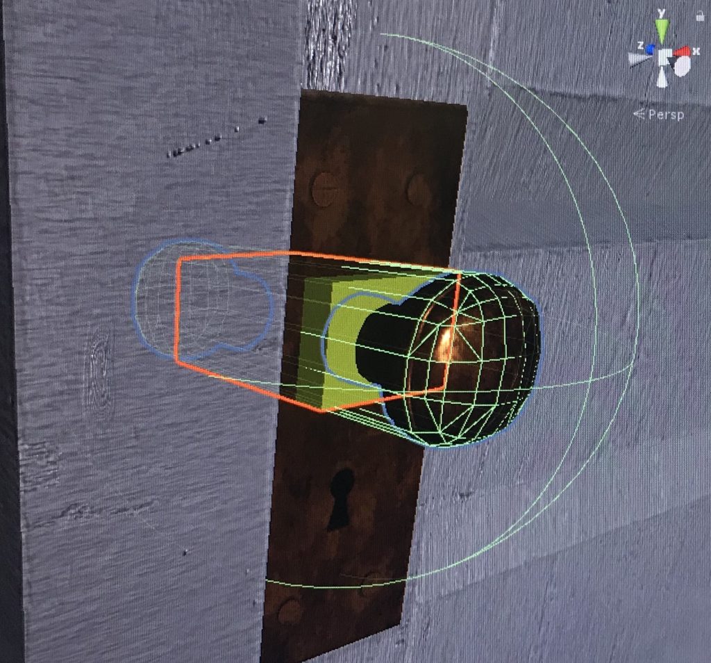
added a circular drive to the knob and a collider to make it interactive and “turnable”

as I followed the instructions of a youtube video on how to make this possible, at the end the door would work but as it opens it would open vertically. messed around with the numbers but each one would give me another way the door can rotate but never the actual right way.

Trying to figure out the rotation on a simple cube instead of the door prefab, but it still was an animation clip..

seeing how much time I have spent invested in making a door work, I figured it would be best to just stick with the animation and focus on the other things in the environment.

April 22

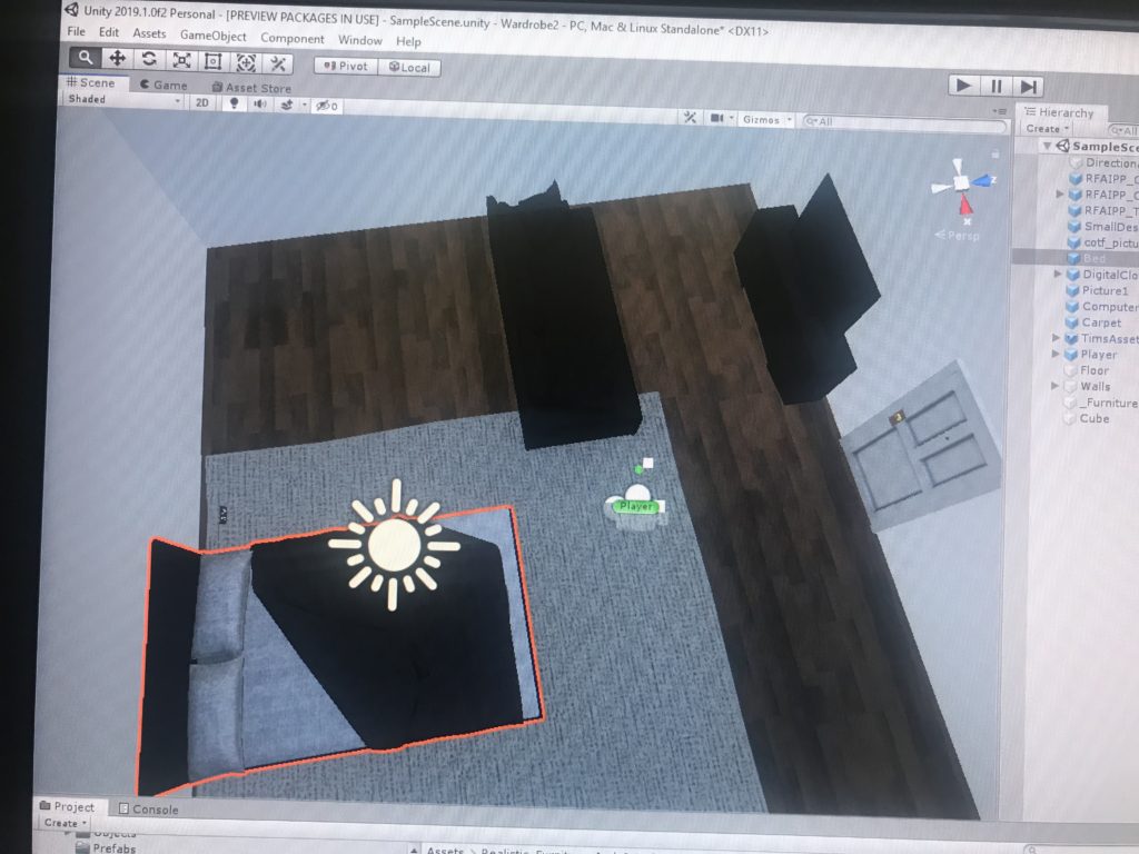
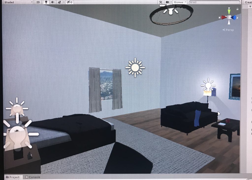
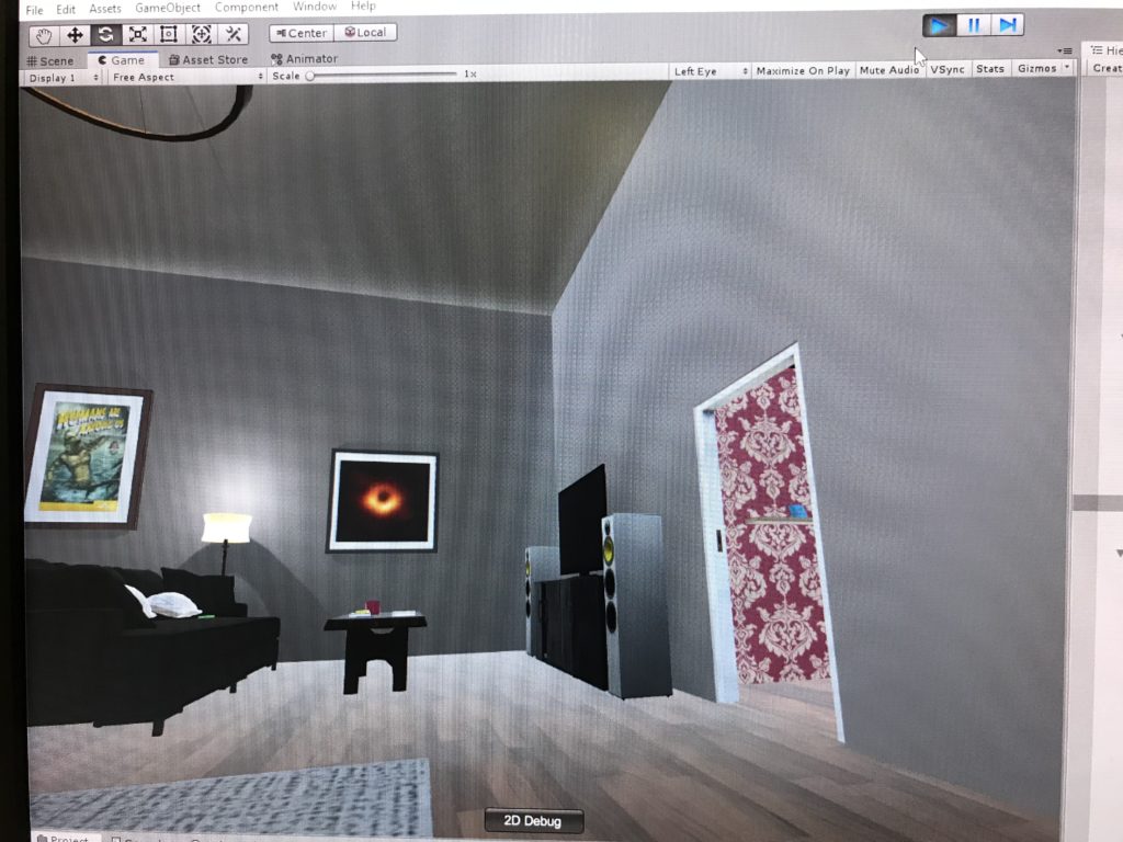
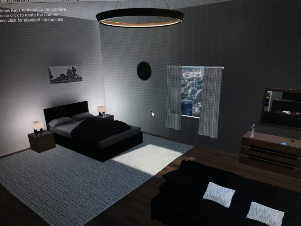
The VR Headset keeps crashing and not connecting, so I decided on beginning to design the room instead. I want to make it modern and simple. Thinking adding a TV as well. Ill see if ill be able to add a video interface for the TV as a newsfeed playing.

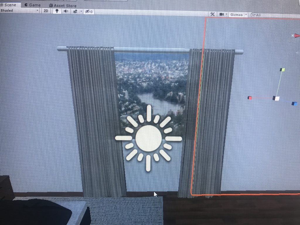
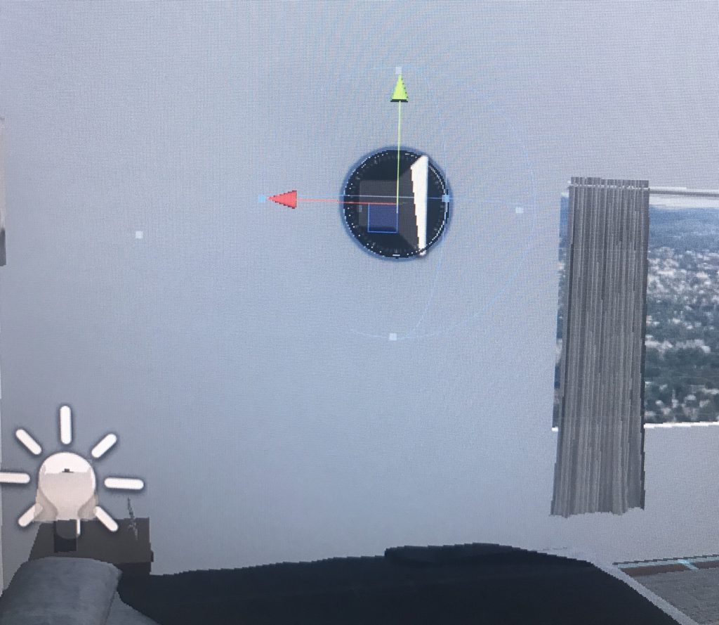
I felt like adding a window was a very important part of the room, not only did it give the user perspective of their surroundings but it made the room feel less trapped and gave in natural light in the room as well

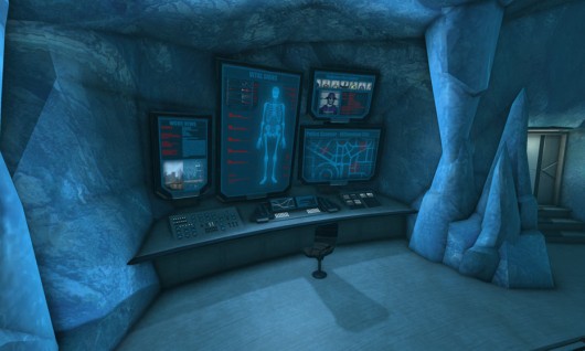
still brainstorming of what could be behind the door; the main idea I’ve got so far is having the door act as a secret entryway to a superhero secret hideout/dungeon

from Incredibles

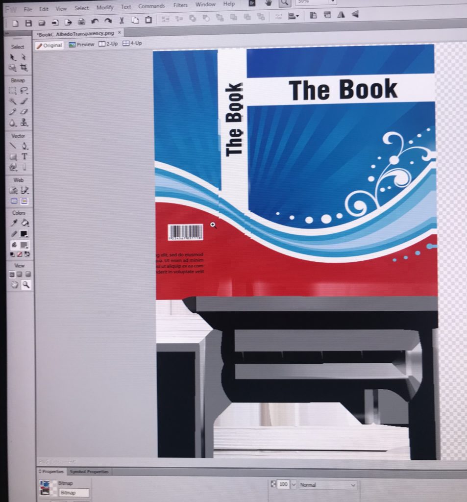
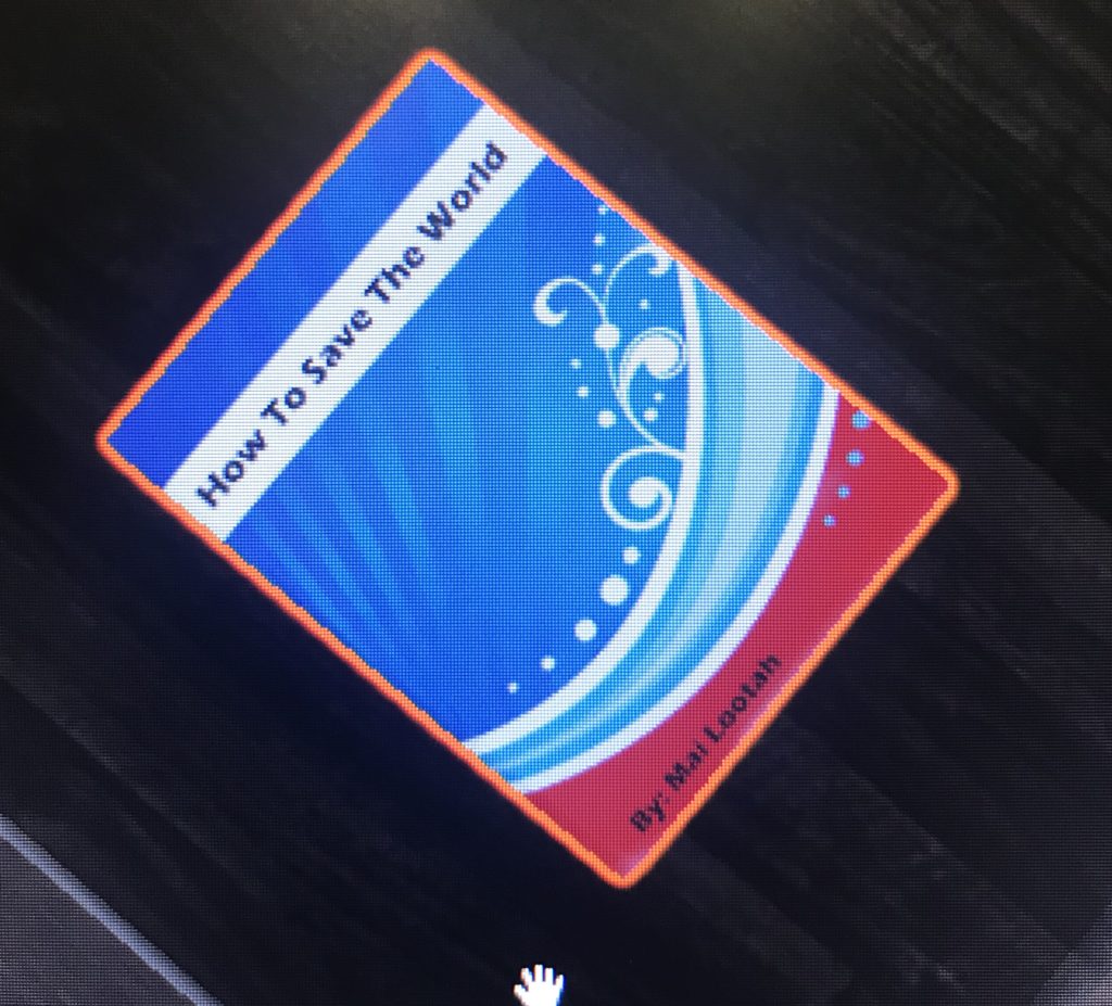
I already included some clues alluding to a superhero persona. I feel like having something that ties these two environments together is important for a complete story that is well rounded. By changing certain objects materials I was able to accomplish putting my own touch and messages on items around the room
April  29

Tried adding light probes but it kept glitching the scene and walls &

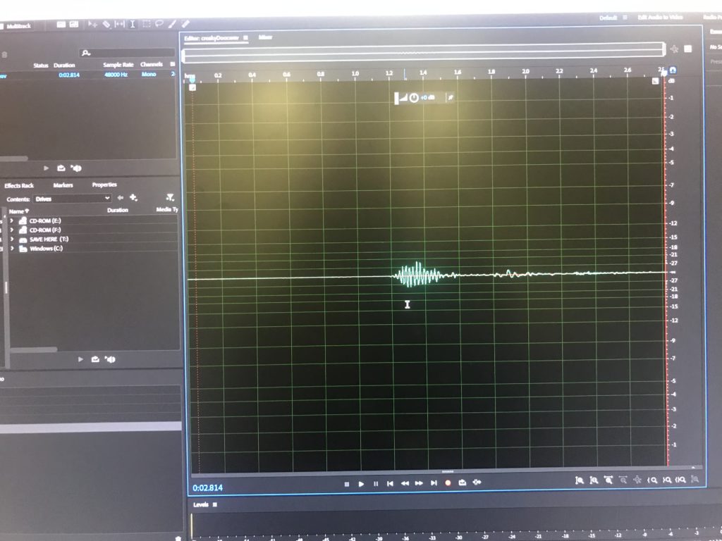
added an audio file for the ticking of the clock for some audio in the room
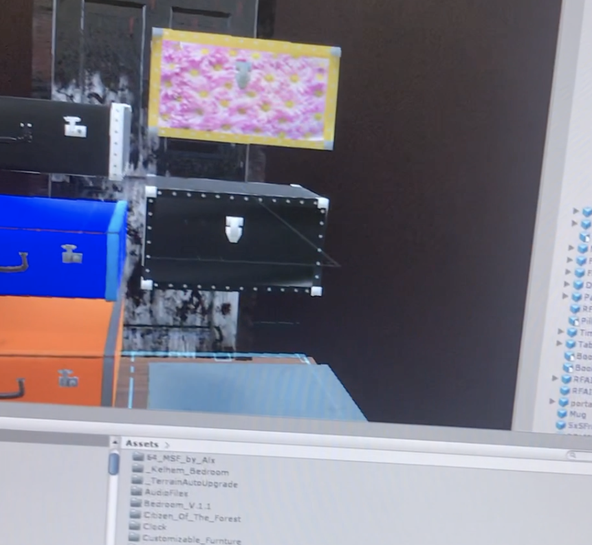
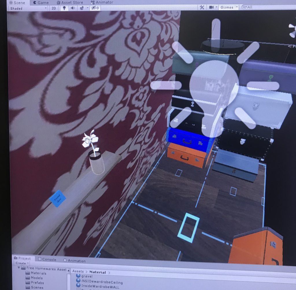
added suitcases to the wardrobe and designed some of them as well for more variety
Added a teleportation platform across the room
April 30
Wardrobe Update with a few intractable suitcases
The bedroom so far

What could I have the player do in the second environment/room if I go along with the superhero narrative.

  • shooting range?
  • buttons that activate something
  • boxing bag
  • a library
  • futuristic screen, map

Two people play tested my project today, they gave me some feedback about the feel of the room and the sizing. As well as the wardrobe being too stuffy?

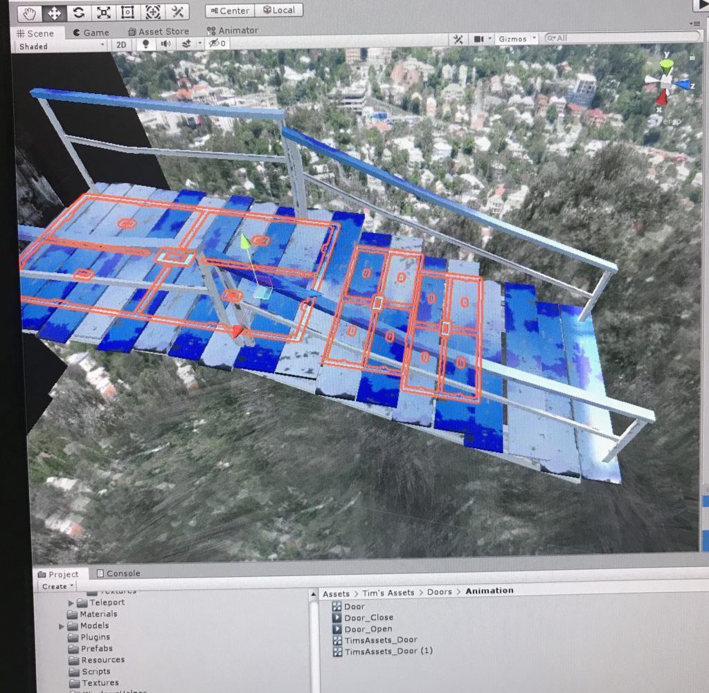
Began working on the hidden lair part, I wanted to include stairs that lead down, but

  1. creating stairs with big enough steps for teleportation makes it seem weird and unrealistic
  2. complicating my project too much.
May 7

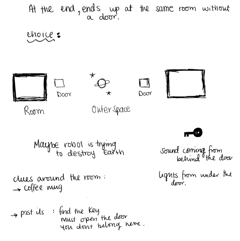
Switched some things up so now “You’re an alien & you go to an alternate universe” is the direction I will take now

Think about how will the player move from scene 1 to scene 2

you find a wardrobe with a hidden door/hole? do you press something and be transported? is there a portal you walk into? how will it work

the player will look around the room for clues, explore.. does the user need to pick up something with them and place it somewhere

like a ticket to outer space?

New Storyboard

  • you wake up in a room with amnesia of who (what) you are, and you start to look around the room for clues
  • you find a ___________ , but you don’t think it has much importance
  • you head towards the door and find yourself in a closet or storage room that is quite cluttered with suitcases
  • behind all these items, you notice another door? or a small crawling space? with a hole for ________ to be placed in, and you remember your saw it in the room
  • if ____________ is placed in the hole, you get transported to outer space. where you belong

Giving the user a choice in the second scene; be good & Save humanity/Earth, be evil & destroy it. Should I label these options or should it just be a surprise, having them choose unknowingly, but they won’t understand if I do that so..

Some notes of more brainstorming, I decided on using a key as the way to transport to the second scene

things to focus on for now;

  • fix closet area
  • key to open door
  • fix outer space environment
  • add more audio
  • doors are too small? you are too tall? check that
  • animate door 1 to open
  • UI screen
  • animate drawers to open?
The outer space scene with these particles is quite a scene
May 8 
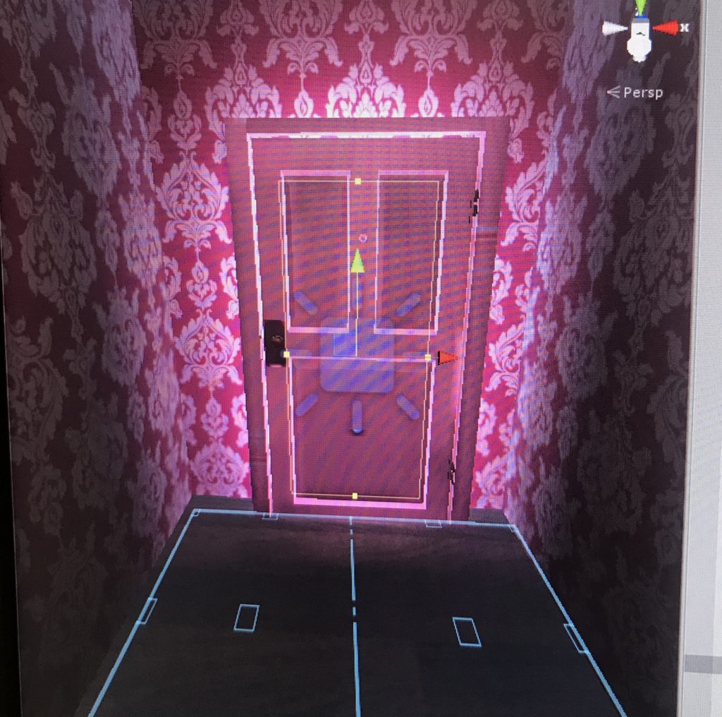
fixing the wallpaper in the wardrobe area, must change the tiling of the material to fit

focus on:

  • fixing the lighting in both worlds, make the items static and add light maps
  • fixing the players location and figuring out how to keep the alien hands in scene 2
  • why does the key fly? .. should I keep it that way?
you can see the key is stuck in mid air now

Playtesting:

  • users with no VR experience find it hard to move around
  • I noticed most people will explore the room first before heading to the door
  • even if they don’t they must find the key to reach the other side
  • player wouldn’t notice a door behind the suitcases. are there too many? should I add a light being the door
May 10

Adding audio clips;

  • sound coming from behind door #2 to draw the user there?
  • a radio in the room?
  • outer space scene, will the robot speak?
May 11
adding an audio for the door when it opens

have an option in scene 2. What could happen in outer space, what could the user do? destroy the earth (the earth that you were on in scene 1, the room)

will a meteor hit it?
May 12
  • edit UI screen in the beginning
  • clock movement
  • fix audio
  • choose; can they open drawers or not (too many actions in scene 1, not enough in scene 2. focus )
  • animate robot, him being static looks weird
  • make the button that opens door 1 move and more obvious to spot
  • put a hint in the wardrobe on a post it for the user to move the suitcases
  • add more things in the room about parallel worlds
  • add a way to restart scene
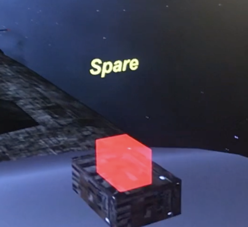
  • add labels to the buttons in scene 2
  • what is the robot doing? whats his purpose if he has any
  • the rotation of the earth is due to animation, change it to a script to make it smoother
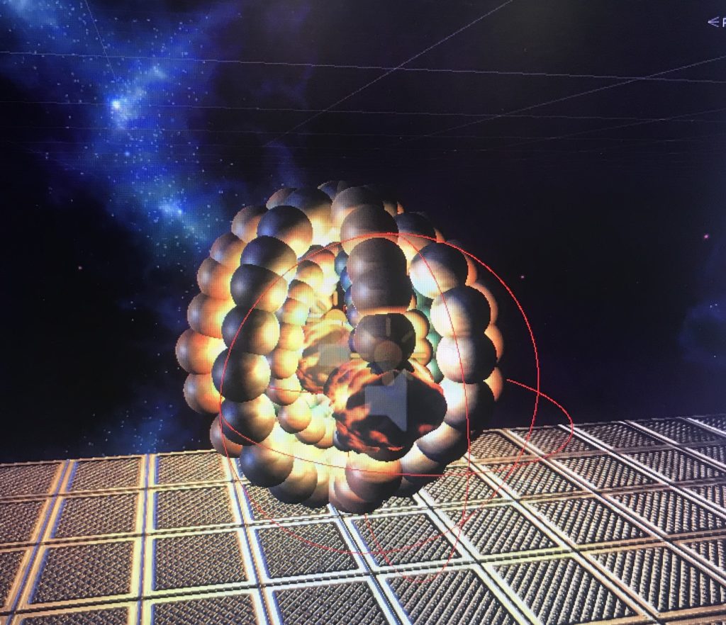
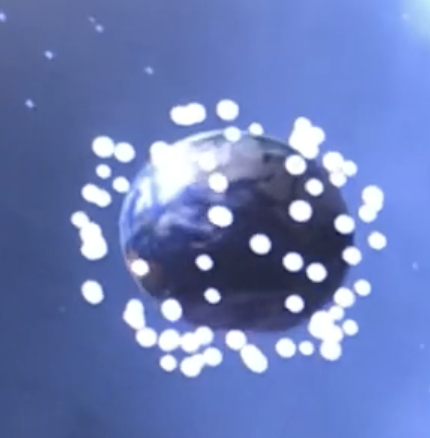
the particles that appear when the earth explodes, using the script GameObject.SetActive() and they have an explosion attached to them making them fly
earth exploding
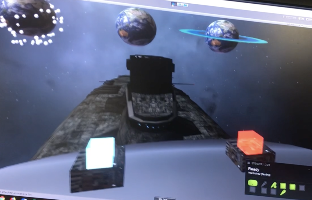
without labels
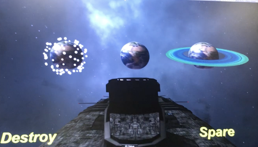
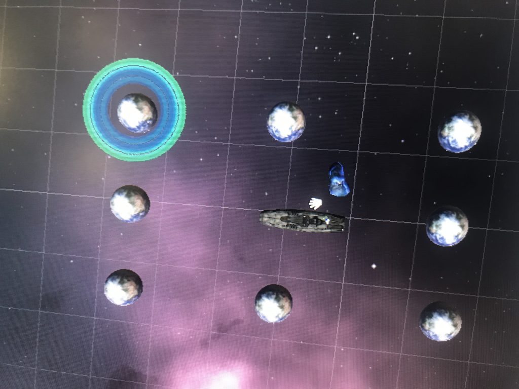
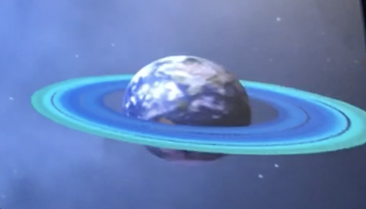
adding multiple earths bring more to the story, making it a parallel universe/world. and some of the earths have special features, for example rings, or asteroids, a glow. when I chose to put multiple earths, the previous effect of snowflake particles flying was too much and decided against it
the button for destroy leads up to the earth exploding, easy. But sparing the earth.. what would happen? Nothing? what about a user playing the game for the first time, such a button would basically do nothing to them. they wouldn’t understand the context. I need visual/auditory cues that you have in fact Spared the earth.

  • a glow from behind
  • angelic “Ahhh” sound

Brainstorming the Final Project

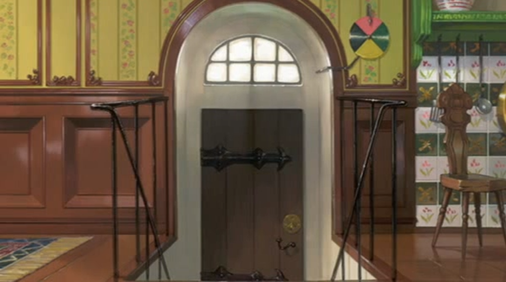
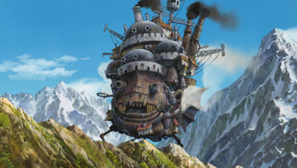
I really wanted to work with the “close the door” idea, and what immediately came to mind was inspired from the movie Howls Moving Castle. Where in the movie there is a ‘moving house’ that is somewhat alive with a special front door with a dial next to it. As you rotate the dial, the castle takes you to a specific place.

The castle
The door with the dial

But as I kept sketching out the idea, I did not seem to be able to make a story or set pathway to the concept…

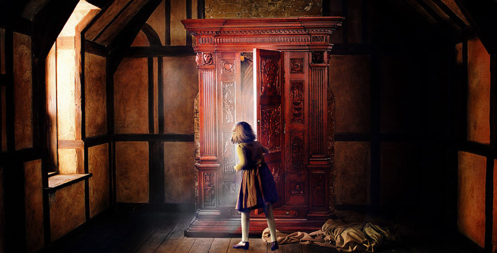
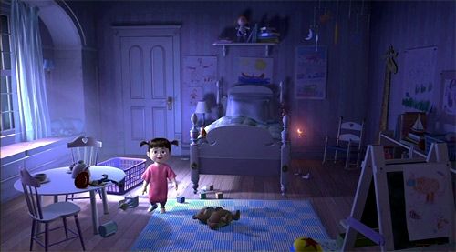
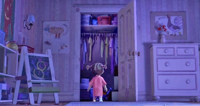
Sticking with the closing door idea, I thought of different movies where behind doors held a different or unusual world. I found inspiration from movies like ‘The Chronicles of Narnia: The Lion, the Witch and the Wardrobe’ and ‘Monsters Inc.’

And what these both ideas had in common was that the door usually led to a normal closet setting, but at other times a whole different world. Branching from that concept I wanted to recreate that in the VR world.

The player would be placed in the setting of a plain and simple bedroom with one door. Drawn to the door, as they open it they discover it simply to be a normal closet filled with ordinary items. The twist is if the player ‘closes the door’ with them inside, they will be faced with mystical things floating around them and realize they are no longer in their mundane room anymore. The door would still be visible to them in that world though, and if opened again, they would be back where they started; the closet and room.

Project 3 Ideation and Storyboarding

Project Title: Windows XPerience

Team member: Junior, Ju Hee, Adham

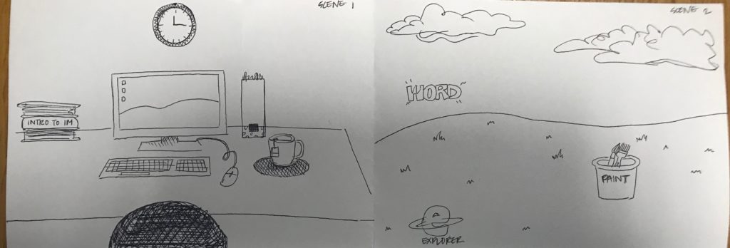
For this project, we will go back in time to revisit a staple piece of technology: a Windows XP computer with the classic green valley and blue sky background. Our inspiration came after a rigorous brainstorming session were we touched base on a lot of ideas that interested us. After presenting some of the ideas to the class and after further deliberation amongst our group, we decided that this idea provided the best balance between abstract storytelling and realistic implementation considering the timeframe and themes available. The theme our piece will be based on is: “close the door” and we hope to do so in an interesting way, giving the user the possibility to decide the ending of a story where, inevitably, the door will be closed.

As seen in the Scene 1, the user will be in a room with his old-style windows computer appearing in front of him/her. As he/her clicks on it, he will be sucked inside the computer, shadowing the idea presented by Richard Moore in the Disney Animated film Wreck it Ralph 2. In order to escape the computer, the user will have to click on a set of icons in a predefined sequence. Each icon will transport the user into a different scene, and it is up to the user to click on the right set of icons to escape.

Possible Assets:

  • Windows XP Icons
  • Furniture for the room
  • Laptop
  • Paint brushes (Paint Program)

Interactions to Design and Code:

  • Clicking on the icons
  • Scene Manager to move from one scene to another

Sound:

  • God-like voice that tells the user the situation he is trapped in and gives him clues to possibly escape the computer
  • Sound effects for clicking on different icons
  • Sound effect of getting absorbed into the monitor
  • Peaceful background music when the user is in the green valley

Lighting:

  • Stark contrast in lighting between the room and the inside of the computer.
Windows Background we are trying to emulate

DEVELOPMENT BLOG – BETRAY

Our initial idea was to tell the story of the development of the UAE, based on the theme “renewal”. I took a core class last semester called the history and environment of the Middle East, and I was shocked by the fact that this region used to have oasis in ancient times. Thus, we thought it would be interesting to see how this places changed from oasis to desert, and then from desert to such a modernized city with skyscrapers and trees planted along the roads. Our idea was to position our story on an isolated island, which represents the UAE, because recreating the country will be challenging.

Then we thought that it would be too complicated to tell the history of the UAE from the beginning, and we failed to figure out how to make the transitions between the three scenes – oasis, desert, and modern city – natural and intuitive, so we decided to focus on the last two stages: how the UAE developed from desert to a modernized city. After some research, we identified three key stages for economic growth in the UAE, and we listed the elements that should appear in each stage:

Stage #1: desert, tent, barren, camel, cactus, pearl picking

Stage #2: souq, discovery of oil, the combination of seven emirates

Stage #3: Asian cup, skyscraper, NYU, city park, luxury car

In terms of transitions between scenes and the experience of time in our scene, player will be an old man who has lived in the UAE for his entire life. Through the player’s interactions and conversations with people around him in the three stages, player gets a sense of his/her age. For example, in stage #1, the player will see his parents collecting pearls, in stage #2, the player will trade with other people in their mid-age, and in stage #3, the player lives happily with his grandchildren.

However, we still think that the elements we would like to include in our environment and the player are loosely connected: player can actually see the history of UAE from a third person’s view, then why are we designing an VR experience for users to interact with the environment? Following that question, we tried to narrow the scope of the whole story down: instead of telling the story of the whole country, we wanted to focus on what this old man experienced during his life. The experience will start with the player lying in bed in his own luxury bedroom, and we designed three interactions based on the previously mentioned three stages:

Interaction #1 Player approaching the window. When he looks outside the window, he will see the modern city (stage #3)

Interaction #2 Player approaching the wall, touching on the photo hanging on the wall, triggering his midlife memory (stage #2)

Interaction #3 Player approaching a desk, on top of which there’s a hand-made toy. Player picking up the toy, remembering how his mother made him the toy when they lived in tribes (stage #1)

Then we realized another issue with this design: after player enters stage #2 for example, how do they come back to the main scene (the bedroom)? We wanted to avoid using back buttons because we want the experience to be more coherent. Bearing that question in mind, we tried to come up with interactions that could actually push the development of the story, and make the transition between stages more fluent. Then we thought that we could set our environment at the corniche. Player could collect pearls at the beach, and as they collect more pearls, the environment changes: more people gather together, and the souq forms gradually. Then the player can trade with other people, and as more people are trading, the skyscrapers occurs. However, a huge problem with this idea is that the rapid development of the country within the past several decades is due to the discovery of oil, yet we could not come up with a way to assign player a role in the discovery of oil.

At this point, Vivian and I felt like we were trapped by the huge idea of presenting the history of the UAE, and we realized that this is an impossible task considering the number of factors involved in the story. We decided to start over and look at the other two themes.

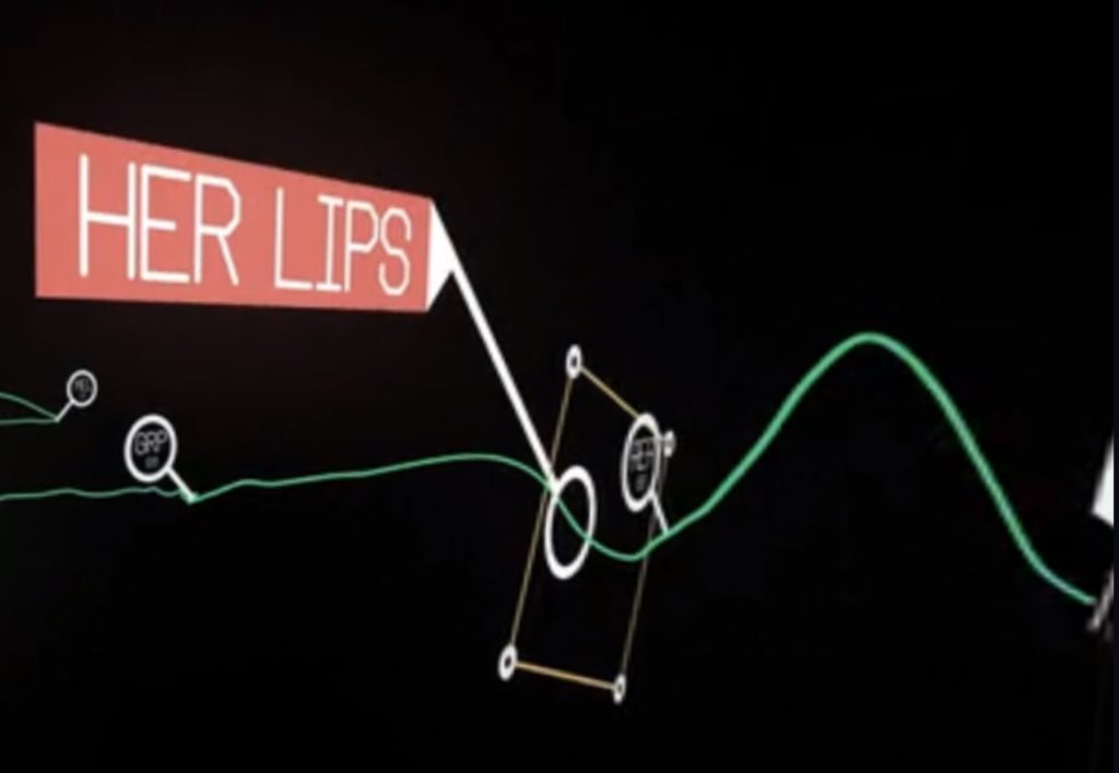
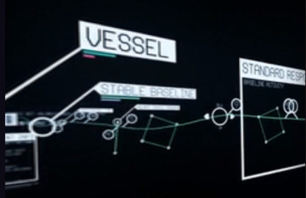
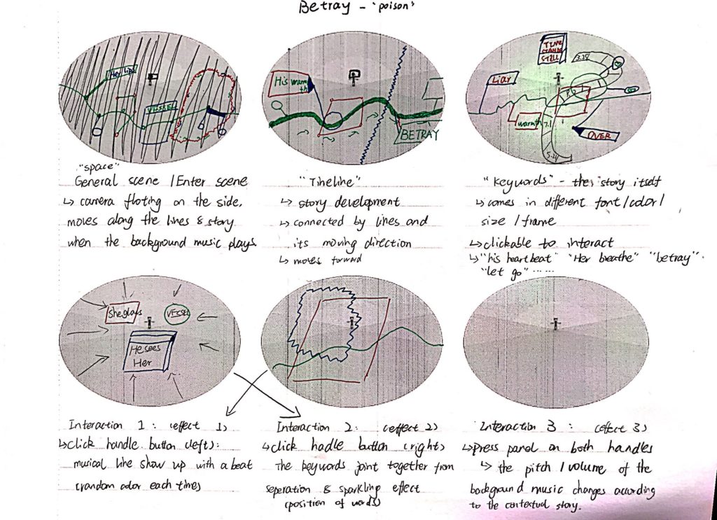
I had another idea of simulating how people feel after taking hallucinogen, the effects of which has been at the center of debate for decades. Meanwhile, Vivian found this interesting projects, which is a 3D data visualization of the brain activities for 4 seconds of someone who fell in love. We thought it would be interesting to create a multi-sensory experience for love and betray. We decided to name our project Betray, which will be a musical bittersweet love story conveyed by beats, background music and key words that follow the story development timeline.

Our environment will be quite illusionary. We will create an endless world, as if players are floating in the universe, but we will also distort the color of the background, so that the environment looks unfamiliar. There will be a list of words associated with love & betray (maybe also trust?), which appears in order. There will also be a background music. Players can interact with the words. By clicking the trigger/throwing the word away/etc., player can trigger different sound effects and visual effects. There will be a certain level of randomness in the experience, but the certain properties of the effects such as the volume & pitch of the sound effects, and the movement of the visual objects will be decided by how player interact with the word, and the category of the word they interact with. For example, if they interact with a word associated with love, the sound and visual effect will be soft, and calming, while if they interact with a word associated with betray, the sound and visual effect will be harsh and intense.

See Vivian’s blog post for our storyboard.

I made a demo using p5.js for the visual effects of our project. However, after presenting it to the class, I realized that I focused too much on how our project looks but ignored the story behind that. What is the message we try to convey to users by having sound and visual effects? I also shared an alternative I have about creating a virtual version of the Museum of Broken Relationships, where users can play around with objects in the environment, and figure out the story behind each object. Sarah suggested that the storyline should have the top priority if we want this to be an immersive storytelling.

After discussing with Vivian, we came up with the idea of having multiple objects and a cardboard box in the environment. By pairing the objects up and putting them into the box, users can trigger the voiceover of one part of the story. The order in which users put the objects into the box does not matter, since we wanted to leave enough space of imagination and free interpretation of the story to the user. Also, we decided to have a female and a male version of the story, because we believe in gender differences in the understanding and perception of love. Users will be able to choose whether to enter the female or the male version of the story.

Here is our story script:

Male Version:

Movie Ticket & Popcorn Box: I finally got the courage to invite her out for movie. Touched her hand when we tried to reach the popcorn at the same time

Paired Toothbrush & Cup: The first night she slept over, she brought her toothbrush with her. The next morning, she changed my toothbrush into a paired one

Dog Food & Dog Cage: She always wanted a pet dog. I brought home a cute puppy one day, and I couldn’t forget how excited she was: her dream finally came true.

Iron & Suit: First day of work after my promotion. She ironed my suit for me. Looking forward to our future.

Ring & Ring Case: I saved all my money for this ring, prepared for a month for this. Today is finally the day.

Passport & flight ticket: Leaving the country tomorrow. I guess I will have to put this memory in the box and leave it behind…

Female Version:

Movie Ticket & Popcorn Box: He finally asked me to hang out. I’ve been waiting for this for a month. He’s so shy but so cute .

Paired Toothbrush & Cup: I was like a kid after I stayed at his place. I paired our toothbrush up.

Dog Food & Dog Cage: Suddenly one day, he brought home a cute puppy. I was so surprised! I always wanted a pet. I guess now we are a family of three.

Iron & Suit: I want to make his first day after promotion special, so I got up early to iron his suit. Looking forward to the bright future of ours

Ring & Ring Case: I said yes.

Passport & flight ticket: His work left us no choice but to lock all these memories up, forever.

I was a bit worried about not being able to find prefabs for passport, flight ticket, movie ticket, ring, and ring case online, and when we looked into the asset store, we really couldn’t find those. So we changed our storyline a bit, based on what we were able to find online.

New Version:

Male Version:

Paired Toothbrush & Cup: Paired toothbrush is the first step to show we are a family, says her.

Candles & Plates:

I finally got the courage to invite her out for a dinner.

Candle light on her cheeks is the cutest thing ever.

Dog Food & Dog Cage: I brought home a new family member that day, and I couldn’t forget how excited she was: her dream finally came true.

Iron & Iron Board:

First day of work after my promotion.  

She ironed my suit in the morning.  

Looking forward to our bright future.

Pen & Notebook:

She used to keep all of our memories in this notebook …

but it’s meaningless now.

Vast & Watering can:

Roses die. So are our promises….

Eventually it turns out to be a wedding without her…

Female Version:

Paired Toothbrush : Pairing our toothbrush makes us look like a family more…

Dog Food & Dog Cage: That day he brought home a cute puppy. I was so surprised! I always wanted a pet. I guess now we are a family of three.

Iron & Iron Board: I want to make his first day after promotion special, so I got up early to iron his suit. Looking forward to our bright future …

Candles and Plate: Can’t ask for anything better than a candlelight dinner for the first date.

Pen & Notebook: It’s been a while since he left me… i used to keep a diary everyday when we were together …. How stupid i was.

Vast & Watering can: Roses die. So are our promises…. Eventually it turns out to be a wedding without him…

Development Blog 1 – Detoxification by Max and Atoka

Temporary Title: Detoxification

Setting: Dark room in an old house

Our theme will be like this:

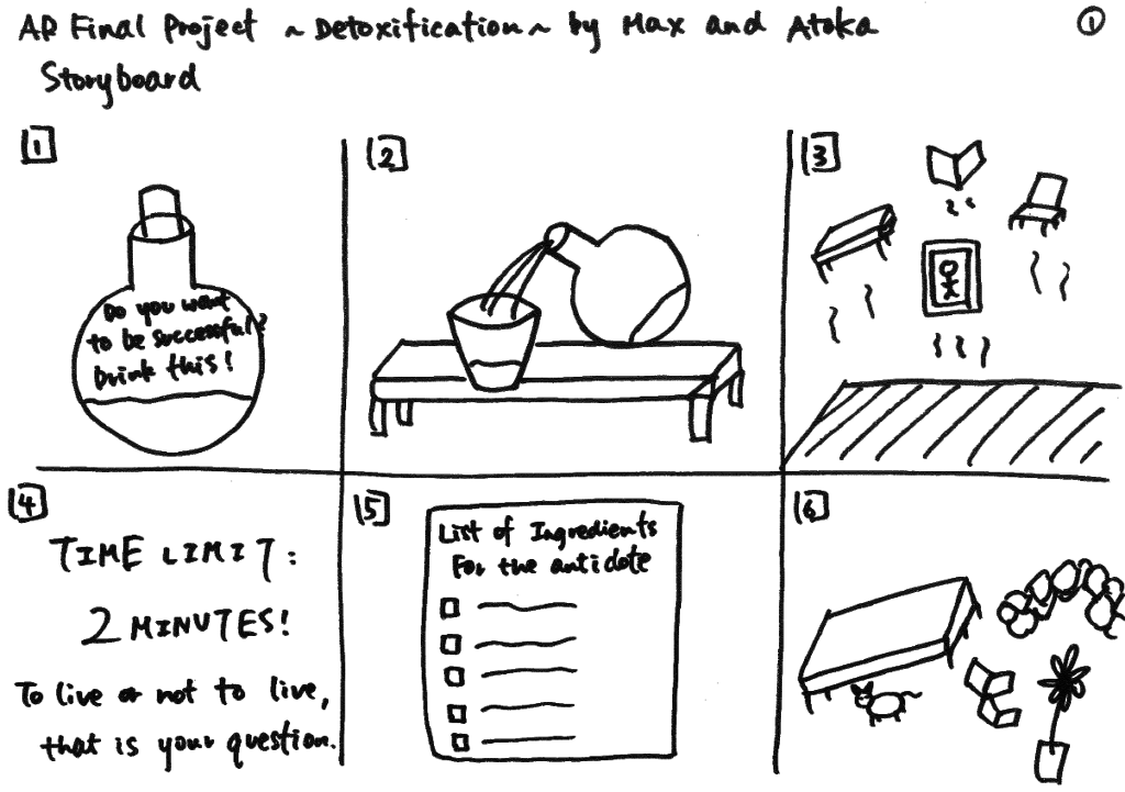
Storyboard:

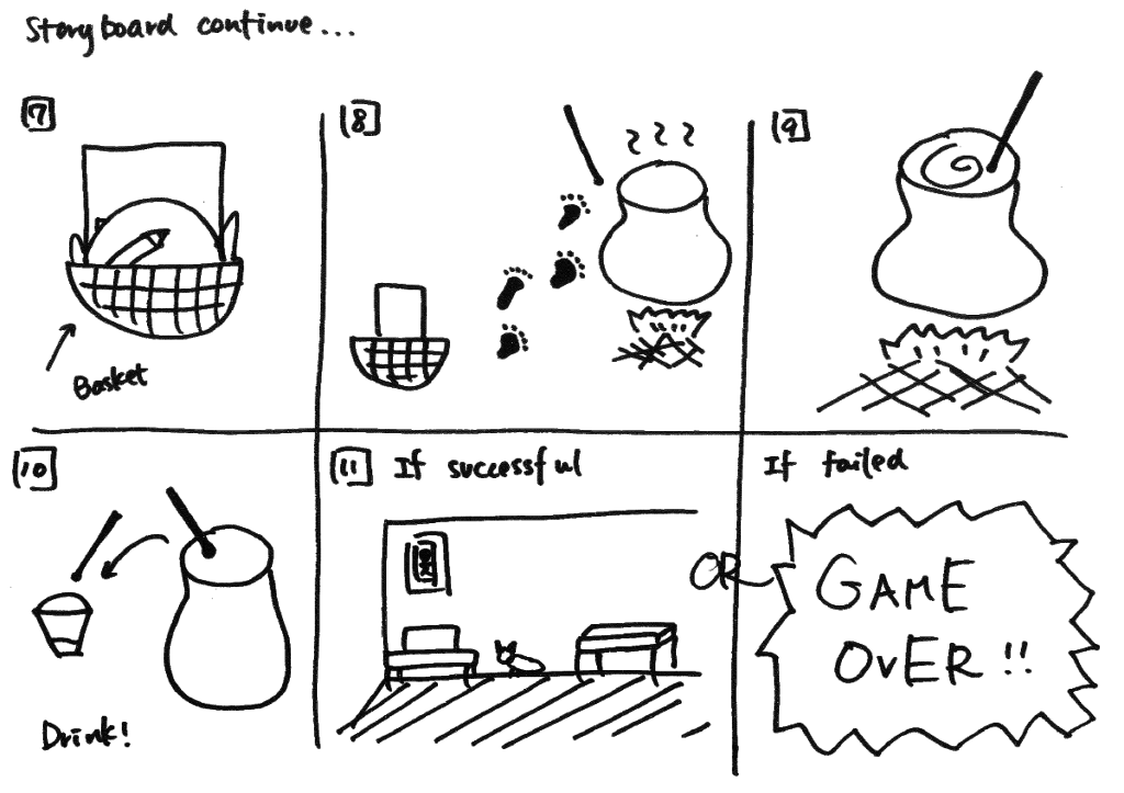
Explanation of the Storyboard:

  1. A potion with poison inside is placed infant of the user (Label -> “Do you want to be successful? Drink this!”)
  2. Open a chemical potion and pours it into a cup
  3. The user hallucinates (Sees flying furniture, utensils, objects)
  4. The user is given a task, a basket, and a time limit (If you don’t find the ingredients of the antidote in 2 minutes, you will not survive!)
  5. A list of ingredients to make the antidote
    Examples:
    Flying Cat
    Cellphone/smartphone
    Snail
    Molded rice
    Pen

  6. The user has to scuffle around to find the ingredients of the antidote
  7. The user has to put the ingredients into his basket
  8. When the user gets all of the ingredients, the user is prompted to go to the big pot
  9. The user is prompted to put the ingredients into the big pot
  10. The user is prompted to mix the pot
  11. The user drinks the antidote successfully -> All the flying furniture utensils, and objects fall down -> real gravity
    • If the user reaches the time limit -> Game Over
    • If the user finds gets the wrong ingredients -> Game Over

Development Blog – Final project

April 7th:

“Betray” is a musical bittersweet love story conveyed by beats, background music and key words that follow the story development timeline.

Project inspiration:

https://www.with.in/watch/lovr?autoplay=true

Storyboard:

April 16th: Memory Box

We paved our project idea into a love story using the theme “close the door” according to the feedback we got from folks and professor that the previous project idea doesn’t involve sufficient meaning for the user that a user might not feel engaged enough into the story just by watching it.

When the game starts, the user will be put in to a lover’s memory with a box in front of his/her (user can choose male/female version to hear different interpretation/stories behind the same paired objects), and the user will pair some memory pieces and put them into the box to complete the story. Once they pair is correct a story piece will be told in the voice message, otherwise the objects will be bumped out of the box and the user need to pair the correct ones again.

the story line we discusses is as following(the order doesn’t matter in this case):

Male Version:

Movie Ticket & Popcorn Box: I finally got the courage to invite her out for movie. Touched her hand when we tried to reach the popcorn at the same time

Paired Toothbrush & Cup: The first night she slept over, she brought her toothbrush with her. The next morning, she changed my toothbrush into a paired one

Dog Food & Dog Cage: She always wanted a pet dog. I brought home a cute puppy one day, and I couldn’t forget how excited she was: her dream finally came true.

Iron & Suit: First day of work after my promotion. She ironed my suit for me. Looking forward to our future.

Ring & Ring Case: I saved all my money for this ring, prepared for a month for this. Today is finally the day.

Passport & flight ticket: Leaving the country tomorrow. I guess I will have to put this memory in the box and leave it behind…

Female Version:

Movie Ticket & Popcorn Box: He finally asked me to hang out. I’ve been waiting for this for a month. He’s so shy but so cute.

Paired Toothbrush & Cup: I was like a kid after I stayed at his place. I paired our toothbrush up.

Dog Food & Dog Cage: Suddenly one day, he brought home a cute puppy. I was so surprised! I always wanted a pet. I guess now we are a family of three.

Iron & Suit: I want to make his first day after promotion special, so I got up early to iron his suit. Looking forward to the bright future of ours

Ring & Ring Case: I said yes.

Passport & flight ticket: His work left us no choice but to lock all these memories up, forever.

April 18th:

Renewal of storyline and objects because some objects are unavailable in asset store:

**The story will be understood regardless of the order – every single piece of a story is independent from one another however once the user finish all the story piece he/she will get the idea of what’s going on – there’s different level of love memories as well as the part the indicates the break up, however there’s no specific reason given why the owner of the memory break up, it leaves the space for user to imagine what happened, different people will have different interpretation of the reason based on their own understanding of the given objects and the story behind them.

Male Version:

Paired Toothbrush & Cup: Paired toothbrush is the first step to show we are a family, says her.

Candles & Plates: I finally got the courage to invite her out for a dinner. Candle light on her cheeks is the cutest thing ever.

Dog Food & Dog Cage: I brought home a new family member that day, and I couldn’t forget how excited she was: her dream finally came true.

Iron & Iron Board: First day of work after my promotion.  She ironed my suit in the morning. Looking forward to our bright future.

Pen & Notebook: She used to keep all of our memories in this notebook … but it’s meaningless now.

Vast with rose: Roses die. So are our promises….Eventually it turns out to be a wedding without her…

Female Version:

Paired Toothbrush : Pairing our toothbrush makes us look like a family more…

Dog Food & Dog Cage: That day he brought home a cute puppy. I was so surprised! I always wanted a pet. I guess now we are a family of three.

Iron & Iron Board: I want to make his first day after promotion special, so I got up early to iron his suit. Looking forward to our bright future …

Candles and Plate: Can’t ask for anything better than a candlelight dinner for the first date.

Pen & Notebook: It’s been a while since he left me… i used to keep a diary everyday when we were together …. How stupid i was.

Vast with rose: Roses die. So are our promises…. Eventually it turns out to be a wedding without him…

finding objects that match the story line

Ending: Initial idea was to do an “close the box” animation when all the objects are paired and destroyed to cater the chosen theme “close the door” by indicating that the owner of the memory space “I” close the door of the bittersweet love memory and leave the memories behind in the box to keep moving on. However, I worked on the scripts of animation but ended up finding that our box is not animatable, because the lips of the box comes together with the box body and can’t be animated separately. Therefore we came up with an alternative ending of the story – in stead of close the box, the box will be destroyed and the moment it disappear, it will be accompanied with the particle effect to show the sense of “vanishing” and an ending explanation in 2D words will be shown to suggest the end of the game as well to explain to the player what happened, by saying “Thank you for helping me recall those memories… Now let me just leave my love story in this box behind and move on….”

April 23th: Environment Design

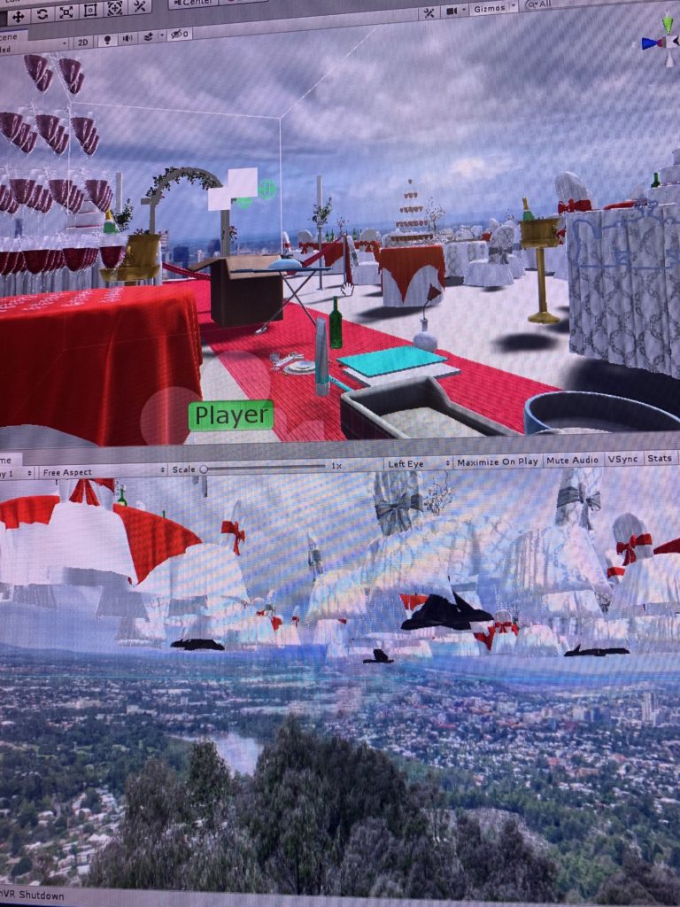
Because our story is a bittersweet love story with a sad ending, I decided to use the wedding scene to indicate the background of the story – it’s about love, however, at the same time, this is the wedding where only “me” (the user) is attending and there’s no one else around, the odd and emptiness of the wedding scene creates the contract and indicate that even though this is a love story but it doesn’t seem to have a happy ending. The realistic wedding design with the non-realistic background (floating above the city) conveys the message that this is not the real world, it is something fictional and doesn’t match our real life experience. Hopefully user will get the idea that this is in someone’s memory world.

April 25th: Voiceover recording and editing – record the narrative of the story in both male and female voice.


May 5th: Background music and Floating effect

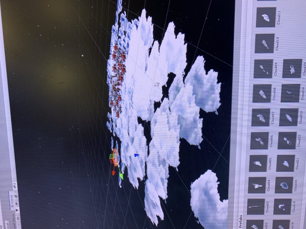
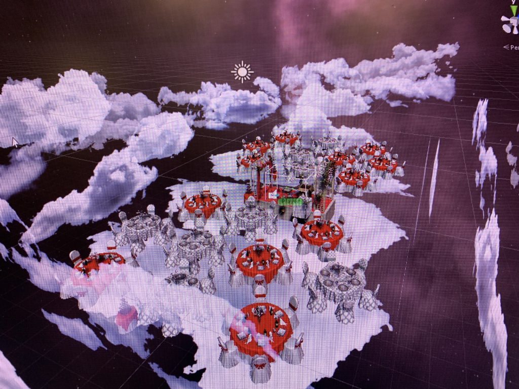
Added the wedding march to the background music to create the atmosphere of a “wedding”. The floating effect is added to the clouds to make the scene more “dreamy” and use it to indicate this is a fantasy memory world. In the beginning I wanted to create the effect that the clouds are moving at different speed so it looks like they clouds are floating around you, however, considering that it might cause too much movement in the background and therefore distract the user, I set the moving speed of all the clouds are the same, which result in the effect that it looks as if the platform that the user is standing on is floating instead of the clouds around them – since it’s relative motion. But this unexpected effect is so cool and achieved the goal to create the illusion of dream so I decided just to keep it that way.

  1. public float amplitude; //Set in Inspector 
  2. public float speed; //Set in Inspector 
  3. public float tempVal;
  4. public Vector3 tempPos;
  5. void Start () 
  6. {
  7. tempVal = transform.position.y;
  8. }
  9. void Update ()
  10. tempPos.y = tempVal + amplitude * Mathf.Sin (speed * Time.time);
  11. transform.position = tempPos;
  12. }

May 6th: User test and adjustment according to feedbacks

Add a collide box outside the player area to bounce back the objects that are thrown away by the users. / The city view background is kinda distracting user’s attention because it has too many details, the scene is too realistic and not dreamy/imaginative enough to indicate this is a fictional “memory space”- changed the scene into a universe space surrounded by clouds.

May 10th:Enviroment Design 3


May 12th: Design of the user interface :

May 12th: Coding and design for ending:

1.problem to solve : when the narrative audio plays, the background music volume down.

solution: attach other 6audio sources to the same game object (the player ),detect when other audios isPlaying, the background volume = 0.1f;

issue: one gameobject cant’t be attached more than 2 audio sources.

another solution: get audio sources from other game objects and detect if it’s isPalying. 

2.problem to solve: close the box animation

issue: when all the game objects are destroyed in the scene, trigger the animation. 

use of GameObject.Find(“”)

3.User test feedback: the floating clouds movement is too intense that it makes user feel dizzy; solution: 1.narrow the range of height movement and the range of moving speed. 2. scale up the red carpet where the user is standing on, so it will feel less scary and dizzy.

Ending: Initial idea was to do an “close the box” animation when all the objects are paired and destroyed to cater the chosen theme “close the door” by indicating that the owner of the memory space “I” close the door of the bittersweet love memory and leave the memories behind in the box to keep moving on. However, I worked on the scripts of animation but ended up finding that our box is not animatable, because the lips of the box comes together with the box body and can’t be animated separately. Therefore we came up with an alternative ending of the story – in stead of close the box, the box will be destroyed and the moment it disappear, it will be accompanied with the particle effect to show the sense of “vanishing” and an ending explanation in 2D words will be shown to suggest the end of the game as well to explain to the player what happened, by saying “Thank you for helping me recall those memories… Now let me just leave my love story in this box behind and move on….”


Development Blog – Cursed

Team: Cassie & Nico

April 6

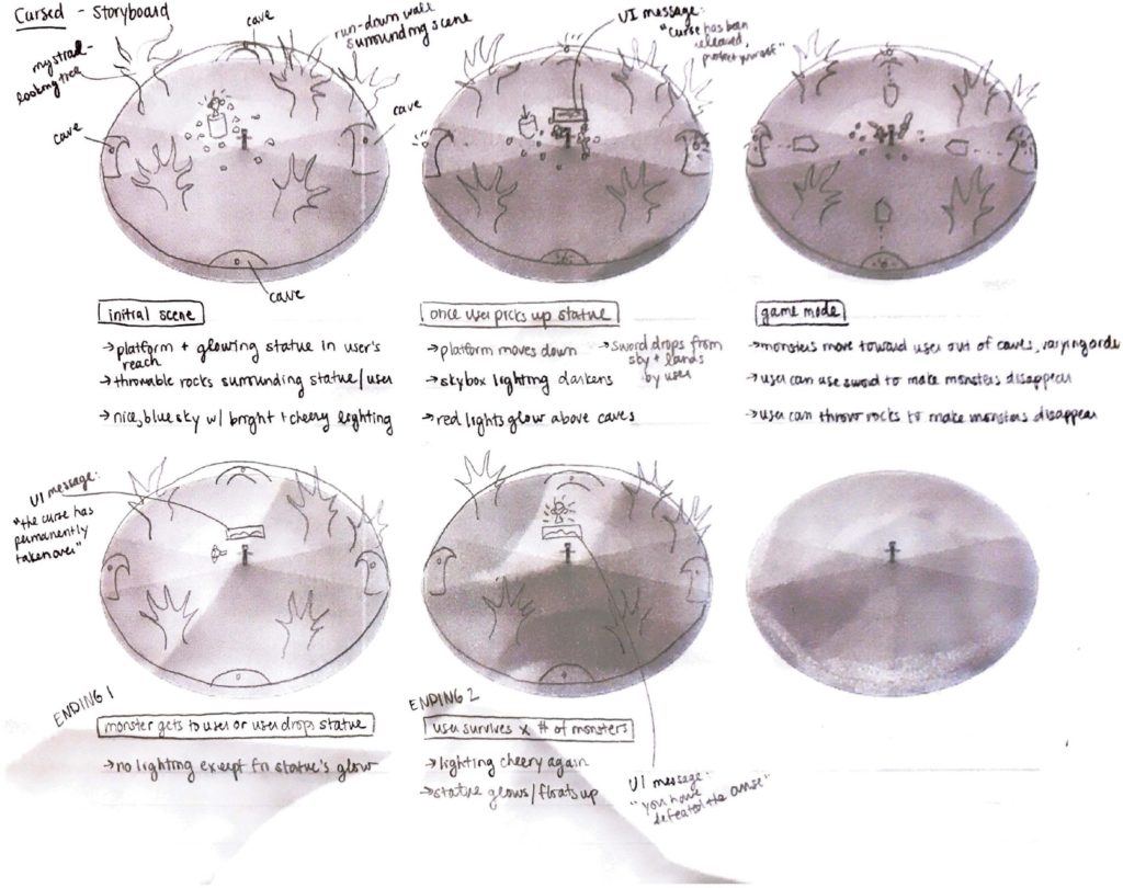
Concept brainstorming/storyboard – see Nico’s post

April 14

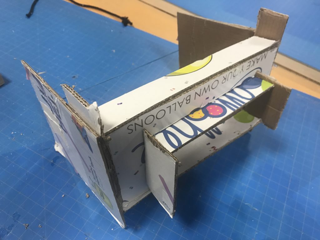
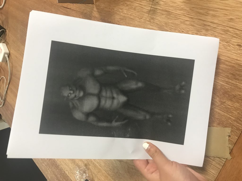
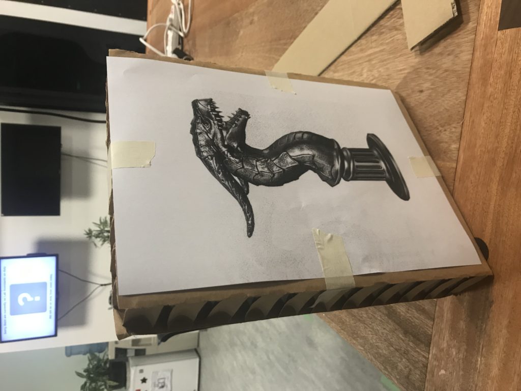
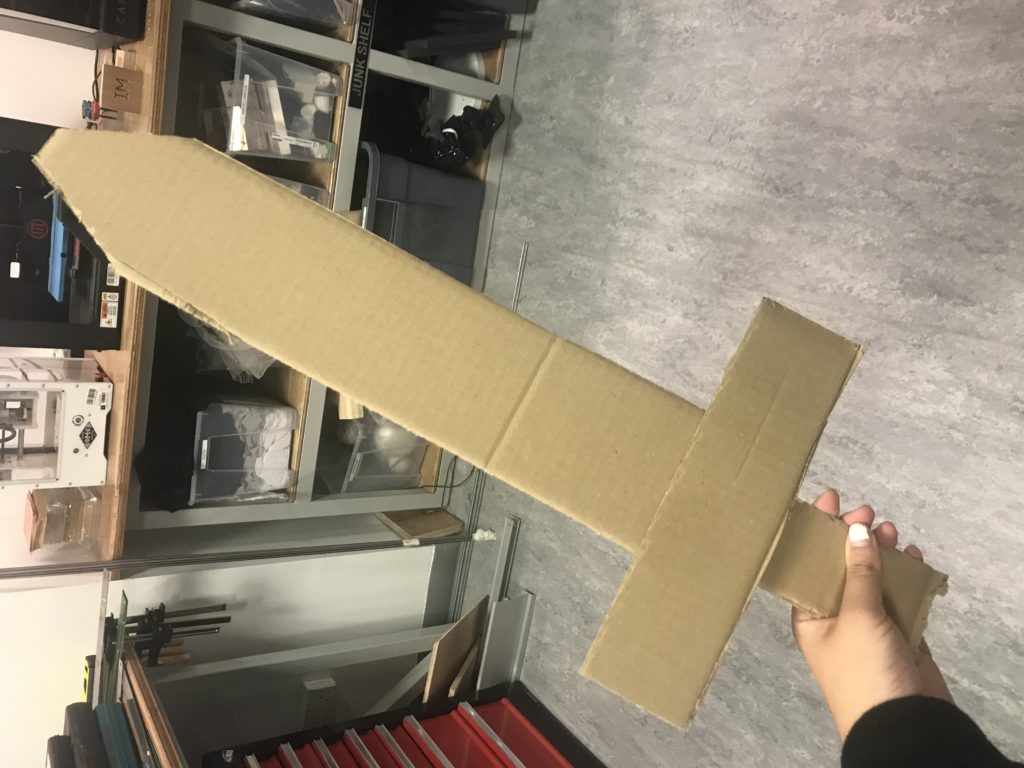
Today we tested out a paper version of our game on our friend Emma. We had several objects made out of paper cardboard: a headset to limit the field of view, a sword, several stones, the statue, and some monsters.

The monsters and statues were pictures of the actual assets we are using.

We set up the room so that the statue was resting on a chair, which will be a platform in the game. The stones were scattered on the floor by the chair.

To start, we had Emma put on the cardboard headset. When she picked up the statue, I wheeled away the chair (the platform will sink down in the game), and Nico announced that the curse has been released, and Emma must now protect herself. Nico then dropped the cardboard sword from above her head. To represent the monsters, Nico and I held up the printouts of the monsters and ran towards Emma one at a time. Here’s how our first test went:

For that first test, we didn’t give Emma any prior instructions, although she had heard about our concept before from casual conversation. However, we did another test where we gave her the instruction to try using the stones. Here’s how that test went:

In this test, she ended up dropping the statue, which means she lost the game.

Here’s what we learned from these tests:

  • In the first test, Emma didn’t notice the stones on the ground or knew that she could use them.
  • In the second test, when Emma wanted to use the stones, she dropped the statue so that she could have stones in one hand and a sword in the other. However, the game doesn’t allow this to happen.
  • The statue stood out enough for Emma to want to pick it up
  • Emma suggested that we should tell people that they have to hold onto the statue, like the voice could say something like “protect the statue” rather than just “protect yourself.” The reason she kept holding onto the statue in the first test was just because she wasn’t really thinking about it.
  • When asked if she thought it would be better if the stones weren’t there at all, she said the stones could be useful and she would rather have the option to use the stones in addition to the sword.

April 15

Feedback from Sarah Rothberg’s visit:

  • Why does the user want the statue? Why does the statue cause a curse?
  • Maybe there can be more things the user can interact with in the environment so that there is more build-up before the user picks up the statue. This would also build more of a narrative, because then it would be like “oh no, I messed with the wrong thing” when the user does pick up the statue.
  • Consider the difficulty of the game in relation to the user. Who is the user and how do we want them to feel?
  • Think about what kind of sounds to implement

April 16

Today I began to build up the environment:

  • Created a terrain. I made it much much smaller this time…lesson learned from Zenboo. Added a grass texture to this as well as a few raised and smoothed sections so that the ground wasn’t super flat.
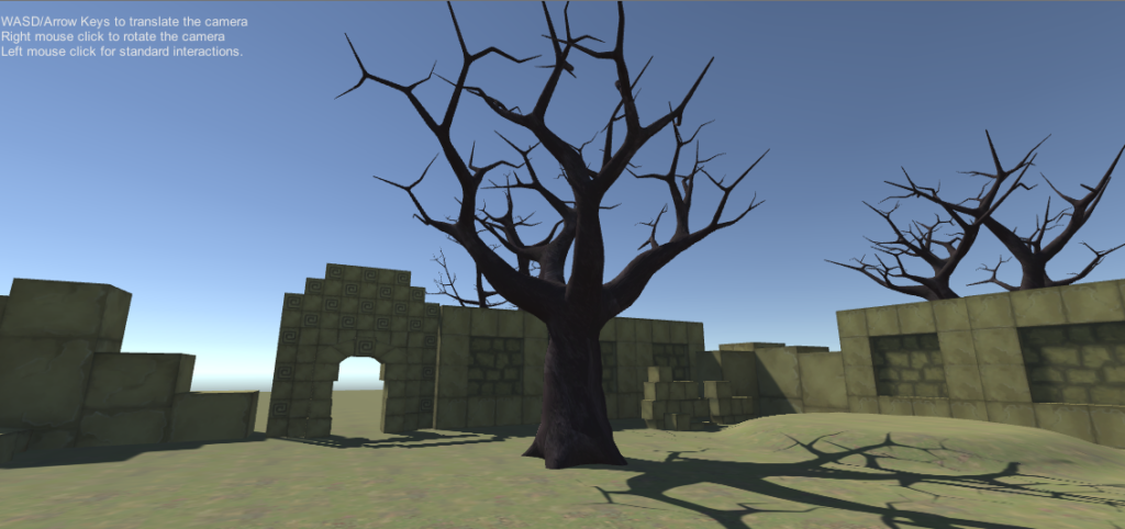
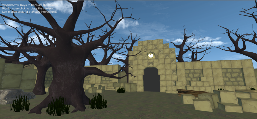
  • Added in walls and ruins from Cartoon Temple Building Kit. The ruins could possibly add more to the narrative…could cause the user to wonder what this place used to be, potentially adding onto a more “cursed” feeling. Decided to make the ruins like four walls surrounding the player so that when the monsters come out it kind of feels like an arena of sorts…adds on to the feeling that the user is supposed to fight the monsters.
  • Added in trees from the Fantasy Forest pack. Have to have trees. 🙂

Progress pic:

April 17

Class playtesting feedback:

  • Simran went first – she first looked around a bit before picking up the statue and throwing it. She eventually picked up the stones and threw them, though she mentioned that the stones look like you’re not supposed to move them because of their placement
    • Perhaps the rocks can shake or tremble to signify that the user can pick them up
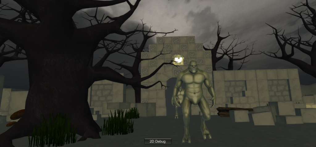
  • Mai went second – she said the monsters were pretty scary, but they look kind of like Shrek.
  • The monsters might be coming out too fast – would be nice if it was slow at first and then became faster and faster
  • Would be cool if lightning struck when the statue was picked up
  • Maybe fire or some sort of goblets could be put up to prevent users from moving away from the center (although you can’t move around that much anyway with the space we are in)
  • Either change the size of the rocks or change the gravity so that they feel heavier…kind of strange that the rocks are huge but easy to pick up. Also makes it seem like the user isn’t supposed to pick them up, because they are so large
  • Maybe limit the amount of rocks there are so that you are forced to use the sword

April 27

Today I worked on:

  • Putting more trees outside of the walls to make the forest more populated
  • Raising the terrain in the background to make everything less flat
  • Putting stones in the background to add variation
  • Putting more decorative objects within the walls: mushrooms, a rock, another stone structure
  • Adding lights to the rest of the doors
  • Finding a skybox for the initial scene (before statue is picked up)
  • Experimenting with a couple floating blocks, but I don’t think it looked that good. Also not sure if we would want these sorts of fantasy elements in the beginning scene, as it would disrupt the sort of “where am I but also this could be somewhere in the real world” initial feeling.

Progress pic:

May 1

Playtesting feedback:

  • Would be cool to have blood when the monsters get hit
  • The headset cable is annoying because it kind of twists around you when you’re playing – would be nice to have it hung up in final presentation
  • A creepy voice would be better than a loud booming voice for the voiceovers

May 5

Today I worked on gathering and creating all of the sound for the game. I first worked on the voiceover instructions:

  • First I recorded the audio, and tried to say the lines kind of creepily:
    • When the user picks up the statue: “The curse has been released…now you must protect the statue or risk releasing the curse forever.” This was taking into account feedback for instructing the user to take care of the statue, hopefully putting into their heads that they aren’t supposed to drop it.
    • When the user loses (either drops statue or monster gets to statue): “You have failed to protect the statue…the curse has taken over….”
    • User wins (kills x amount of monsters): “Congratulations…the curse has been contained, and peace will be restored.”
  • I then found an evil laugh on freesound.org (https://freesound.org/people/Robinhood76/sounds/132252/), which I mixed together with the recorded audio on Audacity.
  • To add a more eerie effect and to also match the sound quality of the laughter, I added a slight echo to the recorded audio.

The next type of sounds I gathered were the background music sounds:

  • First, some sort of calm music was needed for both before the statue is picked up and for after the user wins and peace is restored. For this, I found forest sounds off of Youtube: https://www.youtube.com/watch?v=wKnS8VPxpHI&t=92s
  • Perhaps more importantly is the music that plays when you must kill the monsters. I tested out different music out while listening to the recorded soundtracks on top to see what sounded good, and settled on the intro song in this video about creepy video game music ( https://www.youtube.com/watch?v=-8FN29sHWq8), editing out the rest of the video sounds with Audacity.

And last but not certainly not least, the sound effects:

I then added the scary background music and the first introduction audio when the user picks up the statue to our game. I tried adding in a couple other sounds but was having a little trouble getting the sounds to play, so I will have to spend more time figuring that out!

May 10

Today I worked on the sound effects, the lighting/skybox, the environment, and the blood particle system.

All of the sound effects have now been added into the game, except for a clang sound when the sword first drops to the ground. The way I placed it in the code it was playing but would make a very strange sound at first, like it was starting over and over again. I might also create another sound that instructs the user they can grab the sphere to restart the game if they lose, since one of the feedback we received during playtesting was that it wasn’t clear that the user could restart the game.

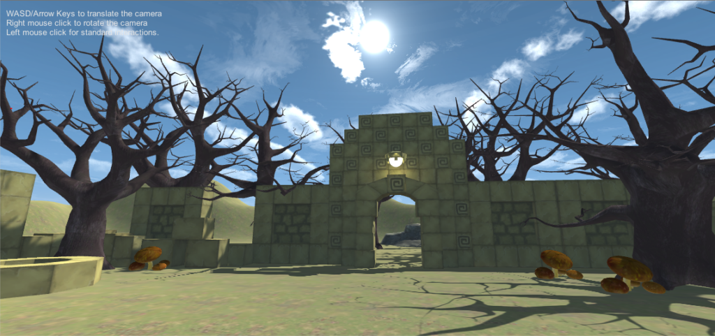
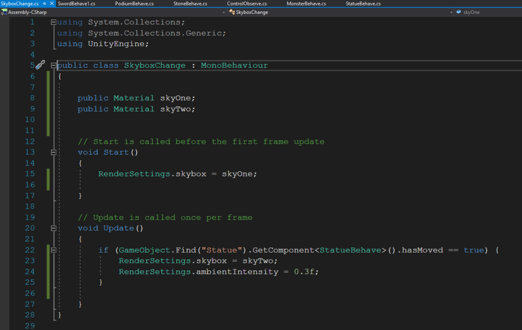
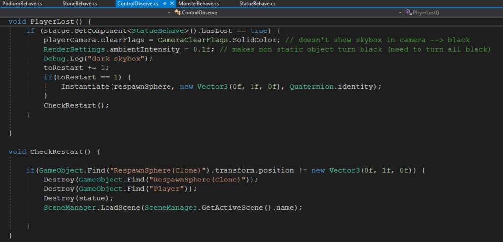
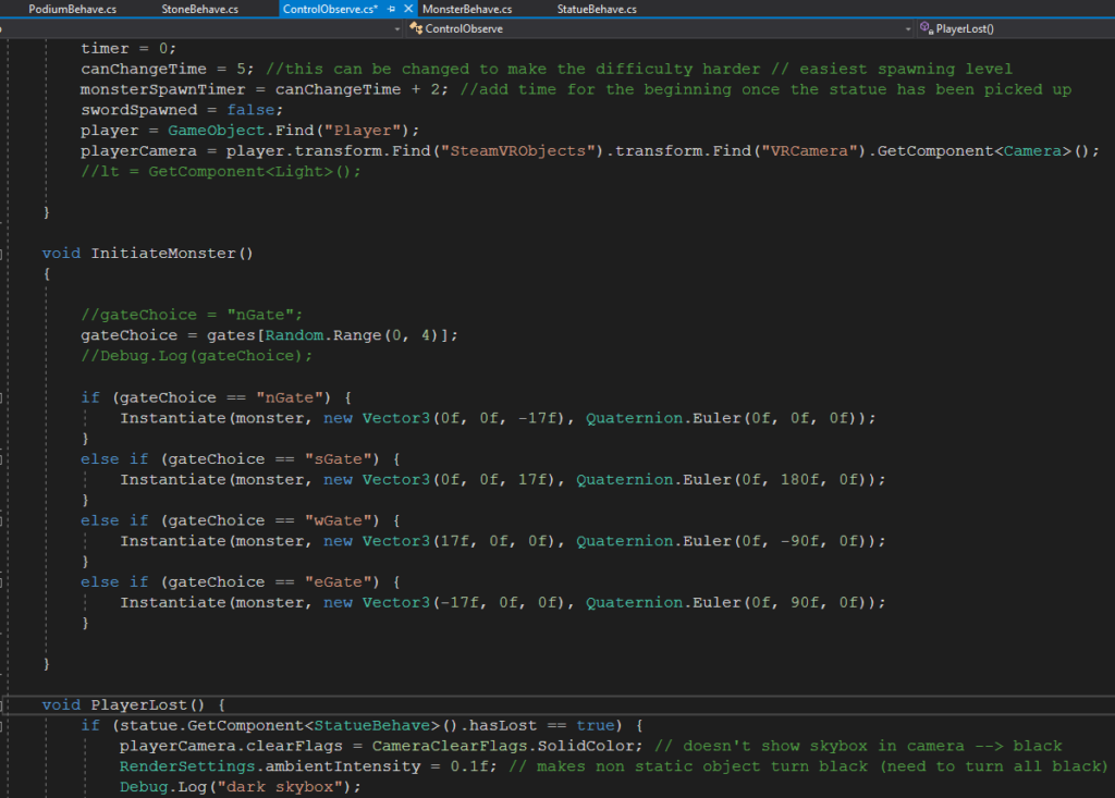
The idea for the lighting is that at first, it will be bright and sunny, but when the user picks up the statue it will become dark and creepy. The sky will return to being bright and sunny once the user wins. I thought it would be easiest to switch the skyboxes themselves between the sunny and creepy situations, and accomplished this through this code (at least partly – to change the skybox back to how it was before I put it in a different script, but with the same concept/logic as this):

However, the ambient intensity also had to be lowered because without this, the sky was dark but everything else was still light.

For the environment, I added more things like grass, logs, ruins, trees, and rocks to make everything look less barren and more like a forest. This was a lot easier to do now thanks to Nico who made a layer to place objects in so that they wouldn’t disrupt the monsters’ movements.

Lastly, I worked on making the blood particle system look slightly more realistic and subtle. I made the particles a darker shade of red, made the circles larger so it looked more like a “gush” rather than splatters, changed the shape from cone to box, turned off the loop, made the particle system play for a shorter period of time, and changed the particle’s texture.


Development Blog [Cursed]

Team: Nico and Cassie

April 2

Initial thoughts

  • smashing/hitting apples from a tree (falling?)
    • Protecting Newton
  • Protecting or moving a dragon egg
    • Something flying at you
    • Have to protect the egg with a shield or weapon
    • Combine with apple idea
      • Protect the egg from falling apples
      • Bird in a cage
      • Instead of an egg, magical stones to be protected
        • Protect from things running towards you
  • Something with cooking
  • Maze or quest for the player
    • Boulder following the player, have to constantly move
  • Skydiving
    • Starting in an abandoned location

Expanding on Protecting Egg/Item Idea

  • Instead of falling with gravity, objects run from in front of player
  • Instead of protecting item, protecting self
  • Indiana Jones sort of scenario
    • Player has stolen an item, now has to protect self and item
    • Evil doers are coming for the player
    • Survive a certain amount of time or monsters/evil doers
    • 3 possible outcomes
      • Drop the item
        • Release the curse
      • Evil doer gets to the player
        • Releases the curse
      • Survive a certain amount of monsters
        • Item transforms
        • Final location, nice scene

Final Idea – Cursed (Protecting the Statue)

  • Initial scenery (first scene)
    • Large open sky area
    • Cave not so prominent
    • Nice lighting
      • Light green
      • Bright yellow
      • Sky blue
    • Outside
    • Large old tree
    • Old run down brick walls surrounding player
    • Mystical statue on a platform closeby to the player
    • Throwable rocks around the statue
  • Picking up the statue (second scene)
    • Lighting changes
      • Nice lighting changes to darker and more evil like
      • Red lights appear above 4 caves, each at a cardinal direction
      • Caves become prominent
    • Statue has a glow
    • Platform lowers
    • Sword falls from above (can be picked up)
    • UI message appears
      • The curse has been released
      • Tells player to protect themself (logic to use sword and stones)
    • Monsters slowly start to appear
      • More start to appear faster
      • Localization of monsters is random
      • Appear behind cave and move towards the player
  • Monster hits player or player drops statue (losing scene)
    • UI message appears
      • The curse has permanently taken over
      • In order to restart
        • Grab another object
        • Maybe no restart
        • Automatically restart
      • Lighting al turns off except for the statue’s glow
  • Destroy X number of monsters (winning scene)
    • Statue is replaced with animated “god” or something
    • UI message appears
      • You have defeated the curse
      • You have destroyed all the monsters
    • Lighting becomes merry
  • Involved scripts
    • Changing lighting
    • Initiating sword
    • Throwable sword, rocks, statue
    • Lowering platform
    • Moving monsters
    • Collision detector for destroying monsters
    • Collision detector for monster touching statue
    • Sound effect
    • UI messages
    • Score in top left/right
    • Potential animation of monsters
    • Animation of final scene statue
    • Restarting game
    • Initiating monsters (randomly) (increase amount with time)
    • Moving of monsters towards statue

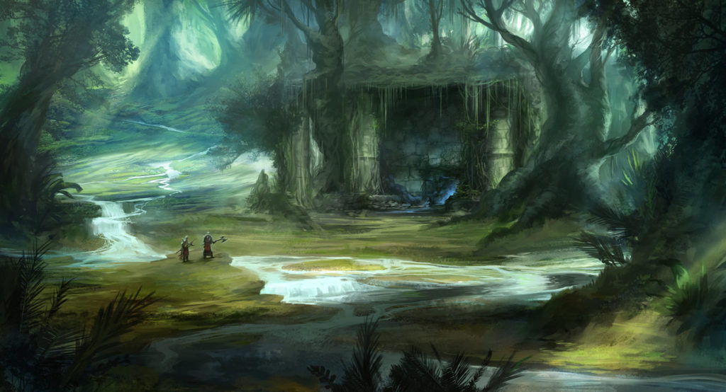
Possible Scenery Inspiration

April 13

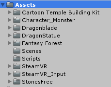
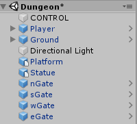
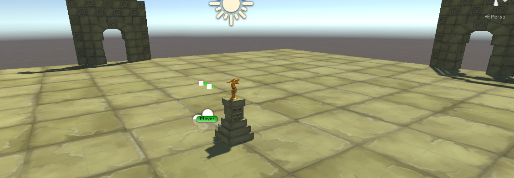
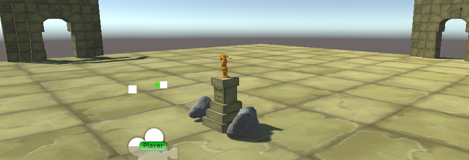
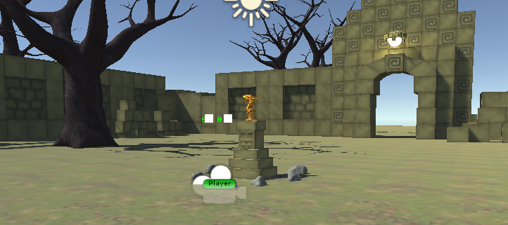
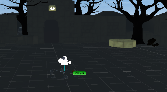
Today’s goal was just to set up the testing area and prepare the Unity file for the project. In order to do that I downloaded all the necessary assets for the project (fig.1). This included all the building blocks for the dungeon, the statue, the sword, the lights, and the stones. After obtaining all the assets, I went ahead and started placing some into the “Dungeon” scene (fig.2). I found a suitable platform for the for the dragon statue, floors that looked decent, and gates that matched. I tried to scale everything to an entertaining size and then tested it out. It is all looking pretty nice, I can see with lights, trees, accessories, and blocks added it, this scene will look a lot like a fully-fledged dungeon room (fig.3). The only issue is that the statue is a bit out of style (too shiny) but that might be useful in catching the player’s attention.

April 14

Today we paper player tested the concept of our games. Cassie fabricated the basic items that were going to be involved in the game and then we gathered a friend of ours to test out the scenario. The items included: the head mounted display (fig.1), the monsters (fig.2), the statue (fig.3), the rocks (fig.4), the sword (fig.5) and the lights, and the podium for the statue.

From the testing (vid.1 & vid.2), we gained some insight into the changes and improvements we needed for our game. The important ones had to do with the voices and narrative structure. It was suggested that we clearing state the goal of the game with a phrase such as “protect the statue” instead of keeping the goal too ambiguous (but don’t go too detailed by saying exactly how). Also more monsters and large ones if possible would be desired. Lastly the idea of being able to place the statue down would make it easier to both throw stones and fend with the sword at the same time. The last idea might not be followed but it was good advice.

April 16

Today, a lot of work was put into the project in order to develop a fundamental basis to continue work off of. Stones were added and scripts were added for each of the object that will need a function (fig.1 & fig.2).

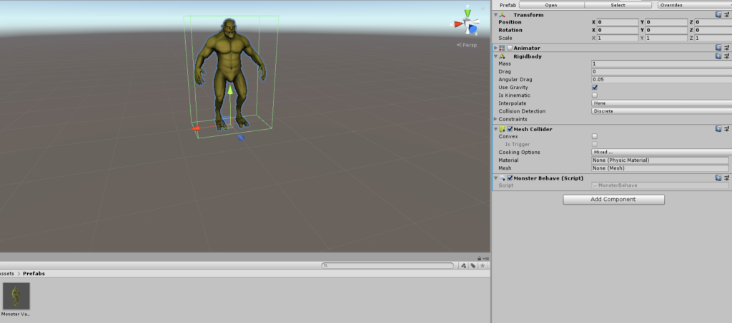
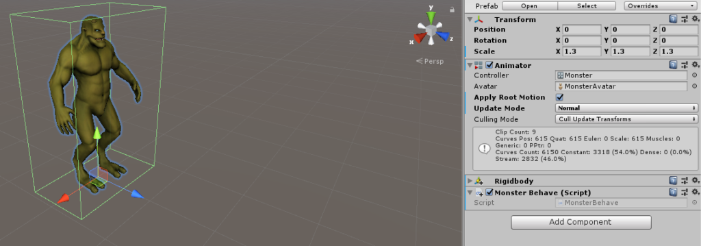
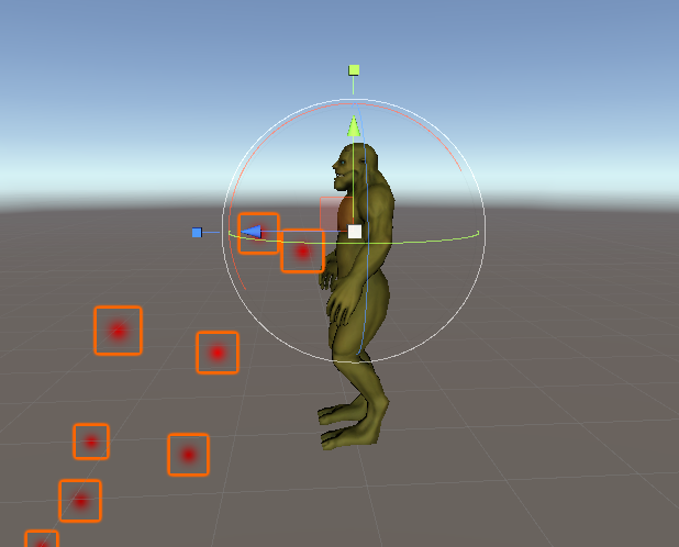
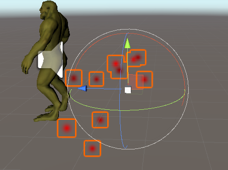
Next, a bunch of work was placed on the monster. The monster came from an asset pack that also involved its animations. The animator was removed just for now, just to keep everything simple for now. A rigid body was added to the monster as well as the script (fig.3).

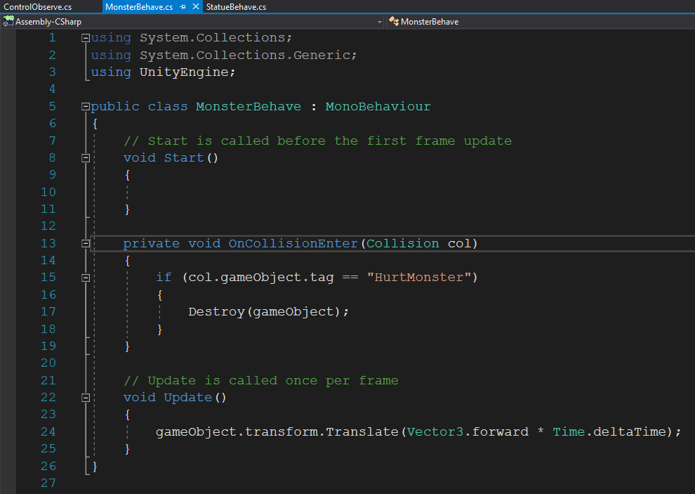
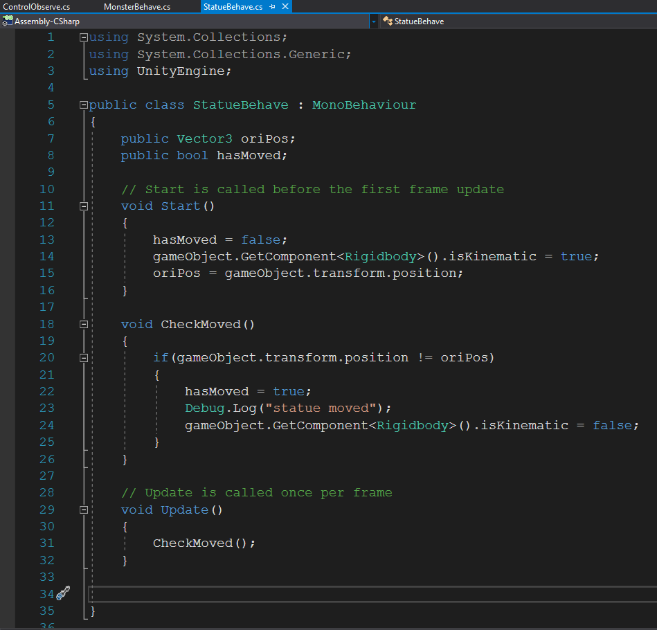
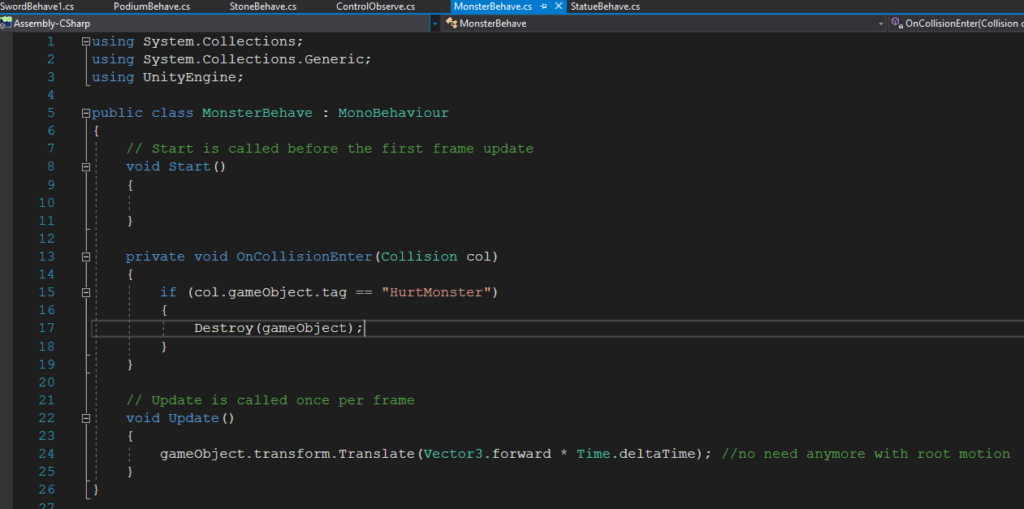
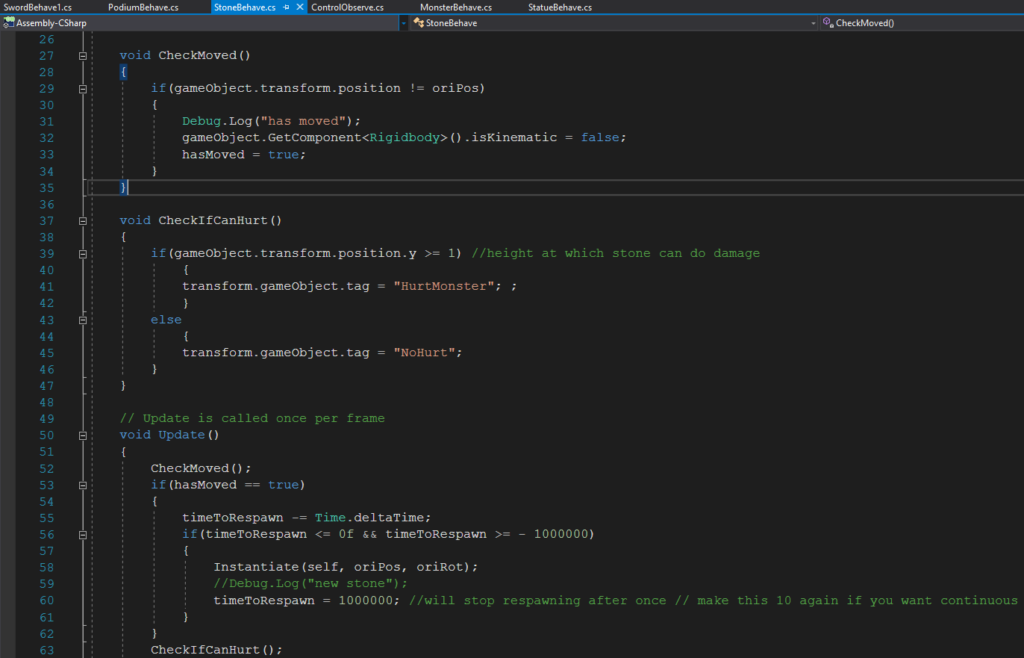
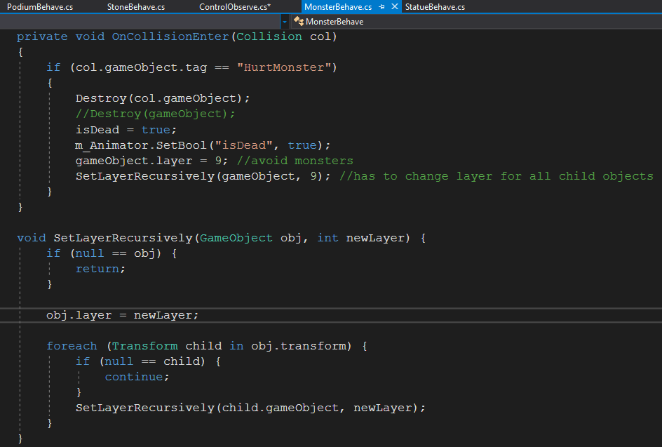
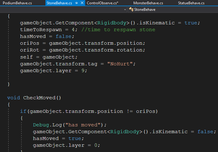
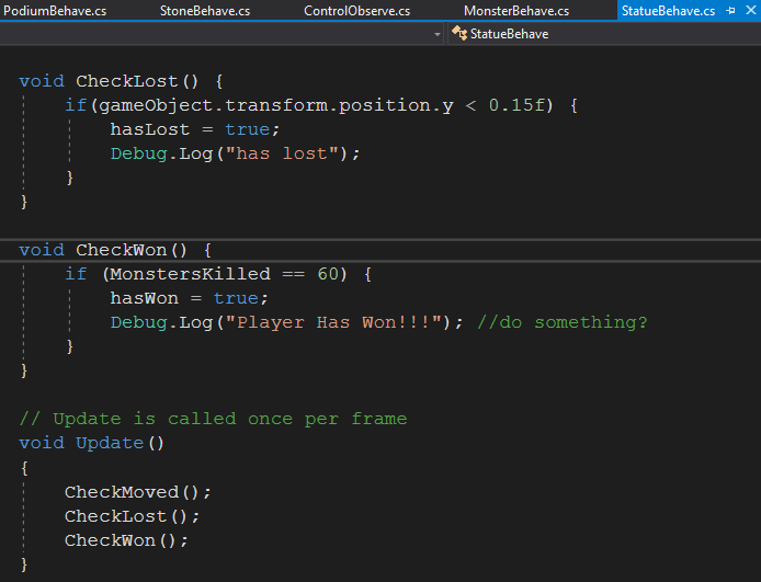
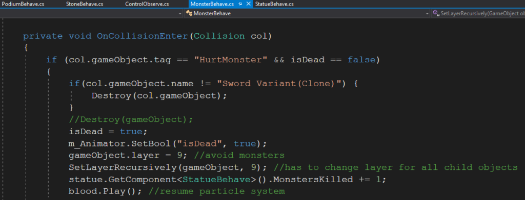
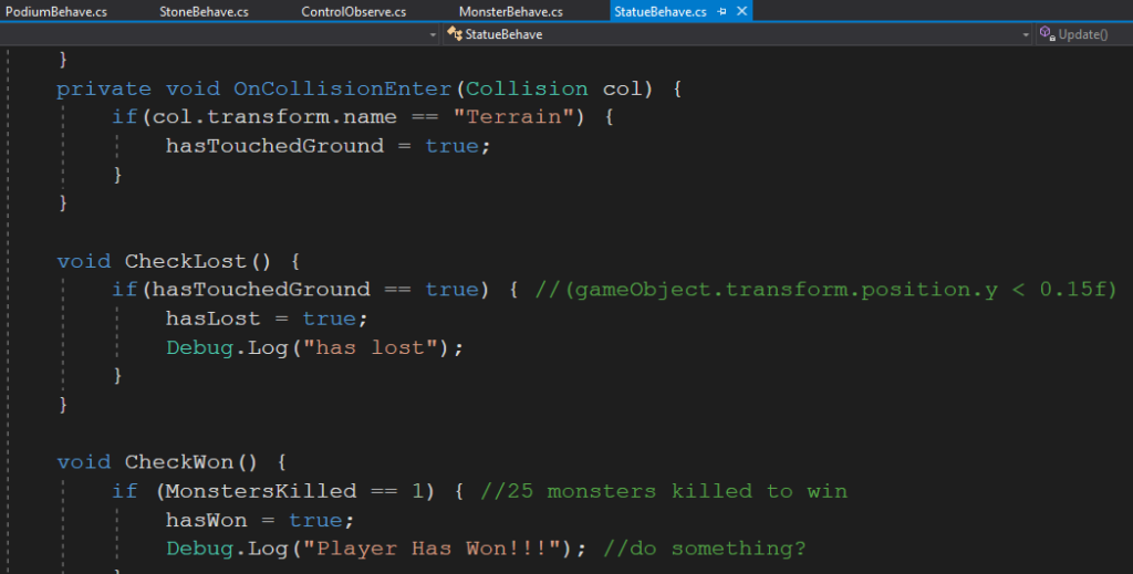
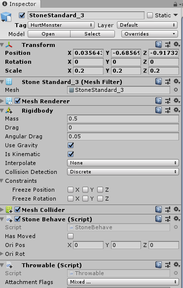
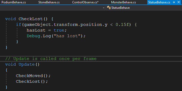
The monster script was quite simple, it caused the monster to move forward one value every second as well as making it vulnerable to any object that has the tag “HurtMonster” (fig.4). The next script that was worked on was for the statue. This script simply kept the statue still and unaffected by gravity until it was moved, at which point it would no longer be kinematic and would also trigger the “hasMoved” Boolean to be true (fig.5). This was used by the control script as an indicator to spawn monsters.

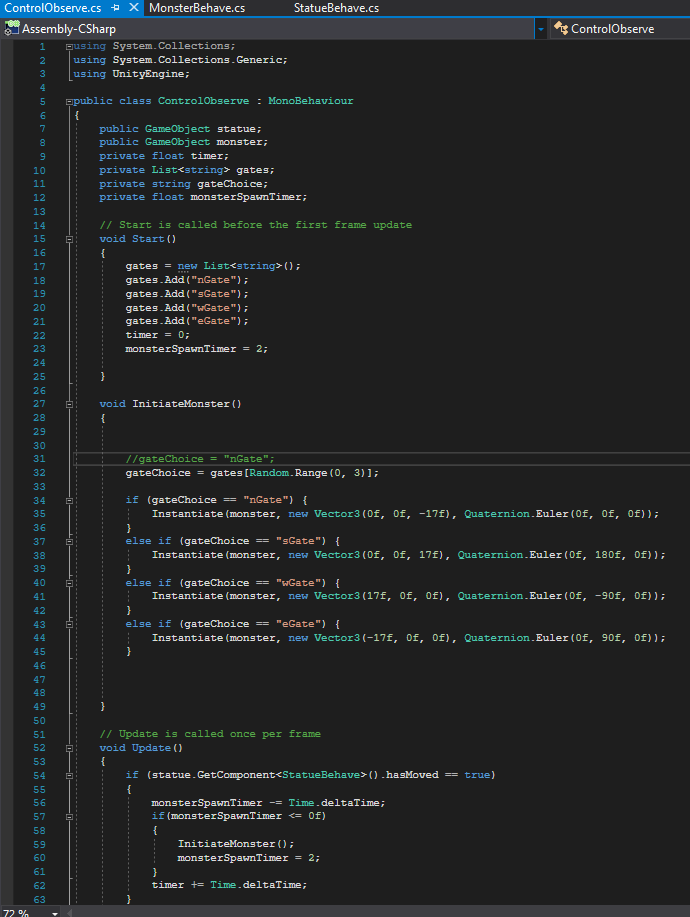
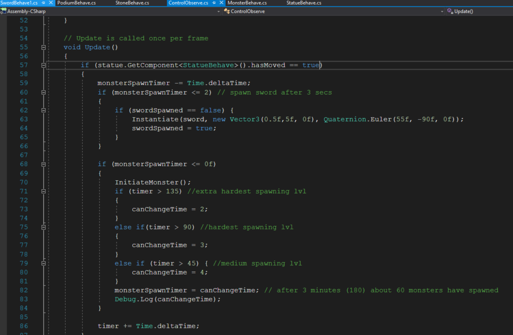
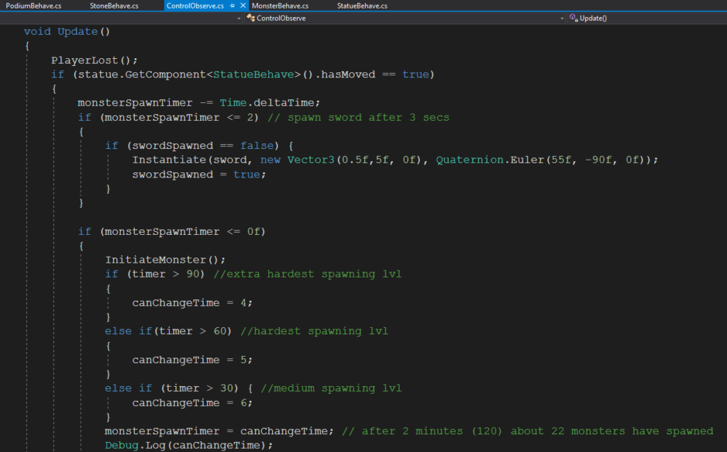
The control script had many parts to it as well (and will have even more with time) (fig.6). It requires the prefab for the monster that is going to be spawned as well as the connection to the statue. Once the statue has been moved, the script will start spawning monsters every 2 seconds. This parameter will eventually be changed to spawn monsters more often as the timer float increase more. The spawning of the monster is also random (placing randomly out of 4 possible gates). This was quite annoying to set up being it required the accurate position and rotation of the monsters to be correct (so that it would walk towards the center). Ideally another script would eventually be added in order to have monsters randomly appear from the diagonal directions as well (just to make it so that the player can’t just move out of the way of the monsters to protect themselves.

April 21

Today a lot of the project and its foundation were worked on. Many scripts were written and many object placement and game testing took place. I continued working on the control script, the statue script, and the monster script but also added scripts for the sword, stones, and podium (fig.1). The two prefabs that were created, with the appropriate scales, details, scripts, and components attached were the monster and sword (fig.2)

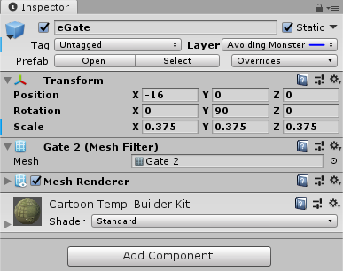
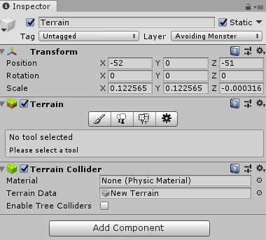
Four major additions were made to the environment. The 4 types of stones were placed around the podium in a circular manner and brought down in scale from before. The terrain was flattened out a bit because it was interfering with the monsters movements. A suitable light source was found and placed were it will be visible and blend it with the gate. The gates and monsters were scaled up in size to give a larger affect; this required some rearranging of objects as well. (fig.3)

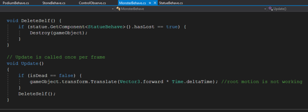
The prefab for the monster had a few features that were worked on in detail. The animator was turned back on and the walking motion was placed on loop (fig.4). I tried turning on root motion to use as more aesthetic walking behavior but it didn’t move the monsters so the previous code to move was retained. The rigid body also needed to be played with a bit in terms of parameters being locked because the monster occasionally would bump off something and start walking into the sky.

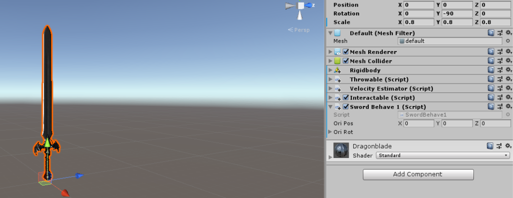
The sword prefab also had some features worked on. The original sword was taken from an asset pack and edited down in terms of scale. It was also made intractable and throwable using the SteamVR asset pack’s scripts. A collider was added and made convex so that it could interact with other object in the game. It was important to mess with some of the boxes in the throwable script because the sword would fall out of your hand slowly as it was being held due to gravity not being turned off. The same issue occurred with the stones, this was an easy fix to apply to everything. (fig.5)

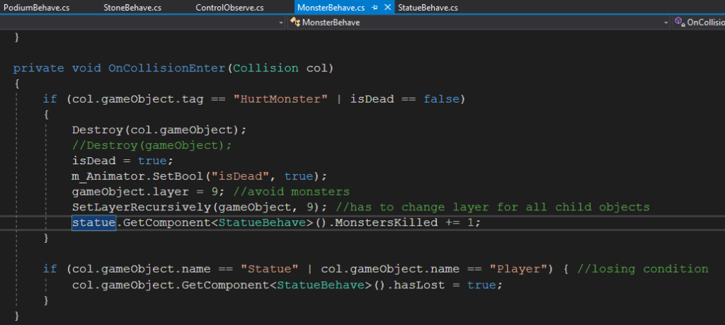
The monster script was kept simple. Since root motion didn’t work the moving forward script had to be kept. A collision detector based on tag names was also implemented. Now items could either have the “NoHurt” or the “HurtMonster” tag that permitted the object to either destroy or damage the monster it hit (fig.6). For now this would be used solely on stones and the sword (at specific times when they were being used).

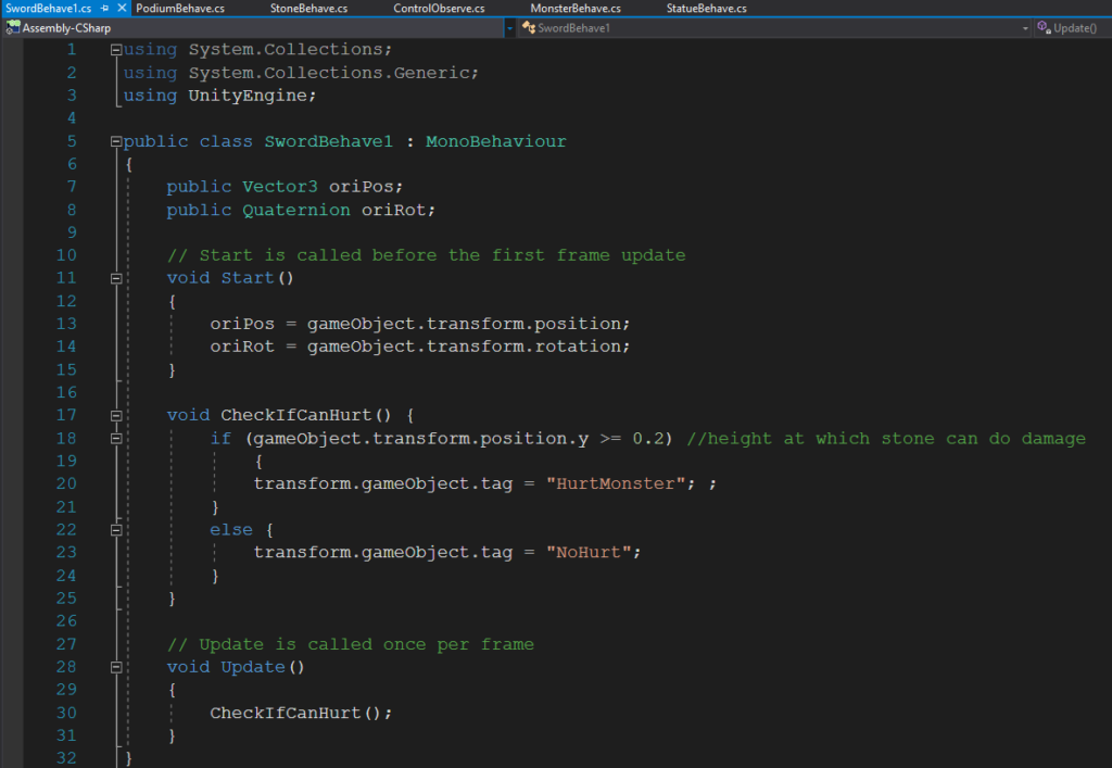
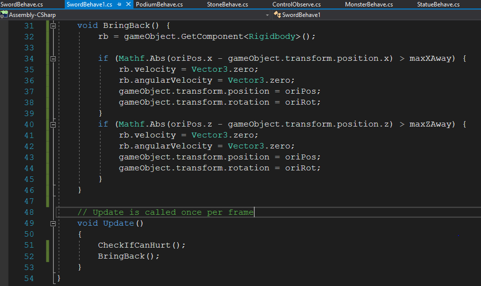
The sword script was created with several features. The original position and rotation was recorded so that the sword could be respawned there if the game were to restart. Also the alternating tags (between hurting and not hurting the monster) was coded for. This was important so that the sword could not hurt the monster when it was on the ground (fig.7).

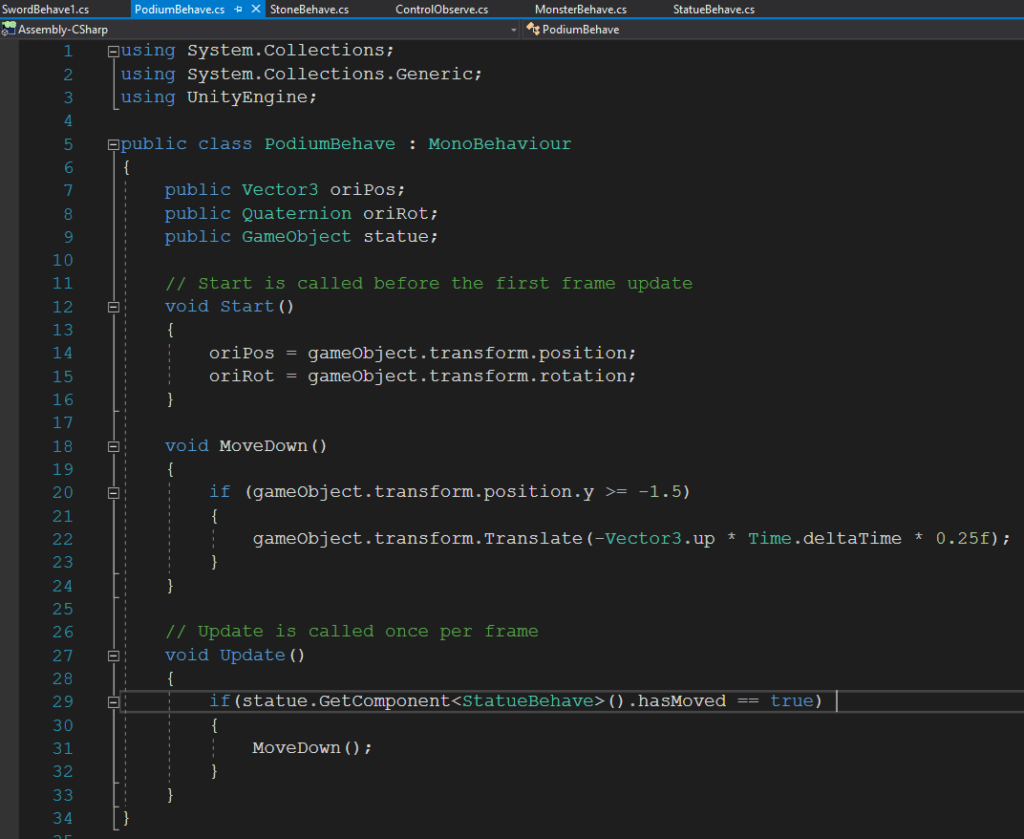
The podium was finally given a script that permitted it to disappear out of sight when necessary). The script recorded its original position and rotation so that it knew how to move and also so that it could be brought back if needed. The podium only moved down (at a reasonable speed one fourth of the scale per second) if the statue was moved (fig.8). It would also not move further than -1.5, just to keep it relatively close and not cause lag to the game.

The script that was written for the stones required a good deal of work and thought. First their original position and rotation was recorded. The stones were also originally set as kinematic so that they didn’t move. If the stones were moved, the kinematic was turned off and a timer would start counting down to respawn a stone at the original location. The respawning doe was written in such a way (that was kind of crude) that it would respawn a new stone only once (this was necessary because otherwise stones would start overlapping and cause the game to have serious lag and issues. The script also check every update to see if the stone could hurt the monsters, the parameters to allow such behavior could be easily altered (for now it had to be at a certain height). Another parameter could be based off of the location, if it was still close to its original location then the stone would not be able to hurt the monsters (meaning it hasn’t been thrown far). There is currently a glitch that I don’t know how to resolve: the first stone that is spawned doesn’t gather any velocity from the hand when it is first thrown (so it doesn’t fly forward but drops down) but once picked up it works normally (fig.9). The stones that then spawn from that stone all behave normally. Also, every now and then the stone loses gravity and just flies away once thrown or bounced on something. These are glitches that could either be maintained to cause difficulty to the player or worked on later on.

The last script that was worked on was the control. I just added some code to this script to spawn monsters more logically and spawn the sword. Once the statue has been moved, a sword will spawn from overhead (the prefab) 3 seconds afterwards (after the podium has gone down) and fall down. This relies on a Boolean variable to not spawn the sword repetitively. The script will also start spawning monsters. It will start spawning monsters every 5 seconds (not shown) but then after half a minute it will spawn monsters every 4 seconds, this will continue increasing till after 135 seconds (about 2.5 minutes) where it will spawn a monster every 2 seconds (fig.10). This mean that after 3 minutes about 60 monsters would have spawned. These times and frequency of spawning can all be easily changed but for now these seem ideal. The spawn frequency cannot go below 1 a second because that is how long it take for the monster to move entirely forward (don’t want monsters spawning on each other).

Lastly in addition to the tags, the layers were played around with a little bit. Two layers were created to make the game more efficient in coding, a “seeking statue” layer for the monsters and an “avoiding monsters” layer for the objects that should not interfere with the monsters movement or behavior (fig.11).

Finally, some important code that has to be worked on: fixing any glitches that were discovered, changing the lighting once the statue is picked up, animating the death of the monster (this should also place them in the avoiding monster layer so it doesn’t interfere with other monsters), having a start or end screen, and implementing a winning and losing condition. Up to this point a lot of work has been put into the project and it looks like a bunch more will have to be put in (especially solving glitches), hopefully it works out!

April 27

Today was another successful day of coding, a substantial amount of progress was made. I started off by tackling the monster movement issue. The very first thing I did was move everything around the monsters trajectory, including the terrain, into a layer that wouldn’t interact with the monster (fig.1). Since I did this, I had to make sure the monster wouldn’t fall through the ground, so I fixed the y position (along with the x and z rotation to keep straight) of the monsters rigid body. After getting the monster’s movement fluid and without stopping, I wanted to animate the dead when hit by a rock. I did this in the animator component of the monster’s prefab. I added a new action (called “Dead”) to the current walk and made a Boolean parameter (called “isDead”) that had to be turned on in order for it to occur. When the monster is hit by something that has the “HurtMonster” tag, then the Boolean within the script for death would turn on as would the Boolean in the animator (fig.2). The falling monster would also be moved to the layer that doesn’t interact with other monsters (“Avoiding Monsters”) as to not inhibit the movement and trajectory (fig.2). A really cool effect of this is that the corpses stay present after their death. An issue I came across was that the dead monster still interacted with other, to fix this I inputted a script I found online that would change the layer for all the children and grandchildren within the monster prefab, function called “SetLayerRecursively”, which worked in the end (fig.2).

Since I noticed that the monsters would be blocked by the stones that were newly spawned (thus not reaching the middle or the statue) I added to the code to fix the issue. I made it so that newly spawned stones were placed in the layer that didn’t interact with monsters (fig.3). I also lowered the time for the stones to respawn since it seemed to take too long. If the player threw the stone at a monster before a new one respawned then it wouldn’t respawn, this was a way to punish the player for using stones at a close distance.

To add to the convenience of the game a bit I made a function that brought the sword back to the original position if it was thrown too far. Since the stones respawned I thought it was only fair that the sword does too. I did this by using the math library and making it so that the position of the sword, along with its rotation and velocity, were set to original if thrown further than 2 in any x or z direction (fig.4).

Finally I attached a losing behavior for the game to the statue’s script. Currently, only if the statue fell below a certain level (on the ground) would the player lose (fig.5). I gave room for the possibility of cheating the system, you could make a platform of stones or place the statue on a dead monster and you would not lose.

I made a change in scenery for the when the player supposedly lost. With a lot of difficulty I found the main camera within the player and found a way to alter the skybox so that it became black when the player lost. I found this through trial and error. Turns out that if you change the “Clear Flags” of the main camera from “Skybox” to “Solid Color” then the beautiful skybox would be turned to a single color quickly (fig.6). This gave off a strong effect for when the player lost. I also made it so that the ambient light intensity would be set to very low when the layer lost, which turned a lot of the environment dark (fig.6). I found out that this would only work on non-static objects. Ideally, I would find a way to turn everything dark.

The control script is getting a bit hectic because I am slowly realizing how inefficient my coding is (stating things more times than they need to be and writing too many lines). It is a bit too late to fix this because it would take a lot of time to redo but it is a good learning experience. I think so far the game is looking good. The next few steps necessary for the coding is: adding more losing conditions, fixing the losing condition, making a winning condition, counting the number of monsters killed, and making a method to restart the game (perhaps with SceneManager.LoadScene(SceneManager.GetActiveScene().name).

April 30

Having in mind what I wanted to do today, I created 2 new materials and a new prefab that I was going to use (fig.1). I created a dark looking material for the planes from which the monsters will emerge (fig.2, naturally set in the “Avoiding Monsters” layer as not to interact with the monster) and a glowing purple material for the respawn sphere that will let you restart the game if desired (fig.3).

I then went ahead and made it so that the player could indeed restart the game if they lost. I did this in a roundabout way, when the player loses everything turns dark but a sphere will appear. This sphere (which is glowing) can be interacted with. A voice will tell the player that they can try again by grabbing the sphere. Grabbing the sphere will then reload the scene (fig.4). When I first tried running this code I noticed that some objects would be carried over into the reloaded scene. This caused issues because some of the scripts would malfunction due to there being multiple objects with the same name. Also, there would be too many statues, swords, and stones, which made the game very different. I added a section to the code that deleted the sword, player, and statue before reloading but I decided to keep the stones (fig.4). I think this would be enjoyable because it would give the player a bit more of a head start and would also allow them to strategize their placement of stones ahead of time (simply gave a bit more character to the game). I noticed that in the reloaded scene the stones and statues would have the issues of not taking velocity from the hand after being thrown (the first time). I don’t know how to fix this but I think it might be reasonable to keep it in the final version of the game because it is a disadvantage that balances out with the advantage the player obtains from restarting.

I also noticed that the monsters would continue to spawn and walk towards the player once they had lost (or won) which seemed aesthetically displeasing. There was also the issue of them (and the corpses) being reloaded to the next scene after a restart. To fix this I made a very simple addition to the code for the monsters. I simply made it so that when the player lost, the monsters would delete themselves (fig.5).

Though I didn’t actually code for the winning scene I wrote the code that prepared for it (as well as the losing scene entry way). If the monster collided with the statue or the player (depending on the name of the objects) the player would lose (fig.6). I might have to change this later on so that it is only the statue because the monster can quite easily collided with the player (even when as a corpse). I also made it so that the player would gain one point every time a monster is killed and will win once they kill 60 monsters (fig.6 & fig.7). As I am writing this blog I noticed an error in the code that needs to be fixed; currently the sword will get destroyed once it interacts with the monsters because it has the “HurtMonster” tag. This needs to be made into an if condition. Also the current if condition needs to have the “or’ operator turned into an “and operator”; currently the player could win simply by hitting a corpse repetitively with the stone or sword.

I think the coding for the game is getting close to its end point. To finalize, I think I need to code the winning scene and fix some bugs with the reloading and the throwing. If necessary, I can also make it so that monsters spawn form the diagonals every now and then. I like how the game is looking so far.

May 5

I started off by fixing something that I thought was made the game unnecessarily inconvenient. I made it so that the losing condition only took into account when the statue touched a monster and not when the player touched a monster (fig.1). I also placed the player in the “Avoid Monsters” layer. This made it so that the monsters would walk through the player to reach the statue.

Another aspect I wanted to fix was the difficulty level of the game. From player testing I understood that the game was a bit too difficult because monsters spawned too quickly. To fix this I decreased the spawn rate. I started at every 7 seconds then 6, 5 and finally 4 (fig.2). This meant that after 2 minutes close to 25 monsters would have spawn. This is the amount of monsters to kill to win.

Next, I wanted to add a blood effect to the monsters. I made a particle system that looked mildly like blood splatter and attached it to the chest of the monsters (fig.3). I found the right parameters mostly through trial and error. I then added code in the “death of monster” section so that it would play the particle system when the monster died (fig.4). This meant that the blood continued inevitably till the player won or lost. Also, the particle system didn’t collide with anything which fixed a few bugs I had in the previous project.

I fixed the losing condition from dropping the statue. Originally it was based on the y position of the statue but do make the system more accurate I based the touching on collisions. Now, if the statue collided with an object named “Terrain” (the ground) then the player would lose (fig.5). This also permitted me to add into the game a small Easter Egg which I do later.

To balance the losing condition, I added a winning condition. Now if the player did indeed kill 25 monsters then the previously turned off directional light would be turned on (fig.6). This made the scene a lot brighter and does indeed feel like success. I had to destroy the statue in the winning scene or else the player would still lose when dropping it. I made it so that there was no more replaying after winning; that is the end of the game.

Finally I worked on the Easter Egg portion. I first made it so almost all of the objects were not static. This made it so that I didn’t have to deal with the baking of light maps and so that everything turned dark or bright with the change of light (fig.7). This is not a perfect method but since there are not too many objects in the game there won’t be much lag. There is one hollow shape that doesn’t turn black when the player loses (fig.7). If when the player is defending themselves, they can throw the statue in the hole and not lose. This makes it so that the player doesn’t have to worry about the statue when fighting. I am thinking of making it so the player automatically wins when they throw it in there.

So I think all the coding for the game is pretty much done. Now all that has to be done is the addition of sounds and a few touch ups.

May 10

I spent way too much time trying to fix the glitch where the stones would not fly after being thrown (only after the scene reload). I found out that it had nothing to do with my script though a lot of trial and error. In the end I found it to be a problem with the throwable script. I just had to prevent the script from turning the object kinetic when it was being picked up (fig.1). This was done in the “Attachment Flags.”

I then went ahead and corrected the blood splatter particle system. I found out that adding an animation to a character doesn’t move all the objects within the prefab. I order to make it so blood came out at the right place when the monster died I just placed the particle system where the chest would be when they fell (fig.2).

Lastly I added a flat sphere (since there are no circles) to the bottom of the statue (fig.3). Originally the statue was see through at the bottom so this fixed that issues.

Done.