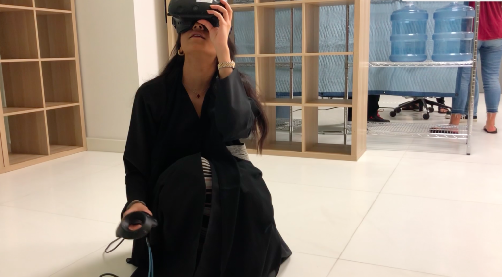
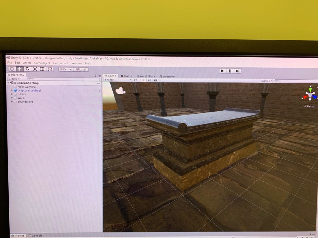
Project 3 Development Blog


Final Documentation: https://alternaterealities.nyuadim.com/2019/05/19/project-3-documentation-3/

April 8,

Project Title: Windows XPerience

Team member: Junior, Ju Hee, Adham

For this project, we will go back in time to revisit a staple piece of technology: a Windows XP computer with the classic green valley and blue sky background. Our inspiration came after a rigorous brainstorming session were we touched base on a lot of ideas that interested us. After presenting some of the ideas to the class and after further deliberation amongst our group, we decided that this idea provided the best balance between abstract storytelling and realistic implementation considering the timeframe and themes available. The theme our piece will be based on is: “close the door” and we hope to do so in an interesting way, giving the user the possibility to decide the ending of a story where, inevitably, the door will be closed.

As seen in Scene 1, the user will be in a room with his old-style windows computer appearing in front of him/her. As he/her clicks on it, he will be sucked inside the computer, shadowing the idea presented by Richard Moore in the Disney Animated film Wreck it Ralph 2. In order to escape the computer, the user will have to click on a set of icons in a predefined sequence. Each icon will transport the user into a different scene, and it is up to the user to click on the right set of icons to escape.

Possible Assets:

  • Windows XP Icons
  • Furniture for the room
  • Laptop
  • Paint brushes (Paint Program)

Interactions to Design and Code:

  • Clicking on the icons
  • Scene Manager to move from one scene to another

Sound:

  • God-like voice that tells the user the situation he is trapped in and gives him clues to possibly escape the computer
  • Sound effects for clicking on different icons
  • Sound effect of getting absorbed into the monitor
  • Peaceful background music when the user is in the green valley

Lighting:

  • Stark contrast in lighting between the room and the inside of the computer.

April 12

In preparation to this project, I decided to start looking into different logistical things that need to be figured out later on but will be beneficial to do so early in order to maximize workflow efficiency amongst all of the team members. First off, I thought it would be a good idea to think of ways we could use GitHub in order to work simultaneously on different portions of the project. As such, I created a GitHub repository to ease collaboration:

https://github.com/jgarcia1599/Windows-XPerience

Link I used to setup the github repository:

Something else I decided to start looking into was the different options we could look into when designing the User Interface of our project. The UI can be manifested in different ways, but one of the clearer options is to add a beginning and end screen to add a conclusive narrative to our piece.

Useful links:

April 14

In preparation for the rough prototype deadline tomorrow, we decided to build a rough version of our two initial scenes in order to show the class the direction our project might go into.

We started with a blank scene, and we added a monitor we got from the asset store. One of the problems the monitor was giving us was that its screen had a predefined animation sequence. We had to remove that and change the canvas of the screen to the Windows XP background.

We also created the second scene, which was composed of a terrain object we modified by changing its colour to green and by playing with the edit height/edit texture tools to create mountains (really bad ones as it is a prototype).

We also added the interactable script (and all of its dependent scripts) from the SteamVR library to the monitor and the icons. We also added a sceneswap script to the monitor. This script checks a change in the transform.position.z (any coordinate variable could be used to make this logic work) of the monitor and unloads the current scene and loads the new scene whenever this change occurs.

April 15

Playtest Session #1

In class, we were able to get meaningful feedback from the class from our Playtest session. One of the problems our project has is that it can go into many different directions. Since there is a lot of staple icons we could recreate in our project, each of them would require an ample amount of work to the point where each one could be a project in it of its own. For example, recreating a Paint icon that would allow users to create any form of Paint-generated artwork could be a project that exploits the artistic capabilities of Paint in a 3D virtual-reality environment. As such, we heavily rely on Ideation and Feedback sessions like this one in order to narrow the focus of our project.


This is some of the feedback we received in class after playtesting our prototype:

  • Keep interactions and everything in one scene
  • Virus takes over the computer. You need to defeat the virus
  • Maybe after you defeat the virus you become king

Generally, people would like to fight against some of the iconic enemies you can find in a computer (a.k.a a virus). Maybe giving the user a predefined task like this one could narrow the focus of our project as it is really open-ended as of right now.

April 17

Having Sarah Rotberg in class was definitely useful as it brought to our attention something that we did not previously consider. She recommends her students in her VR class that their projects should keep the users entertained for a minimum of three minutes.  Even though we didn’t have time in class to present our project idea to her, this feedback is useful as we are looking at ways of narrowing the focus of our project. Maybe giving the user a task to do could be too short of an experience. The idea that we have right now is to make the user submit an assignment. However, in terms of the VR context of our project, how could we recreate a physical manifestation of such an Internet-based task that is engaging enough to keep the user entertained for a minimum of three minutes?

April 21st

Playtest Session #2

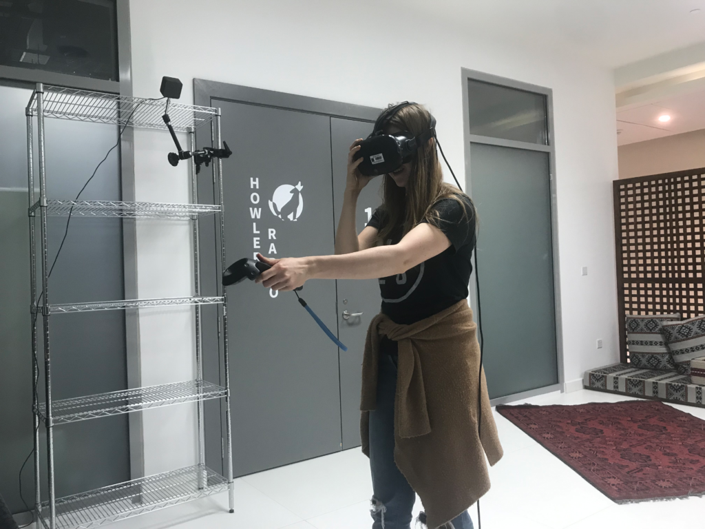
In order to have a better, more complete idea of the way we would like to direct the user towards a sequence of actions he/she must complete in our project, we decided to playtest our prototype with our friends without giving them any clue of what our project is about. Attached is a video of our playtest session:

Lauren
Steven

After letting our friends play our prototype, this is some of the feedback we received from them:

  • Things they liked:
    • They liked playing with the boxes
    • They had the sense that they were getting inside the monitor
  • Things they didn’t fully understand:
    • The transition from the monitor scene to the inside of the monitor scene wasn’t clear. Maybe have a loading screen or a shaking of the camera that creates a pause and indicates a transition from the room to the inside of the computer.
  • Things we could do to make the experience better:
    • Interact with something iconic on the internet (error 404 guy, google chrome dinosaur)

Based on our playtester’s feedback and our previous idea of submitting an assignment, we would like to combine both ideas into one. The iconic character our users would be interacting with is the jumping dinosaur in google chrome. We chose this character in hopes that it is iconic enough for any common user to familiarize with and to incorporate the internet on a controlled environment that is both technically feasible and significant enough to send our message across. This message, we hope, is to allow users to physically engage in a computer-based task in a way that takes full advantage of Virtual Reality.

Task Division:

Junior (Interactions):

Scene swap (done)

Throwing objects (done)

Make a bunch of papers appear from the folder after its thrown

Grab one of the papers and put it close to the google chrome icon

Make a dinosaur appear that jumps

Dinosaur wants to get close to you and jump on you

Attack the dinosaur with the folder

Juhee (Scene Design):

  • Room scene
  • Green valley (inside the computer) scene
  • Stuck in the internet scene
  • Google chrome scene

Adham (User Interface and sounds):

  • Beginner and ending screen(2) (one for each ending)
  • Instruction to users on what to do on each step of our story (either by a UI canvas or through sound)
    • When inside the room, the user must touch the computer
    • When in the green valley, the user must throw the folder to make a bunch of papers appear, grab the final version of the paper, and put it in google chrome
    • When inside google chrome, the user must attack the dinosaur with the assignment three times and he shouldn’t let the dinosaur jump on him
  • If the user wins, then he should go back to the original scene and he should be notified(somehow) that he has successfully submitted the assignment
  • If the user loses, then he should be indicated that he has been stuck on the internet.
  • Sound effects that indicate transition from one scene to the next.

April 24

Today I had a really useful Idea-critique session with Sarah. She mentioned a couple of things that we must bear in mind as we try to finalize our project’s concept:

  1. Google Chrome dinosaur signifies lack of connectivity: This is an important piece of information that we must keep in mind. Our original premise was that after the dinosaur killed the user, the user would be stuck on the Internet and lose the game.  How can the user be stuck on the Internet if the dinosaur only appears when there is no internet connection in the monitor? As such, we fixed this logical mishap by making the user restart the game. This not only fixes our storyline’s logic but also extends the playtime to the user as it makes him/her play the game a couple of times until they are able to beat the dinosaur and submit the assignment.
  2. Kill the dinosaur with a cactus: Before, we wanted the user to kill the dinosaur with the assignment. However, Sarah recommended that we could give the user a cactus to kill the dinosaur as that is what actually kills the dinosaur in the real-life version of the game.

April 27-28

One of the main things that we must accomplish is to make the dinosaur jump and follow the user. As such, I created a script that follows the user (namely the target) and starts jumping after if it reaches a certain distance from the user. In every frame, I calculate the vector3 distance and the magnitude between the dinosaur and the player and I make the dinosaur aim at that direction and change its transform every frame with a predefined speed.

Made the jumping dinasour script

using System.Collections;

using System.Collections.Generic;

using UnityEngine;

public class followTarget : MonoBehaviour

{

   public GameObject target;//the target dinosaur will go to are going too

   public float speed;//the speed of enemiess

   public float jumpingdistance;//distance between object and target

   public bool jumped = false;

   public float jumping_height;

   void Start()

   {

   }

   // Update is called once per frame

   void Update()

   {

       Vector3 path = target.transform.position – transform.position;//calculate the path to target

       path = path / path.magnitude;//calculate only the direction of the path

       if (Vector3.Distance(target.transform.position, transform.position) <= jumpingdistance && jumped == false) //&& to_jump == false && jumped == false)

       {

           path.Set(path.x, jumping_height, path.z);//set the path to the jumping height

           transform.forward = path;//make enemies look forward to the target

           transform.position = transform.position + speed * path;

           jumped = true;//use jumped boolean to avoid infinite jumps

       }

       path.Set(path.x, 0.0f, path.z);//set the path on the ground

       transform.forward = path;//make enemies look forward to the target

       transform.position = transform.position + speed * path;//move enemies with speed “speed

   }

   void OnCollisionEnter(Collision collision)

   {

       if(collision.gameObject.name==target.name)

       {

           Vector3 backwards = new Vector3(transform.position.x – jumpingdistance, 0f, transform.position.z – jumpingdistance);

           transform.position = backwards;//make the enemy go backwards if it collied with the player

           jumped = false;// set the boolean backl to false to restart the jumping action

       }

   }

}

I also made the destroyer script that destroys the player after it has been jumped on 3 times. Instead of destroying, the player will be sent back to the initial scene to start all over

using System.Collections;

using System.Collections.Generic;

using UnityEngine;

public class objectDestroy : followTarget

{

   // Start is called before the first frame update

   void Start()

   {

   }

   // Update is called once per frame

   void Update()

   {

       if (jumpcounter==3)

       {

           Debug.Log(“You died”);

           Destroy(target);

       }

   }

}

One of the problems I encountered while making this script was that the user could not be detected during game time. This comes as a result of using the Scene Manager, which has two simultaneous scenes running: the scene the user is currently in and the “DontDestroyonLoadScene” which carries the user (and any other objects the user was carrying from the previous scene) into the new scene. I didn’t fully comprehend the complexity of this problem as I was prototyping the jumping interaction in my computer with boxes.

Given the little time, there is between today and the project submission, one solution that was proposed to me by my classmate Max is to include all of the scenes into one and just change the transform.position of every object into the position of the new scene.

May 3-5

This weekend I worked on Instating Paper objects whenever the folder Icon collides with the ground. We also worked in finishing up the green valley scene and in uniting all 3 scenes into one to bypass the “DontDestroyonLoad” Issue.

What this script does is that it instantiates a new paper Game Object after every collision the folder has with the terrain. The paper was created out of an empty cube object that was then given its paper look by adding a paper material on it. There is also a counter that limits the number of papers that can be created after every collision with the terrain (10 collisions maximum). I also created a Random Number generator function that creates a random number between a range of number (for this project, this range is set between 1 and 10) so that an assignment paper can be instantiated only once and randomly. The assignment paper is the same as the other paper objects with the addition that canvas was added on top of it with the text “Assignment”.

Juhee and I also worked on doing the final touches in our Green Valley scene. We fixed the mountains and changed the skybox to one with more clouds that are vanishing as we thought it gave the scene a more invigorating, powerful feel to it. The mountains were also carefully designed for, not too big or not too small, in order to best recreate the vintage Windows XP look.

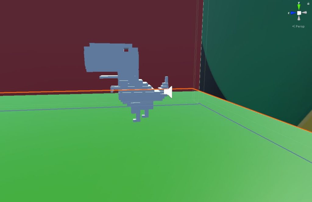
Juhee also spend a fair amount of time designing the dinosaur object. She made it out of a lot of cube objects to give it its iconic, pixelated look.  

We also decided to create a Google chrome world, one that sends the message across that the user just landed in Google Chrome but it an abstract way. We also wanted to give the world an appearance similar to that of a combat studio as the user would be confronted, 1v1, with the dinosaur. As such, we went with a confined box environment, which creates the solitary, depredatory aura that we want the user to feel. We also decorated the box with Google Chrome’s iconic green, yellow, red and blue colours on the sides of the cube, with one side being the google chrome icon itself in order to let the user know where they are at all times.

Finally, we decided to merge all three scenes into one scene in order to bypass the “DestroyonLoad” issue that we had as our player traversed one scene with the other. In order to do so, we made all the Game Objects in the 1st scene and the 3rd scene as children of one empty game object respectively. Then, to avoid any issues as this is a major change, we copied the entire Project File to perform all the major changes in a copy. We then copied the two game object’s from the Project copy’s assets’ folder in the into the Original Project’s Assets Folder. This allowed us to drag and pull the entire scene from our projects asset’s folder inside the 2nd scene(Green Valley Scene).

This merging also required us to change the sceneswap script we had. Instead of using the SceneManager, we just changed the transform of the object to the position we wanted them to be inside the scene.

May 7

Playtest Session #3

Given that we have the scene transition and the dinosaur script done, we wanted to see how the an user would react to this additions so we could get feedback on the experience we are subjecting our players to.

Steven beating the dinosaur

Here is some of the feedback we got from this playtest session:

  • The size of the dinosaur is nice because it makes you feel like there is a threat.
  • Add some form of feedback that lets you know where the dinosaur is once you arrive at Google Chrome
  • The premise of the game is cute, and I would like to continue playing it even more.

May 10-12

This weekend, we focused on finalizing the final interactions necessary for our game to be complete. So far, we have the assignment instantiation, the scene swap, and all three scenes merged into one. Now, we need to finalize the winning and restart conditions, finish the dinosaur script and fix the monitor’s destruction (the object is still carried by the user as it moves from scene 1 to scene 2).

To fix the destruction of the monitor’s script, a simple script attached to the mailbox sufficed.

using System.Collections;

using System.Collections.Generic;

using UnityEngine;

public class Destroymonitor : MonoBehaviour

{

   public bool changed;

   public float initz;

   public float currentz;

   // Start is called before the first frame update

   void Start()

   {

       initz = gameObject.transform.position.z;

       changed = true;

   }

   // Update is called once per frame

   void Update()

   {

       currentz = gameObject.transform.position.z;

       if (changed == true)

       {

           if (initz – currentz > 0.02f || initz – currentz < -0.02f)

           {

               Destroy(gameObject);

               changed = false;

           }

       }

   }

}

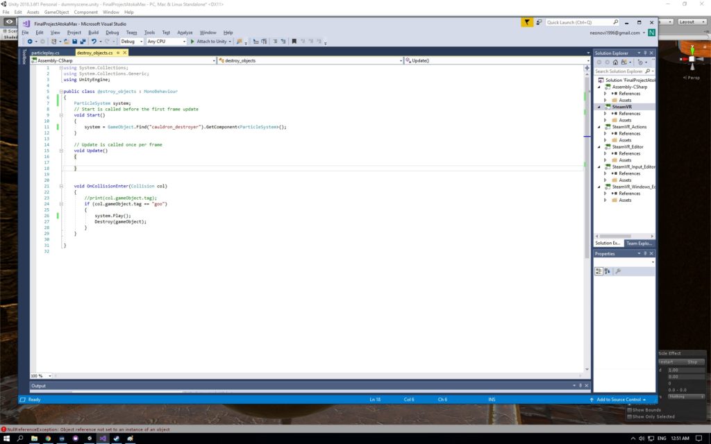
As highlighted above, after there is a change in the transform.position of the monitor, the object will be destroyed.

Another major change that we had to achieve to achieve our project’s full fruition is the dinosaur script. This script has a lot of major components that deal with major parts of our project and such will be explained further in the upcoming paragraphs.

Vector3.Movetoward: This function simplified my code immensely. It boils down a lot of the code that I did before to make the dinosaur follow the target as it literally makes the object follow the object with an incremental change in position after every frame and it also changes the rotation of the object so that it looks at the target.

Rigidbody.addforce: Before, I was trying to literally hardcode the position the dinosaur had to be when it jumped, which seemed unnatural as the dinosaur would disappear and then appear somewhere in the air and then fall down. By setting the ForceMode to Impulse and determining the position in space you want the dinosaur to be after the jump, this line of code creates a natural jump of the object to the desired height.

Quaternion. Euler: Something that was happening after the force was added to the rigidbody was that the dinosaur would move amongst its own axis in space. In order to stop this, I froze the rotation of the Game object using the quaternion.euler function in the Update function so that it remains in place within its own axis after every jump.

Lives and hit counter: The lives and hit counters are an essential variable in the dinosaur that determines a lot of functionalities in my project. Whenever the number of hits is equal to the number of lives assigned to the dinosaur in the inspector, the mailbox appears. The mailbox then detects a collision between itself and the assignment to determine the win condition. This can be further appreciated in the mailbox script I attached to the mailbox.

Coroutine and Delay function: I also learned about coroutines and implemented them in the script as well. I used them to cause a delay between every jump as the jumps were happening very frequently frame after frame. I also added the coroutine on the collision detection so that the number of hits between the dinosaur and the player was reduced as a lot of collisions were happening frame after frame too.

The winning and losing conditions of our project were determined by two scripts attached to the mailbox and the player respectively.

This script detects the collision between the mailbox and the assignment. If this happens, the entire scene is reloaded as the player won the game. Dealing with the SceneManager was definitely one of the biggest challenges I had with Unity this semester. Something that I learned after hours of testing different strategies in order to restart an entire scene was that the best way to achieve this is by deleting all of the game objects of the scene (including the player) and then loading the new scene. As such, I found this function “DestroyAllGameObjects()” that iterates through the entire hierarchy and deletes every single game object. I call this function before unloading the current scene and loading the same scene in order to achieve the scene restart condition.

Similarly, this script also detects for a collision between the user and the dinosaur. If the number of attacks supersedes the number of lives allocated to the player, then the scene is restarted. The restart process entails the same logic of destroying all game objects and unloading and loading the scene.

I also added a simple UI element to my project. I added a set of instructions that followed the player as most playtest sessions required me to explain to the user what to do.

May 14

Playtest Session #4

After presenting our project to the class, we wanted to add an additional playtest session so we could fix (if time allows) any last minute bugs in preparation to the IM showcase.

Alex playtest session

This is what Alex said after playing our game:

  • Add a counter in the UI that shows the number of lives you have left and the number of lives the dinosaur has.

May 16: IM SHOWCASE!

The IM Showcase provided the culmination of a month-long endeavor. It was a nice way to end the semester with a positive note and to show an audience of new playtesters the progress of our project. Generally speaking, people enjoyed the premise of our project. They liked the idea of getting inside the Windows XP computer and playing with the different icons, throwing the folder to the ground to generate papers, and fighting against the dinosaur. Most players would generally react in awe (to put it lightly) to the size of the dinosaur, and would generally loose against it as they had no idea of how to react to it. Attached is the different videos of player’s reactions to our game:

After this two-hour long playtest session, these are the main takeaways I collected from the players to improve this project:

  • In chrome world, the assignment goes far away

In the hastiness of fighting the dinosaur with the cactus, some players would throw the assignment far away and wouldn’t be able to catch it after beating the dinosaur so they could win the game. Maybe adding teleportation would have solved this problem, in order to give the user more freedom of movement. Also, teleportation would have made the final fight scene against the dinosaur more exciting as the user could escape the dinosaur and fight it at the same time. This problem could have also been solved by adding box colliders to prevent the assignment from going beyond reach.

  • The initial scene is too big

Scaling our scene was a big issue. When we made the scenes, they were done at a very small size, which also affected the gravity of our objects. Resizing all of the game objects to an appropriate Unity-unit size would have made the experience more enjoyable.

  • Make a more robust, complete UI system

Definitely, the UI we implemented in our project wasn’t as complete as it could have been as we still needed to vocally guide users through our game despite the fact that we added the UI canvas with the instructions. Maybe incorporating audio feedback in every scene would have helped the users know what to do at every step in a more succinct manner,.
Final Project Documentation “Detoxication”

1.Project Description: describe the space, the “storyness” it conveys, and the inter-relation between modes of interaction and the logic of the world.


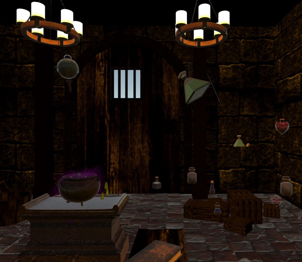
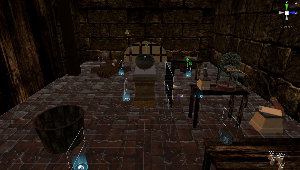
The story is set in a dungeon-like room where there are various objects scattered inside. Although the room has a dark and spooky mood, the lighting has been coordinated so that the user can clearly see the various objects. This is because the task of the user is to find the various objects that are randomly generated onto the recipe clipboard and throw those ingredients into the cauldron so that the user can create the antidote, and thus win the game. 

The story is set in a dungeon-like room where there are various objects scattered inside. Although the room has a dark and spooky mood, the lighting has been coordinated so that the user can clearly see the various objects. This is because the task of the user is to find the various objects that are randomly generated onto the recipe clipboard and throw those ingredients into the cauldron so that the user can create the antidote, and thus win the game. 

Side View of the Setting
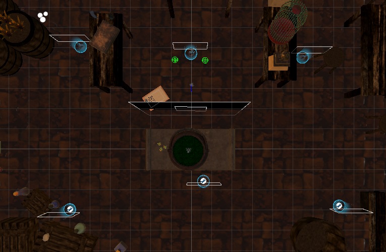
Top View of the Setting

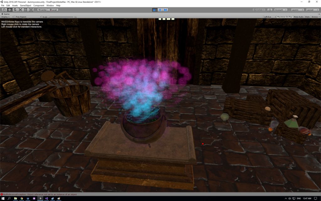
The user can interact with both the surrounding space and the various objects. The size of the actual space matches the size of the virtual space so that the user really feels that he/she is in that fictional environment. For example, when the user moves closer to the birdcage, the birdcage appears larger. However, some parts of te room were difficult to access and so we added the teleporting points in order to solve that issue. Some of the objects in the environment are interactive. For example, the user can use the trigger of the Vive to pick up the broom in the scene and throw it around, as well as the cat statue, clipboards, potions, etc. Another crucial interaction is the caldron responding when the objects are added into it. When any object is put into the caldron, the caldron spits out a blue-to-purple-to-pink bubbles, replicating the chemical reaction.

The Colorful Bubbles from the Cauldron

The logic of the world can be followed through with the narration, background clock ticking sound, the recipe, and the congratulating/game over scene. The introduction narration allows the user to understand what situation he/she is currently in. The recipe shows the task the user has to complete, and the user will get the congratulating scene or the game over scene, depending on how the user performs. 

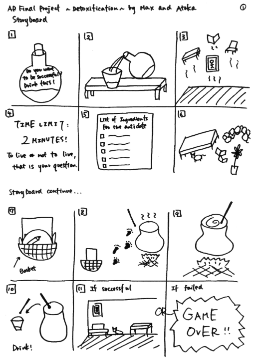
2. Process and Implementation: discuss how you built the space and design choices you or your group made. What did the brainstorming process involve? How did you go about defining the logic of this world? What were the steps to implementing the user’s role? Share images or sketches of visual inspiration or reference, including the storyboard/layout.


In order to create the space and design of our project, we first drew a rough sketch outlining the overall atmosphere and the placement of the objects in the scene. We then looked through the asset store on Unity and found different objects to use for building the setting and the scene.

Storyboard Sketch

Because this game is based on the idea of “poison(ed),” we had to place the user in the way that the user would know that he/she is poisoned, and thus, need to find the ingredients to make the antidote. We used two steps to achieve this – first one being the fact that we placed the user in front of the cauldron when they begin the game, and the second being the fact that we recorded a voice narration at the very beginning of the game explaining the user that he/she has been poisoned and his/her mission is to find the ingredients that are scattered around the room in other to create the antidote.

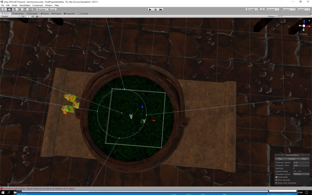
Top View of Cauldron


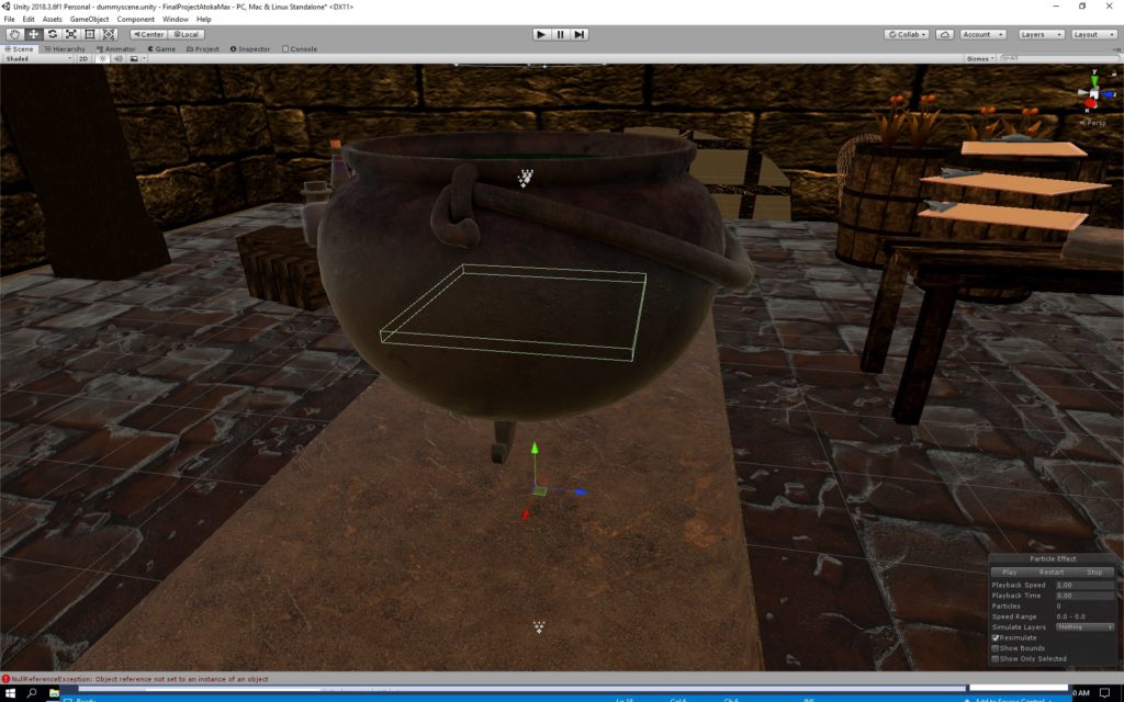
Side View of Cauldron
Floating Objects


We also wanted to make the game playable multiple times. Therefore, we decided to randomize the list of ingredients that show up on the recipe clipboard. That way, when the user plays it for the first time, the recipe might show, blue potion, broom, small green potion, cat, and brownish potion, but when the user plays it for another time, the recipe might show cat, skull, plant, plant, and blue potion.  That way, the user can enjoy a different experience every time the user plays the game.

Some Example of the Scripts
More Scripts

3. Reflection/Evaluation: This should discuss your expectations and goals in the context of the what you felt was achieved with the finished piece.


I am very happy with the outcome of this project. After building the base setting, we gathered various objects from the asset store to decorate the dungeon. Then, we wrote the scripts which were for the list of the ingredients, randomization of the ingredients, verifying if the ingredient that was put into the cauldron matched the ingredient listed on the recipe, the Timer, the If condition for winning and losing condition, the Text FadeIn, and the Blackout FadeOut.

During one of the earlier playback session, we received a feedback to include a voice narration that explains the situation and some kind of ticking clock sound that emphasizes the mood of having a time limit. In order to build the sense of time pressure, we used Audacity and created a background sound of the ticking clock, which begins ticking faster and faster as the two-minute time limit approaches. After incorporating this, we received feedback that the sound was well suited to the atmosphere and the mood of the game and the task that was given to the user.

What I realized during the IM showcase was that because the introduction narration does not explicitly say to put the ingredients into the cauldron, some of the users were simply collecting the ingredients onto one of the tables. To others, this was more instinctual, and the moment they saw the cauldron, they knew that that was where they had to put the ingredients.

Another thing I noticed during the IM showcase was the fact that some users could not locate the recipe from the first place. Because the recipe is originally on the floor, some users did not look down, but rather were always looking around (eye-level). Such users were confused and did not know where to start.

In order for this project to be improved, we should find ways to clarify that the task is to collect the ingredients AND put them into the cauldron from the introduction narration. As for the recipe, instead of having it placed on the floor, it should be placed next to the cauldron so that it is easier for the user to refer back to it. Overall, the game appeared a little difficult for first-time players, but many of the users got used to it quickly, and even if the user did not succeed the first time, the same user were “detoxicated” when playing for their second time.

Project 3 Development Blog

Project Ideation and Direction

Our group has two different ideas. We are thinking of escape room, or having a experience that lets the user get absorbed into a different scene. We want to have a murder mystery room where the user can explore what happened in the room. The second idea is the user being absorbed into the computer screen and exploring what is inside the computer.

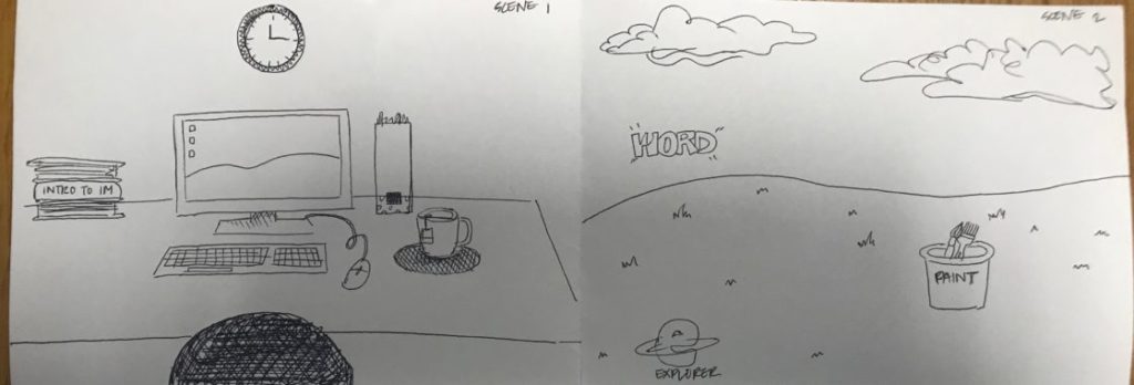
After discussing different ideas in class, our group has settled on the idea of the user getting absorbed into computer and landing in windows xp background. Based on this brief idea, I have created the storyboard.

We will try to have a room scene as a starting scene, and have a second scene – the windows xp desktop background (bliss).

Project Development

We are planning to divide the task into two different parts: scene building and interaction. I will be working on scene designing and building, Junior will be working on the interactions, and Adham will be working on both scene building and interaction. Our plan is to first make sure the absorbing interaction works before starting with the scene building.

For the scene the goal is to make the room look as realistic as possible. I am thinking of a typical student’s room with books, and a computer. For the Windows XP scene, I am still wondering whether it should be realistic or look more like it is still inside the computer. I will be finding different room assets and try to build the room. For the Windows XP scene I am wondering if I should build it from terrain tool.

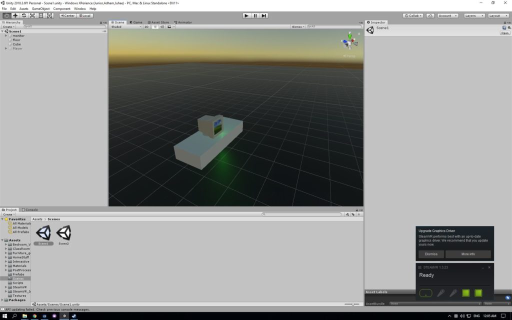
We got the computer interaction working. Now we have a desk (a cube that looks like one) and a computer with Windows XP Bliss background on it. When the user lifts the computer it changes into scene two. It mostly looks like this.

This is going to be our rough prototype and we will move on from here after the feed back

Review Rough Prototype

We got the feedback from class. We need to narrow down the story. Although the initial idea was easy to come up with I was having some issues when it comes to narrowing down the story. There are so many different icons on a computer and I am not sure which icons should be part of the game and which shouldn’t. We were discussing as a group and we decided that we would need a goal in the game to have a set storyline. So we have decided on the goal as submitting an assignment. We wanted it to be relatable to players, who are mostly going to be students.

We also got some ideas from our classmates:

  • Keep interactions and everything in one scene
  • Virus takes over the computer. You need to defeat the virus
  • Maybe after you defeat the virus you become king

I have started with the room scene. I have built the walls and started with changing the desk. After that I added different furnitures that would be in a room. We found an room assets and a classroom assets that had all the things we needed. It was pretty simple to build, but I made sure everything looks realistic. I refrained from using any low-poly assets. The room is all done.

I tried playing it and the stair case seemed very off. I decided to remove the staircase and instead put another furniture in that space. The interaction of the computer works. Junior and I met and deciding on the story line. We have decided we would need a folder, where the homework would be placed. I thought it would be also fun to have different documents and have the player figure out the right one. We also decided on having chrome and email, where the player could submit the assignment.

Share Progress Update

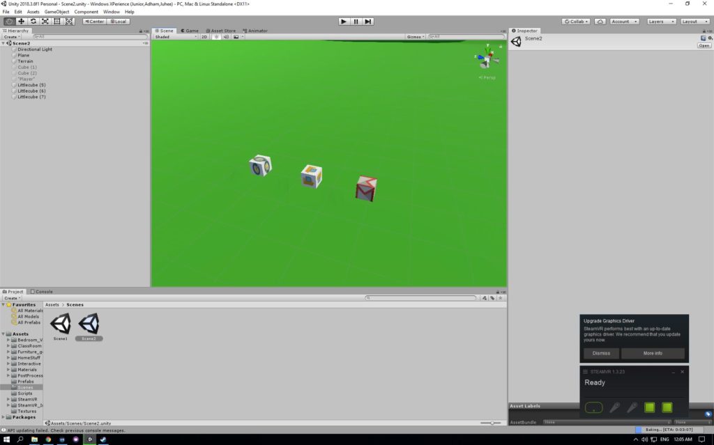
We have created different icons in the second scene. We also tried using the terrain tool. We are having some issues with it because it tends to raise the terrain in a very unnatural way. We made different cubes and tried using the logos on icons to go on the boxes. We landlocked the player so the player doesn’t see how far the plane goes on. We need to improve the terrain and need to find a sky box that looks more like the bliss image. We are trying to figure out what kind of interactions would work with these icons.

I figured out how to make the terrain look better. We could change the smoothness of the brush and the size of it to make it look more like the Bliss image. I also found a sky box that looks exactly like the image. I also want to add some grass texture to the ground, because it looks like a green carpet right now.

We had our friends come and play test our game. They mostly enjoyed throwing the boxes. We were glad that they enjoyed the game itself. However, they also suggested we should add more features to make the absorbing part more obvious.

They gave us very interesting feedbacks such as : interacting with something iconic on the internet (error 404 guy, google chrome dino)

This is the story line we ended up with after talking to them

We could use the dinosaur as an enemy and have the player fight against it to be able to submit the assignment. So I have started building the dinosaur. I tried several different methods. First I looked at the image of the dinosaur and tried cutting out a shape that looks just like it. When I did that the problem was that the image of the chrome dinosaur was two dimensional

Image result for chrome dinosaur

So when I cut out a shape using the outline of the dinosaur, it remains two dimensional. When the dino runs towards the player, it wouldn’t look like a dinosaur. The one option is to build the dinosaur from scratch. I started building it by using cubes but ended up with an ugly prototype version of it.

After talking to the professor we also decided we would use a cactus to fight with the dinosaur instead of an assignment like we initially thought.

As it became the very last few weeks till the due date. Junior and I started added some final touches to the scene. While Junior was working on different interactions such as dinosaur and its jumps, I started finalizing the dinosaur. I used small cubes to make sure the dinosaur looks three dimensional but still has the same look of the chrome dinosaur. Also I added some grass texture to the ground. We also found the right cactus asset that could be used to fight the dinosaur.

We are trying to figure out what sounds would be adequate for the game. We are planning to add voice over that explains the rules. I am also looking for different sounds for the game itself. For example, sound of paper rustling, serene background music, etc.

The dinosaur is finally done!

Before the due date we also moved the room scene into the second scene. It made the interaction building easier.

Now the room scene, the dino scene is all on the windows xp scene but put far away from where the player is so they wouldn’t be able to locate the other scenes. On the final weekend we focused on working on the interactions. We tried to make sure we have the assignment instantiation, the scene swap, and all three scenes merged into one working. We also need to work on finalize the winning and restart conditions, finish the dinosaur script and fix the monitor’s destruction.

We managed to have most of the features working but we still have some few bugs that needs to be fixed.

  • In chromeworld, assignment goes far away
  • In green valley, papers fall through terrain collider
  • Add teleportation to allow for world exploration
  • Initial scene is too big
  • Scaling problem: The entire world is too small
  • Assignment can sometimes be thrown really far away. Add invisible colliders to prevent this from happening

We have fixed few of them before the IM showcase, but haven’t been able to figure out all of them. Hopefully in the future we get to fixed these bugs and improve the game overall.

Project 3 Documentation

Project Description

Windows Xperience is a project that lets the users to have a immersive experience in an environment that we are all aware of — Windows XP background. The aim of the project was to build an experience that opens up to new scenes, in order to make the game more complex and deep. The experience was set in three different scenes. Diverse scene experience lets the users to explore different scenes. The experience is made for the users to imagine what it would be like to be absorbed into a computer, in this case specifically into windows XP. When the user gets absorbed into the computer the user gets to play around with three different icons that are very distinct. There are Chrome, Paint, and Document Folder icons. Users can interact with two of these icons — Chrome and Document Folder. When following the instructions, the user can pick up and throw the Document Folder, which brings out objects that resemble assignments. Once the user finds the right assignment he/she can put it inside Chrome icon. Once the assignment is dropped inside Chrome icon, the user is placed in another scene. In this scene user has to fight the Chrome dinosaur using a cactus. Once the user has successfully defeated the dinosaur a mail box appears, and the assignment can be dropped in the mail box.

This project idea came from the routine of every university student. Once done with our assignments, we send it in through email, and sometimes we have obstacles such as not having wifi connection. We wanted to gamify this whole process and think about how the experience would be different inside the computer.

Process and Implementation

The process started with ideation. When we met as a group we both had in mind that we wanted to play around with different scene, and wanted the game to be relatable to the players. While we were brainstorming, we thought of an image that is so closely related to computers.

The image above is called bliss. Growing up a lot of us saw this desktop background. Surprisingly this image is a picture of a real existing field. So we thought, “What would it be like to build this beautiful field and blue sky?” Then we planned out the game. We wanted to have a initial scene that leads up to the desktop background scene. Below is our first sketch of our idea.

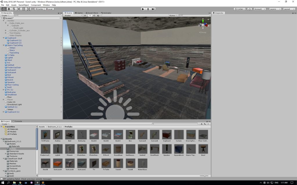
After creating this sketch we divided our tasks into two parts — environment and asset building, and interaction. My first approach to the project was starting off with building a room. After we got the interaction of being absorbed into a different scene figured out, I started building a room. The room consisted of several different objects. I wanted to make sure it looked like it was a room where someone was working on their desk. After placing objects like a desk, a chair, books and etc. the room resembled a students room. Below is an image of the room scene.

Next I started building the field. The field was the main scene, but was the easiest scene to build. I have used the terrain tool to raise the hills. Also found a sky box that is most similar to the image. The assets were created into a cube box with the logos on them.

The last scene was a box that contains the dinosaur, cactus, and a mailbox. The cactus and the mailbox was part of the asset packages that we have downloaded. The Chrome dinosaur on the other hand was built using cubes. Based on the pixel two dimensional image of chrome dinosaur, I have created a three dimensional one using cubes. Below is the image of the dinosaur

Reflection / Evaluation

After several user testings we were pretty happy with the result. However, there were several things that could be improved. For the storyline, in the future, we could expand the story by using different icons. For example, one of the suggestion was that we could make use of the Paint icon and let the user choose the color of the dinosaur they would fight in chrome. This is one example of how it could be improved, and I believe there would be several different ways to add more scenarios to the story.

For the scene building, the room scene scaling was off. If we had more time, it would make the experience more realistic if the scales were better done. Even during play testing, few of my friends mentioned how the chair seemed too big. Moreover, for the icons in the Windows XP scene, I want to to create 3D assets of these icons, making them look more realistic, and let the users to feel like they are actually inside the computer. Lastly, I would like to add more small plants into the scene to make the field look more natural.

For the sound, we had an issue of having a dinosaur sound in the beginning of the game. Because of lack of time, we didn’t get to figure out what exactly was the issue, but later I would like to add different sounds into different interactions to make the experience even more immersive.

This project was a huge learning experience, from ideation to implementation, and we are hoping that we would be able to improve this game in the future.

Project 3 Documentation:Memory Box

1. Project Description:​ 

Project name: “Memory Box”

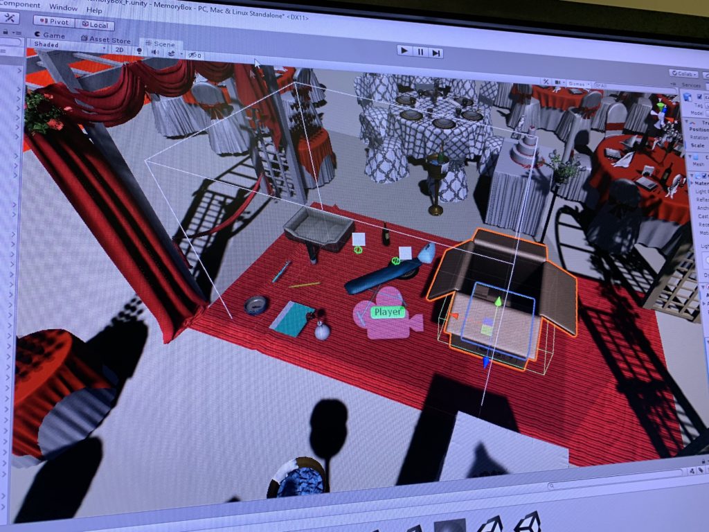
MemoryBox is an immersive experience for user to explore a sad ending love story by being positioned into an empty wedding scene to help “me” recall the pieces from a romantic love memory and wrap these memories up at the end to move on. The aim is for users to interact with objects in the environment, and form their own understanding of the story based on how they interpret the environment setting, the given objects and the stories that are being told behind each match of objects. Since the experience is set to be in an memory space, the user, upon they entered the game scene, would have the choice of deciding whether they want to be positioned as a female or male to experience the story. After they make the choice, they enter an empty wedding scene inside the memory space, and there are multiple daily objects and a cardboard box on the red carpet. Users will be instructed to pick up the objects, and put them into the box in pairs. Each time a correct paring complete, a piece of story about the paired objects will played. When all the objects are put into the box and all the memories related to these objects have been recalled, the box will disappear with some words appearing in particle mist, indicating that this story is erased from the memory and it’s time to carry on.

2. Process and Implementation:

A.Story sketch:

We started with looking for objects that could be matched in a relationship and is obvious enough for user to pair them up without having trouble figuring out the relationship among the objects. So ultimately we decided on doing storytelling on the following objets: toothbrush, toothpaste, wine bottle and dinner plate, pet food bowl, pet mat, iron, iron board, pen, notebook and a vase with rose. Below is the specific storylines, which will be played after the two objects are paired up correctly:

Objects in the game

Male Version:

Toothbrush & toothpaste: Paired toothbrush is the first step to show we are a family, says her.

Wine & Plates: I finally got the courage to invite her out for a dinner. Candle light on her cheeks is the cutest thing ever.

Dog Food & Dog Cage: I brought home a new family member that day, and I couldn’t forget how excited she was: her dream finally came true.

Iron & Iron Board: First day of work after my promotion.  She ironed my suit in the morning. Looking forward to our bright future.

Pen & Notebook: She used to keep all of our memories in this notebook … but it’s meaningless now. 

Vast with rose: Roses die. So are our promises….Eventually it turns out to be a wedding without her…

Female Version:

Paired Toothbrush : Pairing our toothbrush makes us look like a family more… 

Dog Food & Dog Cage: That day he brought home a cute puppy. I was so surprised! I always wanted a pet. I guess now we are a family of three. 

Iron & Iron Board: I want to make his first day after promotion special, so I got up early to iron his suit. Looking forward to our bright future …

Candles and Plate: Can’t ask for anything better than a candlelight dinner for the first date.

Pen & Notebook: It’s been a while since he left me… i used to keep a diary everyday when we were together …. How stupid i was.

Vast with rose: Roses die. So are our promises…. Eventually it turns out to be a wedding without him…


*The story will be understood regardless of the order – every single piece of a story is independent from one another however once the user finish all the story piece he/she will get the idea of what’s going on – there’s different level of love memories as well as the part the indicates the break up, however there’s no specific reason given why the owner of the memory break up, it leaves the space for user to imagine what happened, different people will have different interpretation of the reason based on their own understanding of the given objects and the story behind them.

B.Environment Design: How did we build the scene and the the ideation of designing choices

Environment overview

The role of the user: an explorer of “my” memory, in order to emphasis that, all the story narratives are recorded in the first perspective, and the starting scene intrusion words also put emphasis on the identity of the user, by saying “why am i the only one in the wedding?” and encouraging the user to get involved into the game by saying”can you recall the memory by paring the objects” etc. This is also embodied in the ending scene design: we remind the identity of the user by saying “now I have to leave these memories behind and move on…”

In term of defining the logic the the world, we used the realistic real life wedding scene design for the background, apply the gravity and basic physic logics/ responds to all the objects, embody the emotion difference between male and female by giving two perspectives to experience the story – the same objects may be interpreted differently by gender since females are more emotional and male are more rational. What’s more, the choice of objects: pen with notebook, iron with ironboard etc. enhance the existing daily life knowledge, so the user can still get the sense that their existing knowledge of logic still applies in this world, however, by adding the floating clouds in the outer space as background, we challenge those existing knowledge of how a wedding scene should look like and therefore make it more like a fantasy, a dreamy scene in a “memory space”.

Because our story is a bittersweet love story with a sad ending, so I decided to use the wedding scene to indicate the background of the story – it’s about love, however, at the same time, this is the wedding where only “me” (the user) is attending and there’s no one else around, the odd and emptiness of the wedding scene creates the contract and indicate that even though this is a love story but it doesn’t seem to have a happy ending. The realistic wedding design with the non-realistic background (floating above the city) conveys the message that this is not the real world, it is something fictional and doesn’t match our real life experience.

We also have the wedding march as the background music to create the atmosphere of a “wedding”. The floating effect is added to the clouds to make the scene more “dreamy” and use it to indicate this is a fantasy memory world.

About the ending: the whole projects is developed based on the chosen theme “close the door”, therefore the ending is designed to be that the memory box is destroyed after all the objects are paired up, indicating that the owner of the memory space “I” close the door of the bittersweet love memory and leave the memories behind in the box to keep moving on. The moment when the memory box disappear, it will be accompanied with the particle effect to show the sense of “vanishing” and an ending explanation in 2D words will be shown to suggest the end of the game as well to explain to the player what happened, by saying “Thank you for helping me recall those memories… Now let me just leave my love story in this box behind and move on….”

User Interface Design

C. Steps to implement the interactions:

(highlight some key interactions we worked on)

  • Choosing female/male perspective in the user interface and switch scene based on the gender choice;
  • Pick up and throw objects;
  • Trigger the audio to play when two certain objects collide;
  • Background music volume change: attach other 6 audio sources(which are attached to specific game objects) to the same game object (the player ),detect when other audios “isPlaying”, the background volume = 0.1f, to reach the ideal effect that when the narrative audio plays, the background music volume turns down.
  • Boundary detection: Add a collide box outside the player area to bounce back the objects that are thrown away by the users.
  • The floating effect of the clouds.
  • End of experience : When the the boolean detects of all 11 game objects doesn’t exist in the scene, the box object will be destroyed, the 2D words will be displayed and the particles system of the “mist” effect will be played.

3. Reflection/Evaluation: ​  

Compare to what we had in mind initially, we made a dramatic change in our project, because as we goes on with coding and finalizing the storyline, many of the initial thoughts were either not achievable or doesn’t have the best compatibility with what we had in the piece so far to we have to keep changing and renew how the story goes. However, those changes we made alone the development of the projects carries out the best outcome, imagine if we stick to what we had a month ago and don’t adopt it according to the user’s feedback etc, we would’t have made the final price to be easily understood by any users and create the best experience for them. Overall I think we achieved our goal, to create a project that is lovestory-based, meanwhile the application and the process has been modified a lot and didn’t follow our initial design but ended up pretty good.

We have achieved the basic interaction elements we designed – two gender storylines, pick up and pair objects and hear the story behind it, and the ending scene that indicates the end of the love story. The goal of design is to create the dreamy scene that indicates its a memory space with realistic real life objects, I think we achieve the goal according to users feedback, however we should have worked more on limit the movement of the users on the red carpet since most of them will try to get out of the playing area and explore what’s beyond there.

4.Reflection after IM show:

The IM show provides a great opportunity to let the non-knowledgeable users to test our project. Overall it went pretty well, people liked the idea of the love story and the wedding scene design and they shared different feelings they have after playing the game with us. However, few things worth noticing, that most of the new users need to be educated of how the VR system works, from how to use the handle to how to teleport. In playing our game, specifically, most of the users don’t follow the instruction, or maybe because the instruction wasn’t clear enough, that users just put everything into the box instead of pairing them up; When user figure out the an audio will be triggered to play after the two objects are matched, they will just put the two objects together instead of putting them into the box.

Therefore I think we still have room for improvement, including visualizing the instruction to make it easier for users to understand, and making the two objects collusion only validate when they collide inside the box.

Most of the users don’t follow the instruction, or maybe because the instruction wasn’t clear enough, that users just put everything into the box instead of pairing them up
When user figure out the story will be triggered to play after the two objects are match, she will just put the two objects together instead of putting them into the box

Project 3: Development Blog

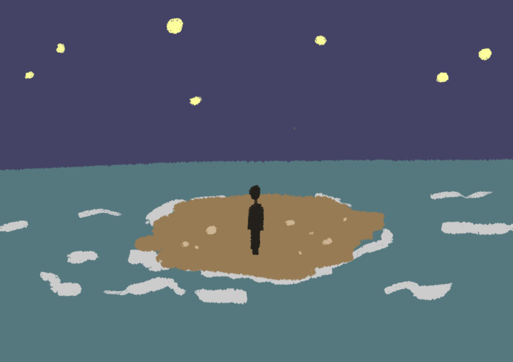
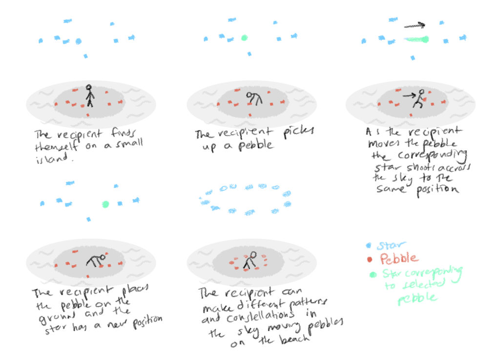
This project was inspired by one of the cities in Italo Calvino’s Invisible Cities. We wanted to create an environment where the actions of the user on the ground below, would affect the movements and positions of the stars.

Initial Environment Sketch
Original Storyboard

Lauren and I started off by making a very simple prototype with a plane and several cubes. We managed to map the x and z positions of the cubes on the ground to a cube in the sky when it was picked up and moved around.

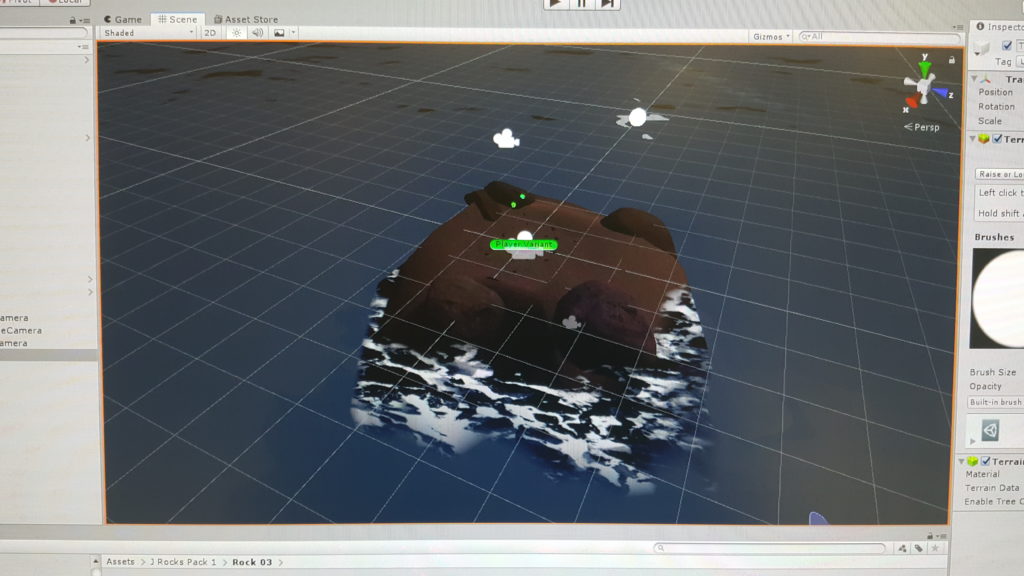
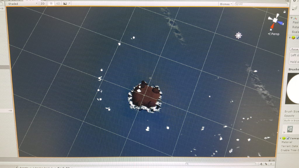
The island environment is built out of a terrain with a grid of several water tiles forming the sea reaching the horizon. We found a unity asset pack with several realistic rocks we could use and a starry skybox that we liked. The stars are spheres with a glowing material attached to it.

Each of the stars has a script attached to it that maps its location to the x and z of the rocks but multiplied, making them further away in the sky and operate on a larger scale. It also adds an acceleration to the star if the player chooses to throw the pebble off the island.

The throwing of the pebble created an unintentional fun feature. Starts often loop the loop into position and it felt like throwing the stars into their positions in the heavenly mantle. We decided to make this a main feature of the experience, rather than just rearranging stones on the island.

We added a particle system to each of the stars that leaves a trail behind it. This added the feature of being able to draw in the sky by moving the stones. We made the particles become smaller, yellower and more transparent with time.

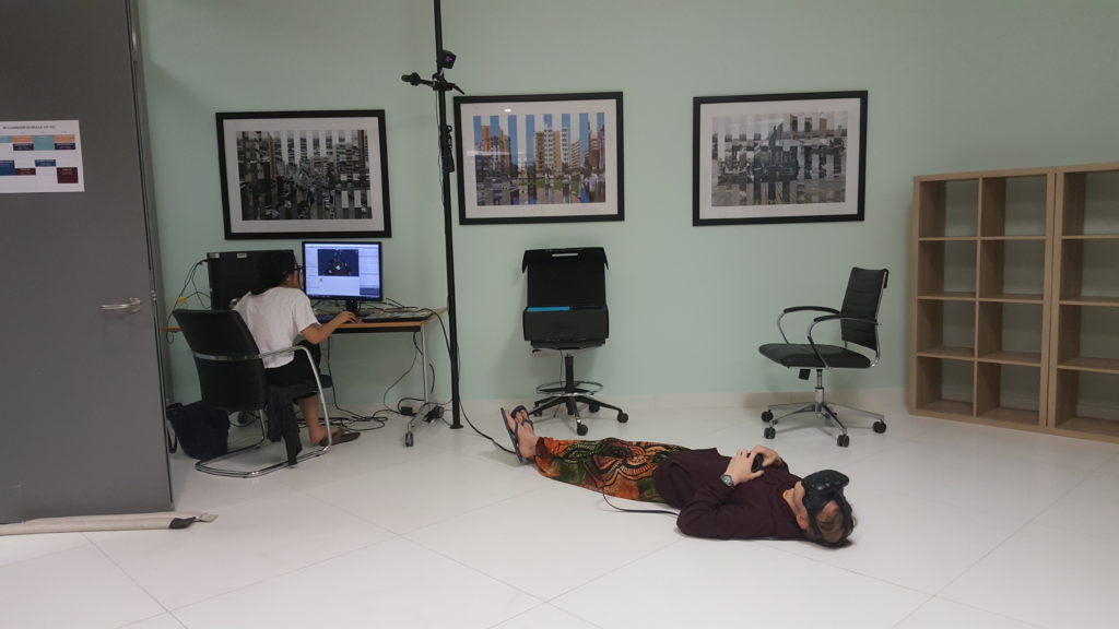
User testing was a lot of fun. Some people stood and twirled around, some lay down on the floor as if they were stargazing and drew in the sky. Users learned pretty quickly to turn their attention towards the sky in the interaction.

We sourced some relaxed but fun and mysterious music from the free music sources on Youtube.

We realized that the experience needs a good ending scene. Something needs to happen after all the stones are thrown. Do they respawn or come back? Does the sun rise and restart the game? does another dramatic event happen?

We settled on creating a particle system that surrounds the player with stars that emerge from the center of the island and hover like fireflies. We made a second script that activated the particle system once all the stones were below a certain point in the y axis (after several different ideas of how to do this, this one worked best. This was to be accompanied by a change in music to something more dramatic. Changing the music proved to be the most tedious task but it eventually worked out!

Several people played the piece and we got some good reactions!

Development Blog 3

We added the function where when the user inserts an object into the pot, the pot reacts by blowing out colorful bubbles. We tested different colors, sizes, textures, and speed of the bubbles so that they enhance the experience. We finally decided that we will use a gradation of colors, beginning from pink, then turning, purple, and then lastly blue to appeal more aesthetically. 

We also came up with an introduction narrative like the following:

“Do you see the objects flying around? Well actually, they only look like they are flying to YOU. You have been poisoned, and the hallucination is only one of the thousand side effects. If you want to survive, gather the ingredients to make your antidote. Of course, find the recipe first. You have two minutes until the poison takes over you and you will become a nobody. Good luck!”

I asked a male friend of mine to do the voiceover, and this is the end product.

Detoxification Introduction Voiceover

Galaxyze: Development Blog 02

Following my previous post, we progressed more to make the vr environment more immersive and aesthetically pleasing.

The vr environment now looks more realistic and complete with the addition of these assets:

  • rocks of different size and shape
  • island terrain
  • water surrounding island

<picture>

When we were play-testing our prototype last time, we noticed how people were throwing away the rocks into the water (of course they’d do this…). Several solutions were proposed, such as making ripple effects or making the rocks bounce back at the player if thrown too far. We decided to add trails to the stars as they move so players can feel free to “draw and paint” on a blank canvas in the sky.

We achieved this by adding a particle system to each star. We then tested it out on game view, trying out different features to decide on the best effect. Here’s a video of what it first looked like:

the star trail…

As you can see in the footage, the trail at first looked like little blobs multiplying over time. To make it look more appealing, we made the following changes:

  • color: turn from yellow to white
  • opacity: fade out slowly over time
  • speed: create a total of x number of particles at a rate of y each time.

We also edited the code of the rock-star movement so that the z value of the star is being multiplied by a number, making it move not directly above the rock (on the same axis), but a little bit to the side. This resulted in the star moving

more realistic star trail! (ft. our midnight happy squeals)

We then proceeded to add music in the background. This contributed a lot to make the experience more mysterious and adventurous. Here’s a video of Max play-testing it:

Max having the time of his life with not one but TWO controllers!
Junior fascinated by the experience!

There were also a few bugs here and there which we fixed, such as how some of the stars weren’t corresponding correctly to the rocks’ movements (being stuck within one area) and some stars not having the right trails.

More thing to work on:

  • adding texture to the moon
  • the final scene when all rocks/pebbles have been used up
  • sound

Galaxyze: Development Blog 01

Shenuka and I decided to name our project Galaxyze. We thought it was a fitting title considering how our vr environment features stars, the universe, and connecting with the world “out and above.” We also thought using “-yze” made it look like an action verb, which suggests that the players have to do something in the game – to draw and create constellations, patterns, and trails in the sky with little rocks on the ground.

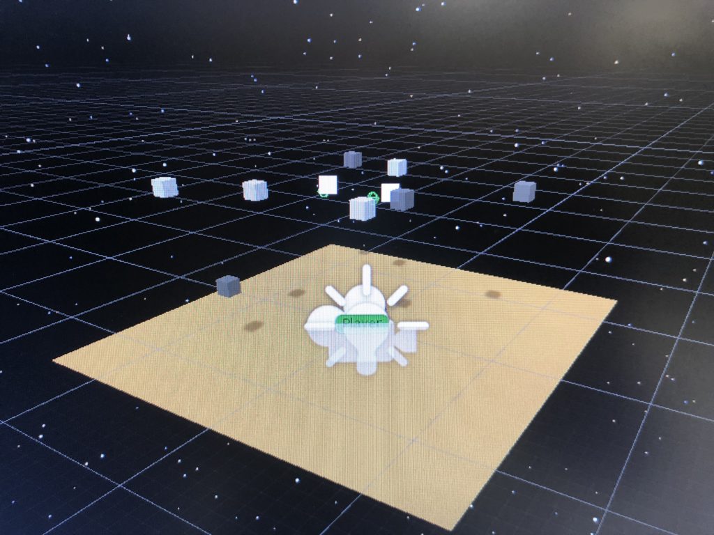
We started out by creating a small plane for the ground and adding a star-filled sky for the skybox, as well as adding little cubes that we’ll later transform into rocks and stars:

Galaxyze in its initial stage

We also worked on a prototype of the first interaction between the player and the world. We imagined the player to be able to pick up rocks on the ground and then be able to see a corresponding star copying and reflecting its movement. We achieved this by essentially creating two cubes – one on the ground and one elevated in the sky, and sending the y position of the cube below to the one above. You can see Junior playing with our prototype in the video below:

Junior testing out our interaction prototype

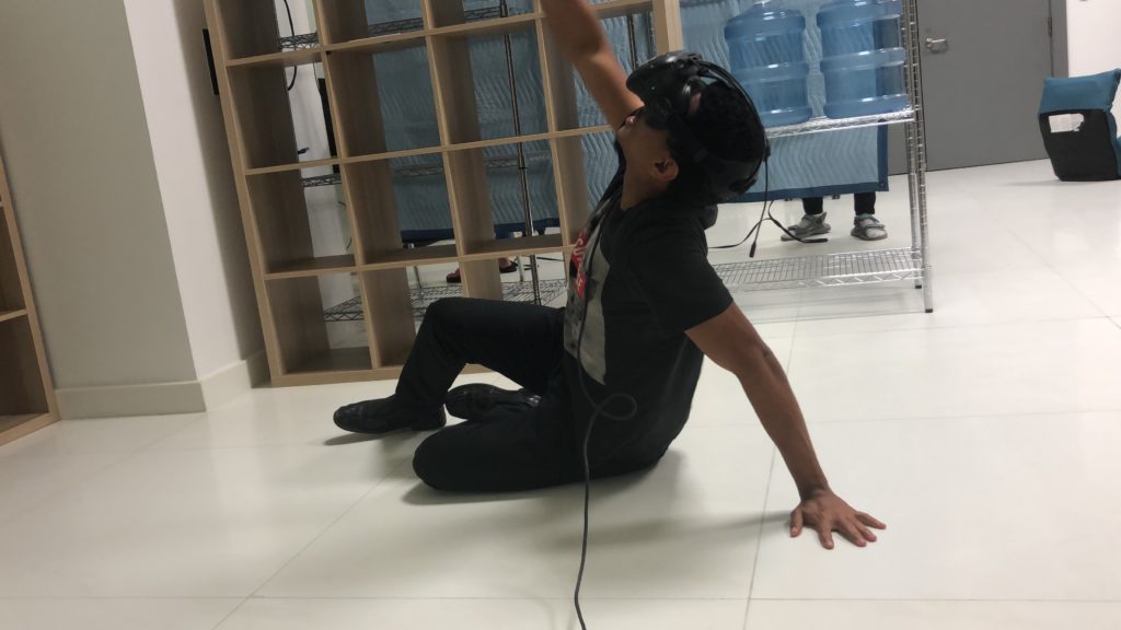
I was also delighted to find that the players who tested out our protytpe began sitting down to observe the object in the sky better (see pictures below), as this looks more like the experience we were going for – sitting on an island and looking up into the sky to watch the impact one was having and creating. It was great to see people do this because we didn’t instruct them to do this in advance – the environment and interaction had apparently made it intuitive and natural for them to play it in this way.

Junior sitting down to enjoy stargazing and galaxyzing to the fullest! 🙂

After presenting this to the class, we received some feedback that we’ll be working on next:

  • how to signal players to look up at the stars? – sound? visuals? shadow on the ground?
  • create more rocks and stars
  • more environment visuals
  • how to make interaction more interesting – more than just the star copying the rock’s movement – creating trails?

Development Blog 2

Max and I decided to use “poison” as our starting point in order to create an interactive project where the user is poisoned and the user must find the various ingredients in the room to create the antidote.

We first began by creating the setting of the scene. I went through the assets store to see if there are any materials and textures that we could use in our setting. I found several prefabs and textures that I felt could be combined to match our idea of our setting. So, first, I imported some prefabs, added some objects, and created a dungeon-like room that was not too dark since the user will have to walk around in the space and find the ingredients of the antidote.  

One of the tables where the ingredients will be placed

However, after building the bulk of this setting, we encountered a problem. The problem was that the program kept on crashing whenever we ran this setting. We ran it multiple times, but the program simply kept on crashing. We could not figure out why it kept on crashing but it was likely due to the amount of light source (from the spooky chandeliers) that were present.

Therefore, we had to create a different setting that was relatively close to the one that we had previously created, using other prefabs, lights, and materials. Max and I discussed again what kind of setting we wanted our project to be, and decided that we wanted to pursue a darkish-mysterious mood.

We agreed on the fact that the large pot would be our main object in the scene, as the user has to find the ingredients in different parts of the room, and put it in the pot in order to create the antidote. Max worked on creating the script which allows the user to pick up the ingredients and put them into the pot.

The following videos are some user testing examples of our first stage project:

Detoxification User Testing 1

Detoxification User Testing 2

Detoxification User Testing 3

From this user test, we got feedback that there should be some kind of timer (that is represented within an item, such as a sand clock) so that it gives a sense of adrenaline to the user that he/she is in a rush to find the ingredients and make the antidote. Moreover, we were told that there has to be some meaning attached to the ingredients. These ingredients could be the key in answering the question as to why the user is here in the first place. If the user is holding a basket, it signifies that the user is already somewhat familiar with the space. On the other hand, if the user is NOT holding a basket, it signifies that the user is NOT familiar with the space. There are some embedded assumptions in our project and so it evokes curiosity and why for the user. The explanation to these why? questions can also be clarified in the voiceover as part of the pre-story. Another feedback we got was the importance of sound. We were advised that as the time pressure increases (less time), the sound should increase as well.