PVRK blog post

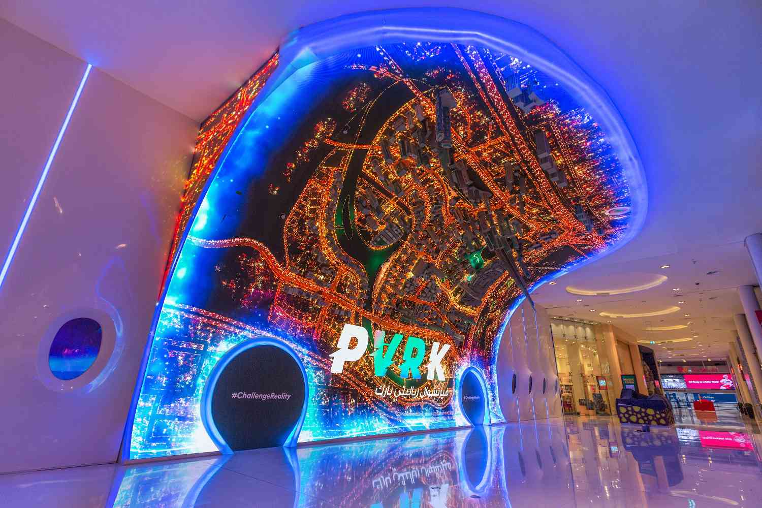
After experiencing the VR park I got a deeper understanding of how an immersive VR experience is designed and why it’s extremely important for users and storytelling in VR world.

Here’s some experiences I want to highlight to emphasis how immersion is addressed/achieved in those VR designs and what’s good and bad about them: I started with the VR roller coaster and felt totally like in an open air amusement park – the wind effect, the actual rails and carriage of a roller coster, the safety bely, the feel of gravity when the carriage pitch down the sound effect and the realistic design of the burj khalifa. However the only thing that reminds me of ‘I’m just in a VR game” is that the headset is so heavy when it moves as the roller coaster goes up and down – it is such a bordern in a physical-experience-focused game like roller coaster, and eventually because it’s not tightened on my head I lost the headset during a sudden turn.

Another game that I think is really immersive is the parachuting one – the design of the seat, the wind effect when you speed up, the movement of the seat when you control the directing by pulling the handle of the parachute and the realistic design of the a mountainous scene, all of those really get me engaged into the game and fee immersed. My role in this game is just to simply pull and handles of the parachute to control the direction of the landing.

The one that I like the most is the Tombescape one in which different scenes and stages are designed and you have to move around to unlock the next scene by walking the certain path constructed / separated by plastic walls. The immersion in this game is represented by allowing the user to walk around to expose along the designated path instead of stay still and wait for things around him/her to happen. Also the sounds and light played an important role in the immersive experience a well – when you are in a dim tomb, the noise of the skeleton and the candle fire guides you to go to the certain direction. Without those indications a user will easily get confused and won’t be able to finish the whole game.
PVRK Experience

Something I absolutely understood after experiencing the VR Park is that involving reality with a VR experience can lead to either great success or horrible failure. When the reality plays a part, either as a moving platform, physical walls, or wind effects, it can make the user feel immersed or completely disjointed. The reason for the drastic effect is solely related to the sync between the experience and the reality.

One of the roller coaster rides moved along in such a way that the flying through the sky felt real, this was because the center of gravity and the inertia moved as expected. In another movement-involved experience, there was slight lag between the video and the physical shakes which made the user absolutely understand that this was all fake. The last experience also had a storyline that was so incredibly unrealistic, which didn’t help with the immersion at all.

The sound was helpful in making an immersive experience as well. This worked because sound was used as a form of attention control; sound from behind or to the side would make the user move and thus involve them well in the story line. When sound was used in conjunction with some slight physical interaction from reality and a good storyline, such as in the maze game, the experience was enjoyable. Having some sound but not too much is an important factor as well. Some of the experience generated a mildly chaotic environment by having constant sound and movement involved, such as with the arcade shooter.

Ideally, an experience would draw you in with a strong story and then push you along with mild actions and developments. Some of the experiences didn’t involve a story and instead focused solely on the physical experience, such as falling from a tower or flying through the sky, but that made the user feel more like a passenger than a participant. Naturally all the different roles could be targeted but the most successful experiences all shared the active participant interest.

Google Cardboard VR : Invasion

I have decided to try Invasion for my Google Cardboard experience. It was a very immersive experience but there were several factors that I thought was really significant.

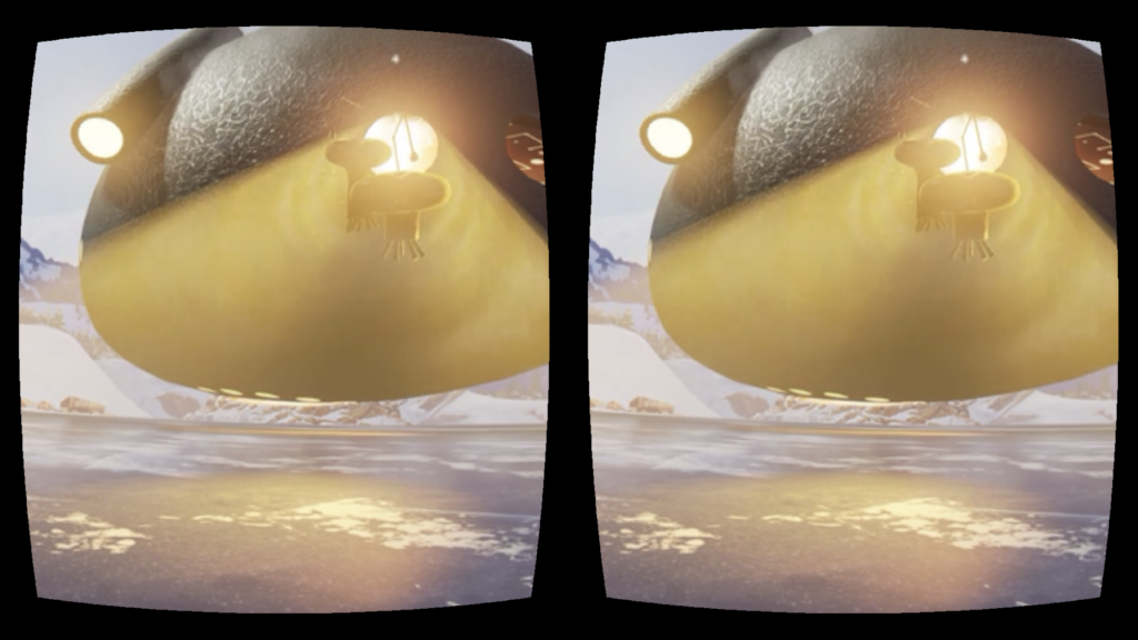
As soon as I started watching the video, I was kind of confused. Nothing was really happening in the screen and I was looking around. However, something that really helped me figure out what was happening was sound. I heard sound and I looked around to see where the sound is coming from. Without the sound it would have been hard to figure out what exactly was happening. When the alien spaceship was showing up in the sky, the surrounding sound made the viewer look around. There was a sound that made me look around and look up to see what exactly was happening. It made me realize, that sound is as important as the environment itself when it comes to viewer experience.

Moreover, What I have realized is that when I am building environment, I do not get to use the whole space. I usually would use half of the space and not use the space behind the viewer. What I found interesting is that this VR experience lets the viewer explore and move around a lot. It was the usage of space that made the viewer, for example, myself to look around and fully experience it.

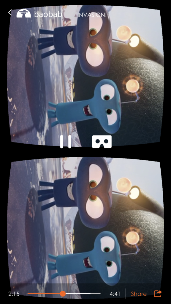
Also there were some parts where the characters approach the user. Personally I thought that was very adorable. Because of the interaction with the characters it made me feel like I was actually there with them instead of feeling like I am watching them from far away. The eye contact these characters make and the noises they make was very significant.

Google Cardboard VR Title Review

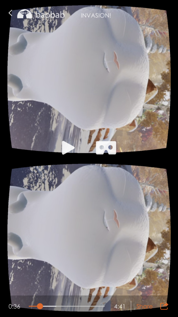
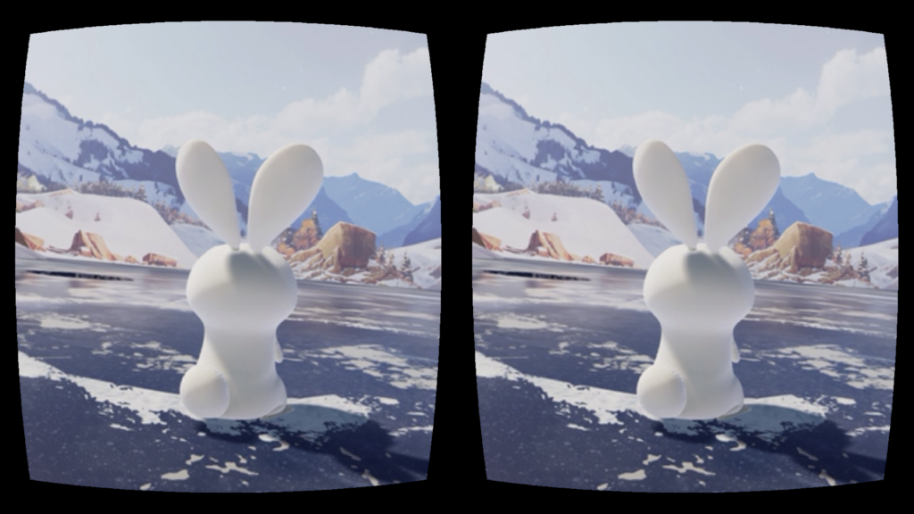
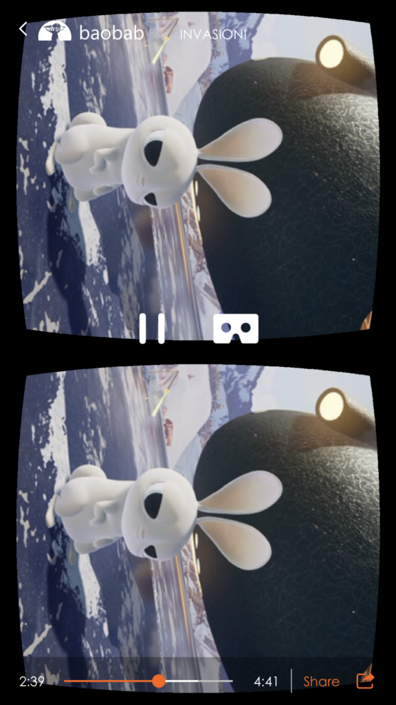
The Google Cardboard VR experience I chose to review is Invasion (and Asteroid), made by Baobab Studio, which specializes in providing users with immersive experience through its storytelling. Invasion is an animation about the story of a couple of aliens who want to conquer the earth, and upon their arrival they met two bunnies. Interestingly, the user is one of the bunnies (in fact I failed to realize that until I read through the description of the story)!

Like other VR animations, Invasion provides a panoramic scene, allowing the user to get a comprehensive sense of the setting and really feel involved in the story. The Baobab app allows the user to switch between the VR mode and the normal mode (the one that does not require a Google Cardboard but still shows the panoramic scene). I watched the animation twice using different modes, and really appreciated the immersive experience of the VR mode. In the normal mode, the whole experience is limited within the screen of your phone. Thus even if you can look around and explore the scene, you still feel the boundary between the story and the reality, while in the VR mode you become part of the story as if everything is happening around you.

On the other hand, the sound effect fosters the immersive experience. When using the Google Cardboard, the speaker of the phone is closer to your ears, and the 3D sound effect is more notable. When I watched the animations (Invasion and also Asteroid), my attention was directed by the sound effect: whenever I heard something behind me, I would look back and see what’s going on. In that sense, I consider the sound effect as an essential part of the environment. Also, the VR environment offers more freedom for the user: unlike films which directs user’s attention through specific camera angles, VR environment allows user to pick their own camera angle. If you are not interested in what’s going on with the main characters, you can just turn around and explore the scene by yourself.

VR Title Review: InMind


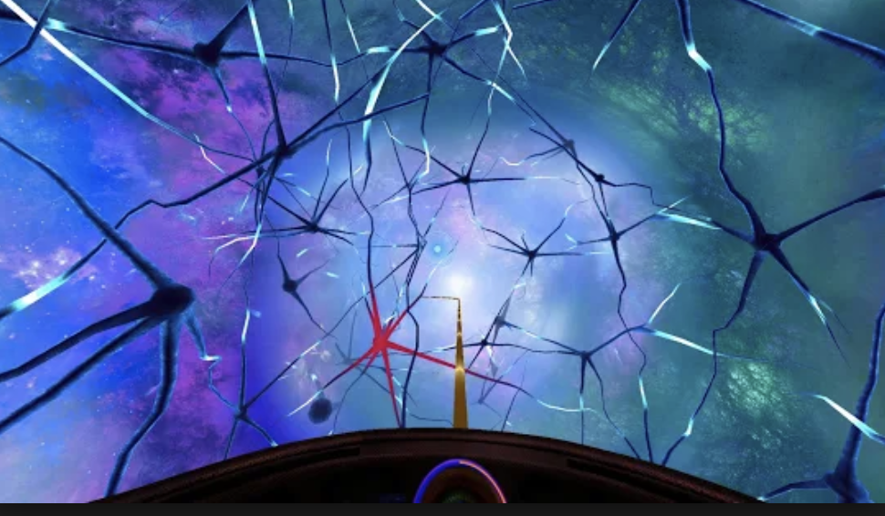
My first Google Cardboard experience was InMind, a VR experience designed to give the viewer an inside look at the brain. I selected this title because I was really excited to have a VR experience in the context of the human body, to have greater understanding into what our brains look like. What I found was something else entirely.


The experience began with an introduction in which the viewer is referred to as “Human.” The only other character in this experience was a robot narrator who speaks in a very patronizing manner to the viewer. The robot frames the narrative as “we are going to look into the brain of a patient who has depression” and the viewer is launched into what is evidently a game in which they must focus on the red neurons of the brain and turn them back to “normal” to “help” the patient. The ridiculous oversimplification of mental health aside, I do not feel that InMind achieves its goal of giving the viewer an immersive experience into the human brain.


First, the interaction is too slow. Feedback is given in the form of a circle becoming fully shaded when you concentrate on it. However, it takes too long for the circle to become full and thus, for the red neuron to change. It brought to mind what Chris Crawford says on interaction in his book “Interactive Storytelling,” that it must have speed. Furthermore, the interaction was slow in the sense that once you changed a few neurons, nothing seemed to happen. I grew bored. There seemed to be no progression in the narrative and when there finally was, it was merely a sentence or two from the robot who gave a feeble “keep going” message. Because there was such a focus on the red neurons, a pointless focus, I don’t think the viewer was necessarily observing the whole brain and all its synapses of activity. Sure, the environment was pretty, but it didn’t feel immersive. Perhaps that is because the game did not take full advantage of designing for VR since the rollercoaster through the brain only moved forward, not giving the viewer the chance to explore. Furthermore, I felt detached as a player. Perhaps, the game would have felt more immersive if there was more effort put into personalizing it. For instance, instead of being called “Human,” you could be called by your real name or a name you created.


Though the whole experience lasted only four minutes, it felt much longer. In this VR mind, I was bored out of my mind. The ending was just as dull as the progression: “congrats Human on not dying. Now download these other apps,” or something along those lines. I wouldn’t say that this was a waste of time though because it made me realize how important it is to have progression through a VR experience, a clear narrative if you will, and that there is attention given to how much feedback given to the viewer in this narrative and how fast the feedback takes.

VR app: InMind


Google Cardboard VR Experience Review

I chose to watch a 360 video featuring dinosaurs in a jungle in hopes of experiencing what it would be like to be in Jurassic Park.

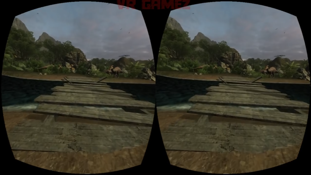
One thing I noticed about the composition of the environment is the use of positive and negative space. I think it’s important that the view is not saturated with so many assets that the player/viewer does not know how to go about that place. There needs to be as much empty space for them to figure out how to navigate through the environment. But on this note, I think the design needs to be clear so that the player/viewer can regonize navigation points like roads. In other words, it should be obvious that there’s a road ahead so the player/viewer knows that they have to go forward (see picture #1).

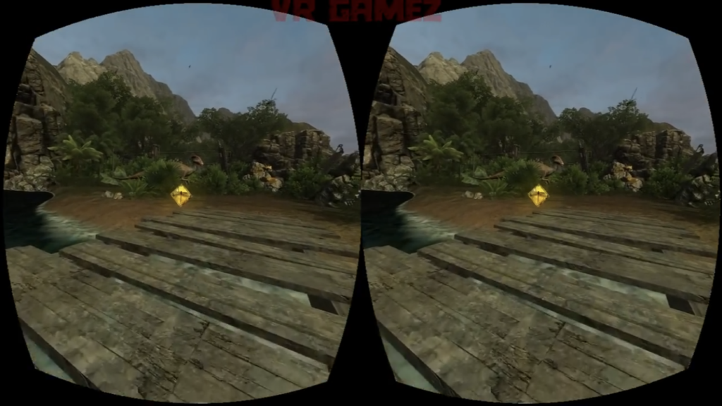
Some of these “navigation points” are clear in the game’s use of coins that are placed on the road before them. The coins appear out of nowhere, bright and glowing, prompting the player to approach it (see picture #2). When you go close enough, it disappears, suggesting that you’ve successfully acquired it.

picture #2: a glowing coin/diamond!

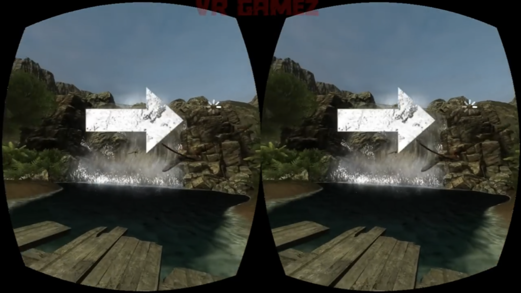
This specific game seems to also use arrows to direct the player (see picture #3). When the player is lost and looks around, arrows appear on the screen to guide the player. These are all different ways a VR environment tries to communicate information to the player.

VR Title Review: Pearl

Here is a link to the film on YouTube.

Pearl Patrick Osborn’s Oscar nominated 360 view short film that tells the story of a young girl, her father, and their love of music, the two of them connected by a song. The viewer witnesses the story unfold across the years and seasons from the passenger seat of the car that the two protagonists travel around in.

The film begins as an older Pearl finds her father’s old car in a scrapyard, she plays a cassette recording of her father’s song, bringing back memories. The film is a montage of scenes spanning from the girl’s childhood to young adulthood, how her love for music, and the friends she makes it with, develops as she finally makes it in the music world. Yet it primarily revolves around her warm and sometimes rocky relationship with her father over time, around the symbols of the song and the car, the space that the film takes place in.

The style consists of simple, not too detailed, 3D models with cel shading that gives them an almost 2D effect. What really makes the style, however is the atmospheric lighting that creates different moods as well as different times and places. The constant changes in lighting signal the change of scene. There is always a focal point to the action in the scene which the film effectively guides the eye of the viewer to the right spot. One of the moments that works best is where the kids run out into the sea, lit up by the headlights of the car.

What I love most about the film is that it makes use of the idea of how a space can contain memories. The choice of car, a contained space that moves around, revealing the space outside is particularly interesting. The use of VR, instead of telling the story through curated shots, works to make the viewer feel like an outsider, given an intimate glimpse into the lives of these two people. It also gives the viewer an association of themselves with the space of the car, like they are seeing the story unfold from its perspective.

Though it makes a great 360 view video, it is difficult to watch through a headset. The scene transitions between scenes happen rapidly and the car constantly switches from moving to stationary, making it a slightly nauseating experience.

“Asteroids!” – Interactive Media Short Movie

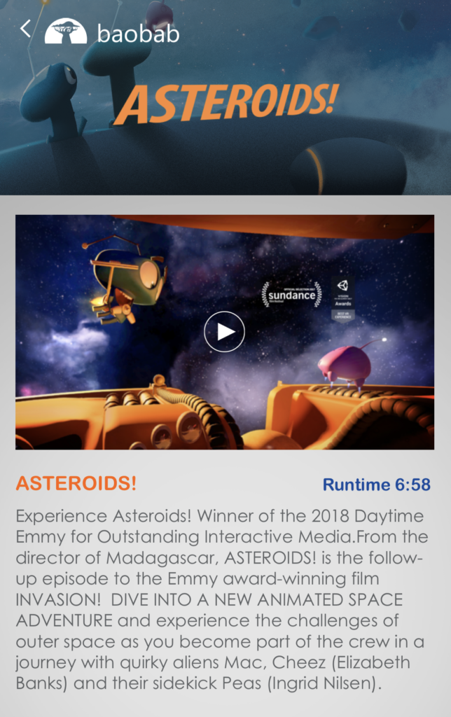
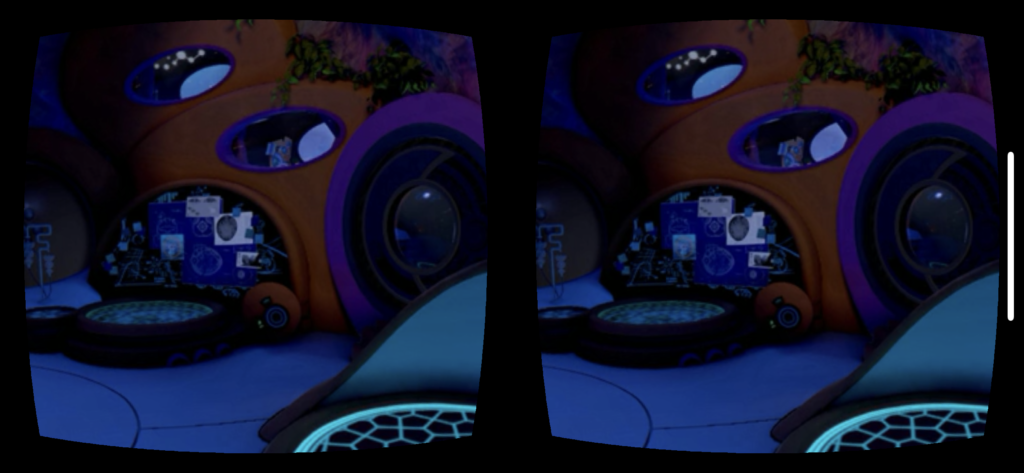
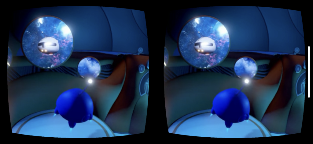
I used the Google Cardboard to view a VR 360 short movie called “Asteroids!” by baobab. In this short movie, the user is virtually placed in the center of a spaceship and depending on the view, the user can see the outside (space) from the large window, or the user can see the interior of the spaceship. There is a storyline within this six-minute clip, which starts off with a peaceful scene, and then the characters face an emergency situation, one of the characters (the mom?) faces death but regains life, and the family is back to their happy norm.

The crucial difference of this 360 video from any other one-side video is that the user is the one who chooses which part of the scene he/she decides to watch. For example, when five dirt pieces hit the window of the spaceship, it was up to the user (in this case, myself) to turn around and see what had hit the window. What I mean by this is that when I was watching this scene, I was looking at the interaction of the three characters facing the interior of the ship. Suddenly, I heard a sound of something hitting the window, and so I turned around with my VR headset and saw that five pieces of green dirt had hit the window. In a sense, I turned around instantaneously when I head that sound out of curiosity, but some user may not even bother turning around, which would mean that that user will not witness that five green dirt on the window.

At times when I was watching this video, I was lost as to where the action was taking place. For example, there would be an action taking place at a certain location and then it would jump to a different location. Those times, I had to do a 360 turn around to figure out where the next scene was taking place. I was watching this video in my room on my bed and so it was easy for me to do a 360-degree turn. However, if I had been watching this video in a smaller and limited space, my actions would have been different. Therefore, I realized that I must secure a free 360-degree space before watching or doing any 360 VR or AR experience.

Example Scene 1
Example Scene 2

VR Experience Review

During the week I tried out the Google Earth VR online, where you can experience varies views from different locations in the world by using the mode “walking” or “flying”. When you are “walking” in the scene all you need is just a VR headset, while in order to experience “flying” you need an extra handle as well to navigate the directions.

Here are two brief clips showing how it looks on a PC:

Flying mode

Walking mode

Experience without equipment online

After experiencing the online Google Earth VR and looking at the videos of how it will work in a headset with a more immersive experience, I deepened my understanding of how the space works in terms of communications information that the way to communicate influence the user experience and the level of immersion. Take Google Earth for example, when the communication means is simply drag the mouse to rotate the 360 degree scene on a PC, it gives you less sense of reality since the user don’t see the instant reaction from the scene they are watching. While when the user is using a headset and maybe a handle to experience it, it feels more like reality since the user is asked to take less effort (no need to drag the mouse) and the scene will give you instant feedback and interactions as the user is moving the head around.

What’s more, beyond the communication means, the information included in the VR experience also matters. Wether the view is from the perspective from above (the god’s view), or it’s a fixed camera point in the middle of a 360 degree scene, the position from which the view starts really influence the level of immersion, or the level of how realistic it is. However, although the Google Earth VR in the flying mode gives you the perspective to see the world from above, it does provides you with the contextual background that you are in an aircraft, which makes more sense and smoothens the user experience.

VR Experience Review: VR Diving

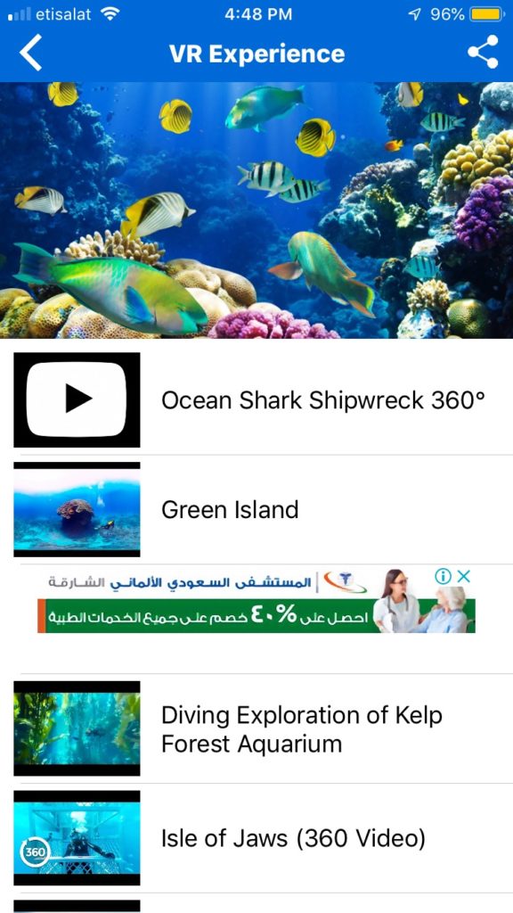
I decided to try out an app called VR Diving where you can choose from a set of different underwater environments to experience either just on your phone or with Google Cardboard:

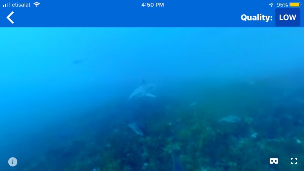
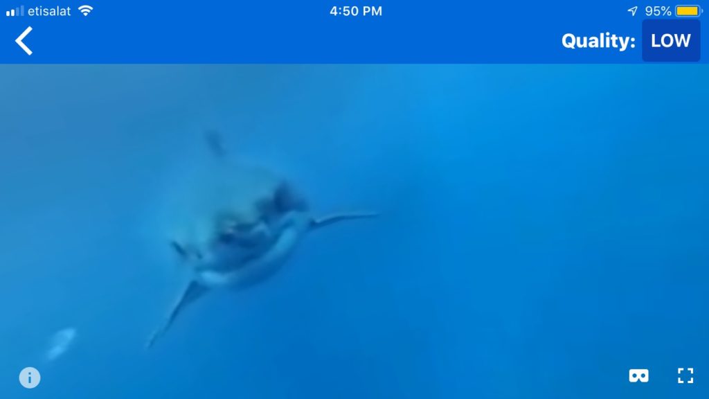
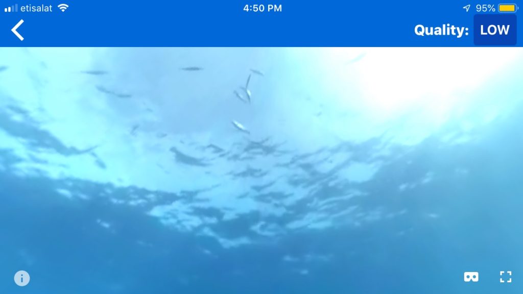
I chose the first one, Ocean Shark Shipwreck 360, to review. Here are a few screenshots of the experience, taken from the normal phone view rather than the Google Cardboard view for ease of viewing on the computer:

Ignore the quality setting – I set it to “high” later on but there wasn’t really any noticeable difference.

This 360 video showed different clips of sharks and fish swimming underwater. When you tilt your head down, you can either see coral or darker blue ocean water, and when you tilt your head up you can see the sun shining onto the surface of the water. While the videos appear to be taken from real life, the sound does not – there is a creepy sort of music along with sounds that sound like bubbles.

I’m a little confused as to what the purpose of this environment is. On one hand, it could be a cool way to represent what scuba diving is like. On the other hand, it could be meant to scare the user because of the music and, at one point, one of the sharks eats the camera. However, this experience was an odd mix of the two. It wasn’t quite like a realistic representation of scuba diving because of the strange sound effects and also because of the fact that every so often, the video would suddenly transition to a slightly different scene with an unnatural fade in/out effect. It also wasn’t quite scary, because the bubbly noises distracted from the scary music, and most of the sharks didn’t seem to mind the user.

It makes more sense for this to be aiming for a realistic representation of scuba diving, because the rest of the worlds you can pick fit along with this theme. In terms of how the view is composed, it is pretty effective, especially because it uses real footage and the slight haziness is similar to how it feels to wear goggles underwater. The editing done to the footage, like the transitions and sound effects, are the components that would need to be improved.