Project 3 Documentation:Memory Box

1. Project Description:​ 

Project name: “Memory Box”

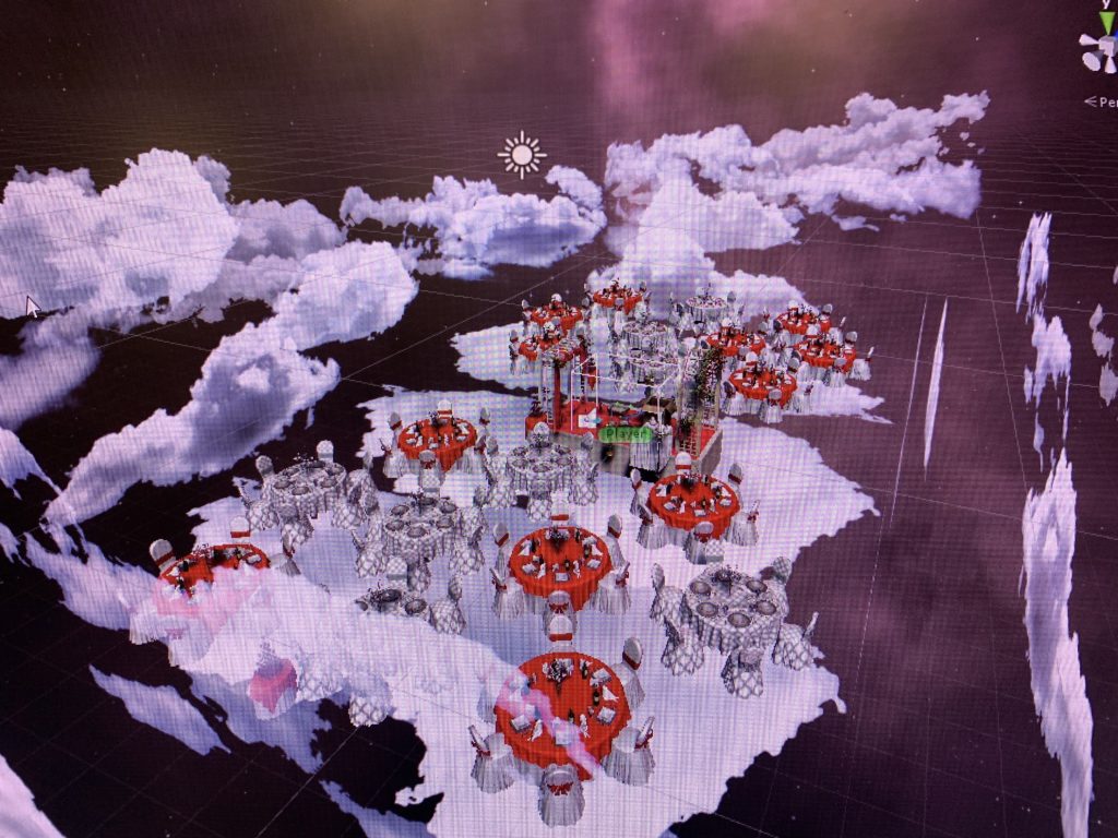
MemoryBox is an immersive experience for user to explore a sad ending love story by being positioned into an empty wedding scene to help “me” recall the pieces from a romantic love memory and wrap these memories up at the end to move on. The aim is for users to interact with objects in the environment, and form their own understanding of the story based on how they interpret the environment setting, the given objects and the stories that are being told behind each match of objects. Since the experience is set to be in an memory space, the user, upon they entered the game scene, would have the choice of deciding whether they want to be positioned as a female or male to experience the story. After they make the choice, they enter an empty wedding scene inside the memory space, and there are multiple daily objects and a cardboard box on the red carpet. Users will be instructed to pick up the objects, and put them into the box in pairs. Each time a correct paring complete, a piece of story about the paired objects will played. When all the objects are put into the box and all the memories related to these objects have been recalled, the box will disappear with some words appearing in particle mist, indicating that this story is erased from the memory and it’s time to carry on.

2. Process and Implementation:

A.Story sketch:

We started with looking for objects that could be matched in a relationship and is obvious enough for user to pair them up without having trouble figuring out the relationship among the objects. So ultimately we decided on doing storytelling on the following objets: toothbrush, toothpaste, wine bottle and dinner plate, pet food bowl, pet mat, iron, iron board, pen, notebook and a vase with rose. Below is the specific storylines, which will be played after the two objects are paired up correctly:
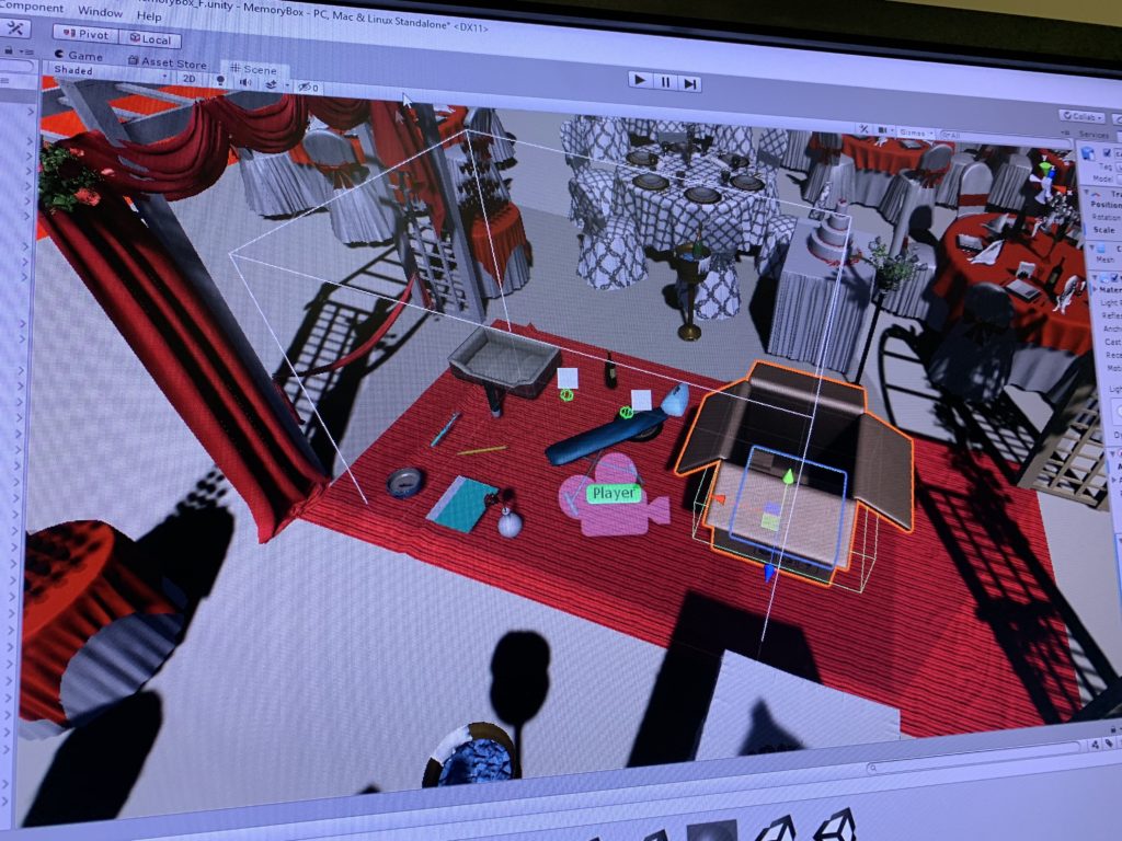
Objects in the game

Male Version:

Toothbrush & toothpaste: Paired toothbrush is the first step to show we are a family, says her.

Wine & Plates: I finally got the courage to invite her out for a dinner. Candle light on her cheeks is the cutest thing ever.

Dog Food & Dog Cage: I brought home a new family member that day, and I couldn’t forget how excited she was: her dream finally came true.

Iron & Iron Board: First day of work after my promotion.  She ironed my suit in the morning. Looking forward to our bright future.

Pen & Notebook: She used to keep all of our memories in this notebook … but it’s meaningless now. 

Vast with rose: Roses die. So are our promises….Eventually it turns out to be a wedding without her…

Female Version:

Paired Toothbrush : Pairing our toothbrush makes us look like a family more… 

Dog Food & Dog Cage: That day he brought home a cute puppy. I was so surprised! I always wanted a pet. I guess now we are a family of three. 

Iron & Iron Board: I want to make his first day after promotion special, so I got up early to iron his suit. Looking forward to our bright future …

Candles and Plate: Can’t ask for anything better than a candlelight dinner for the first date.

Pen & Notebook: It’s been a while since he left me… i used to keep a diary everyday when we were together …. How stupid i was.

Vast with rose: Roses die. So are our promises…. Eventually it turns out to be a wedding without him…


*The story will be understood regardless of the order – every single piece of a story is independent from one another however once the user finish all the story piece he/she will get the idea of what’s going on – there’s different level of love memories as well as the part the indicates the break up, however there’s no specific reason given why the owner of the memory break up, it leaves the space for user to imagine what happened, different people will have different interpretation of the reason based on their own understanding of the given objects and the story behind them.

B.Environment Design: How did we build the scene and the the ideation of designing choices

Environment overview

The role of the user: an explorer of “my” memory, in order to emphasis that, all the story narratives are recorded in the first perspective, and the starting scene intrusion words also put emphasis on the identity of the user, by saying “why am i the only one in the wedding?” and encouraging the user to get involved into the game by saying”can you recall the memory by paring the objects” etc. This is also embodied in the ending scene design: we remind the identity of the user by saying “now I have to leave these memories behind and move on…”

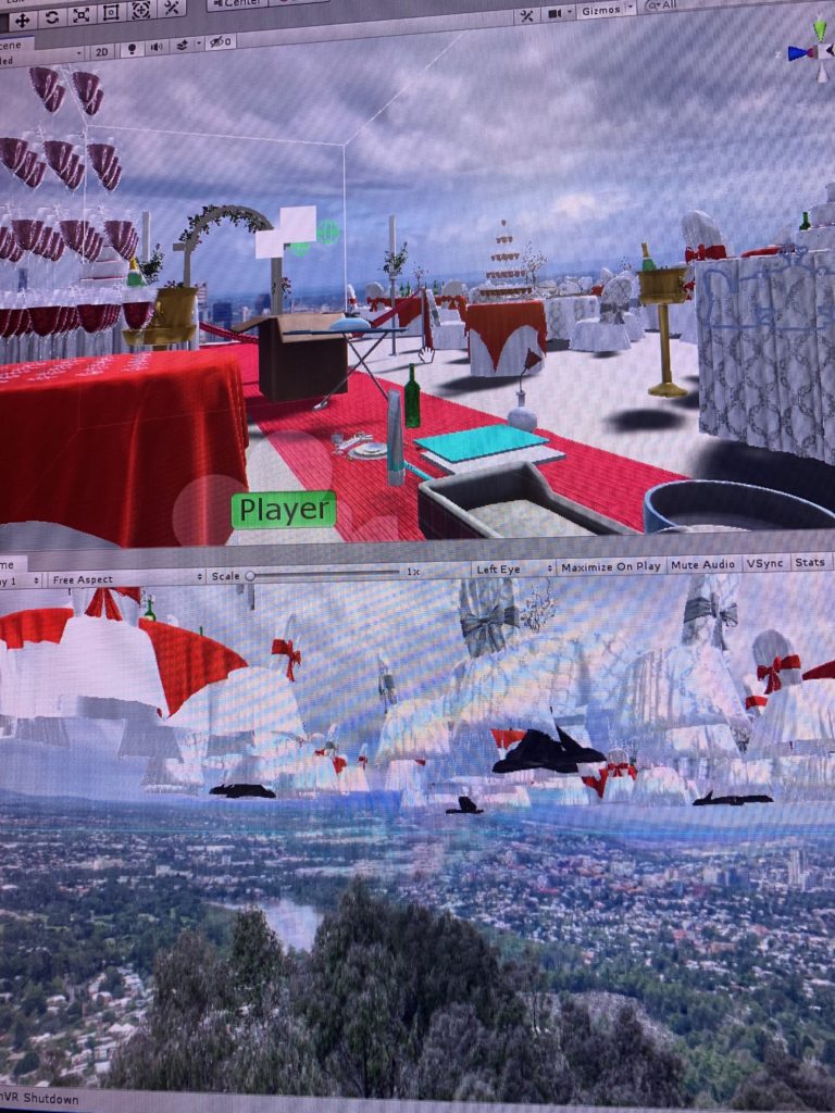
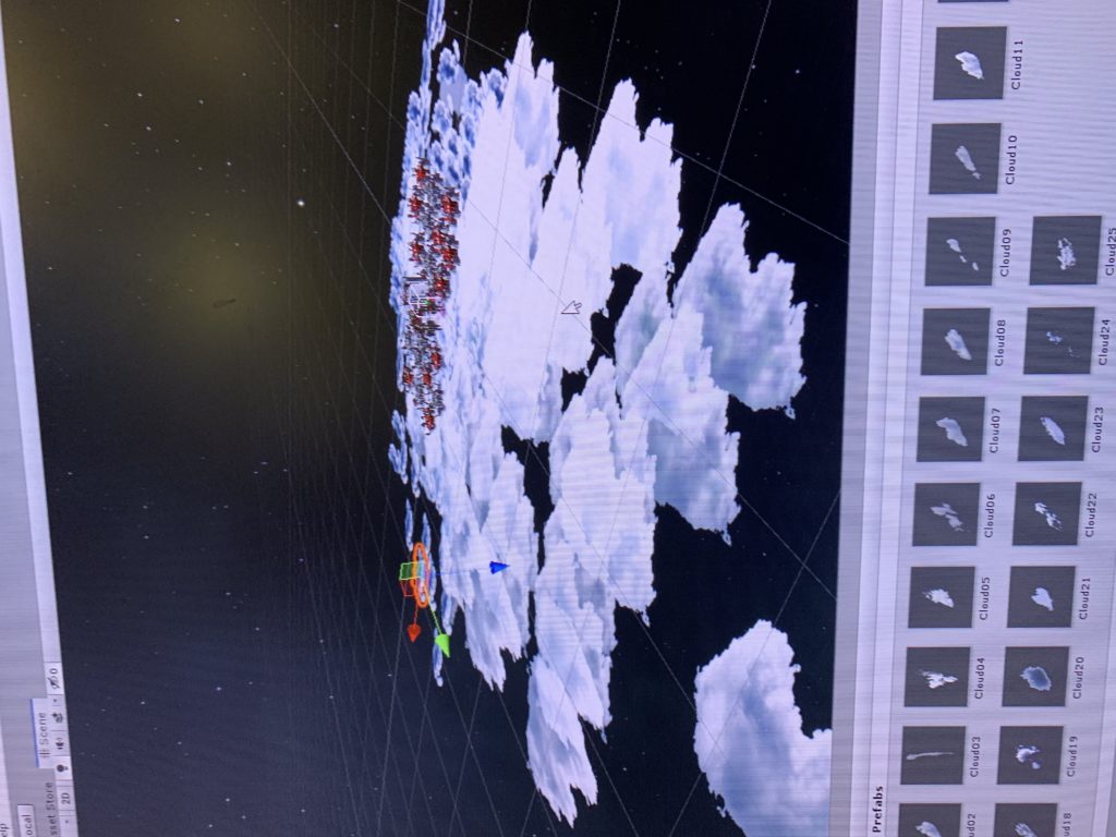
In term of defining the logic the the world, we used the realistic real life wedding scene design for the background, apply the gravity and basic physic logics/ responds to all the objects, embody the emotion difference between male and female by giving two perspectives to experience the story – the same objects may be interpreted differently by gender since females are more emotional and male are more rational. What’s more, the choice of objects: pen with notebook, iron with ironboard etc. enhance the existing daily life knowledge, so the user can still get the sense that their existing knowledge of logic still applies in this world, however, by adding the floating clouds in the outer space as background, we challenge those existing knowledge of how a wedding scene should look like and therefore make it more like a fantasy, a dreamy scene in a “memory space”.

Because our story is a bittersweet love story with a sad ending, so I decided to use the wedding scene to indicate the background of the story – it’s about love, however, at the same time, this is the wedding where only “me” (the user) is attending and there’s no one else around, the odd and emptiness of the wedding scene creates the contract and indicate that even though this is a love story but it doesn’t seem to have a happy ending. The realistic wedding design with the non-realistic background (floating above the city) conveys the message that this is not the real world, it is something fictional and doesn’t match our real life experience.

We also have the wedding march as the background music to create the atmosphere of a “wedding”. The floating effect is added to the clouds to make the scene more “dreamy” and use it to indicate this is a fantasy memory world.

About the ending: the whole projects is developed based on the chosen theme “close the door”, therefore the ending is designed to be that the memory box is destroyed after all the objects are paired up, indicating that the owner of the memory space “I” close the door of the bittersweet love memory and leave the memories behind in the box to keep moving on. The moment when the memory box disappear, it will be accompanied with the particle effect to show the sense of “vanishing” and an ending explanation in 2D words will be shown to suggest the end of the game as well to explain to the player what happened, by saying “Thank you for helping me recall those memories… Now let me just leave my love story in this box behind and move on….”

User Interface Design

C. Steps to implement the interactions:

(highlight some key interactions we worked on)

  • Choosing female/male perspective in the user interface and switch scene based on the gender choice;
  • Pick up and throw objects;
  • Trigger the audio to play when two certain objects collide;
  • Background music volume change: attach other 6 audio sources(which are attached to specific game objects) to the same game object (the player ),detect when other audios “isPlaying”, the background volume = 0.1f, to reach the ideal effect that when the narrative audio plays, the background music volume turns down.
  • Boundary detection: Add a collide box outside the player area to bounce back the objects that are thrown away by the users.
  • The floating effect of the clouds.
  • End of experience : When the the boolean detects of all 11 game objects doesn’t exist in the scene, the box object will be destroyed, the 2D words will be displayed and the particles system of the “mist” effect will be played.

3. Reflection/Evaluation: ​  

Compare to what we had in mind initially, we made a dramatic change in our project, because as we goes on with coding and finalizing the storyline, many of the initial thoughts were either not achievable or doesn’t have the best compatibility with what we had in the piece so far to we have to keep changing and renew how the story goes. However, those changes we made alone the development of the projects carries out the best outcome, imagine if we stick to what we had a month ago and don’t adopt it according to the user’s feedback etc, we would’t have made the final price to be easily understood by any users and create the best experience for them. Overall I think we achieved our goal, to create a project that is lovestory-based, meanwhile the application and the process has been modified a lot and didn’t follow our initial design but ended up pretty good.

We have achieved the basic interaction elements we designed – two gender storylines, pick up and pair objects and hear the story behind it, and the ending scene that indicates the end of the love story. The goal of design is to create the dreamy scene that indicates its a memory space with realistic real life objects, I think we achieve the goal according to users feedback, however we should have worked more on limit the movement of the users on the red carpet since most of them will try to get out of the playing area and explore what’s beyond there.

4.Reflection after IM show:

The IM show provides a great opportunity to let the non-knowledgeable users to test our project. Overall it went pretty well, people liked the idea of the love story and the wedding scene design and they shared different feelings they have after playing the game with us. However, few things worth noticing, that most of the new users need to be educated of how the VR system works, from how to use the handle to how to teleport. In playing our game, specifically, most of the users don’t follow the instruction, or maybe because the instruction wasn’t clear enough, that users just put everything into the box instead of pairing them up; When user figure out the an audio will be triggered to play after the two objects are matched, they will just put the two objects together instead of putting them into the box.

Therefore I think we still have room for improvement, including visualizing the instruction to make it easier for users to understand, and making the two objects collusion only validate when they collide inside the box.
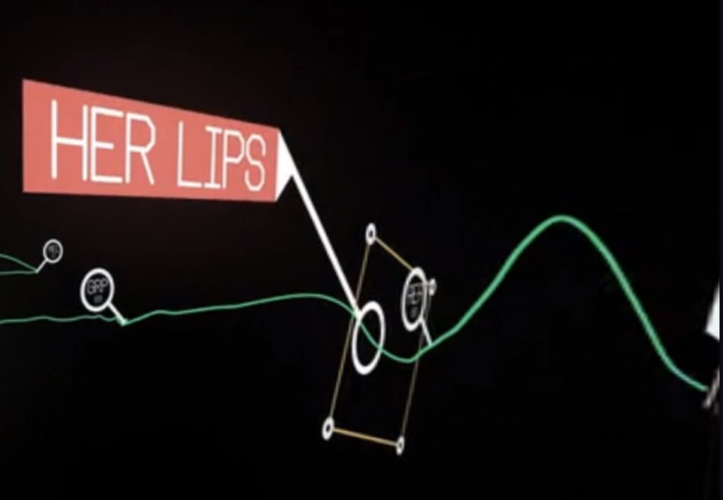
Most of the users don’t follow the instruction, or maybe because the instruction wasn’t clear enough, that users just put everything into the box instead of pairing them up
When user figure out the story will be triggered to play after the two objects are match, she will just put the two objects together instead of putting them into the box

PVRK blog post

After experiencing the VR park I got a deeper understanding of how an immersive VR experience is designed and why it’s extremely important for users and storytelling in VR world.
Here’s some experiences I want to highlight to emphasis how immersion is addressed/achieved in those VR designs and what’s good and bad about them: I started with the VR roller coaster and felt totally like in an open air amusement park – the wind effect, the actual rails and carriage of a roller coster, the safety bely, the feel of gravity when the carriage pitch down the sound effect and the realistic design of the burj khalifa. However the only thing that reminds me of ‘I’m just in a VR game” is that the headset is so heavy when it moves as the roller coaster goes up and down – it is such a bordern in a physical-experience-focused game like roller coaster, and eventually because it’s not tightened on my head I lost the headset during a sudden turn.

Another game that I think is really immersive is the parachuting one – the design of the seat, the wind effect when you speed up, the movement of the seat when you control the directing by pulling the handle of the parachute and the realistic design of the a mountainous scene, all of those really get me engaged into the game and fee immersed. My role in this game is just to simply pull and handles of the parachute to control the direction of the landing.

The one that I like the most is the Tombescape one in which different scenes and stages are designed and you have to move around to unlock the next scene by walking the certain path constructed / separated by plastic walls. The immersion in this game is represented by allowing the user to walk around to expose along the designated path instead of stay still and wait for things around him/her to happen. Also the sounds and light played an important role in the immersive experience a well – when you are in a dim tomb, the noise of the skeleton and the candle fire guides you to go to the certain direction. Without those indications a user will easily get confused and won’t be able to finish the whole game.

Development Blog – Final project

April 7th:

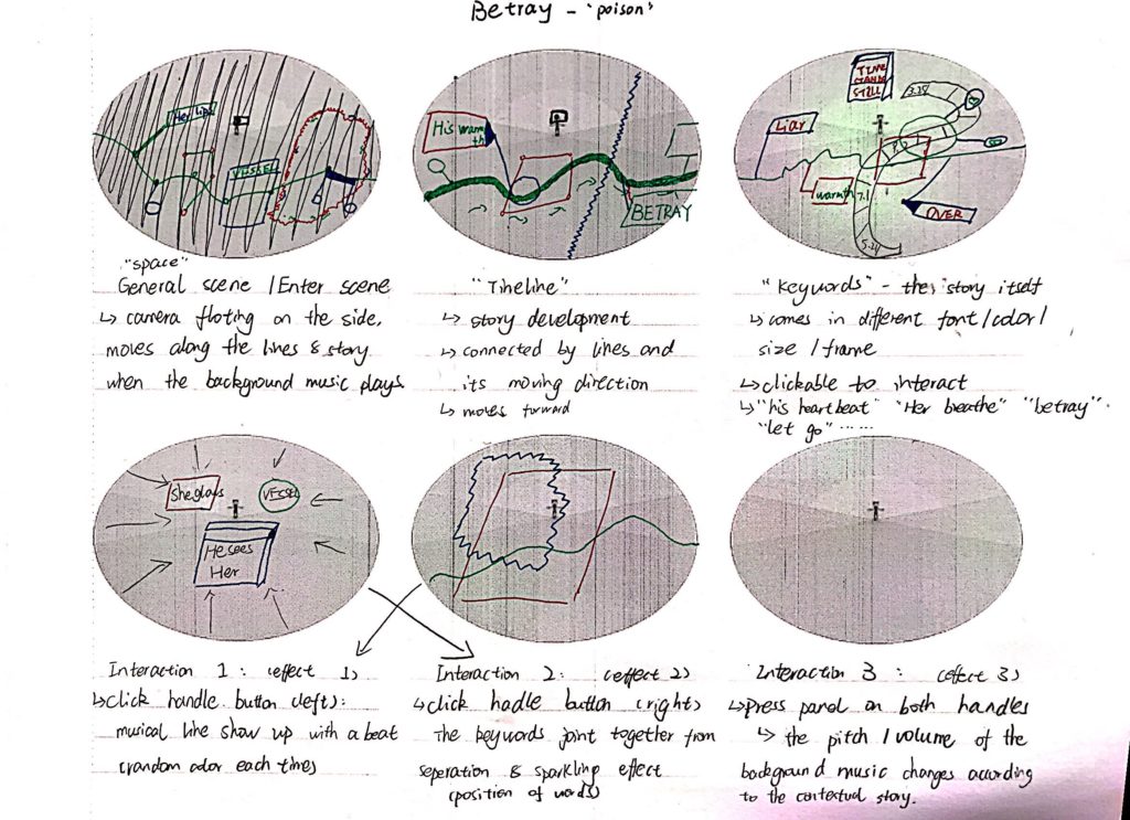
“Betray” is a musical bittersweet love story conveyed by beats, background music and key words that follow the story development timeline.

Project inspiration:

https://www.with.in/watch/lovr?autoplay=true

Storyboard:

April 16th: Memory Box

We paved our project idea into a love story using the theme “close the door” according to the feedback we got from folks and professor that the previous project idea doesn’t involve sufficient meaning for the user that a user might not feel engaged enough into the story just by watching it.

When the game starts, the user will be put in to a lover’s memory with a box in front of his/her (user can choose male/female version to hear different interpretation/stories behind the same paired objects), and the user will pair some memory pieces and put them into the box to complete the story. Once they pair is correct a story piece will be told in the voice message, otherwise the objects will be bumped out of the box and the user need to pair the correct ones again.

the story line we discusses is as following(the order doesn’t matter in this case):

Male Version:

Movie Ticket & Popcorn Box: I finally got the courage to invite her out for movie. Touched her hand when we tried to reach the popcorn at the same time

Paired Toothbrush & Cup: The first night she slept over, she brought her toothbrush with her. The next morning, she changed my toothbrush into a paired one

Dog Food & Dog Cage: She always wanted a pet dog. I brought home a cute puppy one day, and I couldn’t forget how excited she was: her dream finally came true.

Iron & Suit: First day of work after my promotion. She ironed my suit for me. Looking forward to our future.

Ring & Ring Case: I saved all my money for this ring, prepared for a month for this. Today is finally the day.

Passport & flight ticket: Leaving the country tomorrow. I guess I will have to put this memory in the box and leave it behind…

Female Version:

Movie Ticket & Popcorn Box: He finally asked me to hang out. I’ve been waiting for this for a month. He’s so shy but so cute.

Paired Toothbrush & Cup: I was like a kid after I stayed at his place. I paired our toothbrush up.

Dog Food & Dog Cage: Suddenly one day, he brought home a cute puppy. I was so surprised! I always wanted a pet. I guess now we are a family of three.

Iron & Suit: I want to make his first day after promotion special, so I got up early to iron his suit. Looking forward to the bright future of ours

Ring & Ring Case: I said yes.

Passport & flight ticket: His work left us no choice but to lock all these memories up, forever.

April 18th:

Renewal of storyline and objects because some objects are unavailable in asset store:

**The story will be understood regardless of the order – every single piece of a story is independent from one another however once the user finish all the story piece he/she will get the idea of what’s going on – there’s different level of love memories as well as the part the indicates the break up, however there’s no specific reason given why the owner of the memory break up, it leaves the space for user to imagine what happened, different people will have different interpretation of the reason based on their own understanding of the given objects and the story behind them.

Male Version:

Paired Toothbrush & Cup: Paired toothbrush is the first step to show we are a family, says her.

Candles & Plates: I finally got the courage to invite her out for a dinner. Candle light on her cheeks is the cutest thing ever.

Dog Food & Dog Cage: I brought home a new family member that day, and I couldn’t forget how excited she was: her dream finally came true.

Iron & Iron Board: First day of work after my promotion.  She ironed my suit in the morning. Looking forward to our bright future.

Pen & Notebook: She used to keep all of our memories in this notebook … but it’s meaningless now.

Vast with rose: Roses die. So are our promises….Eventually it turns out to be a wedding without her…

Female Version:

Paired Toothbrush : Pairing our toothbrush makes us look like a family more…

Dog Food & Dog Cage: That day he brought home a cute puppy. I was so surprised! I always wanted a pet. I guess now we are a family of three.

Iron & Iron Board: I want to make his first day after promotion special, so I got up early to iron his suit. Looking forward to our bright future …

Candles and Plate: Can’t ask for anything better than a candlelight dinner for the first date.

Pen & Notebook: It’s been a while since he left me… i used to keep a diary everyday when we were together …. How stupid i was.

Vast with rose: Roses die. So are our promises…. Eventually it turns out to be a wedding without him…

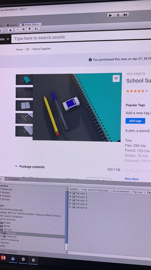
finding objects that match the story line

Ending: Initial idea was to do an “close the box” animation when all the objects are paired and destroyed to cater the chosen theme “close the door” by indicating that the owner of the memory space “I” close the door of the bittersweet love memory and leave the memories behind in the box to keep moving on. However, I worked on the scripts of animation but ended up finding that our box is not animatable, because the lips of the box comes together with the box body and can’t be animated separately. Therefore we came up with an alternative ending of the story – in stead of close the box, the box will be destroyed and the moment it disappear, it will be accompanied with the particle effect to show the sense of “vanishing” and an ending explanation in 2D words will be shown to suggest the end of the game as well to explain to the player what happened, by saying “Thank you for helping me recall those memories… Now let me just leave my love story in this box behind and move on….”

April 23th: Environment Design

Because our story is a bittersweet love story with a sad ending, I decided to use the wedding scene to indicate the background of the story – it’s about love, however, at the same time, this is the wedding where only “me” (the user) is attending and there’s no one else around, the odd and emptiness of the wedding scene creates the contract and indicate that even though this is a love story but it doesn’t seem to have a happy ending. The realistic wedding design with the non-realistic background (floating above the city) conveys the message that this is not the real world, it is something fictional and doesn’t match our real life experience. Hopefully user will get the idea that this is in someone’s memory world.

April 25th: Voiceover recording and editing – record the narrative of the story in both male and female voice.


May 5th: Background music and Floating effect

Added the wedding march to the background music to create the atmosphere of a “wedding”. The floating effect is added to the clouds to make the scene more “dreamy” and use it to indicate this is a fantasy memory world. In the beginning I wanted to create the effect that the clouds are moving at different speed so it looks like they clouds are floating around you, however, considering that it might cause too much movement in the background and therefore distract the user, I set the moving speed of all the clouds are the same, which result in the effect that it looks as if the platform that the user is standing on is floating instead of the clouds around them – since it’s relative motion. But this unexpected effect is so cool and achieved the goal to create the illusion of dream so I decided just to keep it that way.

  1. public float amplitude; //Set in Inspector 
  2. public float speed; //Set in Inspector 
  3. public float tempVal;
  4. public Vector3 tempPos;
  5. void Start () 
  6. {
  7. tempVal = transform.position.y;
  8. }
  9. void Update ()
  10. tempPos.y = tempVal + amplitude * Mathf.Sin (speed * Time.time);
  11. transform.position = tempPos;
  12. }

May 6th: User test and adjustment according to feedbacks

Add a collide box outside the player area to bounce back the objects that are thrown away by the users. / The city view background is kinda distracting user’s attention because it has too many details, the scene is too realistic and not dreamy/imaginative enough to indicate this is a fictional “memory space”- changed the scene into a universe space surrounded by clouds.

May 10th:Enviroment Design 3


May 12th: Design of the user interface :

May 12th: Coding and design for ending:

1.problem to solve : when the narrative audio plays, the background music volume down.

solution: attach other 6audio sources to the same game object (the player ),detect when other audios isPlaying, the background volume = 0.1f;

issue: one gameobject cant’t be attached more than 2 audio sources.

another solution: get audio sources from other game objects and detect if it’s isPalying. 

2.problem to solve: close the box animation

issue: when all the game objects are destroyed in the scene, trigger the animation. 

use of GameObject.Find(“”)

3.User test feedback: the floating clouds movement is too intense that it makes user feel dizzy; solution: 1.narrow the range of height movement and the range of moving speed. 2. scale up the red carpet where the user is standing on, so it will feel less scary and dizzy.

Ending: Initial idea was to do an “close the box” animation when all the objects are paired and destroyed to cater the chosen theme “close the door” by indicating that the owner of the memory space “I” close the door of the bittersweet love memory and leave the memories behind in the box to keep moving on. However, I worked on the scripts of animation but ended up finding that our box is not animatable, because the lips of the box comes together with the box body and can’t be animated separately. Therefore we came up with an alternative ending of the story – in stead of close the box, the box will be destroyed and the moment it disappear, it will be accompanied with the particle effect to show the sense of “vanishing” and an ending explanation in 2D words will be shown to suggest the end of the game as well to explain to the player what happened, by saying “Thank you for helping me recall those memories… Now let me just leave my love story in this box behind and move on….”


Project 2 Documentation

1. Project Description:​ 

Project name: “Zenboo”

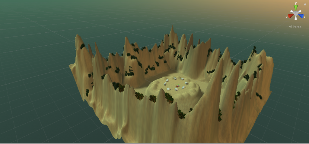
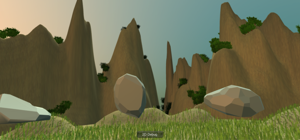
Zenboo is a relaxing space that demonstrates the state of ZEN by giving user relaxing watering&growing&cutting bamboo activities to offer them a chance to interact with mother nature in a fun way. A user will be surrounded by mountains, floating rocks and bamboo clumps, he/she will find tools nearby to give the user hints to initiate some activities with them. In Zenboo, the user is able to water the bamboo using a watering can and watch it grow in a unique way; moreover, he/she can also play with the newly grown bamboo. When picking up the sickle next to the watering can, a user can wave it to the bamboo clump and make the bamboo pieces disappear. If the use water it to much and make bamboo grow too fast, due to the effect of gravity, some piece of bamboo will fall on the ground and disappear after few seconds by themselves as well!

Space view
User view

2. Process and Implementation:​ 

This is how we started:


How did we build the scene and the the ideation of designing choices:

We want to create a scene/space that makes people feel relax in and doesn’t have a lot of things/movement to distract them from feeling the sense of “Zen”, therefore we came up with the idea of having a giant mountainous background with the sunset mode and put the user in the middle, also in order to amplify the interactions between the user and the growing plants experience, we put rocks around where the user is standing to make sure he/she won’t have to move too much to interact with the environment.

The reason for this inspiration is they are very mystical and calming, which would help contribute to the relaxation aspect of Zenboo.

The design of the circle of rocks was decided through the user feedback that the rocks could be larger and floating around the user rather than the initial plan to have them resting on the ground. This turned out to have a pretty cool effect and create the Zen atmosphere.

Another design decision that has been changed during the project development was the location of the bamboo. Since space is a limitation, having the clump of bamboo in front of the user all spaced out would have been problematic, or perhaps not as intuitive that the user had to go over to it and water it. Instead, we decided to place the bamboo in a semi-circle close to and around the user. This way, the user does not have to walk very much in order to water all of the bamboo.

What would be the “everyday” thing in this world?

The simple actions/interactions like pick up/drop/throw/watering and cut that everybody already knows what to do the first time they see the scene. And according to out existing knowledge we have the perception that when you water the plant it will grow, when you wave the sickle it will cut the plant. Therefore there’s not a lot of education of how this project works is needed and it’s easy for any user to take it up.

Steps to implement the interactions:(highlight some key interactions I worked on)

1: Particle system – water:

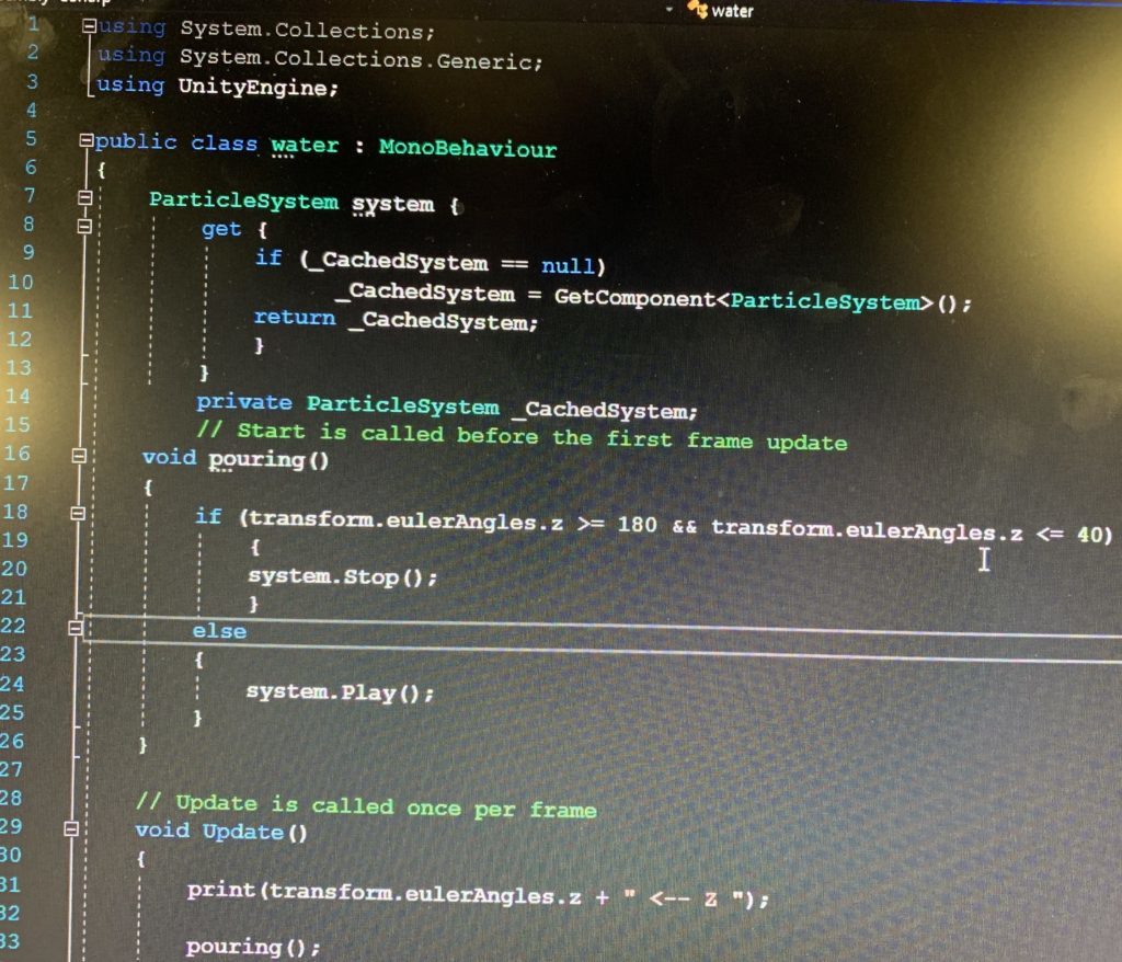
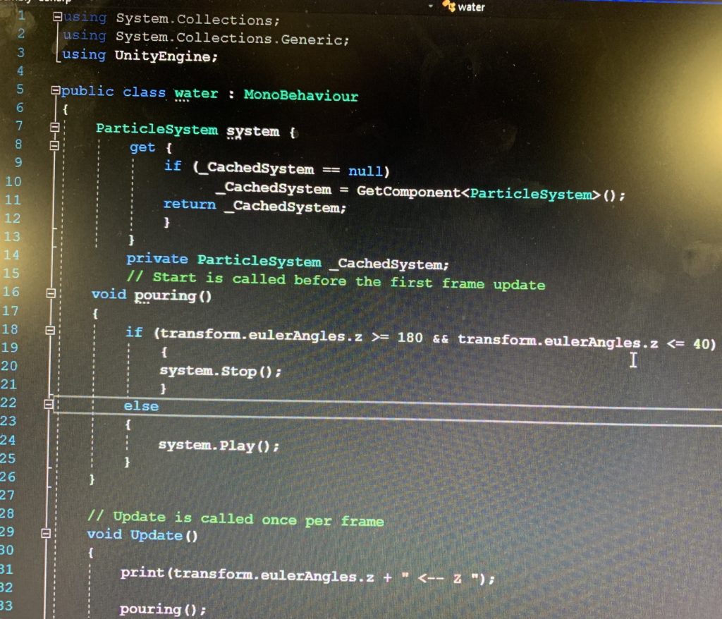
I worked on the particle system to make it on/off when an object is rotated at the certain angle – when the watering can face downwards the water particle system will be on and when it’s at the normal position the article system is off and the water effect won’t be shown. 

I reached the goal by using the transform.enulerAngles and catching the Z angle input of the water can object. We have a boolean function called “IsPouring”, so I grabbed the particle system under it and I added the code if the angles are beyond the range then the the system stop, else the system play. And we call the function “Is pouring” under the “void update” to make sure it is running all the time.

There was a small problem when I practice the code – the particle system is alway on when it’s playing. So I assumed it was disconnected from its parent object, then I added the code “Print” on the IsPouring function to check if it’s connected to the watering can when the codes are running. It turned out to be that there’s nothing printed out in the console log, so I dragged the the particle system to the water can to make sure it’s under the component section (although the particle system is already a child of the watering can), and then it worked.


2: Particle system – mist:

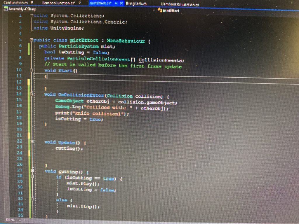
Another particle system I worked on is the the mist effect and it will only be triggered when the sickle is cutting/colliding with the bamboo. 

At first I was thinking about attaching the particle system (the mist) to the bamboo script, so whenever it is detected that the bamboo is colliding with the sickle (the sickle is hitting the bamboo ), the result of which is to destroy a GameObject (a piece of bamboo), the mist particle system will be triggered to play. However, this design has two significant difficulties: one is that OnParticleCollision is really hard to be repositioned in the “instantiate” to make the mist effect only be shown on the specific piece of bamboo that is hit by the sickle (since there will be a lot of bamboo grow out of the OG bamboo); another difficulty is that since at the same time the game object will be destroyed will the child function on it has been trigger, they effect will not be shown at all because the moment it’s triggered, its parent also dies so the mist has nothing to show on.

Taking these conditions into consideration, I tried to created a new mist script just for the sickle and it’s separated from the bamboo function so we don’t have to reposition the particle system for each specific bamboo. At first I tried to detect the dillion of the particle system by “OnParticleCollision”, however it turns out to be super hard to be detected accurately since there are millions of small particles and it almost collide with everything. Therefore I switched to detect the collusion of the sickle – once the collision of the sickle hits a game object, the particle system (mist) that is attached to be sickled will be triggered. 

3:Bamboo Grow when been pointed by particle system

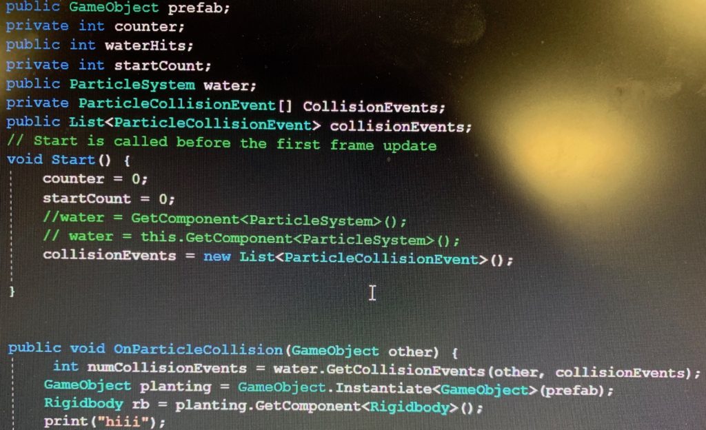
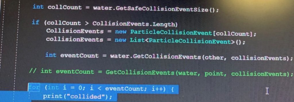
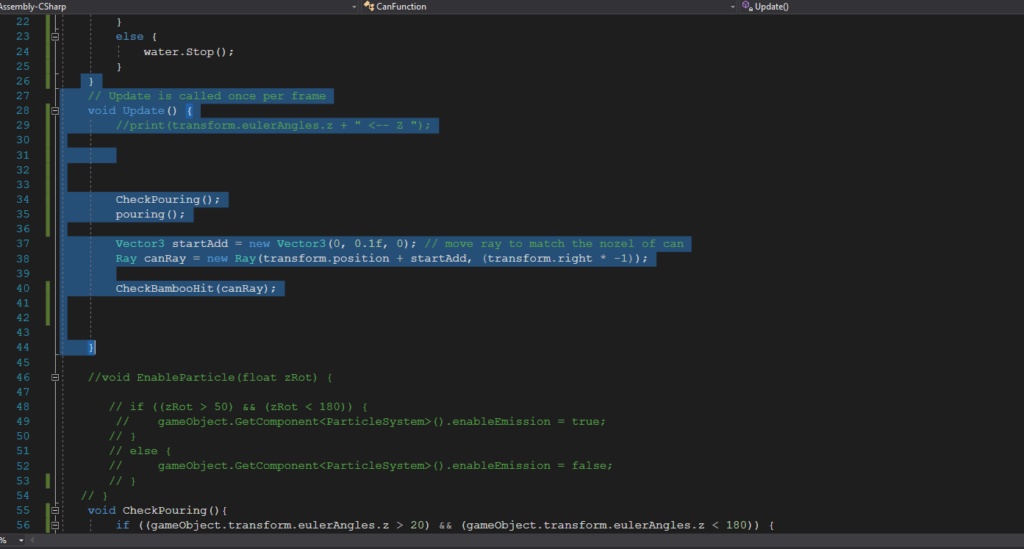
We finished this part by using OnParticleCollision to detect the collision between the bamboo and the particle system that has been attached to the watering can. In the beginning we decided to add the particle system collision detect in the Bamboo OG script, because the growing function is in the same script so it’ll be easier to call, however, even been put into different layers and been set as “only collide with bamboo”, the particle system will literally collide with everything. Then we tried to only write the particle collision detection code in the canfunction and call the bamboo grow function from a different script to make sure the two parts are not messed up with each other. So basically in the particle system we say once it’s collide with bamboo, then it triggers the grow function from the BambooOG script, and then it worked. The codes we uses are shown below:

4: Floating effect of rocks:

In order to improve the user experience and create the sense of ZEN, I added the floating effect:


3. Reflection/Evaluation:​ This should discuss your expectations and goals in the context of the what you felt was achieved with the finished piece.

I think we as a team successfully achieved our initial goals and expectations of this project – that we have a beautiful Zen environment, we built the growing and cutting bamboo interactions, and surprisingly during the process of coding bamboo functions we found a cool way to let the bamboo has the same X and Z position, so even if the user play around the bamboo/lift it up/touch it, the bamboos will come back to the same position. We also achieved our initial thought of limiting the user’s movement – by putting the semi-circle bamboos in front of the users. For the coding part I was involved in particularly, I reached the initial expectation to make the particle systems, trigger the bamboo grow function when it is collides with the water particle system, create the floating rocks effect and create the mist effect when the sickle collides with other game objects.

However, there are something that needs to be reconsidered/improved in this project. In out initial thought, we design the circle of rocks to limit the user’s movement, but it turns out to be in the real VR scene those rocks just become a part of the distant backgrounds that didn’t really work to limit the user’s movement. What’s more, I think there should be an ending of our project – because what we have now is just to endlessly water and cut the bamboos, it should stop or have something else to show at some point. The parts that I could potentially work more on includes making the collision detection more discreet – for example, the mist particle system will only be triggered when specifically collides with bamboo, not with any game objects.

A form of representation suits VR

A form of representation I feel would be suited for VR medium for doctors during a surgery.

It creates an interface to the world where the doctor can comprehensively assess the patient’s physical situation, instead of just seeing from a single dimension screen and being influenced by the surrounding environment. It is common nowadays that a doctor’s hands are operating a surgery while turning his/her head to another direction to see the instant image on the screen, this is an “inhumane” design for doctors because it loses the coherency of eyes and hands. What’s more, there are multiple other external conditions might influence a doctor’s judgement – the light in the operation room, the anxious patient, or even the breathe of the surgery assistants. Therefore by implementing VR into this specific situation will minimize the external influence so the doctor could have a better performance.

By operating with the precise equipment attaching to VR, the doctor will be able to focus on minor details in the surgery (eg. sewing the wound) and eliminate the failure of false judgment.

Project #2 Development Blog

Mar 3

Our group: Vivian, Adham, Cassie, Nico

We started off with some brainstorming for our interactions and actions:

Initial Ideas:

  • Throwing crumpled paper into a basket 
    • Implement points based on how far back you are → makes you move around
    • Obstacles (desk, etc.)
    • Crumpling paper
    • Classroom, library
  • Putting food onto tray- cafeteria
  • Washing face
  • Taking care of plants
    • Zen
    • If you cut the plants they just float around
    • Twisting knob motion to speed up time → plants grow, lighting changes
  • Drawing
  • Slingshot
  • Flipping coin into fountain
    • Something could pop out, you have to catch it

After deciding on the plant idea we enjoyed, we decided to go more into details:

Taking care of plants:

  • Time
    • Lighting changes
    • Sun/moon
    • Plant growth
  • Environment ideas:
    • Dorm room
    • Windowsill
    • Small cottage
    • Outside garden, fence 
  • Interaction
    • Watering
    • Cutting
    • Picking fruit/flowers
    • Growing bamboo

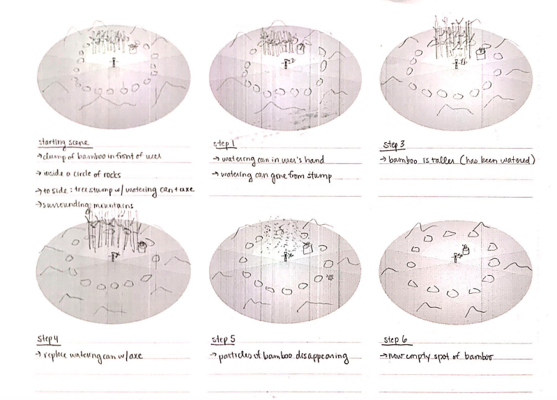
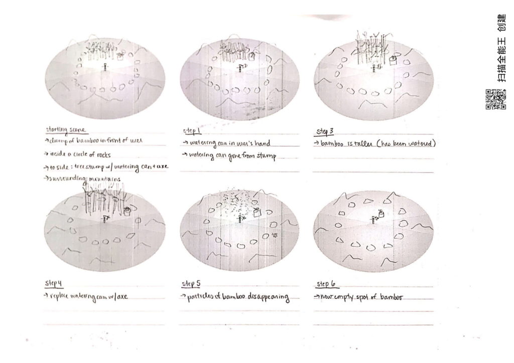
With a solid idea in mind, we went ahead and designed our storyboard:

–Step 1–

Clump of bamboo in front of you

To your side: tree stump with watering can + cutting tool

Surrounding mountains and other bamboo

You’re inside a circle of rocks

Butterflies are flying around

It’s golden hour

–Step 2–

You have the water picked up

Water is gone from stump

–Step 3–

Bamboo is taller

–Step 4–

Replace water with axe

Now the water is back on the stump and the axe is gone

–Step 5–

Show the particles of the bamboo disappearing

–Step 6–

Now an empty spot of bamboo

Our storyboard:

Mar 10

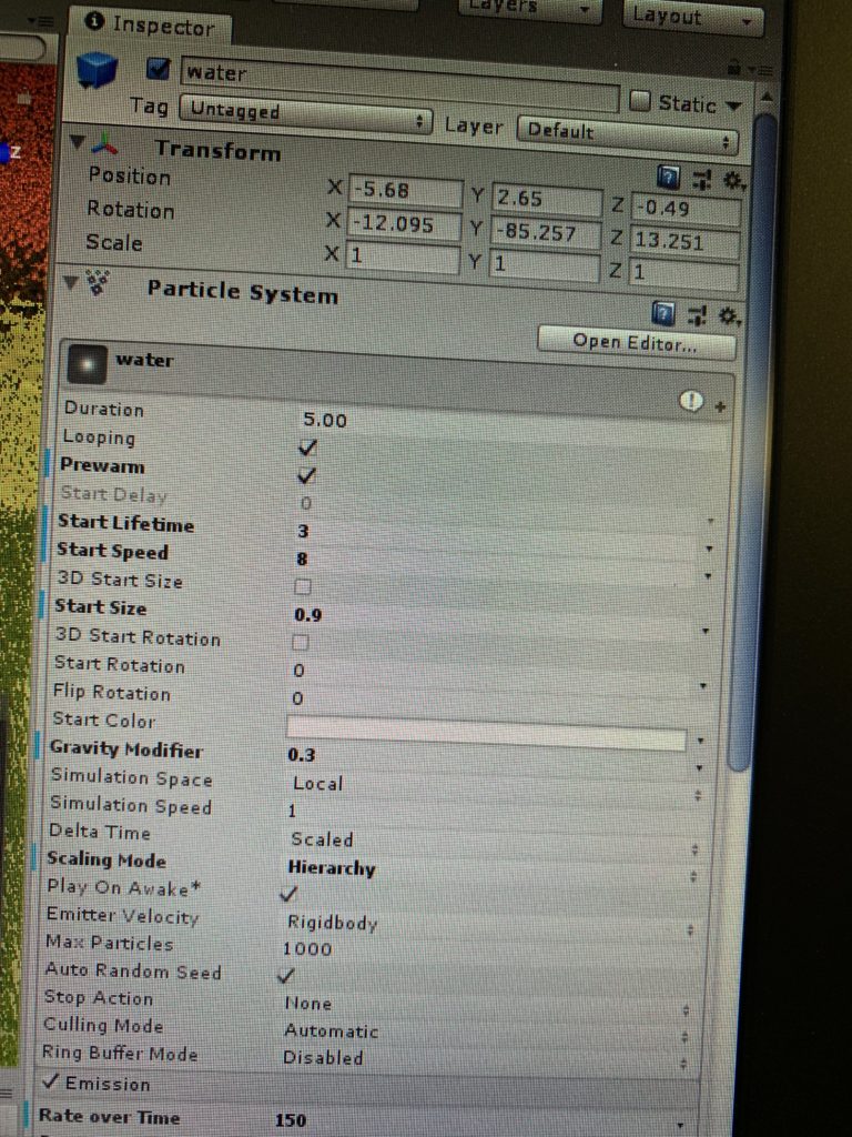
Start to work on the particle system – create the effect of the water coming out of water can when user grab it and pour towards the bamboos.

In order to make the water fro watering can realistic, I changed the following parameters: start lifetime/ start speed/start size, gravity modifier to 0.3, hierarchy scaling mode. Under the emission box, I changed the
rate over time” into 200, and for the “force over lifetime” I adjusted Y into -3 and applies it into “world” instead of local. For the “rotation by speed”, I changed the angular velocity into 300, because I started it with 100 but that way in the game the speed the water moves will not be able to catch the player moving speed.

Mar 13

Today I worked on the particle system to make it on/off when an object is rotated at the certain angle – when the watering can face downwards the water particle system will be on and when it’s at the normal position the article system is off and the water effect won’t be shown.

I reached the goal by using the transform.enulerAngles and catching the Z angle input of the water can object. We have a boolean function called “IsPouring”, so I grabbed the particle system under it and I added the code if the angles are beyond the range then the the system stop, else the system play. And we call the function “Is pouring” under the “void update” to make sure it is running all the time.

There was a small problem when I practice the code – the particle system is alway on when it’s playing. So I assumed it was disconnected from its parent object, then I added the code “Print” on the IsPouring function to check if it’s connected to the watering can when the codes are running. It turned out to be that there’s nothing printed out in the console log, so I dragged the the particle system to the water can to make sure it’s under the component section (although the particle system is already a child of the watering can), and then it worked.

Mar 15&16

Today I’m working on the interaction code that when the particle system is pointing at the bamboo the bamboo will grow (instead of grow when being pointed by the point ray); the floating effect of the rocks (to create the sense of zen in the environment) .

  1. The floating rocks effect:

In order to improve the user experience and create the sense of ZEN, I added the floating effect:

I simply just grabbed a floating up and down code from unity community:

  1. public float amplitude; //Set in Inspector
  2. public float speed; //Set in Inspector
  3. public float tempVal;
  4. public Vector3 tempPos;
  5. void Start ()
  6. {
  7. tempVal = transform.position.y;
  8. }
  9. void Update ()
  10. {
  11. tempPos.y = tempVal + amplitude * Mathf.Sin (speed * Time.time);
  12. transform.position = tempPos;
  13. }

2.Bamboo Grow when been pointed by particle system:

We finished this part by using OnParticleCollision to detect the collision between the bamboo and the particle system that has been attached to the watering can. In the beginning we decided to add the particle system collision detect in the Bamboo OG script, because the growing function is in the same script so it’ll be easier to call, however, even been put into different layers and been set as “only collide with bamboo”, the particle system will literally collide with everything. Then we tried to only write the particle collision detection code in the canfunction and call the bamboo grow function from a different script to make sure the two parts are not messed up with each other. So basically in the particle system we say once it’s collide with bamboo, then it triggers the grow function from the BambooOG script, and then it worked. The codes we uses are shown below:

Mar 17

Today I worked on the the mist effect and it will only be triggered when the sickle is cutting/colliding with the bamboo.

At first I was thinking about attaching the particle system (the mist) to the bamboo script, so whenever it is detected that the bamboo is colliding with the sickle (the sickle is hitting the bamboo ), the result of which is to destroy a GameObject (a piece of bamboo), the mist particle system will be triggered to play. However, this design has two significant difficulties: one is that OnParticleCollision is really hard to be repositioned in the “instantiate” to make the mist effect only be shown on the specific piece of bamboo that is hit by the sickle (since there will be a lot of bamboo grow out of the OG bamboo); another difficulty is that since at the same time the game object will be destroyed will the child function on it has been trigger, they effect will not be shown at all because the moment it’s triggered, its parent also dies so the mist has nothing to show on.

Taking these conditions into consideration, I tried to created a new mist script just for the sickle and it’s separated from the bamboo function so we don’t have to reposition the particle system for each specific bamboo. At first I tried to detect the dillion of the particle system by “OnParticleCollision”, however it turns out to be super hard to be detected accurately since there are millions of small particles and it almost collide with everything. Therefore I switched to detect the collusion of the sickle – once the collision of the sickle hits a game object, the particle system (mist) that is attached to be sickled will be triggered. The coded are shown below:

Interaction I like: Instagram Stories Stickers

Instagram engagement is no longer just likes and comments, it also includes engagement from your stories to build connections between you and your followers, to encourage your followers to chat and share their opinions and experiences with you and therefore to interact with your viewers to foster the loyalty/stickiness.


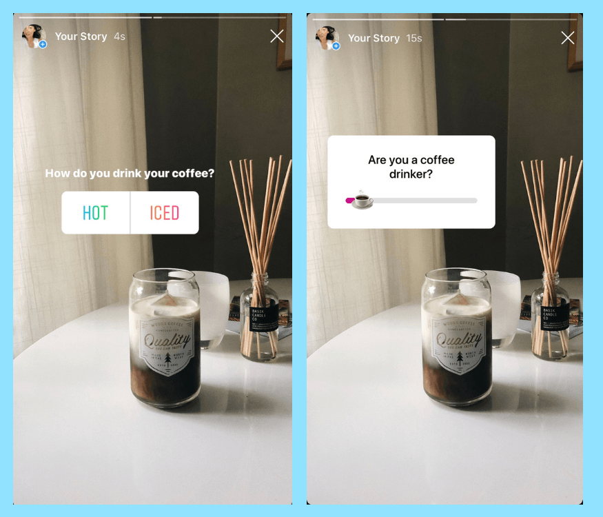
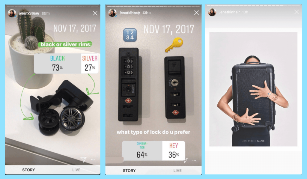
A simple interaction I like between two human beings is the way we comment/reply to each other on instagram stories via stories stickers like question/poll and vote stickers. They are easy to use, fast to get response, and the results of the interactions are clearly visualized to be seen.

Here are two examples that indicate how stories sticker increase the Instagram engagement/interaction:

The Question Sticker:

Nothing sparks conversation more than a good AMA (Ask Me Anything) on Instagram Stories. And while influencers have been known to use the question sticker to help their followers get to know them more. It’s also a great opportunity for your followers to get to know yourself or a specific brand better, or get more information about your products.

On the flipside, it’s a great place for you to ask your followers some questions. You could spark a conversation about your VR project inspiration, your next season’s color palette, or what product lines they’d like to see more of. It’s engagement, conversation, and customer feedback altogether and it’s designed to be user friendly for both instagrammer and followers. All you need to do is to drag the bar / comment your ideas at the spot.

Poll and Vote Stickers:

Ask people to vote can make you decision-making much more easier and give your followers a sense of they are participating in your choice making in your life and people are also curios about what other people’s choices are. All they need to do to join the decision making is by simply tap the answer and the portion of each choice will be shown after you make your own choice.

Project 1 Documentation

1. Project Description:​ 

Project demo: https://youtu.be/E0v61hVvWWA

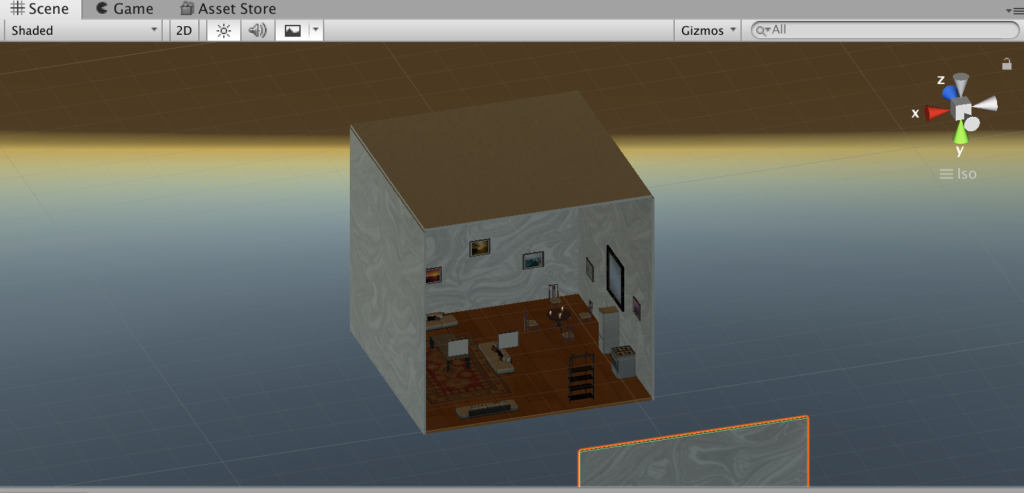
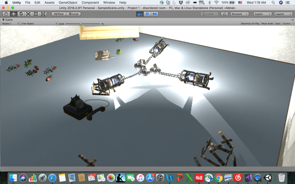
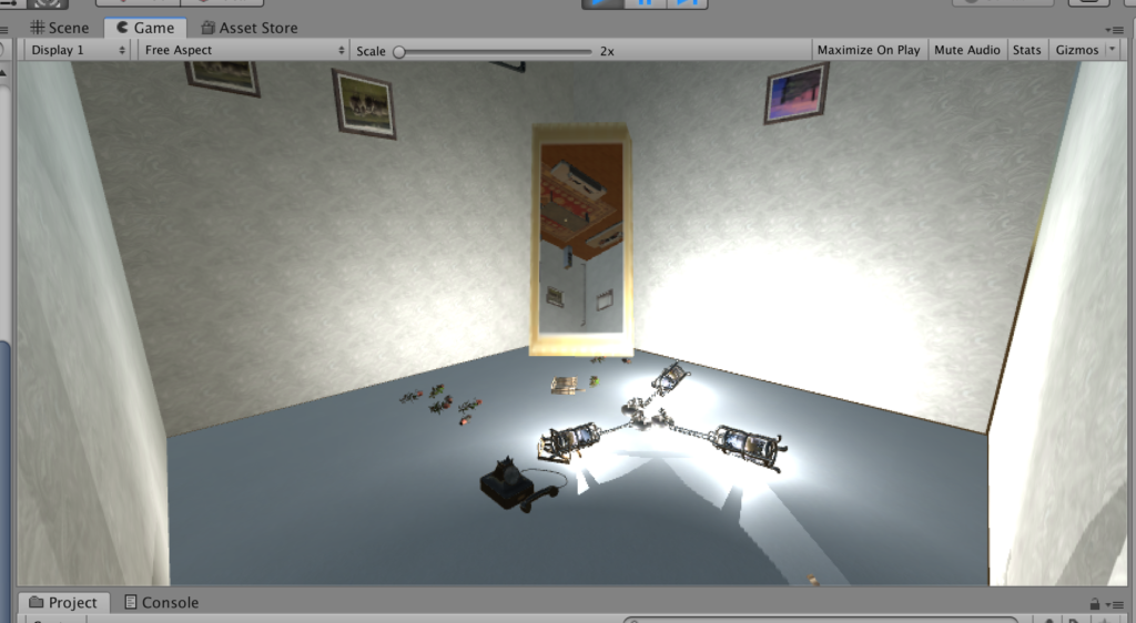
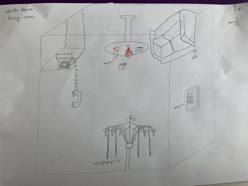
I created an upside-down living room, in which the effect of gravity still works and can be seen. The aspect of reality that I would like to address is that the gravity and orderliness in the real world have been taken for granted by us and viewing the exact same thing from two opposite perspectives can give audience a total different experience and knowledge of what’s existing around us. It’s also supposed to emphasis the sense of space and gravity – how does the world looks like with gravity when everything is upside-down?

The identity in the alternate reality: gravity, disorder, upside down, broken

Sketch
Sketch
Final look
Final look


2. Process and Implementation:​ 

During the project developing process I encountered some difficulties in terms of technical issues, how to achieve the gravity effect I want, and how to decide the best place to put the camera so the viewer will get the most out of my project etc. In the following I’ll highlight what made me choose the objects to represent my chosen identity, the reason behind my camera positioning and some processes of how I solved some problems.

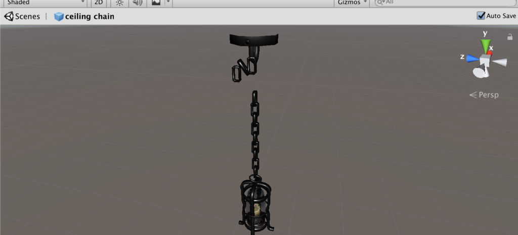
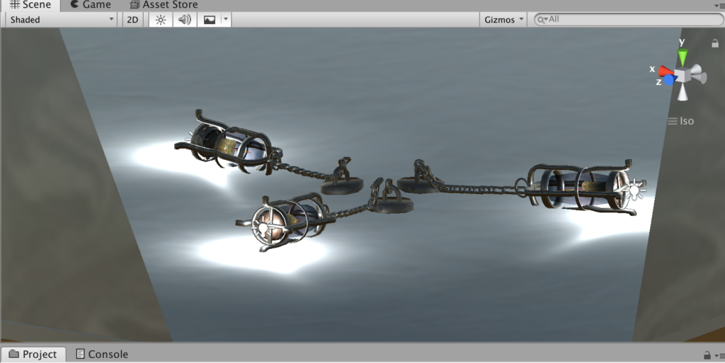
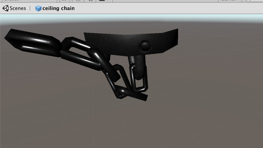
  • The chandelier with chains falling on the ground

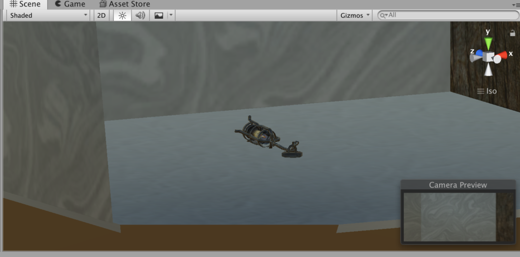
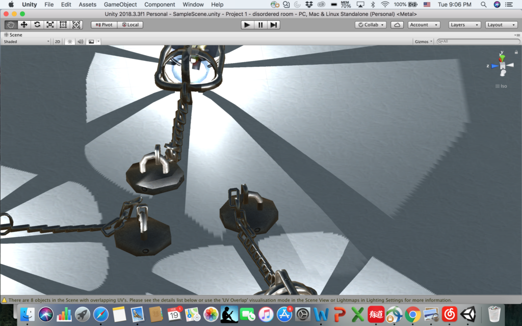
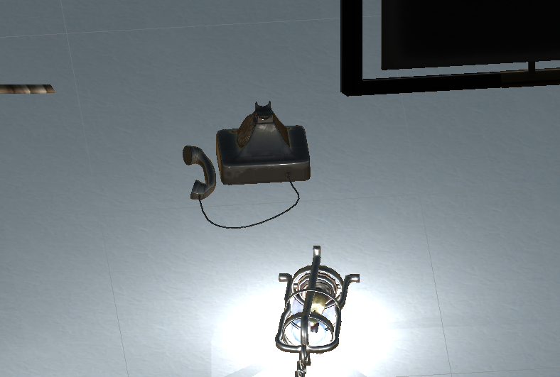
In order to embody the effect of gravity in this upside-down world, where the “ceiling” becomes the “floor” in this case, I played around with the chandelier with chains – in the normal discipline when it’s hanging the chain will be straight, but in this case it should be on the ground, which is obvious enough to show the viewer that the gravity does exist in this environment. In order to do that, I downloaded a chandelier prefab and break down the iron hoop on the chain one by one and reorganized them to make it looks like “staying on the ground”, as shown below:

  • The water pumping out of pipes – partical effect

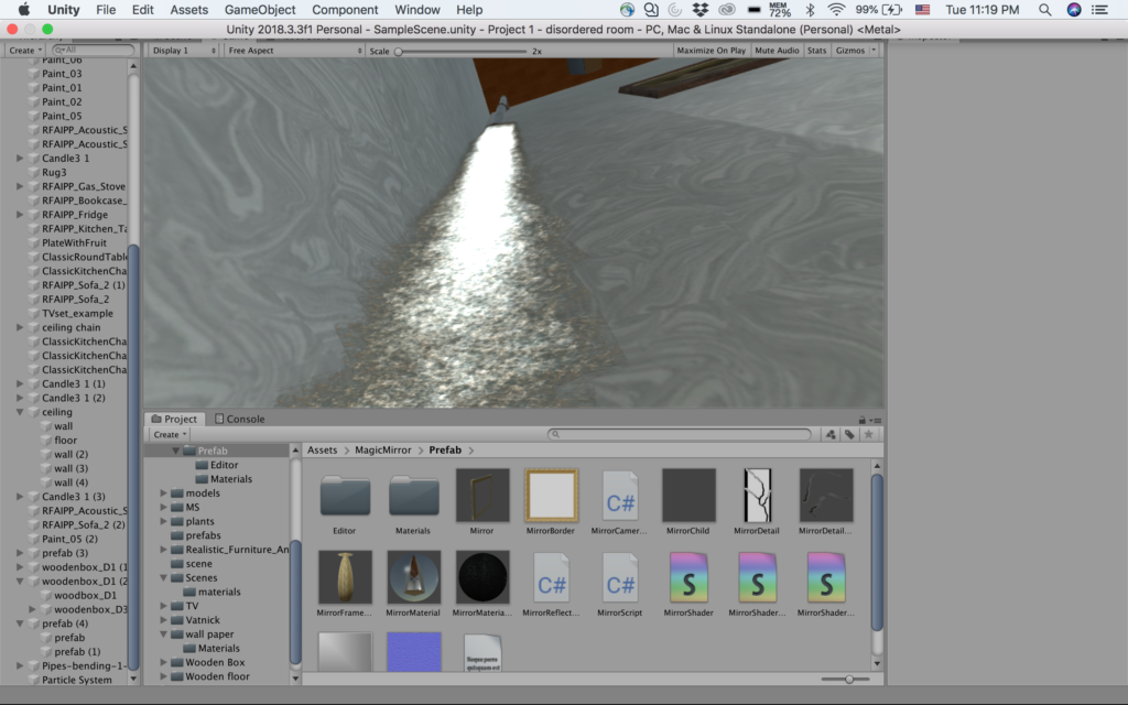
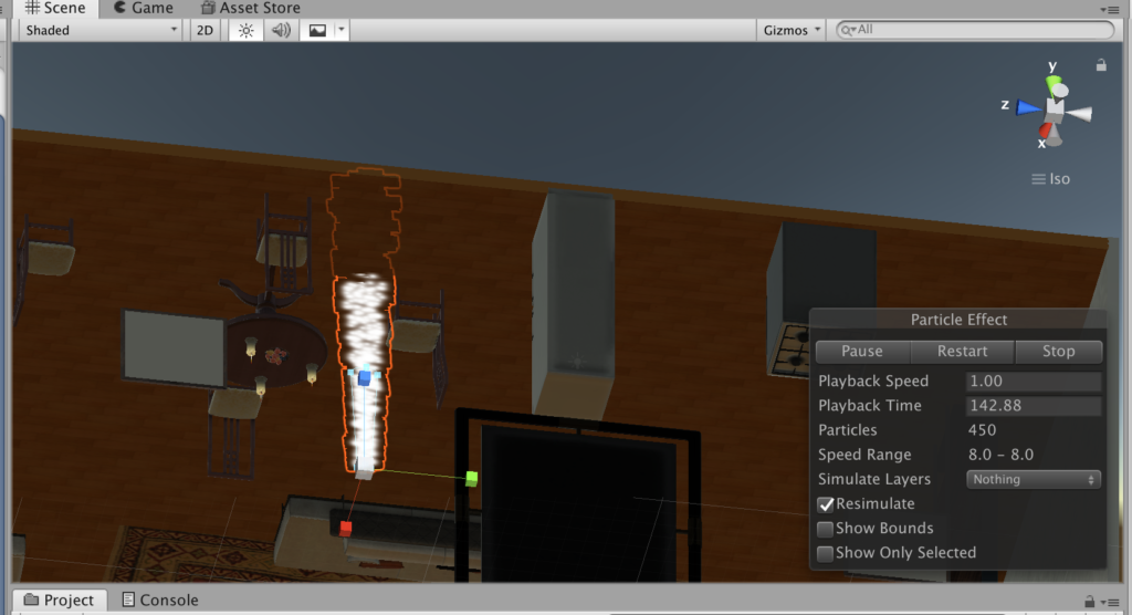
The initial idea was to add the upside-down mug and the water drop coming out of the cup, but taking into consideration of the realness and the time for animation partical, it seems not realistic if there is water endlessly keep falling out of a mug, but the water falling is another obvious way to indicate gravity, so I changed it into water pumping out of the old broken pipes, which also cater the “broken” theme.

water pumping out of pipe – view from camera
Partical effect

  • The telephone with microphone falling on the ground

This came from my initial daft, because the microphone on the ground indicated it fells down from somewhere, and it leaves imagination for viewers to think what happened before in this room.

  • Messy floor resulted from things falling down: plants, broken wooden boxes, telephone

The design of this scene indicates the things falling down because of the gravity, it caters the broken and messy nature of chaotic upside-down, also leaves space for viewers to image what happened before here.

  • Camera positioning and the mirror

It took me a lot of time to decide where to put the camera so the viewer will see most of my design of the room while feel comfortable viewing around. I tried to put it in the middle of the room first, but it takes effort to have a clear view of what is right below or above you. Then I figured the best way to have a comprehensive view of a room is to view the room from a side perspective instead of being in the middle of it. So I moved the camera to a corner of the wall. Surprisingly I happen to placed it under the water falling effect, so when I looked up I feel the water is about to falling on my face! That was such a real experience, so I decided to keep the camera that way so when the viewer look up there will be this kind of “immersive” feeling. However, doing this means I give up the sight to the the pipe, because the viewer is right under it. Then I added a mirror which can actually reflect, I put the mirror across to where the camera is, so the viewer can just look ahead into the mirror and she/he will know what’s going on above him/her and why there’s water falling down. The mirror helped me solve the problem of lack of sight so I decide to just keep the camera in the corner.

Mirror reflecting the view above the viewer
  • Adjust the scale of texture

This is a difficulty I overcame with the help of Sarah. When I was doing the design of the overall layout of the room, I put wall paper and wooden floor to make it look more like a living room, however, when I applied those textures to the materials, it’s been stretched so much that it didn’t look real at all (shown as below). But later I solved it by changing the tiling parameters.

stretched texture


3. Reflection/Evaluation:​ 

This project pretty much satisfied all the expectations I had before I started: in order to show the gravity effect and the sense of being upside-down, I made the partical water falling effect, I designed the chandelier with the chains falling on the ground, the upside-down photos on the wall etc. And during the process I added the mirror with actual reflection to tell the viewer what’s happening above you, since I placed the camera in a lower corner of a wall to make up the lack of light since it’s in a corner and achieve a better effect of immersion (viewer standing under the water fall and can see it falling down on you).

However the things I will consider to improve the project includes adding sounds effect, like the steel lander cover of the chandelier rolling on the ground, the sound of water pumping out of the pipe, and something hanging in the middle of the room and swing around to show the gravity etc. Overall I think I’m satisfied with this project and it achieved what I expected.

VR Experience Review

During the week I tried out the Google Earth VR online, where you can experience varies views from different locations in the world by using the mode “walking” or “flying”. When you are “walking” in the scene all you need is just a VR headset, while in order to experience “flying” you need an extra handle as well to navigate the directions.

Here are two brief clips showing how it looks on a PC:

Flying mode

Walking mode

Experience without equipment online

After experiencing the online Google Earth VR and looking at the videos of how it will work in a headset with a more immersive experience, I deepened my understanding of how the space works in terms of communications information that the way to communicate influence the user experience and the level of immersion. Take Google Earth for example, when the communication means is simply drag the mouse to rotate the 360 degree scene on a PC, it gives you less sense of reality since the user don’t see the instant reaction from the scene they are watching. While when the user is using a headset and maybe a handle to experience it, it feels more like reality since the user is asked to take less effort (no need to drag the mouse) and the scene will give you instant feedback and interactions as the user is moving the head around.

What’s more, beyond the communication means, the information included in the VR experience also matters. Wether the view is from the perspective from above (the god’s view), or it’s a fixed camera point in the middle of a 360 degree scene, the position from which the view starts really influence the level of immersion, or the level of how realistic it is. However, although the Google Earth VR in the flying mode gives you the perspective to see the world from above, it does provides you with the contextual background that you are in an aircraft, which makes more sense and smoothens the user experience.

Project #1 Development Blog

Project idea: an upside down living room

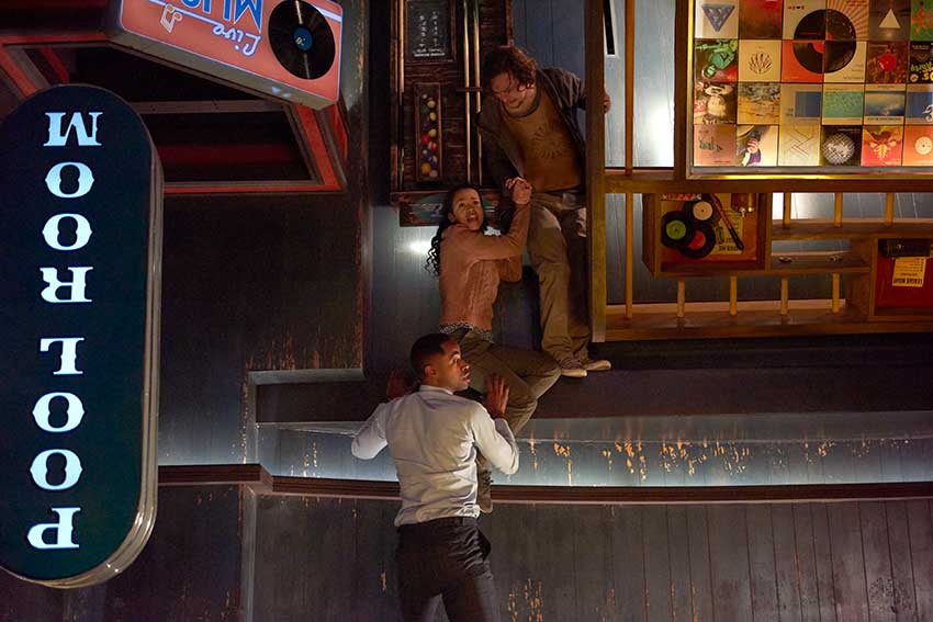
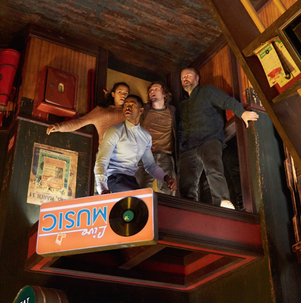
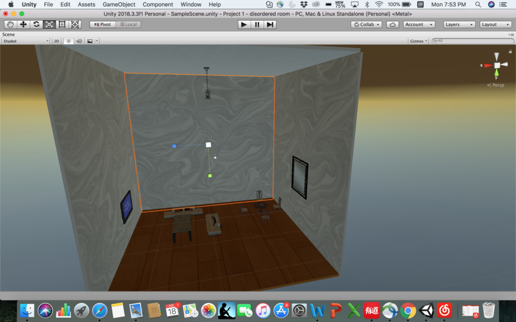
Inspiration: Recently I’ve seen a movie called “escape room” and one of the scene left a deep impression on me (movie scene shown as below) – an upside down pool room. It’s unique and gives audience huge visual impact because it challenges our common sense of how the layout of a pool room is supposed to be while maintaining the exact same objects that an ordinary pool room would have.

The aspect of reality that I would like to address is that the order in the real world has been taken for granted by us and viewing the exact same thing from two opposite perspectives can give audience a total different experience and knowledge of what’s existing around us. It’s also supposed to address the sense of space and gravity.

The identity in the alternate reality: disordered, upside down

Objects in the alternate reality: chandelier, sofa, table, flower, books, mug, telephone, wall paper

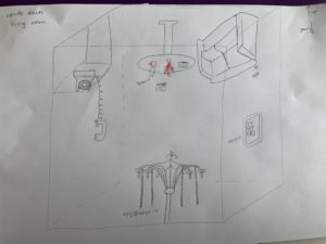
Sketch: