Documentation // Reflections

Project Description

The environment of the space is a confined elliptical structured town composed of houses surrounding a central body of water, directly inspired by Keizersgracht in Amsterdam. The environment choice was taken with careful consideration, leading to a long ideation / brainstorming process. The setting of Amsterdam was chosen due to its capability to encompass our, more abstract, theme of reflection while providing more substance that helped us push the story forward.

The confined structure of the town acted as narrative guidance, leading us to question – why the town was confined in the first place? What existed beyond the town? Are the villagers aware of such an outside? – all of which inspired us to create a corrupted town in which the core tension underlying it stems from lack of awareness of the external world.

Process and Implementation

There is a way in for merchants, but no way out for villagers. The exit is only accessible to those in power, to sustain the deception. The reason for such deception is the queen’s greed for power and control. She assigns the villagers to dig for ‘stones’, the top valuable of the town, in exchange for residency in the town. These stones are sold externally for personal gain.

Such corruption, sustained by deception, exists in the town but not overtly visible. The environment in which the user spawns in is constructed to feel like a jolly utopia. This has been done, on surface level, through the use of warm lighting from the sun which brings out the diverse colors of the scene and uplifting background music playing under town ambient sound. The optimistic monologues and body language of the NPCS, accessible when the user moves close and clicks, develops the environment further through the provision of contextual information. When interacting with the NPCs, the user is a character (merchant from external town) with no-impact. Their presence is acknowledged – NPC faces the user when they start to speak – but must simply listens with no option to respond. These monologues primarily serve to develop the characters of the individual NPCs while simultaneously hinting the tension which underlies the town.

The mode in which the user can gain more insight into this tension is through the reflection. The reflection on the water, central to the town, has the unique property of not permitting deception and lies through, allowing only truth through the reflected scene of the town. This idea was inspired by how we perceive colors. A color of an object is the wavelength reflected from it, every other color is absorbed by the object. In the constructed environment, the reflection has a choice in what it reflects and absorbs and it refuses to passively absorb the lies of the real world.

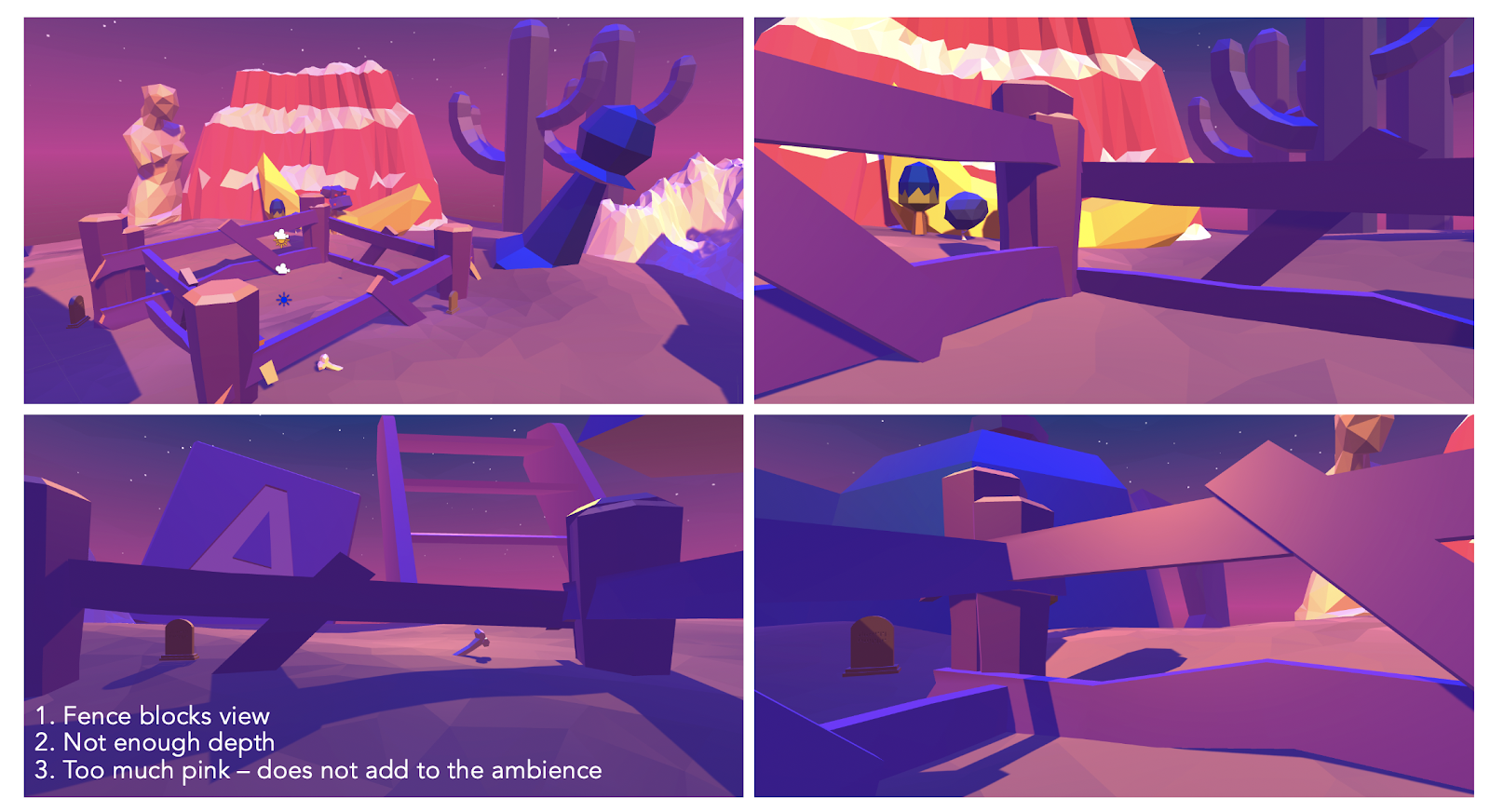
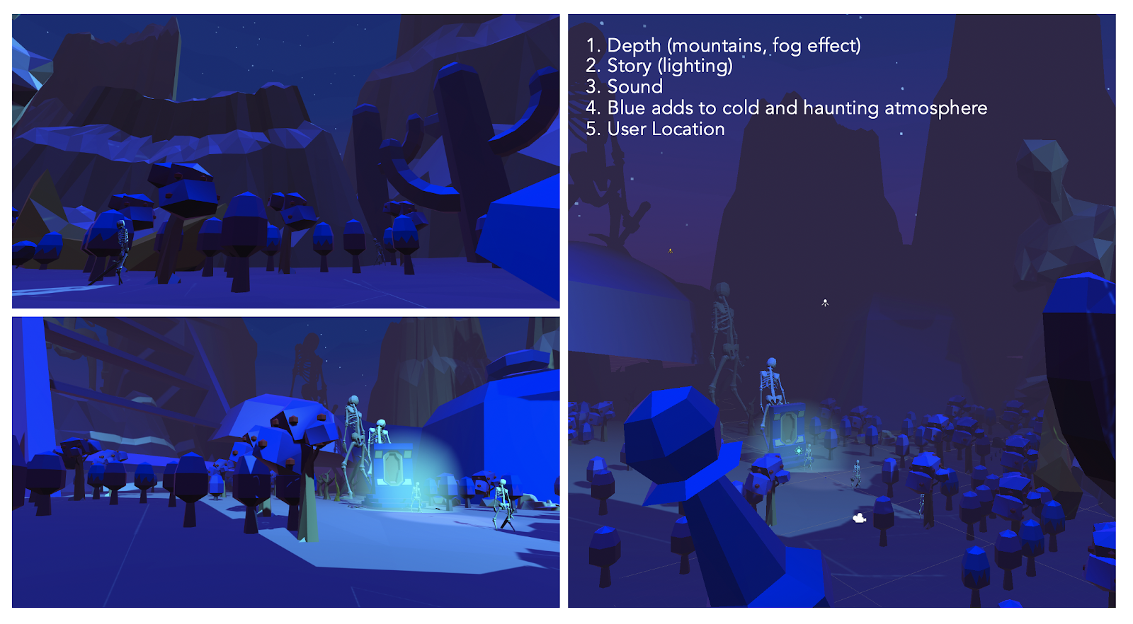
The user can access the reflected scene through a shining orb which becomes accessible, on the dock, after interacting with the King. Once close enough, the user can click the object which teleports them to the reflected scene. The reflected scene portrays a contrasting mood. The light is dimmed to construct a night environment and the music changes to a more haunting one, layered with the sound of night (crickets, water, wind, etc). This visual and auditory contrast is a clear indicator of scene change, which prompts the user to anticipate a contrast of some sort. This motivates the user to move and explore to fill their knowledge on this change.

In contrast to the first scene, the user is given more guidance in approaching the story. In the first scene, the nature of interacting with the NPCs was non-sequential. The individual characters themselves provided structure of the monologues. However, in the reflected scene, the user changes to a ghost with no-impact. The identity shifts from a merchant to a non-physical being that eavesdrops on the dialogues and interactions between the NPCs. In this scene, the story is organized through scenes, the sequence of which is significant. Spot light is used to guide the user towards the active scene of current order (also why the scene takes place at night). The highlighted scene is also the only interact-able one. The scenes are also constructed spatially to reduce unnecessary movement. The circular path of the pedestrian street allows for the implementation of a linear story without it being too noticeable.

The switching of the spotlight denotes the start and end of a scene, similar to how it is used in theatre. While under the spotlight, the NPCs perform their dialogues and actions and the user watches. The nature of the dialogues in this scene is more honest and real. The persona presented by the NPCs in the real scene is brutally contrasted to explicitly communicate the contrast between the façade that people desire to portray vs. their true selves. One’s ability to deceive seems to be a requirement as social beings. The intention behind deception is highly subjective. Some choose to deceive for personal gain (queen), some for self-deception (the happy depressed peasant), some for comfort of others, etc. One’s choice to not reveal their true selves, emotions, state, at certain moments seemed like an interesting phenomenon, reflective of the real world, to explore in a fictional space.

After the user finishes progressing through the dialogues, two NPCs are dead. After the last scene, the orb reappears on the dock which transports the user to scene 3 when clicked. Scene 3, on surface, is almost identical to the first one. A change, which the user can realize if attentive enough, is the disappearance of the two NPCs. Regardless, the town seems unaffected and unchanged, with each NPC carrying on their usual routine of sustaining their jolly façade. The user can choose to roam around scene 3 as long as they want. The option to interact with the NPCs is removed, however. The feeling provoked from roaming in the space would feel different from the first encounter of the space. Now aware of the truth which lies underneath, the user can recognize the deception.

More specific details on the development process / story development / sketches is all in the development journal.

Reflection / Evaluation

As such, the story is constructed around the central aim of bringing light to a phenomenon which occurs in the real world – deception. To communicate such an abstract concept in a tangible form, we had to design a space – composed of characters, speech, animation, environment, sound which all follow a central story. Also, the fictional aspects – the reflection, characters – all played a significant role in constructing a space capable of expressing such concept.

This project taught me a lot on how to develop a theme, through story, in a VR setting. More specifically, it made me recognize the limitless number of approaches the creator can take when attempting to convey a story in VR. Space being the main medium of VR, we had to reconstruct the way in which we told the story. It was not limited to purely text (ex. books), sound (ex. songs, podcasts), visuals (ex. movie), etc. It was an integration of all these components, which made it flexible but also very challenging. As such, I found that we drew a lot of inspiration from many forms of media and combined them. For example, the scenes and spotlight in the reflected scene was inspired from theater. The interaction with NPCS was inspired by the approach taken by many open world games.

The final game, I think, achieved most of the goals intended for this project. The reason for feeling so has to do largely through constantly changing and adapting in the creation process. We made a lot of changes along the way to adapt to the VR interface, but made sure these changes did not take away the core message of the story.

Project 3 Development Journal // Reflection

Update 1 (04/12) : Brain Storm Meeting for Theme

To decide on the theme of the final project, our team, Ganjina, Will, and I, met over zoom. We decided to give more time to brainstorm further individually on the the four final themes chosen in class (Apocalypse, Escape Room, Wonderland, Invisible Cities). We met again couple of days later with our respective ideas. The following ideas were shared and the potential for each were discussed collectively:

APOCALYPSE

  • User in a normal room, where if they touch anything / try to do anything, it triggers an apocalypse.
    • Plays with the idea of affordances.
    • Focuses on micro-narratives.
  • User in a cylindrical room, with many doors. Opening and entering a room → experience different types of apocalypses.
    • Can focus on what apocalypse means.

ESCAPE ROOM

  • User is a kid in a bedroom with monsters.
  • * Therapist / Escape your mind!
  • User is a prisoner in some jail (narrative needed).
  • * Detective has been trapped by criminal mastermind (Joker/Riddler + Batman, Moriarty + Holmes, etc.)

WONDERLAND

  • User finds themselves on a street / in a room / in a different world where everything seems happy but interaction leads to hallucination that feels disturbing.
    • Could go Matrix route / revealing the true world underneath
    • Could go the mushroom forest route / world becomes psychedelic

INVISIBLE CITIES

  • * City built over a lake → have characters in reflection do different things from characters in view (sort of Hawaii/Bali in terms of style)
  • * City that colors memory and time travel (Bring back a friend or reversing an apocalypse)
  • City which only looks down upon the earth → could be sky city with telescopes and things pointed downward, (like Bioshock Infinite but more angelic/futuristic)
  • City filled with earth → dust everywhere, time slowed down, or literal carvings that come to life as you interact with them.

After much discussion for each idea, we came down to two possible ideas:

Idea 1: City, color, time travel 

Initial Idea: A palette, composed of multiple colors, is used as a way to time travel to memories – all of which take place in different cities. Each city has a certain atmosphere, expressed through color in this case, that capture a memory between two individuals. The story is driven by the friendship of two individuals, that which has broken in the present time. The user – one of the two individuals – uses the palette to travel back to these memories and cities, to reverse their past mistakes. The story would have two possible outcomes – one where the user makes the right decisions and wins back the friend and the other where the friendship remains broken. 

Idea developed after meeting: The second approach, developed after the meeting, was to base the story on reversing a global apocalypse instead of reversing a relationship. We were more attracted to the idea due to its clear objective, less focus on dialogue and characters – expanding the interaction with the actual environment and setting, hence less limiting. 

Idea 2: City built over a lake, reflection [Final Idea]

Inspired by the “Valdrada” (Cavino, 45-56), Will shared his idea on building a city reflected by a lake. Calvino describes it as a city “built. . . on the shores of a lake, with houses all verandas one above the other”. The cities resemble in some aspects but are not equal. Like a mirror, the objects are inverted. Inspiration was drawn from these descriptions. With reflection being the central component, it was essential for the city to be surrounded by water. As such, Will suggested building in a tropical island setting. 

We decided to go forward with the idea of the reflected city. The idea of reflection had interesting ideas worth expanding on. After deciding on the theme, we decided to brainstorm individually on the story before the next meeting.

Update 2: Story Ideation Part 1 (4/13)

After the meeting, we individually brainstormed the story. Attached are some records:

After individual brainstorming, we met over zoom. We explored deeper into what the reflections would mean in our world. Discussion on the deception of reflections, on the mirror, was discussed. Mirrored images are familiar to the eye, but they are the inverted version of an object. We establish a preference for the familiar. Yet, when we are faced with the ‘true’ images, we feel uncomfortable (ex. un-mirrored images). The idea of discomfort when faced with a truth seemed interesting to expand on. This also relates to how people feel uncomfortable to face the truth, or express themselves in the most honest ways, as it requires vulnerability. Hence, the truth is often masked due to the discomfort that comes with facing such truth.

Another idea that was considered was – what things are reflected and are not? For example, a mirror. When we stare at a mirror, it is only the sight that is reflected – what we see. The four other senses – smell, touch, sound, taste. Also, Colors are the wavelengths reflected by an object. If an object is red, it absorbs every other color but red. So, for something to be reflected, two components – something that is reflected by the object of reflection (mirror, water, etc) and something that is not (which goes through). Leading to the thought – what goes through the reflection and what does not?

With this idea came the thought, what if there was a body of water which refuses to reflect in an entirely honest manner? A reflection which refuses to reflect back the lies and removes any form of deception of the real world? Hence, the reflected city would only show truth.

After the meeting, we had a more clearer sense of what the reflection meant in the world we were trying to construct. But, we were still unclear about the story.

Update 3: Story Ideation Part 2 (4/15)

We looked in to the history of some tropical islands. An example, colonization. The colonizer approaches the town with an intent to take – resources, culture, tradition, etc. However, they conceal their intent through packaging their acts as ‘service’.

Not fully satisfied with the idea, also due to not wanting the story to be too political, we kept on brainstorming the story. While googling images of reflected cities, images of Amsterdam came up. Specifically, Amsterdam’s canal houses.

The setting was capable of encompassing our theme of while introducing new aspects worth exploring and integrating into our story. New topics explored were:

1/ Society

Being a part of society, being truthful is not always an option. One puts on a façade and perform for others. Whether that is stemmed from one’s fear of truth or an act of being considerate other than themselves is highly subjective. Regardless, concealing inner truth to some extent is almost required for a social creature.

2/ Internal vs. External World (The home)

Houses protect people from the external world. Hence, when one is inside a house, their actions become more overt and in sync with their internal thoughts. They become more honest.

3/ Day and Night

From some personal accounts, the time of day seems to change the nature of conversations. Some of the most real talks have taken place during night, when the world has died down and you feel more present with your thoughts.

With these additional aspects came the idea:

Update 4: Paper Prototyping (4/15)

World 1 Street View
World 1 Dock View (Will)
World 2 Dock View – Inverted (Will)
World 2 Street View
World 2 Window View

[Will’s notes]

During the first play test we were given the following feedback:

  • How will we guide the user to the pier? Dimming the sky to increase visual salience of the cue may help. Using NPC interactions and dialogue would be even better. Starting the user nearer to the pier might also help.
  • How are we moving? We could do automatic moving, like in TrailVR, or we could do GoogleMaps style point-and-teleport.
  • How much animation are we doing? Trying lots of animation means higher potential for making good use of VR storytelling space. It also means more overhead and more work.

Update 5: Environment, UI, Story

To move the project forward, we decided to each take part in the three main components of the development process. Ganjina took charge of starting to construct the environment using the assets (low-poly style) we have decided on, Will took charge of the user interface, and I took charge of the story development.

STORY DEVELOPMENT

Story Summary: 

  • Confined Town
  • Way in for merchants, no way out for villagers. 
  • Villagers unaware of the outside world. 
  • The Queen and King assign villagers to dig for “stones” (gems) under the town pond in exchange for housing.
  • Stones used as currency for life-time housing.
  • Stones are high worth, and sold externally for personal profit of Queen + King. 
  • Main Conflict: Unaware of outside, corruption, topics all of which are not addressed in the main world, only comes out in the reflected world. 

Above Reflection (Dialogue directed towards player, but player doesn’t have to reply) 

  • Player: character with no-impact
  • Aim: player ‘converse’ with each villager, explore their surface-level character
  • How?: when the player approaches npc close enough and clicks, a set of monologues starts playing on the text box. (each monologue aimed to introduce / build the surface character, all of which will be contradicted in the reflected world with action + dialogues)
  • Player input: clicking button for next dialogue to appear. After the user walks away, they can come back for another set of dialogues to play for more context. 

Under Reflection (Action / Animation + Dialogue between characters)

  • Player: Ghost with no-impact
  • Aim: watch npcs interact with each other, watch how their real character shows up through action and words.
  • How?: User walks to the houses of npcs and clicks for a set of actions / dialogues to start.
  • Player input: click the house. look around to watch the scene. 

The characters pre-existing in the asset is where I drew my main inspiration for the story. The story started with characterizing each npc and through that, I gave a role for each character to construct a larger functioning society.

Record of character development:

Record of story development:

Attempt 1: Dialogue in World 1 [Failed]

In the first attempt, user was assigned as ghost with no impact in world 1. The user would go around listening to dialogues between NPCs.

This seemed like the wrong approach because it did not give enough room for individual character development. By allowing the interaction to merely eavesdropping on these dialogues, this did not allow the user enough time to get to know the characters. Hence, it seemed essential to clearly set character and they slowly integrate and progress the story. To do so, in the second attempt, I made the user character with no-impact and reshaped the form of interaction into a monologue style – more commonly used in games with NPCs. NPCs would say couple of lines towards the user, but the user does not have choice to respond.

This approach seemed to make more sense. With this set, I started writing the monologues and dialogues which took place in two worlds.

Read the entire script in google doc:

https://docs.google.com/document/d/1-318n3Ysps96i4_eqbyc9LK_rBQRA5qb3l46raZSHAQ/edit?usp=sharing

The monologues were organized by character. The order of the interaction did not mater. The dialogues, however, in the reflected scene was organized in a chronological manner and through scenes. The scenes would be highlighted through light and space. A light would turn on where the user has to look. The scenes are organized spatially as seen in image below.

Update 6: Implementation of Story in Scene

Invisible Cities // Chloe

IN CHLOE, A great city, the people who move throughout the streets are all strangers. At each encounter, they imagine a thousand things about one another; meetings which could take place between them, conversations, surprises, caresses, bites. But no one greets anyone; eyes lock for a second, then dart away, seeking other eyes, never stopping.

Calvino’s description of Chloe seems to point out a common characteristic shared amongst many megacities. In such cities, it is a natural part of one’s routine, almost inevitable, to encounter a large number of individuals. However, due to the high population density, most people are strangers. Amidst such a colorful crowd, yet most eyes are set on inanimate objects – some fixed on the ground, while most lie on their mobile phones. Those without objects of distraction are more aware. If one is curious enough, not yet accustomed, they start looking. Each person is given a two to, at most, five-second glance. If timings align, two eyes connect but this rarely sustains. 

Seoul, South Korea : One of Asia’s Megacities

Something runs among them, an exchange of glances like lines that connect on figure with another and draw arrows, stars, triangles, until all combinations are used up in a moment, and other characters come on to the scene.

Calvino describes people as characters. The personalities and qualities of such characters seem to be constructed within one’s imagination. The lack of information about another gives the viewer the power to fill the gap. These characters fill up the viewer’s “scene”, one at a time, implying one’s temporal attention is limited. The span of attention per subject is also short due to the richness of alternatives. Also, one must always give up looking at one to give attention to the other. 

The limited nature of attention – both spatially and temporally – seems to be a factor worth taking into account when constructing a VR setting. Due to our strong desires to process and understand our surroundings, to our fullest capabilities, having too much going on at one time or space could easily overwhelm the user. This would create an unpleasant and unsettling scene and would not be effective in delivering ideas clearly. Hence, it seems important to space out the introduction of new factors using time and space through taking account the time it takes for the user to shift their attention and process new elements. This also applies for the opposite case. If one wants to create an unsettling atmosphere, for a horror game perhaps, they could overwhelm the user’s attention through introducing multiple factors to the scene at once. 

Bustling Streets of Seoul, Gangnam

Chloe reminded me of my last three summers in Seoul. That time was spent attending academies located in the center of Gangnam. The daily commute, specifically through the streets and underground station of Gangnam, came back to me while reading Calvino’s description of Chloe. Passing by hundreds of strangers during one commute, I noticed people were more connected to their phones than to their physical surroundings. As Gangnam was a relatively new place for me, I was one of the only few people looking around. Sometimes, I consciously refrained myself from doing so as it almost seemed like social courtesy to not look at others – two to three seconds was the limit before it became invasive. 

Korean Subway during commute hours

The subways were packed with people of various looks and personalities. They had different expressions depending on the time. Weekdays, especially during commute hours, people were more occupied, dressed in their formal work attire. A feeling of stress permeated the enclosed space. Weekends, Friday nights in particular, were more lively. People stood with their group of friends, ready to hit the lively streets of Gangnam after a week of intense work, to destress over multiple bottles of soju and karaoke sessions. Now that I look back, it becomes clear my perception of such strangers were highly limited to my imaginations. It also makes me wonder, the thoughts which came across one’s mind, when I was the stranger to the eye of the beholder. These thoughts we will never know, as strangers are granted merely a couple seconds worth of attention in our scenes.

Project 2 Documentation

Project Description

The main activity used as the basis of the project was using a calculator. The goal was to re-imagine the calculator interface in a VR setting. The calculator most people are familiar with is either in the form of the physical calculator or as apps on our phones or computers. Both versions display the results on a two dimensional screen. Also, the interaction to input numbers is often restricted to the act of pressing buttons – whether they are physical  buttons or those on a screen. With this mind, we wanted to make use of the VR platform to design a functioning interactive calculator in a 3 dimensional space. 

As the project’s emphasis is on the mix of both the usual (everyday) setting and a sense of the alternate, we decided to have two settings for the project. The first, user’s spawn location, is an everyday setting, located in a person’s bedroom. The bedroom is furnished with objects which an average person would possess – bed, drawer, bookshelf, etc. Non-textual elements – such as lighting and color – is used to naturally direct the user towards the calculator. The interactions in this room follow the conventions of the real world, gravity for example, to provide a clear distinction between this world and the alternate. The alternate world is accessed through clicking the calculator. The interactions that take place in this virtual calculator interface would have qualities which do not follow the everyday scene – flying, endless black background, cubes that float in space and snap to each other – creating a clear sense of an alternate reality. 

Brainstorming

Project Two’s brainstorming process was different due to its collaborative nature. The team met up in person, each with potential ideas in mind. Several ideas came up, some of which further developed the 3D drawing idea, simulation of throwing glass, cooking food in a campfire, falling from the sky, pet simulator, backyard work, etc. Ultimately, Ben mentioned re-imagining the programming interface in VR. Discussing the potentials of this idea ultimately led to re-imagining the calculator interface in three dimensional space.

Implementing two different scenes made the division between the everyday and alternate very clear. The everyday surroundings of the bedroom was achieved by placing familiar furniture – desk, bed, plants, etc – under a warm lighting which created a comforting ambience. Furthermore, Ben allowed the user to interact with the objects in the space, making it more interactive. The alternate aspect of the project comes in when the user clicks the calculator. While clicking on other objects, such as the pencil, plant, etc, allows the user to grab and throw, clicking the calculator teleports the user inside the 3D calculator interface. The alternate environment is distinct, evident through the endless black background, glowing objects, ability to fly, grid-like floor. The user also has the freedom to fly. The nature in which objects, cubes in this case, interact is also different. The cubes are not influenced by gravity and also have snapping qualities to each other. 

Process / Implementation

Due to the cancellation of physical classes and partly for convenience, our team divided the work, allowing each of the members to work remotely. As we had two different scenes, it made sense for two people to take charge of one scene. (Keyin and Tiger – scene 1 (bedroom), Ben and I – scene 2 (calculator). 

I was responsible for designing the necessary assets in the alternate world – cubes being the main one. We needed cubes which represented single digits (0-9) and operators (+,-,*,etc). Text Mesh Pro was used to display these numbers. TMP allowed access to the numbers through script which was convenient for Ben when altering the numbers and operators. As the background of the alternate world was darker, a glow effect on the cubes was applied. This was achieved through using the LightWeight Render Pipeline which included a bloom effect.

After finishing the design for the cubes, I worked on writing the script for the teleportation to familiarize myself with the c# language. From Sarah’s suggestion, we decided to place the two worlds in a single scene and teleport the user’s position instead of switching scenes. I initially used Raycast to identify where the cursor was pointing. The raycast was only initiated when pressing the mouse. When the object pointed by the ray was the desired object, the user would be teleported to an assigned location. The script was applied to the player.

From feedback, the script was simplified significantly applying the script to the calculator. Raycast was no longer needed as teleportation was initiated when the calculator was clicked. There was another issue which arose due to the First Person Controller where the player was returned immediately back to their default location after being teleported for a short period of time. Ben fixed this issue through temporarily disabling the First Person Controller while the teleportation took place.

After each person completed their part, the project was assembled in person. Teleportation was implemented to connect two scenes. Most of the time was spent adjusting the LightWeightRender Pipeline to the first scene.  

Reflection / Evaluation

The project managed to create an alternate version of both the interaction with the calculator and its internal interface. The alternate version of the interaction itself was achieved through prompting a different response when clicking the calculator as opposed to clicking the other objects in the room. When clicking the other objects, the user can grab and throw them whereas clicking the calculator teleports the user. This contrast clearly distinguishes the calculator from the rest of the objects. The alternate version of the interface is achieved through the visual and physical elements that clearly differ from the everyday scene. The relative flexibility in the alternate scene allows interactions – such as flying, floating cubes – to occur. 

The primary visual cue which prompts the user to interact with the calculator is the desk light. The calculator is placed in the center of a large desktop under a bright spotlight. When the user hovers the mouse over the calculator, the object luminates to indicate a special interaction and encourages the user to click.

In the alternate world, colors are used to represent the different status of the cubes and expression. Moving around and placing objects follow the conventions of many computer games (wasd) and mouse-click, allowing the user to quickly adapt to the controls. The “=” cube which exists in default, along with the block on the right corner, signals the user to place and block and add on to the expression. 

Different colored cubes

The end result turned out similar to the original designs. Alterations that were made were primarily due to the change in platform from the vive to computer. The keyboard allowed for more freedom in user movement, such as flying. It allowed more buttons for input which were necessary in the alternate world to support the operations. As most interactions in the bedroom was limited to holding and releasing the mouse, they could easily be adapted to the vive. 

Agency Question

Calculators allow for the computation of infinite expressions. This function itself, creates a high-agency experience for the user. The project simply provided another visual interpretation of this very function. Hence, the interactive aspect (pull and drag, snapping, flying), in addition to the freedom of the user to compute any expression and see results for all cases, provide a high-agency environment for the user to interact in. This allows the user to focus more of their attention in formulating expressions and waiting for the right answer and feedback, and less on the physical interactions themselves.

Project 2 // Development Journal (3D calculator)

02.28.2020 // First Meeting: Brainstorming Ideas 

Our team met up on Friday, each with potential ideas developed since last class. Several ideas came up, some of which were further developing the 3D drawing idea, simulation of throwing glass, cooking food in a campfire, falling from the sky, pet simulator, backyard work, etc. While collectively brainstorming and developing ideas, we ultimately came to the idea of re-imagining the calculator interface in a three dimensional space.

As the project’s emphasis is on the mix of both the usual (everyday) setting and a sense of the alternate, we decided to have two settings for the project. The first, user’s spawn location, is an everyday setting, located in a person’s bedroom. The bedroom will be furnished with objects which an average person would possess – bed, drawer, bookshelf, etc. Non-textual elements – such as lighting and color – would be used to naturally direct the user towards the calculator. 

An interaction with the calculator would teleport the user to the second, alternate, setting. This space would be where the calculator’s conventional interface would be re-interpreted in 3D space. In the meeting, we discussed portraying numbers and symbols as cubes floating through space. A calculation would occur once a user drags the cubes and combines them. The result of the calculation could represented as another cube of either a different size of color, to distinguish it to the other cubes, which drops from the sky. The background would ideally be dark, to create a clear contrast to the first setting, but the specific aesthetics of the scenes are in the process of development.

The calculator would function as a portal connecting the two different worlds. Hence, the user would have access to either worlds at any time through interacting with the object. 

Meeting Record (02.28.2020)

03.01.2020 – 03.13.2020 // Development Process

In one of the last class we had (in person), we decided to divide the responsibilities, allowing each of the members to work remotely. As we had two different scenes, it made sense for two people to be in charge of developing a scene each. (Keyin and Tiger – scene 1 (bedroom), Ben and I – scene 2 (calculator).

We needed cubes representing the different numbers (0-9) and operators. Text Mesh Pro was used to display these numbers. This also allowed access to the numbers when altering them through the script.

As the background of the alternate world was darker in color, a glow effect on the cubes was applied. This was achieved through using the Light Weight Render Pipeline which included a bloom effect.

For teleporting between two scenes, from Sarah’s suggestion, we decided to place the two worlds in a single scene and teleport the user’s position.

To provoke teleportation when the player clicked an object, I initially using Raycast, only provoked when user presses the mouse, and when the object pointed by the Ray was the desired object, the user would be teleported to an assigned location. The script was applied to the player.

From feedback, the script cold be simplified significantly by writing the script from the perspective of the calculator. There was another issue which arose due to the First Person Controller where the player was return immediately back to their default location after being teleported for a short period of time. Ben helped fix this issue through temporarily disabling the First Person Controller while the teleportation took place.

03.14.2020 // Second Meeting: Assembling all parts

The second meeting took place to put the scenes together on a single file. Teleportation and adjustments to visuals and shaders was made to finalize the project.

Response as a Medium

How does response act as a medium?


Response becomes a medium once the focus shifts from the visuals and aural response to the interaction itself. Quoting Krueger, “the only aesthetic concern is the quality of the interaction.”. Hence, using sensors of high quality, capable of perceiving as much relevant and accurate user input, is an essential component to maximize the quality of interaction. GLOWFLOW took the opposite approach where they made compromises in the interaction, through adding delay, to bring more focus to the visual mood of the environment. Although they did achieve their intended effect, this compromise seemed to be the main reason for GLOWFLOW succeeding more as a kinetic sculpture than as a responsive environment.

The wide application of responsive technologies, particularly the way it can redefine our approach to education, is exciting. Such customizable and responsive environments would teach the child how to think, not the things they should memorize. Also, interaction is a more accurate way of acquiring knowledge in the real world. Due to its high customizability, the responsive medium allows for creating environments that could provoke intended interactions from users.

Project 1 Documentation

Project Description

1.1 – Inspiration and Direction

The environment which I tried to create for this assignment was centered around the theme of disproportionate objects. Primarily inspired by the works of the Russian surrealist, Vitaly Urzhumov, I wanted to create a landscape composed of objects that were either bigger or smaller than their average size. Through the abnormal sizes of the objects, I wanted to initially provoke a sense of confusion for the user. However, as seen in Urzhumov’s works, although the sizes are not normal, he makes sure to maintain balance in all other aspects of the work such as the side-objects (the tree in the first work, the man and cloud in the second, the mountains in the third), the lighting, the landscape, etc. He does this to set the emphasis on the few objects that are out of proportion. If he were to make everything disproportionate, there would be no focal point and the world will not be visually appealing to the eye of the viewer. I was inspired by these particular aspects of Urzhumov’s work.

1.2 – Environment and Identity

Environment: 

Surreal Landscape consisting of Disproportionate Everyday Objects

Identity: 

The identity of the user is a person who stumbles across this landscape. To achieve this, I made sure to avoid making the user the obvious center of the terrain. The user was placed under a shaded area, behind a few trees. The main scene of the space is the portal and skeletons, illuminated with green light. This ensures that the user does not feel like the world was created for them – rather, they have coincidentally stumbled across an already existing scene. 

1.3 – Design Goals

For this project, I had a couple of design goals I wanted to achieve:


1. Limited Use of Color: 

I wanted to limit the user of color I used for the scene. As the style I was going for was more surrealist – less realism – I also wanted to express this through the choice of colors. I was inspired by an ios game which I played a couple of years back, called Monument Valley. I wanted to adapt the same approach where there are only two to three colors – very bright but pastel. Limiting the colors leads to a more creative adaptation of the different range of tints and tones of the color. I also wanted the main directional light to be an unconventional color which dominates the scene and walls of the objects.


2. Light / Shadow: 

Inspired by the talk on the development of Kentucky Route Zero, I learnt how light and shadow can provide various functions. Particularly, their ability to create a focal point without the user of sound or words, seemed to be such a subtle way to naturally bring attention of the user and communicate what objects were of higher significance, and vice versa. I wanted to make use of this functionality in my project.


3. Depth: 

Looking at various indie games during the brainstorming stage, I learnt that depth – created through layering of objects, fog, lighting – was an essential feature of making a space seem believable. I wanted to make sure to implement depth in my landscape so the user could not sense where the end of the terrain was. 


4. Objects Proportion:

Inspired by Urzhumov’s works, I wanted to make sure to magnify some objects, while keeping the other objects in normal proportion to reinforce the effect and not overwhelm the user. 


5. Consistency in Object Style

To make a scene appear consistent and believable, I thought it was very important to keep the styles of the objects consistent as well. As I needed to use many objects, I decided to stick with low-poly resource packs to increase my options.

Process and Implementation

2.1 – First Build

For the first build, although the Howl’s Moving Castle idea was scrapped, I still wanted to incorporate the aspect of two main spaces – internal (where the player will be located in) and an external space. Although surrounded by a foreign and surreal environment, I want to recreate a sense of coziness through enclosing the user within an internal space. Having these ideas in mind, I started working on my unity file. I decided to go with a cold shade of pink (#CC00FF) and ultramarine (#3300FF). These colors were chosen through playing around with the color options of the directional light on unity.

As seen in the previous surrealist art pieces, I took prefabs of ordinary objects – those small enough to be held with a person’s hand – and blew them out of proportion. I placed these objects within the terrain, through burying their roots, giving a sense of an abandoned landscape. Although I increased the size of most objects, I made the sizes of the trees and hills realistic to emphasize and highlight the absurd proportions of the other objects.

To construct an internal space, I used the fence prefab object and surrounded the 360 camera with it, giving an illusion of being protected. I also placed grave stones and skeletons right outside the parameters of the fence to give the fence significance and to provide a sense of fear towards the outer environment.

2.2 – First Build Limitations

Some primary limitations of build 1 that were taken into consideration when constructing build 2:

  1. Fence: The size of the fence was very big to make the user seem smaller. However, it blocked a significant portion of the background. The effect was not worth the blocking and creation of internal space. 
  2. Not Enough Depth: Due to the lack of objects in the background and fog, it is very obvious where the terrain ends.
  3. Too much pink: Although pink was pleasing to see aesthetically, it seemed like it did not serve any purpose other than the visual appeal. I wanted to maximize the potential of using colors for emotional effect as well.

2.3 – Second Build

Changes that have been made since build 1. These are the main changes:

  1. Depth (mountains, fog effect):

One limitation from the first build was the lack of depth. Due to this, it was very obvious that objects only existed within the parameters surrounding the user. To solve this issue, I added a fog effect, to make the background blend in a more subtle manner. I also layered more objects and filled with empty spaces with objects to remove the filling of emptiness. The overall size of the terrain was also increased to provide more space for objects in the background.

2. Story (lighting)

One aspect lacking was a story. I had a clear image of the world, but no clear narrative for the user and their identity. An idea of the story came to me during the development process. I got feedback that the bones mentioned in the previous build were not easily identifiable as bones. 

Hence, I downloaded a resource pack of a skeleton to replace the bone. While playing with the skeleton, I was also trying to make an escape portal from this alternate world. Combining these two aspects, instead of an escape portal for the user, I decided to give the portal a function – one where if objects go through it, it magnifies (giving more narrative and reason behind the disproportionate world).

3. User Location

Initially, the player was located in the middle of the terrain – again, this made it seem like the world was built for the user which I did not like. Instead of the user, I placed the portal and the skeletons in the middle of the terrain, darkened the overall lighting of the scene, and placed a luminous green light around the scene to bring attention to it and indicate that this was the focal point.

The user was relocated to the side, under the shadows and behind some trees, to make it seem like they were hiding under the shadows witnessing a haunting scene. Through this relocation, they no longer became the focal point of the world. Rather, a spectator who stumbled across this world.

4. Sound

I added the sound of an empty room (which actually has a sound) and placed it under the camera rig. I also added portal sound effects and placed it on the portal to add to the atmosphere.

5. Blue adds to cold and haunting atmosphere

The previous build was very pink. I liked the visuals of it, and enjoyed playing around with different tones and tints of pink, but it did not really add to the atmosphere I was intended to create. Hence, I changed the color to a colder one – blue, to give it a haunting atmosphere. This suited the new narrative more.

There are many more little changes made since the previous builds but the ones above are the most significant.


Reflection and Evaluation 

Do you feel the implementation reflects the identity you intended? In what way?

The most important aspect of the work, which was making the objects disproportionate, was followed and achieved, it seems like that aspect of the identity was clearly reflected in the world I created. Also, the change which I have made in between the two builds – particularly the color change from pink to a colder blue – seemed to aid in achieving the effect of being lost in an unknown world. Changing the user location from center to the side, under the shade, seemed to have contributed significantly in achieving this identity and effect. Hence, I think many of the changes made for build 2 were essential in creating a more accurate depiction of the identity I intended.

How did the end result compare to what you envisioned?

The main components – such as the magnified everyday objects – seemed to align with my original vision. But, the implementation of a storyline – the skeletons and the portal – were ideas which came during the development process through playing around with the prefabs. After the implementation however, it seems like that became almost the focal point and a very significant part of the scene which provides context and a potential reason for the way the world is. This seems to increase the user presence in the scene. 

How would you evaluate the medium for being able to render this kind of environment?

Working on this project made me realize the lack of limitations in using VR as a medium of implementing my vision. As it gives the developer to customize a 360 view of a scene, it is very similar to the way in which we view the real world. The act of looking around alone is a significant part of what makes VR an immersive and powerful tool for creating a place. Due to the 3 dimensional nature of the space, compared to 2D space, it seemed to have many more possibilities. Especially since my project dealt with size, more specifically the alteration of it, the extra z-axis contributed significantly in providing a larger surface to place and move around objects. The specific incorporation of sound into objects was another key component to increasing presence to the scene. Even in a very quiet room, there is always sound at low frequency. It is rare to come across a completely noiseless scene. For my scene, I incorporated the sound of an empty room, and a portal sound to add to the atmosphere. Even with the lack of movement and interaction, except looking around the 360 degree view, it seemed, there were enough properties – lighting, proportion, colors, depth, etc – to create a presence. Through this project, I learnt that it is not necessarily the complexity that matters as much as perfecting these fundamental properties in constructing a place – something to keep in mind moving forward with future projects. I also realized through the process of having more than one build, the importance of having enough time and flexibility to alter ideas in between builds as these changes in development process are equally important and significant. Many of the changes and additions I made in between builds have become an integral part of the scene – the portal, skeleton, color change, etc. This taught me alot about the nature of the development process and to always give myself more time than planned to work on the project to allow these changes. 

Link to Final Build: https://drive.google.com/open?id=1970tL91_xtHvKijMk0bQVuJPqfQTTcDQ

Project 1 // Disproportionate Reality

Post 1 (February 11) – Idea Brainstorm

When brainstorming potential ideas for the first project, I initially tried to draw inspiration from brutalist architecture:

My inspiration was drawn from an indie game which I came across called Manifold Gardens but primarily from my personal preference for such architecture.

Looking through these architecture reminded me of the Howl’s moving castle, a movie which I watched as a child. I think it was due to the brown naked concrete and the blockish characteristics of howl’s moving castle which reminded me of it.

Howl’s moving castle is special due to its ability to move around physically and a door dial that allows the house to teleport to difference spaces. As a child, what appealed to me was how the castle allowed teleportation while being in the comfort of one’s home – allowing the user to bring some sense of familiarity while exploring the unfamiliar.

Based on the color selected, the place would alter with it. Inspired by this, I wanted to incorporate this feature into my alternate world for one of my projects.

Setting 1: User is sitting in front of their work space. The outdoor environment would change based on the dial located on the desk.
Setting 2: User is standing in a wooden hut. In front of the user is a door in between two large windows. Based on the door dial, a property of the external world changes – that could either be season, location, time, etc.

However, as this idea requires an interaction, it was not appropriate for project 1. I will work on further developing on this idea for a future project which allows interaction.

My second idea was to create a world dominated by objects of one chosen color. When constructing this world, I would be limited to using objects that inherently of a chosen color and play with the proportions of them to create a surrealistic atmosphere. The lighting of the world will also be adjusted based on this color. I will however, try to add a sense of familiar through trying to construct a natural landscape. For example, I would use an orange instead of the sun or the tip of a pen as a mountain, etc.

Post 2 (February 16) – Progress Update 1

Prior to tomorrow’s class, I wanted to leave a record of the progress that has been made so far. Inspired by few of the surrealist art pieces attached in the previous post, I wanted the focus of my work to give a sense of confusion through altering the proportions of every day objects. In one word, I would describe my world as disproportionate. I also wanted to limit the use of colors for the scene as realism is not the goal for the project. Although the Howl’s Moving Castle idea is scraped for this project, I still wanted to incorporate the aspect of two main spaces – internal (where the player will be located in) and an external space. Although surrounded by a foreign and surreal environment, I want to recreate a sense of coziness through enclosing the user within an internal space.

Having these ideas in mind, I started working on my unity file. I decided to go with a cold shade of pink (#CC00FF) and ultramarine (#3300FF). These colors were chosen through playing around with the color options of the directional light on unity.

As seen in the previous surrealist art pieces, I took prefabs of ordinary objects – those small enough to be held with a person’s hand – and blew them out of proportion. I placed these objects within the terrain, through burying their roots, giving a sense of an abandoned landscape. Although I increased the size of most objects, I made the sizes of the trees and hills realistic to emphasize and highlight the absurd proportions of the other objects.

To construct an internal space, I used the fence prefab object and surrounded the 360 camera with it, giving an illusion of being protected. I also placed grave stones and skeletons right outside the parameters of the fence to give the fence significance and to provide a sense of fear towards the outer environment.

These are some of the screenshots of the progress so far. I still want to implement more changes with adding more depth through either adding fog or increasing the size of the terrain. I also intend to add sound to add to the ambience.

In relation to the readings on the concepts of space and place, and presence and immersion, I realized for this project, there were limitations in both creating the most ideal environment for immersion and presence as

  1. Immersion: We do not have the most high-tech gears. As mentioned in the reading, ‘Immersion is how good the sensorial informations are’ which in most cases are highly depend on the gadgets used.
  2. Presence: We were limited in one key component – interaction and movement – for this assignment which could decrease the sense of presence in this particular scene. To overcome this and increase the sense of presence regardless, I added a fence around the user to make it indicate that the lack of movement is “normal” in this environment, incorporating the limitation as part of the story and scene.

Post 3 (February 18) – Progress Update 2 

Changes have been made since the last update. These are the main changes:


1. Depth
(mountains, fog effect):

One limitation from the first build was the lack of depth. Due to this, it was very obvious that objects only existed within the parameters surrounding the user. To solve this issue, I added a fog effect, to make the background blend in a more subtle manner. I also layered more objects and filled with empty spaces with objects to remove the filling of emptiness. The overall size of the terrain was also increased to provide more space for objects in the background.


2. Story (lighting)

One aspect lacking was a story. I had a clear image of the world, but no clear narrative for the user and their identity. A idea of the story came to me during the development process. I got feedback that the bones mentioned in the previous build were not easily identifiable as bones. Hence, I downloaded a resource pack of a skeleton to replace the bone. While playing with the skeleton, I was also trying to make an escape portal from this alternate world. Combining these two aspects, instead of an escape portal for the user, I decided to give the portal a function – one where if objects go through it, it magnifies (giving more narrative and reason behind the disproportionate world).

3. User Location

Initially, the player was located in the middle of the terrain – again, this made it seem like the world was build for the user which I did not like. Instead of the user, I placed the portal and the skeletons in the middle of the terrain, darkened the overall lighting of the scene, and placed a luminous green light around the scene to bring attention to it and indicate that this was the focal point.

The user was relocated to the side, under the shadows and behind some trees, to make it seem like they were hiding under the shadows witnessing a haunting scene. Through this relocation, they no longer became the focal point of the world. Rather, a spectator who stumbled across this world.


4. Sound

I added sound of an empty room (which actually has a sound) and placed it under the camera rig. I also added portal sound effects and placed it on the portal to add to the atmosphere.


5. Blue adds to cold and haunting atmosphere

The previous build was very pink. I liked the visuals of it, and enjoyed playing around with different tones and tints of pink, but it did not really add to the atmosphere I was intended to create. Hence, I changed the color to a colder one – blue, to give it a haunting atmosphere. This suited the new narrative more.

There are many more little changes made since the previous builds but the ones above are the most significant.

Here are some screenshots of build 2:

Post 1: Hamlet Chapter 3 (From Additive to Expressive Form: Beyond “Multimedia”)

Murray defines additive formulations, or “multimedia” in contemporary terms, a medium which use and application is highly dependent on the nature of the derived mediums. For instance, she gives the example of the “photo-play”, what we call “film” now. During the initial stages of development, film was merely seen as a combination of photo and play, limiting the creative scope of film. Murray describes, the only way in which a medium can progress from an additive form to that of an expressive one is through bold exploration and exploitation from the creator’s part, respecting the medium as one of its own. As such, whether a technology is additive or expressive depends partly on how the technology is applied and the number of bold attempts made by creators since the introduction of the technology. Using Murray’s definitions of the two terms, it is possible to attempt to deduce whether Virtual Reality, one of the many new emerging technologies defining the Fourth Industrial Revolution, is at a stage of being an additive or expressive form. VR combines extends the visual experience one can encounter through a flat screen. Its primary focus is to give users a sense of being in another “reality”. The current application of VR is wide, ranging from military use, entertainment, education, etc. However, it is not yet a complete immersive experience as there still exists physical gadgets – mostly those that require the user to have a heavy head set or carry a remote etc. There has been cave systems (uses projections on walls for immersive experience) to eliminate the need for headsets, but it is still limiting due to the two dimensional nature of the projection. As such, despite the advancements that have been made, there have yet to be a definite technology created specially dedicated to VR. Hence, I personally believe VR is still at a stage of being an additive form – heavily reliant on simulated false reality through pre-existing forms of media.