Project #3 Documentation

Project Description

MemoryBox is an immersive experience for people to explore the love story buried in one’s memory. The aim is for users to interact with objects in the environment, and form their own understanding of the story based on how they interpret the hint they get from the scene. The experience was set inside someone’s memory, and user, upon they entered the scene, would have the choice of deciding whether they want to hear the female version or the male version of the story. After they make the choice, they enter an empty wedding scene inside the memory, and there are multiple daily objects and a cardboard box on the red carpet. Users will be instructed to pick up the objects, and put them into the box in pairs. There are five pairs of objects, the voiceovers triggered by which, when organized in order, make up a whole story, and one single object, which is supposed to be the “leftover” and the end of the story. However, the order in which user puts objects into the box does not matter, because we wanted to provide the users with freedom to interpret the story and blend in their own imagination. When all the objects are put into the box, the box will disappear, indicating that this story is erased from the memory.

Process and Implementation

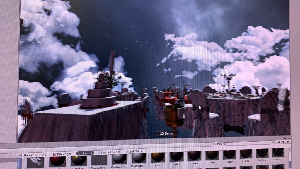
The tasks were divided into two parts: environment and interaction. Initially I made a prototype to test out whether the pairing of the objects we chose make sense to the user. However, we failed to find prefabs for some of the objects we wanted, such as passport and flight ticket, and we had to modify the storyline a bit based on what kind of prefabs we were able to find. After having all the objects placed in our environment, we felt like rather than situating the scene in an abstract environment, a more realistic scene will make the interactions more intuitive for the user, so we decided to use the wedding scene as our environment. For the skybox, we used a skybox for a city at first. Then during the play testing, people said they were distracted by the skybox a bit and were really focusing on the details. Thus we decided to change the skybox to a more abstract one, which could at the same time strengthen the dreaminess of our scene.

our scene with skybox of city view
our scene with skybox of nebula

My main task was to make the objects in our scene interactable, and to trigger different effects. By adding the interactable script and the throwable script to each object, and checking collision between the paired objects, I could attach the story pieces accordingly. When positioning the objects, I made sure that everything is placed within the play area, so that user can definitely reach the objects by walking around, which makes the experience of cleaning up and pairing up objects more real. Then during the play testing, we found that players might want to through objects away, and by doing so, they will never be able to get them back. To address that problem, I added a box that is the same size of the play area and made it transparent. Then by making the box collider as “isTrigger”, I checked whether the object stayed within the box. If not, I will reset the position of the object to its original position.

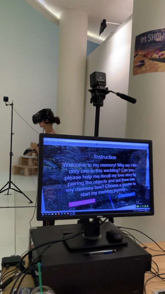
Then when Vivian and I was testing the game, we thought it is weird that the game does not have an ending scene. We initially thought about adding an animation of the box closing, when every object are put into the box and paired up. However, since the prefab we found for the cardboard box cannot be animated, we decided to make the box disappear, and have some visual effects when all the story pieces had been played. And for the first scene, as we planned, I set up a menu that allows user to choose which side of the story they want to hear about, and there’s also an instruction on the menu. The instruction was made “unclear” by purpose, so the user kind of know there task is to pair up objects, but do not know what they will see and what will actually happen in the scene.

Here’s some videos of people playing with our project during the IM showcase.

Reflection/Evaluation

Two main takeaways from this project:

  • Details matter. Most of the issues I had during the process were due to my ignorance of details. For example, in order to make an object to be movable, the box says “static” should be unchecked.
  • User do not always read the instructions. Even if we did more that three rounds of user testing and made adjustments to our project based on the feedback, our project was still kind of “hacked” during the showcase. This is true for all the IM projects I have made in the past: users can always interact with your project in an unexpected way. User testing is really really important.

I liked the idea of our project, but I hope if we have chance in the future, we can turn it into something more than an interactable love story. I always believed that VR can be an effective tool to assist with the treatment of mental health problems. If we can dig deeper into the story, we might be able to come up with a project that helps people who suffer to recover from their breakup.

Project #1 Documentation

Project Description

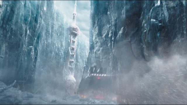
I was inspired by the Chinese Sci-fi movie called The Wandering Earth. The whole story was based in 2075, where the Sun is gradually dying out. The people of Earth are trying to build giant thrusters to move the planet out of orbit and sail to a new star system.

For my first project, I decided to create an apocalyptic scene, which raises people’s awareness of the environmental impact of our actions: if we keep polluting our nature, we will end up entering apocalypse without any uncontrollable factors (say, the sun dying out). However, rather than a recreation of what’s currently happening on the planet, a preview of the future which human beings might witness within the next century should serve as a more effective warning to trigger concerns about our environment. I decided to set the scene at an abandoned park, a place that’s full of sweet memories. The contrast will be thought-provoking.

Process and Implementation

After deciding the theme of the project, I started to search for sets of skybox materials online that resembles the scene in The Wandering Earth – abandoned city covered in snow. At first, I used “abandoned city” as the key word, because I thought I could always change the color tone and brightness of the image. So I found the following material and modified it a bit.

Original skybox material, from http://www.custommapmakers.org/skyboxes.php
Modified Skybox Material

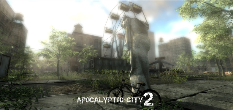
Then I looked for pre-fabs online that could make up an abandoned park, and I found the package: “Apocalyptic City 2”, which has assets for a video game of zombies, and after adding the assets to my scene with the background of an abandoned city, it looked just like a city invaded by zombies, which differed from my original idea. All the assets somewhat blended in with the background, so that you couldn’t really tell which are the objects I added. Plus, I failed to change the color tone of the image to a level that resembles the snowed city, so I decided to change the skybox material to snow, and the conflict between the color of the assets and the color of the background worked out quite well.


New Skybox Material

As entering the play mode, I found that my skybox looked like a box: there are edges between each side. It was because I didn’t change the “Wrap Mode” of the image from “Repeat” to “Clamp”.

Also when I planned out the layout of the assets, I didn’t take into consideration the angle of the camera: in fact, I thought I should be able to see everything because its in 3D. However, because of the height of the camera and the scale of the assets, some assets might be blocked by something behind it so that I couldn’t really see it. After testing in the play mode for several times, I moved objects around so that everything can be view clearly.

At last, I added a background music to my scene, which sounded to me had a mixed feeling of sadness & creepiness, and happiness from the past.

Reflection/Evaluation

This is the first 3D project I have ever made using Unity, and I realized how hard it is to work with 3D objects since you have to consider all three dimensions of the object to ensure its visibility. The layout of the scene was also harder than laying out things on flat space (say, webpage). It will be helpful if I could planned out the scene in real life: using blocks and boxes to represent the objects, and see how it looks in the space. Also, I used a lot of prefabs for my project, and realized how powerful they are: they made the whole process much easier. I am more than willing to learn how to build pre-fab from scratch.

Another take-away from this project is the importance of background music. At first, the scene didn’t seem to be arousing for me. I thought it was because I was so familiar with the scene. However, after adding the background music, I actually felt like I’m part of the environment, and I guess the purpose of raising people’s awareness of our environment should be achieved by really engaging people into the scene emotionally.

VR Park Experience

Last Friday, we went to the VR park in Dubai for a class trip. Since we had been talking about the rides in the VR park and the behind-the-scene tour, I thought that it would be like an amusement park, which has a lot of roller coasters and trains which you could ride on, and the behind-the-scene experience will allow us to understand their efforts to sustain and regulate such a massive place. Unlike what I expected, the PVRK in Dubai was way smaller and looked just like an arcade. It was dark and noise, and we could barely hear other people talking. The only roller coaster they have looked so small that I don’t even think we would be able to have a ride on it. I got a bit disappointed at that point.

However, as we put the headsets on, the whole situation changed: you see a new world in the headset, and the sound effect was so real and you can hear it so clearly from the headset. I realized how wrong I was: the point of VR was to create an equally engaging experience even if the equipments (like the rollercoaster) did not seem to be legit. My favorite experience was the shooting game, where you get to drive a spaceship and fight with the enemy troops. When I first sit on the machine and put on the VR headset, I didn’t really feel immersed in the game. To me, it didn’t seem to be different from those fancy arcade games where you get to drive a car and shoot zombies. Then, when the spaceship I was driving got sucked in by a tunnel and started to climb up the tunnel, the seat changed the orientation so that I really felt that I was part of the spaceship. It was that moment when I started to feel immersed in the experience.

When shooting the enemy troops, I actually felt the backlash of the machine gun, and thus it was so hard to control the spaceship: it was shaking a lot. The visual effects were so real: I could actually tell by the lighting of the explosion how big the exploded spaceship was. The sound effect was also 3D: when I turn around, I could hear the explosion and shooting coming from behind. Overall, it was such an immersive experience where I felt blended in with the spaceship I was driving, and really felt like part of the game. And I think I was doing well in the game. Got 29,000 points XD

DEVELOPMENT BLOG – BETRAY

Our initial idea was to tell the story of the development of the UAE, based on the theme “renewal”. I took a core class last semester called the history and environment of the Middle East, and I was shocked by the fact that this region used to have oasis in ancient times. Thus, we thought it would be interesting to see how this places changed from oasis to desert, and then from desert to such a modernized city with skyscrapers and trees planted along the roads. Our idea was to position our story on an isolated island, which represents the UAE, because recreating the country will be challenging.

Then we thought that it would be too complicated to tell the history of the UAE from the beginning, and we failed to figure out how to make the transitions between the three scenes – oasis, desert, and modern city – natural and intuitive, so we decided to focus on the last two stages: how the UAE developed from desert to a modernized city. After some research, we identified three key stages for economic growth in the UAE, and we listed the elements that should appear in each stage:

Stage #1: desert, tent, barren, camel, cactus, pearl picking

Stage #2: souq, discovery of oil, the combination of seven emirates

Stage #3: Asian cup, skyscraper, NYU, city park, luxury car

In terms of transitions between scenes and the experience of time in our scene, player will be an old man who has lived in the UAE for his entire life. Through the player’s interactions and conversations with people around him in the three stages, player gets a sense of his/her age. For example, in stage #1, the player will see his parents collecting pearls, in stage #2, the player will trade with other people in their mid-age, and in stage #3, the player lives happily with his grandchildren.

However, we still think that the elements we would like to include in our environment and the player are loosely connected: player can actually see the history of UAE from a third person’s view, then why are we designing an VR experience for users to interact with the environment? Following that question, we tried to narrow the scope of the whole story down: instead of telling the story of the whole country, we wanted to focus on what this old man experienced during his life. The experience will start with the player lying in bed in his own luxury bedroom, and we designed three interactions based on the previously mentioned three stages:

Interaction #1 Player approaching the window. When he looks outside the window, he will see the modern city (stage #3)

Interaction #2 Player approaching the wall, touching on the photo hanging on the wall, triggering his midlife memory (stage #2)

Interaction #3 Player approaching a desk, on top of which there’s a hand-made toy. Player picking up the toy, remembering how his mother made him the toy when they lived in tribes (stage #1)

Then we realized another issue with this design: after player enters stage #2 for example, how do they come back to the main scene (the bedroom)? We wanted to avoid using back buttons because we want the experience to be more coherent. Bearing that question in mind, we tried to come up with interactions that could actually push the development of the story, and make the transition between stages more fluent. Then we thought that we could set our environment at the corniche. Player could collect pearls at the beach, and as they collect more pearls, the environment changes: more people gather together, and the souq forms gradually. Then the player can trade with other people, and as more people are trading, the skyscrapers occurs. However, a huge problem with this idea is that the rapid development of the country within the past several decades is due to the discovery of oil, yet we could not come up with a way to assign player a role in the discovery of oil.

At this point, Vivian and I felt like we were trapped by the huge idea of presenting the history of the UAE, and we realized that this is an impossible task considering the number of factors involved in the story. We decided to start over and look at the other two themes.

I had another idea of simulating how people feel after taking hallucinogen, the effects of which has been at the center of debate for decades. Meanwhile, Vivian found this interesting projects, which is a 3D data visualization of the brain activities for 4 seconds of someone who fell in love. We thought it would be interesting to create a multi-sensory experience for love and betray. We decided to name our project Betray, which will be a musical bittersweet love story conveyed by beats, background music and key words that follow the story development timeline.

Our environment will be quite illusionary. We will create an endless world, as if players are floating in the universe, but we will also distort the color of the background, so that the environment looks unfamiliar. There will be a list of words associated with love & betray (maybe also trust?), which appears in order. There will also be a background music. Players can interact with the words. By clicking the trigger/throwing the word away/etc., player can trigger different sound effects and visual effects. There will be a certain level of randomness in the experience, but the certain properties of the effects such as the volume & pitch of the sound effects, and the movement of the visual objects will be decided by how player interact with the word, and the category of the word they interact with. For example, if they interact with a word associated with love, the sound and visual effect will be soft, and calming, while if they interact with a word associated with betray, the sound and visual effect will be harsh and intense.

See Vivian’s blog post for our storyboard.

I made a demo using p5.js for the visual effects of our project. However, after presenting it to the class, I realized that I focused too much on how our project looks but ignored the story behind that. What is the message we try to convey to users by having sound and visual effects? I also shared an alternative I have about creating a virtual version of the Museum of Broken Relationships, where users can play around with objects in the environment, and figure out the story behind each object. Sarah suggested that the storyline should have the top priority if we want this to be an immersive storytelling.

After discussing with Vivian, we came up with the idea of having multiple objects and a cardboard box in the environment. By pairing the objects up and putting them into the box, users can trigger the voiceover of one part of the story. The order in which users put the objects into the box does not matter, since we wanted to leave enough space of imagination and free interpretation of the story to the user. Also, we decided to have a female and a male version of the story, because we believe in gender differences in the understanding and perception of love. Users will be able to choose whether to enter the female or the male version of the story.

Here is our story script:

Male Version:

Movie Ticket & Popcorn Box: I finally got the courage to invite her out for movie. Touched her hand when we tried to reach the popcorn at the same time

Paired Toothbrush & Cup: The first night she slept over, she brought her toothbrush with her. The next morning, she changed my toothbrush into a paired one

Dog Food & Dog Cage: She always wanted a pet dog. I brought home a cute puppy one day, and I couldn’t forget how excited she was: her dream finally came true.

Iron & Suit: First day of work after my promotion. She ironed my suit for me. Looking forward to our future.

Ring & Ring Case: I saved all my money for this ring, prepared for a month for this. Today is finally the day.

Passport & flight ticket: Leaving the country tomorrow. I guess I will have to put this memory in the box and leave it behind…

Female Version:

Movie Ticket & Popcorn Box: He finally asked me to hang out. I’ve been waiting for this for a month. He’s so shy but so cute .

Paired Toothbrush & Cup: I was like a kid after I stayed at his place. I paired our toothbrush up.

Dog Food & Dog Cage: Suddenly one day, he brought home a cute puppy. I was so surprised! I always wanted a pet. I guess now we are a family of three.

Iron & Suit: I want to make his first day after promotion special, so I got up early to iron his suit. Looking forward to the bright future of ours

Ring & Ring Case: I said yes.

Passport & flight ticket: His work left us no choice but to lock all these memories up, forever.

I was a bit worried about not being able to find prefabs for passport, flight ticket, movie ticket, ring, and ring case online, and when we looked into the asset store, we really couldn’t find those. So we changed our storyline a bit, based on what we were able to find online.

New Version:

Male Version:

Paired Toothbrush & Cup: Paired toothbrush is the first step to show we are a family, says her.

Candles & Plates:

I finally got the courage to invite her out for a dinner.

Candle light on her cheeks is the cutest thing ever.

Dog Food & Dog Cage: I brought home a new family member that day, and I couldn’t forget how excited she was: her dream finally came true.

Iron & Iron Board:

First day of work after my promotion.  

She ironed my suit in the morning.  

Looking forward to our bright future.

Pen & Notebook:

She used to keep all of our memories in this notebook …

but it’s meaningless now.

Vast & Watering can:

Roses die. So are our promises….

Eventually it turns out to be a wedding without her…

Female Version:

Paired Toothbrush : Pairing our toothbrush makes us look like a family more…

Dog Food & Dog Cage: That day he brought home a cute puppy. I was so surprised! I always wanted a pet. I guess now we are a family of three.

Iron & Iron Board: I want to make his first day after promotion special, so I got up early to iron his suit. Looking forward to our bright future …

Candles and Plate: Can’t ask for anything better than a candlelight dinner for the first date.

Pen & Notebook: It’s been a while since he left me… i used to keep a diary everyday when we were together …. How stupid i was.

Vast & Watering can: Roses die. So are our promises…. Eventually it turns out to be a wedding without him…
Project #2 Documentation

Project Description

For project #2, our group decided to build an experience that tackles the problem of sustainability on campus. We wanted to base our scene on campus, and there are trash on the ground. In the real world, if someone passes by trash, and ignores it, there are no consequences. Besides, people all have the mind set that someone else will act on that. We wanted to raise people’s awareness of the NYUAD community by creating an alternate reality where if people walks by a piece of trash without picking it up, they will receive negative feedback indicating that they are not acting in a proper way.

Besides, because of the diversity of the community, there isn’t a shared standard for recycling which everyone agrees upon. Always having been such an ignorant person about the environment, I really get confused when I throw an empty Leban bottle: should I put it in general waste or plastics? The bottle is definitely recyclable, but only after I clean the bottle. Recycling can be extremely complicated: I still remember that I was extremely shocked when the RA told us that we should recycle the lid for Starbucks cups but throw the paper cup into general waste. By creating an educational environment which mimics what actually happens on campus, we hope to teach people how to recycle in an entertaining way. Through the repeated interaction within our scene, users might be able to perceive recycling as less burdensome as they get more familiar with it.

Process and Implementation

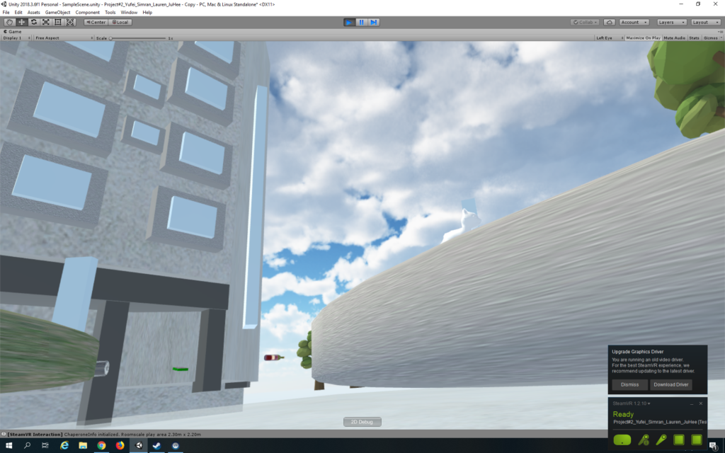
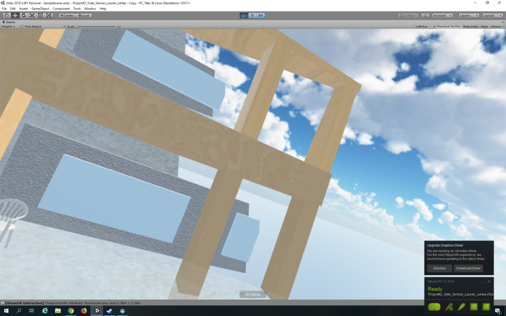
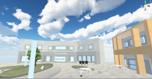
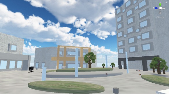
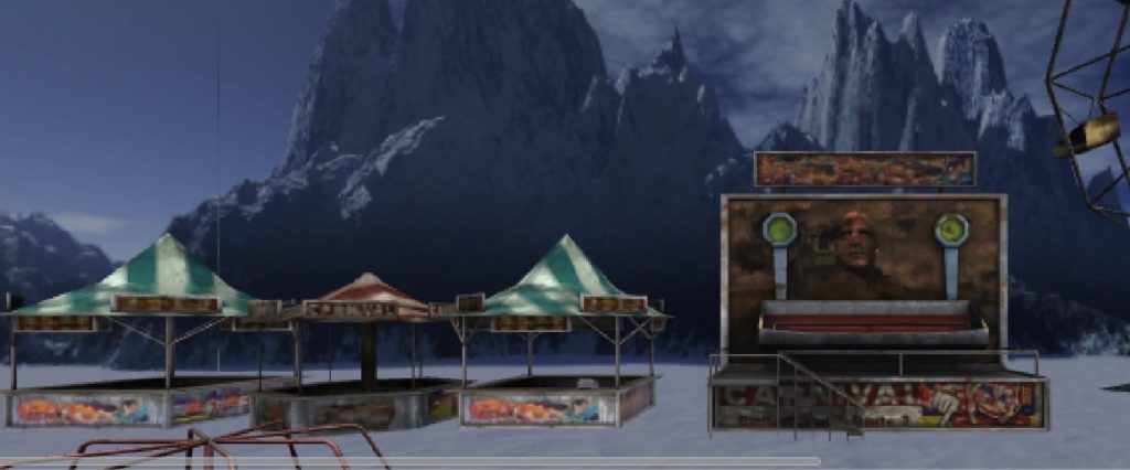
The tasks were divided up: Ju Hee and Lauren were in charge of the environment, while Simran and I were in charge of the interaction. After the environment was created, our scene looked like this:


When Simran and I started to work on the interaction with trash in our environment, we found a lot of problems with the environment. First, because we failed to set up our VR station when we first started the project, we didn’t have a sense of the size of our VR space and how it is reflected in Unity. If I were to figure out we need to set up the VR station beforehand before Lauren and Ju Hee started to build the environment, we could have saved a lot of time and energy from rescaling the space. The environment is too large, so that the movement of users are not significant: users can’t really tell that they are moving inside the environment. So we decided to do a teleporting. We divided our tasks: I will be mainly in charge of the teleporting, and Simran will focus on the interactions, but we are helping each other out throughout the process.

I went through several tutorials to understand how teleport in steamVR works in Unity. Here are the links to the tutorials: https://unity3d.college/2016/04/29/getting-started-steamvr/

https://vincentkok.net/2018/03/20/unity-steamvr-basics-setting-up/

At first, I decided to place teleport points next to each piece of trash, so that users can easily access the piece of trash by aiming at the right teleport point. Then I realized that since we have such a huge space, users would never be able to go to the areas where there is no trash, so I think it would be nice to have the whole space to be teleportable: users should be free to move in our space, and they also have the choice of going directly to the trash and complete the training if they are not interested in experiencing our VR campus.

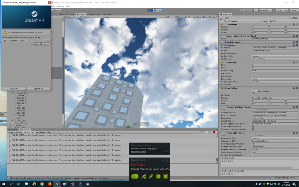
Adding the teleporting object to the scene, setting up the teleport points in the environment, and attaching the TeleportArea script to the ground are easy. However, it becomes frustrating when we have to figure out the scale and the position of our camera. The environment was build in a way that the ground is not set at position (0, 0, 0), and the objects were not tightly attached to the ground. And when we do the teleport, we get teleported beneath the buildings

At first I tried to change the y-position of the camera, so that we actually view everything, but then after raising the camera, we are not able to see our controllers because they are so far away. Then I tried to raise the y-position of the player, but we are still teleported to a place below the ground. Then I figured, instead of making the ground teleportable, I can create a plane that is teleportable, and raise the plane a little bit. By doing that, I fixed the problem.

I also doubled the scale of everything so that the scale looks fine. Then we found several problems when we view the environment via the headset. First, the buildings, or some part of them, disappear when we looking at it.

Then I figured out that the nearest and farthest viewing distance should be adjusted according to the scale of our environment.

Another problem we encountered was how to get close to the trash. Because our scene is in such a huge scale, we cannot even touch the trash lying on the ground because they are so far away, so we decided to have the trash floating in the air, at approximately the same level of the teleport plane, so that users are able to grab them with the controllers. However, if we simply disable the gravity of the trash, they will fly away.

But then if we enable the gravity and kinematics at the same time, the trash won’t be throwable: it couldn’t be dropped into the trash bin. Then I searched online for the correct settings for the Throwable script in steamVR and also asked Vivian how her group did that. In order to make it work properly, we have to set in Regidbody “Use Gravity” to be true, and “Is Kinematic” to be false. Then for the Throwable scripts, we need to select “DetachFromOtherHand”, “ParentToHand” and “TurnOffGravity” for the attachment flags.

I also added the ambience sound to the scene, created the sound objects for positive and negative sound feedbacks, set up the sound script, and attached them properly to each sound object.

Reflection/Evaluation

One of the take-aways from this project is that for VR experience, the scene and the interaction cannot and should not be separated. After dividing the tasks up, Simran and I did not really communicate with Lauren and Ju Hee. Then we took over the already-made environment that was extremely large, and the objects in the scene were kind of off scale. We spent a lot of time fixing the scale of everything, and I felt really bad about not communicating with them beforehand. We could have saved a lot of time.

Another thing I should bear in mind for future projects is that we should never ignore that fact that the hardware might went done. We almost ran out of time when creating the interactions because the sensors kept disconnecting with each other and the controllers kept disappearing from the scene. We should have planned everything ahead rather than leaving everything to the last minute.

Overall, I enjoyed the process of learning from peers and from obstacles, and our project turned out to be nice: we didn’t expect users to be really engaged in our game and to have fun throwing trash.

Project #2 Development Blog

For project #2, our group decided to build an experience that tackles the problem of sustainability on campus. We wanted to base our scene on campus, and there are trash on the ground. In the real world, if someone passes by trash, and ignores it, there are no consequences. Besides, people all have the mind set that someone else will act on that. We wanted to raise people’s awareness of the NYUAD community by creating an alternate reality where if people walks by a piece of trash without picking it up, they will receive negative feedback indicating that they are not acting in a proper way.

Besides, because of the diversity of the community, there isn’t a shared standard for recycling which everyone agrees upon. Always having been such an ignorant person about the environment, I really get confused when I throw an empty Leban bottle: should I put it in general waste or plastics? The bottle is definitely recyclable, but only after I clean the bottle. Recycling can be extremely complicated: I still remember that I was extremely shocked when the RA told us that we should recycle the lid for Starbucks cups but throw the paper cup into general waste. By creating an educational environment which mimics what actually happens on campus, we hope to teach people how to recycle in an entertaining way. Through the repeated interaction within our scene, users might be able to perceive recycling as less burdensome as they get more familiar with it.

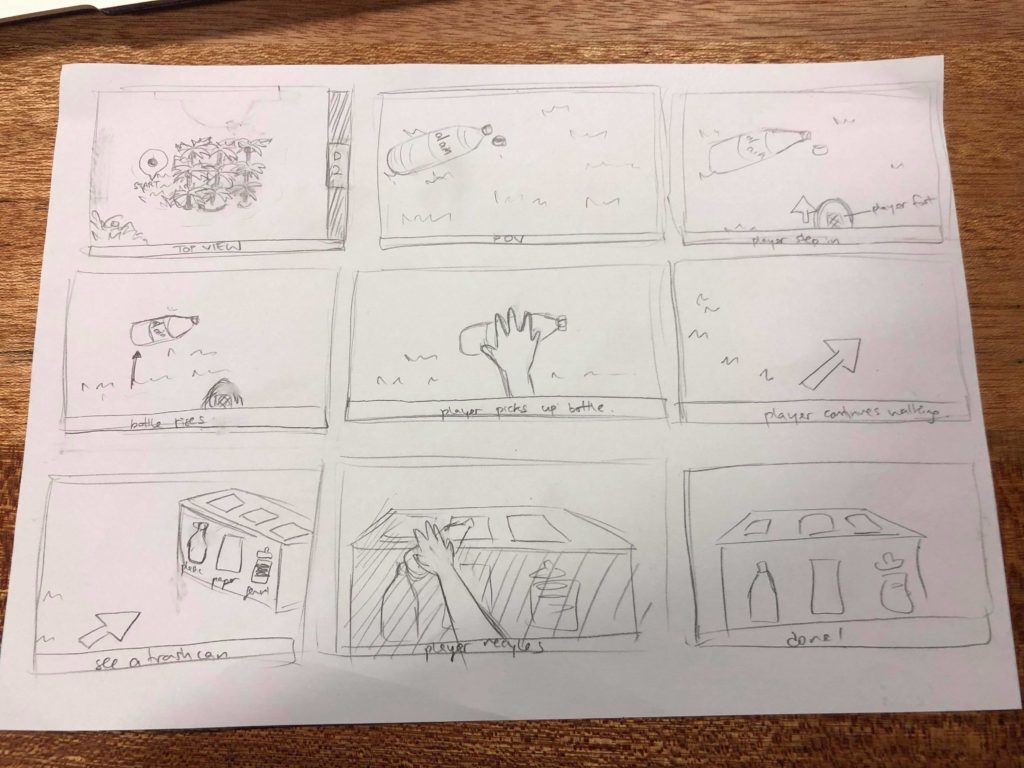
Here is our storyboard, drawn by Lauren:

Some initial thoughts and designs:

Since the campus is kinda huge, and we only have limited space for interaction, we decided to limit our scene to the area (the small garden/square) between D2, A6 and the Arts Center. We think that this side is more populated, compared with the ERB side, since everyone comes to D2 for meals, and we can actually see Al Ain bottles and other trash lying on the benches.

In terms of feedback, we decided that when users get close enough to the trash, the trash will light up, indicating that users could interact with the object. When users put the trash into the correct trash bin, they will get a rewarding sound feedback. Otherwise, they will get a sound feedback that is negative, and will not be able to drop the trash into the trash bin.

For the ambience sound, we decided to use birds sound, because we actually have speakers attached to the palm trees on campus that play birds sound. This is not only a recreation of the campus environment, but also a sarcasm of how they try to make an illusion of something that does not exist on campus.

We split the work so that Ju Hee and I will be in charge of making the environment, while Lauren and Simran will be in charge of making the interactions.

During the class where we presented our initial ideas, Sarah suggested that the main focus of this project should be on the interaction. After discussing a bit on the environment, we decided that the scene does not have to be set on campus. I experimented with the environment and found a skybox of a block in Tokyo. Japanese society put a great amount of emphasis on recycling and eco-friendly lifestyle, so I think it make sense to place our interaction in Japan. But when we met again in class, we decided that we should still use the campus as our environment, and Lauren became passionate about making the environment, so she switched her task with mine.

Ju Hee and Lauren have built the environment, and our scene looks like this:

Representation in VR

My friend and I were talking about the fact that despite the radical differences between different groups of languages, the structure of word groups are usually the same. Thus, if we map all the word in English, for example, in a virtual space, we can expect to see that all the English words related to family cluster together. Meanwhile, when we map all the Chinese words in the same space, all the Chinese words related to family will gather at the same space. Such a corresponding relationship between English words and Chinese words makes translation and language learning much easier, considering how different they are in terms of grammars, algorithms, characters, etc.

The reason why I think words should be mapped in a 3D space rather than a 2D one is that the connections between words and word groups are too complex to be represented in a 2D space. In a 3D word, the “distance” between different words will be less skewered: people pick one word/word group, look around, and then they can see all the connected words/word groups around them. This becomes an interface because people could be immersed in the world of words, and seeing the connections between words/word groups shape their understanding of language.

My Favorite Interaction(s)

Actually there are two interactions I would like to talk about. The first one is a website (showed by Craig in all his classes) that provides an interactive experience. As users access the website via mobile devices, they would be able to make their own paperplane, stamp on it and throw it away. Users could also catch a paperplane, unfold it, see from the stamps where this plane had been, and stamp on it. The design of this experience is quite simple and intuitive. The instructions are quite clear. What users have to do on their mobile devices really resembles what they really have to do if they are making their own paperplane.

https://paperplanes.world/

The other interaction is from a short video I saw, between a user and a piggy bank. The piggy bank looks like a card box. As the user put the coin on the plate and press it, a cat will sneak its claw out from the box and ‘steal’ the coin away. The interaction is quite simple, but it tells a vivid story of the coin being stolen by a greedy cat.

Google Cardboard VR Title Review

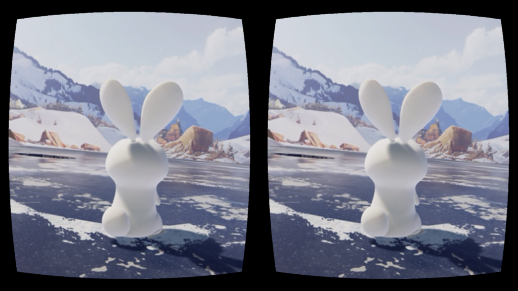
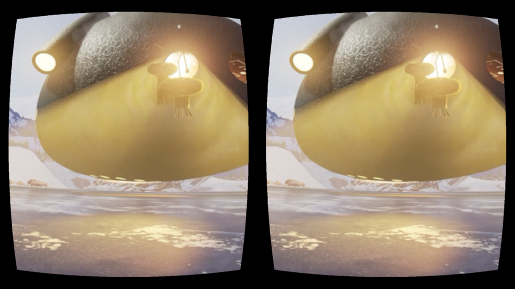
The Google Cardboard VR experience I chose to review is Invasion (and Asteroid), made by Baobab Studio, which specializes in providing users with immersive experience through its storytelling. Invasion is an animation about the story of a couple of aliens who want to conquer the earth, and upon their arrival they met two bunnies. Interestingly, the user is one of the bunnies (in fact I failed to realize that until I read through the description of the story)!

Like other VR animations, Invasion provides a panoramic scene, allowing the user to get a comprehensive sense of the setting and really feel involved in the story. The Baobab app allows the user to switch between the VR mode and the normal mode (the one that does not require a Google Cardboard but still shows the panoramic scene). I watched the animation twice using different modes, and really appreciated the immersive experience of the VR mode. In the normal mode, the whole experience is limited within the screen of your phone. Thus even if you can look around and explore the scene, you still feel the boundary between the story and the reality, while in the VR mode you become part of the story as if everything is happening around you.

On the other hand, the sound effect fosters the immersive experience. When using the Google Cardboard, the speaker of the phone is closer to your ears, and the 3D sound effect is more notable. When I watched the animations (Invasion and also Asteroid), my attention was directed by the sound effect: whenever I heard something behind me, I would look back and see what’s going on. In that sense, I consider the sound effect as an essential part of the environment. Also, the VR environment offers more freedom for the user: unlike films which directs user’s attention through specific camera angles, VR environment allows user to pick their own camera angle. If you are not interested in what’s going on with the main characters, you can just turn around and explore the scene by yourself.

Project #1 Development Blog

For Project #1, I was thinking of re-creating a scene from the film Escape Room since it reminded me of my experience with my friend at the escape room, but I just realized that the idea was already taken by Yiran, so I changed my mind. Last semester for Mashups, I gathered the Air Quality data of my home city during the past 5 years and created an online simulation of how it feels going out on a specific day with a certain level of air pollution. Here is the link to my project: http://yg1262.nyuad.im/airqualitysimulation/simulation.html

My idea for Project #1 is to build upon the aforementioned project and make a game that teaches players how their life choices influence the Air Quality. The environment I will be creating is a crossroad of a city, and players can look around at see how the air quality is. Then by making several choices (such as whether taking cabs or walking to work), players can see how their choices affects the air quality on a larger scale.

After talking to Sarah, I realized that my understanding for our project one was not accurate. Instead of having the possibility to interact with the scene, we, as represented by the camera, will just be standing still at some point within the scene and looking around. Thus, rather than designing the interactive experience in my scene, I should just be focusing on the layout of the environment.

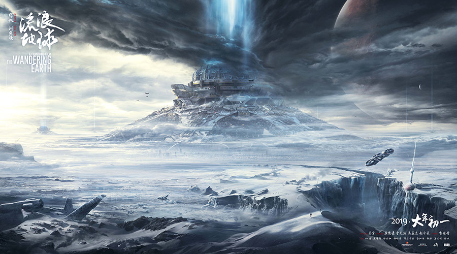
During this winter break, I watched a Chinese Sci-fi movie called The Wandering Earth. The scene looked like below. The whole story was based in 2075, where the Sun is gradually dying out. The people of Earth are trying to build giant thrusters to move the planet out of orbit and sail to a new star system. I was really impressed by this movie, not only because this is the first legit science fiction movie produced by China, but also because its theme which differs from most Sci-fi movie. I do not want to ruin it, so I will stop talking about the details.

So I decided to create a apocalyptic scene for my first project, which kind of connects with my original idea about air quality simulation: if we keep polluting our nature, we will end up entering apocalypse without any uncontrollable factors (say, the sun dying out). However, rather than a recreation of what’s currently happening on the planet, a preview of the future which human beings might witness within the next century should serve as a more effective warning to trigger concerns about our environment.

After deciding the theme of the project, I started to search for sets of skybox materials online that resembles the scene in The Wandering Earth – abandoned city covered in snow. At first, I used “abandoned city” as the key word, because I thought I could always change the color tone and brightness of the image. So I found the following material and modified it a bit.

Original skybox material, from http://www.custommapmakers.org/skyboxes.php

Then I started to think, what I should add to my environment. Where should the user be, when they entered the apocalypse?Or put it in an extremely pessimistic way, if I come to the end of the world, which place do I want to see before I die? A place that brought me happiness, for sure. A place that I usually went to. A place that could trigger my memories. Thus, I decided to put the user at the center of a community park. When I was a kid and before I entered middle school, I went out for a walk everyday with my mom after dinner. There is this community park we usually went to where I called “home”, because the first time I went there (when I was three or four I think), I was reluctant to leave and said to my mom the park is where my home is. Although we moved to a new community when I entered middle school, my mom and I still joked about that whenever we passed by the park.

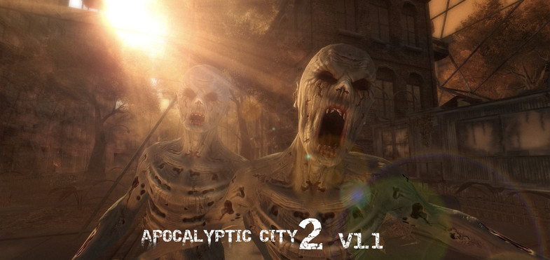
So, I started to look for pre-fabs online that could make up an abandoned park, and I found the package: “Apocalyptic City 2”.

As you can see, Apocalyptic City 2 has assets for a video game of zombies, and after adding the assets to my scene with the background of an abandoned city, it looked just like a city invaded by zombies, which differed from my original idea. All the assets somewhat blended in with the background, so that you couldn’t really tell which are the objects I added. Plus, I failed to change the color tone of the image to a level that resembles the snowed city, so I decided to change the skybox material to snow, and the conflict between the color of the assets and the color of the background worked out quite well.

As I entered play mode, I was disappointed to find that my skybox looked like a box: there are edges between each side. It was because I didn’t change the “Wrap Mode” of the image from “Repeat” to “Clamp”.

Also when I planned out the layout of the assets, I didn’t take into consideration the angle of the camera: in fact, I thought I should be able to see everything because its in 3D. However, because of the height of the camera and the scale of the assets, some assets might be blocked by something behind it so that I couldn’t really see it. After testing in the play mode for several times, I moved objects around so that everything can be view clearly.

At last, I added a background music to my scene, which sounded to me had a mixed feeling of sadness & creepiness, and happiness from the past.