Project 3: Development Blog

This project was inspired by one of the cities in Italo Calvino’s Invisible Cities. We wanted to create an environment where the actions of the user on the ground below, would affect the movements and positions of the stars.
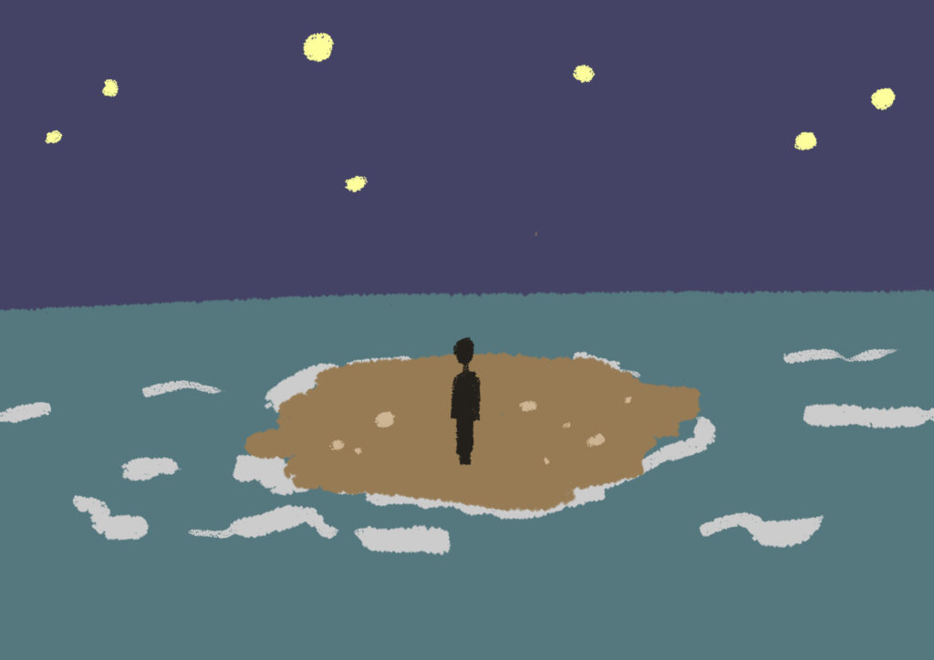
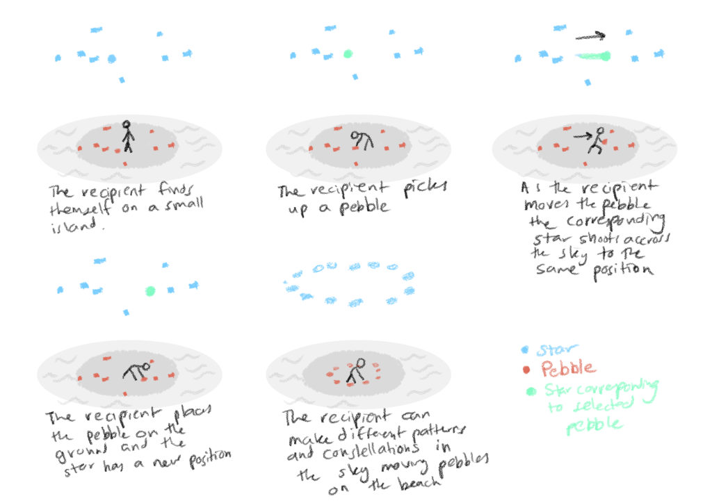
Initial Environment Sketch
Original Storyboard

Lauren and I started off by making a very simple prototype with a plane and several cubes. We managed to map the x and z positions of the cubes on the ground to a cube in the sky when it was picked up and moved around.

The island environment is built out of a terrain with a grid of several water tiles forming the sea reaching the horizon. We found a unity asset pack with several realistic rocks we could use and a starry skybox that we liked. The stars are spheres with a glowing material attached to it.
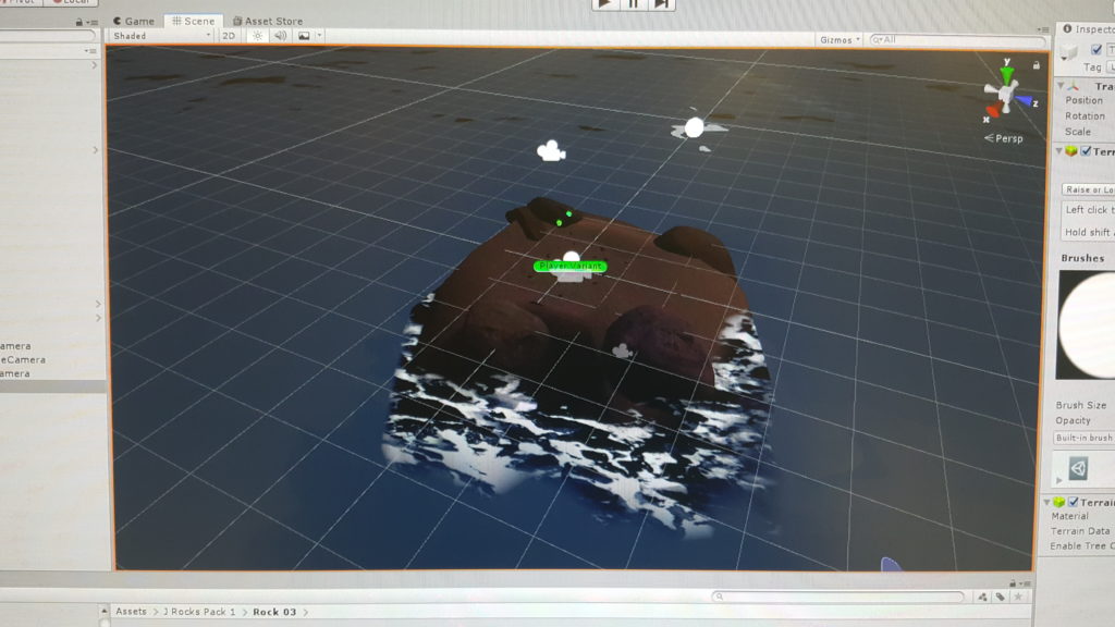
Each of the stars has a script attached to it that maps its location to the x and z of the rocks but multiplied, making them further away in the sky and operate on a larger scale. It also adds an acceleration to the star if the player chooses to throw the pebble off the island.
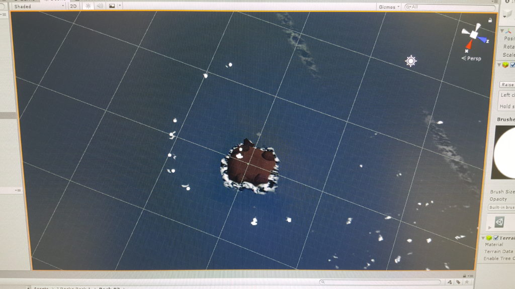
The throwing of the pebble created an unintentional fun feature. Starts often loop the loop into position and it felt like throwing the stars into their positions in the heavenly mantle. We decided to make this a main feature of the experience, rather than just rearranging stones on the island.

We added a particle system to each of the stars that leaves a trail behind it. This added the feature of being able to draw in the sky by moving the stones. We made the particles become smaller, yellower and more transparent with time.

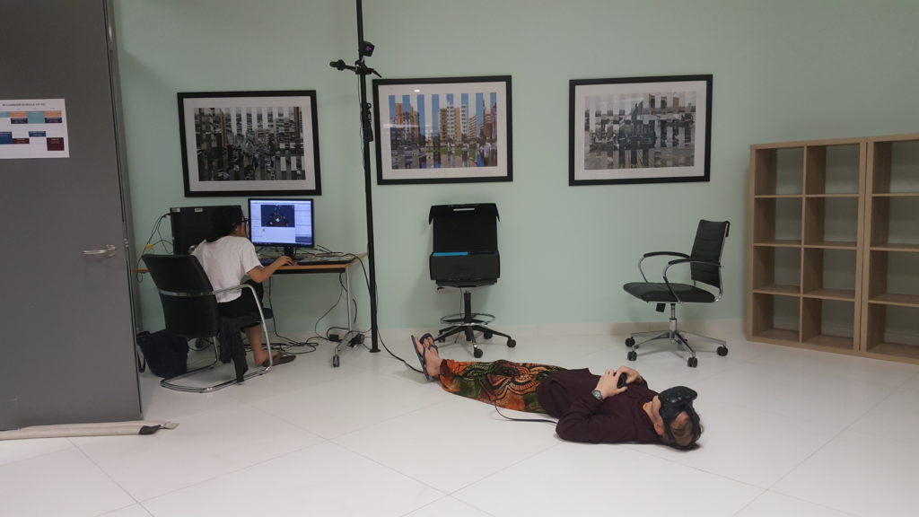
User testing was a lot of fun. Some people stood and twirled around, some lay down on the floor as if they were stargazing and drew in the sky. Users learned pretty quickly to turn their attention towards the sky in the interaction.
We sourced some relaxed but fun and mysterious music from the free music sources on Youtube.

We realized that the experience needs a good ending scene. Something needs to happen after all the stones are thrown. Do they respawn or come back? Does the sun rise and restart the game? does another dramatic event happen?

We settled on creating a particle system that surrounds the player with stars that emerge from the center of the island and hover like fireflies. We made a second script that activated the particle system once all the stones were below a certain point in the y axis (after several different ideas of how to do this, this one worked best. This was to be accompanied by a change in music to something more dramatic. Changing the music proved to be the most tedious task but it eventually worked out!

Several people played the piece and we got some good reactions!

PVRK- Hologate, Zombyte

The best experience I had at the VR Park in Dubai was the Hologate game, Zombyte. I think it was the same for many of my classmates.

It was the experience that was the most ‘Alternate’, depicting a post apocalyptic zombie world where a computer virus takes over the human population’s neural enhancements. As a fan of good world building, to me, most of the experiences I saw that were close to reality like the drone or the Burj drop were fun but still a lot less interesting.

One of the ways in which it was very successful was in making the use of the headsets and equipment was a part of the narrative. We are using our neural enhancements to remotely control fighter robots and hold off the zombie horde, with the danger of the virus spreading to us across the network. We were also handed controllers that were built in to rifles that we held and controlled like real rifles.

The placement of the players back to back, but able to look around and see each other and support each other, and linked headsets to allow us to talk to each other worked well to create a sense of team work. We tried to have each other’s back. Enemies approaching and attacking from multiple sides and angles kept us moving around, sometimes ducking down and shooting over the barrier.

The atmosphere of the game is charged, urgent and terrifying. The dim, artificial neon lighting and the shadows cast from the buildings from which the zombies emerged were effective in creating a sense of a cyber punk world as well as a sense of sci fi horror. I don’t remember if there was music, but that just means it worked so seamlessly that I didn’t notice.

I would totally play it again.

Project 2: Development Blog

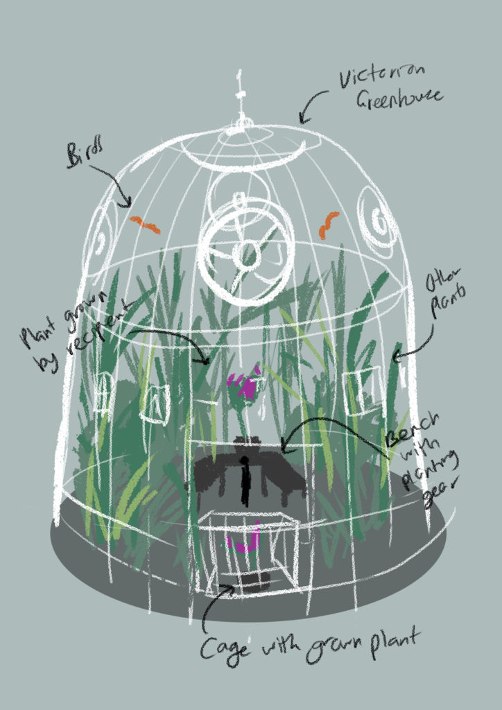
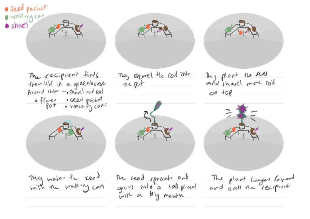
This project is going to be like something out of the Harry Potter universe. It places the recipient in a large, Victorian style greenhouse, in front of a planting station.They are provided with seeds, a watering can and a planting pot. If the user follows what is pretty much expected and plants the seed and waters it they end up growing a giant man eating plant that gets them eaten. Just behind them will be placed a second plant of the same species with a danger sign, an easter egg warning that the user may or may not see.

I envisioned the greenhouse to look like the ones found at the Kew Gardens in London that I visited last summer.

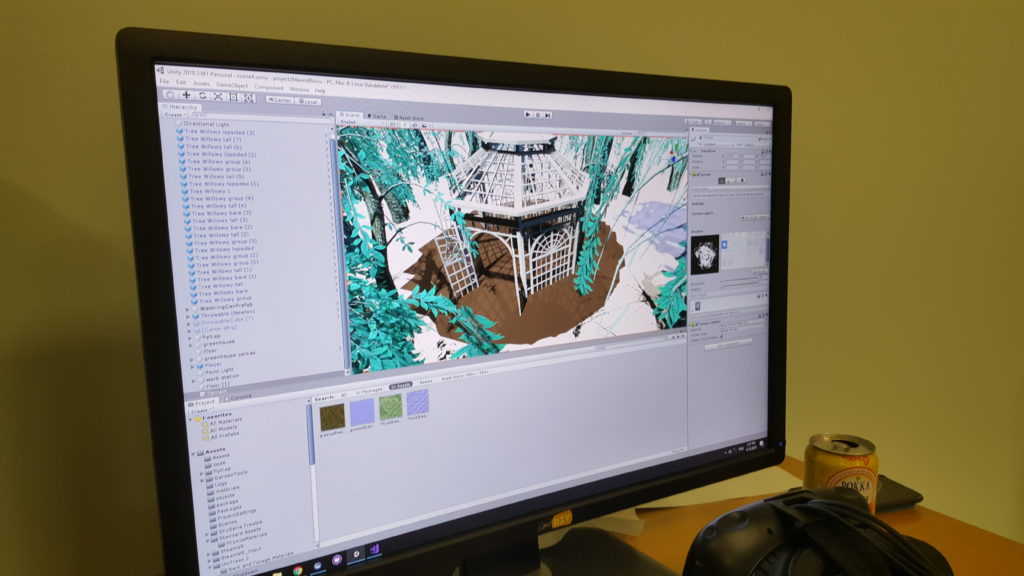
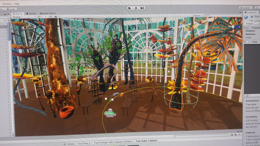
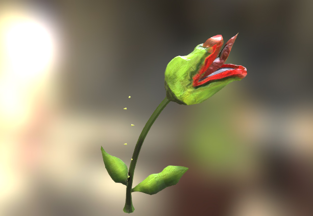
We first set out to find some ready made assets, primarily a greenhouse and the man eating plant. I managed to find a greenhouse that cast some nice shadows and came with a bunch of planting pots and benches. I also managed to find an animated plant with teeth. Getting the animation to loop is something we have yet to figure out. We built the planting area by combining some of the benches that came with the greenhouse.

Then, we began work on the interactions. We brought the player in from one of the example scenes in the Unity VR package. We also brought in a sphere that we will be using as the seed. Adding colliders to the pot and the table allowed us to place the objects on the surface and drop the seed into the pot. Figuring out how to detect the tilt of the watering can to start playing the particle animation of the water took some time but Max was able to figure it out.

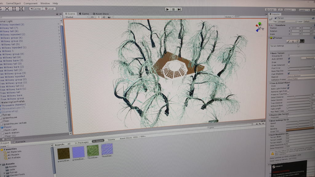
I built an expansive terrain around the greenhouse to create a expansive forest. I sprayed the area near the greenhouse with patches of grass and a single species of tree but nothing too extreme or different so That the focus would remain more on the inside. The greenhouse was populated with strange alien plants, trees that reach above the recipient’s head and some close by the use in planters, some of which came with their own animations. The bench forms a visual barrier around the user. These worked wonders for bringing the space to life. Some of them emit clouds of spores, which became quite distracting so I ended up removing them.

To add another ‘alternate’ element to the world we added a creature, a giant butterfly in the sky. The butterfly makes the outside seem an even more daunting space than the inside.

We added some gardening equipment into the space the the recipient can pick up and play around with as well. I think it may make a fun ending to the game if the user was to pick up one of these and fight off the monster plant.

The growing of the flytrap is triggered to happen when both the soil and the water have contact with the seed for a certain amount of time. This took several hours to figure out how to do. The plant, which is already in the pot but extremely small in size grows larger and animates, lunging at the viewer.

Finally, we decided to add some ambient and 3D sound.
We found a bunch of sounds on freesound.com. The sound of a tropical rain forest plays around the recipient as the plant in the cage behind them emanates, low, rumbling growls.

Form of Representation Suited to VR: Immersive Architectural Model Building

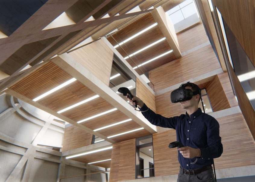
When designing a building, often, no one knows what the building would really feel like to be inside until it  is built. Now, with VR, we can explore the inside of a building that hasn’t been built yet, or even a building that is impossible to build.

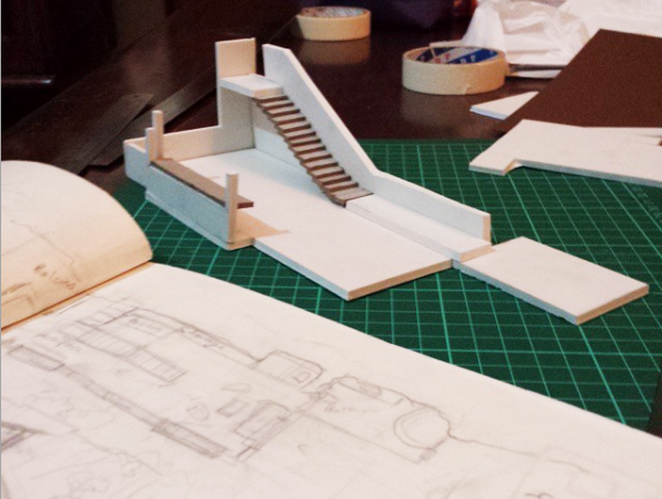
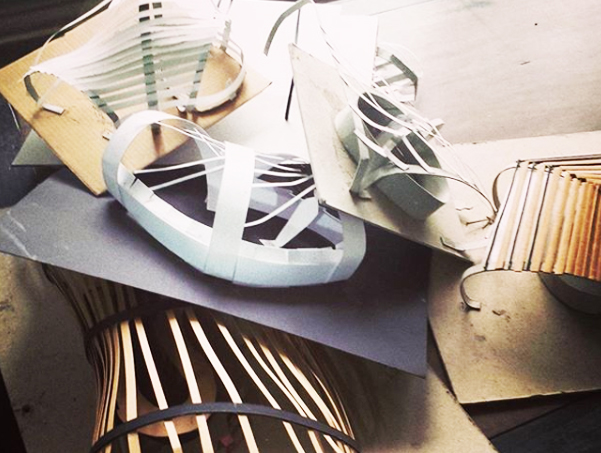
The form of representation I would like to write about in this post is based on my own experience in creating three dimensional models. I went to architecture school for a year. We were encouraged to start thinking about our projects by making sketches. Though I would start out this way, scribbling in  a sketchbook, I would quickly become frustrated by how, though my sketches managed to capture the feel and aesthetic of what I wanted they never managed to convey a sense of the space. I quickly moved on to making rough three dimensional sketches or sculptures with bits of paper, pizza boxes and a box cutter. This really helped me think spatially, to see in one go what it would take a plan, several sections and an isometric view to see before was immediately visible with the three dimensional sketches.

A few years later, I was teaching myself Maya. The modeling capability of the software was more powerful than my limited real life model building ability. Yet the interface of the 2D surface of the screen was a barrier to being really able to see what I was doing as I built. I would move a vertex a certain amount and once I rotated the camera, I would realize that I had moved it too much in the x, y or z direction without even noticing.

VR would be useful in taking a tour through the model of a building to a client. But it could also be extremely valuable at the sketching, conceptualizing and designing stages as well. The software would consist of ‘dynamic material’ that the user can manipulate by holding onto and dragging and scaling surfaces, vertexes, edges and volumes, like on maya.

The software would also have two modes, a miniature one where the architect can tinker with the model and change things and an immersive mode. Thinking about the scale of the body is also extremely important in designing architecture. The architect would be able to move from a miniature scale to placing themselves inside the model as they work on it.

There are some elements of a building that VR would not be able to capture as yet, like heat and air currents but VR would be excellent for representing and creating a sense of space.

VR Title Review: Pearl

Here is a link to the film on YouTube.

Pearl Patrick Osborn’s Oscar nominated 360 view short film that tells the story of a young girl, her father, and their love of music, the two of them connected by a song. The viewer witnesses the story unfold across the years and seasons from the passenger seat of the car that the two protagonists travel around in.

The film begins as an older Pearl finds her father’s old car in a scrapyard, she plays a cassette recording of her father’s song, bringing back memories. The film is a montage of scenes spanning from the girl’s childhood to young adulthood, how her love for music, and the friends she makes it with, develops as she finally makes it in the music world. Yet it primarily revolves around her warm and sometimes rocky relationship with her father over time, around the symbols of the song and the car, the space that the film takes place in.

The style consists of simple, not too detailed, 3D models with cel shading that gives them an almost 2D effect. What really makes the style, however is the atmospheric lighting that creates different moods as well as different times and places. The constant changes in lighting signal the change of scene. There is always a focal point to the action in the scene which the film effectively guides the eye of the viewer to the right spot. One of the moments that works best is where the kids run out into the sea, lit up by the headlights of the car.

What I love most about the film is that it makes use of the idea of how a space can contain memories. The choice of car, a contained space that moves around, revealing the space outside is particularly interesting. The use of VR, instead of telling the story through curated shots, works to make the viewer feel like an outsider, given an intimate glimpse into the lives of these two people. It also gives the viewer an association of themselves with the space of the car, like they are seeing the story unfold from its perspective.

Though it makes a great 360 view video, it is difficult to watch through a headset. The scene transitions between scenes happen rapidly and the car constantly switches from moving to stationary, making it a slightly nauseating experience.

An Interaction I Like (Part 2): Bandersnatch-ed

DANGER:  SOME SPOILERS AHEAD

“People think there’s one reality, but there’s loads of em all snaking off like roots, and what we do on one path affects what happens on other paths. Time is a construct.”

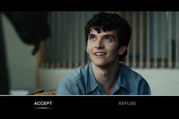
Bandersnatch is a 2018 Netflix sci fi/ horror film that is a part of the fantastic Black Mirror series. Though it is a film it is also a choose your own adventure game. You, the viewer, make certain decisions for Stefan, the protagonist, starting with what kind of cereal he should have for breakfast.

Stefan is a young game developer from the 80s, creating a choose your own adventure based video game himself that he has titled ‘Bandersnatch’ after the book it was based on. Colin, another game developer and a hero of Stefan’s reveals to him that his own life is like a choose your own adventure game, his fate decided by the smallest of decisions.

What makes the interaction in Bandersnatch so brilliant is that it is entirely self aware. You, the viewer on Netflix is a part of the story as the one who is pulling the strings on the protagonist. As Stefan ruminates on Colin’s words, he becomes aware of you, the viewer’s presence and role in his fate as he realizes he no longer has control over his decisions. This is most convincing in the moment in which he actively resists the decision picked by the viewer. The moment of resistance to it draws attention to the own player’s agency, something that we tend to take for granted when playing games.

Bandersnatch’s drawing of the viewer’s agency as the player into the narrative is one of the most effective breaks of the fourth wall I have experienced.

“There’s a cosmic flowchart that dictates where you can and where you can’t go. I’ve given you the knowledge, I’ve set you free.”

An Interaction I Like (Part 1): Tough Bluff

The game One Night Ultimate Werewolf has its players bluffing and lying in order to win ( sort of like mafia).

At the beginning of the game each player is given a card. One or more players are werewolves and the rest are villagers. Each villager has an action that they perform during the ‘night’.

As soon as each player knows what they are, all players must close their eyes, only opening them to perform an action as instructed by the voice on the accompanying app during the ‘night’. Cards are stolen, swapped and spied on and when every action has been performed all the players ‘wake up’.

Now the real game begins. The players have 5 minutes to figure out who the werewolves among them are in order to vote on who to ‘kill’. The main interaction consists of discussion amongst the players as to who is trustworthy and whose story checks out. This stage can get pretty raucous and tense. But you never really know anyone’s true identity until after the voting and the cards are revealed.

Five whole minutes of the game are spent with the players talking it out. What I love about this game is how it has everyone in suspicion of each other which underlies the whole process of the interactions between them. Players band together, try to decide who to trust, bluff (double bluff and triple bluff), test other players to see if their story checks out, trick each other into revealing important information, look for inconsistencies in each other’s stories, double cross each other etc. Not everyone is who they claim to be and you decide who you can trust.

Here is an example of a game…

Project 1: Development Blog

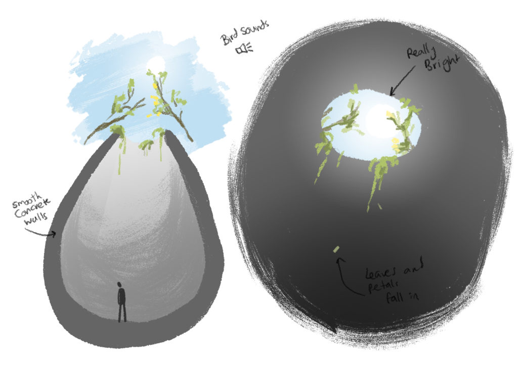
For my first project I wanted to create an environment where the experiencer would feel imprisoned. Instead of focusing on the prison itself I wanted to create the feeling of entrapment by creating the sense of a vibrant and flourishing world outside.

This is an alternate reality where the experience is held at arms length from the world. Able to see the briefest glimpses of light and life while unable to see them clearly or experience them completely.

The prison itself resembles a cocoon or a nest with a smooth, curved surface. The walls are of smooth concrete and impossible to climb. The curved surface is also what makes it impossible to get out of like the inside of a pitcher plant.

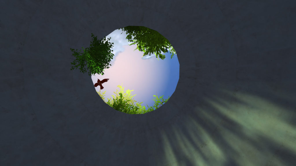
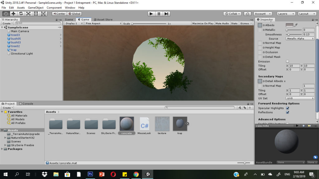
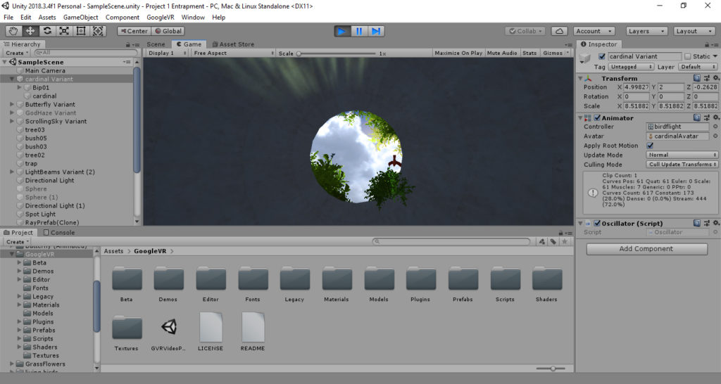
Through an opening far overhead the experiencer can see a sliver of sky and some overhanging branches. Some vines spill over the edge and dust dances in the sunlight. Shadows of birds flitter across the opening. The experiencer can also hear creaking branches, twittering birds and rustling leaves, but muffled and in the distance.

Initial Concept Sketches

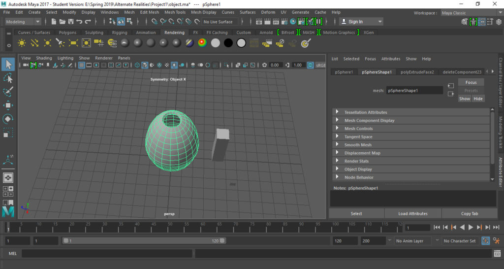
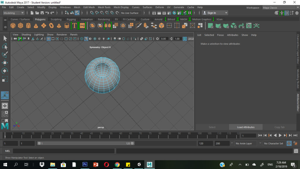
I built the main structure in Maya, a 3D modeling software I am familiar with. It took two tries to get it right. The first one I made looked strange when I imported it into unity and placed the camera inside it. I ended up going for a simple shape, taking a sphere, elongating it, deleting some surfaces and extruding the sides.

The First Try
The Final Shape

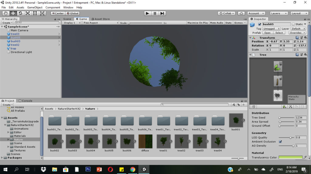
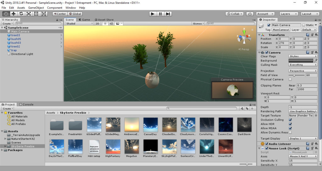
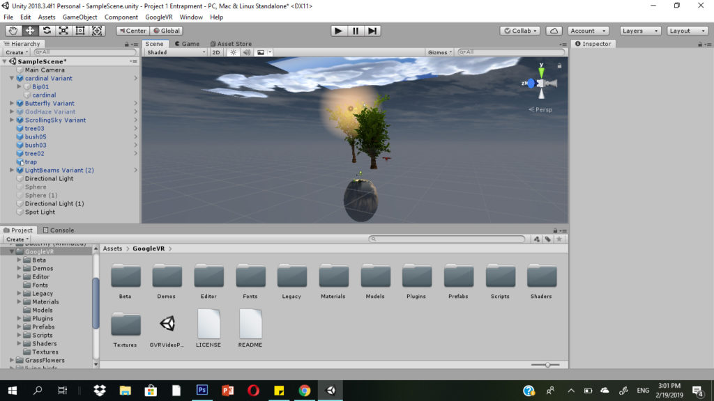
Importing the .fbx file of the object into Unity, I placed the camera inside it, facing upwards. I imported assets from the Nature Starter Kit 2 to play around with the vegetation.

I placed the vegetation based on how it would look from inside the trap. Looking at it from the outside is pretty strange since some of them are floating in mid air.

From Inside
From the Outside

I found a free skybox seires from Avionix that had a wide variety of skies to choose from. I decided it was a little strange to have clouds that weren’t moving so I decided to go for one that just had a gradient and some lighting as if dawn was just breaking. Perhaps this could create the feeling that the user just woke up in this strange trap? I may hunt for some animated skyboxes as well, however.

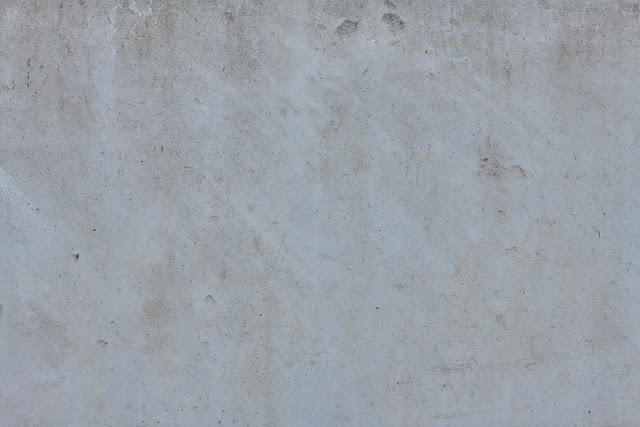
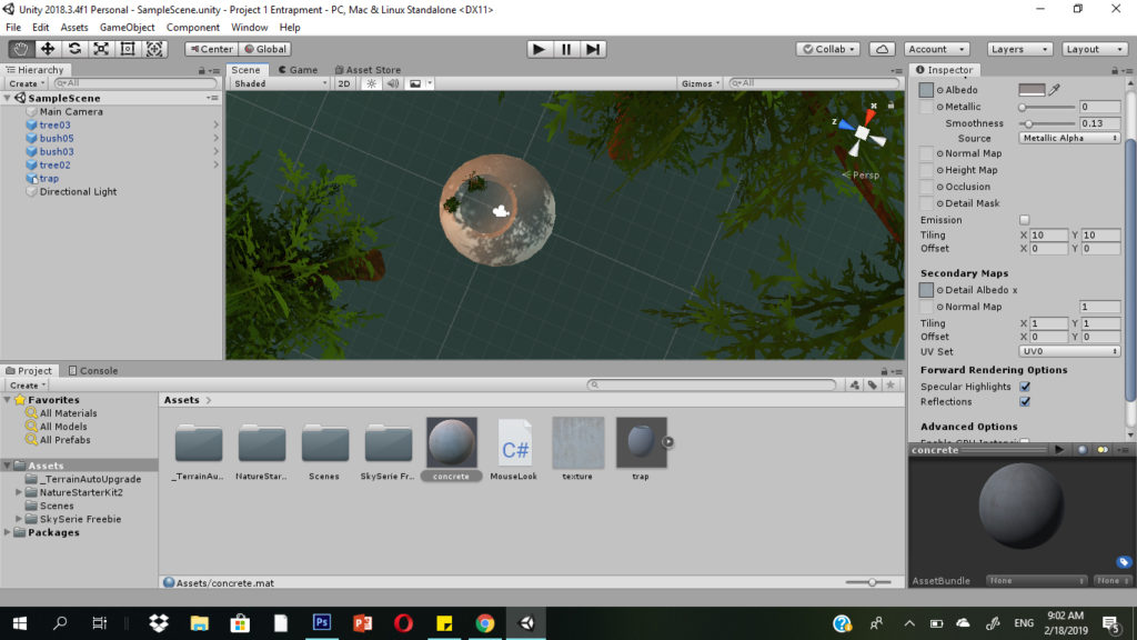
I added a concrete texture to the main object using an image I found.

Texture Image
Material for the Trap Object

The main components of the environment are ready! My next steps would be to experiment with lighting and perhaps add a sun object overhead. I would also like to add some sound and movement to the environment. It also remains to test the environment out with Google Cardboard.

Searching through the asset store, I managed to find a bunch more assets that I could use to make the environment more lively and make the contrast between the vibrant outside world and the dingy space inside more apparent.

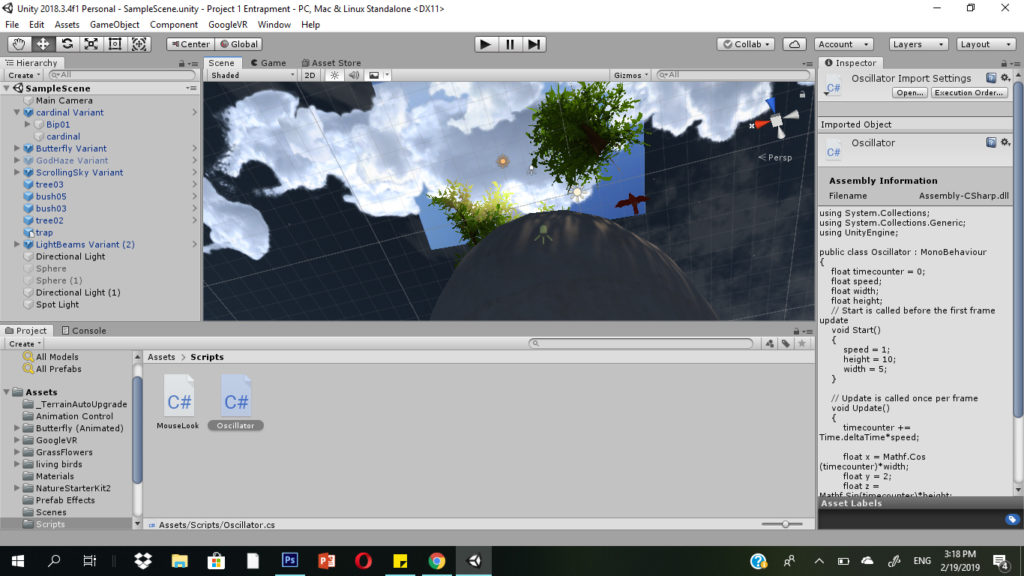
I found an animated prefab of a moving sky to create the feeling of the passing of time. I found another useful asset that took the form of animated beams of light that shine into the space from time to time. I introduced a little, animated butterfly, hovering in the bushes. I also introduced a little bird flying overhead. The bird was a little harder to add since the asset did not have an animation attached to it. I had to attach the animation to the model of the bird and create a script that would keep the bird looping in a circle. It appears over the mouth of the trap for the briefest of moments before it continues on it’s loop, allowing just the right amount of a delay before it appears again.

Outside View of all the Objects and Light Sources
Layers of Objects

Here is the script I used to make the bird fly around in a circle:

<!-- wp:paragraph -->
<p>using System.Collections;<br>
using System.Collections.Generic;<br>
using UnityEngine;</p>
<!-- /wp:paragraph -->

<!-- wp:paragraph -->
<p>public class Oscillator : MonoBehaviour<br>
{<br>
    float timecounter = 0;<br>
    float speed;<br>
    float width;<br>
    float height;<br>
    // Start is called before the first frame update<br>
    void Start()<br>
    {<br>
        speed = 1;<br>
        height = 10;<br>
        width = 5;<br>
    }</p>
<!-- /wp:paragraph -->

// Update is called once per frame
void Update()
{
    timecounter += Time.deltaTime*speed;

    float x = Mathf.Cos (timecounter)*width;
    float y = 2;
    float z = Mathf.Sin(timecounter)*height;

    transform.position = new Vector3(x, y, z);

}
}

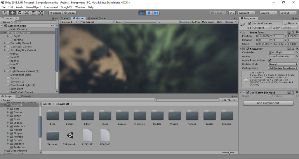
Finally, I worked further on lighting, changing the skybox and adding other light sources. I wanted it to be sufficiently dark inside, in contrast to the brightness outside. The extra light sources I added cast interesting shadows through the leaves on the inside surface of the space.

The Final Lighting Situation
The Shadows on the Inside

Finally, I added some audio to have the sound of distant birds constantly playing in the space.

Here is a link to the final product…. enjoy!