Claire Development Blog: Project 1

Inspiration:

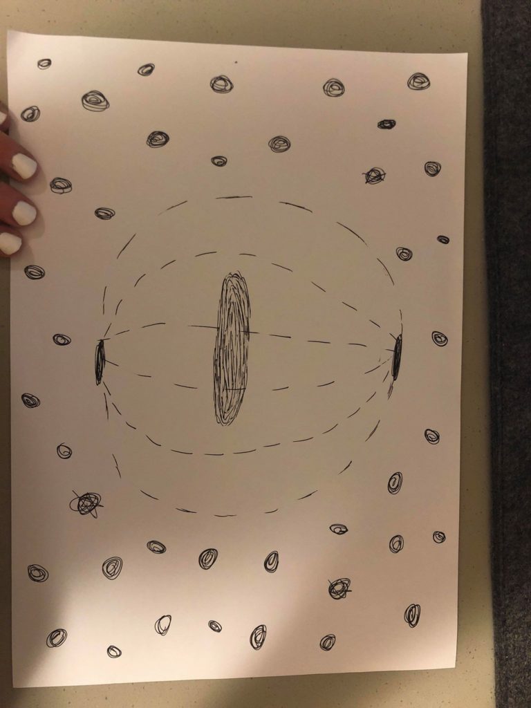
So for my project I want to do a very peaceful and calm space that is also pretty in an unusual way. My goal is to do a view of someone standing on a glowing disc in the middle of space, surrounded by stars and ‘space dust’. This would allow me to lean in to the idea of stylized stars to accommodate for my lack of experience with Unity. I also think experimenting with color paletes and different background music could give the space a lot of character. I found two TV shows to look at for inspiration. One is called Final Space, and I love it because Fred Armisen (<3) is one of the voice actors. And they have an alien space cat named Avocato, which I love animal puns so I’m obviously in love with this show’s cuteness. It’s about a prisoner in a spaceship who joins forces with a motley crew to save the universe from a weird evil green bean thing played by David Tennant weirdly enough. The other is one that my cousins love called Steven Universe. It’s about a group of rainbow aliens adventures in space and on Earth. I think the idea of looking out over space and ‘feeling small’ has been pretty socially engrained by tv and movies at this point in time. And because very few people have ever actually been to space, this setting will give me more creative control and allow for an acceptance of more imaginative design choices. It’s also such a weird scaling effect so I’m able to make very simple shapes for stars as an artistic choice versus as a limitation. I like the smudgy-halo effect that was in the Steven Universe stars and my main goal is to try and figure out how to incorporate that into Unity. I also love the big shots of Final Space, so I want to be able to make the user feel small in comparison.

Here are some sketches of what I would like my ‘space’ to look like. Get it? Because we did all those readings on spaces and I’m making it look like space???

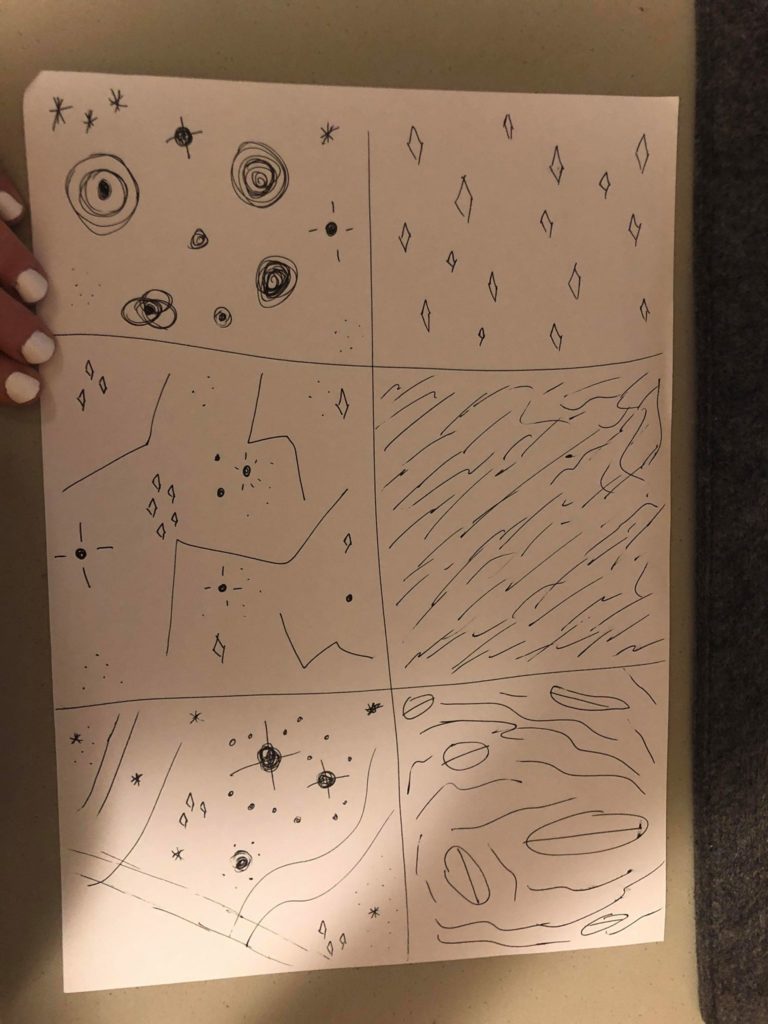
Limitations: The biggest limitation on this project is that I’ve never used Unity before, so I need to create stars using very simple shapes. I also am using professional animation as my aspiration/inspiration, so I will need to temper my expectations. I would also like to learn how to make it look as if my stars are illuminated, give them halos, something like that. And since that will complicate things, I need to budget more time for a learning curve.

Colors: I would like to use soft pinks and purples, maybe some deep blues, white, a lot of blush colors.

Research: I looked up the art teams for both shows, perused their blogs, watched some interviews, etc.

Steven Universe:

Rebecca Sugar(creator) : official show blog: http://stevencrewniverse.tumblr.com/ Sugar’s Insta: https://www.instagram.com/rebeccasugar/ . Random blog about background art: su-aesthetic.tumblr.com

Jeff Liu(storyboard artist/composer): http://jeffliujeffliu.tumblr.com/

Joe Johnston(storyboard artist/supervising director): http://joethejohnston.tumblr.com/

Colin Howard(storyboard artist): http://colin-howard.tumblr.com/

Aleth Romanillos(storyboard artist, designer): http://aromanillos.tumblr.com/

Danny Hynes(lead designer): http://dannyhynes.tumblr.com/

Elle Michalka(Art Director for 44 episodes): http://ellemichalka.com/

Jasmin Lai(Art Director for 44 episodes): https://twitter.com/_jasminlai

Liz Artinian(Art Director for 28episodes): http://lizartinian.tumblr.com/

Ricky Cometa(Art Director for 18 episodes): http://www.rickycometa.com/

Kevin Dart(Art Director for 12 episodes): http://kevindart.tumblr.com/

Sue Mondt(pilot Art Director): http://suemondtportfolio.tumblr.com/

And looking all these people up, I was surprised at how much overlap there was. Apparently Rebecca Sugar originally worked on Adventure Time and brought people from that show to Steven Universe. And then several people from the Steven Universe crew left and started a new show called Craig of the Creek which is pretty cute. And the art director from the pilot worked on another show for the studio called We Bare Bears, which I then found out my favorite Youtube song writer(Louie Zong) also works on. Which leads me to another aspect of this show. My cousins are OBSESSED with the music videos for this show. So I also want to get background music that gels well with my environment as a sort of omage. I like how soft and fluffy this show is aesthetically. I’m going to embed a few music videos below whose colors, shapes, and sounds I liked after watching about a billion of them. I also found that this show has a MASSIVE adult following and has so much content about it online. There was a wikipedia blog entirely devoted to it, reminded me of the Hamlet on the Holodeck reading in that every single detail of this show is posted, discussed, and evenly hotly debated. There were also a lot of Youtube accounts with fan art and theories I found, some people obviously devote A LOT of time to this kind of stuff. Finding all the stuff people were so passionate about made me think a lot more about the backgrounds of this show and gave me a lot of stuff to comb through. I think because there’s such a high demand, the creators of the show have a lot of blogs and information out there about it, so starting to look into this show particularly was like stumbling across a treasure trove of Internet obsession almost.

(This is Estelle. Like, American Boy with Kanye Estelle, what. even. Cartoon Network.)
The colors for this video are so nice, and I like the bubbles.

The sky in this is gorgeous. I like the clouds/wispy thingies and the just white lines, maybe emulate the geometric aspect of this??
the flow of the background colors is just so nice and calming. And I like how this song is sweet and calm but also has a fast rhythm sorta

weirdly sexual for a kid’s cartoon, but go off I guess. Loved the lights and neon-y aspect of this. They just use so many basic shapes in the background shots that I didn’t notice until I started to look for how exactly they were making/designing this after reading the artist’s blogs and stuff.

the song and sky for this one are both super cute

so when the funky white alien and the mullet guy are in space is kind of how I want my audience to feel, just floating in space in a magical peaceful loving moment


Final Space:

So since I watch this show on Netflix, I can’t take screenshots of the scenes I especially like. But each episode starts with a view of Gary, the main character, floating through space as he slowly runs out of oxygen. Just seeing his tiny body in front of this huge backdrop of millions of stars is very calm and serious and doesn’t really fit with the overall tone of the show. It’s like things start out super dark and serious and beautiful and then turn crazy quirky goofy. I don’t want my view to be sad and death-y but I do want to try for a ‘wow’ factor of I’m so small in comparison to this massive universe.

Devin Roth(Art Director-who also worked on my favorite TV show of all time, Bob’s Burgers, and worked with some of the Steven Universe animators too, I’m getting the vibe that animation with Disney is a small world-pun intended): http://www.dvoart.com/

Alan Huynh(Backgrounds and Storyboards): http://www.alanink.com/final-space.html

Liza Epps(background design, also worked on Bob’s Burgers and Bojack Horseman, what is this industry????): http://lizaepps.tumblr.com/

Hedy Yudaw(Background Artist, also worked on Rick and Morty which can’t believe I didn’t think about for inspo): https://www.hedyudaw.com/final-space.html

Allison Perry(Background Artist): https://www.allisonperryart.com/background-design/

Olan Rogers(Series Creator): apparently he’s a youtube star who posted the pilot in 2010, it didn’t really go anywhere until Conan O’Brien found it and got him a one season deal, which I think is a nice nod to the IM Internet new media culture we’ve been reading about https://twitter.com/OlanRogers?ref_src=twsrc%5Egoogle%7Ctwcamp%5Eserp%7Ctwgr%5Eauthor

Dan Brown: this guy worked on the original pilot with Olan Rogers, then came back and helped with the animation on the show, but I cannot find any blogs or accounts for him. There are two Dan Browns working in animation, but neither one listed this show in their portfolios so idk

Here is the trailer for the show!

This little dude is adorable and so weird and I love him
Gary floating through space. It does spoil the ending of the show so SPOILERS

Environment

All throughout high school I worked at an interior design firm. I worked both in the showroom and in the back, sorting fabric samples, cleaning glass, restoring pieces, etc. My least favorite part of the job wasn’t the hours of cleaning and organizing though, it was talking to customers. Mainly because all the customers at this place were snooty and rude and frankly very spoiled. Excluding the art curation and collection that was stored in the back and in several warehouses around town, everything in that store was overpriced, way way overpriced. The worst offender was these ugly as hell pillows. They were sized the same as the 10 dirham square pillows at Ikea, but these babies cost 600 USD a pop. FOR A PILLOW. It still blows my mind today. The rationalization is that they came from some valley somewhere in the mountain ranges somewhere in the Middle East, hand woven by the male lineage of some tribe who’s slowly going extinct. I get the import fees, but it still strikes me as exorbitant. The weirder aspect of this story was that you couldn’t even just buy the pillow, you had to do your homework on it. That crazy price tag came with a reading requirement(one full book on the weaving practice), descriptions of the seller and background(the woman who heads it is actually very nice, I met her in her warehouse in Brooklyn because of course that’s where she’s based), and attendance at a consulting session with the designers. These ridiculous pillows were a massive hit too, they sold out multiple times as word got out how hard they were to acquire.


The designers at the firm wanted to be sure that every piece that they placed in someone’s home was fully understood by the buyer. The pillows were some of the items that came with the most research, but everything bought through them was explained in great detail. Records were kept of every artist or firm or designer who had anything in their books, we’re talking names, schooling, statements, EVERYTHING. They’d even insist on giving their customers overviews of current and historical trends in design. It was their belief that if someone knew more about the origin and significance of what they were filling their homes with they would 1) be more willing to spend the big bucks and more importantly 2) be more fulfilled by the items presence. Knowing that that’s not just a mirror in your closet but it’s a piece of metal work originating from Mexico featuring a flower specific to that region makes the mirror seem more like art and less like, well, an ordinary mirror. The lesson the designers wanted to impart on their customers seemed to be that a personal space should be personal, whoever inhabits it should know each detail, each choice, each piece so well they can tell you a story no matter where they look too. It creates a greater appreciation for pieces as well as a desire for hints of intent and ergonomics in everything you place in your home. One of the lessons I took from that job is that when you understand the purpose of placement of what surrounds you, even if it’s purely artistic, you have a greater appreciation for your environment.


I definitely still practice that lesson today. I can tell you where everything in my room came from and why it’s there. On my desk there’s an angel with a turquoise heart my grandmother bought me in a street fair from an elderly woman who repurposed reclaimed wood found in arroyo’s, a sticker bearing the name of my hometown designed by a co-worker at a magazine, a wooden bowl I bought freshman year with my roommates from Ikea made of bamboo wood, and intermittently scattered bottles of perfume, photos, and nail polish, all arranged to form a U-shape so that it offers a more open look and makes the desk appear larger than it actually is. Typing that all out, I totally feel like Marie Kondo, but I get super anal about any arrangement I make. To me, the ideal environment offers control and curation, digital or physical. I may not spend $600 on a pillow, but I do spend a lot of time thinking about what I want in my living space. I know the placement tricks that will make my tiny dorm room look bigger than it actually is. I know how to fill white space and when to let it sit. I personally like environments where you can tell that everything was curated, even if you don’t know the exact reasoning behind it. And when you are aware of the minutiae of every piece(whether it’s a painting, a bowl, or even a exuberantly priced pillow) you appreciate the environment even more.


At both the homes of our clients and my bosses, you could almost feel how much effort went into every choice. Or it may have just been the fact that I was the one who sorted the architectural blueprints, paint swatches, furniture catalogues, design drafts etc. so I knew firsthand how much effort it took. Each room had distinctive color palettes, statement pieces, lighting picked to illuminate specific areas, art(textiles, hand blown glass, weaponry, folk and fine, portraits, and any and all else you can think of), hundred of tiny details that all merged together you’d never even notice each individual choice. Even the shape of the lightbulbs was something they’d take into account. That attention to detail always made movie sets stand out to me. Everything placed into a shot is put there for a reason. The items that surround characters are meant to subconsciously give you a closer look into their psyche. If a show’s camera focuses on papers strewn everywhere, you might conclude that the character is a struggling academic. Bright colors might indicate a character’s happy disposition, while stacks of take out boxes and mildew might say they are sad and slobbish after a devastating break up.  What people choose to surround themselves with says a lot about them, whether we realize that or not.


I like seeing environments that people create for themselves. I don’t like when everything matches perfectly, think the furniture sets as freemium prizes for so many apps on your phone or the massive churn out of Pottery Barn and their ilk. I like going to someone’s home and feeling that they chose everything there for a reason. Dorm rooms here on campus often do the trick. You can really only bring a few things from home or lug a few things in from Ikea here, so what people have tells you a lot about them. It makes our rooms distinctive, it gives you a peak at what makes people feel comfortable when they excuse themselves from the general public. For me, an environment should tell you more about what lives there. The same rules apply in zoology after all. A crocodile has sharp teeth because it’s a predator, it’s eyes reston the top of it’s head so it can look out from the water, it’s coloring is to camouflage itself in its environment. Humans are still animals after all, and while our design choices aren’t so Darwinian as a crododiles, they can still tell you a lot about the corresponding curator of a space.