Paths of Perception | Final Documentation

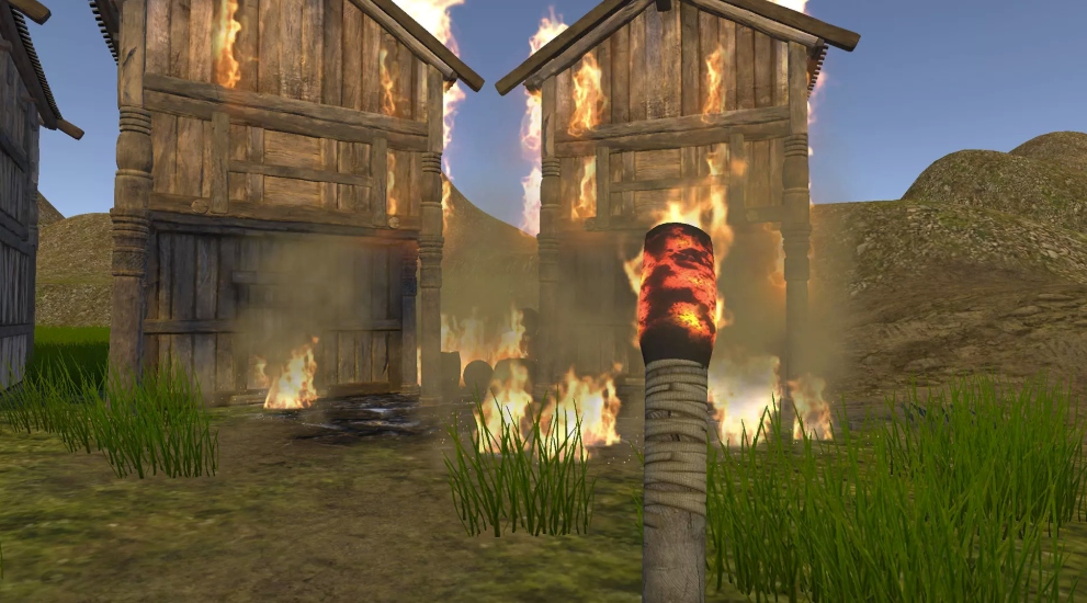
Project Description:The boisterous sound of cicadas in the summer, two kitsune statues on either side of a road leading to a pagoda, a series of gray gravestones surrounded by overbearing bamboos… these are the first things that users find themselves spectating once they enter Paths of Perception. This experience, originally designed and intended for the Google Cardboard yet executed for the Mac and PC, places players in the verge of reality and fantasy as they are faced with the danger of getting possessed by a nogitsune (a wild fox found in Japanese folklore known to trick and even possess humans). To avoid losing complete sight of reality, users have one last chance: to correctly identify three objects that have changed in their surroundings between the time they first found themselves in the cemetery and when they enter the spirit world. 

Since users in Paths of Perception are given no mobility apart from the possibility of rotating 360° around the same spot, the design of this environment was carefully done to make the most of only one main point of view: looking outwards. As such, everything is placed in a loose circle surrounding the user, indicating that they somehow are the main focus of the experience. The “storyness” of this space then comes from a change in this environment. What at first seems mundane and everyday suddenly turns eerie and even mysterious, as the sky turns dark with shades of red, a slightly purple tint encompasses the environment, and two nine-tailed foxes run towards the user. The experience’s story is then driven further through the use of text: prompting users to point and click at their objects of choice as well as providing another alternative by supplying riddles hinting at the correct objects.


Good ending
Bad ending

Process and Implementation

Brainstorming and Game Logic

One of the largest parts of the process of bringing this project to life was actually the idea and plot development. Initially, Neyva and I used the key words of “escape room” and “wonderland” as starting points to try to design a story that was driven by having an objective (like escaping from an escape room) and also presenting mystical qualities to it. Since at the beginning we were designing the experience for the Google Cardboard, we also wanted to constrain ourselves by having a small and very detailed environment that would only require users to look around to get a sense of the narrative. We eventually reached the idea of drawing inspiration from Japanese folklore, particularly that surrounding the kitsune, fox spirits known to be benevolent or malevolent depending on their type, and also known to have intelligence and be able to shapeshift. Reading further, we realized there were various types of kitsune, and we decided that we wanted to form a narrative surrounding the possibility of making a choice between two of these foxes, with no knowledge of which one was the bad or the good fox. After weeks of user testing and reconsidering our idea in relation to what the user’s actions would be, we eventually landed on our final concept: where users start the experience by being possessed by the nogitsune (bad fox), yet are given the possibility of breaking the curse by selecting the three correct objects that changed in their surroundings. To keep our original concept of having the user choose between the two foxes in front of them, we decided that these foxes would also present the user with a riddle hinting at the objects that supposedly changed. The good fox would hint at the three correct items, while the bad fox would contain one incorrect one. With no clue of which fox is which, users are invited to take a gamble and choose which one’s advice to follow.

Implementation

  1. Environment

The environment’s design was an aspect that took a lot of trial and error to get just right. Originally, as shown in our initial storyboard, we intended for the user to be in the middle of a road passing through the surrounding cemetery. The two foxes would then come towards the user from either side of the road, with the visual distinction between the two of them serving as indication of the difference in choice that they represent (one intending to help the user, the other intending to deceive). 

Our initial storyboard, showing how key this road was in the design originally

Considering this layout with a main road crossing through the cemetery, Neyva and I unconsciously created a larger space than we initially envisioned, causing a lot of the items to only be able to be seen from afar. It was until after we did our first user testing session in class and asked people to find 2 quite obvious changes in our environment that we realized how the environment we had created was not conducive for our type of experience. A lot of users mentioned the desire to walk around and explore further, getting close to the items they could only look from afar from their one vantage point. The amount and variety of objects we had also contributed to making users feel overwhelmed rather than guided, which was a significant reason why we decided to reconsider our layout design to make it more small and personal, ultimately contributing to our story as well. As such, we decided to create a sort of square or small circular opening where users could see everything from their location and height. Having this more intimate setting then allowed us to be more careful with our object placement. We decided to decrease the variety of items and be more selective. Gray gravestones would surround the user yet serving as a clear background, while distinctive and even colorful items would clearly serve as the foreground and as clear focal points. Having only one road also served to give context by indicating the path where the user potentially came from, while also providing closure regarding its purpose once the foxes use it to run towards the user. 

A lot of the items felt/seemed very far away
Too much clutter also made it hard to pay attention to the different details in the environment
At first users just arbitrarily started looking at this side of the road
Top view of our new scene design: all the objects are placed in relation to the user’s location in the center
The foreground and background items are now easily distinguishable

2. Interaction

With our new environment design, we addressed one of the main modes of interaction of the Google Cardboard: looking around. We decided to take advantage of the second mode of interaction, that of using the pointer by using it as a means for users to choose the items they wanted to select, as well as “submitting” their items by lighting the candle in front of the foxes. To make this pointing and clicking intuitive, we decided to change the color of the selectable items. Once selected, their material color also changes permanently to suggest that the choice has been recorded, unless clicked again (causing it to deselect and go back to its original color). Having more than 3 selectable objects, and having these be very recognizable items such as the red lamps, and a detailed lantern also serve as a way to encourage the user to try to decipher the riddle, as no two items look the same. In a way, by presenting the riddles, our game provides two different experiences: one where users try their best to remember how the environment was originally or take wild guesses, or one where users could instead take their time to decipher the riddles and muse about which of the foxes’ advice to follow. Having users light up the candle at the end of the sequence also has various purposes. First, it serves as a clear and easy way for the program to know when to analyze the items that were selected and trigger the appropriate ending. Second, and most importantly, it works as our way of directing the user’s gaze back towards the foxes. Originally, once users made their last choice they would stay facing towards the graves and the cemetery, missing the foxes’ movement at the end according to their right or wrong choices. By having the additional step of lighting the candle, they are now naturally facing the direction where the action will happen, finally having closure on the triggered outcome.

Hovering over an object changed its color, showing it’s selectable
Clicking over it changed its hue to blue, indicating it’s selected.

In terms of the logic to make all of this possible, I did spend a lot of time figuring out how everything would happen properly. I learned how to use coroutines in Unity to properly time and set delays between different events. This was key for showing and disappearing text, as well as for triggering the fade out transition effect. Doing the small changes in the environment such as rotating the foxes, changing the fence to a new one, and changing the material of the small gate were actually surprisingly simple. In order to properly check which items the user clicked on and determine whether they are correct or not, I wrote a script that added or deleted objects into a “selected items” array accordingly. Once the 3 choices were made, the program then searched whether the correct items were “contained” into the array, and triggered the final scene. Finally, figuring out how to switch between the fox animations was also a small hurdle I had to overcome, particularly since our bought prefab’s animations were read-only, so I had to find a workaround. Regardless of these challenges,  piecing all of these elements together to create our functioning game was a great learning experience.

Reflection

Overall, even though it was quite a long, and at times frustrating process, I am really happy and proud with how our project turned out. As mentioned previously, Neyva and I originally wanted to make an intimate experience that made the most out of a small environment that drove our story forward. Considering the final result of Paths of Perception, I feel that we were definitely able to fulfill our own expectations, as we continuously user tested outside our class sessions with our roommates and adapted our project accordingly. The final choices we made regarding the environment’s layout, the tone of the text and the riddles, and even the final placement of various objects were done with confidence because of this. Since the very beginning, Neyva and I were very clear about creating a project whose concept we were passionate about, and whose scope was realistic given our time, skills, all the while considering the fact that we were only two people in a group. In the end, we were able to keep these in mind while ultimately creating an experience that successfully conveys our story and intended mood.
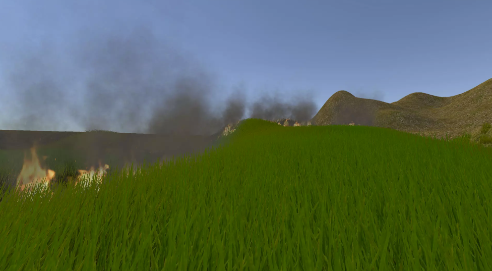
Additional photos:

Project 3: Development Journal

For this final project, Neyva and I were inspired by the prompts of wonderland and escape room. For us, escape room loosely represented the existence of a motivation or objective for the player that would result in some sort of relief. Wonderland then served as inspiration for our setting, which led us to consider fantasy or supernatural elements for it. We eventually started discussing the possibility of obtaining inspiration for our experience from folklore – more specifically, Japanese Yōkai folklore, which deals with supernatural monsters, spirits, and demons. After researching different Yōkai, we came across the kitsune, or fox spirits with various abilities, such as being able to shape-shift into humans. According to Japanese folklore, kitsune could have up to 9 tails, with the highest number of tails representing the fox’ age, power, and intelligence.

There are also various types of kitsune. The two that are key figures in our game are the following:

  • Nogitsune: Nogitsune are wild foxes that do not serve as messengers for the gods. They are known to torment, trick, and even possess humans, sometimes using their shape-shifting powers to do so.
  • Zenko: Also known as benevolent foxes, the zenko are mostly associated with the deity of rice, Inari. These kitsune are white in color and are also known to be able to ward off evil, also at times serving as guardian spirits. They also help protect humans against nogitsune. 
A zenko kitsune with 9 tails
Wild kitsune, nogitsune

Given that representations of kitsune are usually found in shinto shrines in the form of statues, we decided to situate our game in a shinto shrine as well.

The Fushimi Inari shrine in Kyoto has many statues of Inari’s kitsune scattered throughout (please disregard the watermark)

In terms of our story, we decided that we would like it to be based off of the zenko and the nogitsune foxes. This is how the story/experience would pan out:

  • User finds themselves in the middle of a shrine/cemetery during sunset
  • As the sun sets, the environment starts looking more hostile/surreal (haze, colored skybox, creepy background sound)
  • Once the environment is fully “surreal”, two foxes appear in front of the user. Both have 9 tails and look similar. (one is an Inari fox, the other is a wild fox that has disguised its appearance)
  • The user is prompted to “make a choice” and pick one of the two foxes.
  • If the user chooses the Inari fox, the environment goes back to how it normally was (we are still considering different options on how to make this outcome more interesting/exciting)
  • If the user chooses the wild (bad) fox (which is disguised as a good kitsune), they stay trapped in the surreal space.

After pitching our project to the class, we received very helpful feedback from everyone. This is a summary of what we still need to consider as we work on the story/game:

  • Ending: does it end due to a user’s option? Or just naturally? Or does the user just take the Google Cardboard off ?
  • How do we hint at the choice that the user has to make? → we could possibly have the kitsunes be on different path and then the user chooses between them → does this mean that they move somewhere else after following the path? The user appears in another part of the shrine?
  • How do we create a satisfying ending for the good fox? (right now the “bad ending” seems more interesting)

04/29 Update

First, here’s our storyboard for our paper prototyping session. As can be seen, the user starts in the middle of a path. At each side of the path, the kitsune will appear.

Since our paper prototyping sessions, Neyva and I’ve been bouncing a lot of ideas back and forth as we continued to decide what would happen with our story. Following Sarah’s advice of establishing definitely what would happen in the story before focusing on the environment building, we considered a lot of options before finally deciding on a sequence that we think is technically possible and which also maintains the integrity of our original story. A first new idea that we had was inspired by a scene in the movie Ghost in the Shell: Innocence, where the protagonists are trapped inside an illusion that has them repeat the same experience/time 3 times until they realize they are trapped, successfully breaking the curse. It’s a really really interesting sequence, which can be seen here from minute 56 – 1:08 (shorter version from 1:02 – 1:08)

For our project, we similarly were thinking that now, instead of just having to make one choice between 2 foxes that either saves or dooms you, you start the experience by getting cursed by the bad kitsune. The curse is having the illusion of choice, of being able to escape by choosing one of the foxes. In reality, with each choice, the same experience repeats itself: the user finds themselves again in the same shrine and presented again with what seems like the same choice. Trapped, the only way the user is able to break the curse is to identify what is off in the environment (what has changed) and clicking on it instead of on the foxes. As we were fleshing out this idea, however, we questioned how hard it would be for users to catch onto the fact that they were stuck in this cycle, regardless of what fox they chose. We were concerned that instead, users would be confused and even bored about the experience if they thought that all there was to it was a cycle of choosing between foxes that seemingly didn’t make a difference. In light of this, we then started thinking about the possibility of telling the user to look closely at the environment, implying that their attention to detail will ultimately affect their experience. As such, following this line of thought, we finally developed how our experience will finally work:

  1. User appears in a shrine/cemetery at sunset.
  2. A text overlay states: “Look closely around you. Click when you’re ready.” the user has the option now to look around and pay attention to their surroundings, and decide when they are ready to continue
  3. Once the user clicks, the atmosphere changes eerie (the skybox turns dark, the lanterns become weird colors). 2 kitsune walk towards the user and sit at a distance from them. A new text overlay states: “Select the 3 changes”. An overlay on top of each fox contains a riddle/list of objects that they suggest the reader to pick. The good fox contains a list of the correct choices. The bad fox contains one wrong item. By having this overlay on top of the foxes, the user can at least have a hint of what they can select (or which fox’ advice they’d like to follow), if they are unable to track the changes.  
  4. Using their Raycast pointer, the user must now identify the 3 items/things that changed in the surrounding (this does not include the atmospheric change). Once they choose on an object, it will turn a highlight color to indicate that it has been selected.
  5. Once the 3 choices are made, the following could happen depending on whether the items are correctly selected or not:
  6. If they are properly selected: the bad fox walks away and the environment goes back to normal. Overlay states: “Good job! You made it.”
  7. If they are not properly selected: the bad fox walks towards you. Overlay states: “Wrong choice”. Everything goes black.

And an update on how the environment is starting to look like:


05/04 Update

Our playtesting session today was really helpful in giving us a better sense of how to hone down our interactions. These are additional notes we took during our playtesting session today:

  1. Give better indication at the beginning of paying attention to details. Mention some change.
  2. Possibly go back? Possibly do 3 rounds or something like that? –> perhaps this is not necessary if the text at the beginning is obvious
  3. Right now, second change looks like nighttime, change so it looks more surreal
  4. Sunset: take out shadows
  5. Have the text in front of you as soon as you go in. Experiment with overlay vs with set position

05/07 Update

After the second playtesting sessions, here are some additional notes that Neyva and I are considering to improve our project. Update, 5/13: after implementing the changes, I’m adding more descriptions on what we ended up doing.

  • Text resolution/canvas overlay: must be responsive to fit large resolution screens
  • Text overlay: in order to avoid people from clicking instantly and skipping the first part of the experience, we decided to implement a script that disables mouse clicking after 10 seconds. After these 10 seconds, a text will be shown prompting people to “click when you’re ready”. Furthermore, after clicking once, users are prompted, “are you sure?” so they reconsider this choice.
  • Scene change: we still need to make the new environment seem more surreal/ominous. This can be done by changing the skybox to make it have more unnatural colors and perhaps adding fog or another particle system. This is how the lighting looked like at first, when we wanted to have the user start at sunset:
This scene already looked a bit ominous with the pink ambience and the skybox

After realizing people would confuse the change of scene with just nighttime due to the fact that they were previously in a sunset setting, we decided to change it to being during the day. This would make the change of scene more prominent.

Changing the skybox to a sky blue and changing the rotation of the sunlight was key in giving the feel that the setting was during the day.

Layout: to avoid people from thinking that they can potentially move to other parts of the road throughout the experience, we have decided to change the layout of the shrine/cemetery. Instead of placing the user in what seems to be the middle of a road, the user will now be placed in the middle of a circular layout, with only one opening (which is where the foxes will come in from). By having everything directly surrounding them, the user would now be able to pay more attention to the details surrounding them. This is how the environment originally looked like:

Users would find themselves in the middle of this path, which unfortunately gave the sense that they could potentially move throughout the space
Having so many items laid out in this vast space was also very overwhelming for users, as they weren’t sure where their attention should be

Objects: following the previously mentioned layout, we decided to place more “flashy” and distinguishable objects in front of the user to emphasize how these are the ones that will potentially change, not the ones in the background.

Having items that were noticeably background or foreground was key in directing users’ attention
Having such a big lamp such as this one enabled it to stand out from the other simpler objects
  • Movement of foxes : how does their movement start? do they just appear? maybe every few seconds they switch between sitting & standing idle (to make them more realistic). In the end, we decided that both foxes appear running towards the user. Once they stop, the new instructions appear, suggesting that these are related to the foxes
  • The pointer: originally, we wanted the pointer to change when it hovered on a selectable object (we decided not to implement this in the end as we realized that the changing color of the hovered object material is enough indication for users to know they can select it)
  • The riddles: the riddles for us were key in giving more depth to the experience, as well as involving the foxes more into our narrative, as we had originally envisioned. In a way, even though users are not necessarily selecting foxes anymore as we had thought at the beginning, they can choose which fox to trust. Regarding the content and style of the riddles, we aimed at making them seem cryptic yet understandable after a few read-throughs, and we hope that players are able to take the time to try to decipher them.

Explanation of riddles:

Right (correct answer)

  • “In our likeness we stray from the path, one good one bad”: referring to the identical fox statues changing their facing direction
  • “Look for the red, that emerged from the stone. Both small and large, they will return you home”: referring to the small tori gate that turned from being stone gray to red, as well as the surrounding fence that completely changed from being stone to being red and made of wood
  • “Look for the red, that emerged from the stone

Left (‘incorrect answer)

  • “One light guides the path to where you came. It burns not”: referring to the candle (wrong choice)
  • “As the stone grows cold, a red outer edge is your first guide”: referring to the fence that became wooden and red
  • “Only one of us will save you, although both of us are key”: referring to the fox statues

The City of Esmeralda

As I was reading through the many descriptions of cities in Invisible Cities, I tried to imagine which of the ones depicted had some sort of resemblance with any city I had visited before. This was a bit of a challenge with cities that had more abstract descriptions, particularly for those labeled as “Cities & the Dead”. However, one particular city that stood out to me was the City of Esmeralda, a “city of water”, with “a network of canals and a network of streets [that] span and intersect each other” (79). I found this city quite memorable due to its dynamism: with its network of uneven paths able to be traversed by boat or by foot, there seems to be an infinite possibility of routes to take. With the different “steps, landings, cambered bridges and hanging streets”, people of Esmeralda are spared of a repetitive path, and can always find new routes leading to the same destinations (79). 

Another reason why I find the city of Esmeralda memorable is that it reminds me of Zhujiajiao (朱家角) a watertown in the outskirts of Shanghai that I got to visit during a day trip in my Sophomore Spring semester. Though my trip to Zhujiajiao was short, the town was so interesting and fun to explore due to its various bridges, canals, and small shops that my experience there is still fresh in my mind. Interestingly no matter where we went, we didn’t really get lost – many parts of the town were so memorable that it was easy to retrace one’s steps and go back to where one was originally. The network of canals and streets of Esmeralda also instantly brought to mind a short boat trip I took during my day trip in Zhujiajiao. Even though it lasted less than 5 minutes, it provided an interesting viewpoint of the town, where I could see the many zigzags and levels that made up the town. Overall, these similarities between both cities made me really appreciate reading about Esmeralda, as it allowed me to remember Zhujiajiao and think of it in a different light as I think back to my experience there 2 years ago. In a way, this reminds me of Marco Polos’ statement, “Arriving at each new city, the traveler finds again a past of his that he did not know he had: the foreignness of what you no longer are or no longer possess lies in wait for you in foreign, unpossessed places”.

Being in the small boat allowed me to see different parts of the town from a different perspective.
Many shops and restaurants lined up in front of the larger streets.
View right before entering the boat.
This shot shows the many “ups and downs” found in this town.

Fire Planet: Documentation

Project Description
Fire Planet is a small narrative experience that places users in the position of a firefighter in an alternate world/planet engulfed by wildfire. In this world, civilization has been reduced to living under a protective dome, with water sprinkler units protecting its outside perimeters. Placed in the midst of a catastrophe – where one of the sprinklers has malfunctioned and wild fire approaches the city – it is the user’s role to use their powers (in the form of magical projectiles) to extinguish the flames and fix the sprinkler. This activity reflects an alternate world activity as it is an everyday action for the firefighter/protector in this world, yet which is in a setting that is quite distinct from the reality we know. 

Process and Implementation
Brainstorming
The brainstorming process for this project with Will and Steven was actually quite time-consuming yet fruitful. We started by pitching any action that occurred to us, and which we thought would be interesting to explore and use in our VR game. After much deliberation, and after considering a lot of crazy options that in retrospect would have been too ambitious to successfully complete, we realized that what we were missing was deciding on an experience that would fully capitalize on the advantages and affordances of the VR medium. This realization eventually led us to our chosen concept: that of a protector/firefighter who must protect their city from flames. The action that the user would be doing in this scenario was fanning two large fans to extinguish the flames. We believed that the action of fanning something in the air would be an interesting game mechanic to use, especially in VR. In terms of what would be everyday in this world – we decided that the idea/action of extinguishing flames (and thus suggesting that in this world fire is also dangerous) would work well to suggest the user’s objective. However, the alternate-ness would then emerge through the means of putting out the fire, along with the setting itself (which is on a vast, desert-like planet with a dome-encased city in the distance). Making the decision of how we would switch this concept to a non-VR game was easy – instead of fanning the fire out, the user would now throw an orb at it. This decision was made since we realized it would be more intuitive for users to use the keyboard to shoot something, rather than to fan.

This storyboard was the result of our brainstorming session, showing the location of the user in between the wildfire and the city.

Implementation

The first step we made once we finalized this concept was to divide the different components we had to work on to carry the game out successfully. These were the components:

1. Environment

The environment was the most straightforward part, as we all had experience with it from Project #1. Steven was in charge of bringing it to life – adding the dome and the city, using a rugged landscape hinting at the alternate-ness of the environment, adding fog and then finally adding the sprinklers and the fire. Although this environment didn’t require too many components, the careful placement of them was crucial, as they were key in framing our narrative. For instance: having a wall of fire behind the water particles suggests that these flames are somehow contained to their space, and are thus safe. Placing other fires in front of the user would suggest that these are the ones that are dangerous for the city and must be extinguished. 

Rugged terrain surrounded the user
A distant city surrounded by a dome could be seen directly opposite from the fires
Opposite the city the user could see the fire wall, stopped by the sprinklers

2. Interaction 

The interaction was further divided into more parts. These involved rendering the predicted projectile path for the magic sphere as well as shooting an object in that same trajectory, having collision detection between the user’s projectiles and the wildfire, and finally having the water sprinkler reboot triggered by the user getting close to its vicinity. Out of all these, my main role was to render the predicted projectile path and enable shooting through that same path. To do this, I followed this tutorial that demonstrated how to create a line rendering script as well as a spawning script that allowed projectiles to be shot at that same trajectory. The script was also easy enough to be able to fully customize the look, location, and angle of the line, as well as to change which object would be shot, making these components easy to combine with Will and Steven’s work.

Line render showing the predicted projectile path hitting another object

3. Character 

Since we were using a first person non-VR character, we also wanted to show our character’s hands and also show a type of shooting motion that would hint at the fact that the user itself was generating these magic spheres. When we combined the project, we made sure to sync the activation of the hand animation along with the shooting of the orbs.

Throwing animation with orb

4. Combining all of these to create our story

After getting the foundational interactions done, a lot of time was also spent on tweaking the experience and adding enough information/hints for users to understand the story they were placed in the midst of, while also being able to apply the game mechanics to fulfill their objective. Due to the linearity of our experience, this was an aspect we really struggled with in the later stages of this project’s development. At first, we weren’t sure if it was obvious for the user which fires they were meant to extinguish and which were actually contained by the sprinklers. We even reached the point where we changed the story completely to the point that we took out the sprinklers entirely and the only goal was to protect a tree that got caught in fire. In the end, after much deliberation, we decided to stick to our original idea, while making small yet effective changes in the design of the game that would make the story more clear and intuitive. For this, we ended up changing our sprinkler object to one that was more flashy (and even included an animation!) and added a large, flashy cylinder surrounding it that would always indicate the user which direction they had to go.

A closer look at the water turret with the surrounding cylinder

To be more consistent on components that were separate from the environment’s objects, we matched the look and color of the cylinder with that of the line rendering. We were also very careful with our choice of narration – we didn’t want it to just sound like instructions being read on screen, we wanted the person talking to feel like another character in the story, thus building the universe they belong in. Through a carefully made script, we tried to give enough context about what was happening in the story while also tying in a lot of the components that would have otherwise seemed a bit random and misplaced (such as the water fountains). We also edited it in Audacity to create the feel as if the voice was coming from a sort of communication device – enhanced by the white noise and static we added into it. 

Reflection/Evaluation
Overall, I feel that we did achieve an alternate version of this activity, even if it was a very specific one like putting out fires by throwing a magical spell at them. As mentioned earlier, a lot of the latter part of the development process was spent ensuring that the experience offered enough affordances for players to carry out their mission. Obvious indicators, such as the turquoise cylinder and the color-matching projectile line rendering were key in establishing a relationship between the short term objective of putting out the fires by aiming at them, and the long-term goal of reaching the broken water sprinkler unit. Placing the extinguishable flames in a loose line going towards the broken sprinkler was also an effective choice that naturally led users towards their end goal. Though at first it was hard to do the transition away from VR, I’d say that the medium ultimately didn’t majorly affect the implementation of our idea. Our story was there – we just had a slightly different way of telling it now. Finally, I feel that the end result really reflects the mental image most (if not all) of our team members had of the experience. Initially, we each had our own mental image of how the experience would look and feel, but I’d say our game combined all these conceptions we had really well, which I am really happy about. 

Agency question: 

In Fire Planet, a “meaningful” action that we designed for the user is the ability to throw magical orbs, particularly for the purpose of extinguishing fires. This action is triggered by aiming with the mouse and pressing the spacebar to shoot. The design of it incorporates various aspects outside from this pressing mechanic. The projectile path render facilitates the process of aiming at different objects, since the position of the mouse on the screen does not necessarily reflect the raycast aim of the game. The positioning and throwing animation of the hands that gets triggered when the player shoots is an additional element that aims to situate the player more into their character. We didn’t want it to seem like magic orbs are just appearing out of nowhere, which is why having this hand motion was crucial to situate users into the character of our firefighter. The meaningfulness of this throwing action comes with what it is able to allow, which is the ability of reaching the broken sprinkler and fixing it. In a way, this action is a crucial plot device for our story. Having additional outputs from throwing the orb, such as having smoke emerge from the hit location as well as emitting a sizzling sound when the fire gets extinguished are also choices meant to enhance the experience of carrying out this action.

Game demo:

Project 2 Development Journal |Fire Planet

For Project #2, Will, Steven, and I brainstormed a variety of concepts that were properly balanced between actions that were everyday, yet alternate and different from what we already experience in real life. We considered different stories, settings (both in terms of time and space), and actions (squeezing, catching, grabbing, flicking, etc.) and ended up with this mind map:

The concept: In the end, after a long discussion on concepts that took advantage of VR as a medium, we decided on a concept where the user is a firefighter in a planet where a lot of random fires are part of the natural ecosystem. In an effort to make the ecosystem livable, humans have placed sprinklers around the planet. In our VR game’s scenario, the user finds themselves in between a large wall of fire and a city. Via a radio (that will be recorded and edited audio we create), the user will be instructed to use a fan they are holding to push back the fire in front of him in order to move an asteroid that has fallen on one of the sprinklers, then successfully stopping the fire from spreading into the city.

The city

The experience can be broken down as such:

  • User hears audio instructing him to complete his mission
  • User fans fire away from the sprinkler
  • Fire gets smaller/disappears as user’s fan collides against it
  • User walks towards the sprinkler with the asteroid on top
  • User uses free hand to push/move the rock away
  • User turns on the sprinkler
  • Audio congratulates user

For now, we’ve found various fire and particle system assets. We also found an asset that allows fire to propagate from a certain location, which could be useful for us in this case. Here are some samples of potential assets we could use:

Propagating Fire
Other example of Propagating Fire asset pack
Steam could be used in other areas where the sprinklers are putting out the fire
Magic particle system pack that could be useful if we want to go for a more surreal feel

March 11

Up until now, we divided our work as such:

  • Steven: work on the character mechanics (showing hands, triggering an animation whenever user clicks), start working on the environment
  • Will: figure out collision detection of the fire particle system to detect when it should be put out
  • Mari: render a projectile path that allows the user to aim, when user clicks, a water particle system will be shot out following the set projectile path

Two of these aspects: showing a hand animation whenever the user shoots, and rendering the projectile path of the projectile are key in enhancing this non-VR experience. If this project were for the HTC Vive, we wouldn’t have to show any of these, as the controllers would naturally be shown (so no pre-set animation would be required). With a simple motion such as throwing, the user also wouldn’t need a projectile path to estimate where the object would fall. As such, even though these two things might initially seem a bit inconsequential, they are actually key in providing a more enhanced and intuitive experience on the laptop.

For my part, I’ve been able to successfully render the predicted projectile path according to where the mouse is moved, showing an additional radius on the floor of where it will be hit, and also shooting an object on mouse click.
I followed this very useful tutorial that walked me through the whole process, including the scripting of the projectile path. Essentially, I created an empty “Path” object with a script that renders the path. I can fully customize the color, width, initial velocity of this line. I attached it to the Main Character and offset it from the center, simulating how the line will come out of the player’s hand. With a script called “Spawn on Button”, I can also choose what object will be thrown when the user clicks.

The line shows the projectile path, while the sphere shows the collision poing
The path also accounts for other collide-able objects
3rd person view of how these mechanics look

March 14
As of right now, the project is almost done – the environment is mostly built, and we have been able to combine all our different parts (listed above) into one. We play-tested with Carlos without giving him any context and it went mostly well – he brought up points on how we could improve the game play and add more urgency to what the user has to do. Some of the stuff he mentioned included trying to have more cohesion between what is being shot and the fire itself, adding a bit more background to the story so the urgency of the mission is communicated, and generally guiding the user more throughout the experience.

Due to the scale of the project, we won’t be able to implement all of the aspects we could potentially add. However, this feedback was still great in helping us make more conscious decisions and on directing us better in what we would like to include in the narration that would be played at the beginning of the experience. One of the changes we did make included the fact that previously we had changed the project to have the user save a tree that was the last of its species. Instead of having to fix any sprinklers, the user just had to put out the fires surrounding the large tree. After playtesting with Carlos, however, we decided to go back to our original concept of trying to extinguish the fires in order to fix the broken sprinkler. To make this more clear, we decided to find a more obvious and flashy sprinkler that would catch the user’s attention at the end. This is the model we ended up using:

Carlos testing our project!

Based on this feedback another decision we made was to add an indicator for the users about the location of the turret. In this way, they would not lose sight of the objective as they extinguished the flames:

The large turquoise cylinder would not get lost along the business of the flames, and also matches the look of the projectile path

Some more photos of how the environment currently looks like:

Shown: user’s hands, projectile path, far-away city with dome
The user finds themselves between the city and this fire wall (with water turrets stopping the fire from getting closer). The propagating flames will come in from the area where the turret is broken.
Closer look at the water sprinklers without the fire

March 15 
Today was entirely dedicated to doing the finishing touches on the project. This included:

  • Writing, recording, editing, and adding the narration into the project: Since the beginning of this process, we knew that we wanted a narration that would provide necessary context to successfully place the user into this new situation. Since our project was so story-heavy, we wanted to do this part properly, which is why we asked Carlos Páez to be our voice actor. I wrote a script that would properly contextualize players into being in the situation of a person with powers that is given this particular mission. I then added a radio-like filter and white noise to the audio so it would sound as if the person was talking on a radio-like device.
  • Adjusting the beginning and ending sequences: This ended up not taking as much time as we thought. We synced up the narrations for both parts. We also added an animation in the ending where as soon as the player enters the cylinder surrounding the turret, the turret becomes animated and starts shooting water. Simultaneously, the voice from the radio congratulates the player on completing the mission.
  • Doing final tweaks on the location of the player, the number of flames, etc. These changes we made based on doing two other playtests with people and finding small changes we could do to the project.

On response as a medium

How does response act as a medium?

Myron Krueger’s text is key in illustrating how response can act as a medium, particularly by focusing on what he calls responsive environments, which “perceive human behavior and respond with intelligent auditory and visual feedback” (423). By detailing the motivations, technicalities, and deliberate decisions behind installations/responsive environments such as METAPLAY, PSYCHIC SPACE, and other of his famous pieces, Krueger points out how response is the medium. In an environment where the interaction between humans and the environment is the most important component, visual and auditory aesthetics are of secondary importance. Instead, crafting an experience that successfully responds to users actions (or lack of it) and making the response evident to them is key, and is the main factor that establishes response as a medium.

Reading this in 2020, and being fully aware that Krueger’s text was published in the 70s makes me wonder how much this notion has changed, particularly when areas like interactive media arts, integrated digital media, and creative technology are more consolidated than before. Now, there is no question that response is the medium, but the aesthetics and quality of that same response (the visuals, audio, animations, etc.) have now arguably become almost as important as the interaction itself. Now that we have surpassed the age where people get instantly awed and amazed at the existence of technology like VR, projection mapping, etc. it feels like new, relevant yet modern forms of output need to continuously be developed.

Project 1: Crystal Cave // Documentation

Project Folder APK

Description
Crystal Cave is a 360° experience created for the Google Cardboard that immerses users into a small cave containing glowing crystals. To guide my design, I strove to create a cave that would have a serene and peaceful identity. To create the calm experience I was aiming for, I focused on making this environment one that did not look like a generic cave, and decided to include various mysterious, glowing crystals to do so. As such, the experience is designed in a way where the user finds themselves standing on a rock in the middle of a pond, looking at the mouth of the cave and the mountains outside or looking around inside the cave, eventually “discovering” a large assortment of glowing crystals at the end of the cave. 

Process and Implementation
To achieve the peaceful identity I was striving for, I first looked for references and sources of inspiration that had this mood/atmosphere. I first came across The Long Dark and was instantly captivated by the vast, yet tranquil environment it portrayed. Using this videogame as a main source of inspiration, I created two moodboards. The first moodboard contained a lot of images of large, mountainous and snowy environments. After deciding that this would perhaps look a bit too generic and not quite alternate, I created the second moodboard, which contained an assortment of ice caverns with streams of water and crystals, and which lined up better with the serene atmosphere I wanted to create.

The Long Dark has a really captivating atmosphere that I wanted to somehow represent in my project
First moodboard, focused on a vast space with mountains and snow
Final moodboard, showing cool colors, crystals, and glowing materials

Now that I had an initial idea of the general visuals, I created the following storyboard/sketches. As seen in the composition below, I decided to place the user in between the mouth of the cave (which would show a glimpse of the world outside) and the end of the cave (which contained a series of elevated rocks with large, glowing crystals).

Storyboard and sketches

In this initial stage, I was only certain about the composition at both ends of the cave, and not in the other surrounding walls. Once I started working in Unity, I started with these two parts, and decided to design the remaining viewpoints as I developed the project.

Once I started working in Unity, I deliberately created a place that naturally guided the user’s attention through the careful placement of rocks, stalagmites, and crystals, and through the deliberate use of lighting (both from the crystals lighting other parts of the cave and from the moonlight coming from outside). For instance, as shown in the still below, the rocks in the pond along with the rocks at the end of the cave naturally guide the user’s attention upwards towards the largest crystal atop the rocks.

Looking down, the rocks lead the user’s attention upwards…
…revealing this assortment of rocks and crystals

The biggest aspect that created the peaceful and alternate “feel” of the environment was definitely the crystals. Their cool teal color and their emissive glow was key in producing a serene atmosphere. Their lighting also afforded me with a lot of possibility regarding which aspects of the cave would be darker, and which ones would be less obscured. This then really guided me throughout the process of designing parts of the cave that would otherwise just have been empty. This can be shown in the following screenshot, where the crystal’s glow is used to suggest at the surrounding stalagmites. In this manner, the cave loses its potential of being scary, as certain areas are not entirely obscure. In a way, it could be said that the crystals themselves emit peace.

The crystal here was key in suggesting the presence of other surrounding rocks, while contributing to the peaceful ambiance
The rocks at the left were also used for the purpose of lighting up a portion of the darker side of the cave

Reflection/Evaluation
Overall, I feel that the project implementation does reflect the serene identity I was striving for. As mentioned previously, the emissiveness and glow of the crystals inside the cave were key in creating a soft and peaceful atmosphere, and in making the cave feel more like a place rather than just an empty cave. Their placement as objects that directly countered the darkness of the cave contributed to producing an environment that would have otherwise been hostile. Looking back at my moodboard and initial sketches, I feel that this final outcome gives justice to the environment I envisioned, which I am really happy about. Regarding the medium, building for Google Cardboard versus building for the PC really gave different results. In the Cardboard, the whole environment looked much brighter in general, and the lighting lost its soft edges and quality. However, it still maintained itself as a serene environment, which is what I was striving for. Using low-poly visuals in Unity also contributed to the calmness of the environment, as the lack of hyper-realistic visuals created enough of a visual separation between the real world and this alternate crystal cavern.

Final Project Screenshots

Project 1 Development Journal: Ice Cavern

For this first project, the identity that I have decided to build upon is one that is peaceful, serene, and mysterious.

I decided on this identity as I was looking at different video games for inspiration on the type of alternate reality I would like to create. After much browsing, I came upon The Long Dark and was instantly drawn by the game’s vast, snowy landscapes. As I was looking through various screenshots of the game, I realized I wanted to capture the tranquility and peacefulness it portrayed so beautifully.

The Long Dark – Inspiration Images

After deciding on the peaceful identity, I delved into having a stronger sense of what I actually wanted to portray (would it be a snowy forest? a frozen lake? an abandoned campsite?). This was the first moodboard I created:

A lot of the images I was drawn to included snow, mountains, a vast landscape, and a colorful sky atmosphere.

After doing this initial moodboard, I realized that I wanted to create a landscape that had more personality, and that was not just a forest, or a lake, or an open area. I eventually came up with the idea of creating an ice cavern, where the user would be situated inside and could see inside the cavern, or even look at the scenery from outside the cave’s mouth. This was the new moodboard I created:

A lot of the images I liked include a “surreal” aspect to the cave such as glowing plants or crystals. I was also drawn to images showing the mouth of the cave suggesting the landscape outside the cave.

Based on this moodboard, I developed the following sketches and storyboard:

Shown: overview of landscape surrounding the user & additional detailed sketches of crystals, mushrooms, rocks, and the cave’s mouth.

Essentially, this cavern would contain glowing crystals and mushrooms, along with various rocks and potentially a stream of water. On one side of the cave the user will be able to see the cave’s mouth and have a glimpse of what lies outside the cave. On the opposite end, rocks leading to a large accumulation of glowing crystals would be placed. Surrounding the user at various points would be glowing mushrooms and rocks as well. If we are able to add sound, I would love to have sounds of water drops, water flowing, and some white noise (which could potentially be wind).

February 12

Today I started obtaining free assets from the Unity store and (attempting) to build the basic landscape/cave formations for my ice cavern. I got 3 different low-poly packages for different types of rock formations, including crystals, stalagmites (rock formations that rise from the ground), various terrains, and rocks with crystals attached. These are the outcomes of my explorations so far:

Top view of my different attempts at making a cave. I was also having a feel of the different rock formation prefabs I downloaded.
Game preview of above image. At this point, I tried using 2 terrain prefabs to make a cave. However, I found it quite hard to find an arrangement that would make the terrains look like a cavern. I realized that my next step would be to try to make a cave out of the different rock assets I had.

February 15

Today I made further progress in the cave. I created wall/cubes that would give me a sense of space, and which I started adding rocks to so they could make up the walls and roof. I also found a really good terrain that had a small water surface, which looked quite good, so I added some rocks on top and decided that the user/camera would be “standing” on top of the main rock, in the middle of the cave.

Outer cave structure
Some more progress on the cave!

February 16

Today I added more rock formations in the cave in an attempt to give it more ‘personality’. I started adding stalagmites on the mouth of the cave, which I think work well with the scene I envision in my head. I also started experimenting with crystals and with different emissions/lights.

I really like how the “moonlight” looks from inside the cave.
Testing out different emission levels.
I’m still not sure which of these last two I prefer more. As I add more crystals inside the cave, I’ll start deciding.

Hamlet on the Holodeck: Response

In Chapter 3 of Hamlet on the Holodeck, Janet H. Murray elaborates on the concept of additive and expressive forms. Additive forms, including narrative films (initially), eBooks, and even web soaps, are those that depend and even piggyback on existing media formats instead of taking advantage of the new affordances and forms of expression they offer. Expressive forms, on the other hand, are capable of maximizing their “own affordances that can be used for creating new forms of narrative” (113). For instance, social media platforms, with their own particular rules, norms, and expectations, allow for new modes of expression online. Unless in Twitter, for example, people would not necessarily limit their what they say or express to 280 characters.

In my opinion, the additive or expressive nature of VR cannot be fully generalized, and instead seems to change according to its different cases and applications. For instance, it could be argued that 360 films in VR lean more towards the additive spectrum, as it utilizes virtual reality as another, arguably more immersive, movie theater. However, when using 360 VR films in a way that leverages on the capabilities of a VR headset, either through spatial audio or through the capacity of moving inside the film, this medium veers away from its predecessors. For instance, once I experienced a VR film where the user was physically placed in the middle of 4 different locations (an art gallery, a dark alley, an apartment room, and a hallway), all having scenes happening simultaneously. Depending on which scene one views, one could hear and understand what was happening in that one pocket of the story. As the narrative progressed, it became clear that the 4 locations are heavily related to one another and to the overall story, with one character eventually going through all of them. Being an omniscient viewer that could literally see all 4 scenes representing the same moment in time was something I had never experienced before, and which I consider a positive push for VR towards becoming a more expressive form. This same argument can also be applied to VR games, which could be considered the additive form of 3D digital games. When leveraging on the unique affordances of Virtual Reality, such as by providing more immersion through more intuitive controllers whose functionality fits with their use in VR, the medium definitely veers more towards being an expressive form.