Project Description:describe the space, the “storyness” it conveys, and the inter-relation between modes of interaction and the logic of the world.
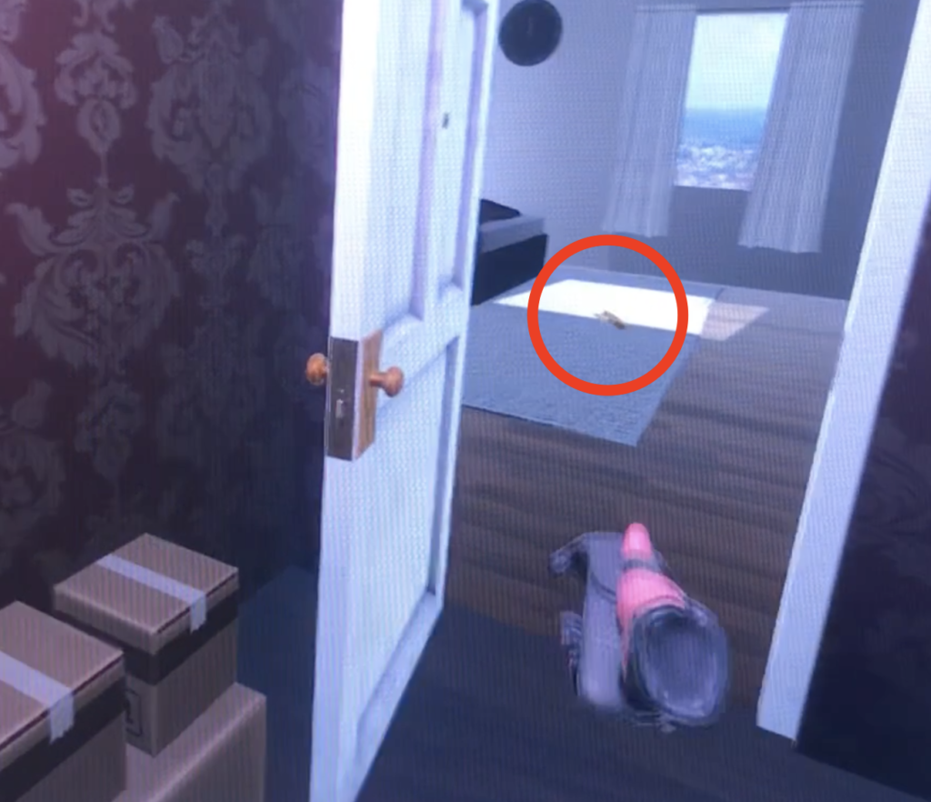
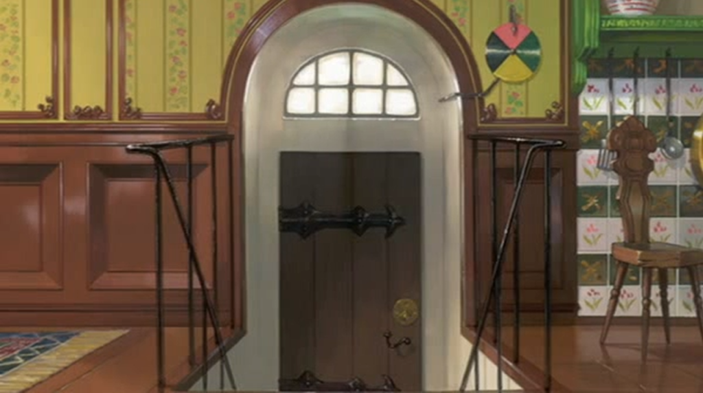
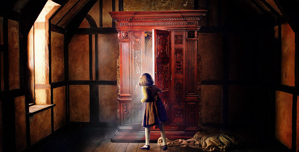
The prompt that I decided to extend on was “close the door”, and the reason for choosing it was the idea of having doors as portals. When creating my projects “storyness”, I always kept the passing through the door as the middle, as a way to go from the beginning to the end.
THE STORY
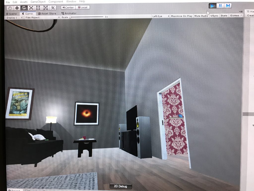
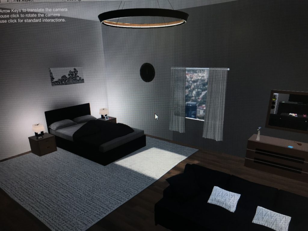
- You wake up in a room with no knowledge of who or what you are.
- Clues around the room written on post-its, posters, books assist (or remind) you of what you should do.
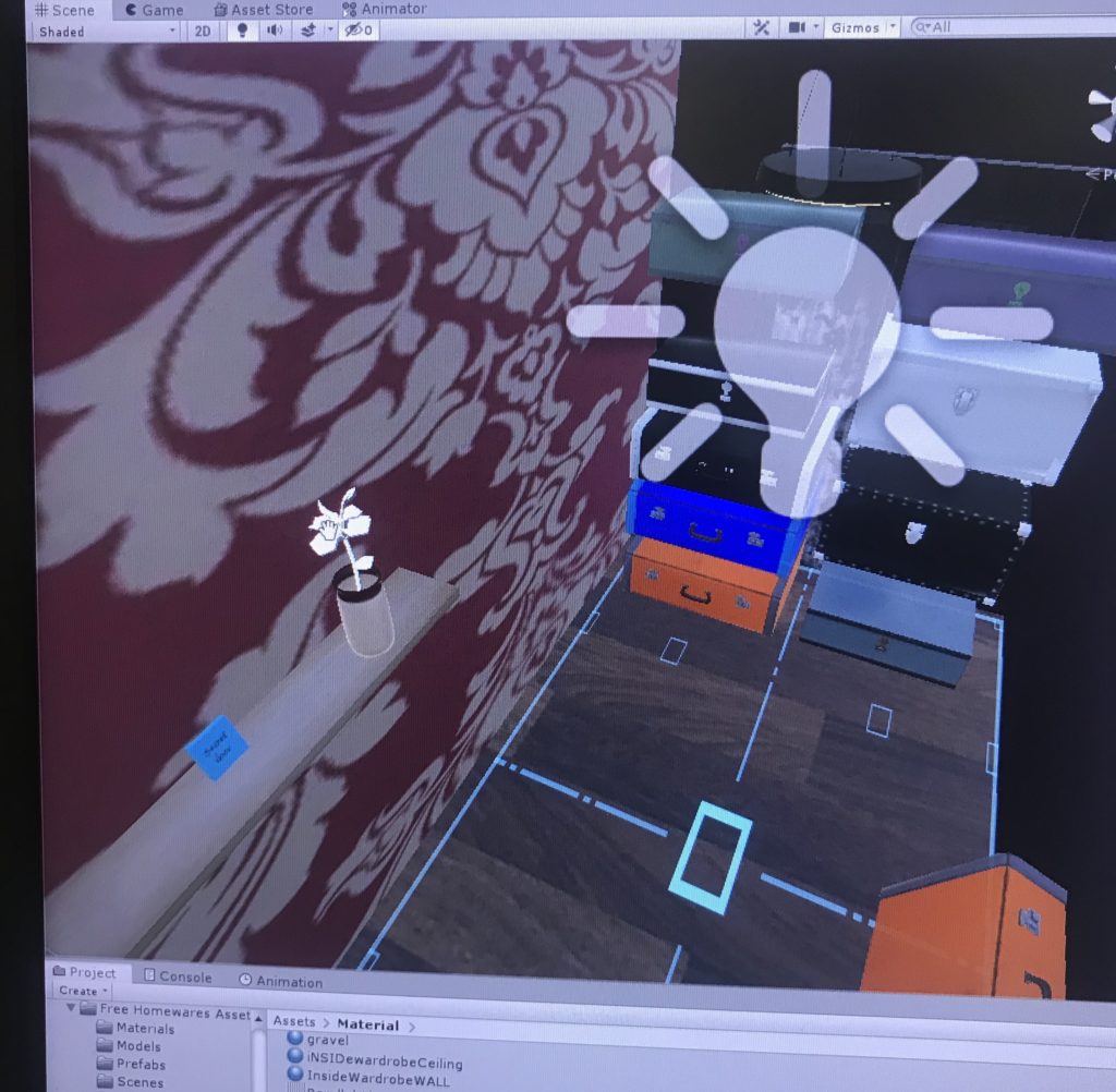
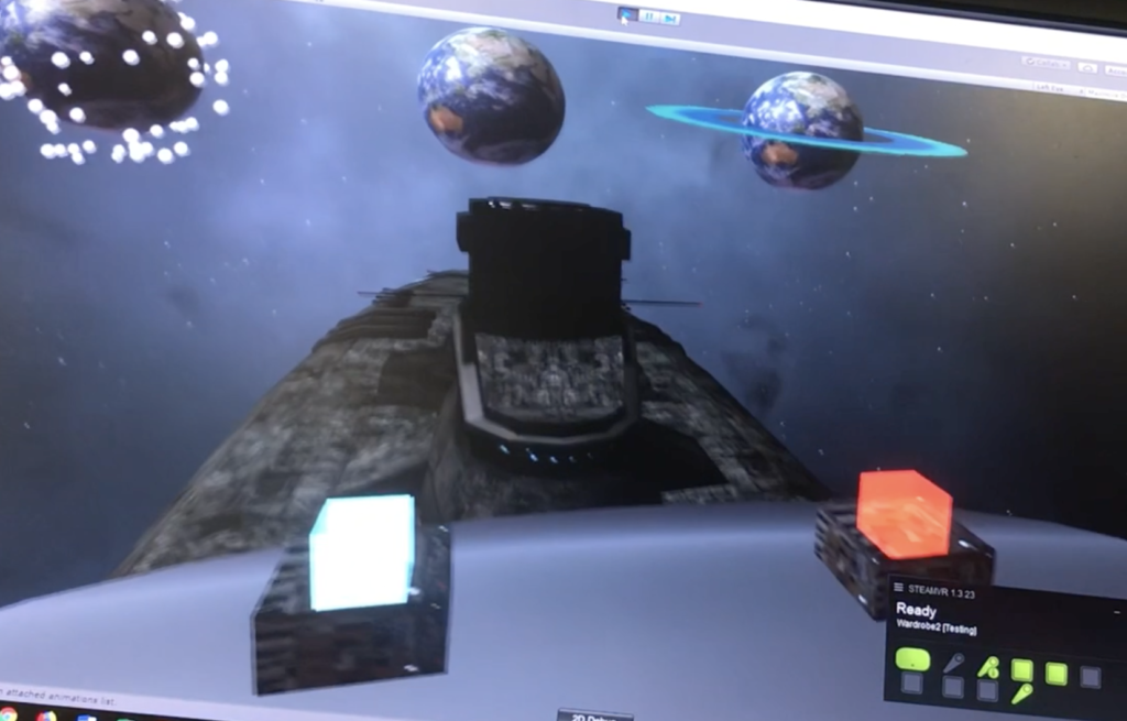
- Going through the wardrobe using the key, you get teleported to your spaceship, now taking your natural form (an extraterrestrial).
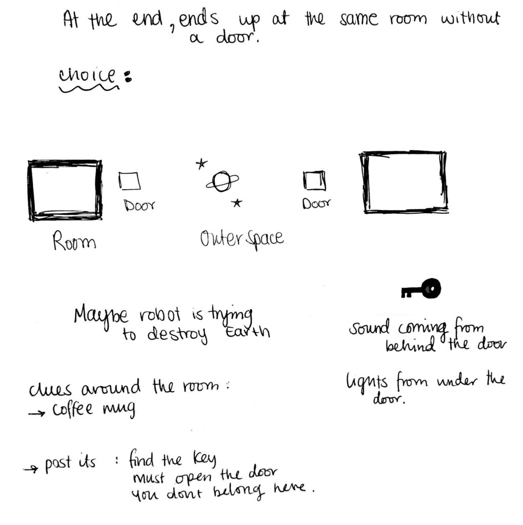
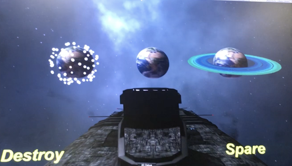
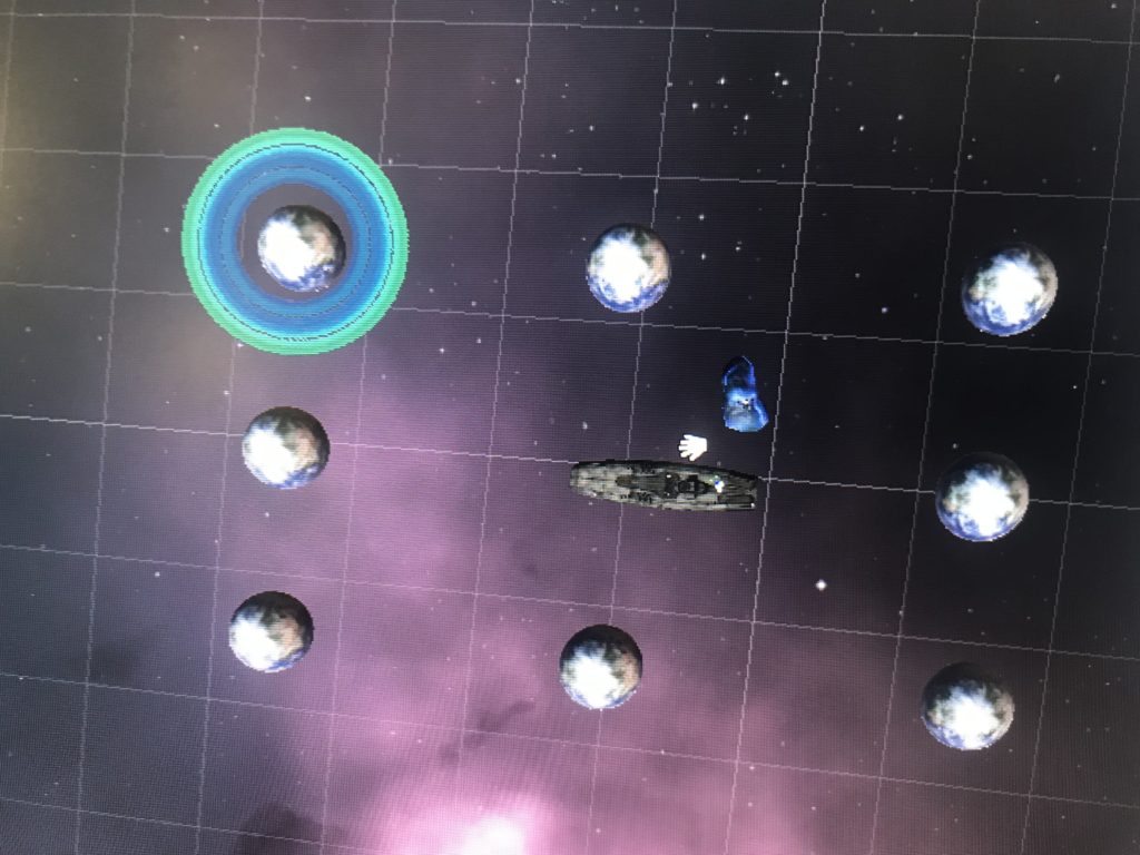
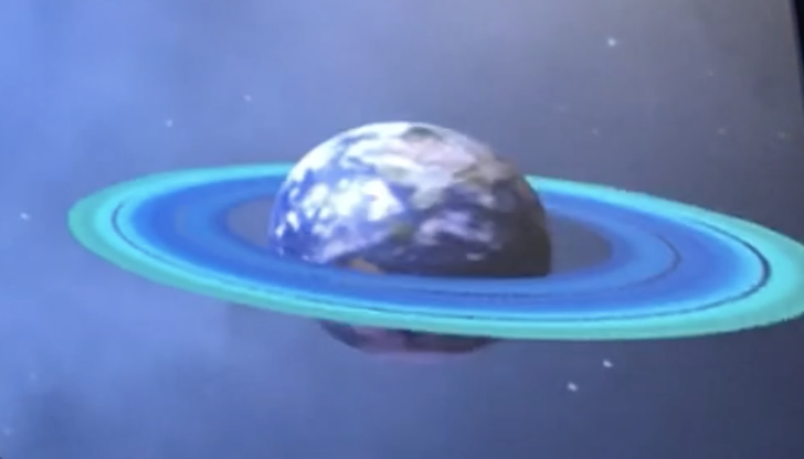
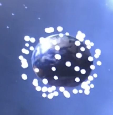
- You are presented with a choice of what you should do to the Earth you have left behind, Destroy or Spare.
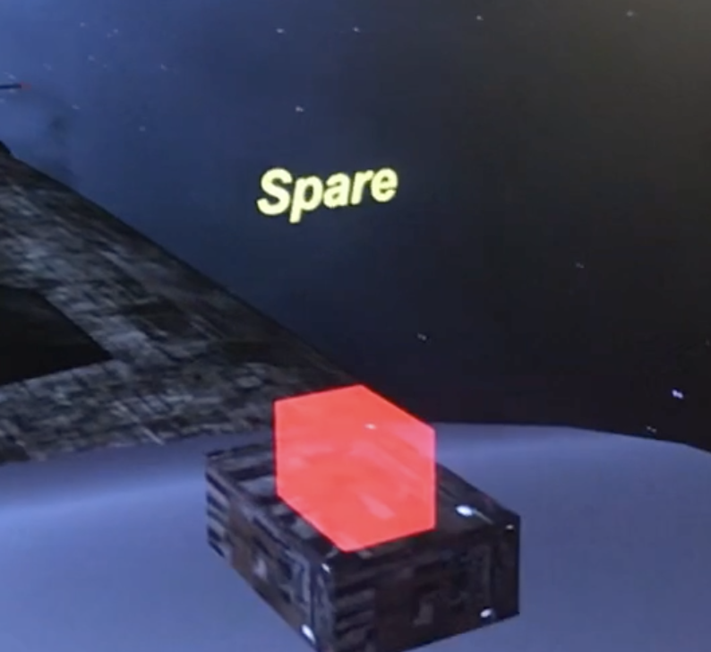
- After choosing, a button appears and you move on to your next mission elsewhere.
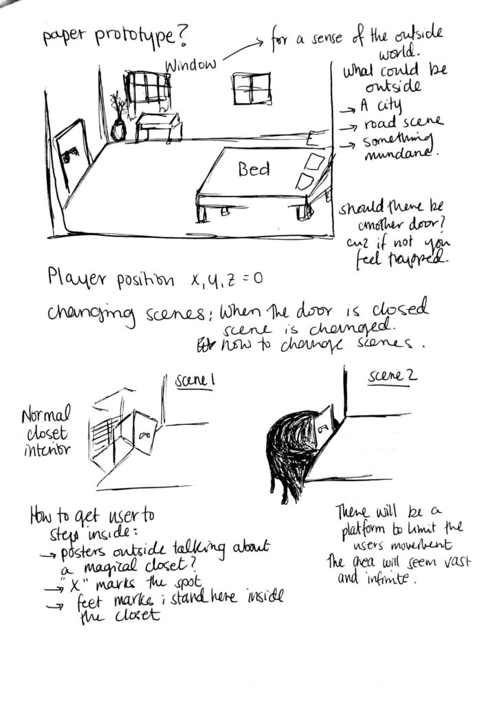
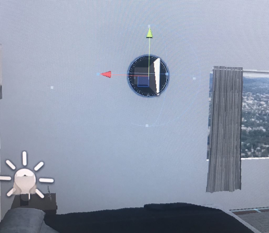
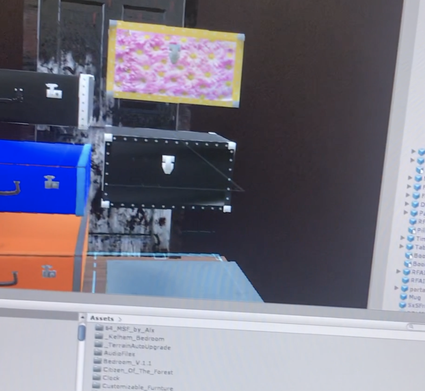
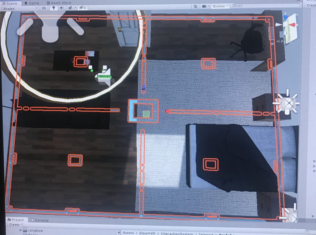
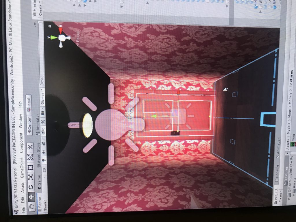
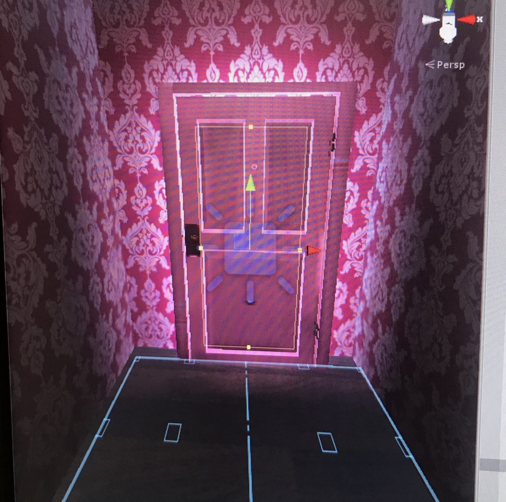
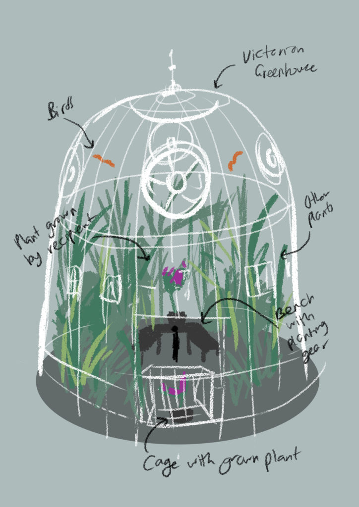
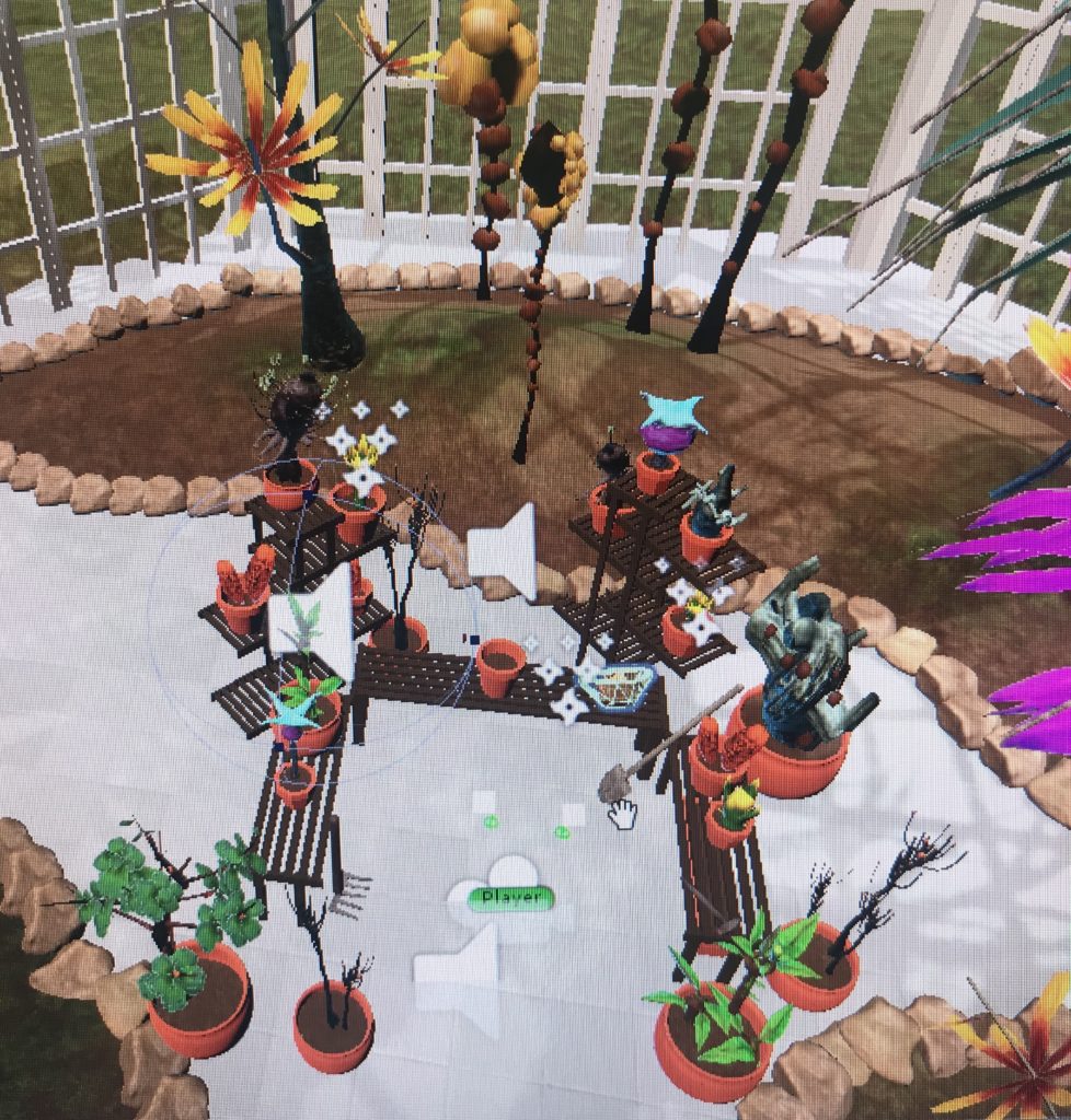
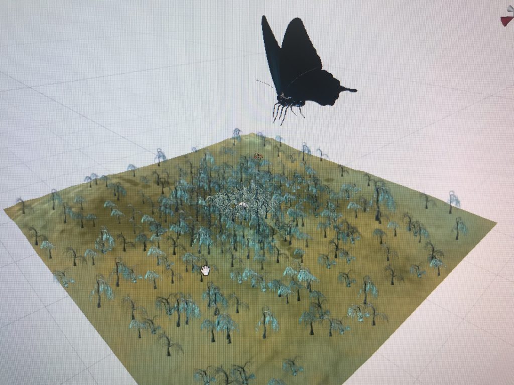
Process and Implementation:discuss how you built the space and design choices you or your group made. What did the brainstorming process involve? How did you go about defining the logic of this world? What were the steps to implementing the user’s role? Share images or sketches of visual inspiration or reference, including the storyboard/layout.
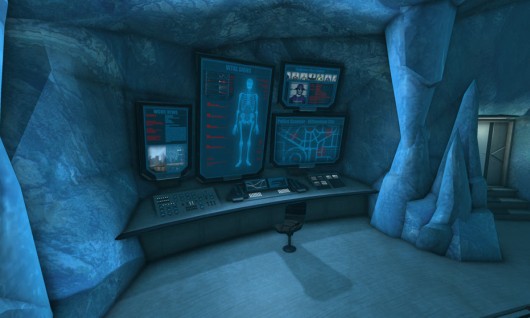
I had a hard time choosing where the ending will be, I knew I wanted to start in an ordinary mundane room. And I wanted it to end in a location that would juxtapose that, but at the same time have the player be able to interact there as well. Because when I was play testing in the beginning, when the user would reach the second part their reactions would be “oh thats it?”, as if the clues in the room, the key, the leading up to the hidden door, all that climax was to something that did not satisfy. So deciding to make the location in Outer Space, with a busy, colorful, noisy environment achieved what I hoped to. And including even simple choices made the user feel like they had a mission, they accomplished something.

My projects inspiration mainly came from two ideas;
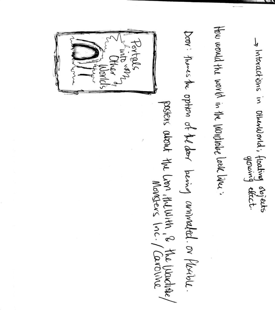
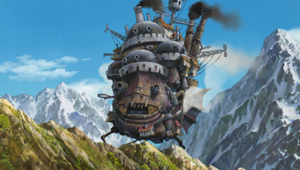
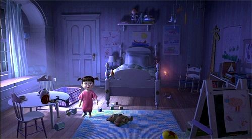
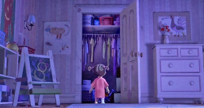
- Doors as portals; Narnia, Monsters Inc., Howls Moving Castle
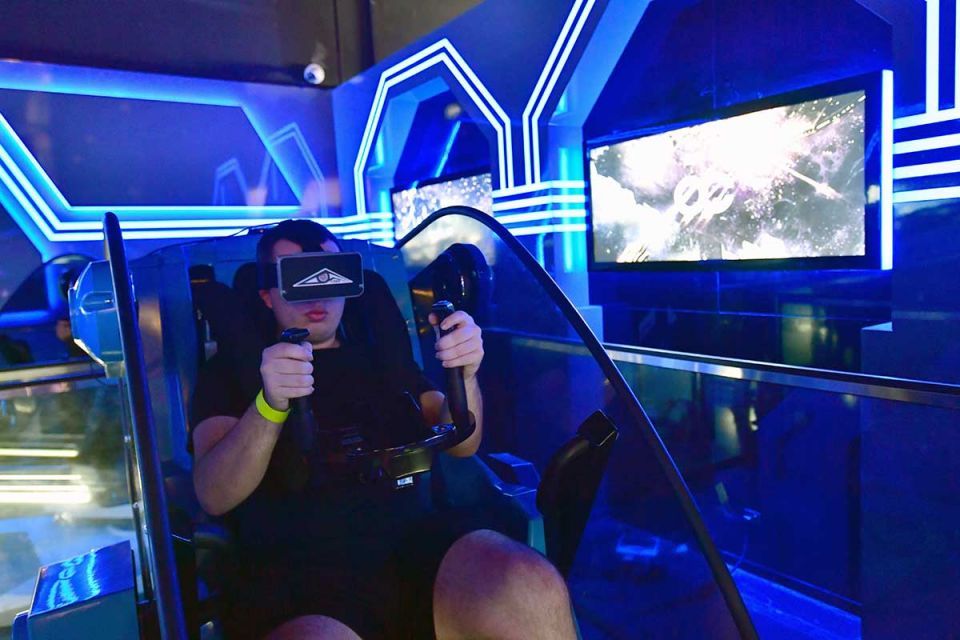
- By this video I saw about how escape rooms are incorporated into a VR environment
Reflection/Evaluation:This should discuss your expectations and goals in the context of the what you felt was achieved with the finished piece.
This project was a great learning experience for me. In my two other projects, I didn’t really expose myself much to scripts and code writing. That made the beginning quite hard for me, but I was determined to use my resources to make what I had in my mind into the project space I have now.
I would often get carried away in the process, wanting to add more and more. Restricting myself from doing too much but at the same time letting myself be able to include what I saw as needed or fitting was important.
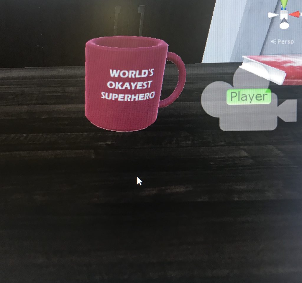
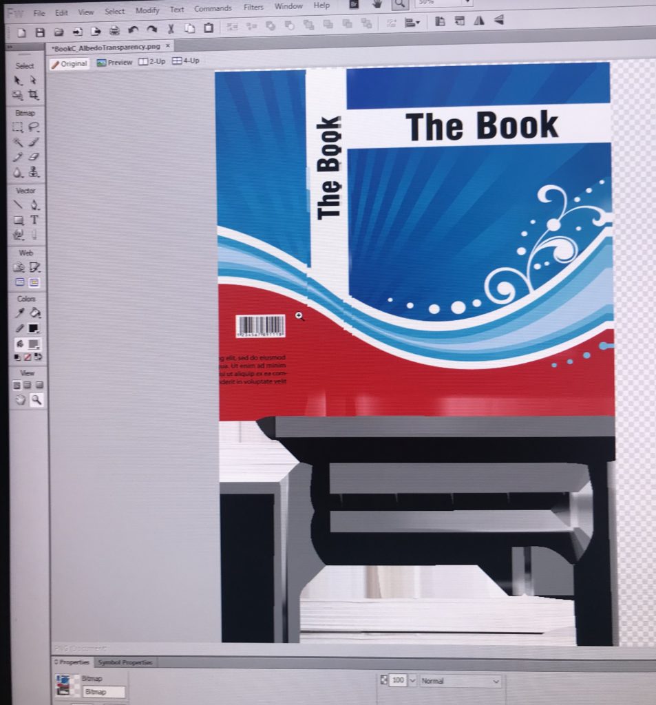
I’ve always had a special fondness for games that required the user to pay attention to the details to receive the “full experience”. I wanted to implement that ideology into my game; thus having every item in the room tailored specifically to bring more “story” to the story. I really enjoyed that part, creating details and seeing how different users catch up on different things.
Walkthrough
https://drive.google.com/file/d/1ON0vu3VS2NtIqVaRGOR7UMPtmfEMcjNo/view?usp=sharing
The IM Show footage
https://drive.google.com/drive/folders/1vkDYMsGLx4VgVP2DLWwTON-UWsPOWIyH?usp=sharing
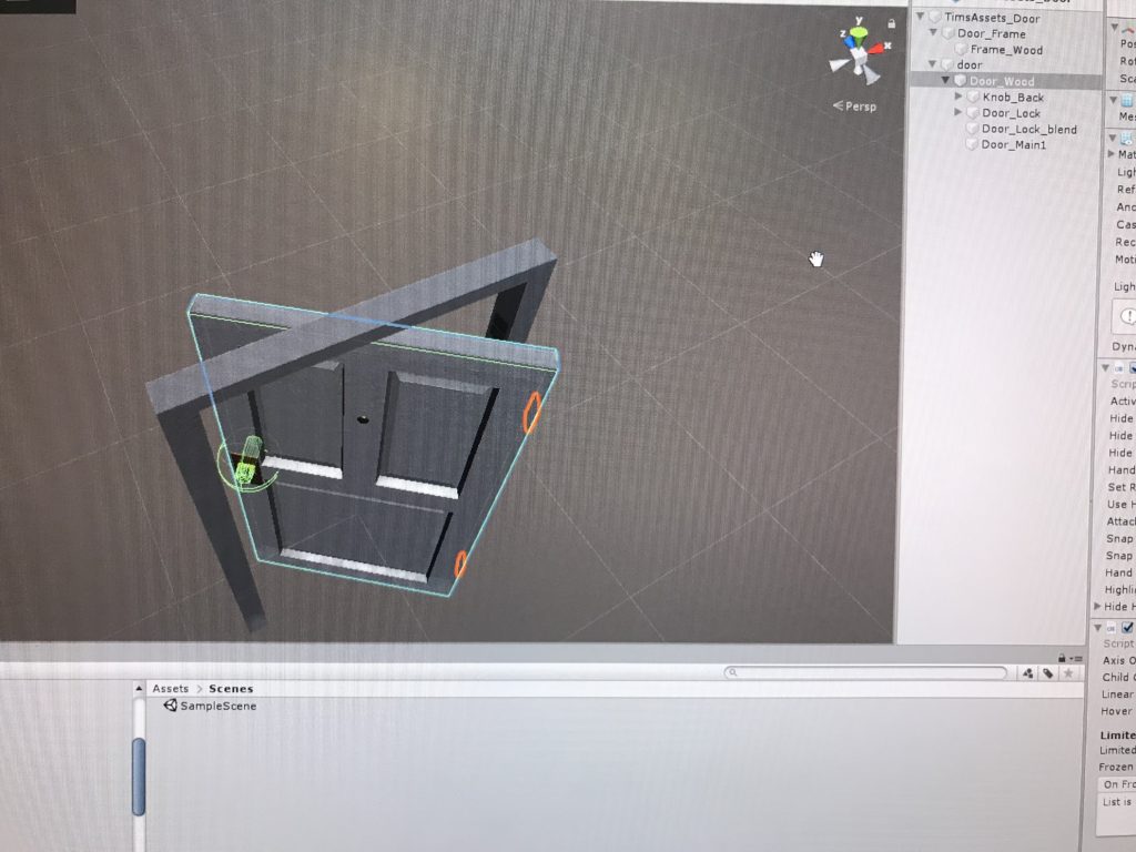
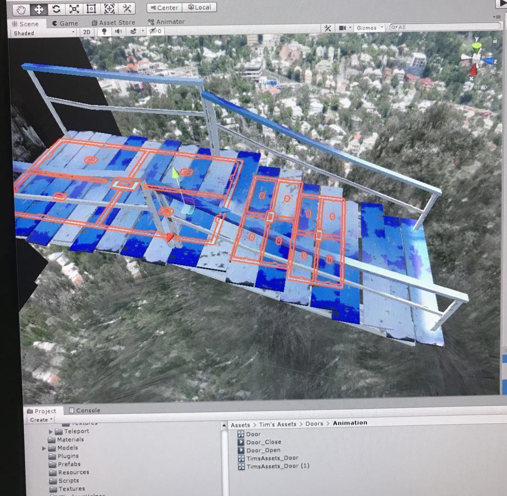
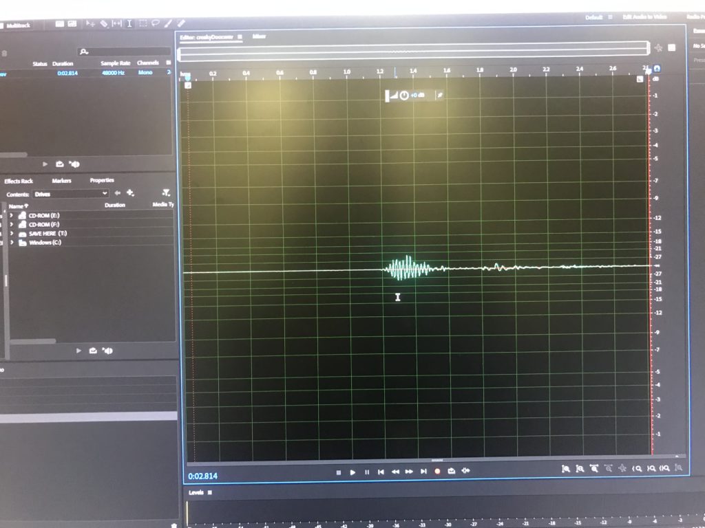
I was debating before whether to put the hint on the UI canvas “Use the post its as clues” or not. I figured that since they stand out and are scattered around the room, they would act as the singular item that is constant. But I noticed I tended to tell users that post its are clues to use. Another thing was the issue with door #1, which required the pushing of a button. The issue was that when you’d press the button, the animation and sound would take a second, and that would prompt the user to press the button again. That makes the door open and then close. I noticed other users that would try the key at the first door, ignoring the button. So maybe if I put a label on top of the button to make it more obvious and to have the animation/sound start immediately it would fix that issue.
