Project 3 Development Blog

Project Ideation and Direction

Our group has two different ideas. We are thinking of escape room, or having a experience that lets the user get absorbed into a different scene. We want to have a murder mystery room where the user can explore what happened in the room. The second idea is the user being absorbed into the computer screen and exploring what is inside the computer.

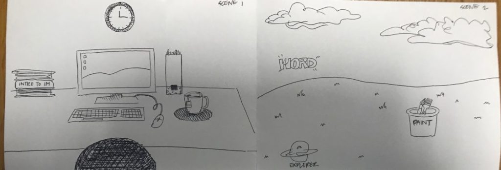
After discussing different ideas in class, our group has settled on the idea of the user getting absorbed into computer and landing in windows xp background. Based on this brief idea, I have created the storyboard.

We will try to have a room scene as a starting scene, and have a second scene – the windows xp desktop background (bliss).

Project Development

We are planning to divide the task into two different parts: scene building and interaction. I will be working on scene designing and building, Junior will be working on the interactions, and Adham will be working on both scene building and interaction. Our plan is to first make sure the absorbing interaction works before starting with the scene building.

For the scene the goal is to make the room look as realistic as possible. I am thinking of a typical student’s room with books, and a computer. For the Windows XP scene, I am still wondering whether it should be realistic or look more like it is still inside the computer. I will be finding different room assets and try to build the room. For the Windows XP scene I am wondering if I should build it from terrain tool.

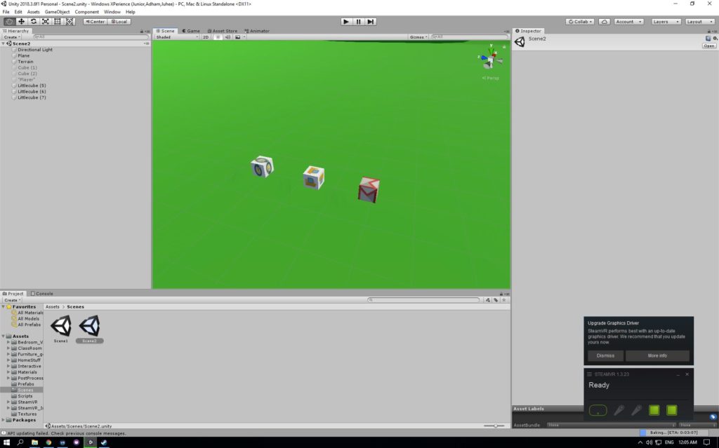
We got the computer interaction working. Now we have a desk (a cube that looks like one) and a computer with Windows XP Bliss background on it. When the user lifts the computer it changes into scene two. It mostly looks like this.
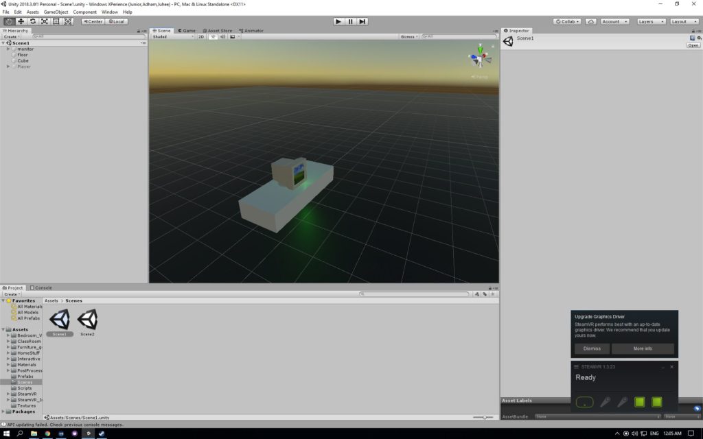
This is going to be our rough prototype and we will move on from here after the feed back

Review Rough Prototype

We got the feedback from class. We need to narrow down the story. Although the initial idea was easy to come up with I was having some issues when it comes to narrowing down the story. There are so many different icons on a computer and I am not sure which icons should be part of the game and which shouldn’t. We were discussing as a group and we decided that we would need a goal in the game to have a set storyline. So we have decided on the goal as submitting an assignment. We wanted it to be relatable to players, who are mostly going to be students.

We also got some ideas from our classmates:

  • Keep interactions and everything in one scene
  • Virus takes over the computer. You need to defeat the virus
  • Maybe after you defeat the virus you become king

I have started with the room scene. I have built the walls and started with changing the desk. After that I added different furnitures that would be in a room. We found an room assets and a classroom assets that had all the things we needed. It was pretty simple to build, but I made sure everything looks realistic. I refrained from using any low-poly assets. The room is all done.
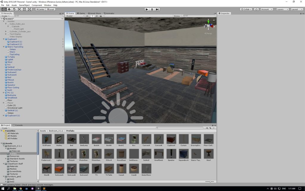
I tried playing it and the stair case seemed very off. I decided to remove the staircase and instead put another furniture in that space. The interaction of the computer works. Junior and I met and deciding on the story line. We have decided we would need a folder, where the homework would be placed. I thought it would be also fun to have different documents and have the player figure out the right one. We also decided on having chrome and email, where the player could submit the assignment.

Share Progress Update

We have created different icons in the second scene. We also tried using the terrain tool. We are having some issues with it because it tends to raise the terrain in a very unnatural way. We made different cubes and tried using the logos on icons to go on the boxes. We landlocked the player so the player doesn’t see how far the plane goes on. We need to improve the terrain and need to find a sky box that looks more like the bliss image. We are trying to figure out what kind of interactions would work with these icons.

I figured out how to make the terrain look better. We could change the smoothness of the brush and the size of it to make it look more like the Bliss image. I also found a sky box that looks exactly like the image. I also want to add some grass texture to the ground, because it looks like a green carpet right now.

We had our friends come and play test our game. They mostly enjoyed throwing the boxes. We were glad that they enjoyed the game itself. However, they also suggested we should add more features to make the absorbing part more obvious.

They gave us very interesting feedbacks such as : interacting with something iconic on the internet (error 404 guy, google chrome dino)
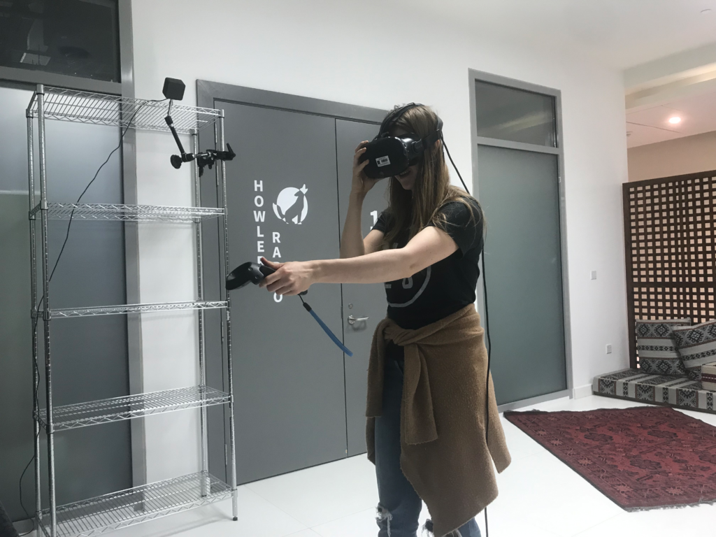
This is the story line we ended up with after talking to them

We could use the dinosaur as an enemy and have the player fight against it to be able to submit the assignment. So I have started building the dinosaur. I tried several different methods. First I looked at the image of the dinosaur and tried cutting out a shape that looks just like it. When I did that the problem was that the image of the chrome dinosaur was two dimensional

Image result for chrome dinosaur

So when I cut out a shape using the outline of the dinosaur, it remains two dimensional. When the dino runs towards the player, it wouldn’t look like a dinosaur. The one option is to build the dinosaur from scratch. I started building it by using cubes but ended up with an ugly prototype version of it.

After talking to the professor we also decided we would use a cactus to fight with the dinosaur instead of an assignment like we initially thought.

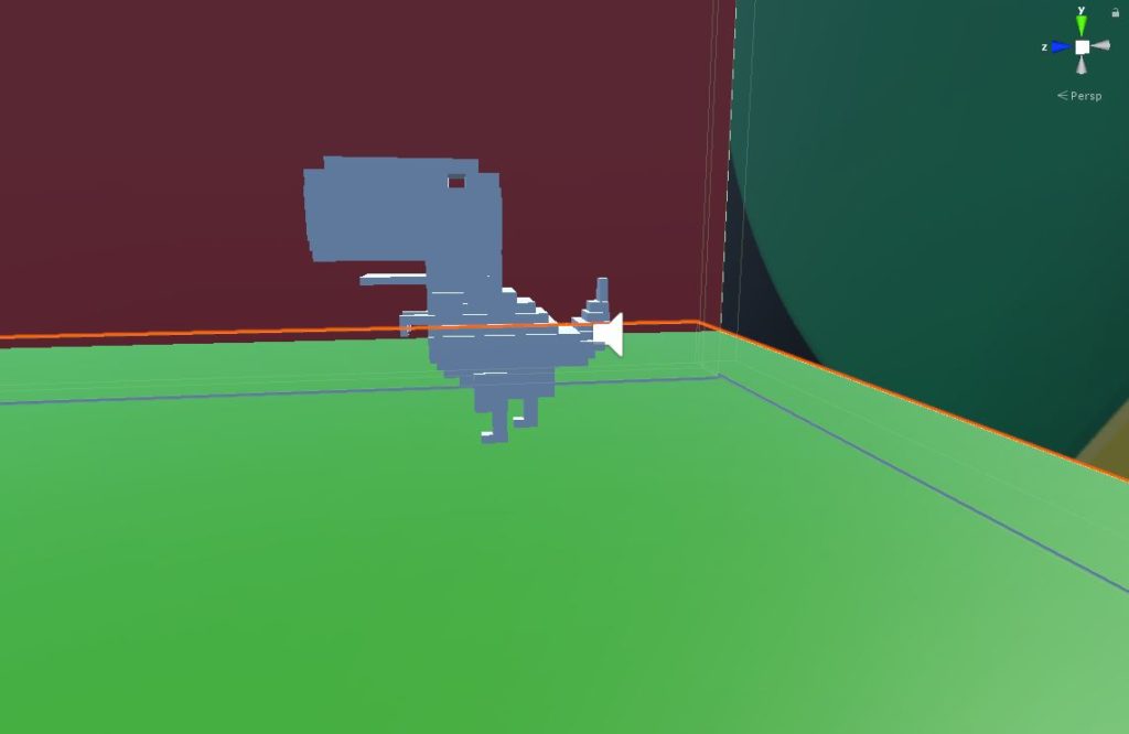
As it became the very last few weeks till the due date. Junior and I started added some final touches to the scene. While Junior was working on different interactions such as dinosaur and its jumps, I started finalizing the dinosaur. I used small cubes to make sure the dinosaur looks three dimensional but still has the same look of the chrome dinosaur. Also I added some grass texture to the ground. We also found the right cactus asset that could be used to fight the dinosaur.

We are trying to figure out what sounds would be adequate for the game. We are planning to add voice over that explains the rules. I am also looking for different sounds for the game itself. For example, sound of paper rustling, serene background music, etc.

The dinosaur is finally done!
Before the due date we also moved the room scene into the second scene. It made the interaction building easier.

Now the room scene, the dino scene is all on the windows xp scene but put far away from where the player is so they wouldn’t be able to locate the other scenes. On the final weekend we focused on working on the interactions. We tried to make sure we have the assignment instantiation, the scene swap, and all three scenes merged into one working. We also need to work on finalize the winning and restart conditions, finish the dinosaur script and fix the monitor’s destruction.

We managed to have most of the features working but we still have some few bugs that needs to be fixed.

  • In chromeworld, assignment goes far away
  • In green valley, papers fall through terrain collider
  • Add teleportation to allow for world exploration
  • Initial scene is too big
  • Scaling problem: The entire world is too small
  • Assignment can sometimes be thrown really far away. Add invisible colliders to prevent this from happening

We have fixed few of them before the IM showcase, but haven’t been able to figure out all of them. Hopefully in the future we get to fixed these bugs and improve the game overall.

Project 3 Documentation

Project Description

Windows Xperience is a project that lets the users to have a immersive experience in an environment that we are all aware of — Windows XP background. The aim of the project was to build an experience that opens up to new scenes, in order to make the game more complex and deep. The experience was set in three different scenes. Diverse scene experience lets the users to explore different scenes. The experience is made for the users to imagine what it would be like to be absorbed into a computer, in this case specifically into windows XP. When the user gets absorbed into the computer the user gets to play around with three different icons that are very distinct. There are Chrome, Paint, and Document Folder icons. Users can interact with two of these icons — Chrome and Document Folder. When following the instructions, the user can pick up and throw the Document Folder, which brings out objects that resemble assignments. Once the user finds the right assignment he/she can put it inside Chrome icon. Once the assignment is dropped inside Chrome icon, the user is placed in another scene. In this scene user has to fight the Chrome dinosaur using a cactus. Once the user has successfully defeated the dinosaur a mail box appears, and the assignment can be dropped in the mail box.

This project idea came from the routine of every university student. Once done with our assignments, we send it in through email, and sometimes we have obstacles such as not having wifi connection. We wanted to gamify this whole process and think about how the experience would be different inside the computer.

Process and Implementation

The process started with ideation. When we met as a group we both had in mind that we wanted to play around with different scene, and wanted the game to be relatable to the players. While we were brainstorming, we thought of an image that is so closely related to computers.

The image above is called bliss. Growing up a lot of us saw this desktop background. Surprisingly this image is a picture of a real existing field. So we thought, “What would it be like to build this beautiful field and blue sky?” Then we planned out the game. We wanted to have a initial scene that leads up to the desktop background scene. Below is our first sketch of our idea.

After creating this sketch we divided our tasks into two parts — environment and asset building, and interaction. My first approach to the project was starting off with building a room. After we got the interaction of being absorbed into a different scene figured out, I started building a room. The room consisted of several different objects. I wanted to make sure it looked like it was a room where someone was working on their desk. After placing objects like a desk, a chair, books and etc. the room resembled a students room. Below is an image of the room scene.

Next I started building the field. The field was the main scene, but was the easiest scene to build. I have used the terrain tool to raise the hills. Also found a sky box that is most similar to the image. The assets were created into a cube box with the logos on them.

The last scene was a box that contains the dinosaur, cactus, and a mailbox. The cactus and the mailbox was part of the asset packages that we have downloaded. The Chrome dinosaur on the other hand was built using cubes. Based on the pixel two dimensional image of chrome dinosaur, I have created a three dimensional one using cubes. Below is the image of the dinosaur

Reflection / Evaluation

After several user testings we were pretty happy with the result. However, there were several things that could be improved. For the storyline, in the future, we could expand the story by using different icons. For example, one of the suggestion was that we could make use of the Paint icon and let the user choose the color of the dinosaur they would fight in chrome. This is one example of how it could be improved, and I believe there would be several different ways to add more scenarios to the story.

For the scene building, the room scene scaling was off. If we had more time, it would make the experience more realistic if the scales were better done. Even during play testing, few of my friends mentioned how the chair seemed too big. Moreover, for the icons in the Windows XP scene, I want to to create 3D assets of these icons, making them look more realistic, and let the users to feel like they are actually inside the computer. Lastly, I would like to add more small plants into the scene to make the field look more natural.

For the sound, we had an issue of having a dinosaur sound in the beginning of the game. Because of lack of time, we didn’t get to figure out what exactly was the issue, but later I would like to add different sounds into different interactions to make the experience even more immersive.

This project was a huge learning experience, from ideation to implementation, and we are hoping that we would be able to improve this game in the future.

Project 2 Documentation

What I have learned from this project

I have learned to build bigger environments more effectively. Before it was hard for me to plan out the environment and build it, but this time it was possible for me to see the environment three-dimensionally. It was definitely easier to build the environment

Limitations and Reflection

The project can be improved with these elements in the future

  • More complex objects
  • Having the trash react angrily if you pass without picking up
  • Having a message indicate the right place to recycle something if you don’t put it in the correct bin
  • Develop environment and interaction system more in tandem with each other

Moreover, we should have had more conversations about interactions and the environment. We faced some hardships when it came to adding interactions because we built the environment separately from interactions.

What I want to work on my next project

I would like to work with the interaction part and while working with it, I would like to work with the environment to make sure it is scaled properly. I want the user to feel like they are actually part of the environment. We want them to feel like they are in the right height, and right scale.

Here is the link to my presentation

Representation in VR

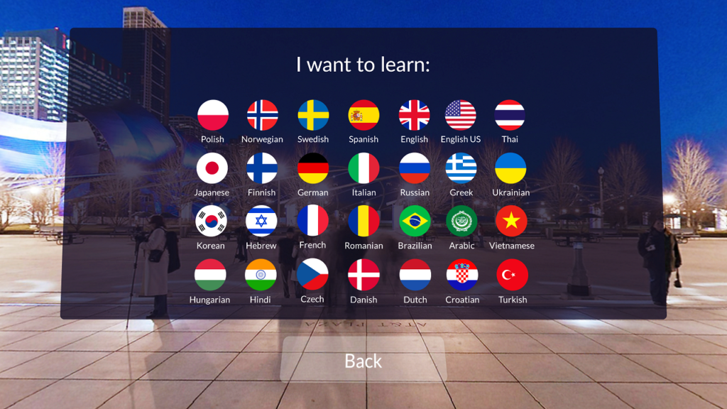
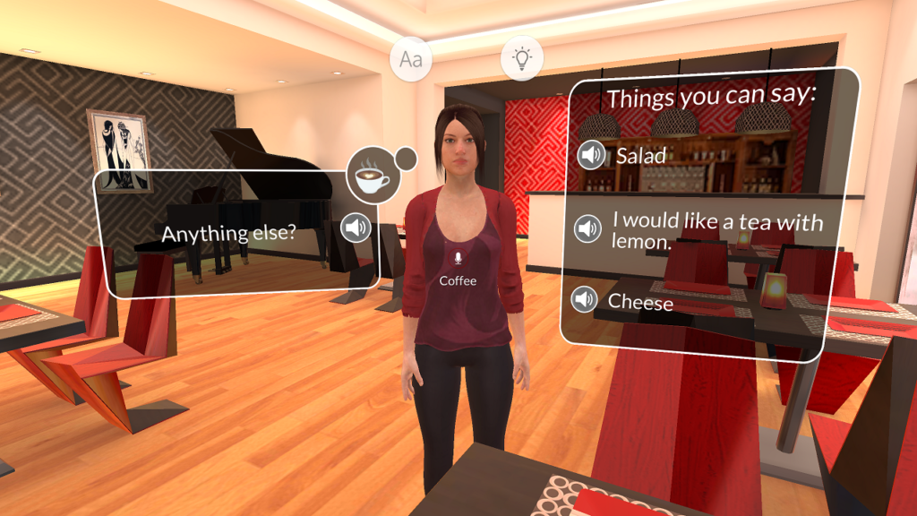
One of the most effective representation in VR is letting interaction that is not possible in real life happen. Learning a language can be difficult. We find it hard to practice it, especially due to the fact we usually don’t have a person around us speaking the language we are trying to learn. However, one of the most effective ways to learn language is to talk to other people.

There is a VR application that lets you learn languages through VR experience. This will let people have the interaction that we lack when we learn new languages through books. Because lots of people find learning a new language difficult, I believe that representation of VR in this area would be very helpful.

Project 1 Documentation

What I have learned from this project

This was my first time building an environment on unity. My biggest issue when it came to building the environment was recognizing the three dimensional space. It was really hard to see where exactly lots of the objects were placed. Because I was so used to the two dimensional designs that I used to do, making a three dimensional space was difficult. I could not make good use of the total space. Instead all the objects were placed on one side of the environment. However, I was able to learn how to think of the space in a three dimensional way. I think this will help me in my future projects. I will be able to plan out the space better and place things better.

Limitations and Reflection

Biggest issue I had with the project was not considering the viewer. When I designed the place I was thinking of the space more as a picture of a place. I thought of it as drawing a painting instead of building a physical space. Because of this, when I was planning everything I did not consider the viewer or the viewer’s experience. The viewer rarely had any interaction with the space due to it. Moreover this was the biggest reason why I had issues with the camera.

I did have technical issues with setting the camera, but I was lost when I was thinking of where to put the camera. There was only one way to put the camera which was putting it in front of the scene, but once I did, there wasn’t any interaction factor to the space.

What I want to work on my next project

What I want to work on my next project is to build a good base for my space and to use all of the space possible. I want to build a solid plane and walls around the space so the viewer could have easier time understanding the place. I also want to try building different buildings on the plane.

Also I would like to add more elements to the environment. I want to make sure the user and turn around and see different objects around him/her instead of not having anything once they turn around.

Here is the link to my presentation about this project

Google Cardboard VR : Invasion

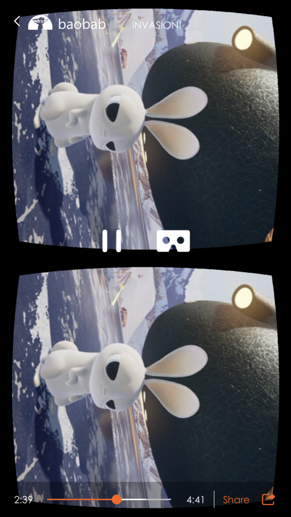
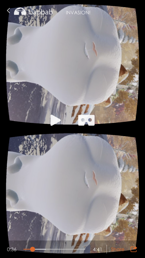
I have decided to try Invasion for my Google Cardboard experience. It was a very immersive experience but there were several factors that I thought was really significant.

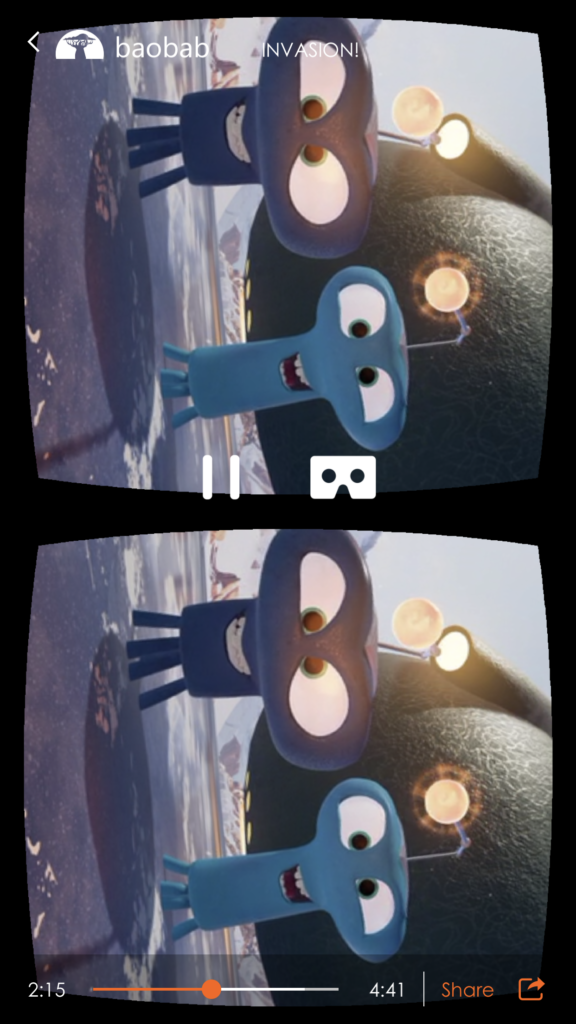
As soon as I started watching the video, I was kind of confused. Nothing was really happening in the screen and I was looking around. However, something that really helped me figure out what was happening was sound. I heard sound and I looked around to see where the sound is coming from. Without the sound it would have been hard to figure out what exactly was happening. When the alien spaceship was showing up in the sky, the surrounding sound made the viewer look around. There was a sound that made me look around and look up to see what exactly was happening. It made me realize, that sound is as important as the environment itself when it comes to viewer experience.

Moreover, What I have realized is that when I am building environment, I do not get to use the whole space. I usually would use half of the space and not use the space behind the viewer. What I found interesting is that this VR experience lets the viewer explore and move around a lot. It was the usage of space that made the viewer, for example, myself to look around and fully experience it.

Also there were some parts where the characters approach the user. Personally I thought that was very adorable. Because of the interaction with the characters it made me feel like I was actually there with them instead of feeling like I am watching them from far away. The eye contact these characters make and the noises they make was very significant.

Interaction

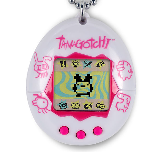
My favorite interaction that I remember fondly of is Tamagotchi. Below is a picture of it.

I remember as a kid playing with it a lot. The reason why it felt so special was because it felt like I had a real pet. The interaction that you had with the device is somewhat similar to interacting with a puppy. Moreover, as you take care of the little tamagotchi character, it evolved or even grew up.

Most of the toys that I was introduced to as a kid did not have such factor to it. It was fun to play with it for a while, but there were limited things you could do with them. However, this little device had several different options. You could help it exercise, eat, clean, and even find a friend with someone else’s tamagotchi. This was definitely my favorite interactive experience.

Development Blog_Project 2

As we first planned the project, we came up with the idea of building an experience where the user can learn more about sorting trash. We wanted it to be not only fun but also a very educational experience.

My role in this project was to create the virtual reality space. We first tried using pre-existing skybox of a city. We tried placing three different garbage bins and garbage such as plastic water bottles, cans, glass bottles, tissues, and etc. We found some prefabs that included diff garbages. We placed them around the city. The skybox on its own looked amazing, but as soon as the garbages were placed, something didn’t look right. So we decided to get rid of the city-scape and build our campus from scratch.

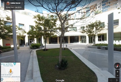
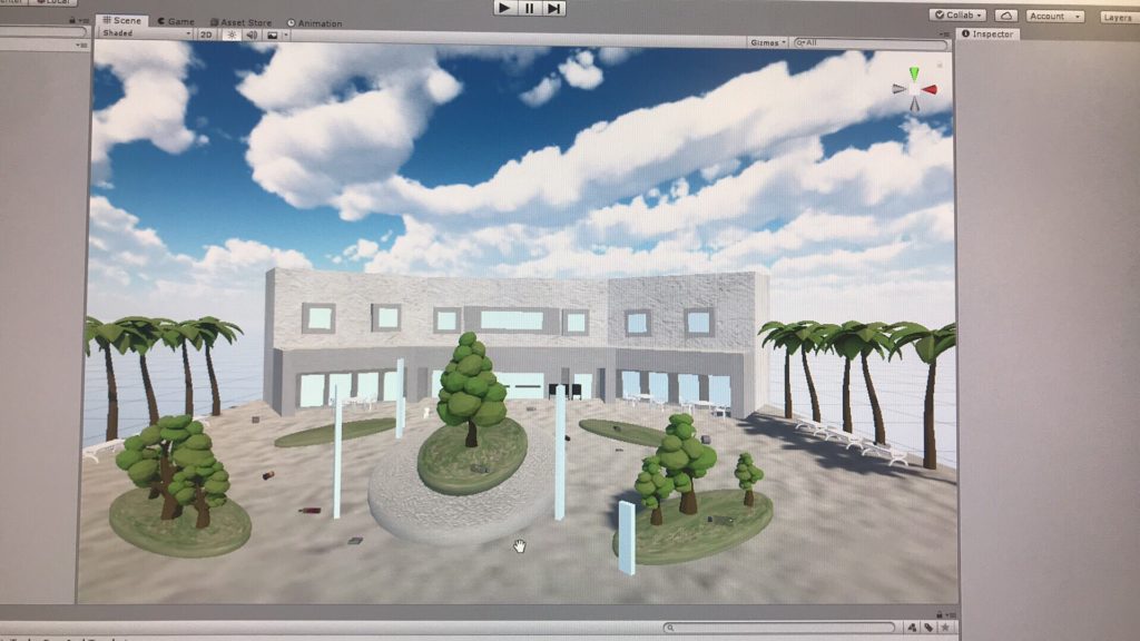
We decided to focus on D2 area. We wanted to build the buildings, create the grass patches. We added trees. We also added the seating areas in front of the dining hall where people usually eat. This is the first draft of our environment and the reference image of our campus.

At this stage, we had one main building in the center (dining hall) and mostly grass patches. Some trash were added as seen. However, there was another issue. We wanted to make sure all three sides were enclosed so that the user would not have to face the issue of not knowing where the environment ends.

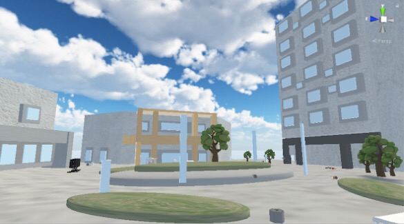
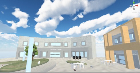
Later we added two more buildings on the each side of dining hall.


The environment part of the project was completed. Now we only have to focus on the interactive part of the project.

Development Blog

When I first started brainstorming I had one goal set in mind. Creating a space that is peaceful, and has the ability to make others feel peaceful. There were several elements, but one of the main element was color.

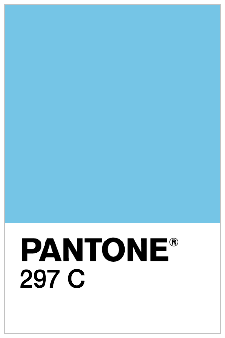
The following colors were the colors I wanted to use in my space:

When I was using glitch before there was a project that I have created and wanted to have a related new project

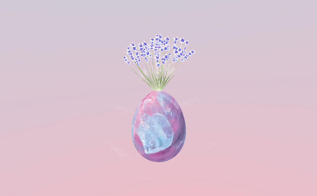
This is the image of the former project

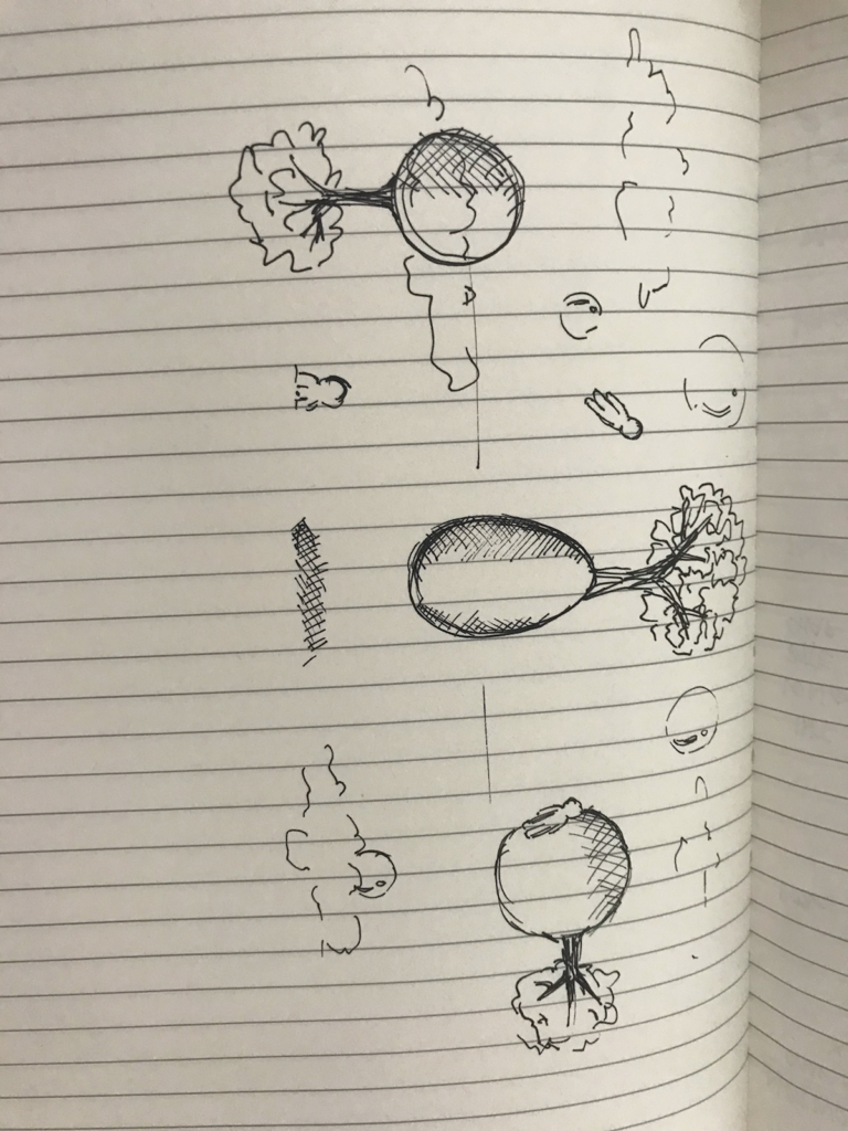
While the former work consisted of one object, I wanted my first project to consist of different spheres. I wanted each spheres to represent source of life. My first planning of the project was to keep the basic form of the egg with the plant growing from it. However I also wanted to show the never-ending sky. These were some elements that I was planning on adding:

  • One egg shaped object with a tree growing out of it
  • To spheres with tree
  • Human figures floating around the spheres
  • Cloud
  • Bubbles

I also wanted the space to almost be dreamy. I didn’t want the space to look too real. I wanted the viewer to be confused and think about what exactly is happening in the scene. To do that I have decided to get rid of gravity. Because we are so used to gravity, I believed, getting rid of it would make the space more dreamy. Also I wanted to implement of idea of being able to exist in different dimension.

This was my initial sketch of the project:

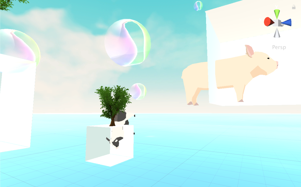
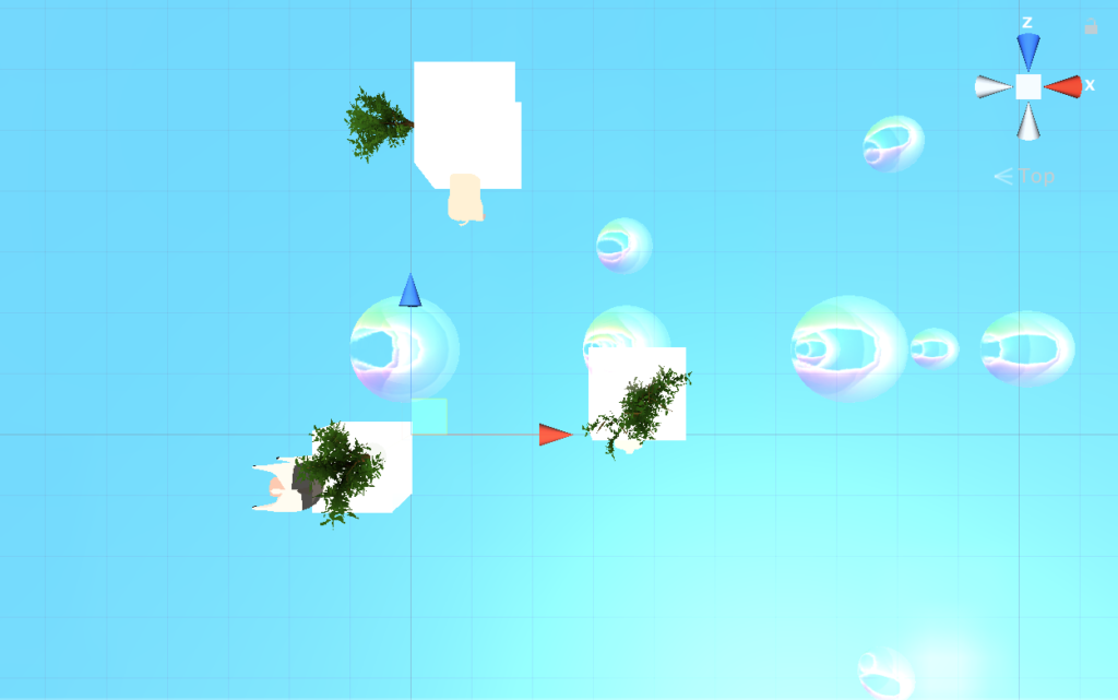
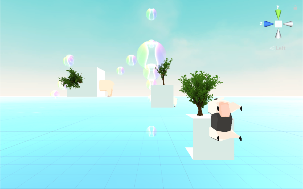
However, as I started building the models there was some modifications made. I wanted to change the spheres to cubes instead. When I used the spheres it almost looked 2-Dimensional. Also I wanted the use to see the 3-dimensional objects. So instead I created a cube with two open sides. The open sides would show what is inside the cube. I wanted those cubes to almost look like small houses, or small show rooms. It was going to be a showroom of life.

I also tried putting human figures into my space, and found it hard to find a human asset that suited with the atmosphere and the color scheme. Instead, I found animal asset and used three different animals. I used three different animal models: Pig, Sheep, Cow. These animals are the most common animals that we can see. They are not exactly pets, but us humankind would not have been able to do a lot of things without them. I have placed these animals in different cubes. But I wanted these animals to not be placed comfortably, so I have chose to have them stuck in between walls.

To make the bubbles, I found a bubble asset that came with animation and the texture. However, I ended up creating the bubbles myself and only using the texture. The biggest reason why I decided not to use the animation in the asset was because the bubbles would pop. In a space without gravity, the bubbles were not supposed to pop.

I also added trees to the cubes. They grow different directions. Which, I believe, emphasizes the disarray of the space. The space looked like world had an explosion and all these elements just started flying around.

These are the images of the space I created:

190204 Blog Post 1

My favorite environment is the town in Animal Crossing. Animal Crossing is a game where you start a town and become a mayor of the town. The player is supposed to farm, pick apples, fish, talk to towns people in order to run the town. Every time I feel stressed out I feel the urge to play this game. It almost has a soothing value to it because of the music, lifestyle, and the characters.

As soon as you start the game, I can notice that the game has started due to the song. Animal Crossing has a very distinct music that plays as the player interacts with the game. Player can even make their own songs. Whatever, soothes the person can be played throughout the game.

It is also the lifestyle the game has. The objective of the game is not fighting against evil monsters nor becoming a hero. However, the game focuses on what a person would do on a daily basis if they lived outside the city.

The main reason why this game is my favorite environment is because it portrays the ideal lifestyle that I would like to live. The reason why this game is so popular, I believe, is that it lets people run away from the busy reality and lets them explore what its to like to live a simple life.

This game also reminds me of a transcendentalist Henry David Thoreau’s book Walden. The book is about the author living independently nowadays considered a ‘a manual for self-reliance’. Although it is seems almost impossible for me to actually life a self-reliant life, it seems possible through playing Animal Crossing.