Project 3 Documentation – Cursed

Project: Cursed

Partner: Nico

Project Description

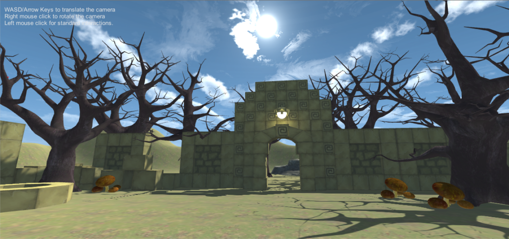
Cursed creates narrative through a game-like approach. The user starts off placed in a strange place: they are surrounded by ruins in a forest, though it is still a bright and sunny day.
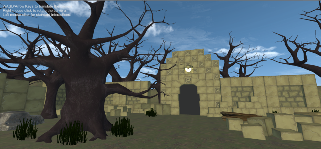
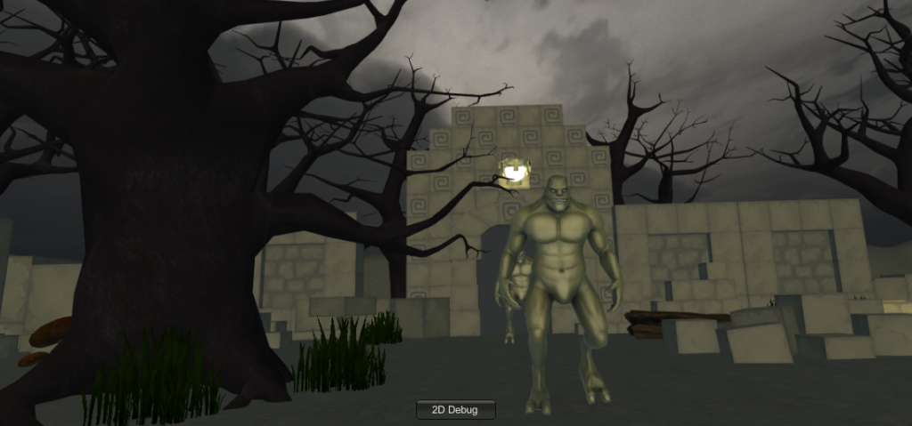
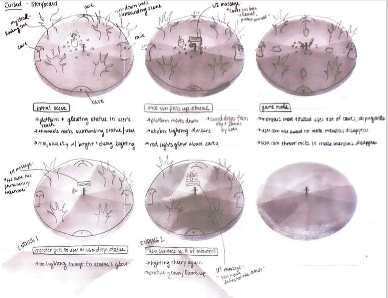
In front of them is a golden dragon statue sitting on a podium, like it is waiting to be picked up. But when the user picks it up, the podium suddenly goes down, everything becomes darker and spookier, and a voice evilly laughs and says “the curse has been released…now you must protect the statue or risk releasing the curse forever.” A sword then drops down from the sky in front of the user, and monsters randomly come out one at a time from one of the four gates surrounding the user.

From here, there are several different possibilities. The “winning” possibility is that the user either uses the sword, stones, or a combination of both to kill forty monsters, all without dropping the statue. When this happens, it becomes bright and sunny again, peaceful bird chirps can be heard, and the voice says “congratulations…the curse has been contained, and peace will be restored.” However, there are two ways the user can “lose.” The first is if a monster touches the statue, and the second is if the user drops the statue on the ground. When this happens, the lighting becomes darker and the voice evilly laughs and says “you have failed to protect the statue…the curse has taken over.” The user can then restart the game by grabbing a floating sphere that appears in front of them, and try again. There is also a cheat to the game – if the user throws the statue into one of the ruins that looks sort of like a well upon restarting the game, they don’t have to worry about holding onto the statue or losing if a monster catches up to them, allowing them to win by destroying forty monsters with ease.

Process and Implementation

This project was largely inspired by an Indiana Jones-type adventure game – we wanted to create a narrative through a game.
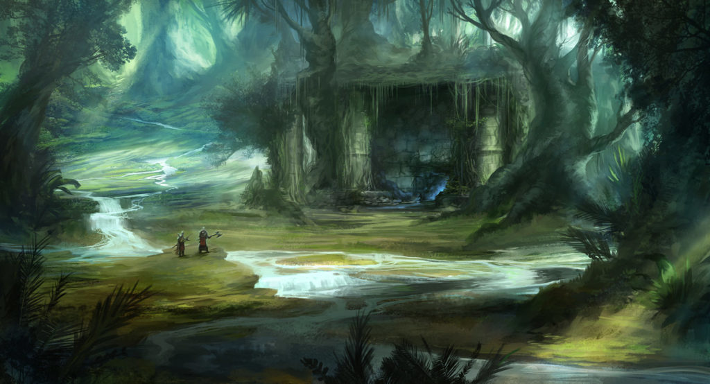
Environment-wise, we were inspired by fantasy-like forests, both mystical and slightly spooky at the same time.
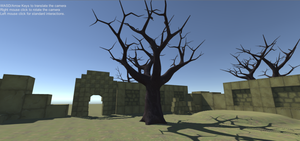
In terms of execution, Nico did most of the coding while I did most of the environment and sound design. For the environment, I created a border of ruins to give an arena-like feeling once the game starts. The other idea behind the ruins is that they would spark a slight curiosity in the user, inspiring additional narrative: why are the ruins there? What is this strange place they are in? On the outside of the walls, there are sections of raised terrain so that everything doesn’t seem so flat, as well as trees. Within the walls, there are more trees, rocks, logs, mushrooms, and grass to fill the space. Nico created a layer to place all of these objects in so that they wouldn’t disrupt the monsters’ path.

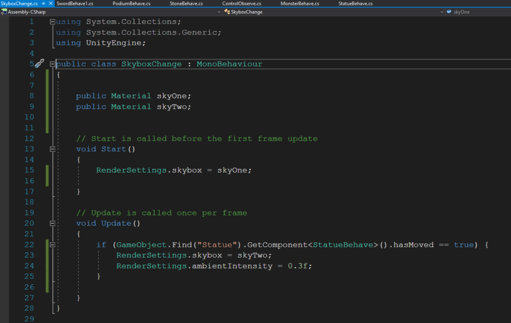
Another part of the environment design was changing the skybox and lighting to help set the mood within the “cursed” narrative. Before the user picks up the statue, it is a bright and sunny day. When the user picks up the statue, it turns dark and gloomy. When the user wins and the curse has been contained, it becomes bright and sunny again. For these changes, I used code to change the skybox material as well as the ambient intensity.

For the sound design, there are three major components: the voice instructions, the background music, and the sound effects. I ended up combining a few sounds together in Audacity in order to get the desired sound for the voice instructions and some of the sound effects. The purpose of the voice instructions are to help with the narrative – I think that if they weren’t there, it would be a little confusing for the user to know what to do or what is going on. This was also something we learned throughout our play-testing and feedback sessions. The background music was also selected to help put the user in a certain mood – there is scary, ominous music playing while the curse has taken over, and peaceful ambient bird chirps playing after the user wins. As for the sound effects, such as the monsters being destroyed or the podium moving down, they are there to create cohesiveness and to enhance the interactive experience, giving the user auditory feedback for their actions.

Reflection and Evaluation

Overall, I’m really happy with how Cursed turned out. I think we successfully created an experience in which the user experiences an adventure-like game within a narrative, taking them through emotions from curiosity to panic to determination, and if they win, triumph and relief. If we were to expand on this project, however, I would like to focus more on the experiences the user has before and after the game component. Perhaps there could be more they can interact with before they happen to pick up the statue, since the user doesn’t really have anything to do besides maybe look around for a couple seconds and then pick up the statue. There are also many unanswered questions – why exactly is the user in this place? Where is this place? Why do the monsters want the statue? Who does the statue belong to? If we were to work on this project more, these would be the questions I would want to focus on answering.
VR Park Experience

Out of the experiences that involved a VR headset at VR Park, I tried out the roller coaster, the dune surfing ride, a couple of the sports games, the maze game, and the four player zombie shooting game. The hierarchy I would assign each of these games in terms of level of immersion (number 1 being the highest level) would be:

  1. Maze game
  2. Four player zombie shooting game
  3. Sports games
  4. Roller coaster
  5. Dune surfing ride

Firstly, it is important to note the difference between immersion and presence, because the order would be very different if we were talking about presence. To me, immersion is about how involved the player feels within the experience, in addition to presence. Presence is about building up a cohesive environment, whereas immersion is about how engaged you are within that environment. The experiences that felt the most immersive were the ones in which the user had some sort of mission within the experience. This explains the first three items on my list: the maze game, the zombie shooting game, and the sports games all gave the player some sort of mission or task, whereas with the roller coaster and dune surfing ride, the player was a passive observer.

As for what makes the maze game the most immersive experience, it is about the construction of the physical space. There were physical walls built that corresponded with walls within the game – being able to actually touch these walls within the game made the experience more immersive.

Next on the list is the four player zombie shooting game – the fact that you could share this experience with other users and the fact that the controller shaped like a gun did a lot for the immersion aspect of the game. However, I would still consider the maze game to be more immersive perhaps because you were able to move around more freely. There is something about the ability to walk around a space, even if it is a constrained maze with a set narrative or path, that makes the experience more “real.” There are corners to duck behind to add to the combat experience, whereas in the zombie shooting game your only mode of defense was shooting a gun.

In terms of the use of light and sound, I think all of these experiences made good use of these tools, especially the zombie shooting game. They generally served to set the mood of the experience, such as zombie sound effects and dark lighting for the scary setting. What was especially compelling was that there were microphones for each of the headsets, allowing the players to talk to one another. However, this had both positive and negative effects on the level of immersion of the experience. It was positive because you got to share the experience with other people, and the sounds of other players shouting into the microphones added to a combat-like experience. However, there was an adverse effect at one point. When the lady in the game was giving instructions, we all pointed the gun and shot to kind of see if anything would happen, which led to some discussion in the headsets, which in turn covered up the audio of what the lady was actually saying. As a result, some of game’s narrative was lost.

Development Blog – Cursed

Team: Cassie & Nico

April 6

Concept brainstorming/storyboard – see Nico’s post

April 14

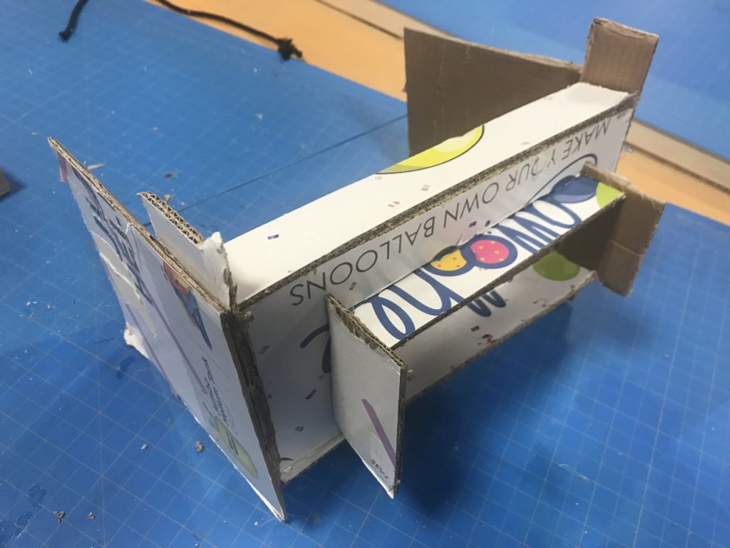
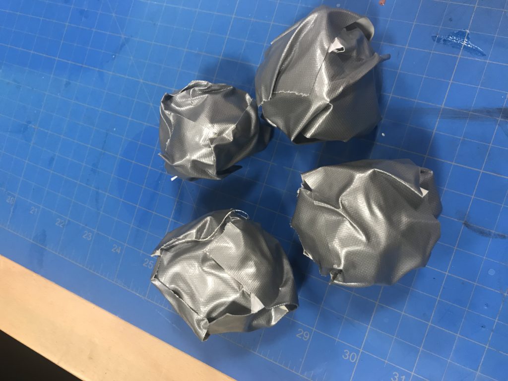
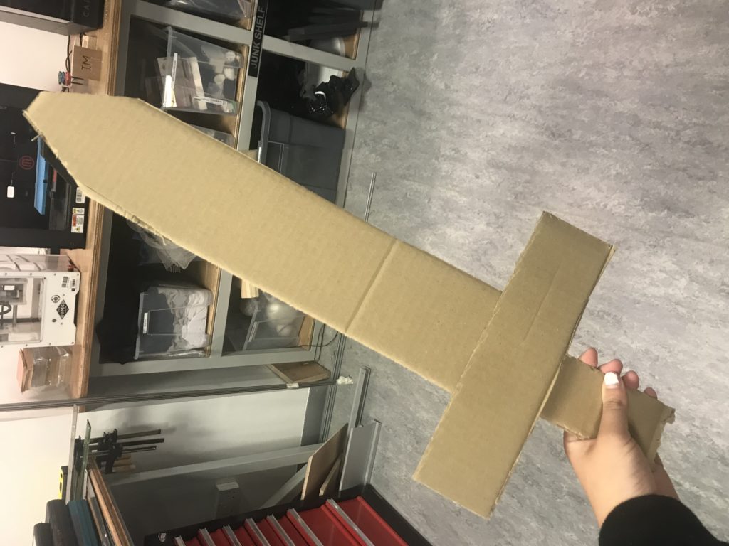
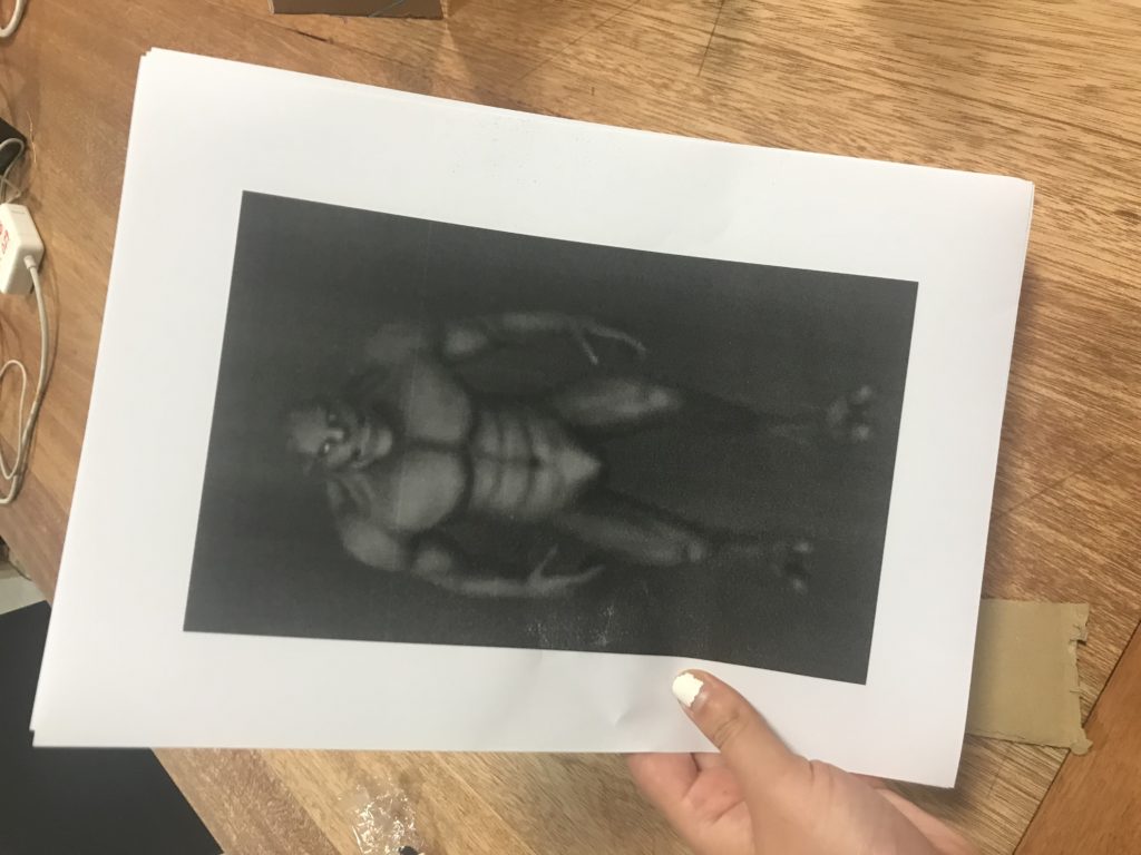
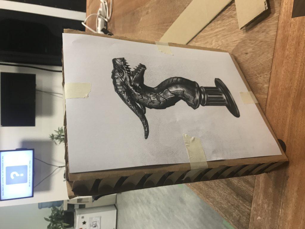
Today we tested out a paper version of our game on our friend Emma. We had several objects made out of paper cardboard: a headset to limit the field of view, a sword, several stones, the statue, and some monsters.

The monsters and statues were pictures of the actual assets we are using.

We set up the room so that the statue was resting on a chair, which will be a platform in the game. The stones were scattered on the floor by the chair.

To start, we had Emma put on the cardboard headset. When she picked up the statue, I wheeled away the chair (the platform will sink down in the game), and Nico announced that the curse has been released, and Emma must now protect herself. Nico then dropped the cardboard sword from above her head. To represent the monsters, Nico and I held up the printouts of the monsters and ran towards Emma one at a time. Here’s how our first test went:

For that first test, we didn’t give Emma any prior instructions, although she had heard about our concept before from casual conversation. However, we did another test where we gave her the instruction to try using the stones. Here’s how that test went:

In this test, she ended up dropping the statue, which means she lost the game.

Here’s what we learned from these tests:

  • In the first test, Emma didn’t notice the stones on the ground or knew that she could use them.
  • In the second test, when Emma wanted to use the stones, she dropped the statue so that she could have stones in one hand and a sword in the other. However, the game doesn’t allow this to happen.
  • The statue stood out enough for Emma to want to pick it up
  • Emma suggested that we should tell people that they have to hold onto the statue, like the voice could say something like “protect the statue” rather than just “protect yourself.” The reason she kept holding onto the statue in the first test was just because she wasn’t really thinking about it.
  • When asked if she thought it would be better if the stones weren’t there at all, she said the stones could be useful and she would rather have the option to use the stones in addition to the sword.

April 15

Feedback from Sarah Rothberg’s visit:

  • Why does the user want the statue? Why does the statue cause a curse?
  • Maybe there can be more things the user can interact with in the environment so that there is more build-up before the user picks up the statue. This would also build more of a narrative, because then it would be like “oh no, I messed with the wrong thing” when the user does pick up the statue.
  • Consider the difficulty of the game in relation to the user. Who is the user and how do we want them to feel?
  • Think about what kind of sounds to implement

April 16

Today I began to build up the environment:

  • Created a terrain. I made it much much smaller this time…lesson learned from Zenboo. Added a grass texture to this as well as a few raised and smoothed sections so that the ground wasn’t super flat.
  • Added in walls and ruins from Cartoon Temple Building Kit. The ruins could possibly add more to the narrative…could cause the user to wonder what this place used to be, potentially adding onto a more “cursed” feeling. Decided to make the ruins like four walls surrounding the player so that when the monsters come out it kind of feels like an arena of sorts…adds on to the feeling that the user is supposed to fight the monsters.
  • Added in trees from the Fantasy Forest pack. Have to have trees. 🙂

Progress pic:

April 17

Class playtesting feedback:

  • Simran went first – she first looked around a bit before picking up the statue and throwing it. She eventually picked up the stones and threw them, though she mentioned that the stones look like you’re not supposed to move them because of their placement
    • Perhaps the rocks can shake or tremble to signify that the user can pick them up
  • Mai went second – she said the monsters were pretty scary, but they look kind of like Shrek.
  • The monsters might be coming out too fast – would be nice if it was slow at first and then became faster and faster
  • Would be cool if lightning struck when the statue was picked up
  • Maybe fire or some sort of goblets could be put up to prevent users from moving away from the center (although you can’t move around that much anyway with the space we are in)
  • Either change the size of the rocks or change the gravity so that they feel heavier…kind of strange that the rocks are huge but easy to pick up. Also makes it seem like the user isn’t supposed to pick them up, because they are so large
  • Maybe limit the amount of rocks there are so that you are forced to use the sword

April 27

Today I worked on:

  • Putting more trees outside of the walls to make the forest more populated
  • Raising the terrain in the background to make everything less flat
  • Putting stones in the background to add variation
  • Putting more decorative objects within the walls: mushrooms, a rock, another stone structure
  • Adding lights to the rest of the doors
  • Finding a skybox for the initial scene (before statue is picked up)
  • Experimenting with a couple floating blocks, but I don’t think it looked that good. Also not sure if we would want these sorts of fantasy elements in the beginning scene, as it would disrupt the sort of “where am I but also this could be somewhere in the real world” initial feeling.

Progress pic:

May 1

Playtesting feedback:

  • Would be cool to have blood when the monsters get hit
  • The headset cable is annoying because it kind of twists around you when you’re playing – would be nice to have it hung up in final presentation
  • A creepy voice would be better than a loud booming voice for the voiceovers

May 5

Today I worked on gathering and creating all of the sound for the game. I first worked on the voiceover instructions:

  • First I recorded the audio, and tried to say the lines kind of creepily:
    • When the user picks up the statue: “The curse has been released…now you must protect the statue or risk releasing the curse forever.” This was taking into account feedback for instructing the user to take care of the statue, hopefully putting into their heads that they aren’t supposed to drop it.
    • When the user loses (either drops statue or monster gets to statue): “You have failed to protect the statue…the curse has taken over….”
    • User wins (kills x amount of monsters): “Congratulations…the curse has been contained, and peace will be restored.”
  • I then found an evil laugh on freesound.org (https://freesound.org/people/Robinhood76/sounds/132252/), which I mixed together with the recorded audio on Audacity.
  • To add a more eerie effect and to also match the sound quality of the laughter, I added a slight echo to the recorded audio.

The next type of sounds I gathered were the background music sounds:

  • First, some sort of calm music was needed for both before the statue is picked up and for after the user wins and peace is restored. For this, I found forest sounds off of Youtube: https://www.youtube.com/watch?v=wKnS8VPxpHI&t=92s
  • Perhaps more importantly is the music that plays when you must kill the monsters. I tested out different music out while listening to the recorded soundtracks on top to see what sounded good, and settled on the intro song in this video about creepy video game music ( https://www.youtube.com/watch?v=-8FN29sHWq8), editing out the rest of the video sounds with Audacity.

And last but not certainly not least, the sound effects:

I then added the scary background music and the first introduction audio when the user picks up the statue to our game. I tried adding in a couple other sounds but was having a little trouble getting the sounds to play, so I will have to spend more time figuring that out!

May 10

Today I worked on the sound effects, the lighting/skybox, the environment, and the blood particle system.

All of the sound effects have now been added into the game, except for a clang sound when the sword first drops to the ground. The way I placed it in the code it was playing but would make a very strange sound at first, like it was starting over and over again. I might also create another sound that instructs the user they can grab the sphere to restart the game if they lose, since one of the feedback we received during playtesting was that it wasn’t clear that the user could restart the game.

The idea for the lighting is that at first, it will be bright and sunny, but when the user picks up the statue it will become dark and creepy. The sky will return to being bright and sunny once the user wins. I thought it would be easiest to switch the skyboxes themselves between the sunny and creepy situations, and accomplished this through this code (at least partly – to change the skybox back to how it was before I put it in a different script, but with the same concept/logic as this):

However, the ambient intensity also had to be lowered because without this, the sky was dark but everything else was still light.

For the environment, I added more things like grass, logs, ruins, trees, and rocks to make everything look less barren and more like a forest. This was a lot easier to do now thanks to Nico who made a layer to place objects in so that they wouldn’t disrupt the monsters’ movements.

Lastly, I worked on making the blood particle system look slightly more realistic and subtle. I made the particles a darker shade of red, made the circles larger so it looked more like a “gush” rather than splatters, changed the shape from cone to box, turned off the loop, made the particle system play for a shorter period of time, and changed the particle’s texture.


Project 2 Documentation – Zenboo

Project Description

Zenboo creates a space for the user to relax, placing the user in the middle of the mountains and free to play with bamboo. The user is able to water the bamboo using a watering can and watch it grow in a unique way, use the watering can to bounce around different parts of the bamboo, and make parts of the bamboo disappear with a sickle. Surrounding the user is a mountain range, a circle of floating rocks, and a tree stump to place the watering can and sickle on. Rather than being a game or a narrative, Zenboo’s purpose is to make the user feel relaxed and playful.


Process and Implementation

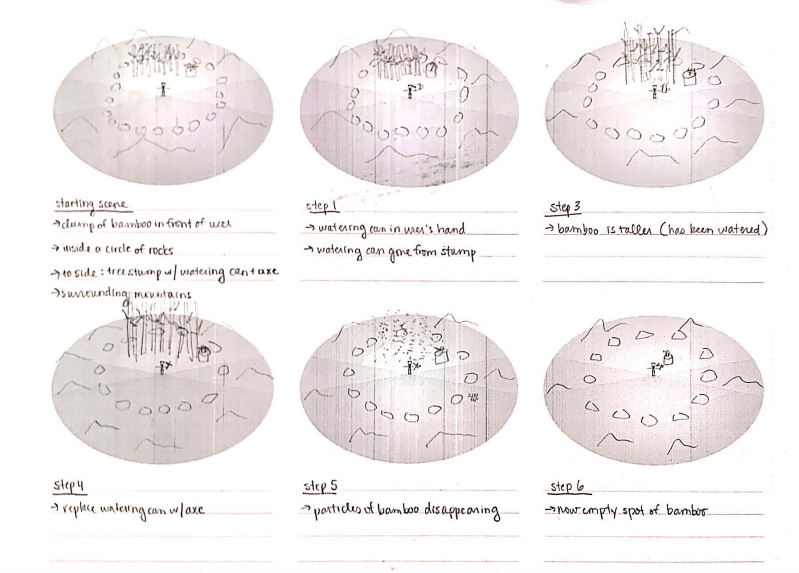
I was mainly responsible for creating the physical environment the user is placed in. This involved a lot of playing around with different aspects as well as going through cycles of feedback from the rest of the team. When we were storyboarding, we had a general idea of what the environment would look like:

The user would stand within a circle of rocks (to indicate a sort of barrier that the user would have to stay within), which was surrounded by a circle of mountains. A group of bamboo would be directly in front of the user, with a tree stump containing the watering can and sickle beside them.

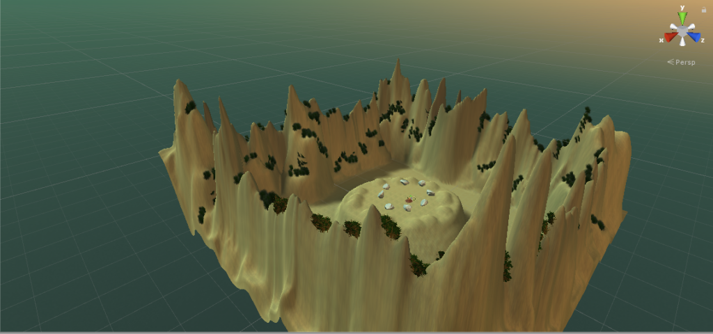
When I set out to create the environment, I initially stuck to this design. I created mountains using the terrain tool, using the Yellow Mountains as inspiration:

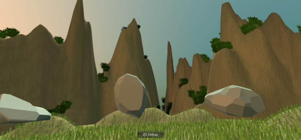
The reason for this inspiration is they are very mystical and calming, which would help contribute to the relaxation aspect of Zenboo. However, when placing the user in the middle of these mountains, it was a bit overbearing so I created a platform mountain for the user to stand in. This way, it feels like the user is more in the mountains rather than standing below and looking up at them, adding a more mystical effect.

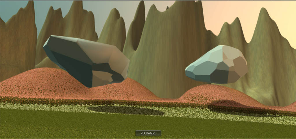
The circle of rocks was another thing implemented into the environment. When receiving feedback, however, it was suggested that the rocks be larger and floating around the user rather than the initial plan to have them resting on the ground. This turned out to have a pretty cool effect, adding another layer of mystique.

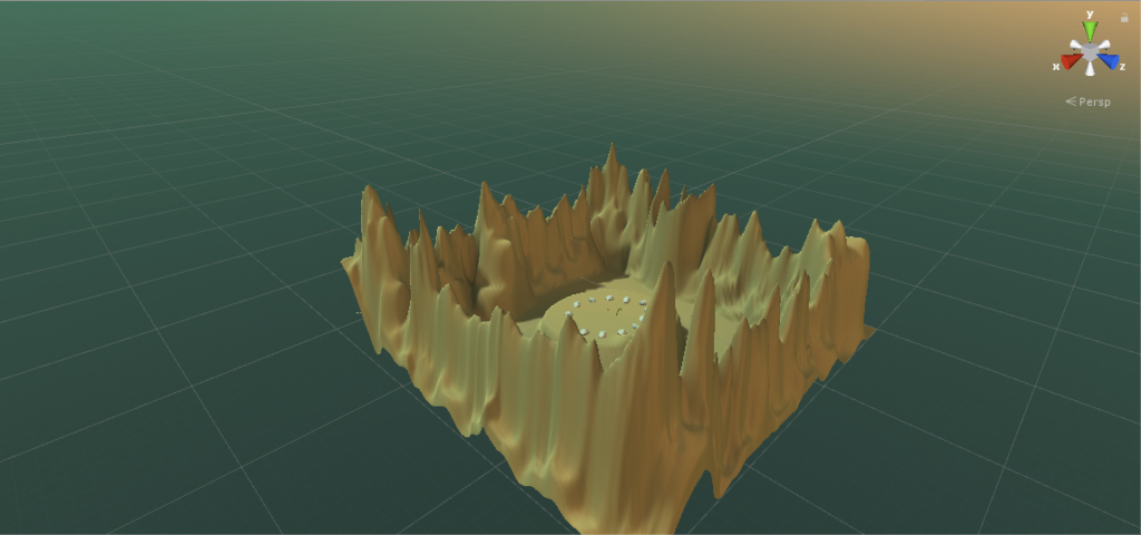
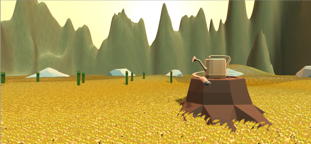
One thing that changed from our initial plan was the location of the bamboo. Since space is a limitation, having the clump of bamboo in front of the user all spaced out would have been problematic, or perhaps not as intuitive that the user had to go over to it and water it. Instead, we decided to place the bamboo in a semi-circle close to and around the user. This way, the user does not have to walk very much in order to water all of the bamboo. The final environment looks like this from afar:

Reflection and Evaluation

I think we successfully created an environment that is peaceful for the user to be in. The surroundings are green and full of nature, the background music is calming, and the main movements the user can do to interact with the environment, pouring and cutting, require gentle motions. I think something unexpected that was added was the added interaction the user can do outside of our initial planning, which slightly transforms the space. For instance, the way the bamboo grows is not how bamboo normally grows, and you can play with the bamboo pieces by bouncing them up and down with the watering can, kind of like a volleyball. I’ve found that this is my favorite activity to do when I’m testing out the space, which is perhaps more playful than it is relaxing. However, I don’t think this is a negative thing; I think the added playfulness fits nicely. But, if we did want to keep Zenboo a strictly relaxing space, then it would perhaps have been constructed differently. The bamboo could float away gently, for example. The sickle could be more low poly. More allowed movement, like a big open space the user could walk around in, would also perhaps be more relaxing.

Project 2 Development Blog: Zenboo

Group members: Adham, Cassie, Nico, Vivian

March 3

planning/storyboarding – see Nico’s post

March 10

This past weekend I started to build up the environment. I started out by messing around with the terrain builder, as part of our plan included having the bamboo garden surrounded by mountains. This was relatively straightforward and fun to play with, though there were a few differences from when I went from using my laptop (I have 2017.3) to the PC in the classroom.

When I made a perimeter of mountains, however, placing the camera in the center made the mountains seem a little overbearing. To accommodate this, I placed a platform mountain of sorts in the center, with the camera on top of it. This way, it feels like the user is up in the mountains and gives a much more peaceful effect:
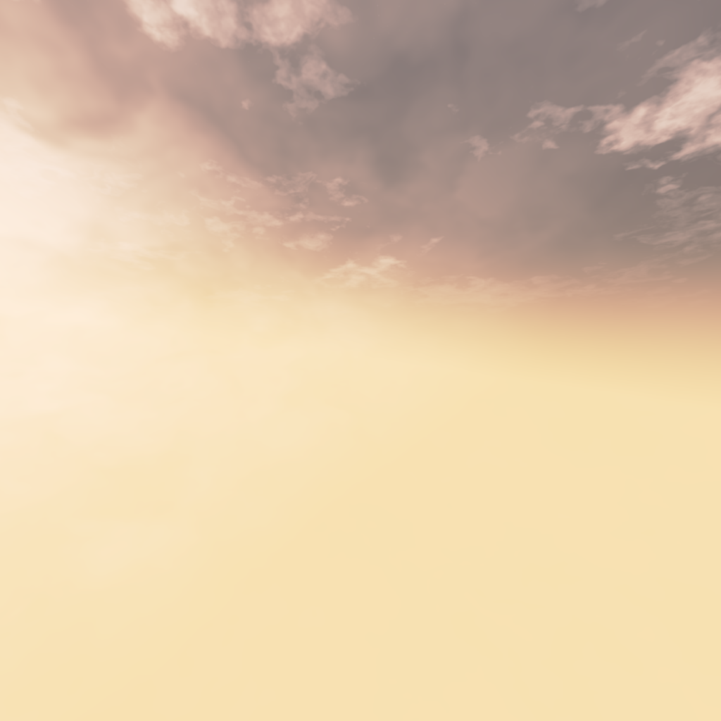
I chose to create somewhat jagged-y mountains because they reminded me of some of the mountains in China – rough yet mystical.

I also played around with the painting feature, and painted on flower details of the platform the user stands on. I got the texture from Grass Flowers Pack Free, and didn’t realize until I placed it in the environment that the flowers actually moved around, like they were swaying in the wind. I’m not sure if we will keep this effect or not, but for now I think it adds a nice peaceful effect, and could possibly be accompanied by calming wind sound effects.

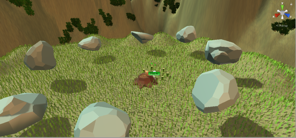
To build up the rest of the environment I relied on other prefabs. To create the circle of rocks surrounding the user, I used rocks from LowPoly Rocks. I got the bamboo from Shuriken Set (which Nico found), the watering can and sickle from Garden Realistic Tools, the tree stump from LowPoly Trees and Rocks, and the skybox from Skybox Series Free. At the moment, this is what one view of the environment looks like:

We’ll have to talk more about how we want the bamboo to be represented and how close it should be to the user. Since there is a circle of rocks, it might make sense for there to also be a circle of bamboo rather than just a section of bamboo in front of the user.

March 11

During class we touched base on more stuff to do for the environment:

  • Waterfall – found something in the assets store for this, Water Fx Particles
  • Make log wider – this way it works with the gravity of the objects on top of it (before the watering can and sickle were falling off of the log for some reason…this was why)
  • Make the bamboo closer to the user – less walking, limited space
  • Prettier bamboo material
  • Not have grass/flowers too high or else when objects fall you can’t see them
  • Have a different color flower – right now it looks like hay

I also started looking around for some music and sound effects we could use. I found some nice sounds of birds chirping and leaves rustling in the wind, as well as a sound that could be good for when the bamboo is being cut.

Later in the evening Nico and I also worked on putting the script he had and the environment. This was really nice because it gave me a better idea of how the space looks and can be better designed when wearing the actual headset. We ended up scaling everything in the environment down so this would be easier to work with in the scripts, and so that the user didn’t have to walk as much. This actually ended up having a nice visual effect as well, since it somehow felt more like a canyon. We also talked about more things to work on with the environment:

  • With the rock circle – make the circle smaller, with less but bigger rocks, and experiment with them floating
  • Take flowers off of the mountains (I had accidentally painted these on, which wasn’t apparent until we scaled everything down)
  • Add material variation in the mountains
  • Add more bumps in the platform mountain the user stands on for terrain variation

March 12

Today I worked on making some of the improvements to the environment:

  • Removed the flowers that were on the background mountains
  • Made the rock circle into larger floating rocks, tilting at different angles and floating at different heights. I actually really like this effect, I think it gives an odd sense of power yet is still zen.
  • Added in more bumps/raised terrain sections around the platform mountain that the user stands on
  • Started experimenting more with the ground…put pinker flowers in the back and short green grass in the circle where the user stands. However, there is a kind of warp in color that happens when the user moves around their head, which doesn’t necessarily cause any issues but it might look slightly out of place. I’ll have to see what the others think.

Here’s what the environment looks like at this point (sans bamboo – will add this in as a group tomorrow):

March 17

These past couple days were spent making finishing touches on the environment. The general consensus on the grass and flowers was that the color change was due to rendering, and was too distracting for the user. I found a blog post online about how to make grass using the tree building tool, but I was having a little trouble getting it to work. I also tried to mess around in the terrain settings, yet this was in vain as well. Eventually, the issue was resolved by adding grass by painting them as trees rather than as a detail – I ended up finding a grass model in a package from the asset store and using this. I also added bushes in the mountains to look kind of like trees to get some variation in the color in the mountains and to look more like those mystical yet peaceful Chinese mountains I was inspired by.

The last thing I worked on was the placement of the bamboo. The space the user is in is a bit limited, so the bamboo was going to have to be placed in a way so that the user did not have to walk much. I ended up placing the bamboo in a semi-circle around the user, so the user can simply turn around to view the other bamboo stalks that are available to interact with. I think this placement also gets the user to turn around and look at the 360 view around them, whereas a clump of bamboo in front of them would simply station their viewpoint in one spot.


Blog: Representation

In “The Humane Representation of Thought,” Bret Victor discusses different modes of understanding mediums, specifically the use of different sensory channels and enactive, iconic, and symbolic methods. At the moment, virtual reality is most typically represented using different gaming systems, such as the Vive, which allow virtual reality to be relatively dynamic. The user navigates and understands the game through action, image, and language-based representations. These games also appeal to various sensory channels; they are visual because of the graphics, they are aural because of sound effects, they are tactile because of the use of controllers, and they are spatial because of the 360 degree aspect, complete with moveable depth.

What is perhaps lacking in this current representation, however, is how the user can understand the virtual reality medium kinesthetically. There are not very many games out there, to my knowledge, that involve movement of the user’s body in a way that matches actual reality effectively. The bow-and-arrow activity in the Unity example world, for instance, does not accurately match how you would shoot an arrow in real life. It takes into account aim, a small pull-back motion, and the push of a button in order to shoot the arrow. When shooting an actual bow, there are several other aspects that go into how the archer’s arrow will shoot. The position of the archer’s elbow, for example, is very important. There is also tension in the bow’s strings that you are not able to feel in your fingers and arms with Vive controllers.

A well-suited representation for virtual reality, therefore, would be one that better takes into account the kinesthetic mode of understanding without compromising other modes of understanding the medium. Sensors all around the body to better map body movements, for example, could be a possibility.

Blog: ARTECHOUSE Interaction

This past winter break, I visited Marpi’s New Nature exhibition at ARTECHOUSE DC, an art gallery that focuses on immersive interactive art pieces.

The part of this particular exhibit that I really liked was a room full of screens, each screen containing a “creature” you could interact with by waving your hand over a motion sensor. The sensor would track your hand, which you could see displayed on the screen with a small hand symbol, the movement of which would get different reactions out of the creature. These also all implemented AI, so the creatures adapted how they reacted to the interactions. Essentially, the way it was explained, the reactions we were getting from the creatures were not the same as say, the reactions the very first exhibition visitors received from the creatures. This video I took during my visit shows just one of the many creatures you could interact with:

I really liked this interaction for many reasons. First, I think the music, lighting, and graphics all complemented each other nicely. The music was very calming yet futuristic in a way, and kind of inspired curiosity. Second, the interaction was very easy to understand. The user’s hand makes a digital hand appear on the screen, which gets an immediate reaction from the creature – it is all very intuitive. Third, it was fun to play with all the creatures in different ways. They were each designed differently – this one just happened to have many balls that would bounce in different ways. I also really liked the use of AI because it made the creatures more “real,” in a sense. They learned, just like real living things do. There was one creature, however, whose sensor didn’t seem to be working properly so the digital hand wouldn’t move the way you wanted it to. However, looking back on it, this could have been on purpose.

Project 1 Documentation

Project Description

Video demo:  https://youtu.be/eTXNGwPbcrs

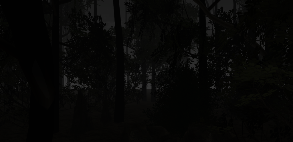
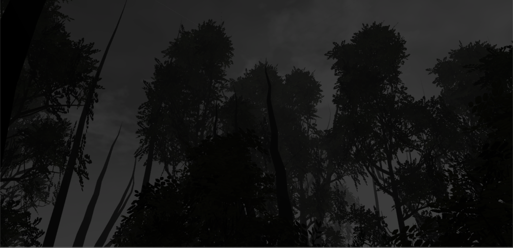
Color is an inherent part of some of our daily lives. It can add vibrance or even different moods – a bright yellow can inspire happiness whereas a dark blue can inspire sadness. With this environment, I wanted to explore how the absence of color could affect a mood. I created a forest with a completely desaturated sky and ground, making its identity one that is eerie and spooky.


Process and Implementation

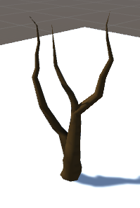
I was initially inspired by the idea of a spooky forest when playing around with the tree building function of Nature Starter Kit 2 since the branches of the trees could be warped in a way that were windy and pointy.

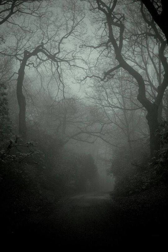
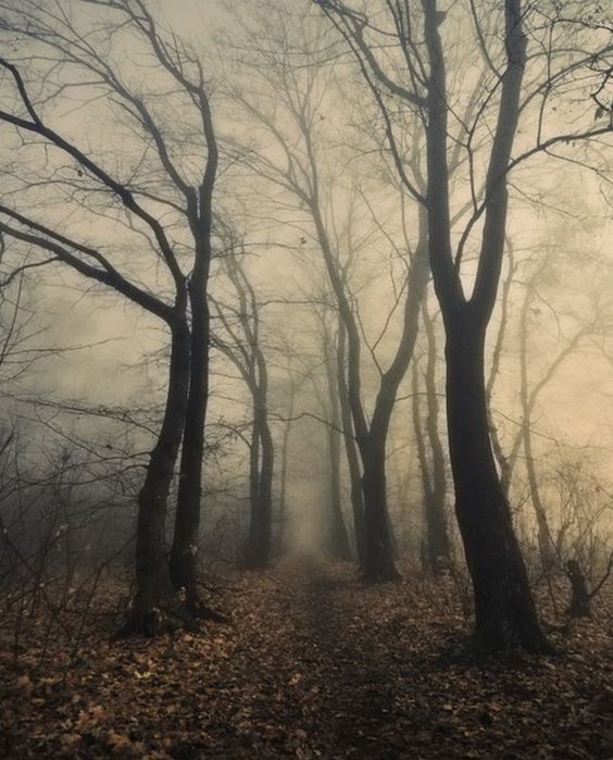
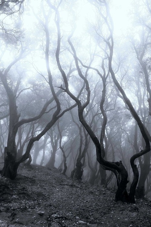
When browsing pictures of spooky forest images, I noticed that a lot of these images were in black and white as if to enhance the creepy effect, hence inspiring me to create a black and white forest to add on to the eerie effect.

In terms of what to put into the actual environment, a lot of my implementation had to do with what I came across in the assets store. I wanted my environment to look a little more realistic, so I kept this in mind when browsing various packages.

The trickiest part was definitely getting the lighting right. I removed the directional light and added fog in order to give the illusion of nighttime, choosing a night setting because night is inherently more spooky than day. However, my biggest struggle was with the skybox. I would try out different materials with different combinations of tint and exposure in order to try and remove the color, however there always seemed to be a slight tinge of color. I eventually realized that I could just edit the saturation out of png images of the panels using a simple photo-editing website (Pixlr), and then place these edited panels into a new skybox material. This finally completely desaturated the sky and gave the effect I was going for.

Reflection/Evaluation

Overall, I think the eerie effect was accomplished because of the absence of most color and the choice to make it nighttime. However, I do think it’s possible that someone could be in this world and feel at peace rather than spooked out, depending on what their feelings towards nighttime forests are. If I were to build upon this, I think I would try and add some animations or sounds in order to enhance the spooky effect. For example, it would be cool to have wind whistling so that the user could perhaps feel “chilled,” and have some leaves rustle in the wind.

VR Experience Review: VR Diving

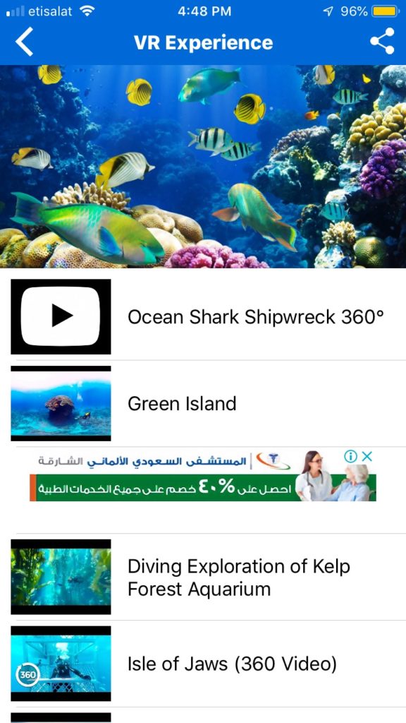
I decided to try out an app called VR Diving where you can choose from a set of different underwater environments to experience either just on your phone or with Google Cardboard:

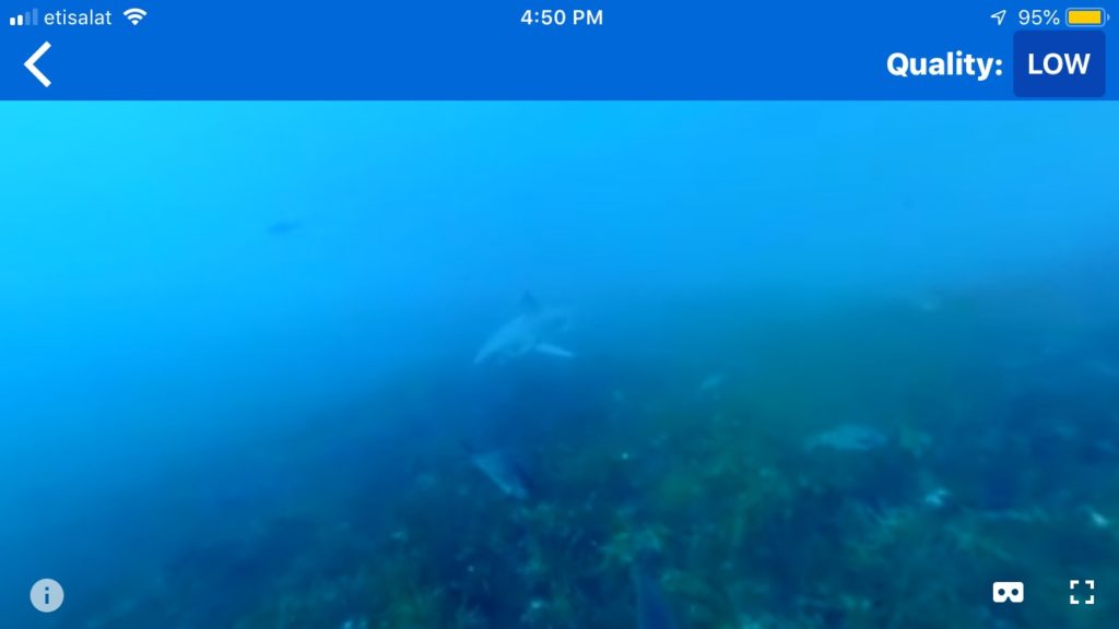
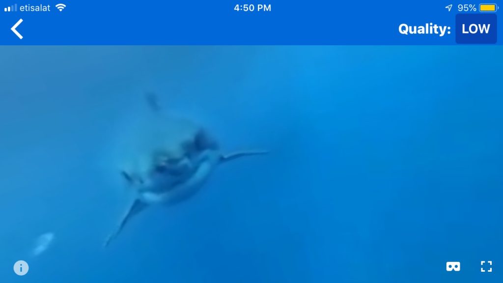
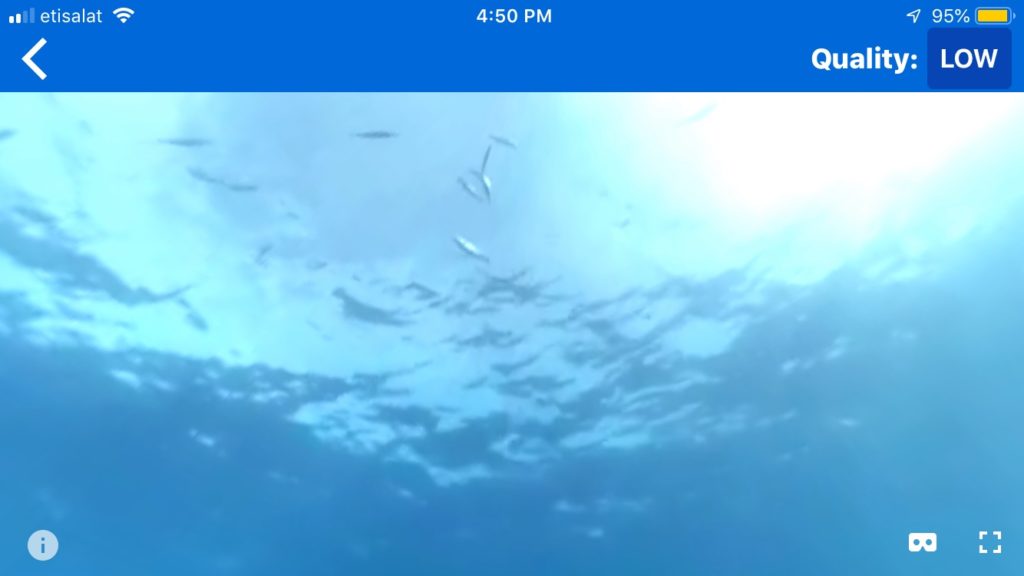
I chose the first one, Ocean Shark Shipwreck 360, to review. Here are a few screenshots of the experience, taken from the normal phone view rather than the Google Cardboard view for ease of viewing on the computer:

Ignore the quality setting – I set it to “high” later on but there wasn’t really any noticeable difference.

This 360 video showed different clips of sharks and fish swimming underwater. When you tilt your head down, you can either see coral or darker blue ocean water, and when you tilt your head up you can see the sun shining onto the surface of the water. While the videos appear to be taken from real life, the sound does not – there is a creepy sort of music along with sounds that sound like bubbles.

I’m a little confused as to what the purpose of this environment is. On one hand, it could be a cool way to represent what scuba diving is like. On the other hand, it could be meant to scare the user because of the music and, at one point, one of the sharks eats the camera. However, this experience was an odd mix of the two. It wasn’t quite like a realistic representation of scuba diving because of the strange sound effects and also because of the fact that every so often, the video would suddenly transition to a slightly different scene with an unnatural fade in/out effect. It also wasn’t quite scary, because the bubbly noises distracted from the scary music, and most of the sharks didn’t seem to mind the user.

It makes more sense for this to be aiming for a realistic representation of scuba diving, because the rest of the worlds you can pick fit along with this theme. In terms of how the view is composed, it is pretty effective, especially because it uses real footage and the slight haziness is similar to how it feels to wear goggles underwater. The editing done to the footage, like the transitions and sound effects, are the components that would need to be improved.

Development Blog: Project 1

Feb 10

When I was playing around with Unity, I downloaded an additional asset package called Nature Starter Kit 2. With this asset, there is a feature that allows you to build trees, which I messed around with and ended up really liking the look of a barren tree:

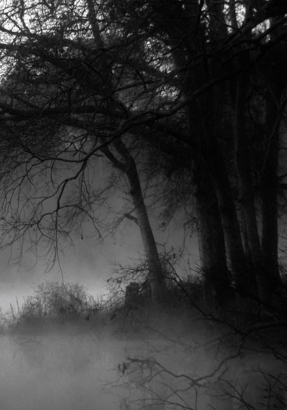
It has a sort of spooky feel, which got me thinking about creating some sort of forest that has a creepy yet mystical identity. I looked at the following photos (from Pinterest) for reference:

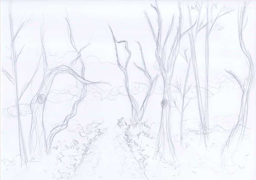
One thing that struck me about these photos was they were either black and white or dark in color. One aspect of (most of) our daily realities is color. In some of these forest photographs, the absence of color adds to the eerie mood in a way that color would potentially not. With this project, I would like to address this and create a spooky forest environment in which the absence of color would provide a lens in which the user is forced to see what would normally be brown and green as black and white. The following is a sketch of what the environment would potentially look like:

So far I’m thinking there will be a path along the forest as a divide so it won’t feel overcrowded (and could add to the spookiness because it’s like you’re forced to walk down a creepy path), with forest surrounding both sides of the path.

Feb 13

Today I created the file for my project and started to play around with the skybox and ground, as well as installed the Google VR components. I browsed the assets store for tree and nature-related packages, and ended up importing Free Rocks, StonyGroundPackage, Realistic Tree Pack Vol.1, and Nature Starter Kit 2. At the moment, my world looks like this:

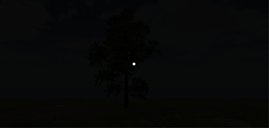
For the skybox, I played around with the material from one of the package’s skyboxes, changing the tint and exposure to make it darker and less blue. I popped a tree in there from Realistic Tree Pack Vol. 1 as a reference for lighting as I messed around with the lighting. I ended up removing the directional light, but at the moment I feel like my world is too dark. Next steps would be to see if I can add some sort of moonlight in there. I’m also wondering if there’s a way to remove the color saturation from materials without having to tint them, since I do want to have a black and white world and the sky is still slightly blue…so this is something I need to look into as well.
Feb 16

Today I worked on adding more elements into my world. I took my initial inspiration, the creepy effect of the build-your-own-tree function of Nature Starter Kit 2 to create some of my own trees. I did this because I couldn’t really find any prefab trees that had the same spooky effect. I also added more prefab trees, bushes, and rocks.

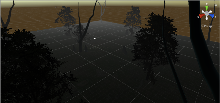
I also messed around with the lighting a little more – adding fog in the lighting settings seemed to make the ground a little lighter than before, sort of giving the illusion of moonlight. I’m still unsatisfied with the skybox itself so it’s back to the default skybox at the moment. Here is a progress pic of what I have so far:

I’m a little nervous about the trees I made myself, because I keep getting this message in the console:

Definitely have to look into that.

Feb 18

Today Sarah helped me get rid of the dot in the game mode from the Google VR player, as well as clear my console (thanks, Sarah). Strangely, the console errors never reappeared so that was thankfully no longer a concern.

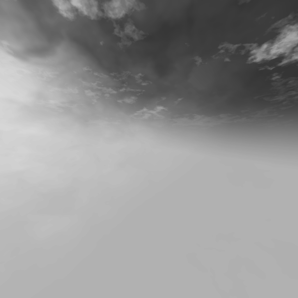
I also worked on the skybox, and got rid of the slightly blue tint. I realized I could just edit the png files of the separate panels that come with the skybox and decrease the saturation outside of Unity, and then upload them back in. I decided to do this with the sky that came from the asset WorldSkies:

I also did this with the ground material, and am now much more satisfied with the lighting of the environment, following the original idea of a black & white world. Now last steps would be to fill the world with more components to make the forest more dense.