Final Project Documentation “Detoxication”

1.Project Description: describe the space, the “storyness” it conveys, and the inter-relation between modes of interaction and the logic of the world.


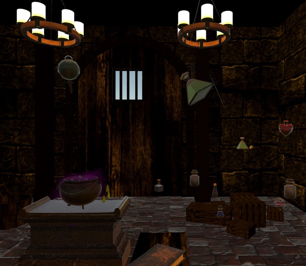
The story is set in a dungeon-like room where there are various objects scattered inside. Although the room has a dark and spooky mood, the lighting has been coordinated so that the user can clearly see the various objects. This is because the task of the user is to find the various objects that are randomly generated onto the recipe clipboard and throw those ingredients into the cauldron so that the user can create the antidote, and thus win the game. 
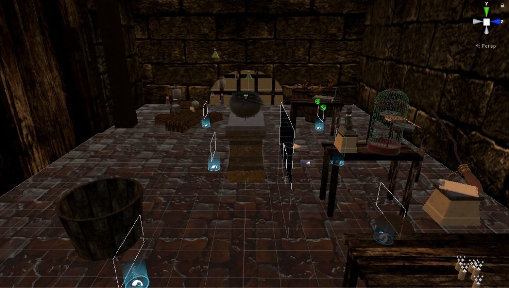
The story is set in a dungeon-like room where there are various objects scattered inside. Although the room has a dark and spooky mood, the lighting has been coordinated so that the user can clearly see the various objects. This is because the task of the user is to find the various objects that are randomly generated onto the recipe clipboard and throw those ingredients into the cauldron so that the user can create the antidote, and thus win the game. 
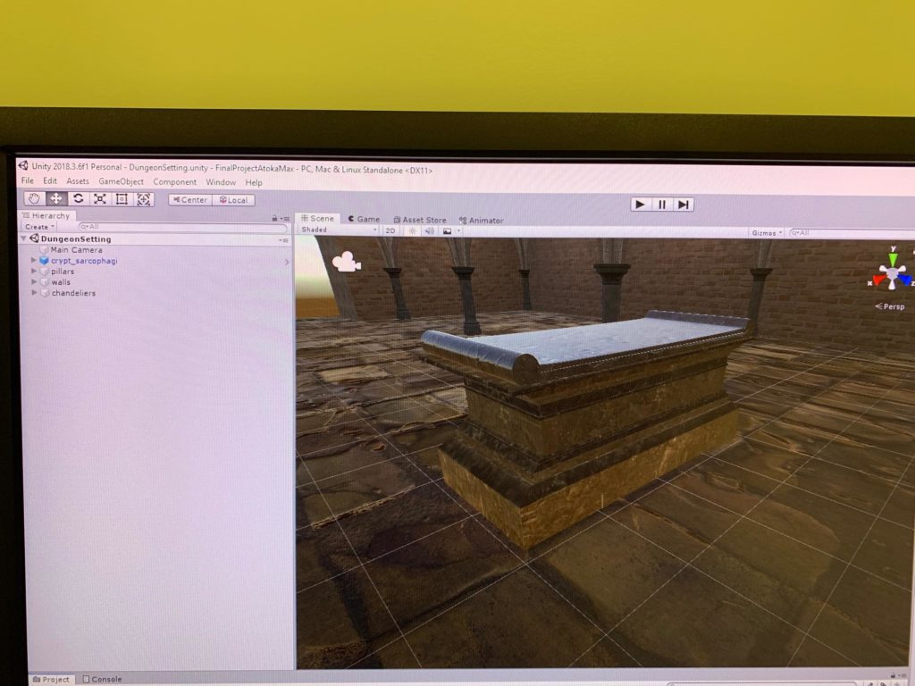
Side View of the Setting
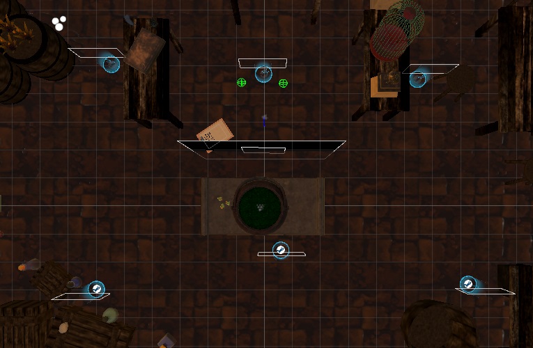
Top View of the Setting

The user can interact with both the surrounding space and the various objects. The size of the actual space matches the size of the virtual space so that the user really feels that he/she is in that fictional environment. For example, when the user moves closer to the birdcage, the birdcage appears larger. However, some parts of te room were difficult to access and so we added the teleporting points in order to solve that issue. Some of the objects in the environment are interactive. For example, the user can use the trigger of the Vive to pick up the broom in the scene and throw it around, as well as the cat statue, clipboards, potions, etc. Another crucial interaction is the caldron responding when the objects are added into it. When any object is put into the caldron, the caldron spits out a blue-to-purple-to-pink bubbles, replicating the chemical reaction.
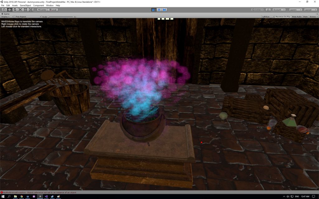
The Colorful Bubbles from the Cauldron

The logic of the world can be followed through with the narration, background clock ticking sound, the recipe, and the congratulating/game over scene. The introduction narration allows the user to understand what situation he/she is currently in. The recipe shows the task the user has to complete, and the user will get the congratulating scene or the game over scene, depending on how the user performs. 

2. Process and Implementation: discuss how you built the space and design choices you or your group made. What did the brainstorming process involve? How did you go about defining the logic of this world? What were the steps to implementing the user’s role? Share images or sketches of visual inspiration or reference, including the storyboard/layout.


In order to create the space and design of our project, we first drew a rough sketch outlining the overall atmosphere and the placement of the objects in the scene. We then looked through the asset store on Unity and found different objects to use for building the setting and the scene.
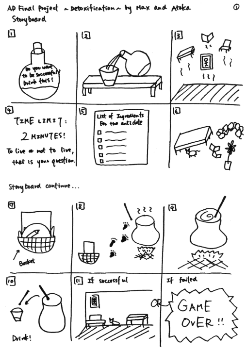
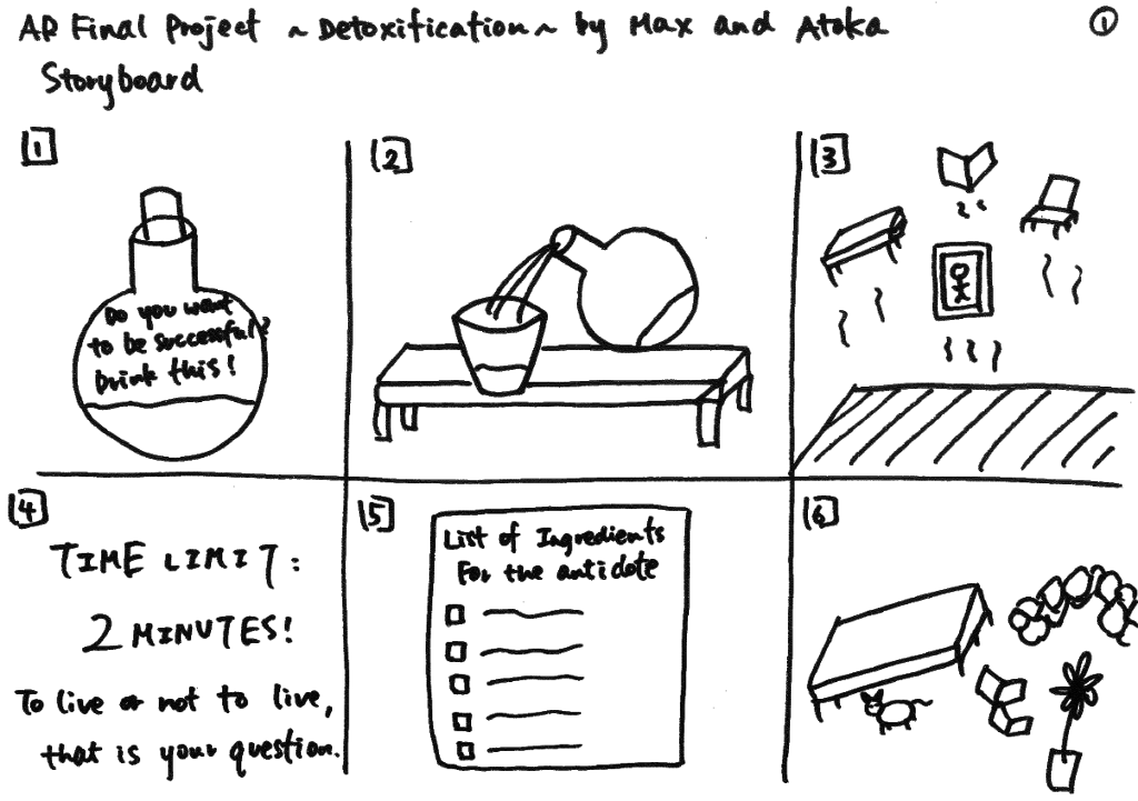
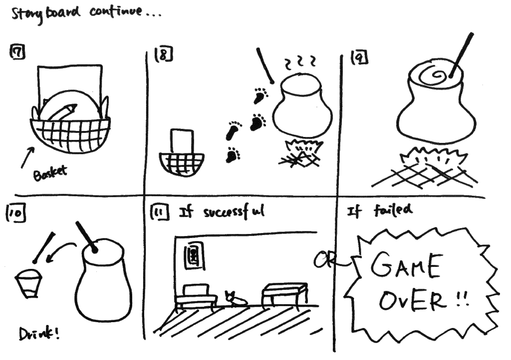
Storyboard Sketch

Because this game is based on the idea of “poison(ed),” we had to place the user in the way that the user would know that he/she is poisoned, and thus, need to find the ingredients to make the antidote. We used two steps to achieve this – first one being the fact that we placed the user in front of the cauldron when they begin the game, and the second being the fact that we recorded a voice narration at the very beginning of the game explaining the user that he/she has been poisoned and his/her mission is to find the ingredients that are scattered around the room in other to create the antidote.
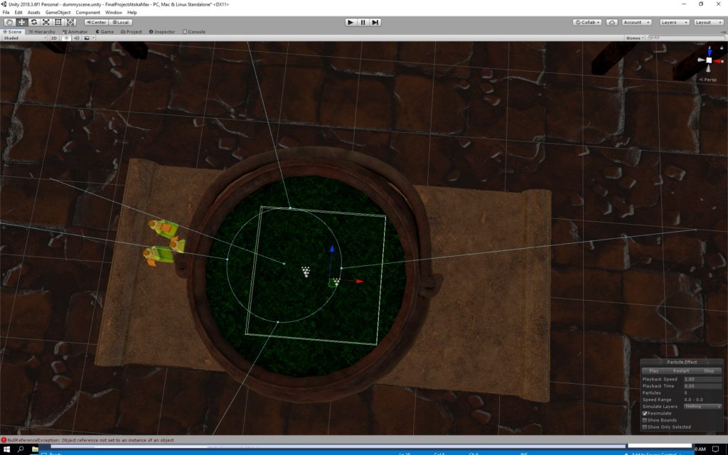
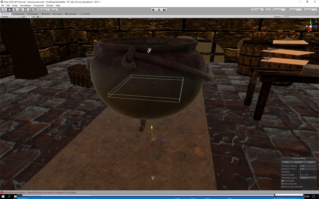
Top View of Cauldron


Side View of Cauldron
Floating Objects


We also wanted to make the game playable multiple times. Therefore, we decided to randomize the list of ingredients that show up on the recipe clipboard. That way, when the user plays it for the first time, the recipe might show, blue potion, broom, small green potion, cat, and brownish potion, but when the user plays it for another time, the recipe might show cat, skull, plant, plant, and blue potion.  That way, the user can enjoy a different experience every time the user plays the game.

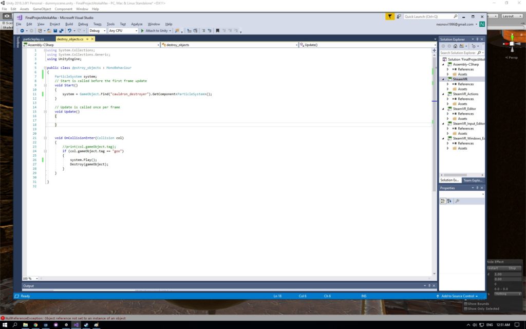
Some Example of the Scripts
More Scripts

3. Reflection/Evaluation: This should discuss your expectations and goals in the context of the what you felt was achieved with the finished piece.


I am very happy with the outcome of this project. After building the base setting, we gathered various objects from the asset store to decorate the dungeon. Then, we wrote the scripts which were for the list of the ingredients, randomization of the ingredients, verifying if the ingredient that was put into the cauldron matched the ingredient listed on the recipe, the Timer, the If condition for winning and losing condition, the Text FadeIn, and the Blackout FadeOut.

During one of the earlier playback session, we received a feedback to include a voice narration that explains the situation and some kind of ticking clock sound that emphasizes the mood of having a time limit. In order to build the sense of time pressure, we used Audacity and created a background sound of the ticking clock, which begins ticking faster and faster as the two-minute time limit approaches. After incorporating this, we received feedback that the sound was well suited to the atmosphere and the mood of the game and the task that was given to the user.

What I realized during the IM showcase was that because the introduction narration does not explicitly say to put the ingredients into the cauldron, some of the users were simply collecting the ingredients onto one of the tables. To others, this was more instinctual, and the moment they saw the cauldron, they knew that that was where they had to put the ingredients.

Another thing I noticed during the IM showcase was the fact that some users could not locate the recipe from the first place. Because the recipe is originally on the floor, some users did not look down, but rather were always looking around (eye-level). Such users were confused and did not know where to start.

In order for this project to be improved, we should find ways to clarify that the task is to collect the ingredients AND put them into the cauldron from the introduction narration. As for the recipe, instead of having it placed on the floor, it should be placed next to the cauldron so that it is easier for the user to refer back to it. Overall, the game appeared a little difficult for first-time players, but many of the users got used to it quickly, and even if the user did not succeed the first time, the same user were “detoxicated” when playing for their second time.
Development Blog 3

We added the function where when the user inserts an object into the pot, the pot reacts by blowing out colorful bubbles. We tested different colors, sizes, textures, and speed of the bubbles so that they enhance the experience. We finally decided that we will use a gradation of colors, beginning from pink, then turning, purple, and then lastly blue to appeal more aesthetically. 

We also came up with an introduction narrative like the following:

“Do you see the objects flying around? Well actually, they only look like they are flying to YOU. You have been poisoned, and the hallucination is only one of the thousand side effects. If you want to survive, gather the ingredients to make your antidote. Of course, find the recipe first. You have two minutes until the poison takes over you and you will become a nobody. Good luck!”

I asked a male friend of mine to do the voiceover, and this is the end product.

Detoxification Introduction Voiceover

Development Blog 2

Max and I decided to use “poison” as our starting point in order to create an interactive project where the user is poisoned and the user must find the various ingredients in the room to create the antidote.

We first began by creating the setting of the scene. I went through the assets store to see if there are any materials and textures that we could use in our setting. I found several prefabs and textures that I felt could be combined to match our idea of our setting. So, first, I imported some prefabs, added some objects, and created a dungeon-like room that was not too dark since the user will have to walk around in the space and find the ingredients of the antidote.  

One of the tables where the ingredients will be placed

However, after building the bulk of this setting, we encountered a problem. The problem was that the program kept on crashing whenever we ran this setting. We ran it multiple times, but the program simply kept on crashing. We could not figure out why it kept on crashing but it was likely due to the amount of light source (from the spooky chandeliers) that were present.

Therefore, we had to create a different setting that was relatively close to the one that we had previously created, using other prefabs, lights, and materials. Max and I discussed again what kind of setting we wanted our project to be, and decided that we wanted to pursue a darkish-mysterious mood.

We agreed on the fact that the large pot would be our main object in the scene, as the user has to find the ingredients in different parts of the room, and put it in the pot in order to create the antidote. Max worked on creating the script which allows the user to pick up the ingredients and put them into the pot.

The following videos are some user testing examples of our first stage project:

Detoxification User Testing 1

Detoxification User Testing 2

Detoxification User Testing 3

From this user test, we got feedback that there should be some kind of timer (that is represented within an item, such as a sand clock) so that it gives a sense of adrenaline to the user that he/she is in a rush to find the ingredients and make the antidote. Moreover, we were told that there has to be some meaning attached to the ingredients. These ingredients could be the key in answering the question as to why the user is here in the first place. If the user is holding a basket, it signifies that the user is already somewhat familiar with the space. On the other hand, if the user is NOT holding a basket, it signifies that the user is NOT familiar with the space. There are some embedded assumptions in our project and so it evokes curiosity and why for the user. The explanation to these why? questions can also be clarified in the voiceover as part of the pre-story. Another feedback we got was the importance of sound. We were advised that as the time pressure increases (less time), the sound should increase as well.

Class Trip to VR Park!

1) While at the VR Park in Dubai, take note of those aspects of the experience that feel particularly immersive and why. Are you engaged in the premise of the experience? What is your role and what do you get to do? Does light or sound play a distinctive part in making the experience compelling? Write about this as a blog post and be ready to share in class on Monday.

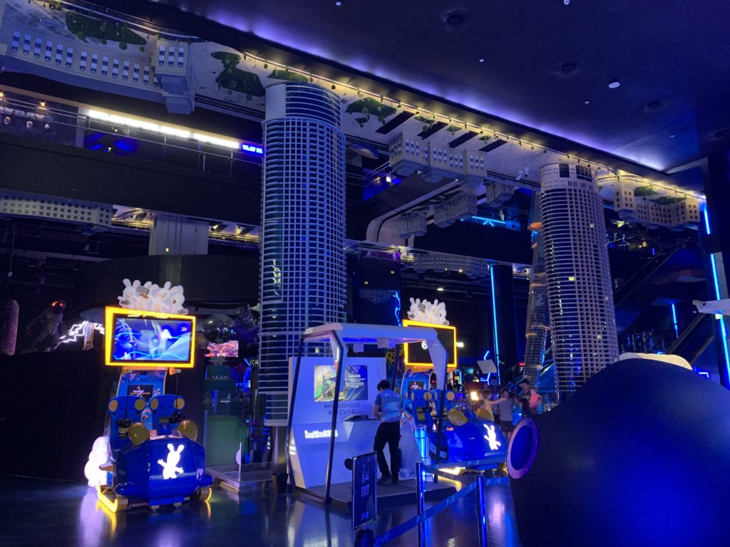
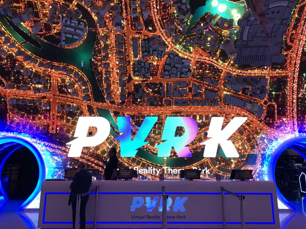
Last Friday, our class visited the VR Park (https://www.vrparkdubai.com/) in Dubai. For me, this was my first time going to a VR park in general, and so I was excited to see what was awaiting me.

Entrance of the VR Park

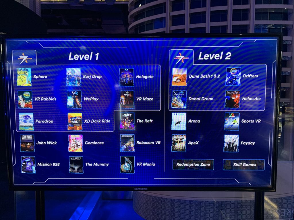
The attraction I felt the most immersive was the “Dubai Drone” and the “VR Maze.” In the “Dubai Drone,” the player rides a roller coaster while putting the VR headset on. The roller coaster here is the drone. What was impressive was that the images in the VR perfectly matched the direction and path of the roller coaster. When the roller coaster made a turn, there was something visually in the VR which also required or prompted a turn. Because all of the scenes in this attraction had bright light, it posed a positive image of how Dubai will keep on developing in the future. The music also played a big role in emphasizing how exciting and optimistic Dubai’s future will be. Here, my role was simply sitting on the roller coaster/drone and viewing the futuristic scene of Dubai.

On the other hand, in the “VR Maze,” the player had more of an agency in controlling the speed to which the player in the VR moved, as well as which direction to move towards. This was because the player was not sitting in an attraction/roller coaster that had a specific route and pathway, but rather the player had to move in the VR space using his/her own feet. While it was a maze in the VR headset, when seeing the physical player space, it was simply a small box with a few walls placed in it. Before playing this game, I was watching other people play the game. Therefore, I kind of knew what I was expecting, and yet, I was quite shocked and scared when entering the VR maze world. The scene took place in a dungeon and there were skeleton skulls and spooky-looking objects. The dim lighting added to the environment and made it a spooky experience (at least for me because I am scared of ghosts, skulls, and anything that is “scary”). The music also added to this because I felt as if I was really inside a maze dungeon, trying to figure out a way out/escape.   

Different Attractions
Inside!


Development Blog 1 – Detoxification by Max and Atoka

Temporary Title: Detoxification

Setting: Dark room in an old house

Our theme will be like this:

Storyboard:

Explanation of the Storyboard:

  1. A potion with poison inside is placed infant of the user (Label -> “Do you want to be successful? Drink this!”)
  2. Open a chemical potion and pours it into a cup
  3. The user hallucinates (Sees flying furniture, utensils, objects)
  4. The user is given a task, a basket, and a time limit (If you don’t find the ingredients of the antidote in 2 minutes, you will not survive!)
  5. A list of ingredients to make the antidote
    Examples:
    Flying Cat
    Cellphone/smartphone
    Snail
    Molded rice
    Pen

  6. The user has to scuffle around to find the ingredients of the antidote
  7. The user has to put the ingredients into his basket
  8. When the user gets all of the ingredients, the user is prompted to go to the big pot
  9. The user is prompted to put the ingredients into the big pot
  10. The user is prompted to mix the pot
  11. The user drinks the antidote successfully -> All the flying furniture utensils, and objects fall down -> real gravity
    • If the user reaches the time limit -> Game Over
    • If the user finds gets the wrong ingredients -> Game Over

Enjoying The Colors

1.Project Description: describe the space you created and the modes of interaction.

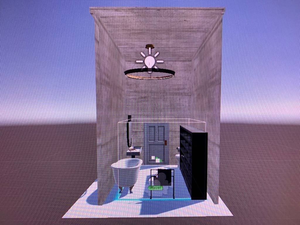
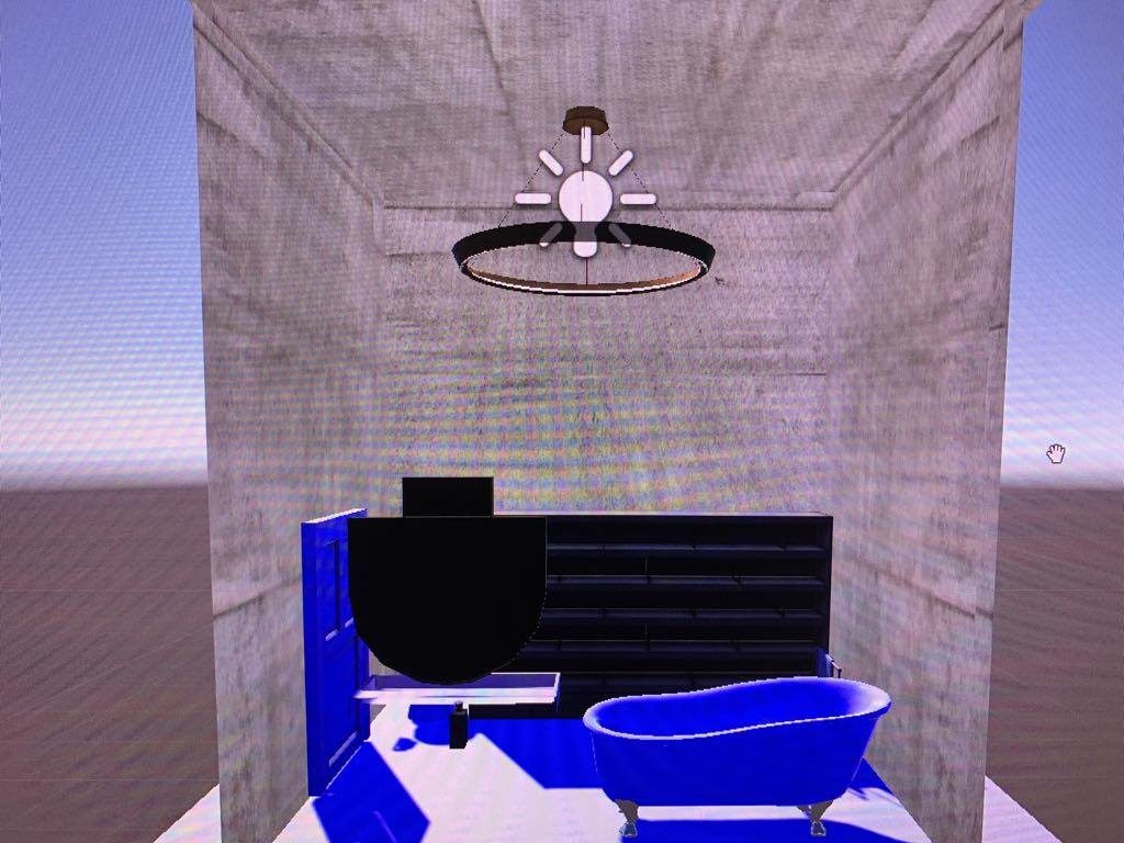
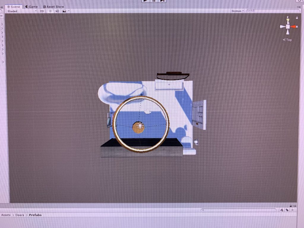
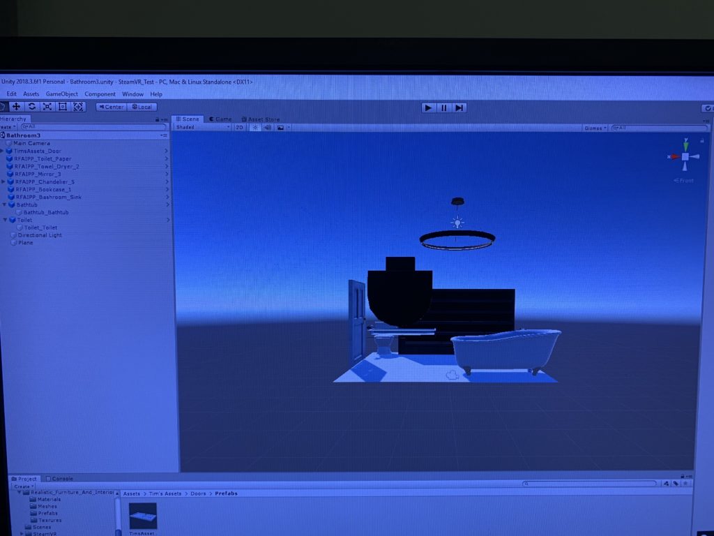
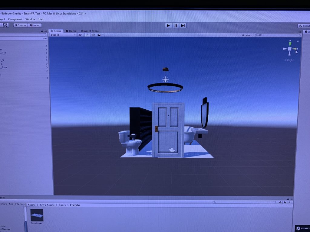
Junior, Claire, and I decided to create a realistic bathroom space in which the user could walk around in. We did have limited space as we used the front part of our classroom, but in a sense, the space limitation worked to our advantage. A regular bathroom is not that big, and so recreating the bathroom space within the limited space replicated the real life situation. While there is a bathtub in the corner, it is relatively the normal size, neither too small nor too big. We also decided to put a tower rack and some towels to show that it is a bathroom that is being used frequently, and not a sample bathroom in a showcase. The big shelf was added to place one of the glasses that would be used for the interaction. And of course, the toilet is placed in the corner to emphasize the fact that the user is in a bathroom. There is also the wide sink with the mirror on top of it which we intentionally chose to match the overall atmosphere of the bathroom.

Overview of the Scene

We used the grab and select tool using the Vive controller’s trigger button as the mode of interaction. By hovering the controllers over the glasses, the user can click on it using the controller’s trigger, which allows them to “take a look” through that specific glass. This means, when the user choses a glass that has the function to make everything look red, the user will see everything in red after selecting those glasses. Another interaction would be walking in the virtual bathroom setting. By calibrating the Vive headset, the user can walk freely inside the bathroom, and look closely at the various objects.

2. Process and Implementation: discuss how you built the scene within the development environment and design choices your group made What did the brainstorming process involve? How did you go about defining what would be everyday in this world? What were the steps to implementing the interaction? Share images or sketches of visual inspiration or reference, including the storyboard/layout.

As for the brainstorming process, Junior, Claire, and I met and discussed what kinds of daily life situations can be replicated in an interesting way. As much as we knew that we had to replicate some kind of daily life situation, we wanted to use the full potential of virtual reality. We talked about how “sight” is an essential part of life and that having bad eyesight can sometimes be a barrier when wanting to examine everything carefully. We thought that experimenting with “sight” would be our main theme. We then discussed how the user can be given a task to find and try on the different glasses in a space. That way, the user can interact with the objects in the space (glasses) and go through the different experiences. We also discussed where we wanted the setting to be. The different ideas were the living room (common room) of a share house, the user’s own room, and the bathroom. We thought that the common bathroom would be the most realistic since people can leave their glasses behind in the common bathroom and forget and have to come back to find their glasses.

We used various assets from Unity’s asset store and created the bathroom setting. While there are a variety of assets in the Unity’s asset store, the ones that looked the most sophisticated and appealing were not free. Therefore, we had to scavenge through the free assets in order to create the bathroom. We gathered different assets packages and played around by placing the objects that were related to the bathroom. For example, we tried different iterations of the sink to see what actually fit the space, mood and interior design. The first sink that we originally put seemed to be too bland, and after some experimentation, we decided to settle down with the current sink.

3. Reflection/Evaluation: This should discuss your expectations and goals in the context of the what you felt was achieved with the finished piece.

Originally, we wanted to add more components to the current piece. However, none of us had experience with using Unity before this class and so there were many components that we had to learn. Our expectation was that we would have each glasses have its own filter, and we would place different scripts on each of the glasses to possess different effects. Our original idea was to have one glasses to zoom in, another one to zoom out, another one to have double-layer vision, and the real one that would give the corrected vision. However, figuring out how to create all of these different kinds of vision took so much of our time, that we needed to come up with a plan B in case we could not debug the scripts that we had written.

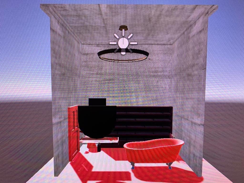
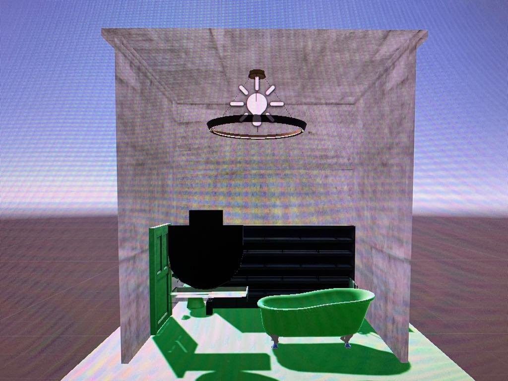
In the end, we settled with the idea of having each glasses possess the power of switching scenes. We switched our main theme to “experiencing the colors” and so we decided to blur the vision a little and have the user focus more on the color change. When one glasses was selected, the user will “put on” those glasses, and see the objects in red. Then, if the user “put on” another glasses, the user will see the objects in green.

Red Scene

Blue Scene

Green Scene

We were able to achieve the basic of what we wanted to achieve, in the sense that we wanted to provide the user of being in a bathroom setting, trying on the different glasses, and allowing the user to experience the different vision with the different glasses. Although the different visions were a little different from the original idea, the way we dealt with trying to recreate the effect in a different manner was a result of our good teamwork.

I would say that the most difficult task in this project was selecting the glasses and placing the script in the object that would jump to different scenes. Because we had the idea of each glasses having its own filter, we needed to create different iterations of the same setting in order to augment that effect. Moreover, our group only had three (two) members, and so we struggled in regards to knowledge and implementation compared to other groups who had four members.

Project #2: Development Blog

For this project, Junior, Claire, and I decided to play around the everyday theme of having to find your glasses. Coincidentally, all three of us have bad eyesight and so we either wear glasses or contact lenses. We shared our experience of how we struggle to find our glasses, especially in the mornings, as we tend to forget where we placed our glasses the night before.

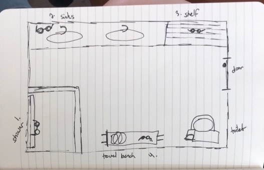
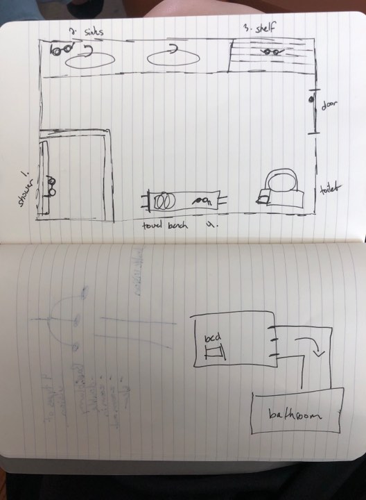
Rough Draft of the Setting

We decided to choose the bathroom as our location and include a bathtub, a toilet, sink, bathroom shelf, a towel hanger and towels. We had originally planned to place different objects, but after placing some objects, figuring out each of the positions, and removing some objects according to the overall balance, we decided to settle down with the current bathroom setting. We also added the hanging light as our light source.

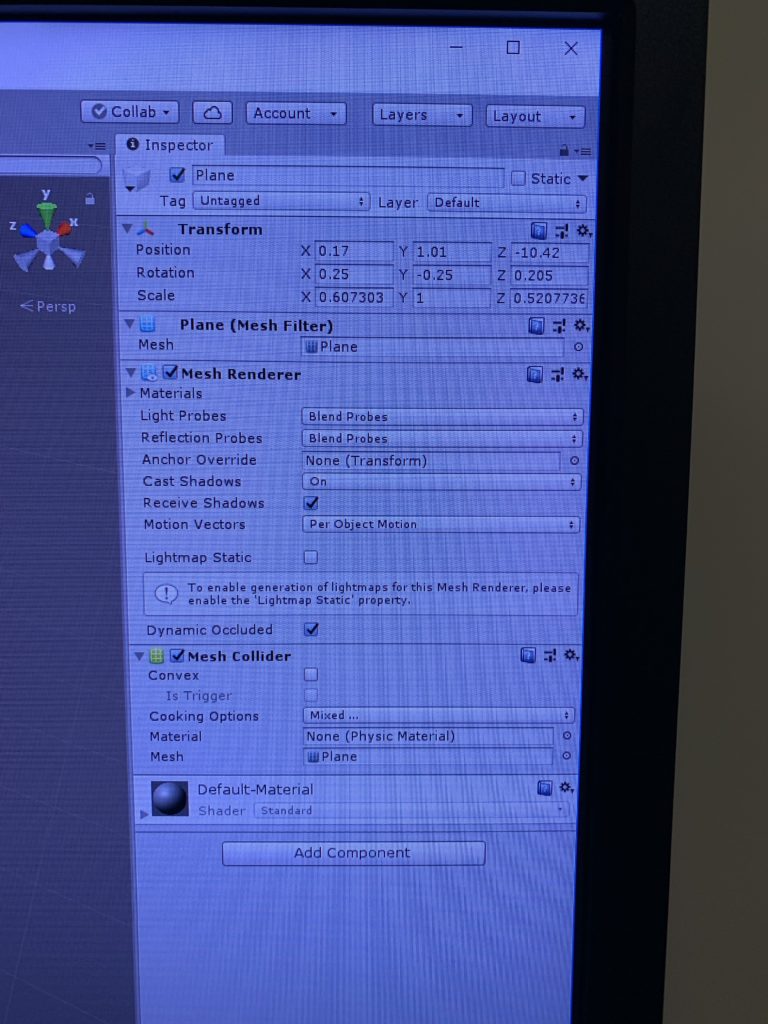
Getting the correct Position, Rotation, and Scale

Claire and I were in charge of creating the bathroom setting, matching the virtual space to the actual available space in the classroom, placing the four glasses in different places, and making sure that the user felt that he/she was in a bathroom trying to find his/her glasses.

Top View of Bathroom Setting
Side View of Bathroom Setting
Different Side View of Bathroom Setting

For our next steps, we need to add the different functions of the four glasses in order to make it interactive. Each of the four glasses will have different functions – whether they are zooming in, zooming out, different colored tints, and the corrected vision. Although we understand that the blurry vision will cause nausea for the user and may not be suitable for long use, we will play around the degree of blurriness to see how we can make it work.

Demo Video

Form of Representation

As Bret Victor mentioned in his talk, The Humane Representation of Thought, “the powerful medium is what powerful representations to be spread,” the medium is what determines how and to what extent the representation can be executed to its full potential.

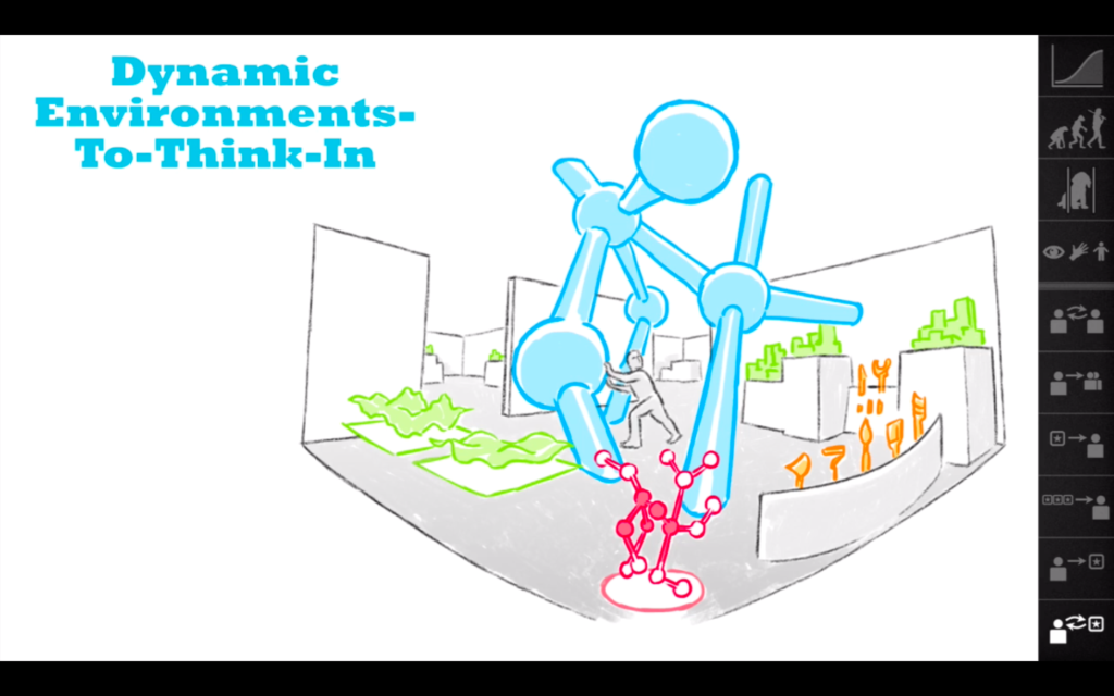
I think that the medium of virtual reality allows the user to get indulged in an environment that the user cannot or is difficult to get exposed to. For example, the medium of virtual reality can allow an ordinary person to feel as if he/she is walking on the surface of the moon, which only skilled and selected astronauts can do. In fact, virtual reality allows the user to be an active participant rather than a passive observant. What I mean by this is that with the use of the hand controllers, the user has the ability to maneuver what is inside the virtual reality. From this essence of virtual reality, I think that a form of representation that I feel would be suited for the medium of virtual reality would be “thinking,” more specifically creating “dynamic environments-to-think-in.”

Visual Image of Bret Victor’s Dynamic Environments-To-Think-In

In a sense, the medium of virtual reality “treat[s] the human beings as sacred” (Victor). Virtual reality can give superpowers to the user by giving the user agency to see and alter the virtual world they are in. Let’s say that the user is placed in a lone island and the user can see the setting through the headset. This user, if given the option, can perhaps light a fire or cook food, using the controllers at the deserted island. More realistically speaking, the user can craft his own image of his house in his virtual space, which he can use it to execute his thoughts, and also come up with new ideas. Such interface would trigger different parts of the users’ brain and allow the user to think in a different manner. Because thoughts and ideas tend to arise when one changes his environment, the medium of virtual reality would be effective in providing that alternate space.

Project #2 Storyboard – Claire, Junior, Atoka

Everyday Theme:

  • Find your glasses!

Scenario:

  • Living with different people in the share house
  • User (A person with blurry vision/bad eyesight)

Setting:

Bathroom

  • Shower
  • Shelf
  • Sink
  • Door

Layout:

  • Rectangle

Storyline:

The user has just woken up and he is heading to the bathroom. The story begins from the point of him being at the door of the bathroom. Because he is sharing the house, he has three other housemates whom he is living with – all of them with some kind of vision problems (bad vision). There are four glasses lying around in the bathroom. Help him find the right glasses!

Original (blurry)

Four kinds of glasses:

  1. Double vision
  2. Zoom In
  3. Zoom Out
  4. Normal (clear vision)

The user will hear a voice when he puts on the wrong glasses like the following:

  1. Double vision – “Wow…I’m seeing double”
  2. Zoom In – “Hmm…this doesn’t seem quite right”
  3. Zoom Out – “These aren’t mine”
  4. Normal (clear vision) – “Finally, I see things properly!”

Storyboard:

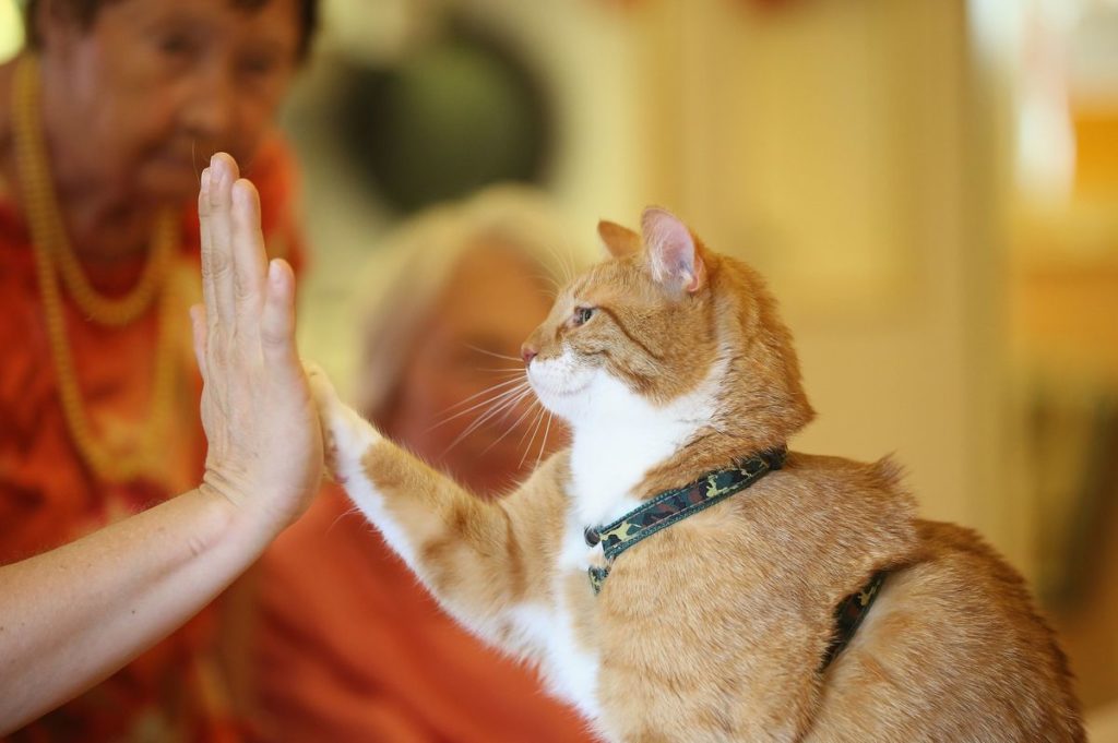
Interaction Between a Cat-lover (human) and Cat

I really like the interaction between a cat-lover (human) and a cat because when such a person sees a cat, a giant smile instantaneously appears on the person’s face regardless of how the person has been feeling. The cat-lover goes up to the cat and begins patting the cat. Depending on how amiable the cat is, the cat either lets the person pat him/her or simply run away. I’ve seen my cat-lover friends talk to cats as if they are talking to a baby. They would talk nicely in a very high-pitched voice and place their face close to the cat. Although I do like cats, I am not a fan of petting wild cats, and so watching the cat-lovers interact in a way they do with the cats are amusing.

Cat and Human High Five!