Project Description
Building off of Japanese folklore, Paths of Perception is an interactive story-telling experience in which the user is both thrust into a wonderland, but challenged to escape, lest they be stuck there forever. Originally intended for Google Cardboard, the experience was designed for Mac and PC
Drawing inspiration from Japanese Kitsune, which are fox spirits that can be both malevolent or benevolent, the user finds themselves in a Shinto shrine/graveyard. The user can see in 360° around where they are standing, but they are not meant to move and explore past their visible boundaries. After observing the peaceful scene— cicadas chirping in the summer, the sun high in the sky— the user is suddenly transported to a more eerie, and otherworldly place. It is still the the shrine, but it now seems ominous and something seems wrong; the sky turns red and the music becomes chilling. This is when 2 Kitsune appear, blocking the only path of the cemetary.
The user is then met with the challenge, find the 3 objects that changed in order to break the evil Kitsune’s — known as nogitsune— curse that he placed on you. The 3 small details in the environment changed from the transition between the day, peaceful scene, to the ominous surreal location, and require a keen eye to identify.
If the user is stuck, the 2 Kitsune offer riddles in order to help identify the objects. But again, one of the Kitsune is trying to trick the user and spouts lies, while the other one is trying to help you escape. It is up to the user to infer and identify which Kitsune is the one trying to help, else, they are stuck in this other world, possessed by the evil Kitsune with no chance to escape.
Process and Implementation
Brainstorming & Implementation
When Mari and I began brainstorming, we were working off of the words “Escape room” and “Wonderland.” We wanted to create the wonder and curiosity that comes within a mystical wonderland, but we knew from the beginning that we wanted to user to only have a limited scope of exploration within the wonderland, lest they become too distracted in the open world and stray from the story we wanted to tell. Within the idea of the escape room, we wanted the user to have some kind of puzzle, or challenge. The wonderland is not merely meant to be gawked at, but to pay close attention to in order to solve a puzzle. We were inspired in part by Alice in Wonderland, specifically when she must drink a potion to fit through a door and search for a key. We thought that was a good execution of Escape Room + Wonderland, as in that scene, Alice has to look for details in her environment to help her solve a problem and escape.
As we were originally building for the Google Cardboard, we designed in mind with the “point and click” interface. This would be the main interaction in furthering the narrative, and so we settled on clicking and selecting objects within the environment we created.
Mari and I are both interested in Japanese folklore, so we began by looking at various Yokai, or Japanese spirits. From there, we found the idea of the Kitsune, and knew that we wanted to incorporate them.
Implementation
Environment
The environment’s design is one of the key components of our project, as the challenge lies within the details of the environment. Originally, we wanted our user to stand in the middle of a path going in 2 directions, with a Kitsune fox on either side. (Shown below)

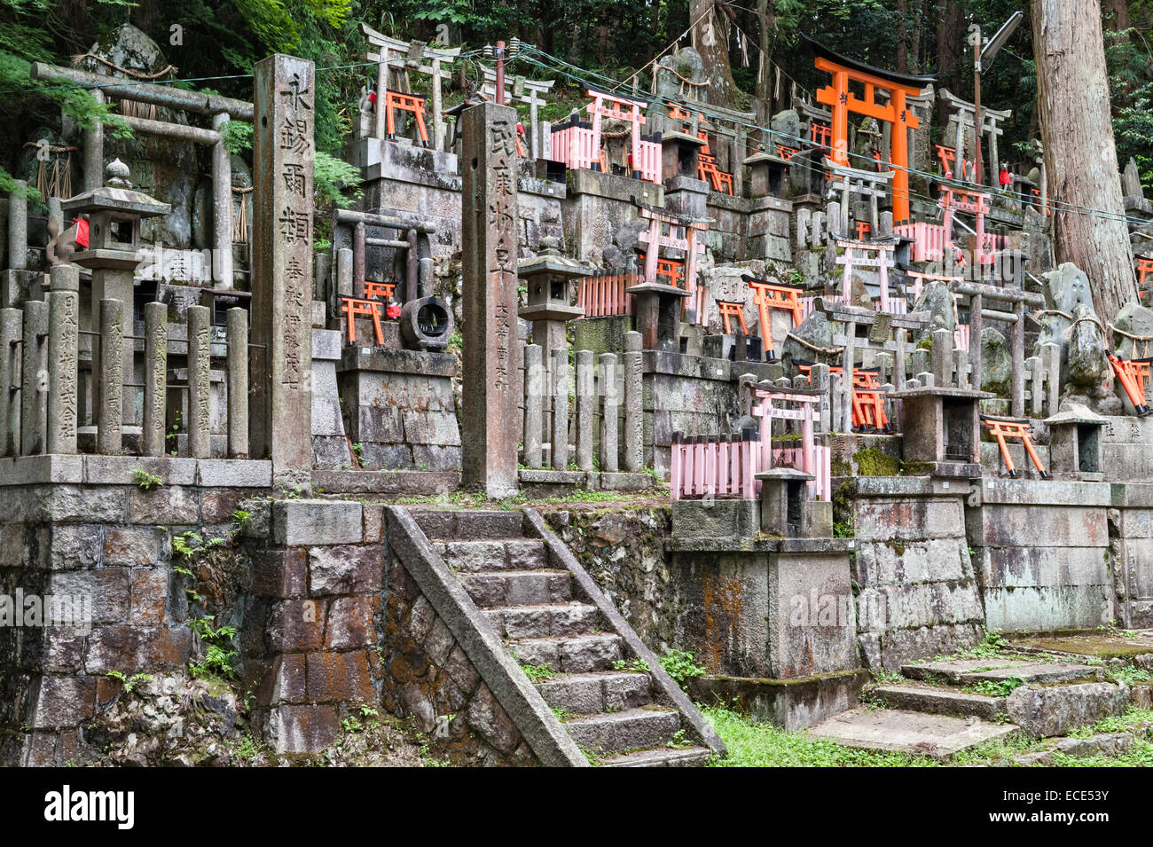
After user testing, we found that this was not the most effective way to lay out our environment. Users were simply disappointed that they could not further explore down the paths, and felt very limited by not being able to walk around and explore. The layout also had a plethora of objects in it to the point that it was a bit too difficult to see what had changed or not. There were too many gravestones, too many Tori gates (the red gates), too many statues, candles, lanterns, plants, fences etc. It was just too overwhelming in this design.


After the user testing, we found that a layout that was more conductive to our idea was to create a closed-off circular layout. In this, there is simply one path for the user to look to, as they are standing in a dead-end. This small area had a limit on how many items we could place around and change, thus accomplishing our goal of not overwhelming the user with the details.


Interaction
Finally finished with our new environment design, we began to focus on the interaction of the project. The original plan was for the user to simply look around and observe their environment before anything changed, and then point and click to select the objects that changed. In order to facilitate animations, we made the user light a candle once they were done selecting their 3 objects that changed. It also allowed for the user to look directly at the foxes after their selection, as the foxes next actions were indicative of whether or not the correct selections had been made.
When they need to select the 3 objects that changed within the environment, once the pointer on the screen lands on it, the object will change color. This was a way to make object selection intuitive for the user, as there were many objects. We also saw it as a way to facilitate the actual selection of the objects, as clicking between 5 objects made it easier than choosing between all of the objects within the environment. We also decided to make one of the objects very obvious (a gray stone fence becoming a bright red) in order to help the user decipher which fox was helping them. Both foxes had riddles appear above them, which hint at which objects changed. But only one of the riddles is completely correct, as one of the foxes is trying to trick the user to select the wrong objects and stay in this alternate world.
If the user selects the apporporiate 3 items, they are then transported back to the normal human world, with the good fox still standing in the path. The words “Welcome Back” great the user.
If the user selects the wrong items, then the evil fox lunges at the user and the screen goes black. This is meant to represent the evil fox finally possessing the user, and the fact that at this point, there is no longer an escape from the surreal reality.


Reflection
Overall, I am very happy with how the project turned out. With some minor tweaking, we should be able to still make it for Google Cardboard. (We really want to show our friends!) While we had some minor issues with the selection color and text not displaying properly/at the right times, we were able to create the detailed, and beautiful environment and interaction that we wanted. Mari and I felt from the very beginning that the scope of our project was realistic, and we accomplished our beginning goals within the project.
Additional photos:


