Project Description
1.1 – Inspiration and Direction
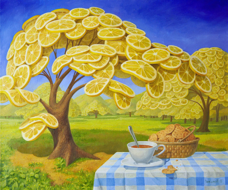
The environment which I tried to create for this assignment was centered around the theme of disproportionate objects. Primarily inspired by the works of the Russian surrealist, Vitaly Urzhumov, I wanted to create a landscape composed of objects that were either bigger or smaller than their average size. Through the abnormal sizes of the objects, I wanted to initially provoke a sense of confusion for the user. However, as seen in Urzhumov’s works, although the sizes are not normal, he makes sure to maintain balance in all other aspects of the work such as the side-objects (the tree in the first work, the man and cloud in the second, the mountains in the third), the lighting, the landscape, etc. He does this to set the emphasis on the few objects that are out of proportion. If he were to make everything disproportionate, there would be no focal point and the world will not be visually appealing to the eye of the viewer. I was inspired by these particular aspects of Urzhumov’s work.


1.2 – Environment and Identity
Environment:
Surreal Landscape consisting of Disproportionate Everyday Objects
Identity:
The identity of the user is a person who stumbles across this landscape. To achieve this, I made sure to avoid making the user the obvious center of the terrain. The user was placed under a shaded area, behind a few trees. The main scene of the space is the portal and skeletons, illuminated with green light. This ensures that the user does not feel like the world was created for them – rather, they have coincidentally stumbled across an already existing scene.
1.3 – Design Goals
For this project, I had a couple of design goals I wanted to achieve:
1. Limited Use of Color:
I wanted to limit the user of color I used for the scene. As the style I was going for was more surrealist – less realism – I also wanted to express this through the choice of colors. I was inspired by an ios game which I played a couple of years back, called Monument Valley. I wanted to adapt the same approach where there are only two to three colors – very bright but pastel. Limiting the colors leads to a more creative adaptation of the different range of tints and tones of the color. I also wanted the main directional light to be an unconventional color which dominates the scene and walls of the objects.
2. Light / Shadow:
Inspired by the talk on the development of Kentucky Route Zero, I learnt how light and shadow can provide various functions. Particularly, their ability to create a focal point without the user of sound or words, seemed to be such a subtle way to naturally bring attention of the user and communicate what objects were of higher significance, and vice versa. I wanted to make use of this functionality in my project.
3. Depth:
Looking at various indie games during the brainstorming stage, I learnt that depth – created through layering of objects, fog, lighting – was an essential feature of making a space seem believable. I wanted to make sure to implement depth in my landscape so the user could not sense where the end of the terrain was.
4. Objects Proportion:
Inspired by Urzhumov’s works, I wanted to make sure to magnify some objects, while keeping the other objects in normal proportion to reinforce the effect and not overwhelm the user.
5. Consistency in Object Style
To make a scene appear consistent and believable, I thought it was very important to keep the styles of the objects consistent as well. As I needed to use many objects, I decided to stick with low-poly resource packs to increase my options.
Process and Implementation
2.1 – First Build
For the first build, although the Howl’s Moving Castle idea was scrapped, I still wanted to incorporate the aspect of two main spaces – internal (where the player will be located in) and an external space. Although surrounded by a foreign and surreal environment, I want to recreate a sense of coziness through enclosing the user within an internal space. Having these ideas in mind, I started working on my unity file. I decided to go with a cold shade of pink (#CC00FF) and ultramarine (#3300FF). These colors were chosen through playing around with the color options of the directional light on unity.
As seen in the previous surrealist art pieces, I took prefabs of ordinary objects – those small enough to be held with a person’s hand – and blew them out of proportion. I placed these objects within the terrain, through burying their roots, giving a sense of an abandoned landscape. Although I increased the size of most objects, I made the sizes of the trees and hills realistic to emphasize and highlight the absurd proportions of the other objects.
To construct an internal space, I used the fence prefab object and surrounded the 360 camera with it, giving an illusion of being protected. I also placed grave stones and skeletons right outside the parameters of the fence to give the fence significance and to provide a sense of fear towards the outer environment.
2.2 – First Build Limitations
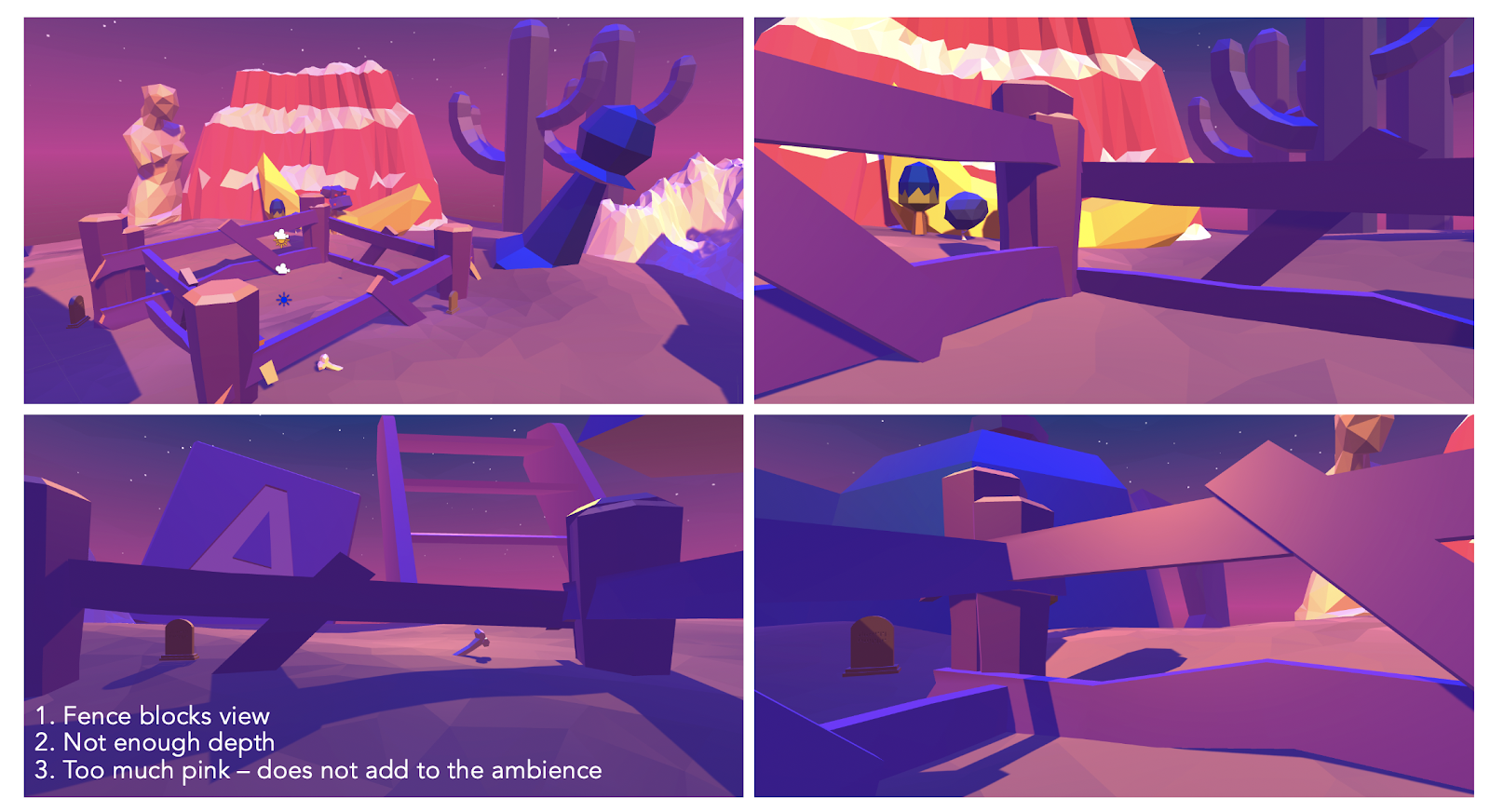
Some primary limitations of build 1 that were taken into consideration when constructing build 2:
- Fence: The size of the fence was very big to make the user seem smaller. However, it blocked a significant portion of the background. The effect was not worth the blocking and creation of internal space.
- Not Enough Depth: Due to the lack of objects in the background and fog, it is very obvious where the terrain ends.
- Too much pink: Although pink was pleasing to see aesthetically, it seemed like it did not serve any purpose other than the visual appeal. I wanted to maximize the potential of using colors for emotional effect as well.
2.3 – Second Build
Changes that have been made since build 1. These are the main changes:
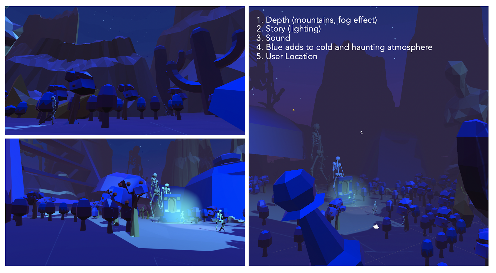
- Depth (mountains, fog effect):
One limitation from the first build was the lack of depth. Due to this, it was very obvious that objects only existed within the parameters surrounding the user. To solve this issue, I added a fog effect, to make the background blend in a more subtle manner. I also layered more objects and filled with empty spaces with objects to remove the filling of emptiness. The overall size of the terrain was also increased to provide more space for objects in the background.
2. Story (lighting)
One aspect lacking was a story. I had a clear image of the world, but no clear narrative for the user and their identity. An idea of the story came to me during the development process. I got feedback that the bones mentioned in the previous build were not easily identifiable as bones.
Hence, I downloaded a resource pack of a skeleton to replace the bone. While playing with the skeleton, I was also trying to make an escape portal from this alternate world. Combining these two aspects, instead of an escape portal for the user, I decided to give the portal a function – one where if objects go through it, it magnifies (giving more narrative and reason behind the disproportionate world).
3. User Location
Initially, the player was located in the middle of the terrain – again, this made it seem like the world was built for the user which I did not like. Instead of the user, I placed the portal and the skeletons in the middle of the terrain, darkened the overall lighting of the scene, and placed a luminous green light around the scene to bring attention to it and indicate that this was the focal point.
The user was relocated to the side, under the shadows and behind some trees, to make it seem like they were hiding under the shadows witnessing a haunting scene. Through this relocation, they no longer became the focal point of the world. Rather, a spectator who stumbled across this world.
4. Sound
I added the sound of an empty room (which actually has a sound) and placed it under the camera rig. I also added portal sound effects and placed it on the portal to add to the atmosphere.
5. Blue adds to cold and haunting atmosphere
The previous build was very pink. I liked the visuals of it, and enjoyed playing around with different tones and tints of pink, but it did not really add to the atmosphere I was intended to create. Hence, I changed the color to a colder one – blue, to give it a haunting atmosphere. This suited the new narrative more.
There are many more little changes made since the previous builds but the ones above are the most significant.
Reflection and Evaluation
Do you feel the implementation reflects the identity you intended? In what way?
The most important aspect of the work, which was making the objects disproportionate, was followed and achieved, it seems like that aspect of the identity was clearly reflected in the world I created. Also, the change which I have made in between the two builds – particularly the color change from pink to a colder blue – seemed to aid in achieving the effect of being lost in an unknown world. Changing the user location from center to the side, under the shade, seemed to have contributed significantly in achieving this identity and effect. Hence, I think many of the changes made for build 2 were essential in creating a more accurate depiction of the identity I intended.
How did the end result compare to what you envisioned?
The main components – such as the magnified everyday objects – seemed to align with my original vision. But, the implementation of a storyline – the skeletons and the portal – were ideas which came during the development process through playing around with the prefabs. After the implementation however, it seems like that became almost the focal point and a very significant part of the scene which provides context and a potential reason for the way the world is. This seems to increase the user presence in the scene.
How would you evaluate the medium for being able to render this kind of environment?
Working on this project made me realize the lack of limitations in using VR as a medium of implementing my vision. As it gives the developer to customize a 360 view of a scene, it is very similar to the way in which we view the real world. The act of looking around alone is a significant part of what makes VR an immersive and powerful tool for creating a place. Due to the 3 dimensional nature of the space, compared to 2D space, it seemed to have many more possibilities. Especially since my project dealt with size, more specifically the alteration of it, the extra z-axis contributed significantly in providing a larger surface to place and move around objects. The specific incorporation of sound into objects was another key component to increasing presence to the scene. Even in a very quiet room, there is always sound at low frequency. It is rare to come across a completely noiseless scene. For my scene, I incorporated the sound of an empty room, and a portal sound to add to the atmosphere. Even with the lack of movement and interaction, except looking around the 360 degree view, it seemed, there were enough properties – lighting, proportion, colors, depth, etc – to create a presence. Through this project, I learnt that it is not necessarily the complexity that matters as much as perfecting these fundamental properties in constructing a place – something to keep in mind moving forward with future projects. I also realized through the process of having more than one build, the importance of having enough time and flexibility to alter ideas in between builds as these changes in development process are equally important and significant. Many of the changes and additions I made in between builds have become an integral part of the scene – the portal, skeleton, color change, etc. This taught me alot about the nature of the development process and to always give myself more time than planned to work on the project to allow these changes.
Link to Final Build: https://drive.google.com/open?id=1970tL91_xtHvKijMk0bQVuJPqfQTTcDQ