Inspired by my first project of creating a meditative space and the second project of observing users hijacking the intended goals of my project to throw trash as far as they could, I wanted to create a stress relief room that would explore users’ destructive tendencies in VR and also challenge myself to depart from the normally slow, poetic experiences I design. I had seen several videos of “Rage Rooms” where the players just started smashing plates and breaking computers. All for the price of $45/hour (or along those lines). The existence of such rooms seemed terribly wasteful and also inaccessible to the everyday person who could not afford to shell out so much money in the name of self-care. I also knew that I wanted to create a project that had a compelling need to be done using the medium of VR. Thus, I began thinking of interactions I could create in this room. I began with smashing plates, hitting a punching bag, and burning things in a fire.To create a sense of story, I thought of dividing one wall into three partitions-one for each interaction. As each interaction was done, one part of that single wall would fall onto the ground, revealing an open forest sky. The room itself was going to be a typical living room with a couch and TV and a shelf of china plates. I decided though that I wanted to have a more peaceful environment to promote stress relief, but I also didn’t want it to be soothing because I wanted players to feel motivated to break things apart. Thus, I was inspired by Japanese training dojos, I created an environment in the same spirit…meditative but still conducive to action-oriented interactions.
The interaction of smashing plates turned out to be very satisfying. Once I fixed performance issues of instantiating so many objects at once, I made the plates the focal piece of my experience by placing them in the center of the room near the player. I placed them on wooden tables to match with the ambience of the room, but if I’m being honest, I would have liked to design my own tables had I more time as I was pretty dissatisfied with the aesthetic of the tables in the asset store.
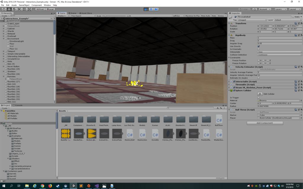
I had a fire in the middle of the room and when one threw a notebook in the fire, the notebook would dissolve. This was pretty dissatisfying and the fire looked weird, so I scrapped this almost immediately. An interaction that I felt sad destroying was the ball throwing. I really liked how if the player threw the ball in the box, a white line appeared, marking the site of a successful throw. I thought players would be excited to get the ball in from further away, but in comparison to the plate smashing, less satisfaction was derived from the ball interaction. Furthermore, the ball was just annoying to get inside the box and its bounciness differed too much from the rhythm of the plate smashing, so I had to scrap it, though I felt a bit sad doing so.

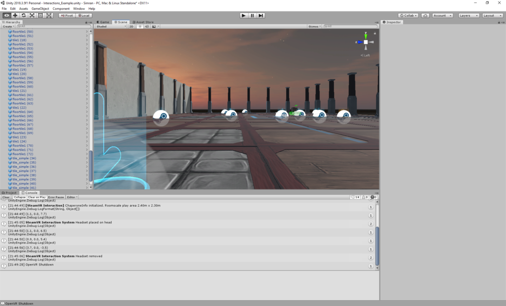
I began with a sunset skybox that was slightly dark with stars in the sky. I intended it to be spiritual, but playtesting revealed that it was really just spooky. I loved the aesthetic of it, but did believe I needed to have a more relieving feeling outside the room. I ended up creating an open sky so that there would be a more openness juxtaposed with the constraints of the room.

I found a cool hatchet in the asset store, so I decided to incorporate it into the experience. I thought it would be fun for the player to smash printers with it and break the printer into pieces. However, the breaking of the printers was into awkward clumps that I couldn’t seem to adjust no matter what in Blender. Thus, I decided to just destroy the printers and have an explosion, which I hoped would create a satisfying feeling.
Having a hatchet though added a specific affordance to the piece. In having access to a hatchet, the player would expect to be able to smash more things beyond the printer. Thus, I added the ability to destroy the walls…instead of having a partition for each interaction, I just split the walls evenly separated by columns. I tried to change the texture to crack the wall everytime it was hit with the ax to give it a stronger depth of experience and make the user feel more powerful, but it looked quite horrible as the crack was not at the site of collision. Thus, the wall was destroyed with each hit.
With the destroying of the walls, the sky looked quite open and I wanted to add something that contrasted with the interior of the room. Something that felt playful and nostalgic. I began with bubbles, but they felt too light. Clouds looked too bad. Then, I settled on balloons and ended up having bubbles blow out each time the balloon was popped just because I really like bubbles (I originally had a laser gun). I decided to replace the laser gun which felt too light with a bow and arrow because I remember how powerful I felt using the bow and arrow in the VR Maze experience during our class trip.
However, having balloons when the walls were opened up really contrasted with the remaining floor in the room and I also wanted to convey a sense of resolution to the player. I ended up switching the floor to white and removing the roof, creating a colorful marquis at the end and adding bright white particles that danced to the floor and changing the music. The combination of all this with the balloons conveyed a sense of nostalgic playfulness and magic.
I tried to make the logic of the space clear through the placement of objects. I tried to make the plates the first things the player saw so that they used their hands to pick them up and throw them. On the right, the hatchet was placed on a table, but the printers were on the floor so that the player knew not to try to pick them up. The longbows were placed on the ends of the room, one on each side so that the player could use them to pop the balloons.
In terms of music, the main background clip was an instrumental of Do I Wanna Know by Arctic Monkeys because it is quite pumped up and energetic but not overly intrusive. Listening to it makes me feel ready for anything. For the ending song, I chose a specific piano cover of Kygo’s Firestone because the song conveys a sense of happiness with a tinge of melancholia and is light in tone to contrast with the heaviness of the first song. I also tried to provide feedback to the user through sound. The shattering of the plates was accompanied by a glass shattering sound that I think contributed to the satisfaction of that interaction. Hitting the hatchet produced a thud sound. Popping the balloons also had a satisfying popping sound. Smashing the printers also produced an explosion sound, but to be honest, I wish I had used a shorter sound as the one I used was a bit too unnaturally long of an explosion for that specific collision.
Reflecting on the overall experience, I am proud of what I accomplished as a one person team. I really wanted to challenge myself to become more comfortable with Unity script, so I wanted to create interactions that didn’t necessarily rely on the SteamVR interactions (though I love the Throwable script. Makes life so much easier). I had a lot more scripting than my last project and feel quite comfortable now. I also really enjoyed hearing the positive user feedback at the showcase-no one noticed the bugs surprisingly. It was nice to hear a couple of people expressing how it was a stress relieving experience despite me not mentioning my objectives to them. Overall, I have a tendency to go off on tangents, which is great when trying new things creatively that improve your project or take it in a new direction, but it’s not so great when you divert too much off course that you end up breaking something. I broke my project so much I don’t know which branch is the real one. I also realized that because I don’t necessarily have clear objectives of what I want to accomplish, but rather just see what happens through the process, there’s never a finished state…there’s always more you can do.
There is definitely a lot of room for improvement. For one, I’d fix the buggy walls: the walls that just would not register a collision and break. I’d polish the design of the interior in terms of the objects in the room. I’d make the explosions smaller and closer to the site of collision. I’d improve the aesthetic of the instructions. I’d add the restart button. I’d fix the particles so they only started coming down during the ending.