Project Description
Windows Xperience is a project that lets the users to have a immersive experience in an environment that we are all aware of — Windows XP background. The aim of the project was to build an experience that opens up to new scenes, in order to make the game more complex and deep. The experience was set in three different scenes. Diverse scene experience lets the users to explore different scenes. The experience is made for the users to imagine what it would be like to be absorbed into a computer, in this case specifically into windows XP. When the user gets absorbed into the computer the user gets to play around with three different icons that are very distinct. There are Chrome, Paint, and Document Folder icons. Users can interact with two of these icons — Chrome and Document Folder. When following the instructions, the user can pick up and throw the Document Folder, which brings out objects that resemble assignments. Once the user finds the right assignment he/she can put it inside Chrome icon. Once the assignment is dropped inside Chrome icon, the user is placed in another scene. In this scene user has to fight the Chrome dinosaur using a cactus. Once the user has successfully defeated the dinosaur a mail box appears, and the assignment can be dropped in the mail box.
This project idea came from the routine of every university student. Once done with our assignments, we send it in through email, and sometimes we have obstacles such as not having wifi connection. We wanted to gamify this whole process and think about how the experience would be different inside the computer.
Process and Implementation
The process started with ideation. When we met as a group we both had in mind that we wanted to play around with different scene, and wanted the game to be relatable to the players. While we were brainstorming, we thought of an image that is so closely related to computers.

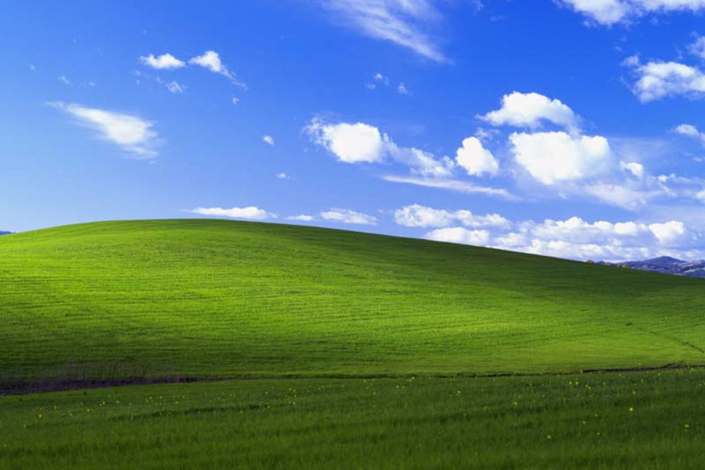
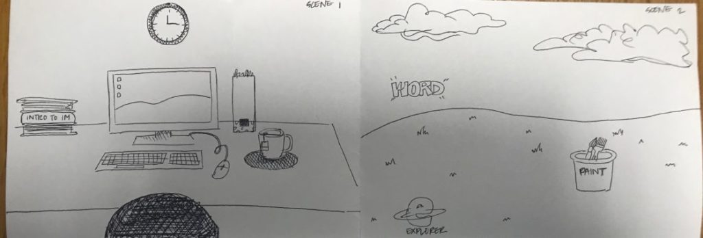
The image above is called bliss. Growing up a lot of us saw this desktop background. Surprisingly this image is a picture of a real existing field. So we thought, “What would it be like to build this beautiful field and blue sky?” Then we planned out the game. We wanted to have a initial scene that leads up to the desktop background scene. Below is our first sketch of our idea.

After creating this sketch we divided our tasks into two parts — environment and asset building, and interaction. My first approach to the project was starting off with building a room. After we got the interaction of being absorbed into a different scene figured out, I started building a room. The room consisted of several different objects. I wanted to make sure it looked like it was a room where someone was working on their desk. After placing objects like a desk, a chair, books and etc. the room resembled a students room. Below is an image of the room scene.
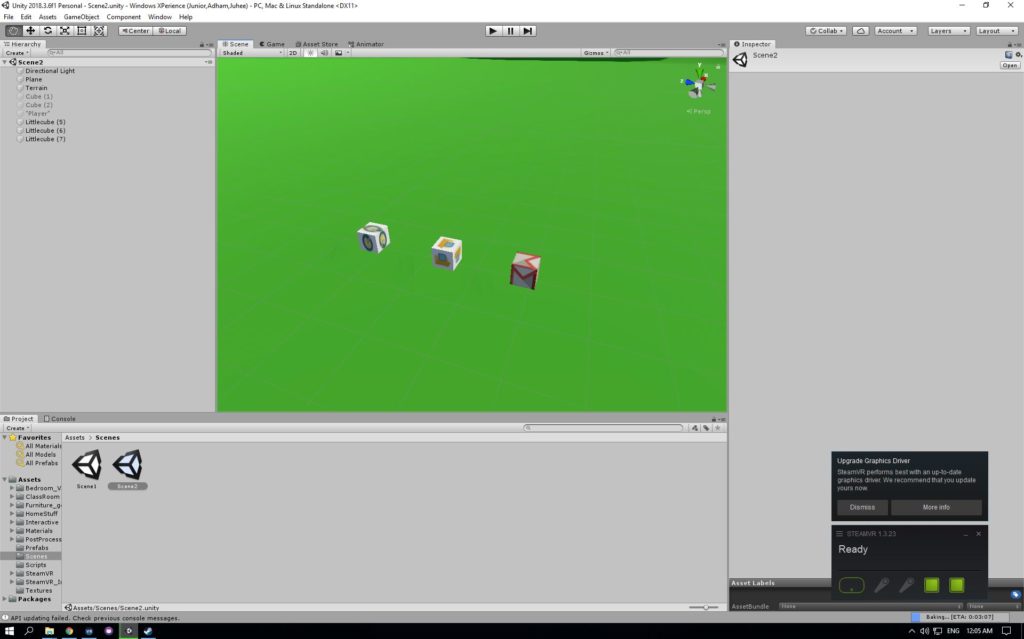
Next I started building the field. The field was the main scene, but was the easiest scene to build. I have used the terrain tool to raise the hills. Also found a sky box that is most similar to the image. The assets were created into a cube box with the logos on them.

The last scene was a box that contains the dinosaur, cactus, and a mailbox. The cactus and the mailbox was part of the asset packages that we have downloaded. The Chrome dinosaur on the other hand was built using cubes. Based on the pixel two dimensional image of chrome dinosaur, I have created a three dimensional one using cubes. Below is the image of the dinosaur
Reflection / Evaluation
After several user testings we were pretty happy with the result. However, there were several things that could be improved. For the storyline, in the future, we could expand the story by using different icons. For example, one of the suggestion was that we could make use of the Paint icon and let the user choose the color of the dinosaur they would fight in chrome. This is one example of how it could be improved, and I believe there would be several different ways to add more scenarios to the story.
For the scene building, the room scene scaling was off. If we had more time, it would make the experience more realistic if the scales were better done. Even during play testing, few of my friends mentioned how the chair seemed too big. Moreover, for the icons in the Windows XP scene, I want to to create 3D assets of these icons, making them look more realistic, and let the users to feel like they are actually inside the computer. Lastly, I would like to add more small plants into the scene to make the field look more natural.
For the sound, we had an issue of having a dinosaur sound in the beginning of the game. Because of lack of time, we didn’t get to figure out what exactly was the issue, but later I would like to add different sounds into different interactions to make the experience even more immersive.
This project was a huge learning experience, from ideation to implementation, and we are hoping that we would be able to improve this game in the future.