1.Project Description: describe the space you created and the modes of interaction.
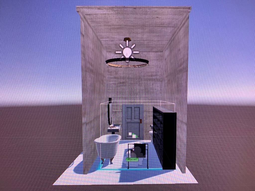
Junior, Claire, and I decided to create a realistic bathroom space in which the user could walk around in. We did have limited space as we used the front part of our classroom, but in a sense, the space limitation worked to our advantage. A regular bathroom is not that big, and so recreating the bathroom space within the limited space replicated the real life situation. While there is a bathtub in the corner, it is relatively the normal size, neither too small nor too big. We also decided to put a tower rack and some towels to show that it is a bathroom that is being used frequently, and not a sample bathroom in a showcase. The big shelf was added to place one of the glasses that would be used for the interaction. And of course, the toilet is placed in the corner to emphasize the fact that the user is in a bathroom. There is also the wide sink with the mirror on top of it which we intentionally chose to match the overall atmosphere of the bathroom.
Overview of the Scene
We used the grab and select tool using the Vive controller’s trigger button as the mode of interaction. By hovering the controllers over the glasses, the user can click on it using the controller’s trigger, which allows them to “take a look” through that specific glass. This means, when the user choses a glass that has the function to make everything look red, the user will see everything in red after selecting those glasses. Another interaction would be walking in the virtual bathroom setting. By calibrating the Vive headset, the user can walk freely inside the bathroom, and look closely at the various objects.
2. Process and Implementation: discuss how you built the scene within the development environment and design choices your group made What did the brainstorming process involve? How did you go about defining what would be everyday in this world? What were the steps to implementing the interaction? Share images or sketches of visual inspiration or reference, including the storyboard/layout.
As for the brainstorming process, Junior, Claire, and I met and discussed what kinds of daily life situations can be replicated in an interesting way. As much as we knew that we had to replicate some kind of daily life situation, we wanted to use the full potential of virtual reality. We talked about how “sight” is an essential part of life and that having bad eyesight can sometimes be a barrier when wanting to examine everything carefully. We thought that experimenting with “sight” would be our main theme. We then discussed how the user can be given a task to find and try on the different glasses in a space. That way, the user can interact with the objects in the space (glasses) and go through the different experiences. We also discussed where we wanted the setting to be. The different ideas were the living room (common room) of a share house, the user’s own room, and the bathroom. We thought that the common bathroom would be the most realistic since people can leave their glasses behind in the common bathroom and forget and have to come back to find their glasses.
We used various assets from Unity’s asset store and created the bathroom setting. While there are a variety of assets in the Unity’s asset store, the ones that looked the most sophisticated and appealing were not free. Therefore, we had to scavenge through the free assets in order to create the bathroom. We gathered different assets packages and played around by placing the objects that were related to the bathroom. For example, we tried different iterations of the sink to see what actually fit the space, mood and interior design. The first sink that we originally put seemed to be too bland, and after some experimentation, we decided to settle down with the current sink.
3. Reflection/Evaluation: This should discuss your expectations and goals in the context of the what you felt was achieved with the finished piece.
Originally, we wanted to add more components to the current piece. However, none of us had experience with using Unity before this class and so there were many components that we had to learn. Our expectation was that we would have each glasses have its own filter, and we would place different scripts on each of the glasses to possess different effects. Our original idea was to have one glasses to zoom in, another one to zoom out, another one to have double-layer vision, and the real one that would give the corrected vision. However, figuring out how to create all of these different kinds of vision took so much of our time, that we needed to come up with a plan B in case we could not debug the scripts that we had written.
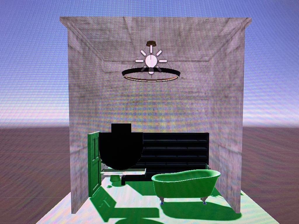
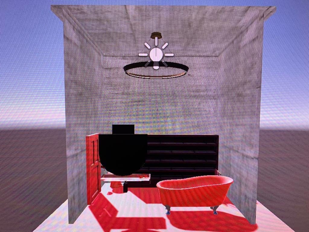
In the end, we settled with the idea of having each glasses possess the power of switching scenes. We switched our main theme to “experiencing the colors” and so we decided to blur the vision a little and have the user focus more on the color change. When one glasses was selected, the user will “put on” those glasses, and see the objects in red. Then, if the user “put on” another glasses, the user will see the objects in green.
Red Scene
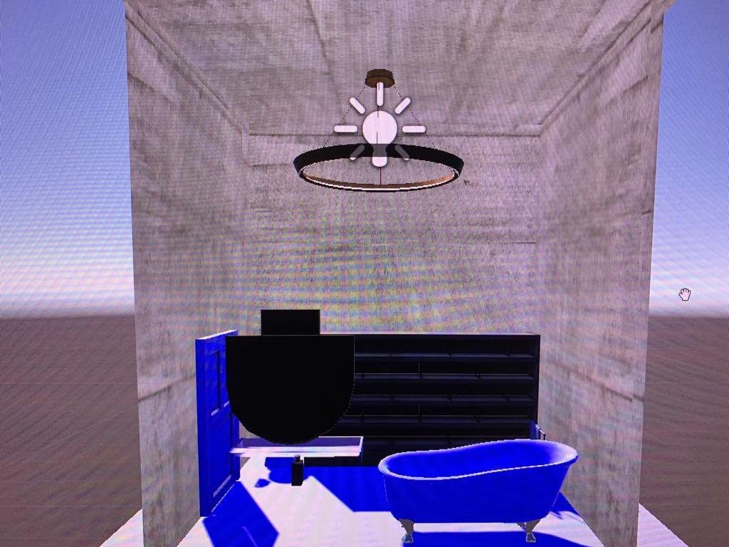
Blue Scene

Green Scene
We were able to achieve the basic of what we wanted to achieve, in the sense that we wanted to provide the user of being in a bathroom setting, trying on the different glasses, and allowing the user to experience the different vision with the different glasses. Although the different visions were a little different from the original idea, the way we dealt with trying to recreate the effect in a different manner was a result of our good teamwork.
I would say that the most difficult task in this project was selecting the glasses and placing the script in the object that would jump to different scenes. Because we had the idea of each glasses having its own filter, we needed to create different iterations of the same setting in order to augment that effect. Moreover, our group only had three (two) members, and so we struggled in regards to knowledge and implementation compared to other groups who had four members.


