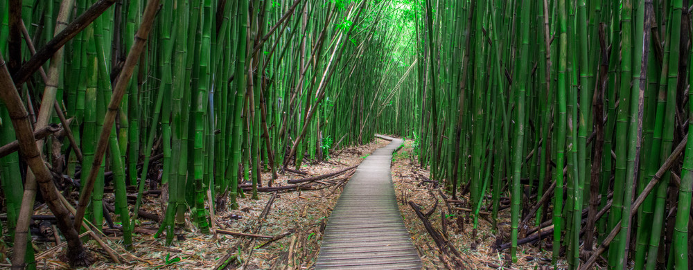
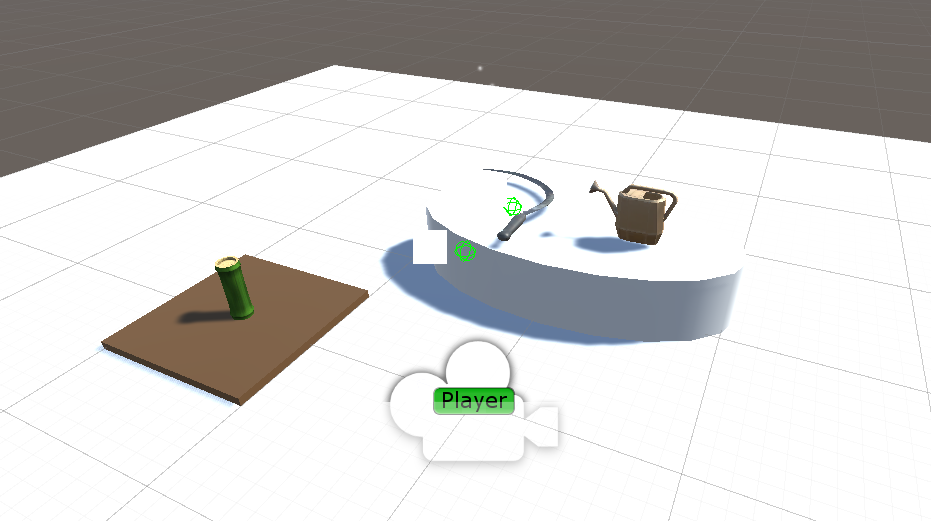
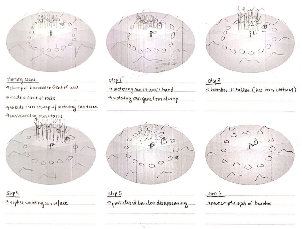
Zenboo was based on the concept of a Zen environment with a simple yet endlessly executable action in place. Originally, the plan was to have flowers that could be endlessly grown but then the idea of bamboo came up. Since, in reality, bamboo grows incredibly quickly and is aesthetically attractive, we decided on this vegetation instead (fig.1). A positive addition was that bamboo inherently already had some connection to the idea of Zen. We wanted to place the user in a comforting environment that presented them clearly with a task which they could continuously do in order to relax for the daily stresses of everyday life. All the artistic choices behind the environment were directed towards this comforting attitude. The interaction were also kept simple and obvious. The interactions involved the picking up of the two objects and the using of the two objects. A watering can could be picked up and used to pour water on the bamboo, which would make it grow, and the sickle could be used to chop the grown bamboo, and make it disappear (fig.2).
Knowing that there was a lot to be done, we split the tasks evenly into two groups: scripting and designing. One individual was responsible for the designing of the environment, another in charge of the music and sound effects, and two responsible for making all the desired actions feasible. I was responsible for scripting actions and did most of my testing in a separate scene than where the environment was being designed. Since the actions had to be explainable without any description, we made sure to use everyday objects and code for recognizable physics behind them. This meant that the watering can could be lifted up and that water would only appear when poured at a certain degree, or that bamboo would grow upwards when water interacted with it. The testing area was modeled around what the final scene would encompass for the user. The tools were placed near to the spawn point of the user and could be used on the bamboo that was close by (fig.3-4).
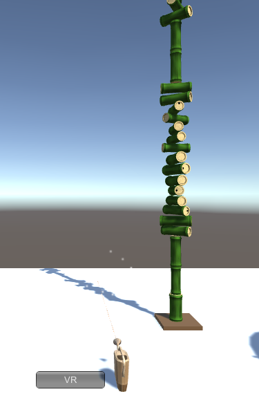
The behaviors of the objects were expected because they were similar to reality and this made them seem like everyday actions. This meant that tools could be lifted, thrown, dropped, and act the correct way when coming into contact with other objects or when being poured. The only area where an unexpected result appears is when bamboo grows (fig.5). It was discovered, during testing, that bamboo balancing on itself was a lot more attractive and brought more comfort to the user, similar to stacking stones (fig.6), so it replaced the regular straight growth of bamboo shoots. Having the segments of bamboo fall to the ground after they reached a certain height was also a feature of this balancing. This brought new possibilities to a used behavior and also prevented clutter by having the segments disappear after a moment. After all the objects were designed and equipped with their respective behaviors, they were made into prefabs and placed in the final scene, in similar coordinates (see Cassie’s blog). The environment was designed to have warm sunset lighting, comforting wind, grass, and hills in order to bring ease to user. A small oddity observed was the floating rocks, though these objects are not following our reality’s physics they look incredibly mesmerizing and thus were maintained in the environment. Generally, having a few quirks that brought personality to the area, was expected to give the user more reason to desire realizing in this world.
Our expected world was a place a used could freely spend their time in with the goal of alleviating stress. This was achieved because the user had a simple task that could be endlessly continued and a surrounding that promoted comfort. With more experience and time, the world could eventually be expanded. There could be more tasks for the user to indulge in and more scenery that was intriguing to look at and enjoy. Expanding is always a possibility to entertain the user but keeping them in a roughly enclosed area was a solution too. Keeping them enclosed and with only a few tasks to focus on lets them possibly enter a form of meditation, which is by far the best stress relieving method. Better designing of the current scene could have involved the matching of asset styles and consideration for certain behaviors. Making the bamboo that falls intractable by hand and making it so that tools were always held in the correct method would have been logical. Making a better match of the tools’ material with the design style of the environment would have been more attractive. After showing the project in class I also noticed that some of the music could have been worked on to be less hostile and the water system needed some tweaking. Simply, there were a few factors that made the objects in the project seem unworldly and made it harder for the player to immerse themselves.
Though there were several factors that could be worked on there was also a sure sign that the project was a success. This is evident in three behaviors, players would want to place the controller on the stump after they were done, players tried to move out of the way of falling bamboo, and players continued to water the bamboo endlessly without tire. This shows that players were about to connect their reality with the world we created to such an extent that they the lines between the two existences became blurred.


