I chose to watch a 360 video featuring dinosaurs in a jungle in hopes of experiencing what it would be like to be in Jurassic Park.
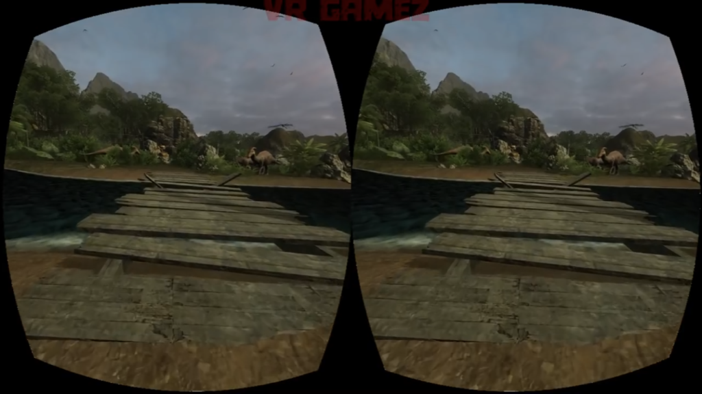
One thing I noticed about the composition of the environment is the use of positive and negative space. I think it’s important that the view is not saturated with so many assets that the player/viewer does not know how to go about that place. There needs to be as much empty space for them to figure out how to navigate through the environment. But on this note, I think the design needs to be clear so that the player/viewer can regonize navigation points like roads. In other words, it should be obvious that there’s a road ahead so the player/viewer knows that they have to go forward (see picture #1).
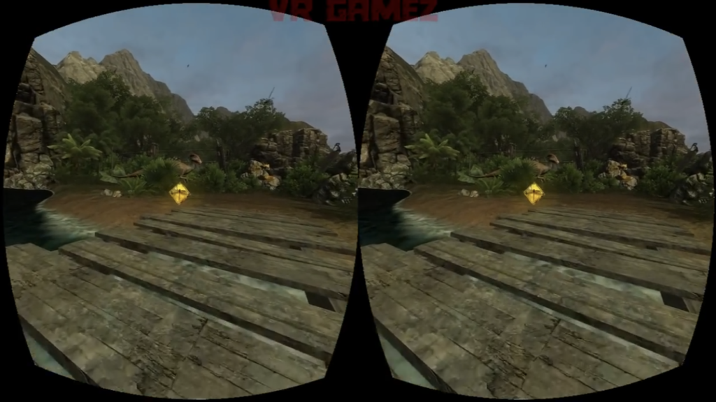
Some of these “navigation points” are clear in the game’s use of coins that are placed on the road before them. The coins appear out of nowhere, bright and glowing, prompting the player to approach it (see picture #2). When you go close enough, it disappears, suggesting that you’ve successfully acquired it.
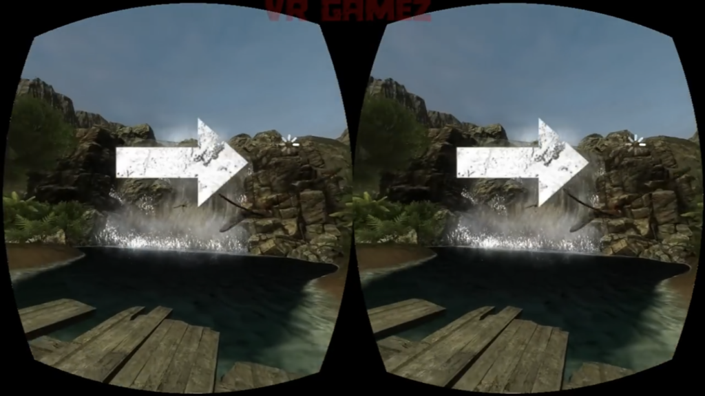
This specific game seems to also use arrows to direct the player (see picture #3). When the player is lost and looks around, arrows appear on the screen to guide the player. These are all different ways a VR environment tries to communicate information to the player.