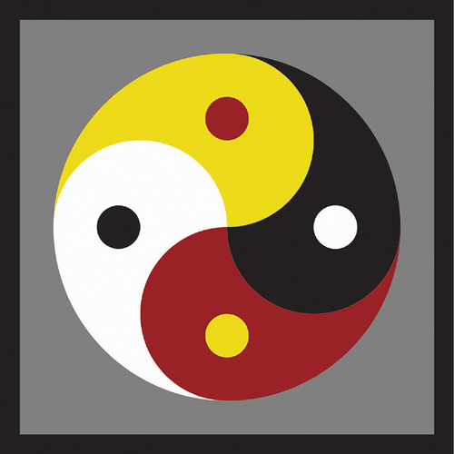
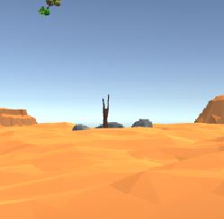
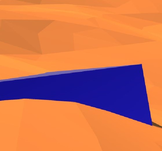
The location that I place the user in is a desert surrounded horizontally with objects representing a dry world but juxtaposed with objects, found in the sky, that complement the dehydrated environment. The identity used as a basis for the project was complementary, an adjective that explains how two parts can come together to “mutually supply each other’s lack.” The desert is composed of dunes, mountains, rocks, and logs, all familiar objects that one would expect to find in a desert. The sky on the other hand, is filled with floating spheres covered with vegetation and trees as well as floating blue cubes, representing the water that is supporting the mixed environment. Not only do the orange-red colors of the desert complement well with the blue-green colors in the sky, but the dehydrated world also complements with the hydrated world. The four core elements are all well presented as well. The earth and fire in the desert and the wind and water in the sky. In our reality, there is some impossibility in having organic spheres and cubes floating above a lifeless environment. This alternate reality on the other hand, has other laws governing physics; this permits a natural yin yang of elements to form.

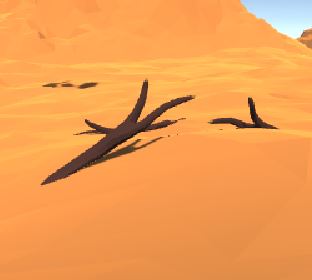
Most of the prefabs I found were originally from a free asset pack. The terrain was skillfully pieced together with scaled desert tiles in order to give the user a perceived view of infinite dunes. Making sure that the user couldn’t see the edge of the tiles gave a more realistic feeling since deserts usually are quite large. In one corner a mountain range was set up with differently scaled mountains to give the perception of depth. Other rock monuments were also placed around the user to further reinforce the feeling of depth in a large desert. Finally, a collection of stones and logs were placed all around in different formats to gives the environment a bit more meaning. Before adding in the complementary objects in the sky, the desert looked essentially like one humans would be used to.
The feeling of being in an alternative world really started with the placement of floating objects. Everything originally looked “normal” but once the user started looking around and seeing things in the sky that were not the sun, then their perception changed. The objects in the sky were also populated by prefabs that were specifically rotated and scaled in such a way to give the user a new experience. Some of the floating spheres and cubes were placed far away and others nearby, once again to promote depth, but they were also designed to all be unique in order avoid pattern recognition. A few were also designed to have huge trees on small spheres in order to further inhibit the user’s original basis of logic. By altering the user’s perception of physics, this world that combined four elements in a harmonizing manner could come to exist. This coordination would not normally be found in our reality so it was necessary to convince the user that they were in a different reality.
In order to force the user to think a bit more, since that usually helps a player connect better with a new world, some small details were hidden in the environment. Some of the collection of logs and stones were gathered in a formation that promoted purpose, perhaps urging the user to develop a story. This is evident in the stones encircling a log, maybe supporting the hypothesis that some creatures lived here and camped, or a group of dead logs packed together next to a shadow, as if they fell from somewhere. These details asked the user to perhaps look into the sky and seek out the source of the logs or seek out the unknown creatures. After looking into the sky, maybe the user would even discover that there were only 5 water cubes in the sky but 6 floating spheres. The last cube was at the foot of the user, buried in the sand, perhaps for some unknown reason. My final goal was for the colors and objects on the ground and in the sky to complement each other in such a way that was usually impossible in our reality, all the while also giving the user a story to explore and formulate hypotheses about.
I believe I did develop a story and an environment that came together smoothly. Using prefabs from an asset package naturally limited my possibilities but I feel that I achieved with what tools I had. Naturally, there is always room for improvement, especially in a 3D world. Using low-poly objects made it easy to pay less attention to details. Ideally the objects used would have been a bit more realistic. This would have been more effective because there would have been more room for storytelling and connecting with the user’s experience. This would have required a much greater time commitment which was not available for this project. This would have been time consuming because the spheres would have to be carefully populated with even more well picked vegetation and the entire desert environment would have to be designed to better give the sense of sand and depth. Better representation of fire and wind would also be done by implementing wind drafts and scorch marks in the sand. I expected there to be more presence in this world but after designing it I understand where the fault is. There is no movement in the environment, giving the user the feeling that they are stuck in place. This could have possibly been achieved by rotating the sphere and cubes and implementing some sort of sandstorm. In general, the desired effect of this world on the user was achieved but not nearly to the extent that was originally anticipated.


