Inspiration:
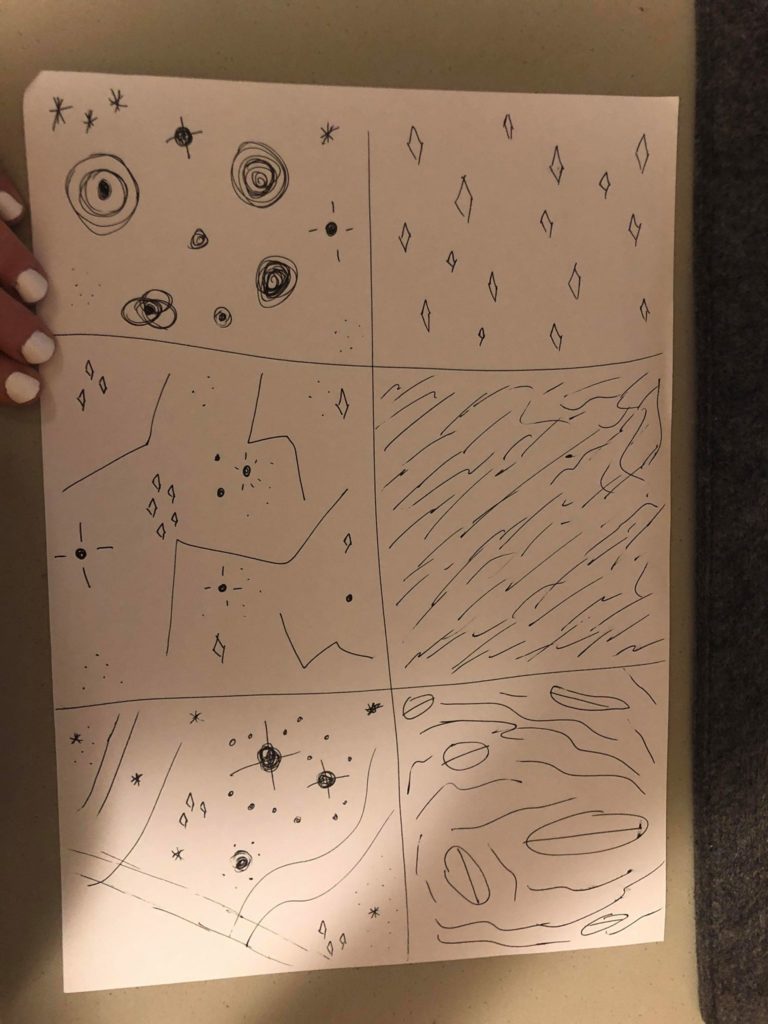
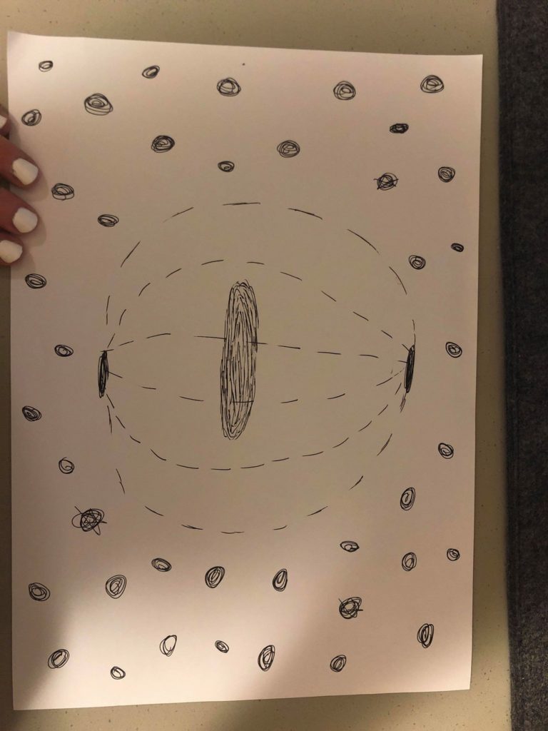
So for my project I want to do a very peaceful and calm space that is also pretty in an unusual way. My goal is to do a view of someone standing on a glowing disc in the middle of space, surrounded by stars and ‘space dust’. This would allow me to lean in to the idea of stylized stars to accommodate for my lack of experience with Unity. I also think experimenting with color paletes and different background music could give the space a lot of character. I found two TV shows to look at for inspiration. One is called Final Space, and I love it because Fred Armisen (<3) is one of the voice actors. And they have an alien space cat named Avocato, which I love animal puns so I’m obviously in love with this show’s cuteness. It’s about a prisoner in a spaceship who joins forces with a motley crew to save the universe from a weird evil green bean thing played by David Tennant weirdly enough. The other is one that my cousins love called Steven Universe. It’s about a group of rainbow aliens adventures in space and on Earth. I think the idea of looking out over space and ‘feeling small’ has been pretty socially engrained by tv and movies at this point in time. And because very few people have ever actually been to space, this setting will give me more creative control and allow for an acceptance of more imaginative design choices. It’s also such a weird scaling effect so I’m able to make very simple shapes for stars as an artistic choice versus as a limitation. I like the smudgy-halo effect that was in the Steven Universe stars and my main goal is to try and figure out how to incorporate that into Unity. I also love the big shots of Final Space, so I want to be able to make the user feel small in comparison.
Here are some sketches of what I would like my ‘space’ to look like. Get it? Because we did all those readings on spaces and I’m making it look like space???


Limitations: The biggest limitation on this project is that I’ve never used Unity before, so I need to create stars using very simple shapes. I also am using professional animation as my aspiration/inspiration, so I will need to temper my expectations. I would also like to learn how to make it look as if my stars are illuminated, give them halos, something like that. And since that will complicate things, I need to budget more time for a learning curve.
Colors: I would like to use soft pinks and purples, maybe some deep blues, white, a lot of blush colors.
Research: I looked up the art teams for both shows, perused their blogs, watched some interviews, etc.
Steven Universe:
Rebecca Sugar(creator) : official show blog: http://stevencrewniverse.tumblr.com/ Sugar’s Insta: https://www.instagram.com/rebeccasugar/ . Random blog about background art: su-aesthetic.tumblr.com
Jeff Liu(storyboard artist/composer): http://jeffliujeffliu.tumblr.com/
Joe Johnston(storyboard artist/supervising director): http://joethejohnston.tumblr.com/
Colin Howard(storyboard artist): http://colin-howard.tumblr.com/
Aleth Romanillos(storyboard artist, designer): http://aromanillos.tumblr.com/
Danny Hynes(lead designer): http://dannyhynes.tumblr.com/
Elle Michalka(Art Director for 44 episodes): http://ellemichalka.com/
Jasmin Lai(Art Director for 44 episodes): https://twitter.com/_jasminlai
Liz Artinian(Art Director for 28episodes): http://lizartinian.tumblr.com/
Ricky Cometa(Art Director for 18 episodes): http://www.rickycometa.com/
Kevin Dart(Art Director for 12 episodes): http://kevindart.tumblr.com/
Sue Mondt(pilot Art Director): http://suemondtportfolio.tumblr.com/
And looking all these people up, I was surprised at how much overlap there was. Apparently Rebecca Sugar originally worked on Adventure Time and brought people from that show to Steven Universe. And then several people from the Steven Universe crew left and started a new show called Craig of the Creek which is pretty cute. And the art director from the pilot worked on another show for the studio called We Bare Bears, which I then found out my favorite Youtube song writer(Louie Zong) also works on. Which leads me to another aspect of this show. My cousins are OBSESSED with the music videos for this show. So I also want to get background music that gels well with my environment as a sort of omage. I like how soft and fluffy this show is aesthetically. I’m going to embed a few music videos below whose colors, shapes, and sounds I liked after watching about a billion of them. I also found that this show has a MASSIVE adult following and has so much content about it online. There was a wikipedia blog entirely devoted to it, reminded me of the Hamlet on the Holodeck reading in that every single detail of this show is posted, discussed, and evenly hotly debated. There were also a lot of Youtube accounts with fan art and theories I found, some people obviously devote A LOT of time to this kind of stuff. Finding all the stuff people were so passionate about made me think a lot more about the backgrounds of this show and gave me a lot of stuff to comb through. I think because there’s such a high demand, the creators of the show have a lot of blogs and information out there about it, so starting to look into this show particularly was like stumbling across a treasure trove of Internet obsession almost.
Final Space:
So since I watch this show on Netflix, I can’t take screenshots of the scenes I especially like. But each episode starts with a view of Gary, the main character, floating through space as he slowly runs out of oxygen. Just seeing his tiny body in front of this huge backdrop of millions of stars is very calm and serious and doesn’t really fit with the overall tone of the show. It’s like things start out super dark and serious and beautiful and then turn crazy quirky goofy. I don’t want my view to be sad and death-y but I do want to try for a ‘wow’ factor of I’m so small in comparison to this massive universe.
Devin Roth(Art Director-who also worked on my favorite TV show of all time, Bob’s Burgers, and worked with some of the Steven Universe animators too, I’m getting the vibe that animation with Disney is a small world-pun intended): http://www.dvoart.com/
Alan Huynh(Backgrounds and Storyboards): http://www.alanink.com/final-space.html
Liza Epps(background design, also worked on Bob’s Burgers and Bojack Horseman, what is this industry????): http://lizaepps.tumblr.com/
Hedy Yudaw(Background Artist, also worked on Rick and Morty which can’t believe I didn’t think about for inspo): https://www.hedyudaw.com/final-space.html
Allison Perry(Background Artist): https://www.allisonperryart.com/background-design/
Olan Rogers(Series Creator): apparently he’s a youtube star who posted the pilot in 2010, it didn’t really go anywhere until Conan O’Brien found it and got him a one season deal, which I think is a nice nod to the IM Internet new media culture we’ve been reading about https://twitter.com/OlanRogers?ref_src=twsrc%5Egoogle%7Ctwcamp%5Eserp%7Ctwgr%5Eauthor
Dan Brown: this guy worked on the original pilot with Olan Rogers, then came back and helped with the animation on the show, but I cannot find any blogs or accounts for him. There are two Dan Browns working in animation, but neither one listed this show in their portfolios so idk